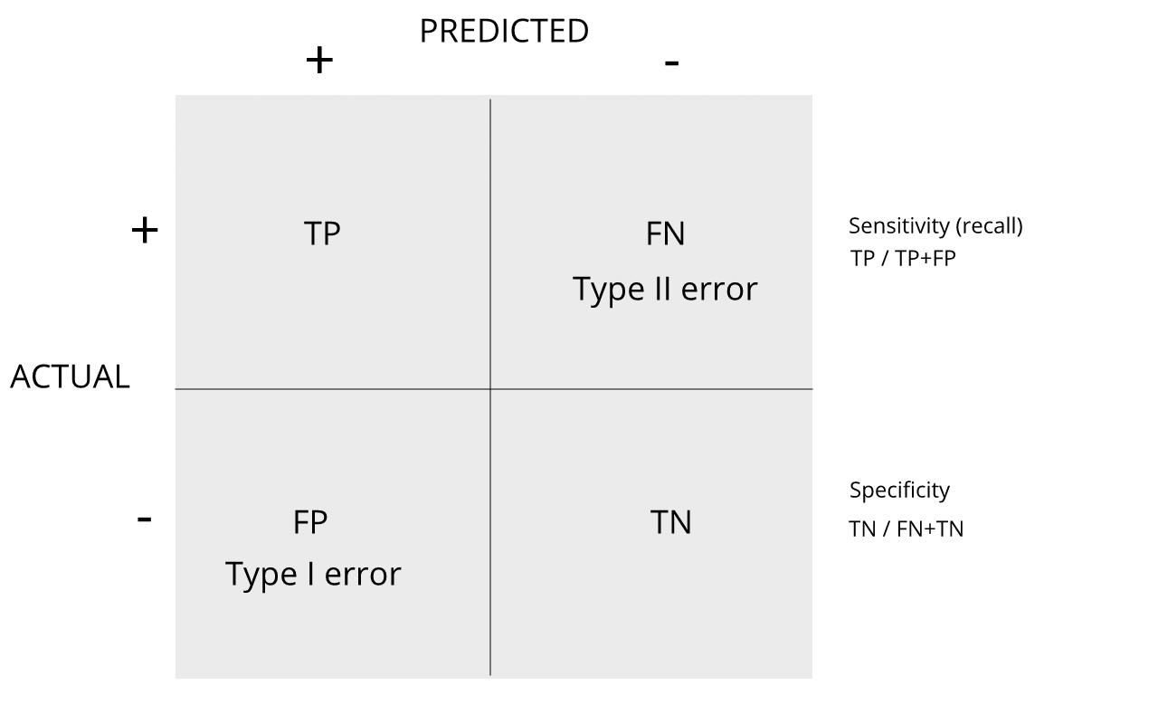
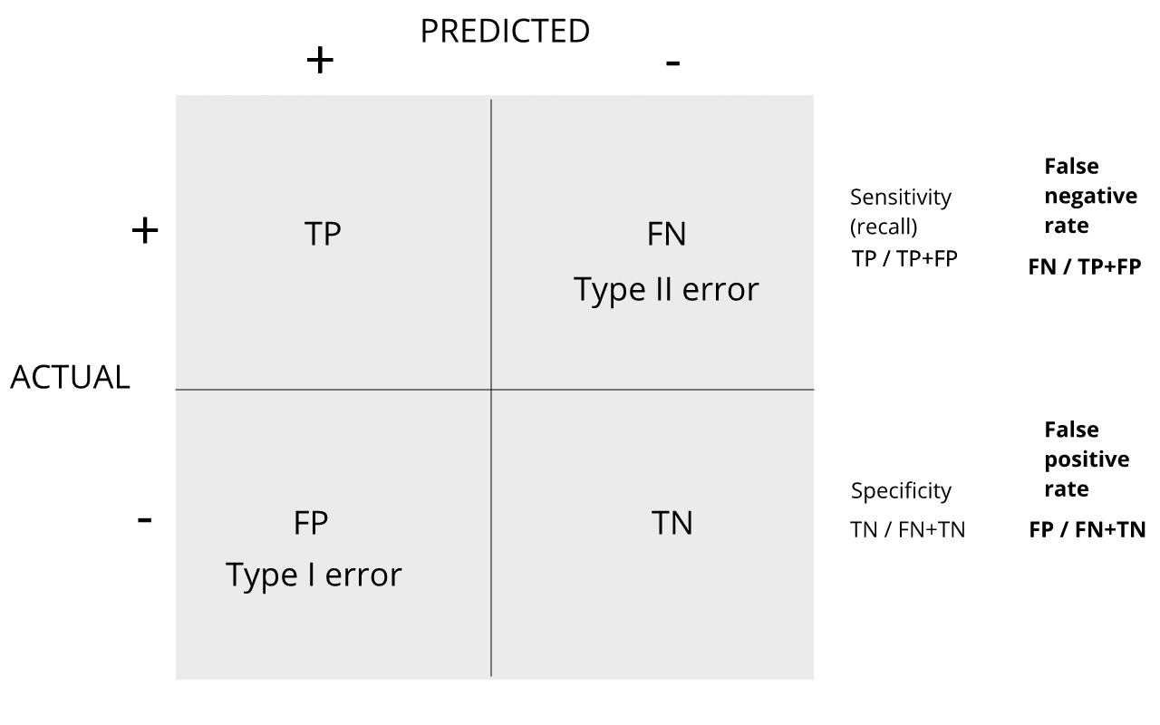
Image 1 of 1: ‘confusion matrix showing error rates’
confusion matrix showing error rates
Figure 2
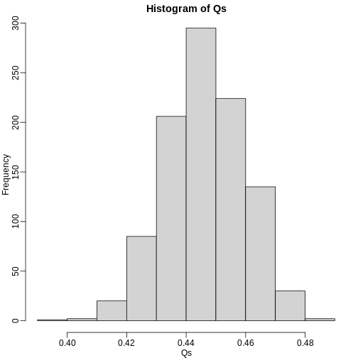
Image 1 of 1: ‘Q (false positives divided by number of features called significant) is a random variable. Here we generated a distribution with a Monte Carlo simulation.’
Q (false positives divided by number of features called significant) is
a random variable. Here we generated a distribution with a Monte Carlo
simulation.
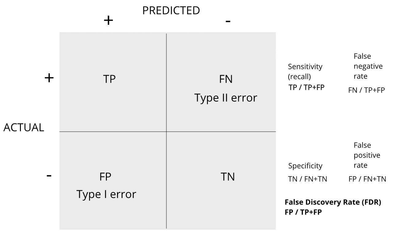
Figure 3
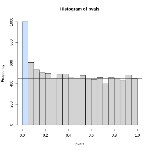
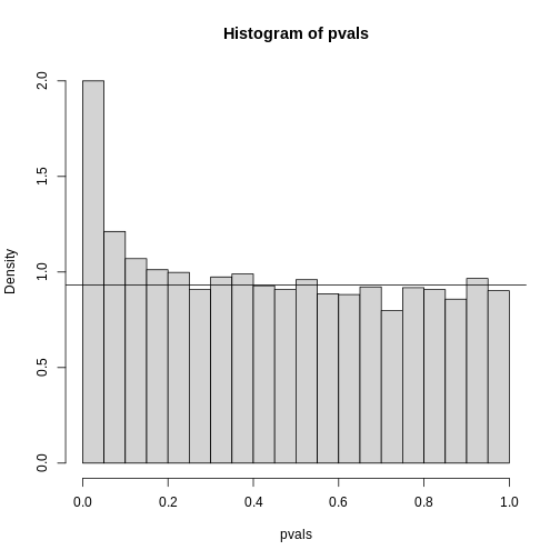
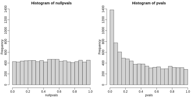
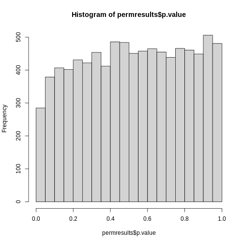
Image 1 of 1: ‘Histogram of p-values. Monte Carlo simulation was used to generate data with m_1 genes having differences between groups.’
Histogram of p-values. Monte Carlo simulation was used to generate data
with m_1 genes having differences between groups.
Figure 4
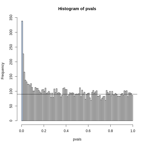
Image 1 of 1: ‘Histogram of p-values with breaks at every 0.01. Monte Carlo simulation was used to generate data with m_1 genes having differences between groups.’
Histogram of p-values with breaks at every 0.01. Monte Carlo simulation
was used to generate data with m_1 genes having differences between
groups.
Figure 5
Image 1 of 1: ‘Plotting p-values plotted against their rank illustrates the Benjamini-Hochberg procedure. The plot on the right is a close-up of the plot on the left.’
Plotting p-values plotted against their rank illustrates the
Benjamini-Hochberg procedure. The plot on the right is a close-up of the
plot on the left.
Figure 6
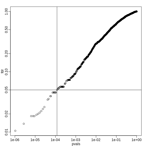
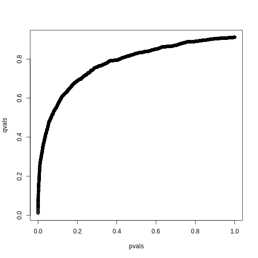
Image 1 of 1: ‘FDR estimates plotted against p-value.’
FDR estimates plotted against p-value.
Figure 7
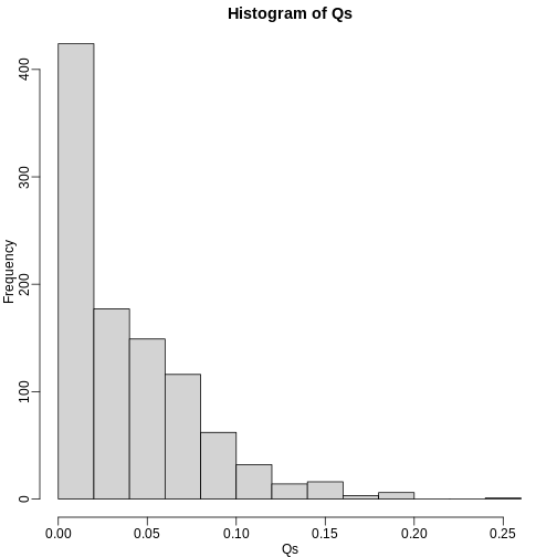
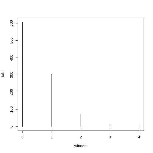
Image 1 of 1: ‘Histogram of Q (false positives divided by number of features called significant) when the alternative hypothesis is true for some features.’
Histogram of Q (false positives divided by number of features called
significant) when the alternative hypothesis is true for some features.
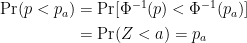
 This implies that: