Content from Introduction
Last updated on 2025-02-11 | Edit this page
Overview
Questions
- What is gained from good experimental design?
Objectives
- Connect experimental design with data quality and meaningful findings.
Good experimental design generates information-rich data with a clear message. In both scientific research and industry, experimental design plays a critical role in obtaining reliable and meaningful results. Scientists can better understand their work when they carry out well-conceived, well-executed experiments and then extract, communicate, and act on information generated in those experiments. This course will prepare scientists to design rigorous experiments that generate high-value data and to extract and communicate its messages. By applying statistical concepts in designing experiments, understanding variability, and drawing meaningful inferences, participants will be equipped with the knowledge and skills for data-driven decision-making.
Experimental design aims to describe and explain variation in natural systems by intervening to affect that variation directly. For example, the Salk polio vaccine trials collected data about variation in polio incidence after injecting more than 600,000 schoolchildren with vaccine or placebo. This clinical trial hypothesized that the vaccine would reduce the incidence of polio in schoolchildren. More than a million additional children were vaccinated and served as observed controls. The results showed evidence that the vaccine was 80-90% effective in preventing polio.
Key Points
- Good experimental design generates information-rich data with a clear message.
Content from Essential Features of a Comparative Experiment
Last updated on 2025-02-11 | Edit this page
Overview
Questions
- How are comparative experiments structured?
Objectives
- Describe the common features of comparative experiments.
- Identify experimental units, treatments, response measurements, ancillary and nuisance variables
Well-designed experiments can deliver information that has a clear impact on human health. The Generation 100 study evaluated the effects of exercise on more than 1500 elderly Norwegians from Trondheim, Norway, to determine if exercise led to a longer active and healthy life. Specifically the researchers investigated the relationship between exercise intensity and health and longevity. One group performed high-intensity interval training (10 minute warm-up followed by four 4-minute intervals at ∼90% of peak heart rate) twice a week for five years. A second group performed moderate exercise twice a week (50 minutes of continuous exercise at ∼70% of peak heart rate). A third control group followed physical activity advice according to national recommendations. Clinical examinations and questionnaires were administered to all at the start and after one, three, and five years. Heart rate, blood pressure, leg and grip strength, cognitive function, and other health indicators were measured during clinical exams.
Challenge 1: Raw ingredients of a comparative experiment
Discuss the following questions with your partner, then share your answers to each question in the collaborative document.
- What is the research question in this study? If you prefer to name a hypothesis, turn the research question into a declarative statement.
- What is the treatment (treatment factor)? How many levels are there for this treatment factor?
- What are the experimental units (the entities to which treatments are applied)?
- What are the responses (the measurements used to determine treatment effects)?
- Should participants have been allowed to choose which group (high-intensity, moderate exercise, or national standard) they wanted to join? Why or why not? Should the experimenters have assigned participants to treatment groups based on their judgment of each participant’s characteristics? Why or why not?
The research question asked whether exercise, specifically high-intensity exercise, would affect healthspan and lifespan of elderly Norwegians. The treatments were high-intensity, moderate-intensity, and national standard exercise groups. The experimental units are the individuals. The responses measured were heart rate, blood pressure, strength, cognitive function and other health indicators. The main response measured was 5-year survival. If participants had been allowed to choose their preferred exercise group or if experimenters had chosen the groups based on participant characteristics, extraneous variables (e.g. state of depression or anxiety) could be introduced into the study. When participants are randomly assigned to treatment groups, these variables are spread across the groups and cancel out. Furthermore, if experimenters had used their own judgment to assign participants to groups, their own biases could have affected the results.
Conducting a Comparative Experiment
Comparative experiments apply treatments to experimental units and measure the responses, then compare the responses to those treatments with statistical analysis. If in the Generation 100 study the experimenters had only one group (e.g. high-intensity training), they might have achieved good results but would have no way of knowing if either of the other treatments would have achieved the same or even better results. To know whether high-intensity training is better than moderate or low-intensity training, it was necessary to run experiments in which some experimental units engaged in high-intensity training, others in moderate, and others still in low-intensity training. Only then can the responses to those treatments be statistically analyzed to determine treatment effects.
Challenge 2: Which are the experimental units?
Identify the experimental units in each experiment described below, then share your answers in the collaborative document.
- Three hundred mice are individually housed in the same room. Half of them are fed a high-fat diet and the other half are fed regular chow.
- Three hundred mice are housed five per cage in the same room. Half of them are fed a high-fat diet and the other half are fed regular chow.
- Three hundred mice are individually housed in two different rooms. Those in the first room are fed a high-fat diet and those in the other room are fed regular chow.
The individual animal is the experimental unit.
The cage receives the treatment and is the experimental unit.
The room receives the treatment and is the experimental unit.
Reducing Bias with Randomization and Blinding
Randomized studies assign experimental units to treatment groups randomly by pulling a number out of a hat or using a computer’s random number generator. The main purpose for randomization comes later during statistical analysis, where we compare the data we have with the data distribution we might have obtained by random chance. Randomization provides us a way to create the distribution of data we might have obtained and ensures that our comparisons between treatment groups are valid. Random assignment (allocation) of experimental units to treatment groups prevents the subjective bias that might be introduced by an experimenter who selects, even in good faith and with good intention, which experimental units should get which treatment. For example, if the experimenter selected which people would do high-, moderate- and low-intensity training they might unconsciously bias the groups by body size or shape. This selection bias would influence the outcome of the experiment.
Randomization also accounts for or cancels out effects of “nuisance” variables like the time or day of the experiment, the investigator or technician, equipment calibration, exposure to light or ventilation in animal rooms, or other variables that are not being studied but that do influence the responses. Randomization balances out the effects of nuisance variables between treatment groups by giving an equal probability for an experimental unit to be assigned to any treatment group.
Blinding (also known as masking) prevents the experimenter from influencing the outcome of an experiment to suit their expectations or preferred hypothesis. Ideally experimenters should not know which treatment the experimental units have received or will receive from the beginning through to the statistical analysis stage of the experiment. This might require additional personnel like technicians or other colleagues to perform some tasks, and should be planned during experimental design. If ideal circumstances can’t be arranged, it should be possible to carry out at least some of the stages blind. Blinding during allocation (assignment of experimental units to treatment groups), treatment, data collection or data analysis can reduce experimental bias.
Challenge 3: How does bias enter an experiment?
Identify ways that bias enters into each experiment described below, then share your answers in the collaborative document.
- A clinician perceives increased aggression in subjects given testosterone.
- A clinician concludes that mood of each subject has improved in the treatment group given a new antidepressant.
- A researcher unintentionally treats subjects differently based on their treatment group by providing more food to control group animals.
- A clinician gives different nonverbal cues to patients in the treatment group of a clinical trial than to the control group patients.
1 and 2 describe nonblind data collection reporting increased treatment effects. Inflated effect sizes are a common problem with nonblinded studies. In 3 and 4 the experimenter
Key Points
- The raw ingredients of comparative experiments are experimental units, treatments and responses.
Content from Experimental Design Principles
Last updated on 2025-02-11 | Edit this page
Overview
Questions
- What are the core principles of experimental design?
Objectives
- The way in which a design applies treatments to experimental units and measures the responses will determine 1) what questions can be answered and 2) with what precision relationships can be described.
- The core principles guiding the way are 1) replication, 2) randomization and 3) blocking.
Variability is natural in the real world. A medication given to a group of patients will affect each of them differently. A specific diet given to a cage of mice will affect each mouse differently. Ideally if something is measured many times, each measurement will give exactly the same result and will represent the true value. This ideal doesn’t exist in the real world. For example, the mass of one kilogram is defined by the International Prototype Kilogram, a cylinder composed of platinum and iridium about the size of a golf ball.

Copies of this prototype kilogram (replicates) are distributed worldwide so each country hosting a replica has its own national standard kilogram. None of the replicas measure precisely the same despite careful storage and handling. The reasons for this variation in measurements are not known. A kilogram in Austria differs from a kilogram in Australia, which differs from that in Brazil, Kazakhstan, Pakistan, Switzerland or the U.S. What we assume is an absolute measure of mass shows real-world natural variability. Variability is a feature of natural systems and also a natural part of every experiment we undertake.
Replication to characterize variability
To figure out whether a difference in responses is real or inherently random, replication applies the same treatment to multiple experimental units. The variability of the responses within a set of replicates provides a measure against which we can compare differences among different treatments. This variability is known as experimental error. This does not mean that something was done wrongly! It’s a phrase describing the variability in the responses. Random variation is also known as random error or noise. It reflects imprecision, but not inaccuracy. Larger sample sizes reduce this imprecision.
In addition to random (experimental) error, also known as noise, there are two other sources of variability in experiments. Systematic error or bias, occurs when there are deviations in measurements or observations that are consistently in one particular direction, either overestimating or underestimating the true value. As an example, a scale might be calibrated so that mass measurements are consistently too high or too low. Unlike random error, systematic error is consistent in one direction, is predictable and follows a pattern. Larger sample sizes don’t correct for systematic bias; equipment or measurement calibration does. Technical replicates define this systematic bias by running the same sample through the machine or measurement protocol multiple times to characterize the variation caused by equipment or protocols.
A biological replicate measures different biological samples in parallel to estimate the variation caused by the unique biology of the samples. The sample or group of samples are derived from the same biological source, such as cells, tissues, organisms, or individuals. Biological replicates assess the variability and reproducibility of experimental results. For example, if a study examines the effect of a drug on cell growth, biological replicates would involve multiple samples from the same cell line to test the drug’s effects. This helps to ensure that any observed changes are due to the drug itself rather than variations in the biological material being used.
The greater the number of biological replicates, the greater the precision (the closeness of two or more measurements to each other). Having a large enough sample size to ensure high precision is necessary to ensure reproducible results. Note that increasing the number of technical replicates will not help to characterize biological variability! It is used to characterize systematic error, not experimental error.
Exercise 1: Which kind of error?
A study used to determine the effect of a drug on weight loss could
have the following sources of experimental error. Classify the following
sources as either biological, systematic, or random error.
1). A scale is broken and provides inconsistent readings.
2). A scale is calibrated wrongly and consistently measures mice 1 gram
heavier.
3). A mouse has an unusually high weight compared to its experimental
group (i.e., it is an outlier).
4). Strong atmospheric low pressure and accompanying storms affect
instrument readings, animal behavior, and indoor relative humidity.
1). random, because the scale is broken and provides any kind of
random reading it comes up with (inconsistent reading)
2). systematic
3). biological
4). random or systematic; you argue which and explain why
These three sources of error can be mitigated by good experimental design. Systematic and biological error can be mitigated through adequate numbers of technical and biological replicates, respectively. Random error can also be mitigated by experimental design, however, replicates are not effective. By definition random error is unpredictable or unknowable. For example, an atmospheric low pressure system or a strong storm could affect equipment measurements, animal behavior, and indoor relative humidity, which introduces random error. We could assume that all random error will balance itself out, and that all samples will be equally subject to random error. A more precise way to mitigate random error is through blocking.
Exercise 2: How many technical and biological replicates?
In each scenario described below, identify how many technical and how many biological replicates are represented. What conclusions can be drawn about experimental error in each scenario?
1). One person is weighed on a scale five times.
2). Five people are weighed on a scale one time each.
3). Five people are weighed on a scale three times each.
4). A cell line is equally divided into four samples. Two samples
receive a drug treatment, and the other two samples receive a different
treatment. The response of each sample is measured three times to
produce twelve total observations. In addition to the number of
replicates, can you identify how many experimental units there
are?
5). A cell line is equally divided into two samples. One sample receives
a drug treatment, and the other sample receives a different treatment.
Each sample is then further divided into two subsamples, each of which
is measured three times to produce twelve total observations. In
addition to the number of replicates, can you identify how many
experimental units there are?
1). One biological sample (not replicated) with five technical
replicates. The only conclusion to be drawn from the measurements would
be better characterization of systematic error in measuring. It would
help to describe variation produced by the instrument itself, the scale.
The measurements would not generalize to other people.
2). Five biological replicates with one technical measurement (not
replicated). The conclusion would be a single snapshot of the weight of
each person, which would not capture systematic error or variation in
measurement of the scale. There are five biological replicates, which
would increase precision, however, there is considerable other variation
that is unaccounted for.
3). Five biological replicates with three technical replicates each. The
three technical replicates would help to characterize systematic error,
while the five biological replicates would help to characterize
biological variability.
4). Four biological replicates with three technical replicates each. The
three technical replicates would help to characterize systematic error,
while the four biological replicates would help to characterize
biological variability. Since the treatments are applied to each of the
four samples, there are four experimental units.
5). Two biological replicates with three technical replicates each.
Since the treatments are applied to only the two original samples, there
are only two experimental units.
Randomization
Exercise 3: The efficient technician
Your technician colleague finds a way to simplify and expedite an
experiment. The experiment applies four different wheel-running
treatments to twenty different mice over the course of five days. Four
mice are treated individually each day for two hours each with a random
selection of the four treatments. Your clever colleague decides that a
simplified protocol would work just as well and save time. Run treatment
1 five times on day 1, treatment 2 five times on day 2, and so on. Some
overtime would be required each day but the experiment would be
completed in only four days, and then they can take Friday off! Does
this adjustment make sense to you?
Can you foresee any problems with the experimental results?
Since each treatment is run on only one day, the day effectively becomes the experimental unit (explain this). Each experimental unit (day) has five samples (mice), but only one replication of each treatment. There is no valid way to compare treatments as a result. There is no way to separate the treatment effect from the day-to-day differences in environment, equipment setup, personnel, and other extraneous variables.
Why should treatments be randomly assigned to experimental units? Randomization minimizes bias and moderates experimental error (a.k.a. noise). A hat full of numbers, a random number table or a computational random number generator can be used to assign random numbers to experimental units so that any experimental unit has equal chances of being assigned to a specific treatment group.
Here is an example of randomization using a random number generator. The study asks how a high-fat diet affects blood pressure in mice. If the random number is odd, the sample is assigned to the treatment group, which receives the high-fat diet. If the random number is even, the sample is assigned to the control group (the group that doesn’t receive the treatment, in this case, regular chow).
R
# create the mouse IDs and 26 random numbers between 1 and 100
mouse_ID <- LETTERS
random_number <- sample(x = 100, size = 26)

# %% is the modulo operator, which returns the remainder from division by 2
# if the remainder is 0 (even number), regular chow diet is assigned
# if not, high fat is assigned
treatment <- ifelse(random_number %% 2 == 0, "chow", "high fat")
random_allocation <- data.frame(mouse_ID, random_number, treatment)
random_allocation
OUTPUT
   mouse_ID random_number treatment
1         A             4      chow
2         B           100      chow
3         C            56      chow
4         D            64      chow
5         E            86      chow
6         F            63  high fat
7         G            24      chow
8         H            18      chow
9         I            33  high fat
10        J            71  high fat
11        K            17  high fat
12        L            82      chow
13        M            52      chow
14        N            84      chow
15        O            77  high fat
16        P             8      chow
17        Q            40      chow
18        R            47  high fat
19        S            23  high fat
20        T            15  high fat
21        U            92      chow
22        V            51  high fat
23        W            45  high fat
24        X            13  high fat
25        Y            49  high fat
26        Z            43  high fat
This might produce unequal numbers between treatment and control groups. It isn’t necessary to have equal numbers, however, sensitivity or statistical power (the probability of detecting an effect when it truly exists) is maximized when sample numbers are equal.
R
table(random_allocation$treatment)
OUTPUT
    chow high fat
      13       13
To randomly assign samples to groups with equal numbers, you can do the following.
R
# place IDs and random numbers in data frame
equal_allocation <- data.frame(mouse_ID, random_number)

# sort by random numbers (not by sample IDs)
equal_allocation <- equal_allocation[order(random_number),]

# now assign to treatment or control groups
treatment <- sort(rep(x = c("chow", "high fat"), times = 13))
equal_allocation <- cbind(equal_allocation, treatment)
row.names(equal_allocation) <- 1:26
equal_allocation
OUTPUT
   mouse_ID random_number treatment
1         A             4      chow
2         P             8      chow
3         X            13      chow
4         T            15      chow
5         K            17      chow
6         H            18      chow
7         S            23      chow
8         G            24      chow
9         I            33      chow
10        Q            40      chow
11        Z            43      chow
12        W            45      chow
13        R            47      chow
14        Y            49  high fat
15        V            51  high fat
16        M            52  high fat
17        C            56  high fat
18        F            63  high fat
19        D            64  high fat
20        J            71  high fat
21        O            77  high fat
22        L            82  high fat
23        N            84  high fat
24        E            86  high fat
25        U            92  high fat
26        B           100  high fat
You can write out this treatment plan to a comma-separated values (csv) file, then open it in Excel and use it to record your data collection or just keep track of which samples are randomly assigned which diet.
R
write.csv(equal_allocation, file = "./data/random-assign.csv", row.names = FALSE)
Discussion
Why not assign treatment and control groups to samples in
alphabetical order?
Did we really need a random number generator to obtain randomized equal
groups?
1). Scenario: One technician processed samples A through M, and a
different technician processed samples N through Z. Might the first
technician have processed samples somewhat differently from the second
technician? If so, there would be a “technician effect” in the results
that would be difficult to separate from the treatment effect. 2).
Another scenario: Samples A through M were processed on a Monday, and
samples N through Z on a Tuesday. Might the weather or the environment
in general have been different between Monday and Tuesday? What if a big
construction project started on Tuesday, or the whole team had a
birthday gathering for one of their members, or anything else in the
environment differed between Monday and Tuesday? If so, there would be a
“day-of-the-week effect” in the results that would be difficult to
separate from the treatment effect. 3). Yet another scenario: Samples A
through M were from one strain, and samples N through Z from a different
strain. How would you be able to distinguish between the treatment
effect and the strain effect? 4). Yet another scenario: Samples with
consecutive ids were all sibling groups. For example, samples A, B and C
were all siblings, and all assigned to the same treatment.
All of these cases would have introduced an effect (from the technician,
the day of the week, the strain, or sibling relationships) that would
confound the results and lead to misinterpretation.
Controlling Natural Variation with Blocking
Experimental units can be grouped, or blocked, to increase the precision of treatment comparisons. Blocking divides an experiment into groups of experimental units to control natural variation among these units. Treatments are randomized to experimental units within each block. Each block, then, is effectively a sub-experiment.
Randomization within blocks accounts for nuisance variables that could bias the results, such as day, time, cage proximity to light or ventilation, etc. In the illustration below, three treatments are randomized to the experimental units (the cages) on each shelf. Each shelf is a block that accounts for random variation introduced by a nuisance variable, proximity to the light.
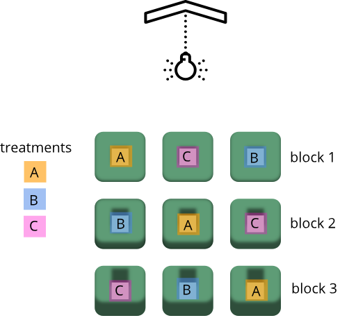
Shelf height is a blocking factor that should be included in the data analysis phase of the experiment. Adding a nuisance variable as a blocking factor accounts for variability and can increase the probability of detecting a real treatment effect (statistical power). If the blocking factor doesn’t substantially impact variability, however, it reduces the information used to estimate a statistic (degrees of freedom) and diminishes statistical power. Blocking should only be used when a variable is suspected to impact the experiment.
Another way to define blocks of experimental units is to use characteristics or traits that are likely associated with the response. Sex and age, for example, can serve as blocking factors in experiments, with experimental units randomly allocated to each block based on age category and sex. Stratified randomization places experimental units into separate blocks for each age category and sex. As with nuisance variables, these blocking factors (age and sex) should be used in the subsequent data analysis.
Exercise 3: Explain blocking to the efficient technician
Your technician colleague is not only efficient but very well-organized. They will administer treatments A, B and C shown in the figure above.
- Explain to your colleague why the treatments should not be administered by shelf (e.g. the top shelf all get treatment A, the next shelf B and the lower shelf treatment C).
- Explain blocking to the technician and describe how it helps the experiment.
Exercise 4: How and when to set up blocks
For the following scenarios, describe whether you would set up blocks and if so, how you would set up the blocks.
- A large gene expression study will be run in five different batches or runs.
- An experiment will use two different models of equipment to obtain measurements.
- Samples will be processed in the morning, afternoon and evening.
- In a study in which mice were randomly assigned to treatment and control groups, the air handler in the room went off and temperature and humidity increased.
Key Points
- Replication, randomization and blocking determine the validity and usefulness of an experiment.
Content from Statistics in Data Analysis
Last updated on 2025-02-11 | Edit this page
Overview
Questions
- How can information be extracted and communicated from experimental data?
Objectives
- Plotting reveals information in the data.
- Statistical significance testing compares experimental data obtained to probability distributions of data that might also be possible.
- A probability distribution is a mathematical function that gives the probabilities of different possible outcomes for an experiment.
A picture is worth a thousand words
To motivate this next section on statistics, we start with an example of human variability. This 1975 living histogram of women from the University of Wisconsin Madison shows variability in a natural population.

B. Joiner, Int’l Stats Review, 1975
Exercise 1: A living histogram
From the living histogram, can you estimate by eye
1). the mean and median heights of this sample of women?
2). the spread of the data? Estimate either standard deviation or
variance by eye. If you’re not sure how to do this, think about how you
would describe the spread of the data from the mean. You do not need to
calculate a statistic.
3). any outliers? Estimate by eye - don’t worry about
calculations.
4). What do you predict would happen to mean, median, spread and
outliers if an equal number of men were added to the histogram?
1). Mean and median are two measures of the center of the data. The median is the 50th% of the data with half the women above this value and the other half below. There are approximately 100 students total. Fifty of them appear to be above 5 feet 5 inches and fifty of them appear to be below 5’5”. The median is not influenced by extreme values (outliers), but the mean value is. While there are some very tall and very short people, the bulk of them appear to be centered around a mean of 5 foot 5 inches with a somewhat longer right tail to the histogram. 2). If the mean is approximately 5’5” and the distribution appears normal (bell-shaped), then we know that approximately 68% of the data lies within one standard deviation (sd) of the mean and ~95% lies within two sd’s. If there are ~100 people in the sample, 95% of them lie between 5’0” and 5’10” (2 sd’s = 5” above and 5” below the mean). One standard deviation then would be about 5”/2 = 2.5” from the mean of 5’5”. So 68% of the data (~68 people) lie within 5 feet 2.5 inches and 5 feet 7.5 inches. 3). There are some very tall and very short people but it’s not clear whether they are outliers. Outliers deviate significantly from expected values, specifically by more than 3 standard deviations in a normal distribution. Values that are greater than 3 sd’s (7.5”) above or below the mean could be considered outliers. Outliers would then be shorter than 4 feet 7.5 inches or taller than 6 feet 2.5 inches. The shortest are 4 feet 9 inches and the tallest 6’ 0 inches. There are no outliers in this sample because all heights fall within 3 sd’s. 4). Average heights for men are greater than average heights for women, so you could expect that a random sample of 100 men would increase the average height of the sample of 200 students. The mean would shift to the right of the distribution toward taller heights, as would the median.
The first step in data analysis: plot the data!
A picture is worth a thousand words, and a picture of your data could reveal important information that can guide you forward. So first, plot the data!
R
# load the tidyverse library to write more easily interpreted code
library(tidyverse)

# read in the simulated heart rate data
heart_rate <- read_csv("data/simulated_heart_rates.csv")
OUTPUT
Rows: 1566 Columns: 3
── Column specification ────────────────────────────────────────────────────────
Delimiter: ","
chr (2): exercise_group, sex
dbl (1): heart_rate

ℹ Use `spec()` to retrieve the full column specification for this data.
ℹ Specify the column types or set `show_col_types = FALSE` to quiet this message.
R
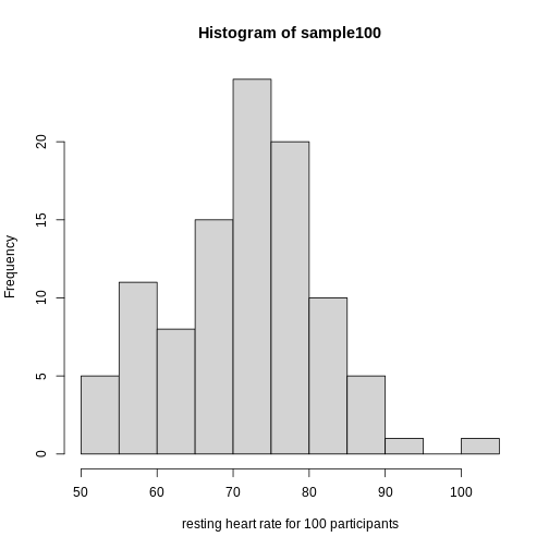
# take a random sample of 100 and create a histogram
# first set the seed for the random number generator
set.seed(42)
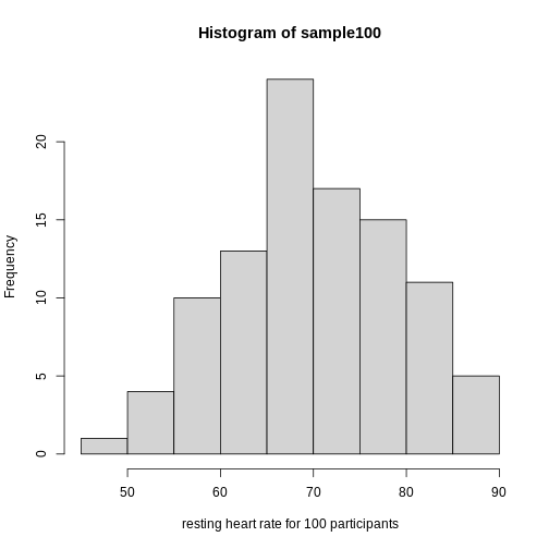
sample100 <- sample(heart_rate$heart_rate, 100)
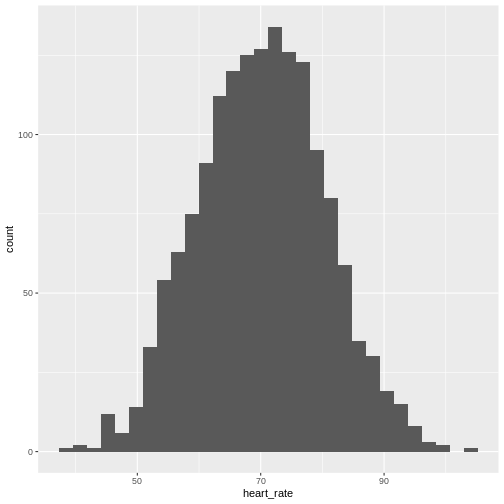
hist(sample100, xlab = "resting heart rate for 100 participants")
Exercise 2: What does this picture tell you about resting heart rates?
Do the data appear to be normally distributed? Why does this matter? Do the left and right tails of the data seem to mirror each other or not? Are there gaps in the data? Are there large clusters of similar heart rate values in the data? Are there apparent outliers? What message do the data deliver in this histogram?
Now create a boxplot of the same sample data.
R
boxplot(sample100)
Exercise 3: What does this boxplot tell you about resting heart rates?
What does the box signify? What does horizontal black line dividing the box signify? Are there apparent outliers? How does the boxplot relate to the histogram? What message do the data deliver in this boxplot?
Plotting the data can identify unusual response measurements (outliers), reveal relationships between variables, and guide further statistical analysis. When data are not normally distributed (bell-shaped and symmetrical), many of the statistical methods typically used will not perform well. In these cases the data can be transformed to a more symmetrical bell-shaped curve.
Random variables
The Generation 100 study aims to determine whether high-intensity exercise in elderly adults affects lifespan and healthspan.
R
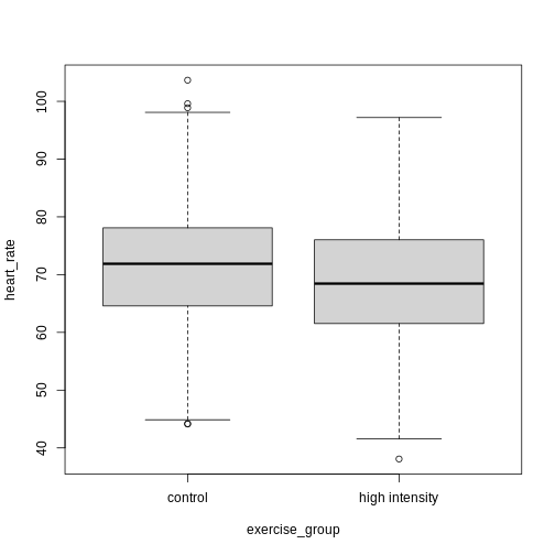
heart_rate %>% filter(exercise_group %in% c("high intensity", "control")) %>% ggplot(aes(exercise_group, heart_rate)) + geom_boxplot()
Exercise 4: Comparing two groups - control vs. high intensity
- Does there appear to be a significant heart rate difference between the control and high intensity exercise groups? How would you know?
- Do any of the data overlap between the two boxplots?
- Can you know which exercise group a person belongs to just by knowing their heart rate? For example, for a heart rate of 80 could you say with certainty that a person belongs to one group or the other?
- There appears to be a trend of lower heart rate in the high-intensity exercise group, however, we can’t say whether or not it is significant without performing statistical tests.
- There is considerable overlap between the two groups, which shows that there is considerable variability in the data.
- Someone with a heart rate of 80 could belong to any group. When considering significance of heart rate differences between the two groups we don’t look at individuals, rather, we look at averages between the two groups.
The boxplots above show a trend of lower heart rate in the high-intensity exercise group and higher heart rate in the control exercise group. There is inherent variability in heart rate in both groups however, which is to be expected. That variability appears in the box and whisker lengths of the boxplots, along with any outliers that appear as hollow circles outside of the whisker length. This variability in heart rate measurements also means that the boxplots overlap between the two groups, making it difficult to determine whether there is a significant difference in mean heart rate between the groups.
We can calculate the difference in means between the two groups to answer the question about exercise intensity.
R
# calculate the means of the two groups
# unlist() converts a tibble (special tidyverse table) to a vector
highHR <- heart_rate %>%
            filter(exercise_group == "high intensity") %>%
            select(heart_rate) %>%
            unlist()
controlHR <- heart_rate %>%
                filter(exercise_group == "control") %>%
                select(heart_rate) %>%
                unlist()
meanDiff <- mean(controlHR) - mean(highHR)
meanDiff
OUTPUT
[1] 4.456752The actual difference in mean heart rates between the two groups is 4.46. Another way of stating this is that the high-intensity group had a mean heart rate that was 6 percent lower than the control group. This is the observed effect size.
So are we done now? Does this difference support the alternative hypothesis that there is a significant difference in mean heart rates? Or does it fail to reject the null hypothesis of no significant difference? Why do we need p-values and confidence intervals if we have evidence we think supports our claim? The reason is that the mean values are random variables that can take many different values. We are working with two samples of elderly Norwegians, not the entire population of elderly Norwegians. The means are estimates of the true mean heart rate of the entire population, a number that we can never know because we can’t access the entire population of elders. The sample means will vary with every sample we take from the population. To demonstrate this, let’s take a sample from each exercise group and calculate the difference in means for those samples.
R
# calculate the sample mean of 100 people in each group
HI100 <- mean(sample(highHR, size = 100))
control100 <- mean(sample(controlHR, size = 100))
control100 - HI100
OUTPUT
[1] 4.830802Now take another sample of 100 from each group and calculate the difference in means.
R
# calculate the sample mean of 100 people in each group
HI100 <- mean(sample(highHR, size = 100))
control100 <- mean(sample(controlHR, size = 100))
control100 - HI100
OUTPUT
[1] 4.836228Are the differences in sample means the same? We can repeat this sampling again and again, and each time arrive at a different value. The sample means are a random variable, meaning that they can take on any number of different values. Since they are random variables, the difference between the means (the observed effect size) is also a random variable.
Supposing we did have access to the entire population of elderly Norwegians. Can we determine the mean resting heart rate for the entire population, rather than just for samples of the population? Imagine that you have measured the resting heart rate of the entire population of elders 70 or older, not just the 1,567 from the Generation 100 study. In practice we would never have access to the entire population, so this is a thought exercise.
R
# read in the heart rates of the entire population of all elderly people
population <- heart_rate %>%
              filter(exercise_group %in% c("high intensity", "control"))

# sample 100 of them and calculate the mean three times
mean(sample(population$heart_rate, size = 100))
OUTPUT
[1] 69.49368R
mean(sample(population$heart_rate, size = 100))
OUTPUT
[1] 71.02936R
mean(sample(population$heart_rate, size = 100))
OUTPUT
[1] 68.73223Notice how the mean changes each time you sample. We can continue to do this many times to learn about the distribution of this random variable. Comparing the data obtained to a probability distribution of data that might have been obtained can help to answer questions about the effects of exercise intensity on heart rate.
The null hypothesis
Now let’s return to the mean difference between treatment groups. How do we know that this difference is due to the exercise? What happens if all do the same exercise intensity? Will we see a difference as large as we saw between the two treatment groups? This is called the null hypothesis. The word null reminds us to be skeptical and to entertain the possibility that there is no difference.
Because we have access to the population, we can randomly sample 100 controls to observe as many of the differences in means when exercise intensity has no effect. We can give everyone the same exercise plan and then record the difference in means between two randomly split groups of 100 and 100.
Here is this process written in R code:
R
## 100 controls
control <- sample(population$heart_rate, size = 100)

## another 100 controls that we pretend are on a high-intensity regimen
treatment <- sample(population$heart_rate, size = 100)
mean(control) - mean(treatment)
OUTPUT
[1] -0.4151924Now let’s find the sample mean of 100 participants from each group 10,000 times.
R
treatment <- replicate(n = 10000, mean(sample(population$heart_rate, 100)))
control <- replicate(n = 10000, mean(sample(population$heart_rate, 100)))
null <- control - treatment
hist(null)
abline(v=meanDiff, col="red", lwd=2)
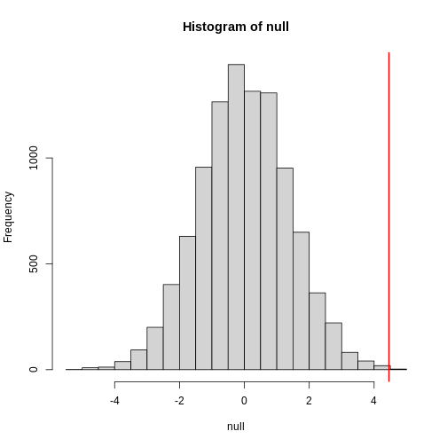
null contains the differences in means between the two
groups sampled 10,000 times each. The value of the observed difference
in means between the two groups, meanDiff, is shown as a
vertical red line. The values in null make up the
null distribution. How many of these differences are
greater than the observed difference in means between the actual
treatment and control groups?
R
mean(null >= meanDiff)
OUTPUT
[1] 4e-04Approximately 0% of the 10,000 simulations are greater than the observed difference in means. We can expect then that we will see a difference in means approximately 0% of the time even if there is no effect of exercise on heart rate. This is known as a p-value.
Exercise 5: What does a p-value mean?
What does this p-value tell us about the difference in means between the two groups? How can we interpret this value? What does it say about the significance of the difference in mean values?
P-values are often misinterpreted as the probability that, in this example, high-intensity and control exercise result in the same average heart rate. However, “high-intensity and control exercise result in the same average heart rate” is not a random variable like the number of heads or tails in 10 flips of a coin. It’s a statement that doesn’t have a probability distribution, so you can’t make probability statements about it. The p-value summarizes the comparison between our data and the data we might have obtained from a probability distribution if there were no difference in mean heart rates. Specifically, the p-value tells us how far out on the tail of that distribution the data we got falls. The smaller the p-value, the greater the disparity between the data we have and the data distribution that might have been. To understand this better, we’ll explore probability distributions next.
The alternative hypothesis
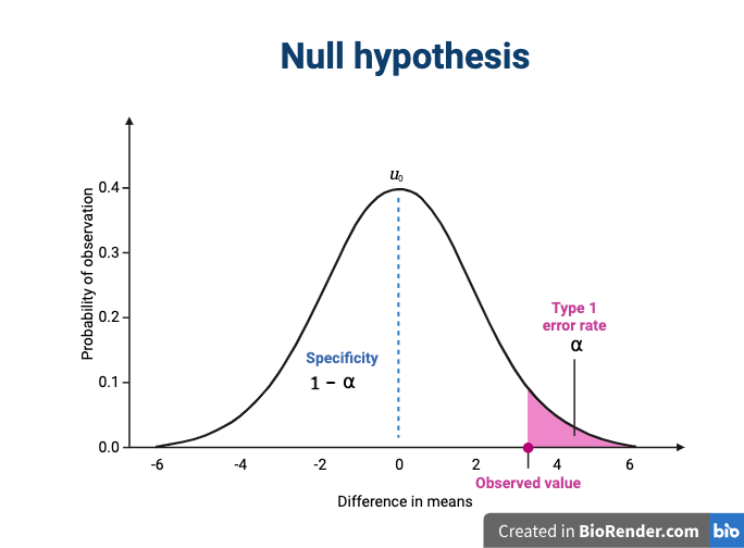
We assume that our observations are drawn from a null distribution with mean μ0, which in this case equals zero because the null hypothesis states that there is no difference between the treatment groups. We reject the null hypothesis for values that fall within the region defined by α, they Type I error rate. If we have a value that falls within this region, it is possible to falsely reject the null hypothesis and to assume that there is a treatment effect when in reality none exists. False positives (Type I errors) are typically set at a low rate (0.05) in good experimental design so that specificity (1 - α) remains high. Specificity describes the likelihood of true negatives, or accepting the null hypothesis when it is true and correctly assuming that no effect exists.
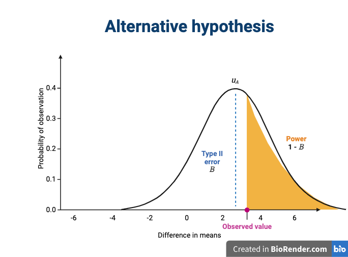
The alternative hypothesis challenges the null by stating that an effect exists and that the mean difference, μA, is greater than zero. The difference between μ0 and μA is known as the effect size, which is expressed in units of standard deviation: d = μA - μ0 / σ.
Probability and probability distributions
Suppose you have measured the resting heart rate of the entire
population of elderly Norwegians 70 or older, not just the 1,567 from
the Generation 100 study. Imagine you need to describe all of these
numbers to someone who has no idea what resting heart rate is. Imagine
that all the measurements from the entire population are contained in
population. We could list out all of the numbers for them
to see or take a sample and show them the sample of heart rates, but
this would be inefficient and wouldn’t provide much insight into the
data. A better approach is to define and visualize a
distribution. The simplest way to think of a
distribution is as a compact description of many numbers.
Histograms show us the proportion of values within an interval. Here is a histogram showing all resting heart rates for the entire population 70 and older.
R
population %>% ggplot(mapping = aes(heart_rate)) + geom_histogram()
 Showing this plot is much more informative and easier to interpret than
a long table of numbers. With this histogram we can approximate the
number of individuals in any given interval. For example, there are
approximately 29 individuals (~2.8%) with a resting heart rate greater
than 90, and another 31 individuals (~3%) with a resting heart rate
below 50.
Showing this plot is much more informative and easier to interpret than
a long table of numbers. With this histogram we can approximate the
number of individuals in any given interval. For example, there are
approximately 29 individuals (~2.8%) with a resting heart rate greater
than 90, and another 31 individuals (~3%) with a resting heart rate
below 50.
The histogram above approximates one that is very common in nature: the bell curve, also known as the normal distribution or Gaussian distribution.
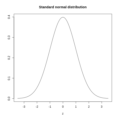
The curve shown above is an example of a probability density
function that defines a normal distribution. The y-axis is the
probability density, and the total area under the curve
sums to 1.0 on the y-axis. The x-axis denotes a variable z that
by statistical convention has a standard normal distribution. If you
draw a random value from a normal distribution, the probability that the
value falls in a particular interval, say from a to b,
is given by the area under the curve between a and b.
When the histogram of a list of numbers approximates the normal
distribution, we can use a convenient mathematical formula to
approximate the proportion of values or outcomes in any given interval.
That formula is conveniently stored in the function
pnorm
If the normal approximation holds for our list of data values, then
the mean and variance (spread) of the data can be used. For example,
when we noticed that ~ 0% of the values in the null distribution were
greater than meanDiff, the mean difference between control
and high-intensity groups. We can compute the proportion of values below
a value x with pnorm(x, mu, sigma) where
mu is the mean and sigma the standard
deviation (the square root of the variance).
R
1 - pnorm(meanDiff, mean=mean(null), sd=sd(null))
OUTPUT
[1] 0.0006295383A useful characteristic of this approximation is that we only need to
know mu and sigma to describe the entire
distribution. From this, we can compute the proportion of values in any
interval.
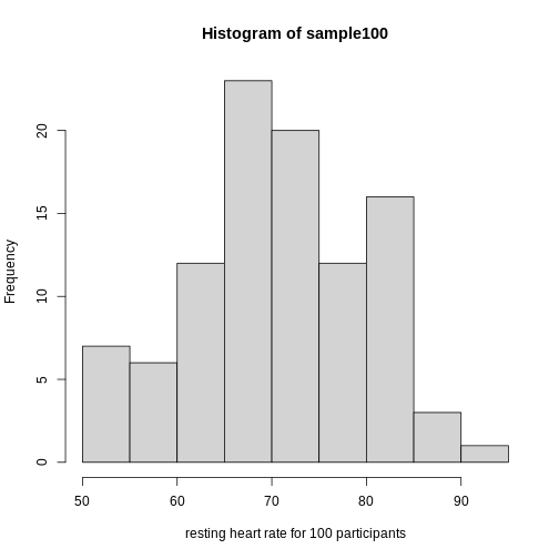
Real-world populations may be approximated by the mathematical ideal of the normal distribution. Repeat the sampling we did earlier and produce a new histogram of the sample.
R
sample100 <- sample(heart_rate$heart_rate, 100)
hist(sample100, xlab = "resting heart rate for 100 participants")
Exercise 6: Sampling from a population
- Does the sample appear to be normally distributed?
- Can you estimate the mean resting heart rate by eye?
- What is the sample mean using R (hint: use
mean())?
- Can you estimate the sample standard deviation by eye? Hint: if
normally distributed, 68% of the data will lie within one standard
deviation of the mean and 95% will lie within 2 standard
deviations.
- What is the sample standard deviation using R (hint: use
sd())?
- Estimate the number of people with a resting heart rate between 60
and 70.
- What message does the sample deliver about the population from which it was drawn?
If you have doubts about whether the sample follows a normal distribution, a quantile-quantile (QQ) plot can make interpretation easier.
R
qqnorm(sample100)
qqline(sample100)
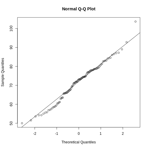
We can use qq-plots to confirm that a distribution is relatively close to normally distributed. A qq-plot compares data on the y-axis against a theoretical distribution on the x-axis. If the data points fall on the identity line (diagonal line), then the data is close to the theoretical distribution. The larger the sample, the more forgiving the result is to the weakness of this normal approximation. For small sample sizes, the t-distribution works well.
Statistical significance testing: the t-test
Significance testing can answer questions about differences between the two groups in light of inherent variability in heart rate measurements. What does it mean that a difference is statistically significant? We can eye plots like the boxplots above and see a difference, however, we need something more objective than eyeballs to claim a significant difference. A t-test will report whether the difference in mean values between the two groups is significant. The null hypothesis would state that there is no difference in mean values, while the alternative hypothesis states that there is a difference in the means of the two samples from the whole population of elders in Norway.
R
# provide a formula stating that heart rate is dependent on exercise intensity
t.test(formula = heart_rate ~ exercise_group, data = population)
OUTPUT
	Welch Two Sample t-test

data:  heart_rate by exercise_group
t = 7.1567, df = 1039.9, p-value = 1.559e-12
alternative hypothesis: true difference in means between group control and group high intensity is not equal to 0
95 percent confidence interval:
 3.234779 5.678725
sample estimates:
       mean in group control mean in group high intensity
                    72.36999                     67.91324
The perils of p-values
You can access the p-value alone from the t-test by saving the
results and accessing individual elements with the $
operator.
R
# save the t-test result and access the p-value alone
result <- t.test(formula = heart_rate ~ exercise_group, data = population)
result$p.value
OUTPUT
[1] 1.559161e-12The p-value indicates a statistically significant difference between exercise groups. It is not enough, though, to report only a p-value. The p-value says nothing about the effect size (the observed difference). If the effect size was tiny, say .01 or less, would it matter how small the p-value is? The effect is negligible, so the p-value does nothing to demonstrate practical relevance or meaning. We should question how large the effect is. The p-value can only tell us whether an effect exists.
A p-value can only tell us whether an effect exists. However, a p-value greater than .05 doesn’t mean that no effect exists. The value .05 is rather arbitrary. Does a p-value of .06 mean that there is no effect? It does not. It would not provide evidence of an effect under standard statistical protocol. Absence of evidence is not evidence of absence. There could still be an effect.
Confidence intervals
P-values report statistical significance of an effect, but what we want is scientific significance. Confidence intervals include estimates of the effect size and uncertainty associated with these estimates. When reporting results, use confidence intervals.
R
# access the confidence interval
result$conf.int
OUTPUT
[1] 3.234779 5.678725
attr(,"conf.level")
[1] 0.95
The confidence interval states that the true difference in means is between 3.23 and 5.68. We can say, with 95% confidence, that high intensity exercise could decrease mean heart rate from 3.23 to 5.68 beats per minute. Note that these are simulated data and are not the outcomes of the Generation 100 study.
A 95% confidence interval states that 95% of random intervals will contain the true value. This is not the same as saying that there is a 95% chance that the true value falls within the interval. The graphic below helps to explain a 95% confidence interval for mean heart rates of samples of size 30 taken from the overall population.
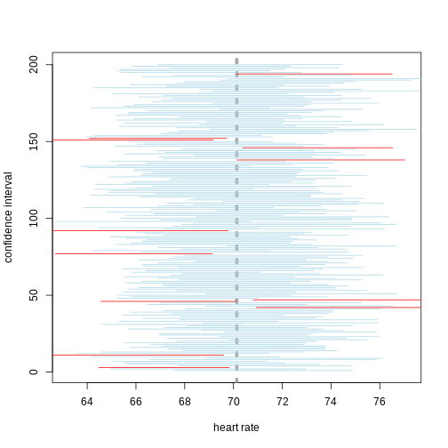
If we generate 200 confidence intervals for the sample mean heart rate, those confidence intervals will include the population mean (vertical gray dotted line) approximately 95% of the time. You will see that about 5% of the confidence intervals (shown in red) fail to cover the mean.
Exercise 7: Explaining p-values and confidence intervals
For each statement, explain to a partner why you believe the statement is true or untrue.
- A p-value of .02 means that there is only a 2% chance that high-intensity and control exercise result in the same average heart rate.
- A p-value of .02 demonstrates that there is a meaningful difference in average heart rates between the two groups.
- A 95% confidence interval has a 95% chance of containing the true difference in means.
- A confidence interval should be reported along with the p-value.
Comparing standard deviations
When comparing the means of data from the two groups, we need to ask whether these data have equal variances (spreads). Previous studies and prior knowledge can help us with this assumption. If we know from previous data or from our own expertise that adjusting a treatment will affect the mean response but not its variability, then we can assume equal variances between treatment groups.
However, if we suspect that changing a treatment will affect not only mean response but also its variability, we will be as interested in comparing standard deviations (the square root of the variance) as we are in comparing means.
R
heart_rate %>% group_by(exercise_group) %>%
  summarise_at(vars(heart_rate), list(variance=var, standard_deviation = sd))
OUTPUT
# A tibble: 3 × 3
  exercise_group     variance standard_deviation
  <chr>                 <dbl>              <dbl>
1 control                96.6               9.83
2 high intensity        106.               10.3
3 moderate intensity    104.               10.2
As a rule of thumb, if the ratio of the larger to the smaller variance is less than 4, the groups have equal variances.
R
heart_rate %>% group_by(exercise_group) %>%
  summarise_at(vars(heart_rate), var)
OUTPUT
# A tibble: 3 × 2
  exercise_group     heart_rate
  <chr>                   <dbl>
1 control                  96.6
2 high intensity          106.
3 moderate intensity      104.
A more formal approach uses an F test to compare variances between samples drawn from a normal population.
R
var.test(heart_rate ~ exercise_group, data=heart_rate)
ERROR
Error in var.test.formula(heart_rate ~ exercise_group, data = heart_rate): grouping factor must have exactly 2 levelsThe F test reports that the variances between the groups are not the same, however, the ratio of variances is very close to 1.
Sample sizes and power curves
Statistical power analysis is an important preliminary step in experimental design. Sample size is an important component of statistical power (the power to detect an effect). To get a better sense of statistical power, let’s simulate a t-test for two groups with different means and equal variances.
R
set.seed(1)
n_sims <- 1000 # we want 1000 simulations
p_vals <- c()  # create a vector to hold the p-values

for(i in 1:n_sims){
  group1 <- rnorm(n=30, mean=1, sd=2) # simulate group 1
  group2 <- rnorm(n=30, mean=0, sd=2) # simulate group 2

  # run t-test and extract the p-value
  p_vals[i] <- t.test(group1, group2, var.equal = TRUE)$p.value
}

mean(p_vals < .05) # check power (i.e. proportion of p-values that are smaller
OUTPUT
[1] 0.478R
# than alpha-level of .05)
Let’s calculate the statistical power of our experiment so far, and then determine the sample size we would need to run a similar experiment on a different population.
R
# sample size = 783 per group
# delta = the observed effect size, meanDiff
# sd = standard deviation
# significance level (Type 1 error probability or
#                     false positive rate) = 0.05
# type = two-sample t-test
# What is the power of this experiment to detect
#                     an effect of size meanDiff?
power.t.test(n = 783, delta = meanDiff, sd = sd(heart_rate$heart_rate),
             sig.level = 0.05, type = "two.sample")
OUTPUT
     Two-sample t test power calculation

              n = 783
          delta = 4.456752
             sd = 10.26359
      sig.level = 0.05
          power = 1
    alternative = two.sided

NOTE: n is number in *each* group
In biomedical studies, statistical power of 80% (0.8) is an accepted standard. If we were to repeat the experiment with a different population of elders (e.g. Icelandic elders), what is the minimum sample size we would need for each exercise group?
R
# delta = the observed effect size, meanDiff
# sd = standard deviation
# significance level (Type 1 error probability or false positive rate) = 0.05
# type = two-sample t-test
# What is the minimum sample size we would need at 80% power?
power.t.test(delta = meanDiff, sd = sd(heart_rate$heart_rate),
             sig.level = 0.05, type = "two.sample", power = 0.8)
OUTPUT
     Two-sample t test power calculation

              n = 84.22402
          delta = 4.456752
             sd = 10.26359
      sig.level = 0.05
          power = 0.8
    alternative = two.sided

NOTE: n is number in *each* group
As a rule of thumb, Lehr’s equation streamlines calculation of sample size assuming equal variances and sample sizes drawn from a normal distribution. The effect size is standardized by dividing the difference in group means by the standard deviation. Cohen’s d describes standardized effect sizes from 0.01 (very small) to 2.0 (huge).
R
# n = (16/delta squared), where delta is the standardized effect size
# delta = effect size standardized as Cohen's d
#     (difference in means)/(standard deviation)
standardizedEffectSize <- meanDiff/sd(heart_rate$heart_rate)
n <- 16/standardizedEffectSize^2
n
OUTPUT
[1] 84.85574Often budget constraints determine sample size. Lehr’s equation can be rearranged to determine the effect size that can be detected for a given sample size.
R
# difference in means = (4 * sd)/(square root of n)
# n = 100, the number that I can afford
SD <- sd(heart_rate$heart_rate)
detectableDifferenceInMeans <- (4 * SD)/sqrt(100)
detectableDifferenceInMeans
OUTPUT
[1] 4.105434Try increasing or decreasing the sample size (100) to see how the detectable difference in mean changes. Note the relationship: for very large effects, you can get away with smaller sample sizes. For small effects, you need large sample sizes.
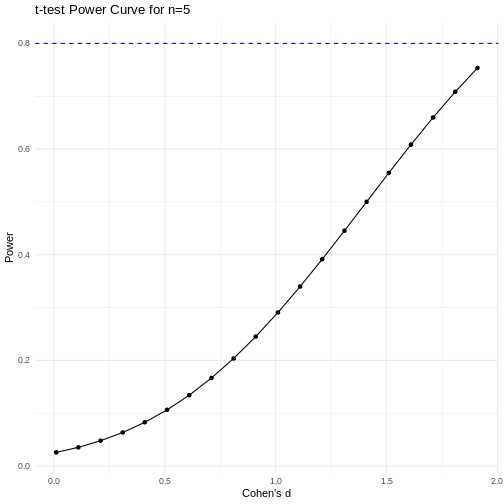
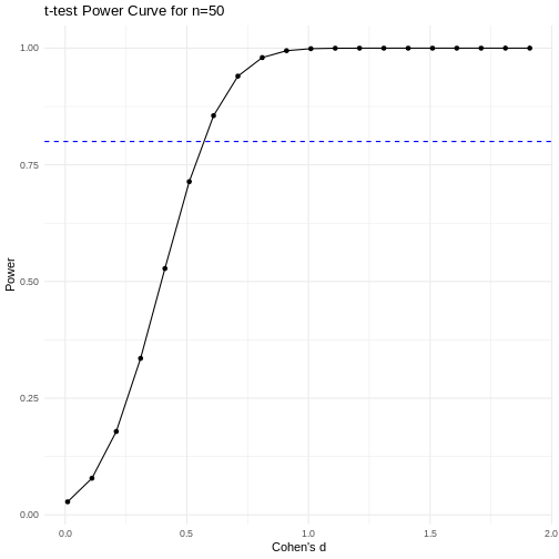
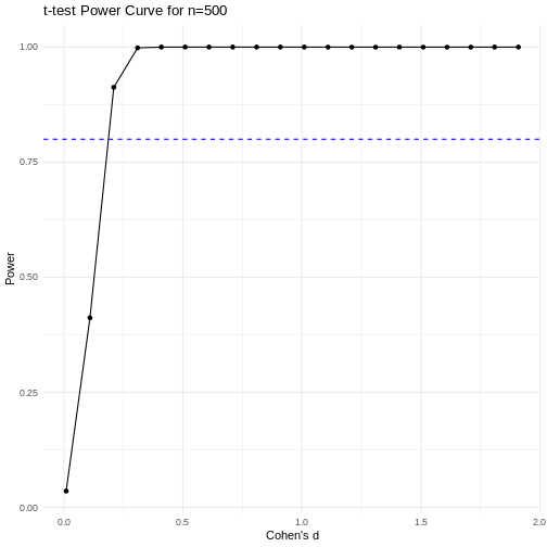
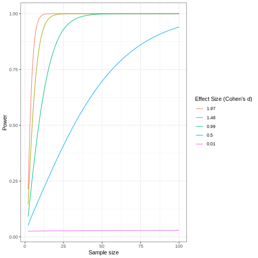
A power curve can show us statistical power based on sample size and effect size. Review the following figures to explore the relationships between effect size, sample size, and power. What is the relationship between effect size and sample size? Between sample size and power? What do you notice about effect size and power as you increase the sample size?
 Code adapted from Power
Curve in R by Cinni Patel.
Code adapted from Power
Curve in R by Cinni Patel.
Review the following figure to explore the relationships between effect size, sample size, and power. What is the relationship between effect size and sample size? Between sample size and power?
 Code adapted from How
to Create Power Curves in ggplot by Levi Baguley
Code adapted from How
to Create Power Curves in ggplot by Levi Baguley
Notice that to detect a standardized effect size of 0.5 at 80% power, you would need a sample size of approximately 70. Larger effect sizes require much smaller sample sizes. Very small effects such as .01 never reach the 80% power threshold without enormous samples sizes in the hundreds of thousands.
Key Points
- Plotting and significance testing describe patterns in the data and quantify effects against random variation.
Content from Completely Randomized Designs
Last updated on 2025-02-11 | Edit this page
Overview
Questions
- What is a completely randomized design (CRD)?
- What are the limitations of CRD?
Objectives
- CRD is the simplest experimental design.
- In CRD, treatments are assigned randomly to experimental units.
- CRD assumes that the experimental units are relatively homogeneous or similar.
- CRD doesn’t remove or account for systematic differences among experimental units.
A completely randomized design (CRD) is the simplest experimental design. In CRD, experimental units are randomly assigned to treatments with equal probability. Any systematic differences between experimental units (e.g. differences in measurement protocols, equipment calibration, personnel) are minimized, which minimizes confounding. CRD is simple, however it can result in larger experimental error compared to other designs if experimental units are not similar. This means that the variation among experimental units that receive the same treatment (i.e. variation within a treatment group) will be greater. In general though, CRD is a straightforward experimental design that effectively minimizes systematic errors through randomization.
A single qualitative factor
The Generation 100 study employed a single qualitative factor (exercise) at three treatment levels - high intensity, moderate intensity and a control group that followed national exercise recommendations. The experimental units were the individuals in the study who engaged in one of the treatment levels.
Challenge 1: Raw ingredients of a comparative experiment
Discuss the following questions with your partner, then share your answers to each question in the collaborative document.
- How would you randomize the 1,500+ individuals in the study to one
of the treatment levels?
- Is blinding possible in this study? If not, what are the
consequences of not blinding the participants or investigators to
treatment assignments?
- Is CRD a good design for this study? Why or why not?
- How would you randomize the 1,500+ individuals in the study to one
of the treatment levels?
You can use a random number generator like we did previously to assign all individuals to one of three treatment levels.
- Is blinding possible in this study? If not, what are the
consequences of not blinding the participants or investigators to
treatment assignments?
Blinding isn’t possible because people must know which treatment they have been assigned so that they can exercise at the appropriate level. There is a risk of response bias from participants knowing which treatment they have been assigned. The investigators don’t need to know which treatment group an individual is in, however, so they could be blinded to the treatments to prevent reporting bias from entering when following study protocols. In either case random assignment of participants to treatment levels will minimize bias.
- Is CRD a good design for this study? Why or why not?
CRD is best when experimental units are homogeneous or similar. In this study, all individuals were between the ages of 70-77 years and all lived in Trondheim, Norway. They were not all of the same sex, however, and sex will certainly affect the study outcomes and lead to greater experimental error within each treatment group. Stratification, or grouping, by sex followed by random assignment to treatments within each stratum would alleviate this problem. So, randomly assigning all women to one of the three treatment groups, then randomly assigning all men to one of the three treatment groups would be the best way to handle this situation.
In addition to stratification by sex, the Generation 100 investigators stratified by marital status because this would also influence study outcomes.
Analysis of variance (ANOVA)
Previously we tested the difference in means between two treatment groups, high intensity and control, using a t-test. We could continue using the t-test to determine whether there is a significant difference between high intensity and moderate intensity, and between moderate intensity and control groups. This would be tedious though because we would need to test each possible combination of two treatment groups separately.
Analysis of variance (ANOVA) addresses two sources of variation in the data: 1) the variation within each treatment group; and 2) the variation among the treatment groups. In the boxplots below, the variation within each treatment group shows in the vertical length of the each box and its whiskers. The variation among treatment groups is shown horizontally as upward or downward shift of the treatment groups relative to one another. ANOVA quantifies and compares these two sources of variation.
R
heart_rate %>% ggplot(aes(exercise_group, heart_rate)) + geom_boxplot()
ERROR
Error in heart_rate %>% ggplot(aes(exercise_group, heart_rate)): could not find function "%>%"Equal variances and normality
Confidence intervals
Inference
Prediction intervals
Design issues
Key Points
- CRD is a simple design that can be used when experimental units are homogeneous.
Content from Completely Randomized Design with More than One Treatment Factor
Last updated on 2025-02-11 | Edit this page
Overview
Questions
- How is a CRD with more than one treatment factor designed and analyzed?
Objectives
- .
- .
Key Points
- .
Content from Randomized Complete Block Designs
Last updated on 2025-02-11 | Edit this page
Overview
Questions
- What is randomized complete block design?
Objectives
- A randomized complete block design randomizes treatments to experimental units within the block.
- Blocking increases the precision of treatment comparisons.
Design issues
Imagine that you want to evaluate the effect of different doses of a new drug on the proliferation of cancer cell lines in vitro. You use four different cancer cell lines because you would like the results to generalize to many types of cell lines. Divide each of the cell lines into four treatment groups, each with the same number of cells. Each treatment group receives a different dose of the drug for five consecutive days.
Group 1: Control (no drug)
Group 2: Low dose (10 μM) Group 3: Medium dose (50 μM) Group 4: High
dose (100 μM)
R
# create treatment levels
f <- factor(c("control", "low", "medium", "high"))

# create random orderings of the treatment levels
block1 <- sample(f, 4)
block2 <- sample(f, 4)
block3 <- sample(f, 4)
block4 <- sample(f, 4)
treatment <- c(block1, block2, block3, block4)
block <- factor(rep(c("cellLine1", "cellLine2", "cellLine3", "cellLine4"), each = 4))
dishnum <- rep(1:4, 4)
plan <- data.frame(cellLine = block, DishNumber = dishnum, treatment = treatment)
plan
OUTPUT
    cellLine DishNumber treatment
1  cellLine1          1   control
2  cellLine1          2    medium
3  cellLine1          3       low
4  cellLine1          4      high
5  cellLine2          1   control
6  cellLine2          2      high
7  cellLine2          3       low
8  cellLine2          4    medium
9  cellLine3          1    medium
10 cellLine3          2       low
11 cellLine3          3   control
12 cellLine3          4      high
13 cellLine4          1   control
14 cellLine4          2      high
15 cellLine4          3    medium
16 cellLine4          4       low
When analyzing a random complete block design, the effect of the block is included in the equation along with the effect of the treatment.
Randomized block design with a single replication
Sizing a randomized block experiment
True replication
Balanced incomplete block designs
Key Points
- Replication, randomization and blocking determine the validity and usefulness of an experiment.
Content from Repeated Measures Designs
Last updated on 2025-02-11 | Edit this page
Overview
Questions
- What is a repeated measures design?
Objectives
- A repeated measures design measures the response of experimental units repeatedly during the study.
Drug effect on heart rate
Among-subject vs. within-subject variability
Each subject can be its own control
crossover design for heart rate
Key Points
- .