Introduction
Overview
Teaching: 10 min
Exercises: 0 minQuestions
What is machine learning?
How is it used in biomedical studies?
Objectives
Describe how machine learning is used in biomedical science.
Basic Machine Learning
Machine learning is a very broad topic and a highly active research area. In the life sciences, much of what is described as “precision medicine” is an application of machine learning to biomedical data. The general idea is to predict or discover outcomes from measured predictors. Can we discover new types of cancer from gene expression profiles? Can we predict drug response from a series of genotypes? Here we give a very brief introduction to two major machine learning components: clustering and class prediction. There are many good resources to learn more about machine learning, for example the excellent textbook The Elements of Statistical Learning: Data Mining, Inference, and Prediction, by Trevor Hastie, Robert Tibshirani and Jerome Friedman. A free PDF of this book can be found here.
Key Points
Machine learning predicts outcomes from data.
As examples, machine learning can be used to discover new kinds of cancers or predict drug response in biomedical studies.
Clustering
Overview
Teaching: 30 min
Exercises: 30 minQuestions
How clusters within high dimensional data can be discovered?
Objectives
Perform clustering analysis.
Interpret a heatmap.
Clustering
We will demonstrate the concepts and code needed to perform clustering analysis with the tissue gene expression data:
library(tissuesGeneExpression)
data(tissuesGeneExpression)
To illustrate the main application of clustering in the life sciences, let’s pretend that we don’t know these are different tissues and are interested in clustering. The first step is to compute the distance between each sample:
d <- dist( t(e) )
Hierarchical clustering
With the distance between each pair of samples computed, we need clustering algorithms to join them into groups. Hierarchical clustering is one of the many clustering algorithms available to do this. Each sample is assigned to its own group and then the algorithm continues iteratively, joining the two most similar clusters at each step, and continuing until there is just one group. While we have defined distances between samples, we have not yet defined distances between groups. There are various ways this can be done and they all rely on the individual pairwise distances. The helpfile for hclust includes detailed information.
We can perform hierarchical clustering based on the distances defined above using the hclust function. This function returns an hclust object that describes the groupings that were created using the algorithm described above. The plot method represents these relationships with a tree or dendrogram:
library(rafalib)
mypar()
hc <- hclust(d)
hc
Call:
hclust(d = d)

Cluster method   : complete
Distance         : euclidean
Number of objects: 189
plot(hc,labels=tissue,cex=0.5)

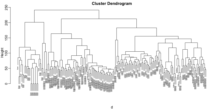
Does this technique “discover” the clusters defined by the different tissues? In this plot, it is not easy to see the different tissues so we add colors by using the myplclust function from the rafalib package.
myplclust(hc, labels=tissue, lab.col=as.fumeric(tissue), cex=0.5)

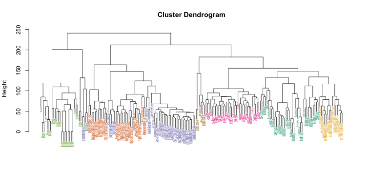
Visually, it does seem as if the clustering technique has discovered the tissues. However, hierarchical clustering does not define specific clusters, but rather defines the dendrogram above. From the dendrogram we can decipher the distance between any two groups by looking at the height at which the two groups split into two. To define clusters, we need to “cut the tree” at some distance and group all samples that are within that distance into groups below. To visualize this, we draw a horizontal line at the height we wish to cut and this defines that line. We use 120 as an example:
myplclust(hc, labels=tissue, lab.col=as.fumeric(tissue),cex=0.5)
abline(h=120)
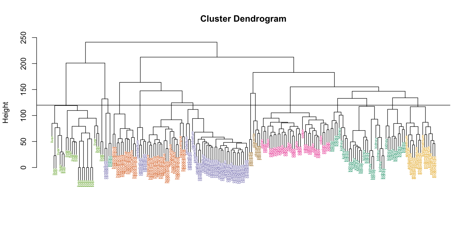
 If we use the line above to cut the tree into clusters, we can examine how the clusters overlap with the actual tissues:
hclusters <- cutree(hc, h=120)
table(true=tissue, cluster=hclusters)
             cluster
true           1  2  3  4  5  6  7  8  9 10 11 12 13 14
  cerebellum   0  0  0  0 31  0  0  0  2  0  0  5  0  0
  colon        0  0  0  0  0  0 34  0  0  0  0  0  0  0
  endometrium  0  0  0  0  0  0  0  0  0  0 15  0  0  0
  hippocampus  0  0 12 19  0  0  0  0  0  0  0  0  0  0
  kidney       9 18  0  0  0 10  0  0  2  0  0  0  0  0
  liver        0  0  0  0  0  0  0 24  0  2  0  0  0  0
  placenta     0  0  0  0  0  0  0  0  0  0  0  0  2  4
We can also ask cutree to give us back a given number of clusters. The function then automatically finds the height that results in the requested number of clusters:
hclusters <- cutree(hc, k=8)
table(true=tissue, cluster=hclusters)
             cluster
true           1  2  3  4  5  6  7  8
  cerebellum   0  0 31  0  0  2  5  0
  colon        0  0  0 34  0  0  0  0
  endometrium 15  0  0  0  0  0  0  0
  hippocampus  0 12 19  0  0  0  0  0
  kidney      37  0  0  0  0  2  0  0
  liver        0  0  0  0 24  2  0  0
  placenta     0  0  0  0  0  0  0  6
In both cases we do see that, with some exceptions, each tissue is uniquely represented by one of the clusters. In some instances, the one tissue is spread across two tissues, which is due to selecting too many clusters. Selecting the number of clusters is generally a challenging step in practice and an active area of research.
K-means
We can also cluster with the kmeans function to perform k-means clustering. As an example, let’s run k-means on the samples in the space of the first two genes:
set.seed(1)
km <- kmeans(t(e[1:2,]), centers=7)
names(km)
[1] "cluster"      "centers"      "totss"        "withinss"     "tot.withinss"
[6] "betweenss"    "size"         "iter"         "ifault"
mypar(1,2)
plot(e[1,], e[2,], col=as.fumeric(tissue), pch=16)
plot(e[1,], e[2,], col=km$cluster, pch=16)
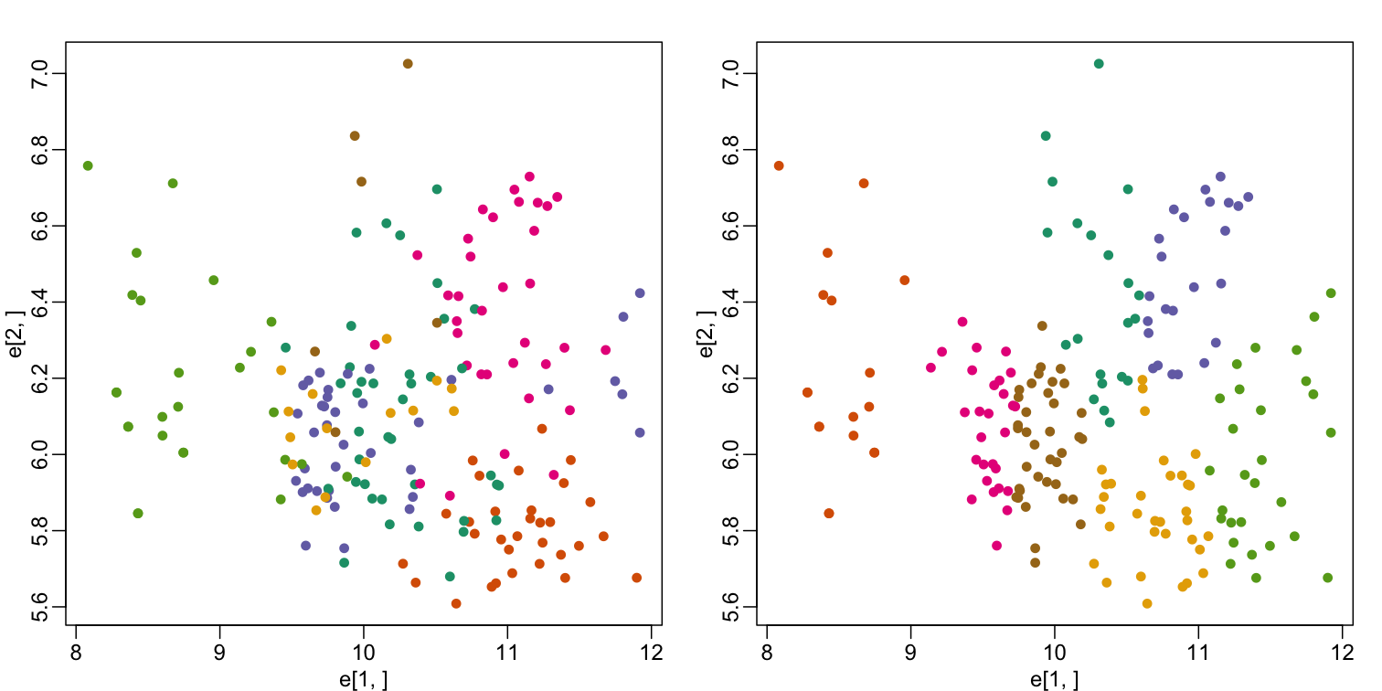
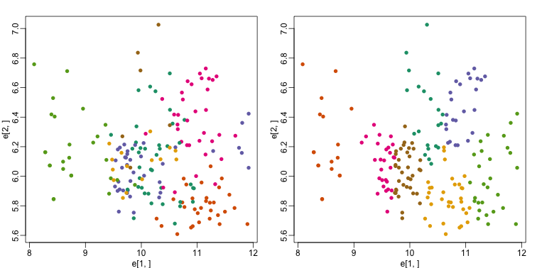
In the first plot, color represents the actual tissues, while in the second, color represents the clusters that were defined by kmeans. We can see from tabulating the results that this particular clustering exercise did not perform well:
table(true=tissue,cluster=km$cluster)
             cluster
true           1  2  3  4  5  6  7
  cerebellum   1  0  0 13  6  4 14
  colon        3  0 22  0  6  3  0
  endometrium  3  0  0  6  0  2  4
  hippocampus  0  0  0  0 16 15  0
  kidney      10  0  2  1  0  9 17
  liver        0 18  0  7  0  0  1
  placenta     4  0  0  1  0  0  1
This is very likely due to the fact that the first two genes are not informative regarding tissue type. We can see this in the first plot above. If we instead perform k-means clustering using all of the genes, we obtain a much improved result. To visualize this, we can use an MDS plot:
km <- kmeans(t(e), centers=7)
mds <- cmdscale(d)

mypar(1,2)
plot(mds[,1], mds[,2])
plot(mds[,1], mds[,2], col=km$cluster, pch=16)
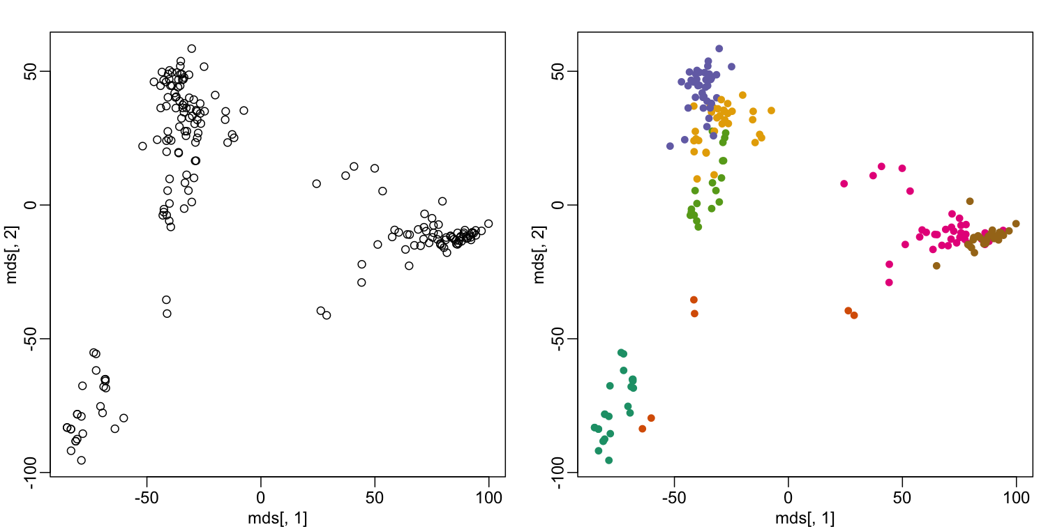
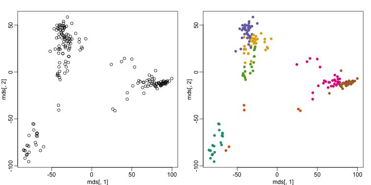
By tabulating the results, we see that we obtain a similar answer to that obtained with hierarchical clustering.
table(true=tissue,cluster=km$cluster)
             cluster
true           1  2  3  4  5  6  7
  cerebellum   0  2  0  5  0  0 31
  colon        0  0 34  0  0  0  0
  endometrium  0  0  0  0  0 15  0
  hippocampus  0  0  0 31  0  0  0
  kidney       0  2  0  0 19 18  0
  liver       24  2  0  0  0  0  0
  placenta     0  0  6  0  0  0  0
Heatmaps
Heatmaps are ubiquitous in the genomics literature. They are very useful plots for visualizing the measurements for a subset of rows over all the samples. A dendrogram is added on top and on the side that is created with hierarchical clustering. We will demonstrate how to create heatmaps from within R. Let’s begin by defining a color palette:
library(RColorBrewer)
hmcol <- colorRampPalette(brewer.pal(9, "GnBu"))(100)
Now, pick the genes with the top variance over all samples:
library(genefilter)
rv <- rowVars(e)
idx <- order(-rv)[1:40]
While a heatmap function is included in R, we recommend the heatmap.2 function from the gplots package on CRAN because it is a bit more customized. For example, it stretches to fill the window. Here we add colors to indicate the tissue on the top:
library(gplots) ##Available from CRAN
cols <- palette(brewer.pal(8, "Dark2"))[as.fumeric(tissue)]
head(cbind(colnames(e),cols))
                       cols
[1,] "GSM11805.CEL.gz" "#1B9E77"
[2,] "GSM11814.CEL.gz" "#1B9E77"
[3,] "GSM11823.CEL.gz" "#1B9E77"
[4,] "GSM11830.CEL.gz" "#1B9E77"
[5,] "GSM12067.CEL.gz" "#1B9E77"
[6,] "GSM12075.CEL.gz" "#1B9E77"
heatmap.2(e[idx,], labCol=tissue,
          trace="none",
          ColSideColors=cols,
          col=hmcol)

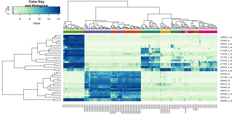
We did not use tissue information to create this heatmap, and we can quickly see, with just 40 genes, good separation across tissues.
Exercises
- Create a random matrix with no correlation in the following way:
set.seed(1)
m = 10000
n = 24
x = matrix(rnorm(m * n), m, n)
colnames(x) = 1:n
Run hierarchical clustering on this data with the
hclustfunction with default parameters to cluster the columns. Create a dendrogram.
In the dendrogram, which pairs of samples are the furthest away from each other?
A) 7 and 23
B) 19 and 14
C) 1 and 16
D) 17 and 18Solution
d <- dist(t(x))
hc <- hclust(d)
mypar()
plot(hc)
# A hint to determine the disimilarity between two samples is to look at
# how hight would be the dendogram be cut in order to have these two
# samples in the same group. The higher the cut, the disimilar those samples are.
# In this case the cut that would join sample 19 and 14 is higher than any
# of the other pairs.
7 and 23 - 141
19 and 14 - 143
1 and 16 - 142
17 and 18 - 142
The answer is B: 19 and 14. The answer might be different due to the random numbers.
- Set the seed at 1,
set.seed(1)and replicate the creation of this matrix 100 times:m = 10000 n = 24 x = matrix(rnorm(m * n), m, n)then perform hierarchical clustering as in the solution to exercise 1, and find the number of clusters if you use
cuttreeat height 143. This number is a random variable. Based on the Monte Carlo simulation, what is the standard error of this random variable?Solution
set.seed(1)
res_list <- replicate(100, {
  m = 10000
  n = 24
  # Generate a new matrix every repetition.
  x = matrix(rnorm(m * n), m, n)
  d <- dist(t(x))
  # Run the hierarchical clustering on the new matrix.
  hc <- hclust(d)
  # Compute how many clusters form if we cut the dendogram at a height of 143.
  hclusters <- cutree(hc, h=143)
  num_clus <- length(unique(hclusters))
  return(num_clus)
})
# Compute the Standard Error of the number of clusters created by cutting
# the dendograms at a height of 143 on each repetition.
popsd(res_list)
- Run
kmeanswith 4 centers for the blood RNA data:library(GSE5859Subset) data(GSE5859Subset)Set the seed to 10,
set.seed(10)right before running kmeans with 5 centers. Explore the relationship of clusters and information insampleInfo. Which of the following best describes what you find? A)sampleInfo$groupis driving the clusters as the 0s and 1s are in completely different clusters. B) The year is driving the clusters. C)Dateis driving the clusters. D) The clusters don’t depend on any of the column ofsampleInfoSolution
km <- kmeans(t(geneExpression), centers = 5) km$cluster # Use the group as the true clusters of our data, and compare it agains the # clusters found by k-means. table(true = sampleInfo$group, cluster = km$cluster) # Now use the date of acquisition of the samples as the true clusters and # compare it against the same clusters found by k-means. table(true = sampleInfo$date, cluster = km$cluster)The answer is C: Date is driving the clusters.
- Load the data:
library(GSE5859Subset) data(GSE5859Subset)Pick the 25 genes with the highest across sample variance. This function might help:
install.packages("matrixStats") library(matrixStats) ?rowMads ## we use mads due to a outlier sampleUse
heatmap.2to make a heatmap showing thesampleInfo$groupwith color, the date as labels, the rows labelled with chromosome, and scaling the rows. What do we learn from this heatmap? A) The data appears as if it was generated byrnorm.
B) Some genes in chr1 are very variable.
C) A group of chrY genes are higher in group 0 and appear to drive the clustering. Within those clusters there appears to be clustering bymonth.
D) A group of chrY genes are higher in October compared to June and appear to drive the clustering. Within those clusters there appears to be clustering bysamplInfo$group.Solution
hmcol <- colorRampPalette(brewer.pal(9, "GnBu"))(100) month = format( sampleInfo$date, "%m") rv <- rowVars(geneExpression) idx <- order(-rv)[1:25] cols <- palette(brewer.pal(8, "Dark2"))[as.fumeric(as.character(sampleInfo$group))] # Compute the heatmap using the intensity of the gene expressions to color # the graph. We are using the months of acquisition of the samples as the # columns in our plot, so we can see how the samples arrange according to the date. heatmap.2(geneExpression[idx,], trace = 'none', labRow = geneAnnotation[idx,]$CHR, col = hmcol, labCol = month, ColSideColors = cols)The correct answer is C: A group of chrY genes are higher in group 0 and appear to drive the clustering. Within those clusters there appears to be clustering by month. Answer A is wrong because if the data were generated by
norm, the color distribution of the heatmap would be entirely random. Answer B is wrong because the colors in the row chr1 are more or less the same except for one column (one sample). Answer D is wrong chrY genes are higher in June, not October.
- Create a large dataset of random data that is completely independent of
sampleInfo$grouplike this:set.seed(17) m = nrow(geneExpression) n = ncol(geneExpression) x = matrix(rnorm(m * n), m, n) g = factor(sampleInfo$g)Create two heatmaps with these data. Show the group
geither with labels or colors. First, take the 50 genes with smallest p-values obtained withrowttests. Then, take the 50 genes with largest standard deviations. Which of the following statements is true?
A) There is no relationship betweengandx, but with 8,793 tests some will appear significant by chance. Selecting genes with the t-test gives us a deceiving result.
B) These two techniques produced similar heatmaps.
C) Selecting genes with the t-test is a better technique since it permits us to detect the two groups. It appears to find hidden signals.
D) The genes with the largest standard deviation add variability to the plot and do not let us find the differences between the two groups.Solution
library(genefilter) # p-value # Perform a t-test on the expression of each gene to determine if they have # an effect different from 0. pvals <- rowttests(x, g)$p.value # Select the top 50 genes that show the most statistical significance of their # expression, obtained by the t-tests. idx <- order(pvals)[1:50] cols <- palette(brewer.pal(8, "Dark2"))[as.fumeric(as.character(sampleInfo$g))] heatmap.2(x[idx,], trace = 'none', labRow = geneAnnotation[idx,]$CHR, col = hmcol, labCol = month, ColSideColors = cols) # std dev # Compute the standard deviation of the expression of each gene. sds <- rowSds(x,g) # Select the top 50 genes that show a higher variance of their expression # acoss all the samples. idx <- order(-sds)[1:50] cols <- palette(brewer.pal(8, "Dark2"))[as.fumeric(as.character(sampleInfo$g))] heatmap.2(x[idx,], trace = 'none', labRow = geneAnnotation[idx,]$CHR, col = hmcol, labCol = month, ColSideColors = cols)The answer is A: There is no relationship between g and x, but with 8,793 tests some will appear significant by chance. Selecting genes with the t-test gives us a deceiving result.
Recall that we have already selected smallest p-values from a dataset in which the null hypothesis is true. Therefore, we can see clusters that indicate that there is a significant difference between sample groups. However, this significance is not real because we know that the null hypothesis is true.
Key Points
We have used the euclidean distance to define the disimilarity between samples; however, we can use other metrics according to the prior knowledge we have from our data.
Conditional Probabilities and Expectations
Overview
Teaching: 30 min
Exercises: 30 minQuestions
How to get statstical information from specific subsets in our data?
Objectives
Calculate statistics from subsets of a dataset that satisfies especific conditions
Predict the expected outcome of an experiment given certain conditions on a dataset
Conditional Probabilities and Expectations
Prediction problems can be divided into categorical and continuous outcomes. However, many of the algorithms can be applied to both due to the connection between conditional probabilities and conditional expectations.
For categorical data, for example binary outcomes, if we know the probability of $Y$ being any of the possible outcomes $k$ given a set of predictors $X=(X_1,\dots,X_p)^\top$,
[f_k(x) = \mbox{Pr}(Y=k \mid X=x)]
we can optimize our predictions. Specifically, for any $x$ we predict the $k$ that has the largest probability $f_k(x)$.
To simplify the exposition below, we will consider the case of binary data. You can think of the probability $\mbox{Pr}(Y=1 \mid X=x)$ as the proportion of 1s in the stratum of the population for which $X=x$. Given that the expectation is the average of all $Y$ values, in this case the expectation is equivalent to the probability: $f(x) \equiv \mbox{E}(Y \mid X=x)=\mbox{Pr}(Y=1 \mid X=x)$. We therefore use only the expectation in the descriptions below as it is more general.
In general, the expected value has an attractive mathematical property, which is that it minimizes the expected distance between the predictor $\hat{Y}$ and $Y$:
[\mbox{E}{ (\hat{Y} - Y)^2 \mid X=x }]
Regression in the context of prediction
We use the son and father height example to illustrate how regression can be interpreted as a machine learning technique. In our example, we are trying to predict the son’s height $Y$ based on the father’s $X$. Here we have only one predictor. Now if we were asked to predict the height of a randomly selected son, we would go with the average height:
library(rafalib)
mypar(1,1)
data(father.son,package="UsingR")
x=round(father.son$fheight) ##round to nearest inch
y=round(father.son$sheight)
hist(y,breaks=seq(min(y),max(y)))
abline(v=mean(y),col="red",lwd=2)
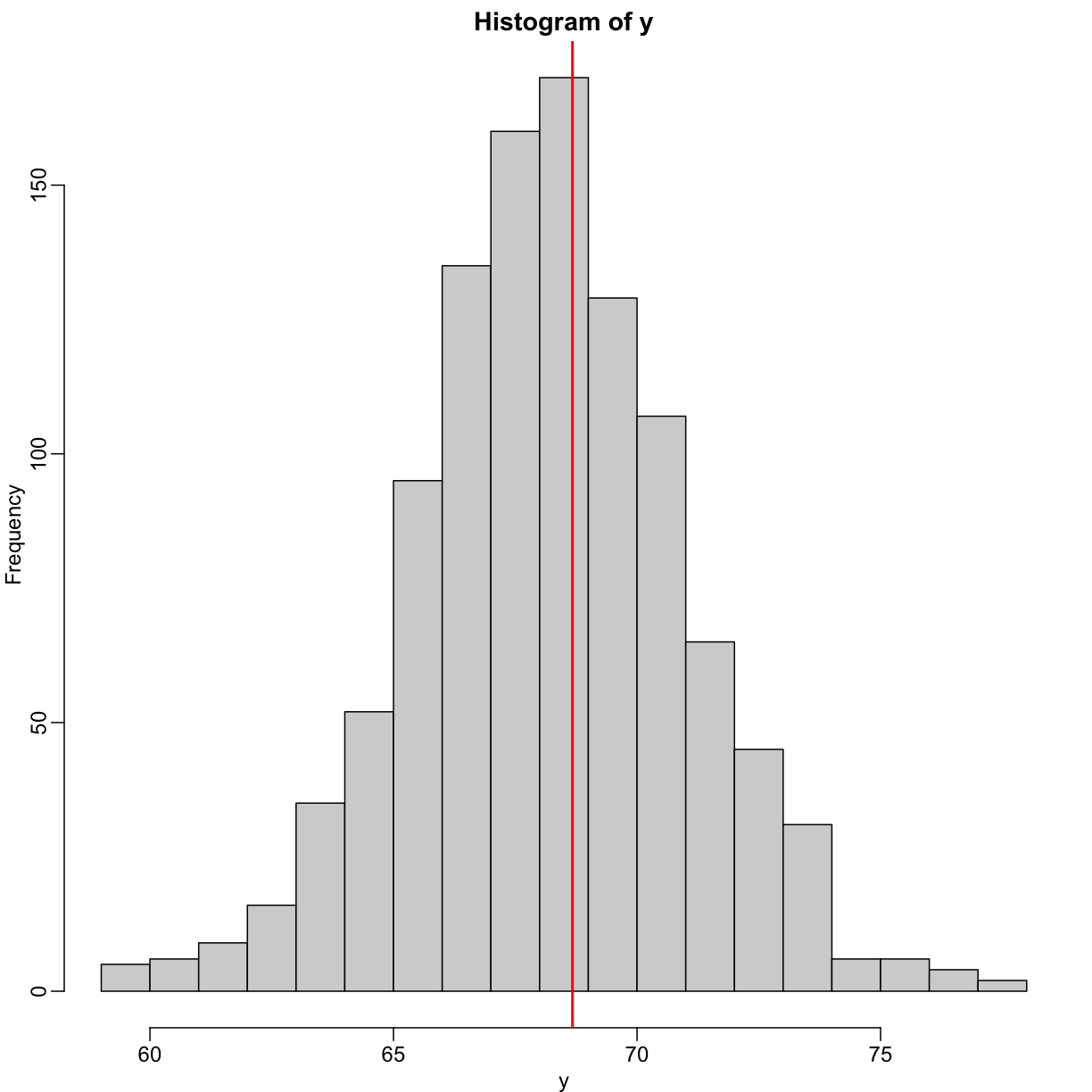
In this case, we can also approximate the distribution of $Y$ as normal, which implies the mean maximizes the probability density.
Let’s imagine that we are given more information. We are told that the father of this randomly selected son has a height of 71 inches (1.25 SDs taller than the average). What is our prediction now?
mypar(1,2)
plot(x,y,xlab="Father's height in inches",ylab="Son's height in inches",
main=paste("correlation =",signif(cor(x,y),2)))
abline(v=c(-0.35,0.35)+71,col="red")
hist(y[x==71],xlab="Heights",nc=8,main="",xlim=range(y))
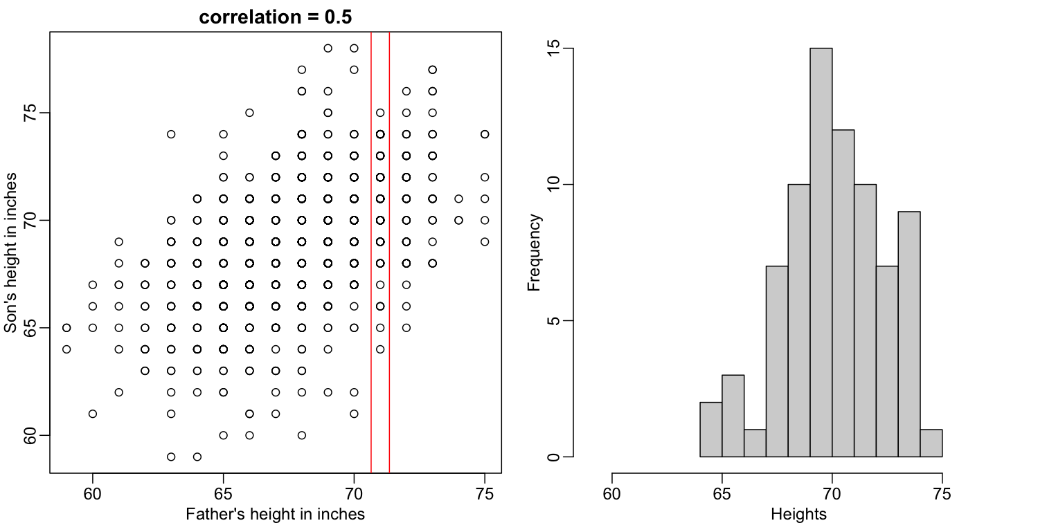
The best guess is still the expectation, but our strata has changed from all the data, to only the $Y$ with $X=71$. So we can stratify and take the average, which is the conditional expectation. Our prediction for any $x$ is therefore:
[f(x) = E(Y \mid X=x)]
It turns out that because this data is approximated by a bivariate normal distribution, using calculus, we can show that:
[f(x) = \mu_Y + \rho \frac{\sigma_Y}{\sigma_X} (X-\mu_X)]
and if we estimate these five parameters from the sample, we get the regression line:
mypar(1,2)
plot(x,y,xlab="Father's height in inches",ylab="Son's height in inches",
main=paste("correlation =",signif(cor(x,y),2)))
abline(v=c(-0.35,0.35)+71,col="red")
fit <- lm(y~x)
abline(fit,col=1)
hist(y[x==71],xlab="Heights",nc=8,main="",xlim=range(y))
abline(v = fit$coef[1] + fit$coef[2]*71, col=1)
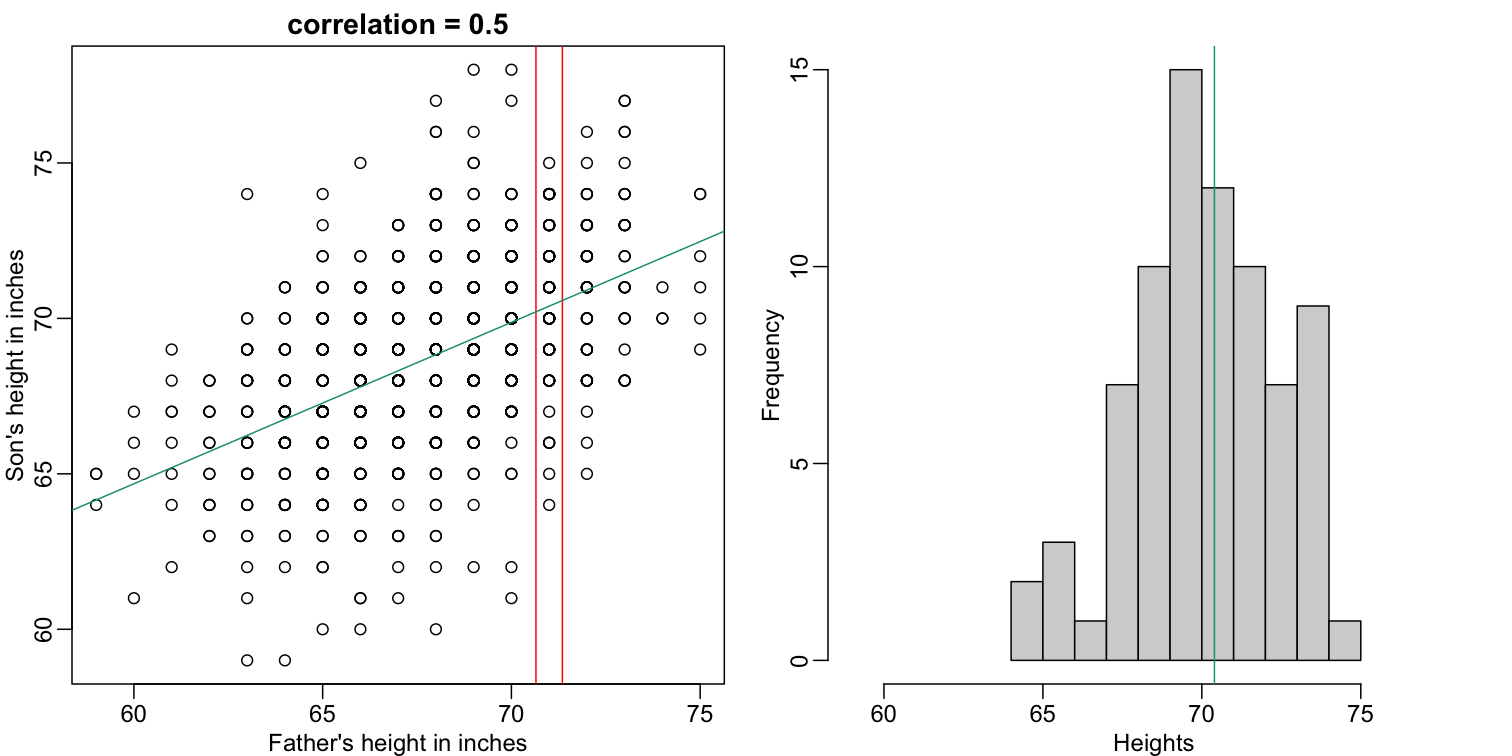
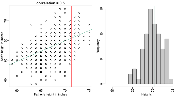
In this particular case, the regression line provides an optimal prediction function for $Y$. But this is not generally true because, in the typical machine learning problems, the optimal $f(x)$ is rarely a simple line.
Exercises
Throughout these exercises it will be useful to remember that when our data are 0s and 1s, probabilities and expectations are the same thing. We can do the math, but here is some R code:
n = 1000 y = rbinom(n, 1, 0.25) ## proportion of ones Pr(Y) sum(y==1)/length(y) ## expectation of Y mean(y)
- Generate some random data to imitate heights for men (0) and women (1):
n = 10000 set.seed(1) # Generate a sample of heights for a mixed population of men and women men = rnorm(n, 176, 7) # height in centimeters women = rnorm(n, 162, 7) # height in centimeters # Assign a class label to each height generated above (0: men, 1:women) y = c(rep(0, n), rep(1, n)) x = round(c(men, women)) ## mix it up ind = sample(seq(along=y)) y = y[ind] x = x[ind]
Using the data generated above, what is the E(Y X = 176)? Solution
# Take all labels `y` that correspond to individuals whose height is 176 cm. # Then compute the mean value as an insight about an individual with # that height could be a woman or a man. mean(y[x==176])
- Now make a plot of E(Y|X=x) for
x=seq(160, 178)using the data generated in exercise 1. If you are predicting female or male based on height and want your probability of success to be larger than 0.5, what is the largest height where you predict female ?Solution
mypar() plot(x,y) # This time we test a single height at a time from a set of heights, # between 160 cm and 178 cm. x_list <- seq(160,178) res <- vector('double', length(x_list)) for (i in seq_along(x_list)) { # Compute the expected label (woman or man) of an individual whose height # is the same as x_list[i] res[i] <- mean(y[x==x_list[i]]) } # Verify that the probability to identify an individual as a woman given their # height is higher than 50 % mean(y[x==x_list[ind]]) # And if we move one centimeter higher, our probability falls under 50 % mean(y[x==x_list[ind + 1]])
Key Points
For categorical/discrete variables we have used estrict conditions (i.e. X=x); however, conditioning can be applied to continuous vriables by using ranges instead (e.g. X>=x, X<=x, or a<X<b)
Smoothing
Overview
Teaching: 30 min
Exercises: 30 minQuestions
Can a model be fitted to a dataset which shape is unknown but smooth?
Objectives
Fit a smooth regression model to data which behavior depends conditionally on a set of predictors
Predict the expected value of a smooth model given the value of the predictors
Smoothing
Smoothing is a very powerful technique used all across data analysis. It is designed to estimate $f(x)$ when the shape is unknown, but assumed to be smooth. The general idea is to group data points that are expected to have similar expectations and compute the average, or fit a simple parametric model. We illustrate two smoothing techniques using a gene expression example.
The following data are gene expression measurements from replicated RNA samples.
##Following three packages are available from Bioconductor
library(Biobase)
library(SpikeIn)
library(hgu95acdf)
data(SpikeIn95)
We consider the data used in an MA-plot comparing two replicated samples ($Y$ = log ratios and $X$ = averages) and take down-sample in a way that balances the number of points for different strata of $X$ (code not shown):
library(rafalib)
mypar()
plot(X,Y)
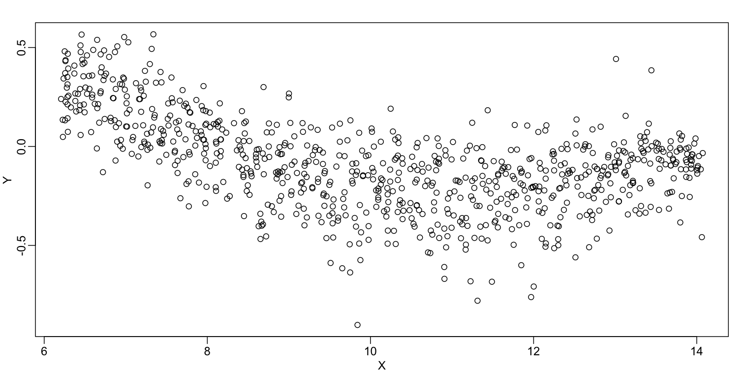

In the MA plot we see that $Y$ depends on $X$. This dependence must be a bias because these are based on replicates, which means $Y$ should be 0 on average regardless of $X$. We want to predict $f(x)=\mbox{E}(Y \mid X=x)$ so that we can remove this bias. Linear regression does not capture the apparent curvature in $f(x)$:
mypar()
plot(X,Y)
fit <- lm(Y~X)
points(X,Y,pch=21,bg=ifelse(Y>fit$fitted,1,3))
abline(fit,col=2,lwd=4,lty=2)
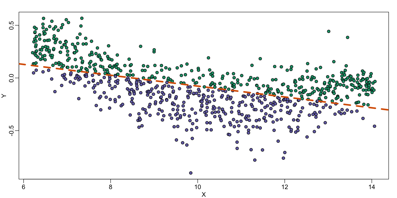
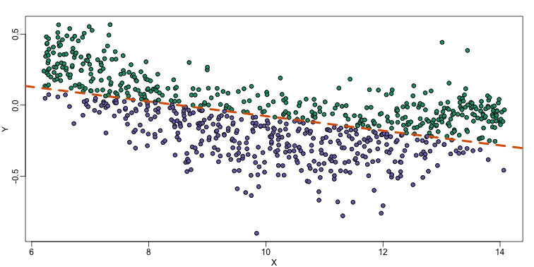
The points above the fitted line (green) and those below (purple) are not evenly distributed. We therefore need an alternative more flexible approach.
Bin Smoothing
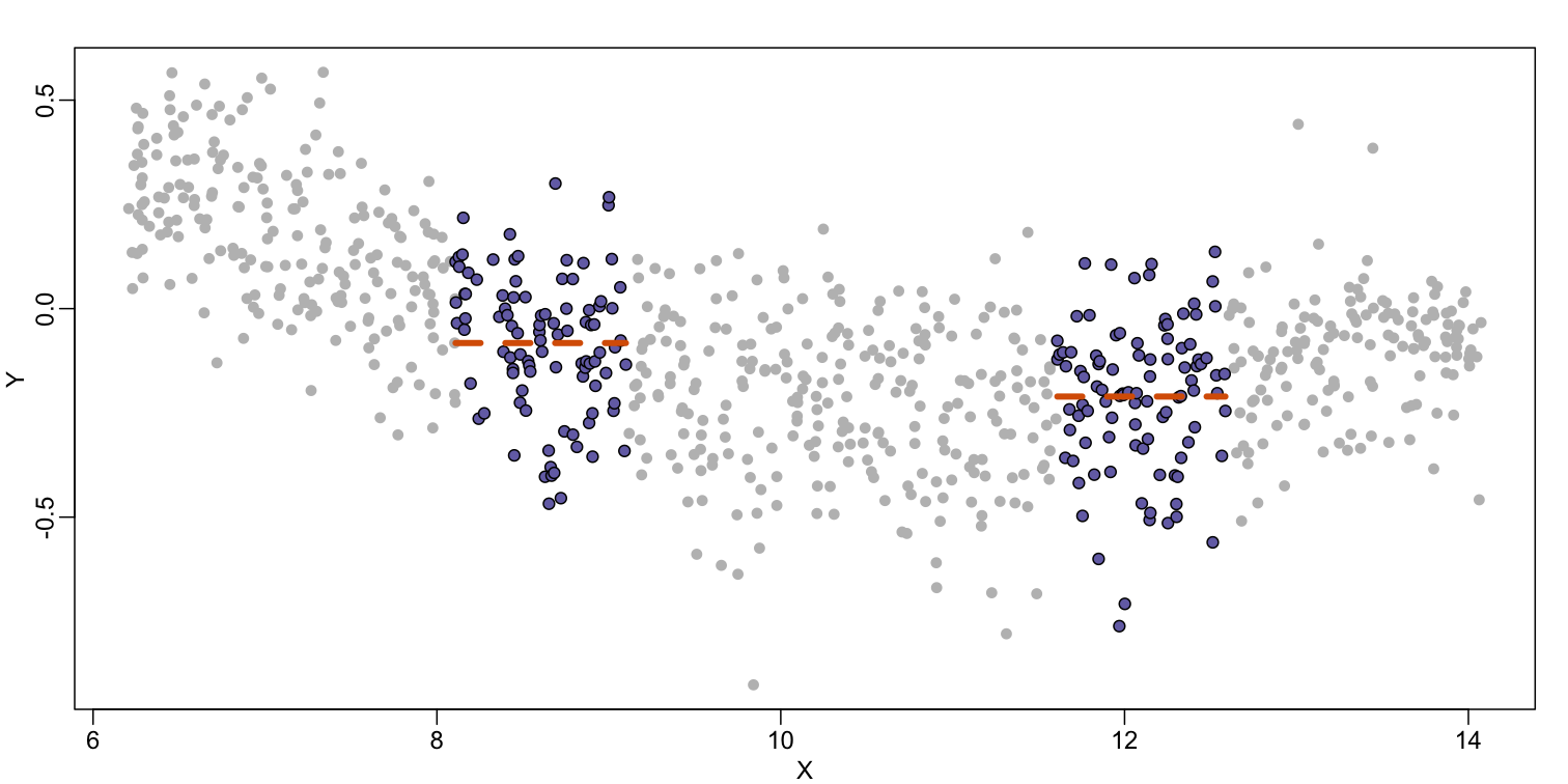
Instead of fitting a line, let’s go back to the idea of stratifying and computing the mean. This is referred to as bin smoothing. The general idea is that the underlying curve is “smooth” enough so that, in small bins, the curve is approximately constant. If we assume the curve is constant, then all the $Y$ in that bin have the same expected value. For example, in the plot below, we highlight points in a bin centered at 8.6, as well as the points of a bin centered at 12.1, if we use bins of size 1. We also show the fitted mean values for the $Y$ in those bins with dashed lines (code not shown):

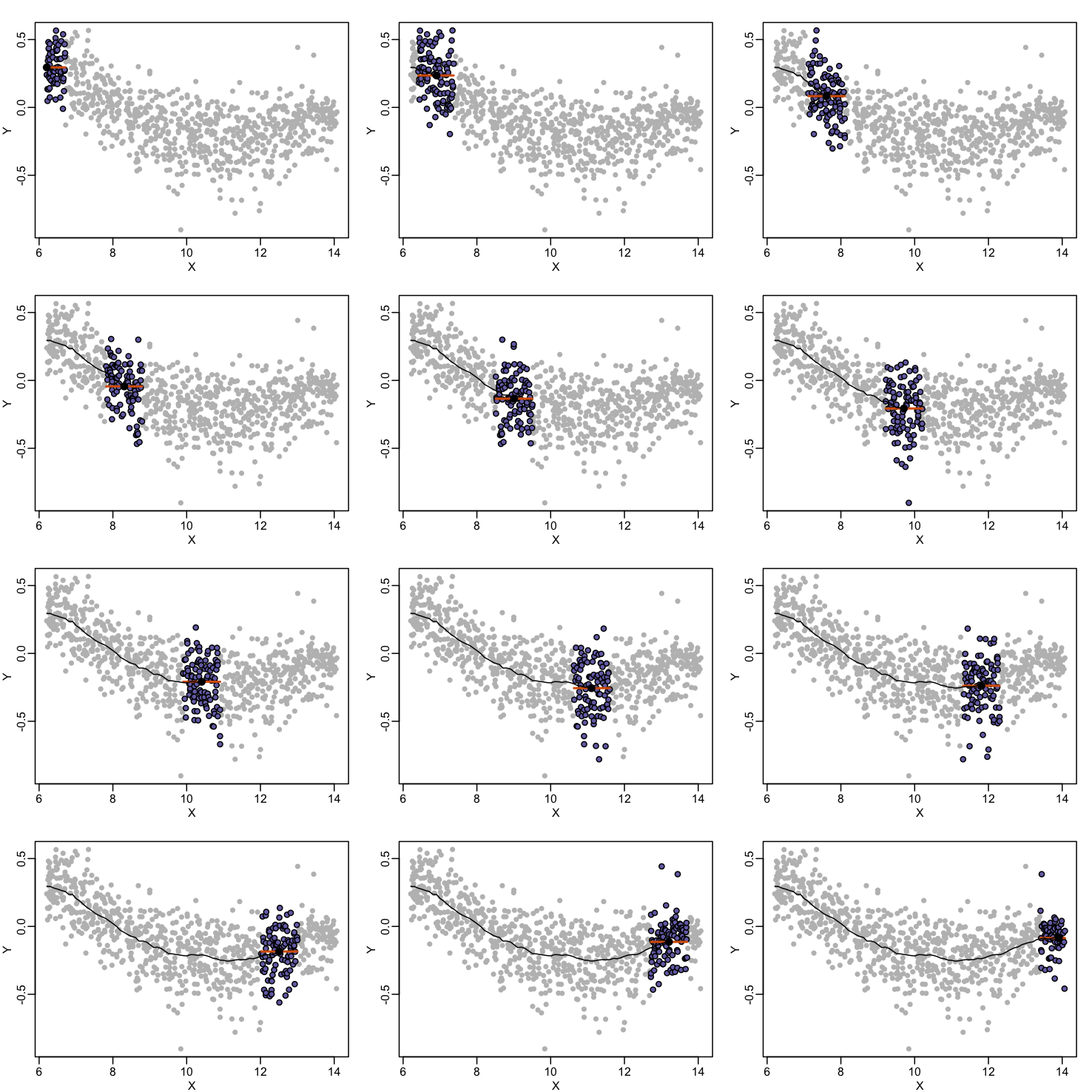
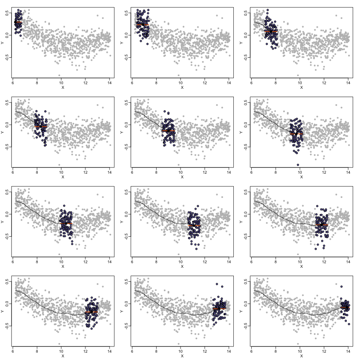
By computing this mean for bins around every point, we form an estimate of the underlying curve $f(x)$. Below we show the procedure happening as we move from the smallest value of $x$ to the largest. We show 10 intermediate cases as well (code not shown):
The final result looks like this (code not shown):

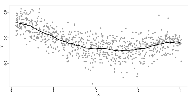
There are several functions in R that implement bin smoothers. One example is ksmooth. However, in practice, we typically prefer methods that use slightly more complicated models than fitting a constant. The final result above, for example, is somewhat wiggly. Methods such as loess, which we explain next, improve on this.
Loess
Local weighted regression (loess) is similar to bin smoothing in principle. The main difference is that we approximate the local behavior with a line or a parabola. This permits us to expand the bin sizes, which stabilizes the estimates. Below we see lines fitted to two bins that are slightly larger than those we used for the bin smoother (code not shown). We can use larger bins because fitting lines provide slightly more flexibility.
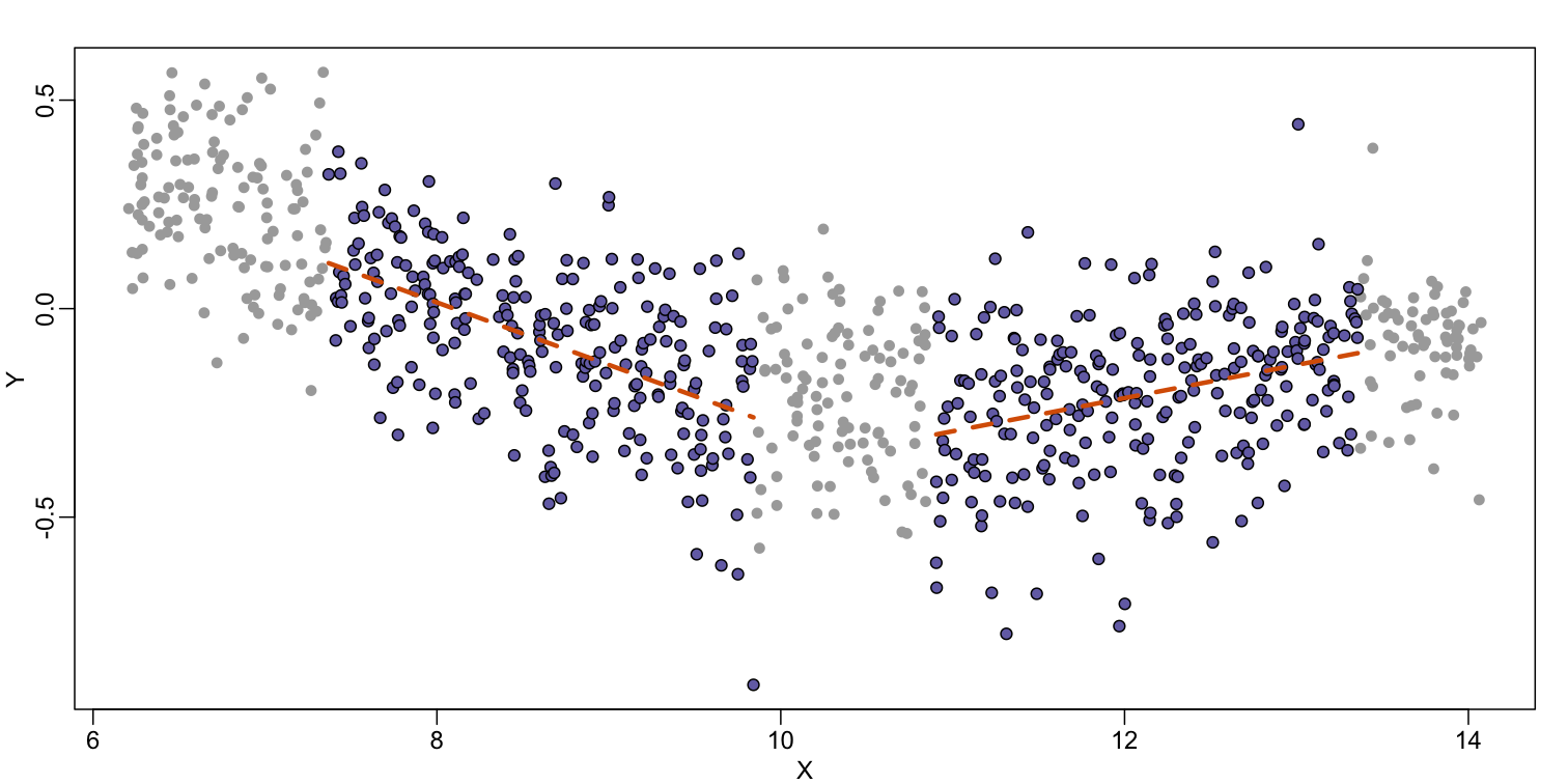
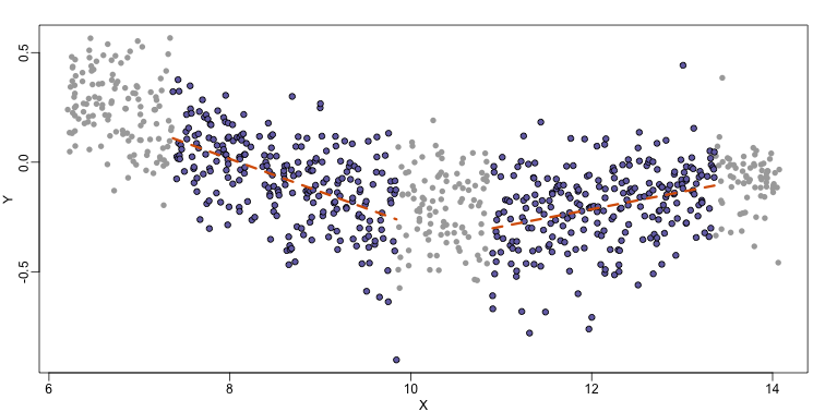
As we did for the bin smoother, we show 12 steps of the process that leads to a loess fit (code not shown):
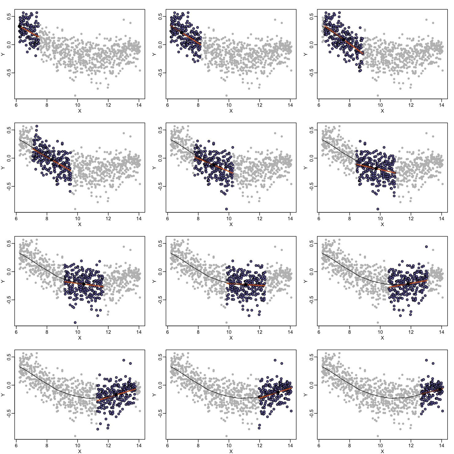

The final result is a smoother fit than the bin smoother since we use larger sample sizes to estimate our local parameters (code not shown):
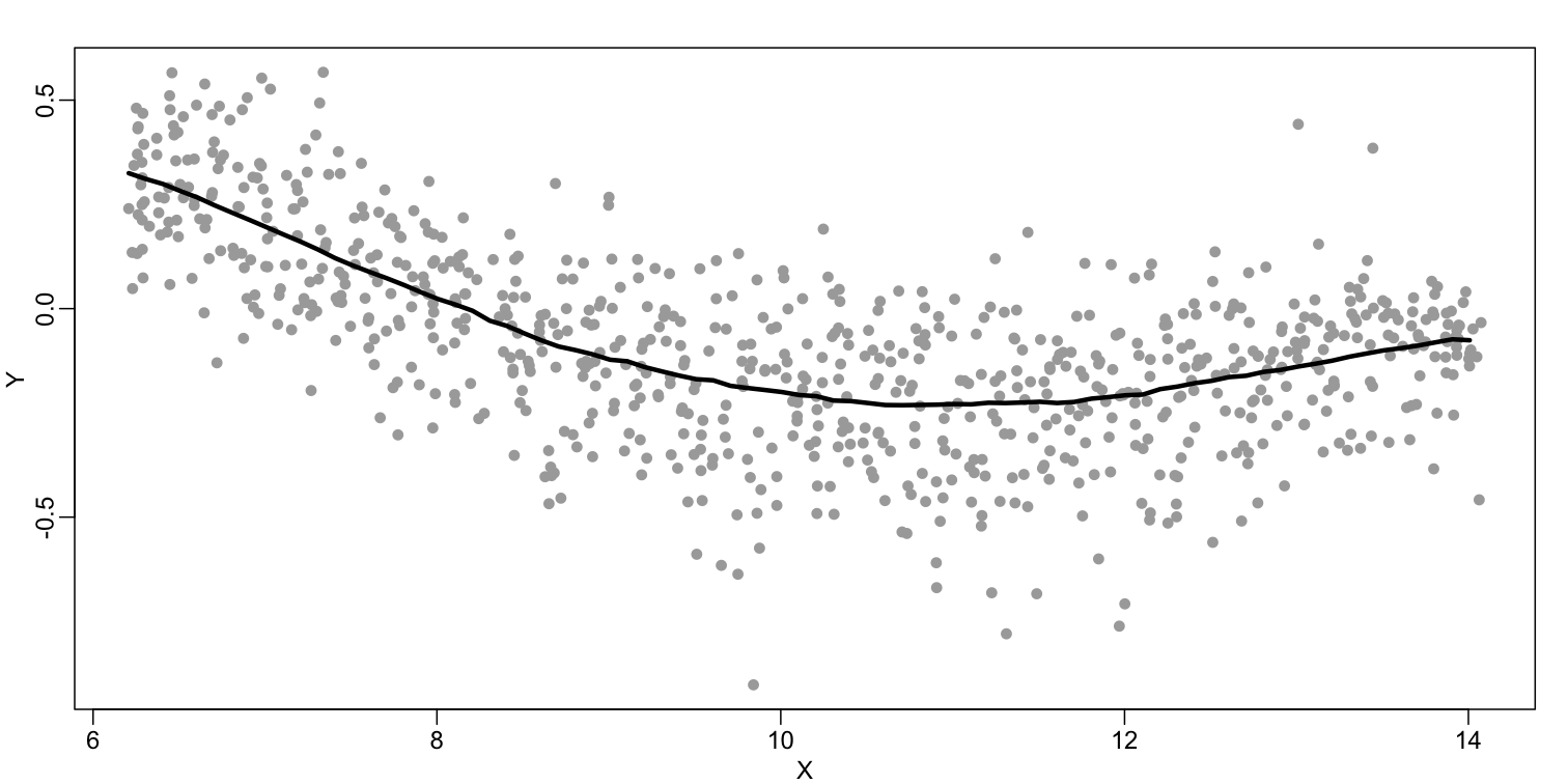
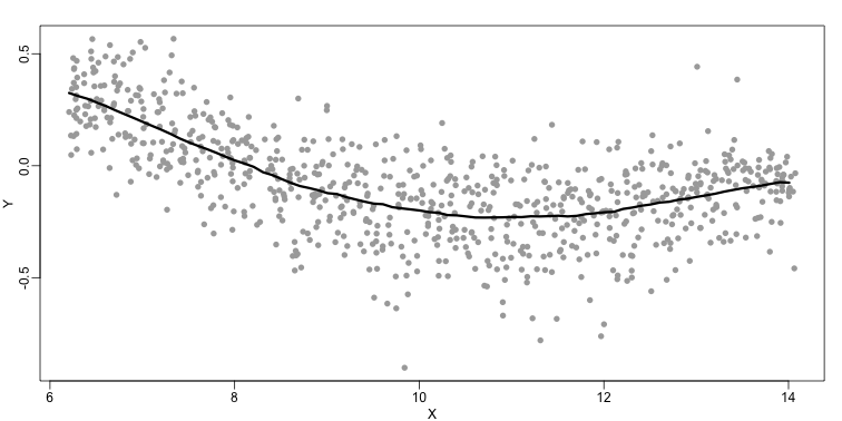
The function loess performs this analysis for us:
fit <- loess(Y~X, degree=1, span=1/3)
newx <- seq(min(X),max(X),len=100)
smooth <- predict(fit,newdata=data.frame(X=newx))
mypar ()
plot(X,Y,col="darkgrey",pch=16)
lines(newx,smooth,col="black",lwd=3)


There are three other important differences between loess and the typical bin smoother. The first is that rather than keeping the bin size the same, loess keeps the number of points used in the local fit the same. This number is controlled via the span argument which expects a proportion. For example, if N is the number of data points and span=0.5, then for a given $x$ , loess will use the 0.5*N closest points to $x$ for the fit. The second difference is that, when fitting the parametric model to obtain $f(x)$, loess uses weighted least squares, with higher weights for points that are closer to $x$. The third difference is that loess has the option of fitting the local model robustly. An iterative algorithm is implemented in which, after fitting a model in one iteration, outliers are detected and downweighted for the next iteration. To use this option, we use the argument family="symmetric".
Exercises
- Generate the following data:
n = 10000 set.seed(1) # Generate a sample of heights for a mixed population of men and women men = rnorm(n,176,7) #height in centimeters women = rnorm(n,162,7) #height in centimeters # Assign a class label to each height generated above (0: men, 1:women) y = c(rep(0,n),rep(1,n)) x = round(c(men,women)) ## mix it up ind = sample(seq(along=y)) y = y[ind] x = x[ind]Set the seed at 5,
set.seed(5)and take a random sample of 250 from:set.seed(5) N = 250 # Take a sample of size N=250 individuals from our mixed population ind = sample(length(y), N) # Remember that `Y` contains the labels that identify if the individual is a # man or a woman. Y = y[ind] # And `X` contains the heights if those individuals. X = x[ind]Use loess to estimate f(x) = E(Y |X = x) using the default parameters. What is the predicted f(168)?
Solution
# Fit a LOESS model to predict if an individual is a man or a woman using # its height as predictor. fit <- loess(Y~X) # Generate a grid on the height axis to plot the model fitted above newx <- seq(min(X),max(X),len=45) # Predict if the individual is a man or a woman according to the heights on # our `newx` grid hat <- predict(fit, newdata=data.frame(X=newx)) mypar() plot(X,Y) names(hat) <- round(newx,1) lines(newx,hat) # Lets check what is the predicted label for an individual whos height is # 168 cm. A label closer to 0 (< 0.5) would be an insight that the # individual is a man, whereas a label closer to 1 (> 0.5) would indicate # that the individual is a woman. hat['168']
- The loess estimate above is a random variable. We can compute standard errors for it. Here we use Monte Carlo to demonstrate that it is a random variable. Use Monte Carlo simulation to estimate the standard error of your estimate of f (168).
Set the seed to 5, set.seed(5) and perform 10000 simulations and report the SE of the loess based estimate.
Solution
set.seed(5) B <- 10000 N <- 250 newx <- seq(min(X),max(X),len=45) res <- replicate(B, { ind = sample(length(y),N) Y = y[ind] X = x[ind] # The model fitted by LOESS will be different according to the data used # to fit it, so we need to fit it again to each new random sample. fit <- loess(Y~X) hat <- predict(fit, newdata=data.frame(X=newx)) names(hat) <- round(newx,1) # Because the model is different, the predicted label for a specific # height will be different too. We are focused to know how much that # prediction will vary. return(hat['168']) }) names(res) <- NULL # Compute the Standard Error (SE) of the label estimation popsd(res)
Key Points
The smoothing methods work well when used inside the range of predictor values seen in the training set, however them are not suitable for extrapolation the prediction outside those ranges.
Class Prediction
Overview
Teaching: 30 min
Exercises: 30 minQuestions
What is machine learning (ML)?
Why should we learn ML?
Objectives
In brief, know two major types of ML
Learn training and test data and their relevance
Class Prediction
Here we give a brief introduction to the main task of machine learning: class prediction. In fact, many refer to class prediction as machine learning and we sometimes use the two terms interchangeably. We give a very brief introduction to this vast topic, focusing on some specific examples.
Some of the examples we give here are motivated by those in the excellent textbook The Elements of Statistical Learning: Data Mining, Inference, and Prediction, by Trevor Hastie, Robert Tibshirani and Jerome Friedman, which can be found here.
Similar to inference in the context of regression, Machine Learning (ML) studies the relationships between outcomes $Y$ and covariates $X$. In ML, we call $X$ the predictors or features. The main difference between ML and inference is that, in ML, we are interested mainly in predicting $Y$ using $X$. Statistical models are used, but while in inference we estimate and interpret model parameters, in ML they are mainly a means to an end: predicting $Y$.
Here we introduce the main concepts needed to understand ML, along with two specific algorithms: regression and k nearest neighbors (kNN). Keep in mind that there are dozens of popular algorithms that we do not cover here.
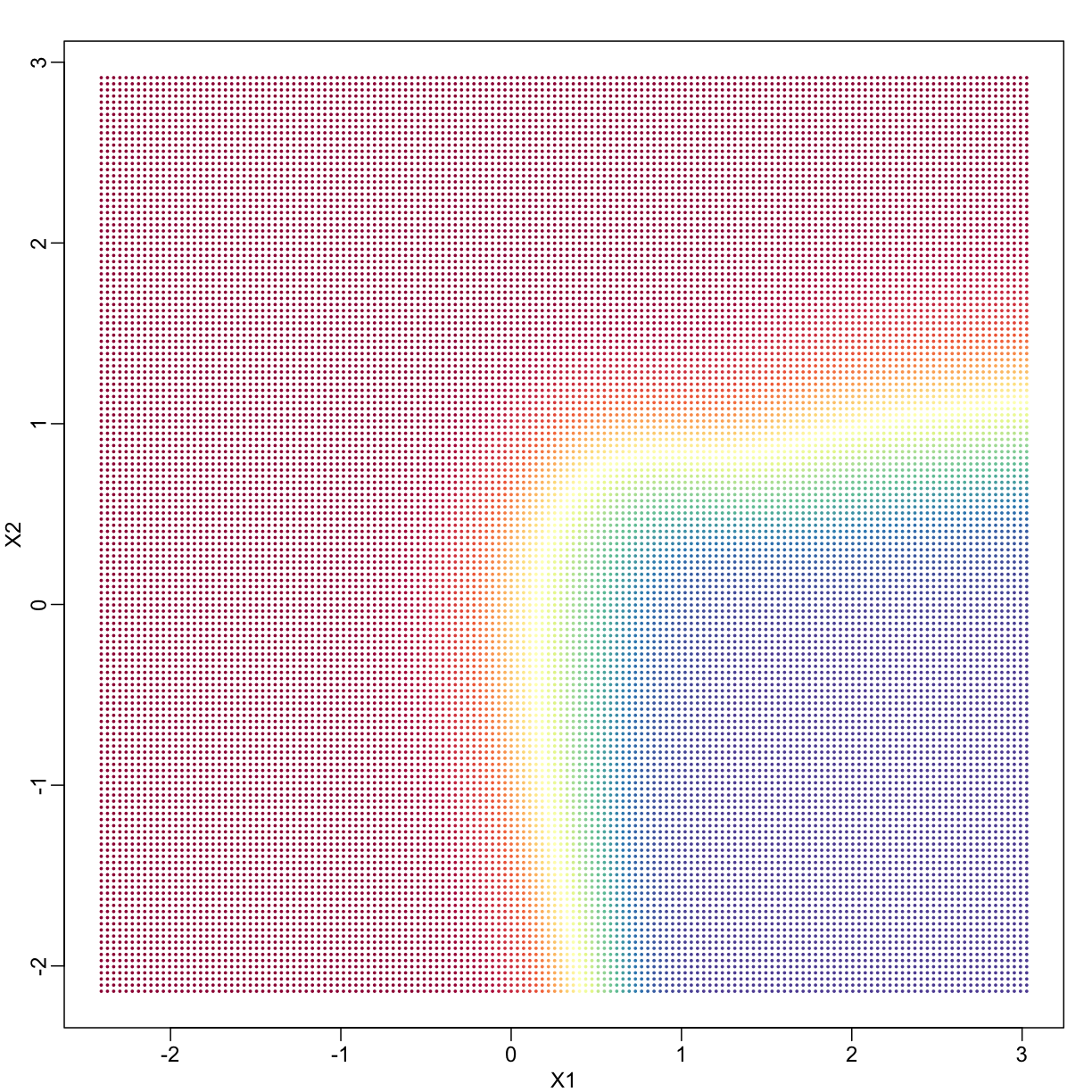
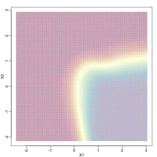
In a previous section, we covered the very simple one-predictor case. However, most of ML is concerned with cases with more than one predictor. For illustration purposes, we move to a case in which $X$ is two dimensional and $Y$ is binary. We simulate a situation with a non-linear relationship using an example from the Hastie, Tibshirani and Friedman book. In the plot below, we show the actual values of $f(x_1,x_2)=E(Y \mid X_1=x_1,X_2=x_2)$ using colors. The following code is used to create a relatively complex conditional probability function. We create the test and train data we use later (code not shown). Here is the plot of $f(x_1,x_2)$ with red representing values close to 1, blue representing values close to 0, and yellow values in between.
library(rafalib)
library(RColorBrewer)
hmcol <- colorRampPalette(rev(brewer.pal(11, "Spectral")))(100)
mycols=c(hmcol[1], hmcol[100])
set.seed(1)
## create covariates and outcomes
## outcomes are always 50 0s and 50 1s
s2=0.15
## pick means to create a non linear conditional expectation
library(MASS)
M0 <- mvrnorm(10, c(1,0), s2*diag(2)) ## generate 10 means
M1 <- rbind(mvrnorm(3, c(1,1), s2*diag(2)),
mvrnorm(3, c(0,1), s2*diag(2)),
mvrnorm(4, c(0,0),s2*diag(2)))
### function to generate random pairs
s <- sqrt(1/5)
N=200
makeX <- function(M, n=N, sigma=s*diag(2)){
z <- sample(1:10, n, replace=TRUE) ## pick n at random from above 10
m <- M[z,] ## these are the n vectors (2 components)
return(t(apply(m, 1, function(mu) mvrnorm(1, mu, sigma)))) ## the final values
}
### create the training set and the test set
x0 <- makeX(M0) ##the final values for y=0 (green)
testx0 <- makeX(M0)
x1 <- makeX(M1)
testx1 <- makeX(M1)
x <- rbind(x0, x1) ## one matrix with everything
test <- rbind(testx0, testx1)
y <- c(rep(0, N), rep(1, N)) # the outcomes
ytest <- c(rep(0, N), rep(1, N))
cols <- mycols[c(rep(1, N), rep(2, N))]
colstest <- cols
## Create a grid so we can predict all of X,Y
GS <- 150 ## grid size is GS x GS
XLIM <- c(min(c(x[,1], test[,1])), max(c(x[,1], test[,1])))
tmpx <- seq(XLIM[1], XLIM[2], len=GS)
YLIM <- c(min(c(x[,2], test[,2])), max(c(x[,2], test[,2])))
tmpy <- seq(YLIM[1], YLIM[2], len=GS)
newx <- expand.grid(tmpx, tmpy) #grid used to show color contour of predictions
### Bayes rule: best possible answer
p <- function(x){ ##probability of Y given X
p0 <- mean(dnorm(x[1], M0[,1], s) * dnorm(x[2], M0[,2], s))
p1 <- mean(dnorm(x[1], M1[,1], s) * dnorm(x[2], M1[,2], s))
p1/(p0+p1)
}
### Create the bayesrule prediction
bayesrule <- apply(newx, 1, p)
colshat <- bayesrule
colshat <- hmcol[floor(bayesrule * 100) + 1]
mypar()
plot(x, type="n", xlab="X1", ylab="X2", xlim=XLIM, ylim=YLIM)
points(newx, col=colshat, pch=16, cex=0.35)
If we show points for which $E(Y \mid X=x) > 0.5$ in red and the rest in blue, we see the boundary region that denotes the boundary in which we switch from predicting 0 to 1.
mypar()
colshat[bayesrule>=0.5] <- mycols[2]
colshat[bayesrule<0.5] <- mycols[1]
plot(x,type="n",xlab="X1",ylab="X2",xlim=XLIM,ylim=YLIM)
points(newx,col=colshat,pch=16,cex=0.35)
contour(tmpx,tmpy,matrix(round(bayesrule),GS,GS),levels=c(1,2),
add=TRUE,drawlabels=FALSE)
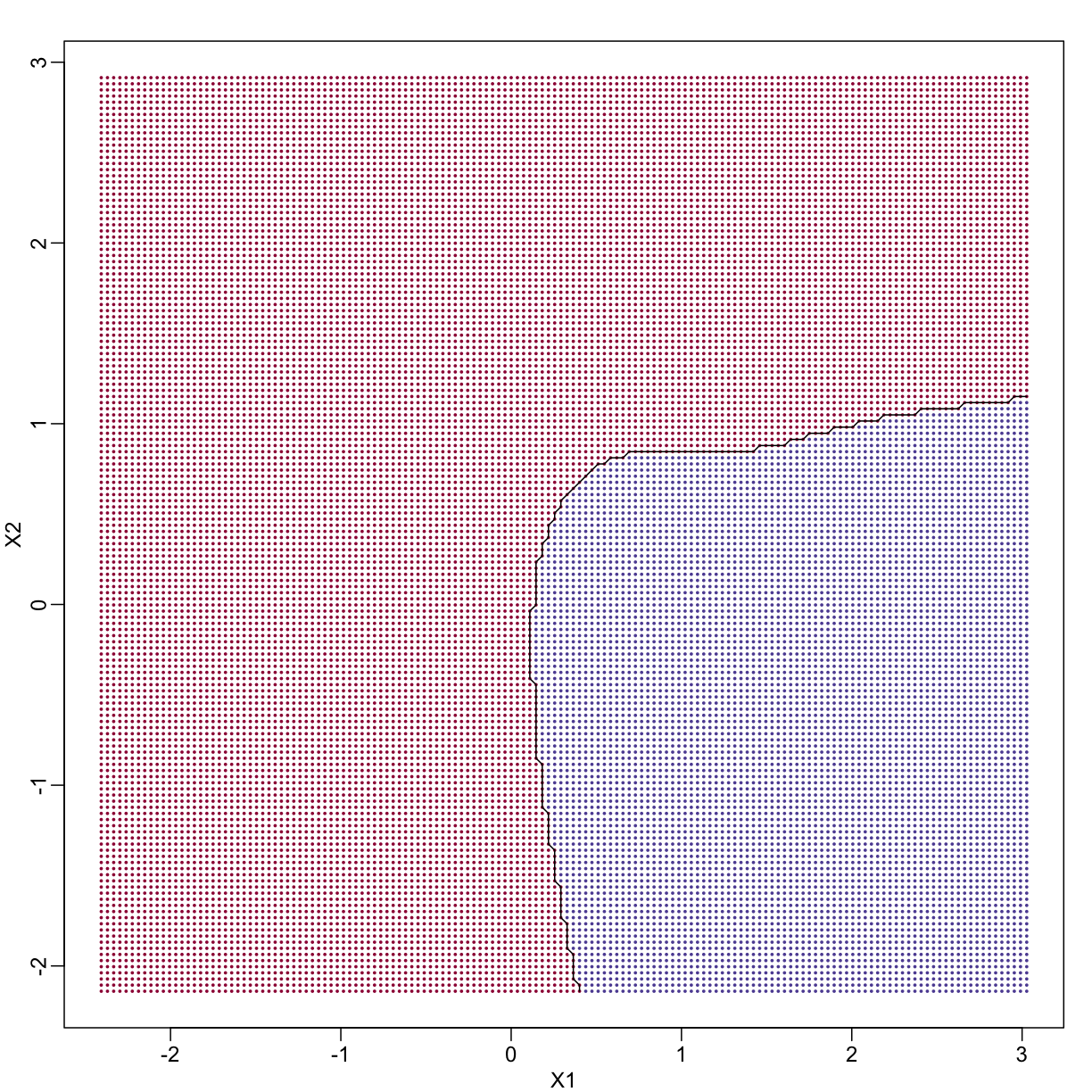
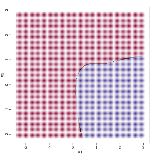
The above plots relate to the “truth” that we do not get to see. Most ML methodology is concerned with estimating $f(x)$. A typical first step is usually to consider a sample, referred to as the training set, to estimate $f(x)$. We will review two specific ML techniques. First, we need to review the main concept we use to evaluate the performance of these methods.
Training and test sets
In the code (not shown) for the first plot in this chapter, we created a test and a training set. We plot them here:
#x, test, cols, and coltest were created in code that was not shown
#x is training x1 and x2, test is test x1 and x2
#cols (0=blue, 1=red) are training observations
#coltests are test observations
mypar(1, 2)
plot(x, pch=21, bg=cols, xlab="X1", ylab="X2", xlim=XLIM, ylim=YLIM)
plot(test, pch=21, bg=colstest, xlab="X1", ylab="X2", xlim=XLIM, ylim=YLIM)
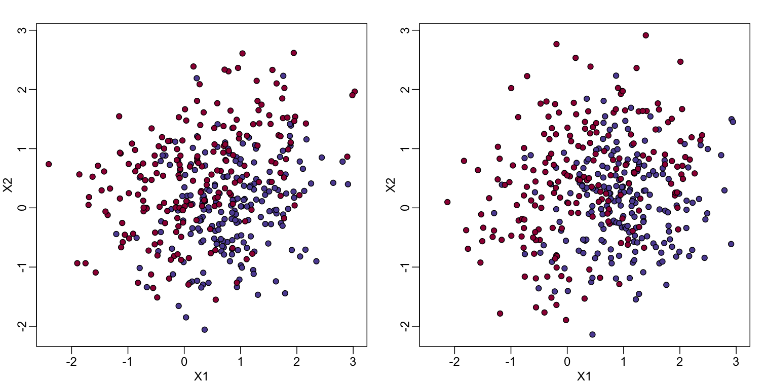

You will notice that the test and train set have similar global properties since they were generated by the same random variables (more blue towards the bottom right), but are, by construction, different. The reason we create test and training sets is to detect over-training by testing on a different data than the one used to fit models or train algorithms. We will see how important this is below.
Predicting with regression
A first naive approach to this ML problem is to fit a two variable linear regression model:
##x and y were created in the code (not shown) for the first plot
#y is outcome for the training set
X1 <- x[,1] ##these are the covariates
X2 <- x[,2]
fit1 <- lm(y~X1+X2)
## get summary of a fitted model
summary(fit1)
Call:
lm(formula = y ~ X1 + X2)
Residuals:
Min 1Q Median 3Q Max
-0.99350 -0.36244 0.00274 0.37927 0.92329
Coefficients:
Estimate Std. Error t value Pr(>|t|)
(Intercept) 0.55305 0.02559 21.608 < 2e-16 ***
X1 -0.20902 0.02378 -8.790 < 2e-16 ***
X2 0.22230 0.02610 8.517 3.42e-16 ***
---
Signif. codes: 0 '***' 0.001 '**' 0.01 '*' 0.05 '.' 0.1 ' ' 1
Residual standard error: 0.4382 on 397 degrees of freedom
Multiple R-squared: 0.2377, Adjusted R-squared: 0.2339
F-statistic: 61.91 on 2 and 397 DF, p-value: < 2.2e-16
Once we the have fitted values, we can estimate $f(x_1,x_2)$ with $\hat{f}(x_1,x_2)=\hat{\beta}_0 + \hat{\beta}_1x_1 +\hat{\beta}_2 x_2$. To provide an actual prediction, we simply predict 1 when $\hat{f}(x_1,x_2)>0.5$. We now examine the error rates in the test and training sets and also plot the boundary region:
##prediction on train
yhat <- predict(fit1)
yhat <- as.numeric(yhat>0.5)
cat("Linear regression prediction error in train:", 1-mean(yhat==y), "\n")
Linear regression prediction error in train: 0.2975
We can quickly obtain predicted values for any set of values using the predict
function:
yhat <- predict(fit1, newdata=data.frame(X1=newx[,1], X2=newx[,2]))
Now we can create a plot showing where we predict 1s and where we predict 0s, as
well as the boundary. We can also use the predict function to obtain predicted
values for our test set.
Note that nowhere do we fit the model on the test set:
colshat <- yhat
colshat[yhat>=0.5] <- mycols[2]
colshat[yhat<0.5] <- mycols[1]
m <- -fit1$coef[2]/fit1$coef[3] #boundary slope
b <- (0.5 - fit1$coef[1])/fit1$coef[3] #boundary intercept
##prediction on test
yhat <- predict(fit1,newdata=data.frame(X1=test[,1],X2=test[,2]))
yhat <- as.numeric(yhat>0.5)
cat("Linear regression prediction error in test:",1-mean(yhat==ytest),"\n")
Linear regression prediction error in test: 0.32
plot(test,type="n",xlab="X1",ylab="X2",xlim=XLIM,ylim=YLIM)
abline(b,m)
points(newx,col=colshat,pch=16,cex=0.35)
##test was created in the code (not shown) for the first plot
points(test,bg=cols,pch=21)
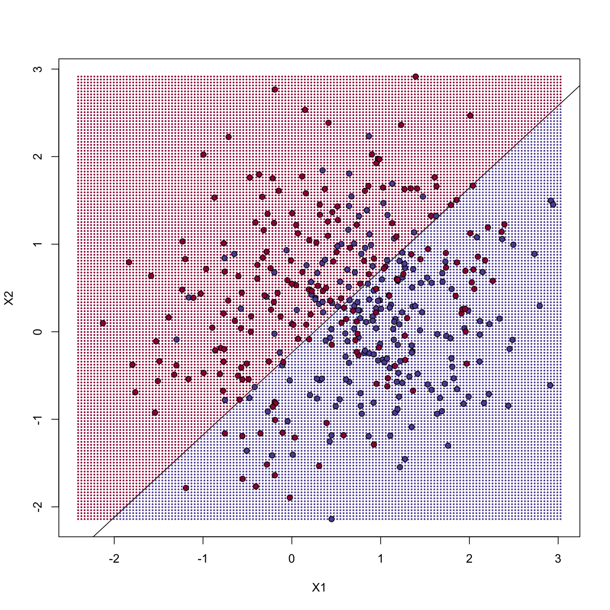
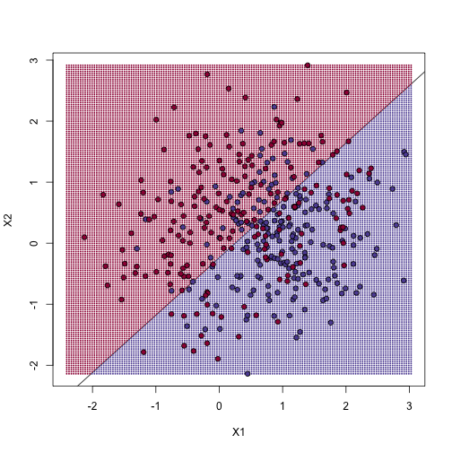
The error rates in the test and train sets are quite similar. Thus, we do not seem to be over-training. This is not surprising as we are fitting a 2 parameter model to 400 data points. However, note that the boundary is a line. Because we are fitting a plane to the data, there is no other option here. The linear regression method is too rigid. The rigidity makes it stable and avoids over-training, but it also keeps the model from adapting to the non-linear relationship between $Y$ and $X$. We saw this before in the smoothing section. The next ML technique we consider is similar to the smoothing techniques described before.
K-nearest neighbor
K-nearest neighbors (kNN) is similar to bin smoothing, but it is easier to adapt to multiple dimensions. Basically, for any point $x$ for which we want an estimate, we look for the k nearest points and then take an average of these points. This gives us an estimate of $f(x_1,x_2)$, just like the bin smoother gave us an estimate of a curve. We can now control flexibility through $k$. Here we compare $k=1$ and $k=100$.
library(class)
mypar(2,2)
for(k in c(1, 100)){
## predict on train
yhat <- knn(x, x, y, k=k)
cat("KNN prediction error in train:",
1-mean((as.numeric(yhat)-1)==y), "\n")
## make plot
yhat <- knn(x,test,y,k=k)
cat("KNN prediction error in test:",
1-mean((as.numeric(yhat)-1)==ytest), "\n")
}
KNN prediction error in train: 0
KNN prediction error in test: 0.3375
KNN prediction error in train: 0.2725
KNN prediction error in test: 0.3125
To visualize why we make no errors in the train set and many errors in the test set when $k=1$ and obtain more stable results from $k=100$, we show the prediction regions (code not shown):
library(class)
mypar(2,2)
for(k in c(1,100)){
##predict on train
yhat <- knn(x,x,y,k=k)
##make plot
yhat <- knn(x,newx,y,k=k)
colshat <- mycols[as.numeric(yhat)]
plot(x,type="n",xlab="X1",ylab="X2",xlim=XLIM,ylim=YLIM)
points(newx,col=colshat,cex=0.35,pch=16)
contour(tmpx,tmpy,matrix(as.numeric(yhat),GS,GS),levels=c(1,2),
add=TRUE,drawlabels=FALSE)
points(x,bg=cols,pch=21)
title(paste("Train: KNN (",k,")",sep=""))
plot(test,type="n",xlab="X1",ylab="X2",xlim=XLIM,ylim=YLIM)
points(newx,col=colshat,cex=0.35,pch=16)
contour(tmpx,tmpy,matrix(as.numeric(yhat),GS,GS),levels=c(1,2),
add=TRUE,drawlabels=FALSE)
points(test,bg=cols,pch=21)
title(paste("Test: KNN (",k,")",sep=""))
}
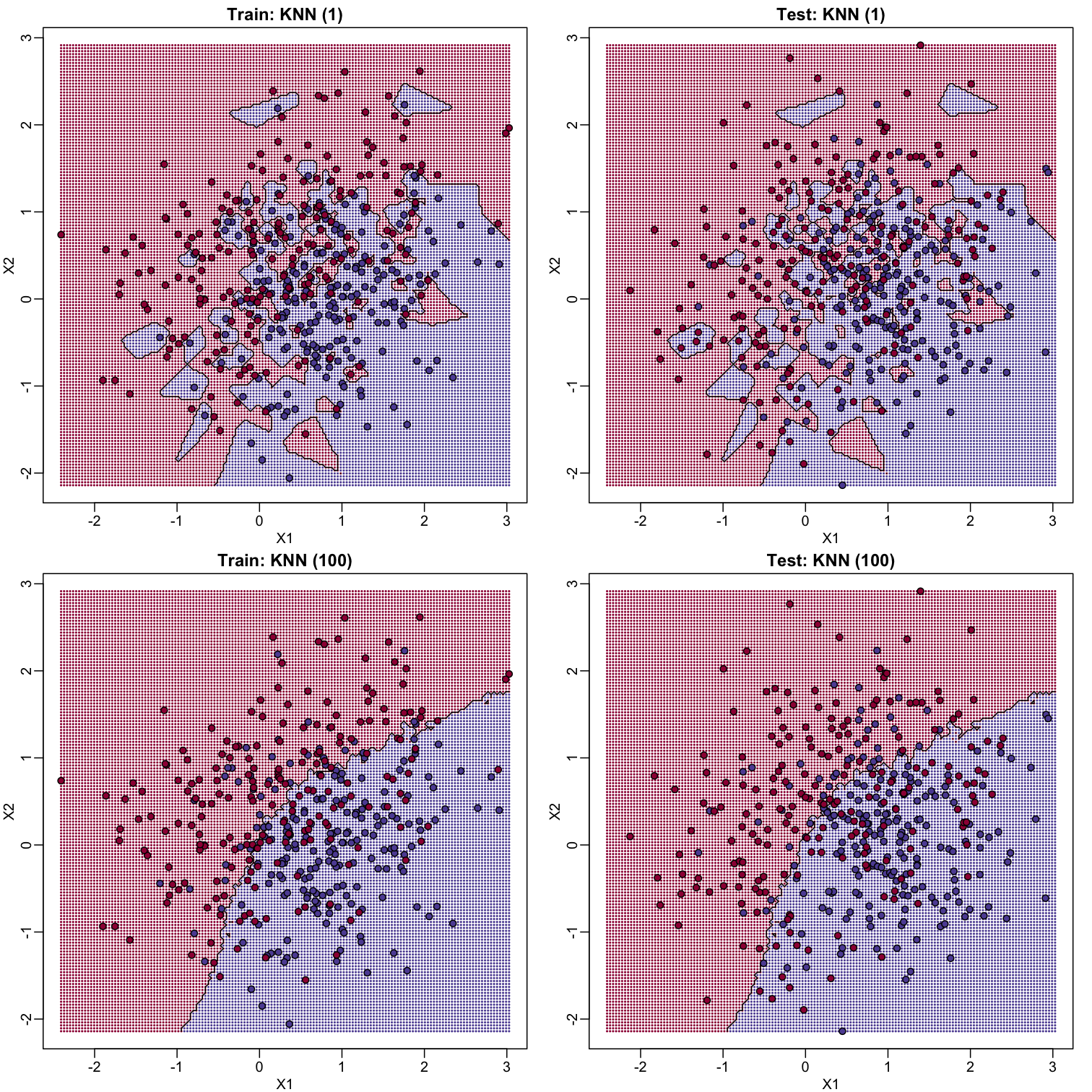
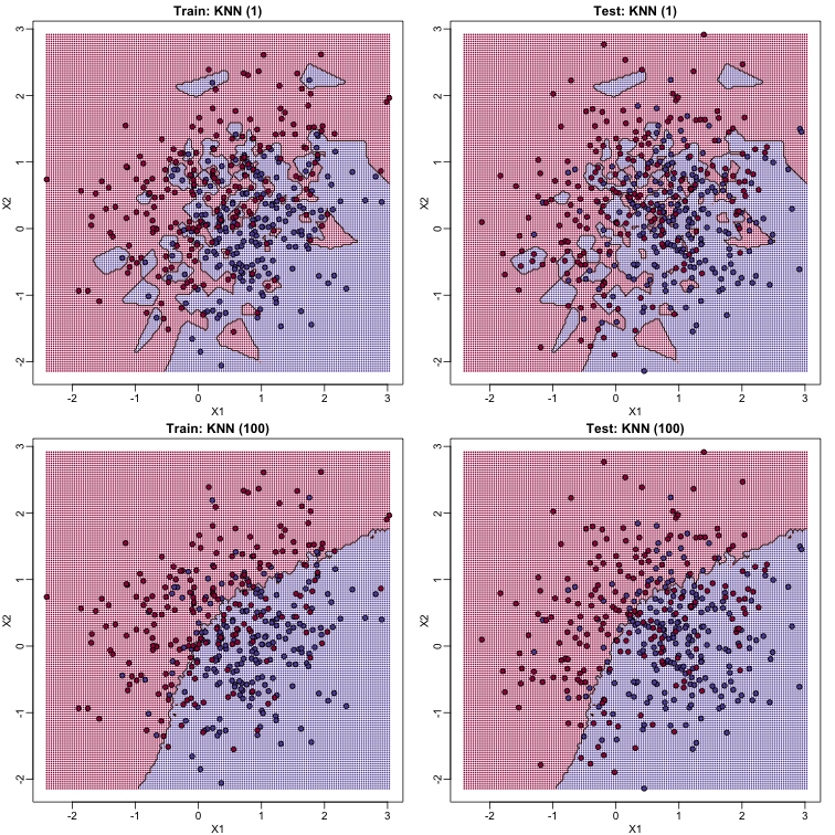
When $k=1$, we make no mistakes in the training test since every point is its closest neighbor and it is equal to itself. However, we see some islands of blue in the red area that, once we move to the test set, are more error prone. In the case $k=100$, we do not have this problem and we also see that we improve the error rate over linear regression. We can also see that our estimate of $f(x_1,x_2)$ is closer to the truth.
Bayes rule

Here we include a comparison of the test and train set errors for various values of $k$. We also include the error rate that we would make if we actually knew ${E}(Y | X_1=x1, X_2=x_2)$ referred to as Bayes Rule.
We start by computing the error rates…
###Bayes Rule
yhat <- apply(test,1,p)
cat("Bayes rule prediction error in train", 1-mean(round(yhat)==y), "\n")
Bayes rule prediction error in train 0.2825
bayes.error=1-mean(round(yhat)==y)
train.error <- rep(0,16)
test.error <- rep(0,16)
for(k in seq(along=train.error)){
##predict on train
yhat <- knn(x,x,y,k=2^(k/2))
train.error[k] <- 1-mean((as.numeric(yhat)-1)==y)
##prediction on test
yhat <- knn(x,test,y,k=2^(k/2))
test.error[k] <- 1-mean((as.numeric(yhat)-1)==y)
}
… and then plot the error rates against values of $k$. We also show the Bayes rules error rate as a horizontal line.
ks <- 2^(seq(along=train.error)/2)
mypar()
plot(ks, train.error, type="n", xlab="K", ylab="Prediction Error", log="x",
ylim=range(c(test.error, train.error)))
lines(ks, train.error, type="b", col=4, lty=2, lwd=2)
lines(ks, test.error, type="b", col=5, lty=3, lwd=2)
abline(h=bayes.error, col=6)
legend("bottomright", c("Train","Test","Bayes"), col=c(4,5,6), lty=c(2,3,1), box.lwd=0)
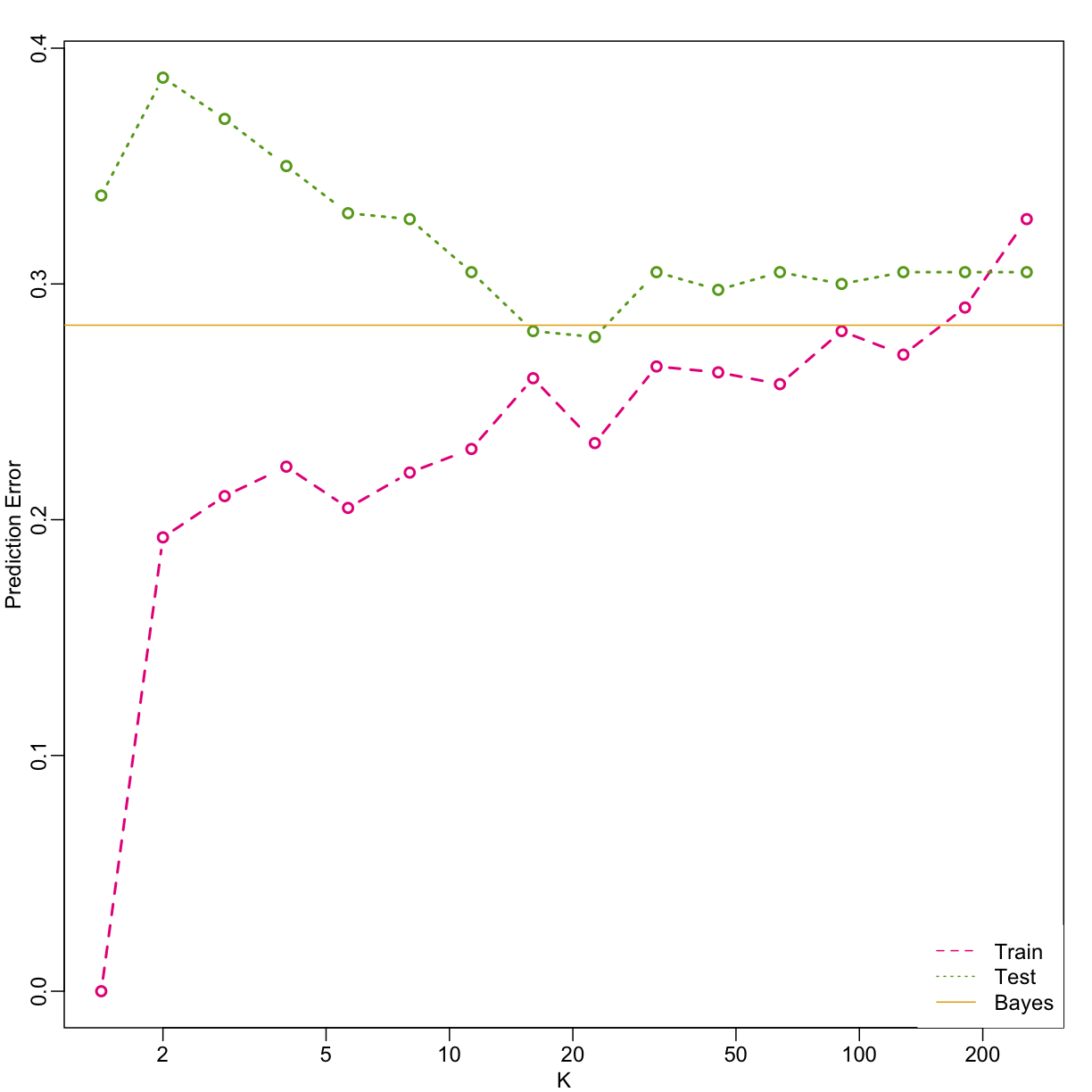
Note that these error rates are random variables and have standard errors. In the next section we describe cross-validation which helps reduce some of this variability. However, even with this variability, the plot clearly shows the problem of over-fitting when using values lower than 20 and under-fitting with values above 100.
Key Points
Data quality matters. Garbage in, Garbage out!
Cross-validation
Overview
Teaching: 30 min
Exercises: 30 minQuestions
How can the best configuration of parameters be selected for a machine learning model using only the data available?
Objectives
Create a set of fold indices for cross-validation
Select the best configuration for a machine learning model using cross-validation
Cross-validation
Here we describe cross-validation: one of the fundamental methods in machine learning for method assessment and picking parameters in a prediction or machine learning task. Suppose we have a set of observations with many features and each observation is associated with a label. We will call this set our training data. Our task is to predict the label of any new samples by learning patterns from the training data. For a concrete example, let’s consider gene expression values, where each gene acts as a feature. We will be given a new set of unlabeled data (the test data) with the task of predicting the tissue type of the new samples.
If we choose a machine learning algorithm with a tunable parameter, we have to come up with a strategy for picking an optimal value for this parameter. We could try some values, and then just choose the one which performs the best on our training data, in terms of the number of errors the algorithm would make if we apply it to the samples we have been given for training. However, we have seen how this leads to over-fitting.
Let’s start by loading the tissue gene expression dataset:
library(tissuesGeneExpression)
data(tissuesGeneExpression)
For illustration purposes, we will drop one of the tissues which doesn’t have many samples:
table(tissue)
tissue
cerebellum colon endometrium hippocampus kidney liver
38 34 15 31 39 26
placenta
6
ind <- which(tissue != "placenta")
y <- tissue[ind]
X <- t( e[,ind] )
This tissue will not form part of our example.
Now let’s try out k-nearest neighbors for classification, using $k=5$. What is our average error in predicting the tissue in the training set, when we’ve used the same data for training and for testing?
library(class)
pred <- knn(train = X, test = X, cl=y, k=5)
mean(y != pred)
[1] 0
We have no errors in prediction in the training set with $k=5$. What if we use $k=1$?
pred <- knn(train=X, test=X, cl=y, k=1)
mean(y != pred)
[1] 0
Trying to classify the same observations as we use to train the model can be very misleading. In fact, for k-nearest neighbors, using k=1 will always give 0 classification error in the training set, because we use the single observation to classify itself. The reliable way to get a sense of the performance of an algorithm is to make it give a prediction for a sample it has never seen. Similarly, if we want to know what the best value for a tunable parameter is, we need to see how different values of the parameter perform on samples, which are not in the training data.
Cross-validation is a widely-used method in machine learning, which solves this training and test data problem, while still using all the data for testing the predictive accuracy. It accomplishes this by splitting the data into a number of folds. If we have $N$ folds, then the first step of the algorithm is to train the algorithm using $(N-1)$ of the folds, and test the algorithm’s accuracy on the single left-out fold. This is then repeated N times until each fold has been used as in the test set. If we have $M$ parameter settings to try out, then this is accomplished in an outer loop, so we have to fit the algorithm a total of $N \times M$ times.
We will use the createFolds function from the caret package to make 5 folds of our gene expression data, which are balanced over the tissues. Don’t be confused by the fact that the createFolds function uses the same letter ‘k’ as the ‘k’ in k-nearest neighbors. These ‘k’ are totally unrelated. The caret function createFolds is asking for how many folds to create, the $N$ from above. The ‘k’ in the knn function is for how many closest observations to use in classifying a new sample. Here we will create 10 folds:
library(caret)
set.seed(1)
idx <- createFolds(y, k=10)
sapply(idx, length)
Fold01 Fold02 Fold03 Fold04 Fold05 Fold06 Fold07 Fold08 Fold09 Fold10
19 19 18 18 19 18 20 16 16 20
The folds are returned as a list of numeric indices. The first fold of data is therefore:
y[idx[[1]]] ##the labels
[1] "kidney" "hippocampus" "hippocampus" "hippocampus" "cerebellum"
[6] "cerebellum" "cerebellum" "kidney" "kidney" "kidney"
[11] "colon" "colon" "colon" "liver" "endometrium"
[16] "endometrium" "liver" "liver" "cerebellum"
head( X[idx[[1]], 1:3] ) ##the genes (only showing the first 3 genes...)
1007_s_at 1053_at 117_at
GSM12105.CEL.gz 9.913031 6.337478 7.983850
GSM21209.cel.gz 11.667431 5.785190 7.666343
GSM21215.cel.gz 10.361340 5.663634 7.328729
GSM21218.cel.gz 10.757734 5.984170 8.525524
GSM87066.cel.gz 9.746007 5.886079 7.459517
GSM87085.cel.gz 9.864295 5.753874 7.712646
We can see that, in fact, the tissues are fairly equally represented across the 10 folds:
sapply(idx, function(i) table(y[i]))
Fold01 Fold02 Fold03 Fold04 Fold05 Fold06 Fold07 Fold08 Fold09
cerebellum 4 4 4 4 4 3 4 3 4
colon 3 4 4 3 3 3 4 3 3
endometrium 2 1 1 1 2 2 2 1 1
hippocampus 3 3 3 3 3 3 3 3 3
kidney 4 4 4 4 4 4 4 4 3
liver 3 3 2 3 3 3 3 2 2
Fold10
cerebellum 4
colon 4
endometrium 2
hippocampus 4
kidney 4
liver 2
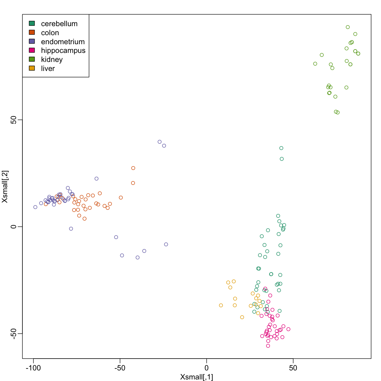
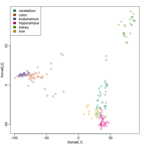
Because tissues have very different gene expression profiles, predicting tissue with all genes will be very easy. For illustration purposes we will try to predict tissue type with just two dimensional data. We will reduce the dimension of our data using cmdscale:
library(rafalib)
mypar()
Xsmall <- cmdscale(dist(X))
plot(Xsmall,col=as.fumeric(y))
legend("topleft",levels(factor(y)),fill=seq_along(levels(factor(y))))
Now we can try out the k-nearest neighbors method on a single fold. We provide the knn function with all the samples in Xsmall except those which are in the first fold. We remove these samples using the code -idx[[1]] inside the square brackets. We then use those samples in the test set. The cl argument is for the true classifications or labels (here, tissue) of the training data. We use 5 observations to classify in our k-nearest neighbor algorithm:
pred <- knn(train=Xsmall[ -idx[[1]] , ], test=Xsmall[ idx[[1]], ], cl=y[ -idx[[1]] ], k=5)
table(true=y[ idx[[1]] ], pred)
pred
true cerebellum colon endometrium hippocampus kidney liver
cerebellum 4 0 0 0 0 0
colon 0 2 0 0 1 0
endometrium 0 0 2 0 0 0
hippocampus 2 0 0 1 0 0
kidney 0 0 0 0 4 0
liver 0 0 0 0 0 3
mean(y[ idx[[1]] ] != pred)
[1] 0.1578947
Now we have some misclassifications. How well do we do for the rest of the folds?
for (i in 1:10) {
pred <- knn(train=Xsmall[ -idx[[i]] , ], test=Xsmall[ idx[[i]], ], cl=y[ -idx[[i]] ], k=5)
print(paste0(i,") error rate: ", round(mean(y[ idx[[i]] ] != pred),3)))
}
[1] "1) error rate: 0.158"
[1] "2) error rate: 0.158"
[1] "3) error rate: 0.278"
[1] "4) error rate: 0.167"
[1] "5) error rate: 0.158"
[1] "6) error rate: 0.167"
[1] "7) error rate: 0.25"
[1] "8) error rate: 0.188"
[1] "9) error rate: 0.062"
[1] "10) error rate: 0.1"
So we can see there is some variation for each fold, with error rates hovering around 0.1-0.3. But is k=5 the best setting for the k parameter? In order to explore the best setting for k, we need to create an outer loop, where we try different values for k, and then calculate the average test set error across all the folds.
We will try out each value of k from 1 to 12. Instead of using two for loops, we will use sapply:
set.seed(1)
ks <- 1:12
res <- sapply(ks, function(k) {
##try out each version of k from 1 to 12
res.k <- sapply(seq_along(idx), function(i) {
##loop over each of the 10 cross-validation folds
##predict the held-out samples using k nearest neighbors
pred <- knn(train=Xsmall[ -idx[[i]], ],
test=Xsmall[ idx[[i]], ],
cl=y[ -idx[[i]] ], k = k)
##the ratio of misclassified samples
mean(y[ idx[[i]] ] != pred)
})
##average over the 10 folds
mean(res.k)
})
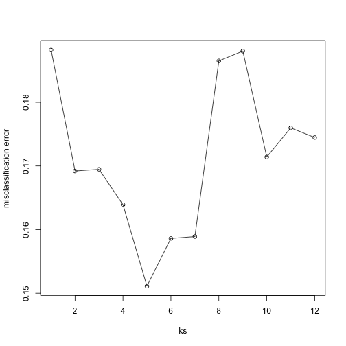
Now for each value of k, we have an associated test set error rate from the cross-validation procedure.
res
[1] 0.1882164 0.1692032 0.1694664 0.1639108 0.1511184 0.1586184 0.1589108
[8] 0.1865058 0.1880482 0.1714108 0.1759795 0.1744664
We can then plot the error rate for each value of k, which helps us to see in what region there might be a minimal error rate:
plot(ks, res, type="o",ylab="misclassification error")
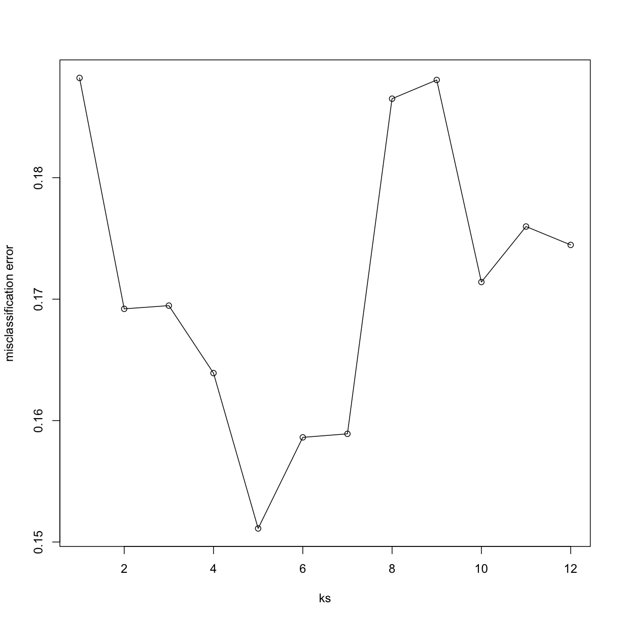
Remember, because the training set is a random sample and because our fold-generation procedure involves random number generation, the “best” value of k we pick through this procedure is also a random variable. If we had new training data and if we recreated our folds, we might get a different value for the optimal k.
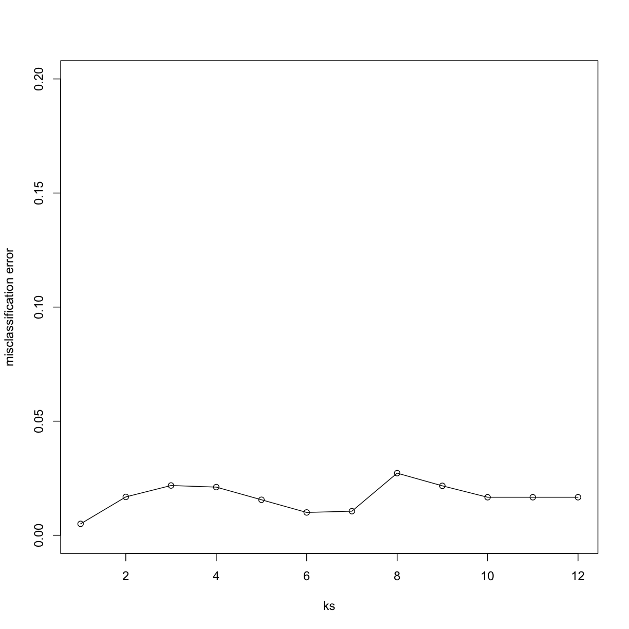
Finally, to show that gene expression can perfectly predict tissue, we use 5 dimensions instead of 2, which results in perfect prediction:
Xsmall <- cmdscale(dist(X),k=5)
set.seed(1)
ks <- 1:12
res <- sapply(ks, function(k) {
res.k <- sapply(seq_along(idx), function(i) {
pred <- knn(train=Xsmall[ -idx[[i]], ],
test=Xsmall[ idx[[i]], ],
cl=y[ -idx[[i]] ], k = k)
mean(y[ idx[[i]] ] != pred)
})
mean(res.k)
})
plot(ks, res, type="o",ylim=c(0,0.20),ylab="misclassification error")
Important note: we applied cmdscale to the entire dataset to create
a smaller one for illustration purposes. However, in a real machine
learning application, this may result in an underestimation of test
set error for small sample sizes, where dimension reduction using the
unlabeled full dataset gives a boost in performance. A safer choice
would have been to transform the data separately for each fold, by
calculating a rotation and dimension reduction using the training set only
and applying this to the test set.
Exercises
Load the following dataset:
library(GSE5859Subset)
data(GSE5859Subset)
And define the outcome and predictors. To make the problem more difficult, we will only consider autosomal genes:
y = factor(sampleInfo$group)
X = t(geneExpression)
out = which(geneAnnotation$CHR %in% c("chrX","chrY"))
X = X[,-out]
Exercise 1
Use the
createFoldfunction in thecaretpackage, set the seed to 1set.seed(1)and create 10 folds ofy. What is the 2nd entry in the fold 3?Solution
library(caret)
set.seed(1)
idx <- createFolds(y, k = 10)
# Select the set of indices corresponding to the third fold
# using idx[[3]], then print the second index of that fold
idx[[3]][2]
Exercise 2
We are going to use kNN. We are going to consider a smaller set of predictors by using filtering gene using t-tests. Specifically, we will perform a t-test and select the $m$ genes with the smallest p-values.
Let m = 8 and k = 5 and train kNN by leaving out the second fold
idx[[2]]. How many mistakes do we make on the test set? Remember it is indispensable that you perform the t-test on the training data. Use all 10 folds, keep k = 5. Hint: be careful about indexing.Solution
library(genefilter)
m <- 8 # number of genes

# `rowttests` performs a t-test on the expression of each gene
pvals <- rowttests(t(X[-idx[[2]],]),y[-idx[[2]]])$p.value

# We use the p-value to identify the genes that present a
# significant effect (i.e. the effect is statistically
# different from 0). That is achieved by ordering `pvals`
# in increasing order, and taking the `m` smallest p-values
ind <- order(pvals)[1:m]

# Then the k-nearest-neighbor algorithm is executed only
# considering these `m` most significant genes.
pred <- knn(train = X[-idx[[2]],ind],
            test = X[idx[[2]],ind],
            cl = y[-idx[[2]]], k = 5)

# This command computes the total number of examples that
# were miss-classified by the knn algorithm.
sum(pred != y[idx[[2]]])
Exercise 3
Now run through all 5 folds. What is our error rate? (total number of errors / total predictions)
Solution
# Now run the previous piece of code for each fold
n_fold <- length(idx)
res <- vector('double', n_fold)
m <- 8
for (i in seq(n_fold)) {
  # To be fair and only use the information we have at the moment
  # of training, we perform the t-tests only on the training set.
  pvals <- rowttests(t(X[-idx[[i]],]),y[-idx[[i]]])$p.value
  ind <- order(pvals)[1:m]
  # We will use again the top m=8 genes that showed the most
  # significant effect according to the previous t-tests.
  pred <- knn(train = X[-idx[[i]],ind],
              test = X[idx[[i]],ind],
              cl = y[-idx[[i]]], k = 5)
  res[[i]] <- sum(pred != y[idx[[i]]])
}
# Compute the average performance of the knn algorithm achieved on
# the ten folds.
sum(res)/length(y)
Exercise 4
Now we are going to select the best values of k and m. Use the expand grid function to try out the following values:
ms = 2^c(1:11)
ks = seq(1,9,2)
# Compute all possible pairs of configurations of number of most
# significant genes and number of neighbors for the knn algorithm.
params = expand.grid(k=ks, m=ms)
Now use apply or a for-loop to obtain error rates for each of these pairs of parameters. Which pair of parameters minimizes the error rate?
Solution
n_fold <- length(idx)
# Store the mean performance on the ten folds of the knn algorithm
# using each pair of parameters.
error_rate_avg = vector('double',nrow(params))
# Iterate over each pair of parameters:
# (number of neighbors, number of genes)
for (j in seq(nrow(params))) {
    # Iterate over each fold
    for (i in seq(n_fold)) {
        # Again perform the t-tests only on the training set
        pvals <- rowttests(t(X[-idx[[i]],]),y[-idx[[i]]])$p.value
        # This time we take the top number of genes given by
        # the current pair of parameters `param[j,][[2]]`
        ind <- order(pvals)[1:params[j,][[2]]]

        # Train the knn algorithm using the train set, and
        # evaluating on the test set of the current fold `idx[[i]]`.
        # The knn is trained using the number of neighbors given
        # by the current pair of parameters `param[j,][[1]]`
        pred <- knn(train = X[-idx[[i]],ind],
                    test = X[idx[[i]],ind],
                    cl = y[-idx[[i]]],
                    k = params[j,][[1]])
        res[[i]] <- sum(pred != y[idx[[i]]])
    }
    # Approximate how our knn algorithm would perform with unseen data
    # by computing the mean error achieved on all the folds.
    error_rate_avg[[j]] <- sum(res)/length(y)
}
# Find the pair of parameters (number of neighbors, number of genes)
# that achieves the lowest expected error.
ind <- which(error_rate_avg == min(error_rate_avg))

# Print that pair of parameters and the corresponding error rate
# achieved
params[ind,] # answer
min(error_rate_avg) # minimum error rate
Exercise 5
Repeat exercise 4, but now perform the t-test filtering before the cross validation. Note how this biases the entire result and gives us much lower estimated error rates.
Solution
# We perform the same experiment with the exception that
# this time we perform the t-tests on all the dataset to
# choose the top number of genes with most significant
# effect.
ms = 2^c(1:11)
ks = seq(1,9,2)
params = expand.grid(k=ks, m=ms)
n_fold <- length(idx)
error_rate_avg = vector('double',nrow(params))
for (j in seq(nrow(params))) {
    for (i in seq(n_fold)) {
        # Here we use the complete dataset to select the genes,
        # rather than only the examples corresponding to this fold.
        pvals <- rowttests(t(X),y)$p.value
        ind <- order(pvals)[1:params[j,][[2]]]
        pred <- knn(train = X[-idx[[i]],ind],
                    test = X[idx[[i]],ind],
                    cl = y[-idx[[i]]], k = params[j,][[1]])
        res[[i]] <- sum(pred != y[idx[[i]]])
    }
    error_rate_avg[[j]] <- sum(res)/length(y)
}
min(error_rate_avg) # minimum error rate
mean(error_rate_avg) # mean error rate
The error rate is much lower than the one in Exercise 4 because we did not filter out p values from the test data in this case. This is not a correct practice. The practice shown in Exercise 4 is correct.
Exercise 6
Repeat exercise 3, but now, instead of
sampleInfo$group, usey = factor(as.numeric(format( sampleInfo$date, "%m")=="06"))What is the minimum error rate now? We achieve much lower error rates when predicting date than when predicting the group. Because group is confounded with date, it is very possible that these predictors have no information about group and that our lower 0.5 error rates are due to the confounding with date. We will learn more about this in the batch effect chapter.Solution
# We use 'y' as the date the sample was taken as class.
# However, notice that this is introducing a `batch effect`.
y = factor(as.numeric(format( sampleInfo$date, "%m")=="06"))

ms = 2^c(1:11)
ks = seq(1,9,2)
params = expand.grid(k=ks, m=ms)
n_fold <- length(idx)
error_rate_avg = vector('double',nrow(params))
for (j in seq(nrow(params))) {
    for (i in seq(n_fold)) {
        pvals <- rowttests(t(X[-idx[[i]],]),y[-idx[[i]]])$p.value
        ind <- order(pvals)[1:params[j,][[2]]]
        pred <- knn(train = X[-idx[[i]],ind],
                    test = X[idx[[i]],ind],
                    cl = y[-idx[[i]]], k = params[j,][[1]])
        res[[i]] <- sum(pred != y[idx[[i]]])
    }
    error_rate_avg[[j]] <- sum(res)/length(y)
}
min(error_rate_avg) # minimum error rate
mean(error_rate_avg) # mean error rate
Key Points
The mean validation error obtained from cross-validation is a better approximation of the test error (real world data) than the training error iteself