Statistics in Data Analysis
Overview
Teaching: 0 min
Exercises: 0 minQuestions
How can information be extracted and communicated from experimental data?
Objectives
Plotting reveals information in the data.
Statistical significance testing compares experimental data obtained to probability distributions of data that might also be possible.
A probability distribution is a mathematical function that gives the probabilities of different possible outcomes for an experiment.
A picture is worth a thousand words
To motivate this next section on statistics, we start with an example of human variability. This 1975 living histogram of female students from the University of Wisconsin Madison shows variability in a natural population.

B. Joiner, Int’l Stats Review, 1975
Exercise 1: A living histogram
From the living histogram, can you estimate by eye
1). the mean and median heights of this sample of female students?
2). the spread of the data? Estimate either standard deviation or variance by eye. If you’re not sure how to do this, think about how you would describe the spread of the data from the mean. You do not need to calculate a statistic.
3). any outliers? Estimate by eye - don’t worry about calculations.
4). What do you predict would happen to mean, median, spread and outliers if an equal number of male students were added to the histogram?Solution to Exercise 1
1). Mean and median are two measures of the center of the data. The median is the 50th% of the data with half the female students above this value and the other half below. There are approximately 100 students total. Fifty of them appear to be above 5 feet 5 inches and fifty of them appear to be below 5’5”. The median is not influenced by extreme values (outliers), but the mean value is. While there are some very tall and very short people, the bulk of them appear to be centered around a mean of 5 foot 5 inches with a somewhat longer right tail to the histogram.
2). If the mean is approximately 5’5” and the distribution appears normal (bell-shaped), then we know that approximately 68% of the data lies within one standard deviation (sd) of the mean and ~95% lies within two sd’s. If there are ~100 people in the sample, 95% of them lie between 5’0” and 5’10” (2 sd’s = 5” above and 5” below the mean). One standard deviation then would be about 5”/2 = 2.5” from the mean of 5’5”. So 68% of the data (~68 people) lie within 5 feet 2.5 inches and 5 feet 7.5 inches.
3). There are some very tall and very short people but it’s not clear whether they are outliers. Outliers deviate significantly from expected values, specifically by more than 3 standard deviations in a normal distribution. Values that are greater than 3 sd’s (7.5”) above or below the mean could be considered outliers. Outliers would then be shorter than 4 feet 7.5 inches or taller than 6 feet 2.5 inches. The shortest are 4 feet 9 inches and the tallest 6’ 0 inches. There are no outliers in this sample because all heights fall within 3 sd’s.
4). Average male heights are greater than average female heights, so you could expect that a random sample of 100 male students would increase the average height of the sample of 200 students. The mean would shift to the right of the distribution toward taller heights, as would the median.
The first step in data analysis: plot the data!
A picture is worth a thousand words, and a picture of your data could reveal important information that can guide you forward. So first, plot the data!
# read in the simulated heart rate data
heart_rate <- read.csv("../data/heart_rate.csv")
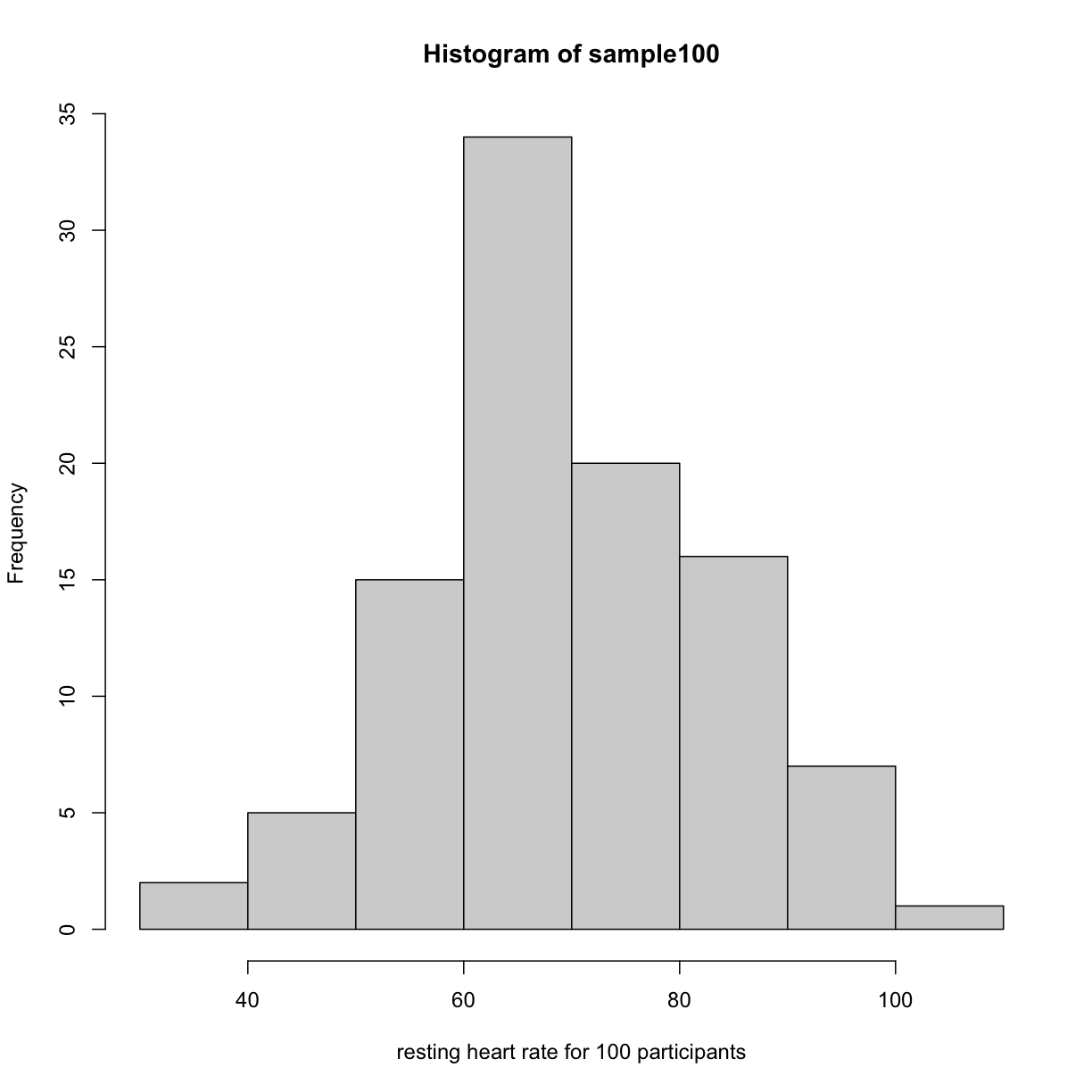
# take a random sample of 100 and create a histogram
# first set the seed for the random number generator
set.seed(42)
sample100 <- sample(heart_rate$heart_rate, 100)
hist(sample100, xlab = "resting heart rate for 100 participants")

plot of chunk readin_data
Exercise 2: What does this picture tell you about resting heart rates?
Do the data appear to be normally distributed? Why does this matter?
Do the left and right tails of the data seem to mirror each other or not?
Are there gaps in the data?
Are there large clusters of similar heart rate values in the data?
Are there apparent outliers?
What message do the data deliver in this histogram?Solution to Exercise 2
Now create a boxplot of the same sample data.
boxplot(sample100)
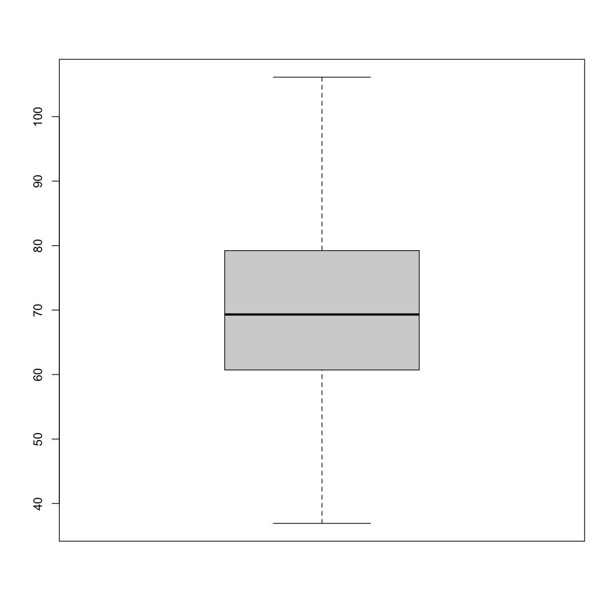
plot of chunk boxplot_simulated_gen100_data
Exercise 3: What does this boxplot tell you about resting heart rates?
What does the box signify?
What does horizontal black line dividing the box signify?
Are there apparent outliers?
How does the boxplot relate to the histogram? What message do the data deliver in this boxplot?Solution to Exercise 3
Plotting the data can identify unusual response measurements (outliers), reveal relationships between variables, and guide further statistical analysis. When data are not normally distributed (bell-shaped and symmetrical), many of the statistical methods typically used will not perform well. In these cases the data can be transformed to a more symmetrical bell-shaped curve.
Statistical significance testing
The Generation 100 studied aims to determine whether high-intensity exercise in elderly adults affects lifespan and healthspan.
boxplot(heart_rate ~ exercise_group, data = heart_rate)
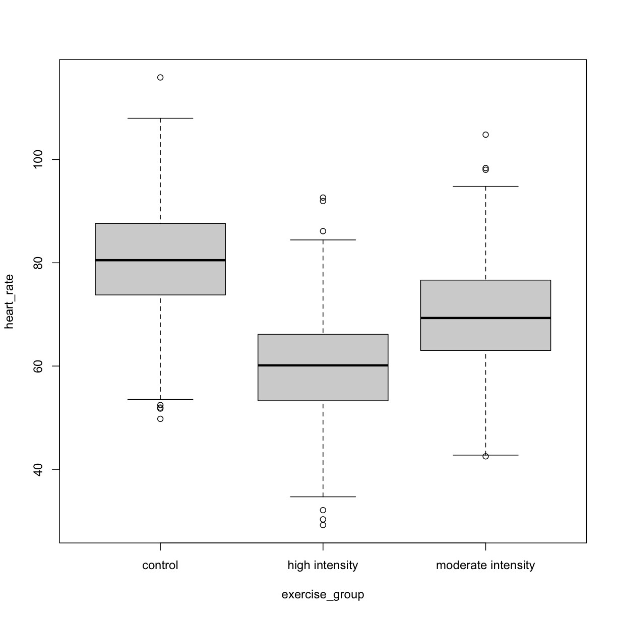
plot of chunk exercise_intensity_boxplot
Exercise 3: Comparing two groups - control vs. high intensity
- Does there appear to be a significant heart rate difference between the two groups? How would you know?
- Do any of the data overlap between the two boxplots?
- Can you know which exercise group a person belongs to just by knowing their heart rate? For example, for a heart rate of 80 could you say with certainty that a person belongs to one group or the other?
Solution to Exercise 3
- There appears to be a trend of lower heart rate in the high-intensity exercise group, however, we can’t say whether or not it is significant without performing statistical tests.
- There is considerable overlap between the two groups, which shows that there is considerable variability in the data.
- Someone with a heart rate of 80 could belong to either group. When considering significance of heart rate differences between the two groups we don’t look at individuals, rather, we look at averages between the two groups.
The boxplots above show a trend of lower heart rate in the high-intensity exercise group and higher heart rate in the control exercise group. There is inherent variability in heart rate in both groups however, which is to be expected. That variability appears in the box and whisker lengths of the boxplots, along with the outliers that appear as hollow circles. This variability in heart rate measurements also means that the boxplots overlap between the two groups, making it difficult to determine whether there is a significant difference in mean heart rate between the groups.
We can calculate the difference in means between the two groups to answer the question about exercise intensity.
# calculate the means of the two groups
HI <- heart_rate[heart_rate$exercise_group=="high intensity", "heart_rate"]
control <- heart_rate[heart_rate$exercise_group=="control", "heart_rate"]
mean(control) - mean(HI)
[1] 20.97851
The actual difference in mean heart rates is 20.9785147. Another way of stating this is that the high-intensity group had a mean heart rate that was 26 percent lower than the control group.
So are we done now? Does this difference support the alternative hypothesis that there is a significant difference in mean heart rates? Or does it fail to reject the null hypothesis of no significant difference? Why do we need p-values and confidence intervals if we have evidence we think supports our claim? The reason is that the mean values are random variables that can take many different values. We are working with two samples of elderly Norwegians, not the entire population of elderly Norwegians. The means are estimates of the true mean heart rate of the entire population, a number that we can never know because we can’t access the entire population of elders. The sample means will vary with every sample we take from the population. To demonstrate this, let’s take a sample from each exercise group and calculate the difference in means for those samples.
# calculate the sample mean of 100 people in each group
HI100 <- mean(sample(HI, size=100))
control100 <- mean(sample(control, size=100))
control100 - HI100
[1] 20.22396
Now take another sample of 100 from each group and calculate the difference in means.
# calculate the sample mean of 100 people in each group
HI100 <- mean(sample(HI, size=100))
control100 <- mean(sample(control, size=100))
control100 - HI100
[1] 21.05398
Are the differences in sample means the same? We can repeat this sampling again and again, and each time arrive at a different value. The sample means are a random variable, meaning that they can take on any number of different values. Since they are random variables, the difference between the means is also a random variable.
Let’s explore random variables further. Imagine that you have measured the resting heart rate of the entire population of elderly people 70 or older, not just the 1,567 from the Generation 100 study. In practice we would never have access to the entire population, so this is a thought exercise.
# read in the heart rates of the entire population of all elderly people
population <- rbind(heart_rate$heart_rate, heart_rate$heart_rate)

# sample 100 of them and calculate the mean three times
mean(sample(population, size=100))
[1] 71.2388
mean(sample(population, size=100))
[1] 68.13981
mean(sample(population, size=100))
[1] 69.99927
Notice how the mean changes each time you sample. We can continue to do this many times to learn about the distribution of this random variable.
The null hypothesis
Now let’s return to the mean difference between treatment groups. How do we know that this difference is due to the exercise? What happens if all 100 in the sample do the same exercise intensity? Will we see a difference as large as we saw between the two treatment groups? This is called the null hypothesis. The word null reminds us to be skeptical and to entertain the possibility that there is no difference.
Because we have access to the population, we can randomly sample 100 controls to observe as many of the difference in means when exercise intensity has no effect. We can give everyone the same exercise plan and then record the difference in means between two randomly split groups of 100 and 100.
Here is this process written in R code:
##100 controls
control <- sample(population,100)
##another 100 controls that we pretend are on a high-intensity regimen
treatment <- sample(population,100)
print(mean(treatment) - mean(control))
[1] -1.891352
Now let’s do it 10,000 times. We will use a “for-loop”, an operation that lets us automate this (a simpler approach that, we will learn later, is to use replicate).
n <- 10000
null <- vector("numeric",n)
for (i in 1:n) {
  control <- sample(population,100)
  treatment <- sample(population,100)
  null[i] <- mean(treatment) - mean(control)
}
Significance testing can answer questions about differences between the two groups in light of inherent variability in heart rate measurements. Comparing the data obtained to a probability distribution of data that might have been obtained can help to answer questions about the effects of exercise intensity on heart rate.
The t-test
What does it mean that a difference is statistically significant? We can eye plots like the one above and see a difference, however, we need something more objective than eyeballs to claim a significant difference. A t-test will report whether the difference in mean values between the two groups is significant. The null hypothesis would state that there is no difference in mean values, while the alternative hypothesis states that there is a difference in the means of the two samples from the whole population of elders in Norway.
# provide a formula stating that heart rate is dependent on exercise intensity
Exercise 4: What does a p-value mean?
What does this p-value tell us about the difference in means between the two groups? How can we interpret this value? What does it say about the significance of the difference in mean values?
Solution to Exercise 4
P-values are often misinterpreted as the probability that, in this example, high- and control exercise result in the same average heart rate. However, “high- and control exercise result in the same average heart rate” is not a random variable like the number of heads or tails in 10 flips of a coin. It’s a statement that doesn’t have a probability distribution, so you can’t make probability statements about it. The p-value summarizes the comparison between our data and the data we might have obtained from a probability distribution if there were no difference in mean heart rates. Specifically, the p-value tells us how far out on the tail of that distribution the data we got falls. To understand this better, we’ll explore probability distributions next.
Probability and probability distributions
Suppose you have measured the resting heart rate of the entire population of
elderly Norwegians 70 or older, not just the 1,567 from the Generation 100
study. Imagine you need to describe all of these numbers to someone who has no
idea what resting heart rate is. Imagine that all the measurements from the
entire population are contained in heart_rate. We could list out
all of the numbers for them to see or take a sample and show them the sample of
heart rates, but this would be inefficient and wouldn’t provide much insight
into the data. A better approach is to define and visualize a distribution.
The simplest way to think of a distribution is as a compact description of many
numbers.
Histograms show us the proportion of values within an interval. Here is a histogram showing all resting heart rates for the entire population 70 and older.
hist(heart_rate, xlab = "resting heart rate")
Error in hist.default(heart_rate, xlab = "resting heart rate"): 'x' must be numeric
Showing this plot is much more informative and easier to interpret than a long table of numbers. With this histogram we can approximate the number of individuals in any given interval. For example, there are approximately 30 individuals (~2%) with a resting heart rate greater than 100, and another ~30 with a resting heart rate below 60.
The histogram above approximates one that is very common in nature: the bell curve, also known as the normal distribution or Gaussian distribution.
plot(function(x) dnorm(x), -3.5, 3.5, main = "Standard normal distribution",
     xlab = "z", ylab = "")
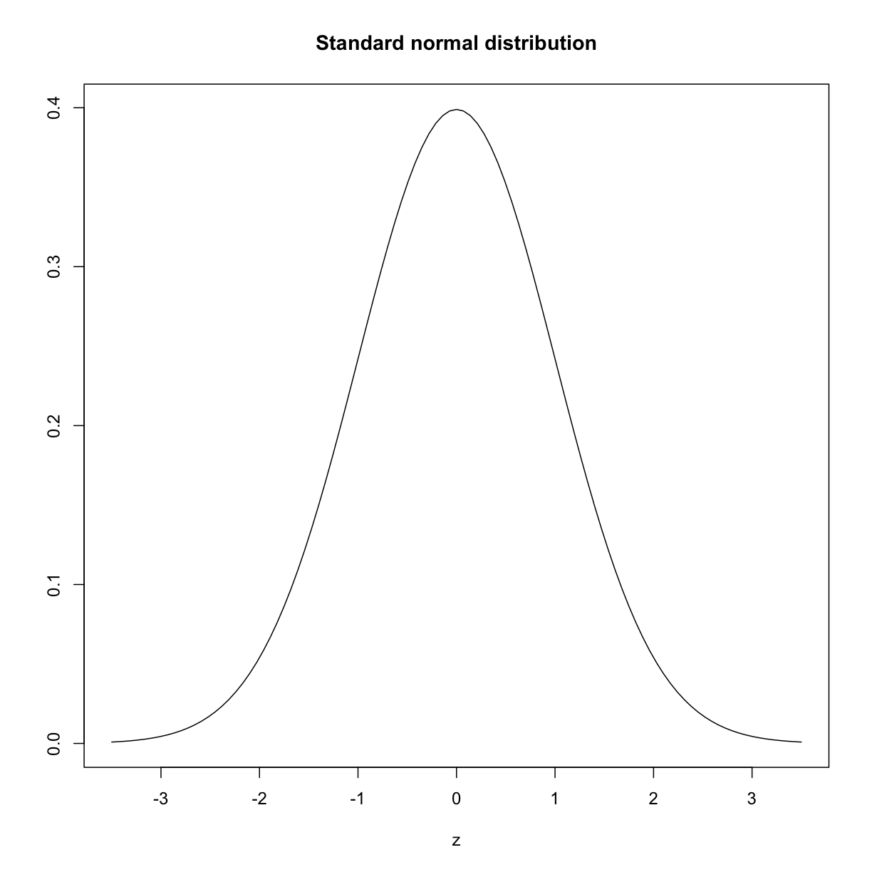
plot of chunk standard_normal_dist
The curve shown above is an example of a probability density function that defines a bell-shaped curve. The y-axis is the probability density, and the total area under the curve sums to 1.0 on the y-axis. The x-axis denotes a variable z that by statistical convention has a standard normal distribution. If you draw a random value from a normal distribution, the probability that the value falls in a particular interval, say from a to b, is given by the area under the curve between a and b. Software can be used to calculate these probabilities.
Real-world populations may be approximated by the mathematical ideal of the normal distribution. Repeat the sampling we did earlier and produce a new histogram of the sample.
sample100 <- sample(heart_rate, 100)
Error in sample.int(length(x), size, replace, prob): cannot take a sample larger than the population when 'replace = FALSE'
hist(sample100, xlab = "resting heart rate for 100 participants")
plot of chunk sample_hist
Exercise 4: Sampling from a population
Does the sample appear to be normally distributed?
Can you estimate the mean resting heart rate by eye?
What is the sample mean using R (hint: usemean())?
Can you estimate the sample standard deviation by eye? Hint: if normally distributed, 68% of the data will lie within one standard deviation of the mean and 95% will lie within 2 standard deviations. What is the sample standard deviation using R (hint: usesd())? Estimate the number of people with a resting heart rate between 60 and 70. What message does the sample deliver about the population from which it was drawn?Solution to Exercise 4
When the histogram of a list of numbers approximates the normal distribution, we can use a convenient mathematical formula to approximate the proportion of values or outcomes in any given interval.
The perils of p-values
Confidence intervals
Sample sizes and power curves
Comparing standard deviations
Key Points
Plotting and significance testing describe patterns in the data and quantify effects against random variation.