Introduction
Essential Features of a Comparative Experiment
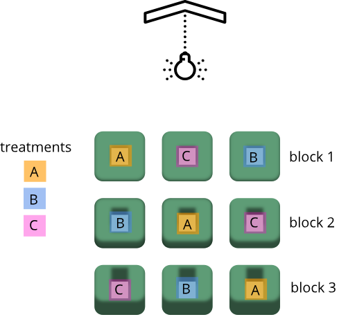
Experimental Design Principles
Figure 1

Figure 2
Statistics in Data Analysis
Figure 1

Figure 2
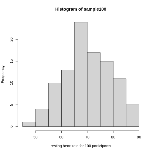
Figure 3
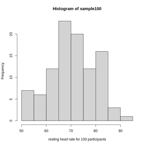
Figure 4
Figure 5
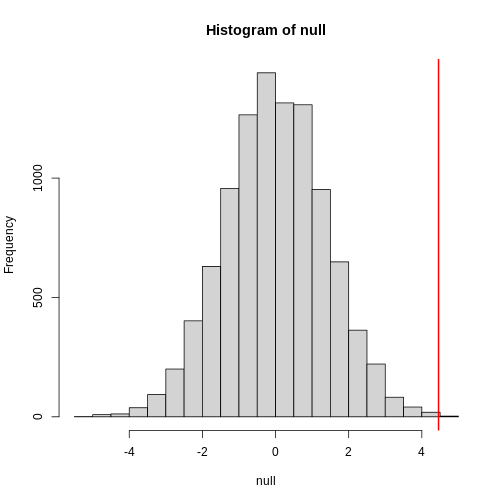
Figure 6
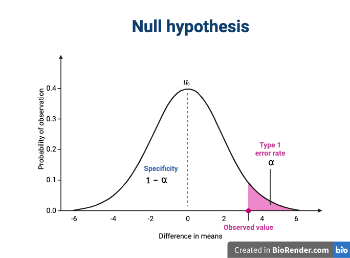
Figure 7
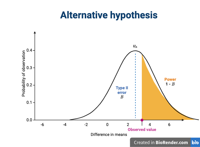
Figure 8
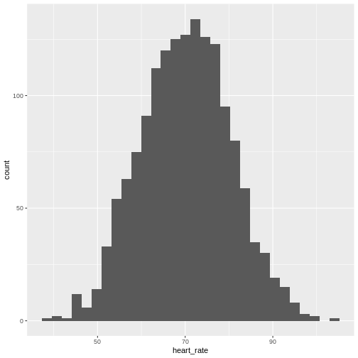 Showing this plot is much more informative and easier to interpret than
a long table of numbers. With this histogram we can approximate the
number of individuals in any given interval. For example, there are
approximately 29 individuals (~2.8%) with a resting heart rate greater
than 90, and another 31 individuals (~3%) with a resting heart rate
below 50.
Showing this plot is much more informative and easier to interpret than
a long table of numbers. With this histogram we can approximate the
number of individuals in any given interval. For example, there are
approximately 29 individuals (~2.8%) with a resting heart rate greater
than 90, and another 31 individuals (~3%) with a resting heart rate
below 50.
Figure 9
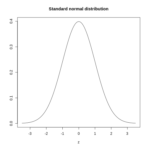
Figure 10
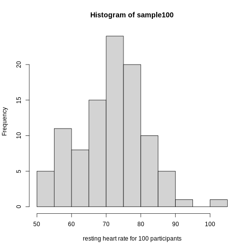
Figure 11
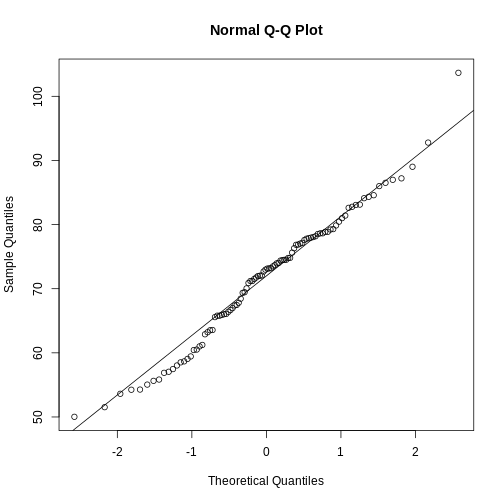
Figure 12
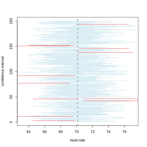
Figure 13
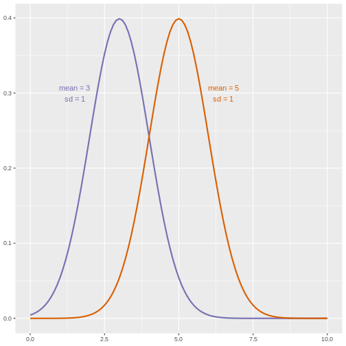
Figure 14
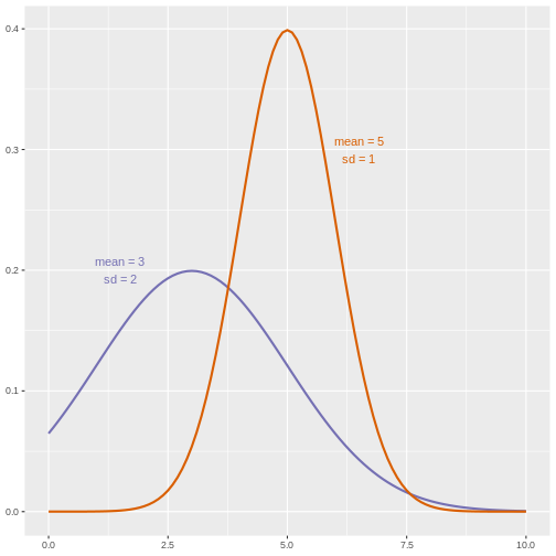
Figure 15
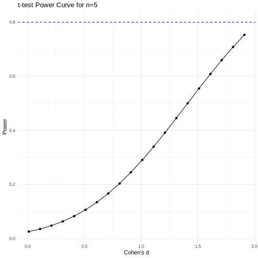
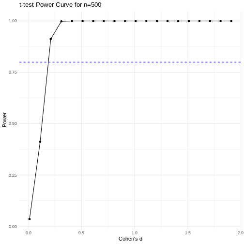 Code adapted from Power
Curve in R by Cinni Patel.
Code adapted from Power
Curve in R by Cinni Patel.
Figure 16
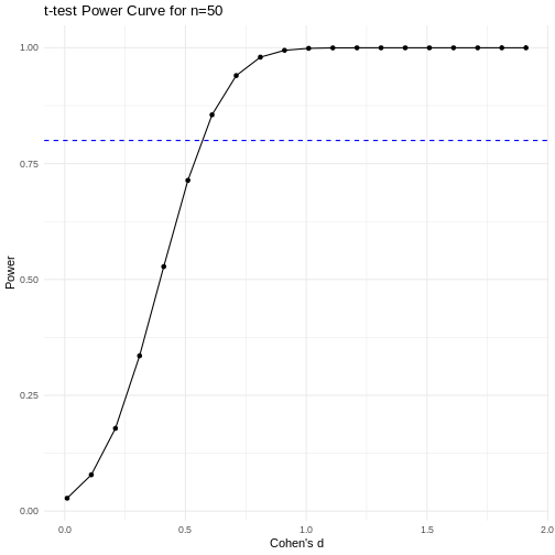
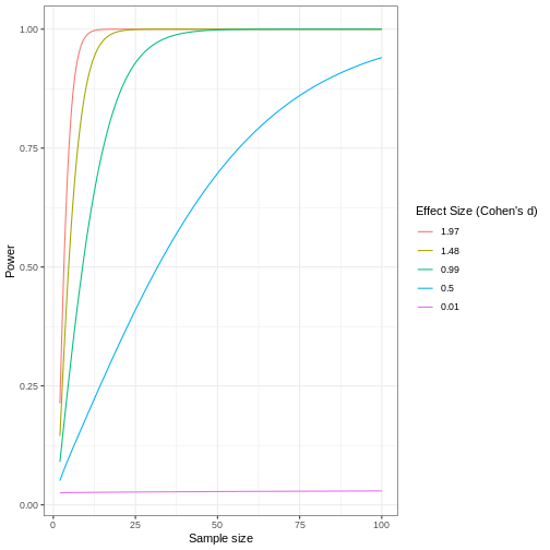 Code adapted from How
to Create Power Curves in ggplot by Levi Baguley
Code adapted from How
to Create Power Curves in ggplot by Levi Baguley