Inference
Overview
Teaching: 75 min
Exercises: 40 minQuestions
What does inference mean?
Why do we need p-values and confidence intervals?
What is a random variable?
What exactly is a distribution?
Objectives
Describe the statistical concepts underlying p-values and confidence intervals.
Explain random variables and null distributions using R programming.
Compute p-values and confidence intervals using R programming.
Introduction
This section introduces the statistical concepts necessary to understand p-values and confidence intervals. These terms are ubiquitous in the life science literature. Let’s use this paper as an example.
Note that the abstract has this statement:
“Body weight was higher in mice fed the high-fat diet already after the first week, due to higher dietary intake in combination with lower metabolic efficiency.”
To support this claim they provide the following in the results section:
“Already during the first week after introduction of high-fat diet, body weight increased significantly more in the high-fat diet-fed mice (+ 1.6 ± 0.1 g) than in the normal diet-fed mice (+ 0.2 ± 0.1 g; P < 0.001).”
What does P < 0.001 mean? Why are the ± included? We will learn what this means and learn to compute these values in R. The first step is to understand random variables. To do this, we will use data from a mouse database (provided by Karen Svenson via Gary Churchill and Dan Gatti and partially funded by P50 GM070683). We will import the data into R and explain random variables and null distributions using R programming. See the Setup instructions to import the data.
Our first look at data
We are interested in determining if following a given diet makes mice heavier
after several weeks. This data was produced by ordering 24 mice from The Jackson
Lab and randomly assigning either chow or high fat (hf) diet. After several
weeks, the scientists weighed each mouse and obtained this data (head just
shows us the first 6 rows):
fWeights <- read.csv("../data/femaleMiceWeights.csv")
head(fWeights)
  Diet Bodyweight
1 chow      21.51
2 chow      28.14
3 chow      24.04
4 chow      23.45
5 chow      23.68
6 chow      19.79
If you would like to view the entire data set with RStudio:
View(fWeights)
So are the hf mice heavier? Mouse 24 at 20.73 grams is one of the lightest mice, while Mouse 21 at 34.02 grams is one of the heaviest. Both are on the hf diet. Just from looking at the data, we see there is variability. Claims such as the previous (that body weight increased significantly in high-fat diet-fed mice) usually refer to the averages. So let’s look at the average of each group:
control <- filter(fWeights, Diet=="chow") %>%
  select(Bodyweight) %>%
  unlist
treatment <- filter(fWeights, Diet=="hf") %>%
  select(Bodyweight) %>%
  unlist
print( mean(treatment) )
[1] 26.83417
print( mean(control) )
[1] 23.81333
obsdiff <- mean(treatment) - mean(control)
print(obsdiff)
[1] 3.020833
So the hf diet mice are about 10% heavier. Are we done? Why do we need p-values and confidence intervals? The reason is that these averages are random variables. They can take many values.
If we repeat the experiment, we obtain 24 new mice from The Jackson Laboratory and, after randomly assigning them to each diet, we get a different mean. Every time we repeat this experiment, we get a different value. We call this type of quantity a random variable.
Random Variables
Let’s explore random variables further. Imagine that we actually have the weight of all control female mice and can upload them to R. In Statistics, we refer to this as the population. These are all the control mice available from which we sampled 24. Note that in practice we do not have access to the population. We have a special dataset that we are using here to illustrate concepts.
Now let’s sample 12 mice three times and see how the average changes.
population <- read.csv(file = "../data/femaleControlsPopulation.csv")

control <- sample(population$Bodyweight, 12)
mean(control)
[1] 23.47667
control <- sample(population$Bodyweight, 12)
mean(control)
[1] 25.12583
control <- sample(population$Bodyweight, 12)
mean(control)
[1] 23.72333
Note how the average varies. We can continue to do this repeatedly and start learning something about the distribution of this random variable.
The Null Hypothesis
Now let’s go back to our average difference of obsdiff. As scientists we need
to be skeptics. How do we know that this obsdiff is due to the diet? What
happens if we give all 24 mice the same diet? Will we see a difference this big?
Statisticians refer to this scenario as the null hypothesis. The name “null”
is used to remind us that we are acting as skeptics: we give credence to the
possibility that there is no difference.
Because we have access to the population, we can actually observe as many values as we want of the difference of the averages when the diet has no effect. We can do this by randomly sampling 24 control mice, giving them the same diet, and then recording the difference in mean between two randomly split groups of 12 and 12. Here is this process written in R code:
## 12 control mice
control <- sample(population$Bodyweight, 12)
## another 12 control mice that we act as if they were not
treatment <- sample(population$Bodyweight, 12)
print(mean(treatment) - mean(control))
[1] -0.2391667
Now let’s do it 10,000 times. We will use a “for-loop”, an operation that lets
us automate this (a simpler approach that, we will learn later, is to use
replicate).
n <- 10000
null <- vector("numeric", n)
for (i in 1:n) {
  control <- sample(population$Bodyweight, 12)
  treatment <- sample(population$Bodyweight, 12)
  null[i] <- mean(treatment) - mean(control)
}
The values in null form what we call the null distribution. We will define
this more formally below. By the way, the loop above is a Monte Carlo
simulation to obtain 10,000 outcomes of the random variable under the null
hypothesis. Simulations can be used to check theoretical or analytical results.
For more information about Monte Carlo simulations, visit Data Analysis for the Life Sciences.
So what percent of the 10,000 are bigger than obsdiff?
mean(null >= obsdiff)
[1] 0.0123
Only a small percent of the 10,000 simulations. As skeptics what do we conclude? When there is no diet effect, we see a difference as big as the one we observed only 1.5% of the time. This is what is known as a p-value, which we will define more formally later in the book.
Distributions
We have explained what we mean by null in the context of null hypothesis, but what exactly is a distribution?
The simplest way to think of a distribution is as a compact description of many numbers. For example, suppose you have measured the heights of all men in a population. Imagine you need to describe these numbers to someone that has no idea what these heights are, such as an alien that has never visited Earth. Suppose all these heights are contained in the following dataset:
father.son <- UsingR::father.son
x <- father.son$fheight
One approach to summarizing these numbers is to simply list them all out for the alien to see. Here are 10 randomly selected heights of 1,078:
round(sample(x, 10), 1)
[1] 67.7 72.5 64.7 62.7 66.1 67.5 68.2 61.8 69.7 71.2
Cumulative Distribution Function
Scanning through these numbers, we start to get a rough idea of what the entire list looks like, but it is certainly inefficient. We can quickly improve on this approach by defining and visualizing a distribution. To define a distribution we compute, for all possible values of a, the proportion of numbers in our list that are below a. We use the following notation:
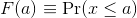
This is called the cumulative distribution function (CDF). When the CDF is derived from data, as opposed to theoretically, we also call it the empirical CDF (ECDF). The ECDF for the height data looks like this:
Histograms
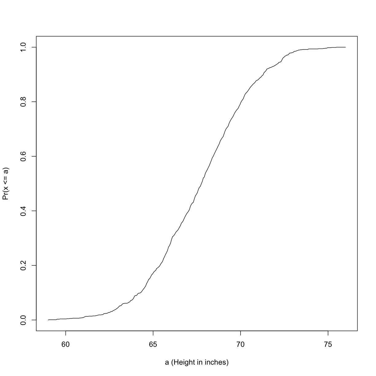
Although the empirical CDF concept is widely discussed in statistics textbooks, the plot is actually not very popular in practice. The reason is that histograms give us the same information and are easier to interpret. Histograms show us the proportion of values in intervals:
 Plotting these heights as bars is what we call a histogram. It is a more
useful plot because we are usually more interested in intervals, such and such
percent are between 70 inches and 71 inches, etc., rather than the percent less
than a particular height. Here is a histogram of heights:
Plotting these heights as bars is what we call a histogram. It is a more
useful plot because we are usually more interested in intervals, such and such
percent are between 70 inches and 71 inches, etc., rather than the percent less
than a particular height. Here is a histogram of heights:
hist(x, xlab="Height (in inches)", main="Adult men heights")
Showing this plot to the alien is much more informative than showing numbers. With this simple plot, we can approximate the number of individuals in any given interval. For example, there are about 70 individuals over six feet (72 inches) tall.
Probability Distribution
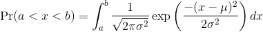
Summarizing lists of numbers is one powerful use of a distribution. An even more important use is describing the possible outcomes of a random variable. Unlike a fixed list of numbers, we don’t actually observe all possible outcomes of random variables, so instead of describing proportions, we describe probabilities. For instance, if we pick a random height from our list, then the probability of it falling between a and b is denoted with:
 Note that the X is now capitalized to distinguish it as a random variable
and that the equation above defines the probability distribution of the random
variable. Knowing this distribution is incredibly useful in science. For
example, in the case above, if we know the distribution of the difference in
mean of mouse weights when the null hypothesis is true, referred to as the
null distribution, we can compute the probability of observing a value as
large as we did, referred to as a p-value. In a previous section we ran what
is called a Monte Carlo simulation (we will provide more details on Monte
Carlo simulation in a later section) and we obtained 10,000 outcomes of the
random variable under the null hypothesis.
Note that the X is now capitalized to distinguish it as a random variable
and that the equation above defines the probability distribution of the random
variable. Knowing this distribution is incredibly useful in science. For
example, in the case above, if we know the distribution of the difference in
mean of mouse weights when the null hypothesis is true, referred to as the
null distribution, we can compute the probability of observing a value as
large as we did, referred to as a p-value. In a previous section we ran what
is called a Monte Carlo simulation (we will provide more details on Monte
Carlo simulation in a later section) and we obtained 10,000 outcomes of the
random variable under the null hypothesis.
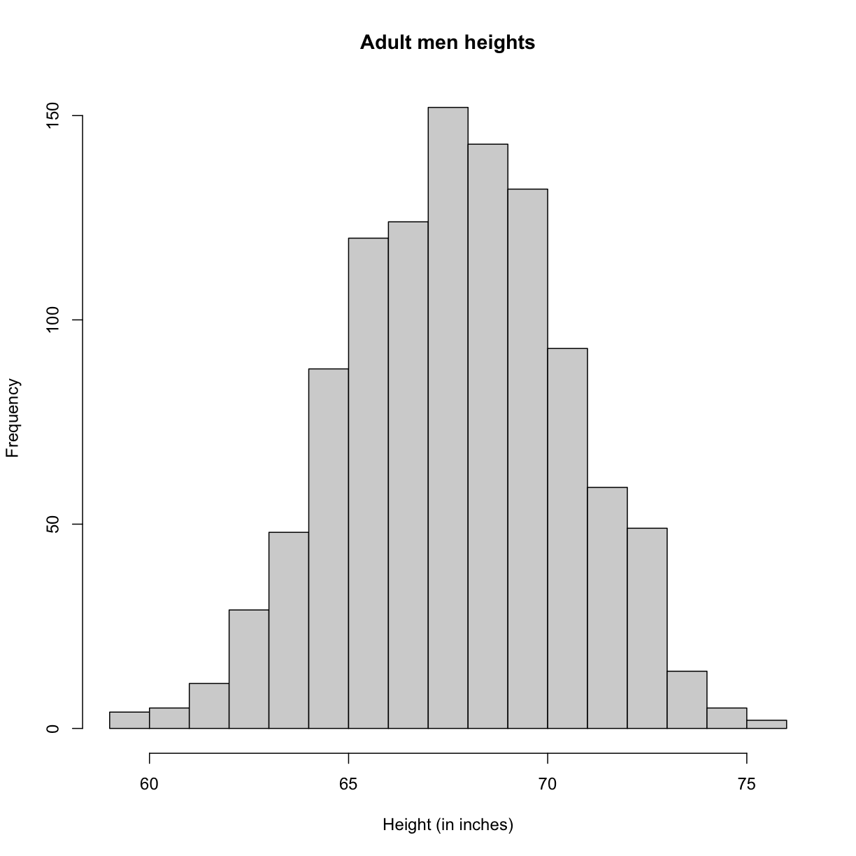
The observed values will amount to a histogram. From a histogram of the null
vector we calculated earlier, we can see that values as large as obsdiff are
relatively rare:
hist(null, freq=TRUE)
abline(v=obsdiff, col="red", lwd=2)
An important point to keep in mind here is that while we defined Pr(a) by counting cases, we will learn that, in some circumstances, mathematics gives us formulas for Pr(a) that save us the trouble of computing them as we did here. One example of this powerful approach uses the normal distribution approximation.
Normal Distribution
The probability distribution we see above approximates one that is very common in nature: the bell curve, also known as the normal distribution or Gaussian distribution. When the histogram of a list of numbers approximates the normal distribution, we can use a convenient mathematical formula to approximate the proportion of values or outcomes in any given interval:
While the formula may look intimidating, don’t worry, you will never actually
have to type it out, as it is stored in a more convenient form (as pnorm in R
which sets a to -∞, and takes b as an argument).
Here μ and σ are referred to as the mean and the standard deviation of
the population (we explain these in more detail in another section). If this
normal approximation holds for our list, then the population mean and variance
of our list can be used in the formula above. An example of this would be when
we noted above that only 1.5% of values on the null distribution were above
obsdiff. We can compute the proportion of values below a value x with
pnorm(x, mu, sigma) without knowing all the values. The normal approximation
works very well here:
1 - pnorm(obsdiff, mean(null), sd(null))
[1] 0.01311009
Later, we will learn that there is a mathematical explanation for this. A very useful characteristic of this approximation is that one only needs to know μ and σ to describe the entire distribution. From this, we can compute the proportion of values in any interval.
Refer to the histogram of null values above. The code we just ran represents
everything to the right of the vertical red line, or 1 minus everything to the
left. Try running this code without the 1 - to understand this better.
pnorm(obsdiff, mean(null), sd(null))
[1] 0.9868899
This value represents everything to the left of the vertical red line in the null histogram above.
Summary
So computing a p-value for the difference in diet for the mice was pretty easy, right? But why are we not done? To make the calculation, we did the equivalent of buying all the mice available from The Jackson Laboratory and performing our experiment repeatedly to define the null distribution. Yet this is not something we can do in practice. Statistical Inference is the mathematical theory that permits you to approximate this with only the data from your sample, i.e. the original 24 mice. We will focus on this in the following sections.
Setting the random seed
Before we continue, we briefly explain the following important line of code:
set.seed(1)
Throughout this lesson, we use random number generators. This implies that many of the results presented can actually change by chance, including the correct answer to problems. One way to ensure that results do not change is by setting R’s random number generation seed. For more on the topic please read the help file:
?set.seed
Even better is to review an example. R has a built-in vector of characters
called LETTERS that contains upper case letters of the Roman alphabet. We can
take a sample of 5 letters with the following code, which when repeated will
give a different set of 5 letters each times.
LETTERS
 [1] "A" "B" "C" "D" "E" "F" "G" "H" "I" "J" "K" "L" "M" "N" "O" "P" "Q" "R" "S"
[20] "T" "U" "V" "W" "X" "Y" "Z"
sample(LETTERS, 5)
[1] "Y" "D" "G" "A" "B"
sample(LETTERS, 5)
[1] "W" "K" "N" "R" "S"
sample(LETTERS, 5)
[1] "A" "U" "Y" "J" "V"
If we set a seed, we will get the same sample of letters each time.
set.seed(1)
sample(LETTERS, 5)
[1] "Y" "D" "G" "A" "B"
set.seed(1)
sample(LETTERS, 5)
[1] "Y" "D" "G" "A" "B"
set.seed(1)
sample(LETTERS, 5)
[1] "Y" "D" "G" "A" "B"
When we set a seed we ensure that we get the same results from random number
generation, which is used in sampling with sample.
For the following exercises, we will be using the female controls population
dataset that we read into a variable called population. Here population
represents the weights for the entire population of female mice. To remind
ourselves about this data set, run the following:
str(population)
'data.frame':	225 obs. of  1 variable:
 $ Bodyweight: num  27 24.8 27 28.1 23.6 ...
head(population)
  Bodyweight
1      27.03
2      24.80
3      27.02
4      28.07
5      23.55
6      22.72
summary(population)
   Bodyweight
 Min.   :15.51
 1st Qu.:21.51
 Median :23.54
 Mean   :23.89
 3rd Qu.:26.08
 Max.   :36.84
Exercise 1
- What is the average of these weights?
- After setting the seed at 1, (
set.seed(1)) take a random sample of size 5.
What is the absolute value (abs()) of the difference between the average of the sample and the average of all the values?- After setting the seed at 5,
set.seed(5)take a random sample of size 5. What is the absolute value of the difference between the average of the sample and the average of all the values?- Why are the answers from 2 and 3 different?
A) Because we made a coding mistake.
B) Because the average of the population weights is random.
C) Because the average of the samples is a random variable.
D) All of the above.Solution to Exercise 1
mean(population$Bodyweight)
set.seed(1)
meanOfSample1 <- mean(sample(population$Bodyweight, 5))
abs(meanOfSample1 - mean(population$Bodyweight))
set.seed(5)
meanOfSample2 <- mean(sample(population$Bodyweight, 5))
abs(meanOfSample2 - mean(population$Bodyweight))C) Because the average of the samples is a random variable.
Exercise 2
- Set the seed at 1, then using a for-loop take a random sample of 5 mice 1,000 times. Save these averages. What percent of these 1,000 averages are more than 1 gram away from the average of the population?
- We are now going to increase the number of times we redo the sample from 1,000 to 10,000. Set the seed at 1, then using a for-loop take a random sample of 5 mice 10,000 times. Save these averages. What percent of these 10,000 averages are more than 1 gram away from the average of the population?
- Note that the answers to the previous two questions barely changed. This is expected. The way we think about the random value distributions is as the distribution of the list of values obtained if we repeated the experiment an infinite number of times. On a computer, we can’t perform an infinite number of iterations so instead, for our examples, we consider 1,000 to be large enough, thus 10,000 is as well. Now if instead we change the sample size, then we change the random variable and thus its distribution.
Set the seed at 1, then using a for-loop take a random sample of 50 mice 1,000 times. Save these averages. What percent of these 1,000 averages are more than 1 gram away from the average of the population?Solution to Exercise 2
set.seed(1)
 n <- 1000
meanSampleOf5 <- vector("numeric", n)
for (i in 1:n) {
  meanSampleOf5[i] <- mean(sample(population$Bodyweight, 5)
}
 meanSampleOf5
 mean(population$Bodyweight)
 # histogram of sample means
 hist(meanSampleof5)
 # mean population weight plus one gram and minus one gram
 meanPopWeight <- mean(population$Bodyweight) # mean
 sdPopWeight <- sd(population$Bodyweight)     # standard deviation
 abline(v = meanPopWeight, col = "blue", lwd = 2)
 abline(v = meanPopWeight + 1, col = "red", lwd = 2)
 abline(v = meanPopWeight - 1, col = "red", lwd = 2)
 # proportion below mean population weight minus 1 gram
 pnorm(meanPopWeight - 1, mean = meanPopWeight, sd = sdPopWeight)
 # proportion greater than mean population weight plus 1 gram
 1 - pnorm(meanPopWeight + 1, mean = meanPopWeight, sd = sdPopWeight)
 # add the two together
 pnorm(meanPopWeight - 1, mean = meanPopWeight, sd = sdPopWeight) +
 1 - pnorm(meanPopWeight + 1, mean = meanPopWeight, sd = sdPopWeight)
set.seed(1)
 n <- 10000
meanSampleOf5 <- vector("numeric", n)
for (i in 1:n) {
  meanSampleOf5[i] <- mean(sample(population$Bodyweight, 5))
}
 meanSampleOf5
 mean(population$Bodyweight)
 # histogram of sample means
 hist(meanSampleOf5)
 # mean population weight plus one gram and minus one gram
 meanPopWeight <- mean(population$Bodyweight) # mean
 sdPopWeight <- sd(population$Bodyweight)     # standard deviation
 abline(v = meanPopWeight, col = "blue", lwd = 2)
 abline(v = meanPopWeight + 1, col = "red", lwd = 2)
 abline(v = meanPopWeight - 1, col = "red", lwd = 2)
 # proportion below mean population weight minus 1 gram
 pnorm(meanPopWeight - 1, mean = meanPopWeight, sd = sdPopWeight)
 # proportion greater than mean population weight plus 1 gram
 1 - pnorm(meanPopWeight + 1, mean = meanPopWeight, sd = sdPopWeight)
 # add the two together
 pnorm(meanPopWeight - 1, mean = meanPopWeight, sd = sdPopWeight) +
 1 - pnorm(meanPopWeight + 1, mean = meanPopWeight, sd = sdPopWeight)
set.seed(1)
 n <- 1000
meanSampleOf50 <- vector("numeric", n)
for (i in 1:n) {
  meanSampleOf50[i] <- mean(sample(population$Bodyweight, 50))
}
 meanSampleOf50
 mean(population$Bodyweight)
 # histogram of sample means
 hist(meanSampleOf50)
 # mean population weight plus one gram and minus one gram
 abline(v = meanPopWeight, col = "blue", lwd = 2)
 abline(v = meanPopWeight + 1, col = "red", lwd = 2)
 abline(v = meanPopWeight - 1, col = "red", lwd = 2)
 # proportion below mean population weight minus 1 gram
 pnorm(meanPopWeight - 1, mean = meanPopWeight, sd = sdPopWeight)
 # proportion greater than mean population weight plus 1 gram
 1 - pnorm(meanPopWeight + 1, mean = meanPopWeight, sd = sdPopWeight)
 # add the two together
 pnorm(meanPopWeight - 1, mean = meanPopWeight, sd = sdPopWeight) +
 1 - pnorm(meanPopWeight + 1, mean = meanPopWeight, sd = sdPopWeight)
Exercise 3
Use a histogram to “look” at the distribution of averages we get with a sample size of 5 and a sample size of 50. How would you say they differ?
A) They are actually the same.
B) They both look roughly normal, but with a sample size of 50 the spread is smaller.
C) They both look roughly normal, but with a sample size of 50 the spread is larger.
D) The second distribution does not look normal at all.Solution to Exercise 3
# sample size = 5
set.seed(1)
n <- 1000
res5 <- vector('double',n)
for (i in seq(n)) {
  avg_sample <- mean(sample(x,5))
  res5[[i]] <- avg_sample
}
sd(res5) # standard deviation = spread of the histogram
# sample size = 50
set.seed(1)
n <- 1000
res50 <- vector('double',n)
for (i in seq(n)) {
  avg_sample <- mean(sample(x,50))
  res50[[i]] <- avg_sample
}
sd(res50) # standard deviation = spread of the histogram
mypar(1,2) # plot histograms
hist(res5)
hist(res50)
The answer is B: They both look normal, but with a sample size of 50 the spread is smaller.
Exercise 4
For the last set of averages, the ones obtained from a sample size of 50, what percent are between 23 and 25? Now ask the same question of a normal distribution with average 23.9 and standard deviation 0.43. The answer to the previous two were very similar. This is because we can approximate the distribution of the sample average with a normal distribution. We will learn more about the reason for this next.
Solution to Exercise 4
mean((res50 >=23) & (res50 <= 25))
pnorm(25,23.9,0.43) - pnorm(23,23.9,0.43)
Key Points
Inference uses sampling to investigate population parameters such as mean and standard deviation.
A p-value describes the probability of obtaining a specific value.
A distribution summarizes a set of numbers.