Creating A Transcriptome Map
Last updated on 2025-10-07 | Edit this page
Overview
Questions
- How do I create and interpret a transcriptome map?
Objectives
- Describe a transcriptome map.
- Interpret a transcriptome map.
Local and Distant eQTL
In the previous lesson, we saw that the QTL peak for a gene can lie directly over the gene that is being mapped. This is called a local eQTL because the QTL peak is located near the gene. When the QTL peak is located far from the gene being mapped, we call this a distal eQTL. When the QTL peak is located on the same chromosome as the gene, there are different heuristics regarding the distance between the gene and its QTL peak that we use to call an eQTL local or distal. This depends on the type of cross and the resolution of the recombination block structure.
In this episode, we will create a table containing the QTL peaks for all genes and the gene positions. We will then classify QTL into local or distal and will make a plot of all off the eQTL in relation to the gene positions. First let’s load the libraries and data again in case these are no longer in your environment.
R
library(tidyverse)
library(qtl2)

pheno    = readRDS('data/attie_do_pheno.rds')
addcovar = readRDS('data/attie_do_addcovar.rds')
annot    = readRDS('data/attie_do_expr_annot.rds')
expr_rz  = readRDS('data/attie_do_expr_rz.rds')
probs    = readRDS('data/attie_DO500_genoprobs_v5.rds')
map      = readRDS('data/attie_do_map.rds')
K        = readRDS('data/attie_do_kinship.rds')
peaks    = readRDS('data/attie_do_eqtl_peaks.rds')
Transcriptome Map
We have encapsulated the code to create a transcriptome map in a file in this lesson. You can copy this file from the Github repository to use in your eQTL mapping project. We will read this file in now.
R
source("https://raw.githubusercontent.com/smcclatchy/eqtl-mapping/refs/heads/main/episodes/code/gg_transcriptome_map.R")
This file loads in a function called ggtmap, which
requires the input data to be in a specific format.
In order to use the ggtmap function, we need to provide
specific column names. These are documented in the
gg_transcriptome_map.R file in the code directory of this
workshop. The required column names are:
-
data: data.frame (or tibble) with the following columns:-
gene_id: (required) character string containing the Ensembl gene ID. -
qtl_chr: (required) character string containing QTL chromosome. -
qtl_pos: (required) floating point number containing the QTL position in Mb. -
qtl_lod: (optional) floating point number containing the LOD score. -
gene_chr: (optional) character string containing transcript chromosome. -
gene_start: (optional) character string containing transcript start position in Mb. -
gene_end: (optional) character string containing transcript end position in Mb.
-
First, we will get the gene positions from the annotation and rename
the columns to match what ggtmap requires. We need to have
columns named gene_id, gene_chr, and
gene_pos. We must rename the columns because, when we are
finished, we will have chr and pos columns for
both the gene and its QTL. We will also add the symbol
column since it is nice to have gene symbols in the data.
R
gene_pos <- annot |>
              select(gene_id, symbol,
                     gene_chr   = chr,
                     gene_start = start,
                     gene_end   = end)
Next, we will rename the columns in the filtered peaks and will join them with the gene positions from above.
R
eqtl <- peaks |>
          select(gene_id = lodcolumn,
                 qtl_chr = chr,
                 qtl_pos = pos,
                 qtl_lod = lod) |>
          left_join(gene_pos, by = "gene_id") |>
          mutate(marker.id = str_c(qtl_chr,   qtl_pos * 1e6, sep = "_"),
                 gene_chr  = factor(gene_chr, levels = c(1:19, "X")),
                 qtl_chr   = factor(qtl_chr,  levels = c(1:19, "X")))

rm(gene_pos)
Challenge 1: How many genes have QTL on the same chromosome?
Write a command to count the number of genes which are located on the same chromosome as their corresponding QTL peak.
R
sum(eqtl$qtl_chr == eqtl$gene_chr, na.rm = TRUE)
OUTPUT
[1] 1510515105 genes have QTL on the same chromosome.
We can tabulate the number of local and distal eQTL that we have and add this to our QTL summary table. A local eQTL occurs when the QTL peaks is directly over the gene position. But what if it is 2 Mb away? Or 10 Mb? It’s possible that a gene may have a distal eQTL on the same chromosome if the QTL is “far enough” from the gene. In Keller et al, the authors selected a 4 Mb distance from the corresponding gene and we will use this threshold.
R
eqtl <- eqtl |>
          mutate(local = if_else(qtl_chr == gene_chr &
                                 abs(gene_start - qtl_pos) < 4,
                                     TRUE,
                                     FALSE))
count(eqtl, local)
OUTPUT
  local     n
1 FALSE 28875
2  TRUE 14066
Plot Transcriptome Map
In Keller et al, the authors used a LOD threshold of 7.2 to select genes to use in their transcriptome map. We will use this threshold to reproduce their results as closely as possible.
R
eqtl_thr = 7.2

ggtmap(data = eqtl |>
                filter(qtl_lod      >= eqtl_thr),
                       local.points = TRUE,
                       local.radius = 4)
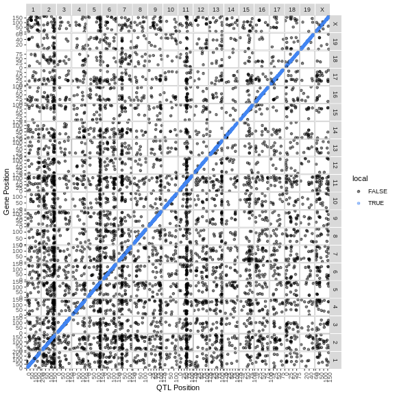
The plot above is called a transcriptome map because it shows the positions of the genes (or transcripts) and their corresponding QTL. The QTL position is shown on the X-axis and the gene position is shown on the Y-axis. The chromosomes are listed along the top and right of the plot.
Challenge 2: What are the blue points on the diagonal?
What type of QTL are the genes with QTL that are located along the diagonal?
Points on the diagonal have QTL that are located in the same position as the gene, and so are local eQTL.
Challenge 3: Are there any genome locations with many QTL?
Look at the transcriptome map and see if you can find any vertical stripes? What do these vertical stripes mean and what might cause them?
There are vertical stripes on chromosomes 2, 5, and 11. There may be more, depending on how you look at the plot. Since the QTL position is on the X-axis, these stripes represent genes which are located through out the genome, but all have a QTL in the same location.
These stripes imply that there is some genomic feature at the QTL position which regulates the expression levels of many genes. This might be a transcription factor or some other molecule which can regulate transcription, possibly through multiple steps.
If you look at the plot, there are vertical bands of points which
stack over a single QTL location. These are called eQTL
hotspots. Rather than look at the transcriptome map, it may be
easier to look at the density of the eQTL along the genome. We have
provided a function called eqtl_density_plot to do
this.
R
eqtl_density_plot(eqtl, lod_thr = eqtl_thr)
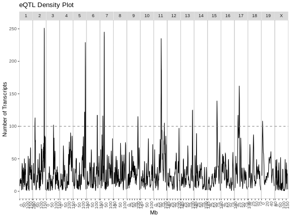
The plot above shows the mouse genome on the X-axis and the number of transcripts in a 4 Mb window on the Y-axis. It is difficult to say how many genes must be involved to call something and eQTL hotspot. There are permutation-based methods which require a large amount of time and memory. In this case, we have called hotspots involving more than 100 genes eQTL hotspots.
Note that there appears to be an eQTL hotspot on chromosome 7 in the plot above, but this is not evident in the transcriptome map.
R
eqtl_density_plot(filter(eqtl, local == FALSE),
                  lod_thr = eqtl_thr) +
  labs(title = "Distant eQTL Density")
R
eqtl_density_plot(filter(eqtl, local == TRUE),
                  lod_thr = eqtl_thr) +
  labs(title = "Local eQTL Density")
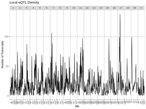
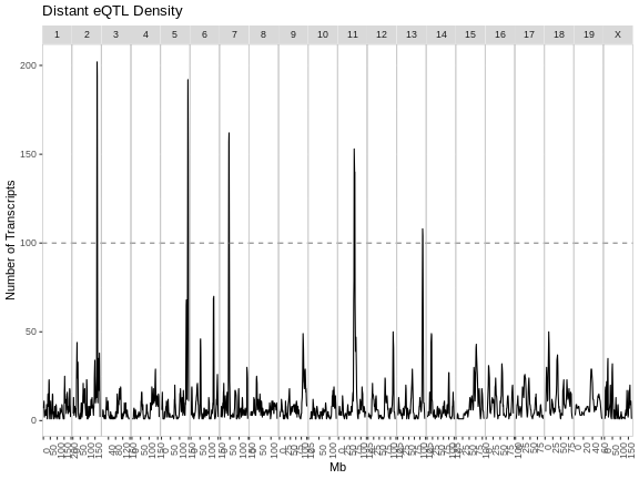
From these two plots, it appears that the eQTL hotspots on most chromosomes contain distant eQTL.
Challenge 4: Compare results to Keller et al.
Look at figure 3 in Keller et al. How do the eQTL density plots compare to their results?
The eQTL density plots are largely similar. The hotspot on chromosome 11 contains more genes in our analysis than in the paper.
How can we find the location of the eQTL hotspots and the genes which
lie within each eQTL? We have written a function called
get_eqtl_hotspots to help you and have provides it in
gg_transcriptome_map.R. It requires the eQTL data, a LOD
threshold to filter the peaks, the number of genes required to call a
locus a hotspot, and the radius in Mb around the hotspot to use when
selecting genes which are part of the hotspot. We will use a 2 MB radius
around the hotspot, but may refine that later.
R
hotspots <- get_eqtl_hotspots(data           = eqtl,
                              lod_thr        = 7,
                              hotspot_thr    = 200,
                              hotspot_radius = 2)
Let’s see how many hotspots we have and how many genes are in each hotspot.
R
sapply(hotspots, nrow)
OUTPUT
  2   5   7  11
271 257 273 268
In the table above, the first row of values are the chromosomes on which hotspots occur. The second row contains the number of genes in each hotspot.
Where does each hotspot occur? We can get this information by taking the mean of the eQTL positions in each hotspot.
R
sapply(hotspots, function(z) { mean(z$qtl_pos) })
OUTPUT
        2         5         7        11
164.00699 146.30691  45.49353  70.47718
Let’s look at some of the genes in the chromosome 2 hotspot.
R
head(hotspots[["2"]])
OUTPUT
             gene_id qtl_chr  qtl_pos   qtl_lod        symbol gene_chr
1 ENSMUSG00000082514       2 162.0824 10.816809       Gm11452        2
2 ENSMUSG00000021902       2 162.3910  7.192061          Phf7       14
3 ENSMUSG00000021285       2 162.3945  7.576862      Ppp1r13b       12
4 ENSMUSG00000094856       2 162.5281 51.759581       Gm21962        3
5 ENSMUSG00000053141       2 162.6222 79.169112         Ptprt        2
6 ENSMUSG00000087267       2 162.6222 74.916874 4933427J07Rik        2
  gene_start  gene_end   marker.id local
1   162.9079 162.90861 2_162082435  TRUE
2    31.2377  31.25122 2_162391032 FALSE
3   111.8285 111.90805 2_162394483 FALSE
4   137.6715 137.67254 2_162528109 FALSE
5   161.5220 162.66115 2_162622197  TRUE
6   128.9557 128.95786 2_162622197 FALSE
Let’s also look at the positions of the eQTL for these genes by making a histogram of the positions.
R
par(plt = c(0.1, 0.99, 0.22, 0.9))
plot(table(hotspots[["2"]]$qtl_pos),
     las    = 2,
     main   = "Positions of Chr 2 eQTL",
     xlab   = "",
     ylab   = "Number of Genes")
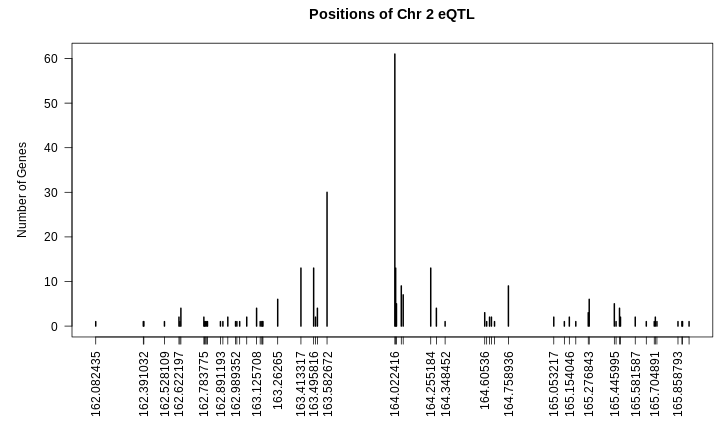
From the plot above, we can see that many genes have eQTL which stack up around 164 Mb. Are the other genes part of the same regulatory network?
Let’s look at the correlation of all of these genes with each other. First, we will get the genes from the expression data.
R
expr_2 <- expr_rz[,hotspots[["2"]]$gene_id]
Next, we will get the correlation of the genes with each other an make a heatmap.
R
cor_2 <- cor(expr_2)
heatmap(cor_2, symm = TRUE, main = "Correlation of Chr2 Hotspot Genes")
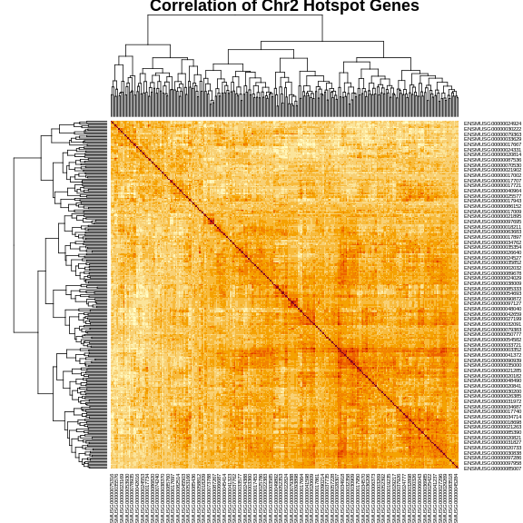
The plot above shows a clustered heatmap in which red indicates positive correlation and yellow indicates negative correlation.There are “dendrograms” on the top and left, indicating the sort order.
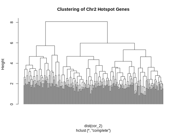
We can split the genes into clusters by telling R how many clusters we want. It will use the dendrogram to select a split which gives the requested number of clusters. We are arbitrarily selecting three clusters.
R
cl     <- hclust(dist(cor_2))
plot(cl, labels = FALSE, hang = -1, main = "Clustering of Chr2 Hotspot Genes")
R
cl_cut <- cutree(tree = cl, k = 3)
Let’s look at the number of genes and the median eQTL position of these clusters.
R
cl_spl <- split(cl_cut, cl_cut)
for(subcl in cl_spl) {

  cl_annot <- filter(hotspots[["2"]], gene_id %in% names(subcl))
  cl_expr  <- expr_2[,names(subcl)]

  print(paste(nrow(cl_annot), median(cl_annot$qtl_pos)))

} # for(i)
OUTPUT
[1] "72 164.0704045"
[1] "94 164.022416"
[1] "105 164.022416"
R
rm(cl_spl)
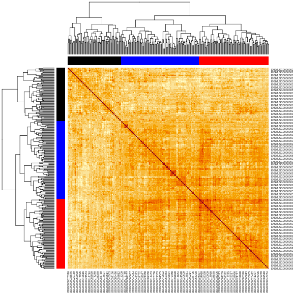
Next, let’s make the heatmap again and place the cluster colors on the axes.
R
cols <- c('black', 'red', 'blue', 'orange')[cl_cut]
heatmap(cor_2, symm = TRUE, RowSideColors = cols, ColSideColors = cols)
In this case, we will filter the chromosome 2 hotspot to only include the genes with an eQTL between 163.5 and 164.5 Mb.
R
hot_2 <- hotspots[["2"]] |>
           filter(abs(qtl_pos - 164) < 0.5)
How many genes are there in the chromosome 2 hotspot now?
R
nrow(hot_2)
OUTPUT
[1] 149Principal Component of eQTL Hotspot Genes
One way to summarize the expression of genes in an eQTL hotspot is to take the first principal component (PC1) of all of the genes in the hotspot. PC1 should capture the largest amount of variance in the eQTL hotspot and we can use this as a phenotype to map the hotspot.
R
expr_2 <- expr_rz[,hot_2$gene_id]
pca_2  <- princomp(expr_2)
pc1_2  <- pca_2$scores[,1,drop = FALSE]
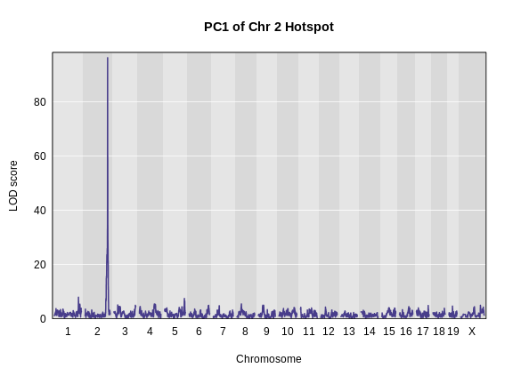
We can then map PC1 as a phenotype and we should have a large QTL peak in the same location as the hotspot.
R
pc1_lod <- scan1(genoprobs = probs,
                 pheno     = pc1_2,
                 kinship   = K,
                 addcovar  = addcovar)

plot_scan1(pc1_lod, map, main = "PC1 of Chr 2 Hotspot")
We can also look at the founder allele effects at the peak. We will
use a function in gg_transcriptome_map.R called
plot_fit1().
R
peaks <- find_peaks(pc1_lod, map, threshold = 20)
pr    <- pull_genoprobpos(genoprobs = probs,
                          map       = map,
                          chr       = peaks$chr[1],
                          pos       = peaks$pos[1])
mod   <- fit1(genoprobs = pr,
              pheno     = pc1_2,
              kinship   = K[[peaks$chr[1]]],
              addcovar  = addcovar)

plot_fit1(mod) +
  labs(title = "Chr 2 Hotspot Allele Effects",
       x     = "Founder",
       y     = "Founder Allele Effects") +
  theme(text = element_text(size = 20))
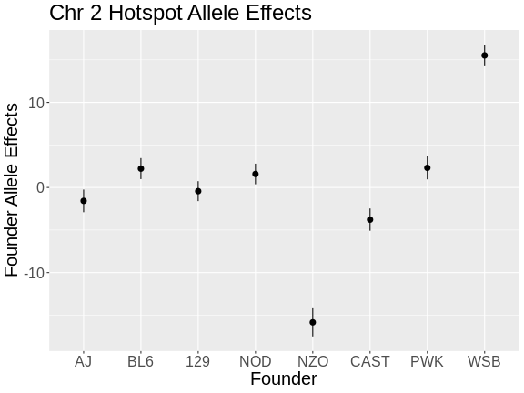
From the plot above, we can see that NZO and WSB have allele effects which are different from the other strains. The direction of the allele effects is arbitrary in the principal components, so we can’t determine the direction of the allele effects from this plot.
- Transcriptome maps aid in understanding gene expression regulation.
- Local eQTL occur more frequently than distant eQTL.
- Local eQTL appear along the diagonal in a transcriptome map and distant eQTL appear on the off-diagonal.
- Stacks of eQTL which appear over a single locus are called eQTL hotspots and represent sets of genes which are transcriptionally regulated by a single locus.
- The first principal component of genes in and eQTL hotspot can be used to summarize the genes in the hotspot.
