Mapping A Single Gene Expression Trait
Last updated on 2025-10-07 | Edit this page
Overview
Questions
- What are the steps in QTL mapping?
- How do I map one gene expression trait?
Objectives
- Review the steps in QTL mapping.
- Run a QTL analysis for expression data.
Expression Data
In this lesson we review mapping steps and apply those steps to a gene expression trait. In a previous lesson, we loaded in the raw transcript expression data and noticed that the distribution of each gene was non-Gaussian and different.
There is another issue that we must also address. Each sample has a different total number of counts. This affects our ability to compare values between samples. For example, say that we look at the expression of Gene1 in two samples and find that both samples have 500 counts for Gene1. It appears that Gene1 is equally expressed in both samples. However, suppose that the total counts (i.e. the sum of counts for all genes in each sample) is 10 million for sample 1 and 20 million for sample 2. The sum of all counts across all genes in a sample is also called the library size. Then we need to scale the counts for Gene1 by the total counts. This is shown in the table below.
| Sample | Gene1 Counts | Total Counts | Proportion |
|---|---|---|---|
| 1 | 500 | 10e6 | 5e-05 |
| 2 | 500 | 20e6 | 2.5e-05 |
In this case, we can see that Gene1 has lower expression in sample 2 compared to sample 1. Although the actual adjustment for library size (i.e. total counts) is more complicated, this is the rationale for adjusting each sample.
Let’s plot a histogram of the total counts in each sample.
R
libsize <- rowSums(raw) * 1e-6
hist(libsize,
     breaks = 50,
     main   = "Histogram of Total Counts per Sample (raw counts)",
     xlab   = "Total Counts (Millions)")
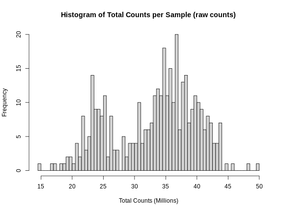
As you can see, total counts range from 15 to 50 million reads. The distribution of counts seems to be bimodal as well, which is troubling. This may be due to a batch effect.
Perhaps we should plot total counts versus the batch information that we have in the covariates. Recall that there are 500 mice in the covariate data. The mouse IDs are in the rownames of the raw expression data, but not all 500 mice have expression data.
R
sum(covar$mouse %in% rownames(raw))
OUTPUT
[1] 378Let’s subset the covariates to include only those with expression data.
R
expr_covar <- subset(covar, mouse %in% rownames(raw))
expr_covar <- expr_covar[match(rownames(raw), expr_covar$mouse),]
expr_covar$DOwave <- factor(expr_covar$DOwave)
Now we can plot the library size by batch.
R
boxplot(libsize ~ expr_covar$DOwave,
        las = 1,
        main = "Library Size by Batch",
        xlab = "Library Size (millions)",
        ylab = "Batch")
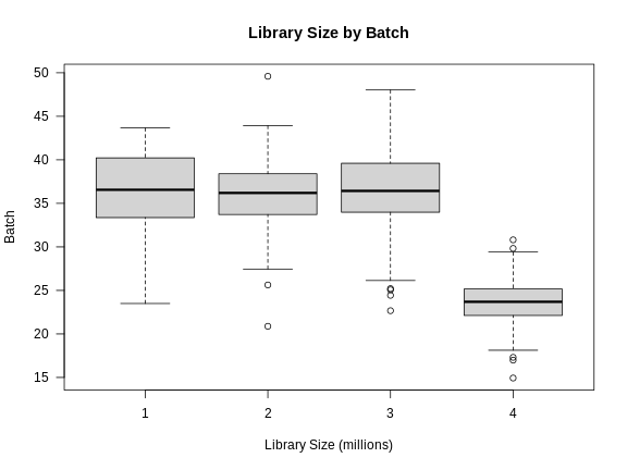
There is definitely a difference in library size by batch.
Another way to look at batch effects is to plot the first and second principal components of the expression data and to color them by batch.
R
counts  <- log1p(t(raw))
counts  <- scale(counts)
pca_raw <- princomp(counts)
Let’s plot the first two PCs and color the samples by batch.
R
plot(pca_raw$loadings,
     pch = 16, col = expr_covar$DOwave,
     main = "PCA of Raw counts")
legend("topleft", pch = 16, cex = 1.5, legend = levels(expr_covar$DOwave),
       col = 1:4)
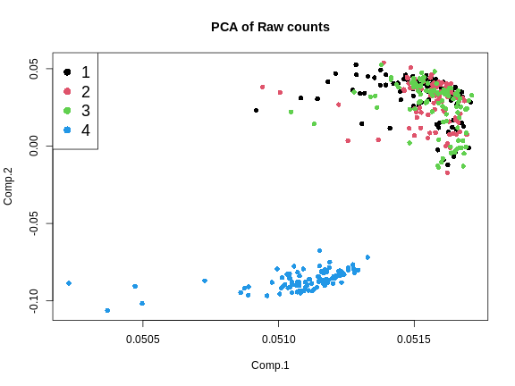
From the plot above, we can see that the first three batches cluster together and the fourth batch is quite different.
Batch Adjustment
We will use a tool called ComBat-Seq to adjust for the batch differences.
ComBat-Seq requires the counts matrix, the experimental variables of interest, and the batch structure.
First, we will make the sex covariate.
R
covar_mod <- model.matrix(~sex, data = expr_covar)[,-1,drop = FALSE]
Next, we will run ComBat.
R
expr_cbt <- ComBat_seq(counts    = t(raw),
                       batch     = expr_covar$DOwave,
                       covar_mod = covar_mod)
OUTPUT
Found 4 batches
Using null model in ComBat-seq.
Adjusting for 1 covariate(s) or covariate level(s)
Estimating dispersions
Fitting the GLM model
Shrinkage off - using GLM estimates for parameters
Adjusting the data
expr_cbt now contains batch-adjusted counts. Let’s plot
the first two PCs of the batch-adjusted data.
R
counts  <- log1p(expr_cbt)
counts  <- scale(counts)
pca_cbt <- princomp(counts)
R
plot(pca_cbt$loadings,
     pch = 16, col = expr_covar$DOwave,
     main = "PCA of Batch-Adjusted counts")
legend("topleft", pch = 16, cex = 1.5, legend = levels(expr_covar$DOwave),
       col = 1:4)
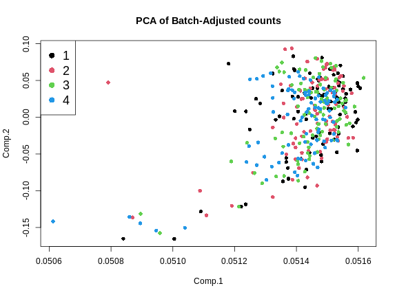
This looks much better because the four batches now largely overlap. We will move forward with the Combat-adjusted counts.
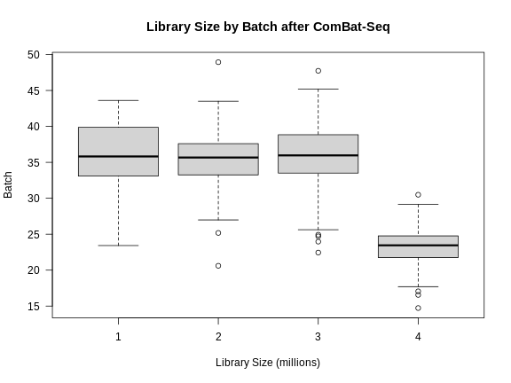
Note that the differences in library size have not changed greatly.
R
libsize2 <- colSums(expr_cbt) * 1e-6
boxplot(libsize2 ~ expr_covar$DOwave,
        las = 1,
        main = "Library Size by Batch after ComBat-Seq",
        xlab = "Library Size (millions)",
        ylab = "Batch")
Normalizing Gene Expression
After batch-adjustment, we need to normalize the gene expression by adjusting for differences in library sizes between samples and for the difference in variances between genes.
We will use the DESeq2 package to adjust the counts for library size. DESeq2 is a large package which performs many types of analyses. Further details are in the DESeq2 Tutorial.
First, we must create a DESeq object. We need the raw counts, rounded so that all values are integers, and the sample covariate data. We will have to subset the sample covariates to include only the expression samples, since we don’t have expression data for every mouse.
In order to create the DESeq2 object, we will need to transpose
(using t()) the expression data so that the mouse IDs
(samples) are moved to the columns. This is because DESeq2 requires that
the samples be in columns and the genes in rows. We will also tell
DESeq2 what the design variables are for our data, although they are not
used in this case. These would be used if we were searching for
differentially expressed genes. We specify no design with
design = ~ 1.
R
dds  = DESeqDataSetFromMatrix(countData = round(expr_cbt),
                              colData   = expr_covar,
                              design    = ~ 1)
OUTPUT
converting counts to integer modeThe object dds contains the counts for all mice that
have expression data. Genes are in rows and samples are in columns.
R
dds
OUTPUT
class: DESeqDataSet
dim: 21771 378
metadata(1): version
assays(1): counts
rownames(21771): ENSMUSG00000000001 ENSMUSG00000000028 ...
  ENSMUSG00000099322 ENSMUSG00000099329
rowData names(0):
colnames(378): DO021 DO022 ... DO417 DO420
colData names(4): mouse sex DOwave diet_days
R
dim(dds)
OUTPUT
[1] 21771 378This is a complex data object. Let’s look at the counts for the first gene in the first 5 samples.
R
dds@assays@data$counts[1, 1:5]
OUTPUT
DO021 DO022 DO023 DO024 DO025
 9012 10608 11309 11205 10018
Now look at the counts for the first five genes in sample 1.
R
dds@assays@data$counts[1:5, 1]
OUTPUT
ENSMUSG00000000001 ENSMUSG00000000028 ENSMUSG00000000037 ENSMUSG00000000049
              9012                 96                 24                 11
ENSMUSG00000000056
               136
Next, we will run DESeq2 and let it adjust the expression data for differing library sizes.
R
dds = DESeq(dds)
OUTPUT
estimating size factorsOUTPUT
estimating dispersionsOUTPUT
gene-wise dispersion estimatesOUTPUT
mean-dispersion relationshipOUTPUT
final dispersion estimatesOUTPUT
fitting model and testingOUTPUT
-- replacing outliers and refitting for 137 genes
-- DESeq argument 'minReplicatesForReplace' = 7
-- original counts are preserved in counts(dds)
OUTPUT
estimating dispersionsOUTPUT
fitting model and testingOnce this is done, we will get the expression data after it has been transformed using the Variance Stabilizing Transformation (VST). The VST adjusts the variance of the genes such that it is not related to the mean gene expression level.
First, let’s look at the mean expression of each gene versus its standard deviation.
R
tibble(mean = rowMeans(expr_cbt),
       sd   = apply(expr_cbt, 1, sd)) |>
  ggplot(aes(mean, sd)) +
    geom_point() +
    scale_x_log10() +
    scale_y_log10() +
    labs(title = "Mean vs SD of expression values",
         x     = "log(Mean)", y = "log(Std. Dev.)") +
    theme(text = element_text(size = 20))
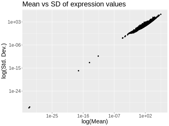
The plot above shows the mean expression value for each gene versus the standard deviation of each gene. Both axes are log-transformed. As you can see, there is a positive correlation between the mean and the standard deviation. We would like each gene to have the same variance, regardless of the mean, for each gene.
Next, we will apply the variance stabilizing transformation and will transpose the expression values.
R
expr = assays(vst(dds))[[1]]
expr = t(expr)
Let’s look at the mean versus the standard deviation of each gene after normalization.
R
tibble(mean = colMeans(expr),
       sd   = apply(expr, 2, sd)) |>
  ggplot(aes(mean, sd)) +
    geom_point() +
    scale_x_log10() +
    scale_y_log10() +
    labs(title = "Mean vs SD of expression after VST",
         x     = "log(Mean)", y = "log(Std. Dev.)") +
    theme(text = element_text(size = 20))
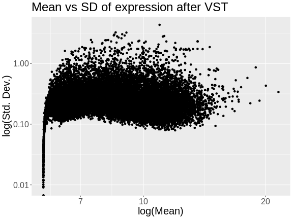
The standard deviation is now largely unrelated to the mean. At lower expression levels, the standard deviation is somewhat related to the mean.
Let’s look at a the distribution of total counts per sample after normalization.
R
hist(rowSums(expr) * 1e-6,
      breaks = 50,
      main   = "Total Expression per Sample (after normalization)",
      xlab   = "Total Counts (Millions)")
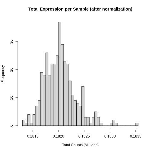
Note that we no longer see a bimodal distribution, which indicates that the batch effects have largely been adjusted.
At this point, while each gene has been normalized, each gene has a different distribution. In QTL mapping, we often use permutations to estimate significance thresholds. This approach works for one phenotype. However, if other phenotypes have different distributions, then the significance threshold for one phenotype cannot be used for another. This means that we would have to perform 1,000 permutations for each gene. While modern computing clusters can do this, it is time consuming.
Another approach is to force the distribution of each gene to be identical. Then, we can perform permutations on one gene and get a significance threshold for all genes.
We can force the distribution of each gene to be Gaussian and identical for all genes using an inverse-normal or rank-Z transformation.
R
source("https://raw.githubusercontent.com/smcclatchy/eqtl-mapping/refs/heads/main/episodes/code/rankz.R")

expr_rz = apply(expr, 2, rankZ)
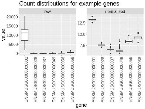
Boxplots of raw counts for six example genes are shown at left below. Notice that the median count values (horizontal black bar in each boxplot) are not comparable between the genes because the counts are not on the same scale. At right, boxplots for the same genes show normalized count data on the same scale.
R
tmp = raw |>
        as.data.frame() |>
        select(ENSMUSG00000000001:ENSMUSG00000000058) |>
        pivot_longer(cols      = everything(),
                     names_to  = 'gene',
                     values_to = 'value') |>
        mutate(type = 'raw')

norm = expr |>
         as.data.frame() |>
         select(ENSMUSG00000000001:ENSMUSG00000000058) |>
         pivot_longer(cols      = everything(),
                      names_to  = 'gene',
                      values_to = 'value') |>
         mutate(type = 'normalized')

bind_rows(tmp, norm) |>
  mutate(type = factor(type, levels = c('raw', 'normalized'))) |>
  ggplot(aes(gene, value)) +
    geom_boxplot() +
    facet_wrap(~type, scales = 'free') +
    labs(title = 'Count distributions for example genes') +
    theme(text = element_text(size = 20),
          axis.text.x = element_text(angle = 90, hjust = 0.5, vjust = 1))
R
rm(tmp, norm)
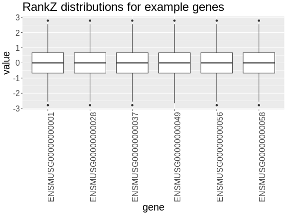
In the rankZ-transformed data, every gene has the same distribution.
R
expr_rz |>
  as.data.frame() |>
  select(ENSMUSG00000000001:ENSMUSG00000000058) |>
  pivot_longer(cols      = everything(),
               names_to  = 'gene',
               values_to = 'value') |>
  ggplot(aes(gene, value)) +
    geom_boxplot() +
    labs(title = 'RankZ distributions for example genes') +
    theme(text = element_text(size = 20),
          axis.text.x = element_text(angle = 90, hjust = 0.5, vjust = 1))
Let’s save the rankZ-transformed expression data so that we will have it when we need it again.
R
saveRDS(expr_rz, file = "data/attie_do_expr_rz.rds")
Before moving on, let’s remove data objects that we won’t be using again.
R
rm(dds, raw, expr)
To recap, before we perform any analysis using the transcript expression data, we need to:
- adjust for batch differences,
- normalize it by adjusting for library size and,
- transform the expression of each gene to be Gaussian.
The Marker Map
The marker map contains a list of the genetic marker positions for each marker in the genoprobs. Let’s read it in now.
R
map <- readRDS(file = 'data/attie_do_map.rds')
The marker map for each chromosome is stored in the map
object. This is used to plot the LOD scores calculated at each marker
during QTL mapping. Each list element is a numeric vector with each
marker position in megabases (Mb). Here we are using the 69K grid marker
file. Often when there are numerous genotype arrays used in a study, we
interpolate all to a 69k grid file so we are able to combine all samples
across different array types.
Look at the structure of map in the Environment tab by
clicking the triangle to the left or by running str(map) in
the Console.
R
str(map)
OUTPUT
List of 20
 $ 1 : Named num [1:4711] 3 3.04 3.35 3.65 3.66 ...
  ..- attr(*, "names")= chr [1:4711] "1_3e+06" "1_3041392" "1_3346528" "1_3651663" ...
 $ 2 : Named num [1:4709] 3 3.04 3.08 3.51 3.51 ...
  ..- attr(*, "names")= chr [1:4709] "2_3e+06" "2_3038312" "2_3076624" "2_3510793" ...
 $ 3 : Named num [1:3811] 3 3.48 3.95 4.43 4.91 ...
  ..- attr(*, "names")= chr [1:3811] "3_3e+06" "3_3476607" "3_3953213" "3_4429820" ...
 $ 4 : Named num [1:3872] 3 3.04 3.08 3.12 3.16 ...
  ..- attr(*, "names")= chr [1:3872] "4_3e+06" "4_3039973" "4_3079946" "4_3119919" ...
 $ 5 : Named num [1:3837] 3 3.04 3.33 3.34 3.35 ...
  ..- attr(*, "names")= chr [1:3837] "5_3e+06" "5_3039177" "5_3333513" "5_3343035" ...
 $ 6 : Named num [1:3653] 3 3.04 3.41 3.77 4.14 ...
  ..- attr(*, "names")= chr [1:3653] "6_3e+06" "6_3040509" "6_3407400" "6_3774290" ...
 $ 7 : Named num [1:4006] 3 3.04 3.07 3.18 3.23 ...
  ..- attr(*, "names")= chr [1:4006] "7_3e+06" "7_3035905" "7_3071810" "7_3183355" ...
 $ 8 : Named num [1:3387] 3 3.04 3.08 3.4 3.41 ...
  ..- attr(*, "names")= chr [1:3387] "8_3e+06" "8_3037619" "8_3075238" "8_3402939" ...
 $ 9 : Named num [1:3414] 3 3.04 3.07 3.52 3.97 ...
  ..- attr(*, "names")= chr [1:3414] "9_3e+06" "9_3035823" "9_3071646" "9_3522909" ...
 $ 10: Named num [1:3450] 3 3.04 3.07 3.11 3.15 ...
  ..- attr(*, "names")= chr [1:3450] "10_3e+06" "10_3037150" "10_3074301" "10_3111451" ...
 $ 11: Named num [1:3796] 3 3.03 3.06 3.09 3.13 ...
  ..- attr(*, "names")= chr [1:3796] "11_3e+06" "11_3031502" "11_3063005" "11_3094507" ...
 $ 12: Named num [1:3124] 3 3.04 3.08 3.44 3.8 ...
  ..- attr(*, "names")= chr [1:3124] "12_3e+06" "12_3038001" "12_3076003" "12_3437198" ...
 $ 13: Named num [1:3229] 3 3.4 3.79 3.8 3.81 ...
  ..- attr(*, "names")= chr [1:3229] "13_3e+06" "13_3396518" "13_3793036" "13_3803732" ...
 $ 14: Named num [1:3019] 3 3.04 3.08 3.12 3.16 ...
  ..- attr(*, "names")= chr [1:3019] "14_3e+06" "14_3040840" "14_3081681" "14_3122521" ...
 $ 15: Named num [1:2761] 3 3.04 3.07 3.11 3.58 ...
  ..- attr(*, "names")= chr [1:2761] "15_3e+06" "15_3036880" "15_3073761" "15_3110641" ...
 $ 16: Named num [1:2688] 3 3.04 3.07 3.11 3.14 ...
  ..- attr(*, "names")= chr [1:2688] "16_3e+06" "16_3035541" "16_3071083" "16_3106624" ...
 $ 17: Named num [1:2873] 3 3.03 3.06 3.38 3.69 ...
  ..- attr(*, "names")= chr [1:2873] "17_3e+06" "17_3032196" "17_3064392" "17_3375528" ...
 $ 18: Named num [1:2588] 3 3.42 3.83 4.25 4.26 ...
  ..- attr(*, "names")= chr [1:2588] "18_3e+06" "18_3416510" "18_3833020" "18_4249530" ...
 $ 19: Named num [1:2434] 3 3.02 3.05 3.07 3.1 ...
  ..- attr(*, "names")= chr [1:2434] "19_3e+06" "19_3024080" "19_3048159" "19_3072239" ...
 $ X : Named num [1:3643] 3 3.05 3.09 3.14 3.19 ...
  ..- attr(*, "names")= chr [1:3643] "X_3e+06" "X_3046778" "X_3093557" "X_3140335" ...
Each element in map contains a list of marker positions and names.
R
head(map[[1]])
OUTPUT
  1_3e+06 1_3041392 1_3346528 1_3651663 1_3657931 1_3664199
 3.000000  3.041392  3.346528  3.651663  3.657931  3.664199
The names of the markers consist of the chromosome and the bp position, separated by an underscore (_).
The marker positions in the map must be in Mb.
Genotype probabilities
Previously, we loaded in the physiological phenotypes, the sample covariates, and the transcript expression data and annotation. We also normalized and rankZ transformed the expression data.
In order to perform QTL mapping, we also need the genotype probabilities (i.e genoprobs). In this lesson, we have already processed the genotypes and produced the genoprobs using calc_genoprob.
R
probs <- readRDS("data/attie_DO500_genoprobs_v5.rds")
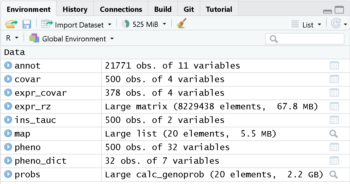
At this point, you should have several data objects in your environment. Look at the Environment tab to see what data objects are in your environment. It should look like the figure below.
 Each element of
probs is a 3-dimensional array containing the founder
allele dosages for each sample at each marker on one chromosome. These
are the 8 state allele probabilities (not 32) using the 69k marker grid
for the same 500 DO mice that also have clinical phenotypes. We have
already calculated genotype probabilities for you, so you can skip the
step for calculating
genotype probabilities and the optional step for calculating allele
probabilities.
Challenge 1: What is a genotype probability? Why do we need genotype probabilities in QTL mapping?
A genotype probability is the probability of possible genotypes in between typed markers. We use genotype probabilities in QTL mapping to identify QTL in between typed markers.
Next, we look at the dimensions of probs for chromosome
1:
R
dim(probs[[1]])
OUTPUT
[1] 500 8 4711Each list element of the genoprobs has 500 samples, eight founders, and a variable number of markers, depending on the chromosome.
As a reminder, this is what the genoprobs of one mouse look like along one chromosome.
R
plot_genoprob(probs, map, ind = 1, chr = 1)
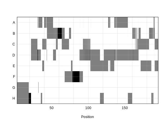
In the plot above, the founder contributions, which range between 0 and 1, are colored from white (= 0) to black (= 1.0). A value of ~0.5 is grey. The markers are on the X-axis and the eight founders (denoted by the letters A through H) on the Y-axis. Starting at the left, we see that this sample has genotype GH because the rows for G and H are grey, indicating values of 0.5 for both alleles. Moving along the genome to the right, the genotype becomes HH where the row is black indicating a value of 1.0. This is followed by CD, DD, DG, AD, AH, CE, etc. The values at each marker sum to 1.0.
Kinship Matrix
We also use a kinship matrix in the mapping model to adjust for the relatedness between mice. We also use a different kinship matrix on each chromosome by including all of the markers except the ones on the current chromosome. This is called the “Leave-One-Chromosome-Out” (LOCO) method. We use the genoprobs to create the kinship matrices in the calc_kinship function.
R
K <- calc_kinship(probs = probs,
                  type = 'loco')
Challenge 2: Why do we calculate kinship? What purpose does it serve?
Calculating kinship between individuals in a study corrects for known relatedness and unknown population structure. Without accounting for kinship, many false positives can occur due to genetic relatedness.
And let’s save the kinship matrices so that we don’t have to build them again.
R
saveRDS(K, file = "data/attie_do_kinship.rds")
Let’s look at a part of one of the kinship matrices.
R
n_samples <- 50
heatmap(K[[1]][1:n_samples, 1:n_samples], main = "Kinship Between Mice")
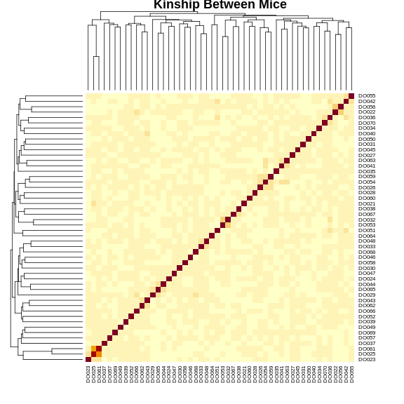
The figure above shows kinship between all pairs of samples. Light yellow indicates low kinship and dark red indicates higher kinship. Orange values indicate varying levels of kinship between 0 and 1. The dark red diagonal of the matrix indicates that each sample is identical to itself. The orange blocks along the diagonal may indicate close relatives (i.e. siblings or cousins).
Covariates
Next, we need to create additive covariates that will be used in the
mapping model. First, we need to see which covariates are significant.
In the data set, we have sex, DOwave
(i.e., batch) of DO mice) and diet_days (number of
days on diet) to test whether there are any sex, batch or diet
effects.
Challenge 3: Why do we use covariates in the model? What purpose do they serve?
Covariates are added into the model to explain variation in phenotypes. When including sex in the model, for example, we allow the phenotype means of the two different sexes to vary rather than to be the same.
We will use sex and DOwave as additive
covariates. Sex and DO outbreeding generation are often sensible
covariates to add. We will convert sex and
DOwave to factors and then use model.matrix to
create the covariates matrix that qtl2 will use.
R
pheno$sex    <- factor(pheno$sex)
pheno$DOwave <- factor(pheno$DOwave)

addcovar     <- model.matrix(~sex + DOwave + diet_days, data = pheno)[,-1]
The sample IDs must be in the rownames of pheno,
addcovar, genoprobs and K.
qtl2 uses the sample IDs to align the samples between
objects.
R
head(addcovar)
OUTPUT
      sexM DOwave2 DOwave3 DOwave4 DOwave5 diet_days
DO021    0       0       0       0       0       112
DO022    0       0       0       0       0       112
DO023    0       0       0       0       0       112
DO024    0       0       0       0       0       112
DO025    0       0       0       0       0       114
DO026    0       0       0       0       0       114
Let’s save the additive covariates so that we don’t have to create them agian.
R
saveRDS(addcovar, 'data/attie_do_addcovar.rds')
Performing a Genome Scan
We will perform a genome scan for insulin AUC, comparing the results of the untransformed and log-transformed results. Use the scan1 function to map insulin AUC.
R
ins_lod <- scan1(genoprobs = probs,
                 pheno     = ins_tauc,
                 kinship   = K,
                 addcovar  = addcovar)
After the genome scan, ins_lod contains the LOD scores
for both the untransformed and log-transformed insulin values.
R
head(ins_lod)
OUTPUT
          Ins_tAUC Ins_tAUC_log
1_3000000 5.174362     4.415858
1_3041392 5.174948     4.416144
1_3346528 5.113387     4.401578
1_3651663 4.879878     4.229782
1_3657931 4.928267     4.271351
1_3664199 4.977715     4.311565
Let’s plot both LOD curves.
R
plot_scan1(x         = ins_lod,
           map       = map,
           lodcolumn = "Ins_tAUC_log",
           main      = "insulin AUC")
plot_scan1(x         = ins_lod,
           map       = map,
           lodcolumn = "Ins_tAUC",
           col       = rgb(0.8, 0, 0, 0.5),
           lty       = "dashed",
           add       = TRUE)
legend("topleft",
       legend = c("log-transformed", "untransformed"),
       col    = c("black",           "red3"),
       lwd    = 2)
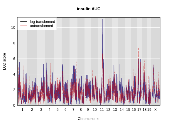
Challenge 4: Which phenotype has the higher LOD score on chromosomes 11 and 17?
The log-transformed data has a higher LOD score on chromosome 11. However, the untransformed data has a higher LOD on chromosome 17.
The challenge above shows the value of transforming data to make it
more normally distributed. We have a peak for log(ins_tauc)
on chromosome 11 which we will work with for the rest of the lesson.
Let’s save this LOD profile in case we need it again. We will only save the results from the log-transformed data since that produces a higher LOD at a peak that we will use later.
R
saveRDS(ins_lod[, 2, drop = FALSE], file = "data/ns_tauc_lod.rds")
Because we are working with the insulin AUC phenotype, which has a QTL peak on chromosome 11, we will map a gene on chromosome 11 which may influence insulin and glucose levels. This gene is called Hnf1b. Since the expression data uses Ensembl IDs in its column names, we need to find the Ensembl ID for this gene:
R
ensid <- annot |>
           subset(symbol == "Hnf1b") |>
           pull(gene_id)
ensid
OUTPUT
[1] "ENSMUSG00000020679"Next, we will create a variable which contains the rankZ-transformed Hnf1b expression values to reduce our typing.
R
hnf1b = expr_rz[, ensid, drop = FALSE]
Remember to use the drop = FALSE argument so that R will
not convert the expression data from a matrix to a vector.
R
hnf1b_lod = scan1(genoprobs = probs,
                  pheno     = hnf1b,
                  kinship   = K,
                  addcovar  = addcovar)
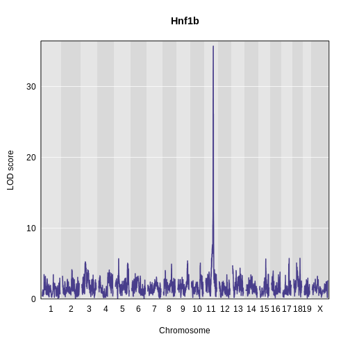
Challenge 5: Plot Hnf1b Genome Scan
Use the plot_scan1 function to plot the Hnf1b genome scan.
R
plot_scan1(x    = hnf1b_lod,
           map  = map,
           main = "Hnf1b")
Permutations
We now have a peaks on chromosome 11 for both insulin AUC and Hnf1b, but we do not know if the LODs are significant. In order to assess significance, we will use permutations.
Don’t run the permutation block below. It will take hours to complete. We have pre-computed the permutations and have code for you to load them in below.
R
iperm <- scan1perm(genoprobs = probs,
                   pheno     = ins_tauc[,2, drop = FALSE],
                   addcovar  = addcovar,
                   n_perm    = 1000)
Since calculating permutations takes a long time, we will read in pre-computed permutations.
R
iperm <- readRDS(file = 'data/ins_tauc_log_perm_1000.rds')
We then obtain the permutation thresholds using the summary function. Let’s find the significance level for 0.1, 0.05 and 0.01.
R
thr_ins <- summary(object = iperm,
                   alpha  = c(0.1, 0.05, 0.01))
thr_ins
OUTPUT
LOD thresholds (1000 permutations)
     Ins_tAUC_log
0.1          7.06
0.05         7.42
0.01         8.34
We also need to perform permutations of the Hnf1b values since they have a different distribution than insulin AUC.
Don’t run the permutation block below. It will take hours to complete. We have pre-computed the permutations and have code for you to load them in below.
R
eperm <- scan1perm(genoprobs = probs,
                   pheno     = expr_rz[, ensid, drop = FALSE],
                   addcovar  = addcovar,
                   n_perm    = 1000)
We will read in the pre-computed permutations.
R
eperm <- readRDS(file = str_c("data/", ensid, "_perm_1000.rds"))
Next, we will get the significance thresholds at the alpha = 0.1, 0.05, and 0.01 levels.
R
thr_hnf1b <- summary(eperm,
                     alpha = c(0.1, 0.05, 0.01))
thr_hnf1b
OUTPUT
LOD thresholds (1000 permutations)
     ENSMUSG00000020679
0.1                7.08
0.05               7.47
0.01               8.35
Challenge 6: What does permutation do to the data? How do permutations aid in finding significant LOD scores?
Permutations shuffle the data, breaking the relationship between genotype and phenotype. Genome-wide maximum LOD scores are calculated with the permuted (shuffled) data to determine how high a LOD score could occur by random chance. This LOD score indicates the significance of LOD scores in a scan, indicating which values might occur simply by random chance.
Finding Significant Peaks
Let’s use find_peaks to identify the significant peaks
in the insulin AUC genome scan. We will use the 0.05 significance
threshold.
R
peaks_ins <- find_peaks(scan1_output = ins_lod,
                        map          = map,
                        threshold    = thr_ins[2],
                        prob         = 0.95)
peaks_ins |>
  dplyr::select(-lodindex) |>
  arrange(chr, pos) |>
  kable(caption = "insulin AUC QTL Peaks")
| lodcolumn | chr | pos | lod | ci_lo | ci_hi |
|---|---|---|---|---|---|
| Ins_tAUC_log | 11 | 83.59467 | 11.07456 | 83.58167 | 84.95444 |
We can see that we have a peak for insulin AUC on chromosome 11 at 83.594665 Mb.
Challenge 7: Significant Peaks for Hnf1b
Use the find_peaks
function to find the significant peaks for Hnf1b at the
alpha = 0.05 threshold. Make a note of the QTL support
interval.
R
hnf1b_peaks <- find_peaks(scan1_output = hnf1b_lod,
                          map          = map,
                          threshold    = thr_hnf1b[2],
                          prob         = 0.95)

hnf1b_peaks |>
  dplyr::select(-lodindex) |>
  arrange(chr, pos) |>
  kable(caption = "Hnf1b QTL Peaks")
| lodcolumn | chr | pos | lod | ci_lo | ci_hi |
|---|---|---|---|---|---|
| ENSMUSG00000020679 | 11 | 84.40138 | 35.70779 | 83.59197 | 84.40138 |
Challenge 8: Genomic Position of Hnf1b
Find the position of the Hnf1b gene in the gene annotation. You may
want to use the filter or subset functions on
the annot object.
Where is Hnf1b in relation to the QTL interval in Challenge 3?
R
hnf1b_pos <- filter(annot, symbol == "Hnf1b")
hnf1b_pos
OUTPUT
                              gene_id symbol chr    start      end strand
ENSMUSG00000020679 ENSMUSG00000020679  Hnf1b  11 83.85006 83.90592      1
                     middle nearest.marker.id        biotype       module
ENSMUSG00000020679 83.87799       11_84097611 protein_coding midnightblue
                   hotspot
ENSMUSG00000020679    <NA>
The support interval ranges from 83.591972 to 84.401384 Mb. Hnf1b is located on chromosome 11 at 83.850063 Mb, which is within the support interval.
In the challenges above, we saw that Hnf1b has a QTL peak directly over the gene’s genomic position. When this happens, we call is a local eQTL because the QTL is co-located with the gene. We will revisit this phenomenon more in later episodes.
Estimating Founder Allele Effects
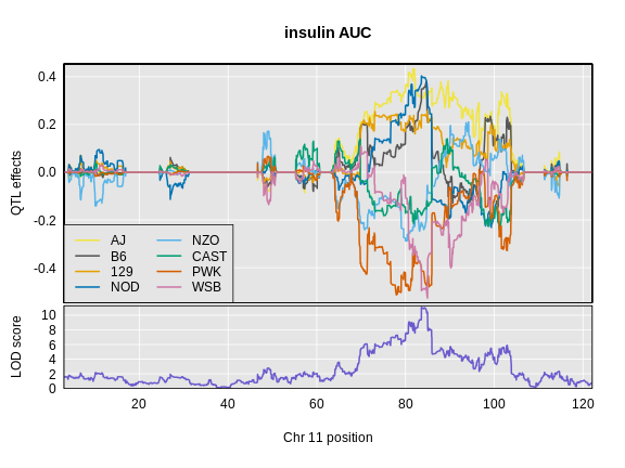
Let’s look at the QTL effects for insulin AUC on chromosome 11.
Below is the code that you would use. It will take too long to run in this class, so we will read the results in below.
R
chr      <- peaks_ins$chr[1]
ins_blup <- scan1blup(genoprobs = probs[,chr],
                      pheno     = ins_tauc[,2,drop = FALSE],
                      kinship   = K[[chr]],
                      addcovar  = addcovar)
Read in the insulin AUC founder allele effects.
R
ins_blup <- readRDS(file = 'data/ins_tauc_blup_chr11.rds')
Next, we will plot the founder allele effects.
R
plot_coefCC(x      = ins_blup,
            map    = map,
            legend = "bottomleft",
            scan1_output = ins_lod[, 2, drop = FALSE],
            main   = "insulin AUC")
Next we will estimate the founder allele effects for Hnf1b.
Below is the code that you would use. It will take too long to run in this class, so we will read the results in below.
R
chr        <- hnf1b_peaks$chr[1]
hnf1b_blup <- scan1blup(genoprobs = probs[,chr],
                      pheno       = hnf1b,
                      kinship     = K[[chr]],
                      addcovar    = addcovar)
Read in the Hnf1b founder allele effects.
R
hnf1b_blup <- readRDS(file = 'data/hnf1b_blup_chr11.rds')
Next, we will plot the founder allele effects.
R
plot_coefCC(x      = hnf1b_blup,
            map    = map,
            legend = "bottomleft",
            scan1_output = hnf1b_lod,
            main   = "Hnf1b")
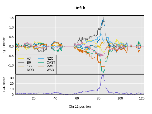
Challenge 9: Compare Founder Allele Effects
Compare at the pattern of founder allele effects at the QTL position for insulin tAUC and Hnf1b.
In the insulin AUC allele effects, the A/J, C57BL/6J, 129S1/SvmJ, and NOD/ShiLtJ alleles contribute to higher insulin AUC.
- Gene expression values must be normalized to account for the library size of each sample.
- After normalization, gene expression values can be rankZ transformed to make the distribution of every gene the same.
