Normalization in Spatial Transcriptomics
Last updated on 2025-10-07 | Edit this page
Overview
Questions
- What technical and biological factors impact spatial transcriptomics data?
- How do these factors motivate the need for normalization?
- What are popular normalization methods?
- How do we assess the impact of normalization?
Objectives
- Understand and learn to apply popular normalization techniques, such as CPM normalization, log normalization, and SCTransform.
- Diagnose the impact of normalization.
Understanding Normalization in Spatial Transcriptomics
As with scRNA-seq data, normalization is necessary to overcome two technical artifacts in spatial transcriptomics:
- the difference in total counts across spots, and
- the dependence of a gene’s expression variance on its expression level.
The number of total counts in a spot is termed its library size. Since library sizes differ across spots, it will be difficult to compare gene expression values between them in a meaningful way because the denominator (total spot counts) is different in each spot. On the other hand, different spots may contain different types of cells, which may express differing numbers of transcripts. So there is a balance between normalizing all spots to have the same total counts and leaving some variation in total counts which may be due to the biology of the tissue. In general, we want to be cautious that removing the above technical artifacts may also obscure true biological differences.
Regarding the second artifact, we will see below that the variance in a gene’s expression scales with its expression. If we do not correct for this effect, differentially expressed genes will be skewed towards the high end of the expression spectrum. Hence, we seek to stabilize the variance – i.e., transform the data such that expression variance is independent of mean expression.
In this lesson we will:
- Observe that total spots per spot are variable
- Explore biological factors that contribute to that variability
- See that gene expression variance is correlated with mean expression
- Apply three methods aimed at mitigating one or both of these technical observations: counts per million (CPM) normalization, log normalization, and Seurat’s SCTransform
Total Counts per Spot are Variable
Let’s first assess the variability in the total counts per spot.
The spots are arranged in columns in the data matrix. We will look at the distribution of total counts per spot by summing the counts in each column and making a histogram.
R
# Extract the raw counts (gene by spot matrix) from the Seurat object
counts <- LayerData(filter_st, layer = 'counts')

# Plot a histogram of the total counts (library size or sum across genes).
# Note that this column sum is also encoded in the nCount_Spatial metadata
# variable. We could have simply made a histogram of that variable.
hist(colSums2(counts), breaks = 100,
     main = "Histogram of Counts per Spot")
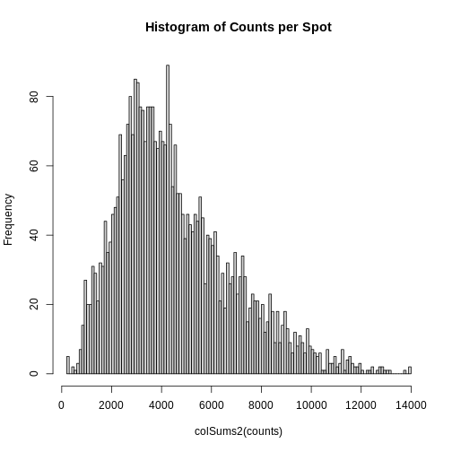
As you can see, the total counts per spot ranges cross four orders of magnitude. Some of this may be due to the biology of the tissue, i.e. some cells may express more transcripts. But some of this may be due to technical issues. Let’s explore each of these two considerations further.
Sources of Biological Variation in Total Counts
Hematoxylin and Eosin (H&E) staining is routinely performed on tissue sections in the clinic for diagnosis. Hematoxylin stains nuclei purple or blue and eosin stains cytoplasm and extracellular matrix pink. Collectively, they elucidate tissue and cellular morphology, which can guide interpretation of transcriptomic data. For example, observing high RNA counts in a necrotic region, which should instead have fewer cells, might suggest technical artifacts and, thus, indicate a need for normalization.
Maynard and colleagues used the information encoded in the H&E, in particular cellular organization, morphology, and density, in conjunction with expression data to annotate the six layers and the white matter of the neocortex. Additionally, they applied standard image processing techniques to the H&E image to segment and count nuclei under each spot. They provide this as metadata. Let’s load that layer annotation and cell count metadata and add it to our Seurat object.
R
# Load the metadata provided by Maynard et al.
spot_metadata <- read.table("./data/spot-meta.tsv", sep="\t")

# Subset the metadata (across all samples) to our sample
spot_metadata <- subset(spot_metadata, sample_name == 151673)

# Format the metadata by setting rowname to the barcode (id) of each spot,
# by ensuring that each spot in our data is represented in the metadata,
# and by ordering the spots within the metadata consistently with the data.
rownames(spot_metadata) <- spot_metadata$barcode
stopifnot(all(Cells(filter_st) %in% rownames(spot_metadata)))
spot_metadata <- spot_metadata[Cells(filter_st),]

# Add the layer annotation (layer_guess) and cell count as
# metadata to the Seurat object using AddMetaData.
filter_st <- AddMetaData(object = filter_st,
                         metadata = spot_metadata[, c("layer_guess", "cell_count"), drop=FALSE])
Now, we can plot the layer annotations to understand the structure of
the tissue. We will use a simple wrapper,
SpatialDimPlotColorSafe, around the Seurat function
SpatialDimPlot. This is defined in
code/spatial_utils.R and uses a color-blind safe
palette.
R
# Plot the layer annotations on the tissue, omitting any spots
# that do not have annotations (*i.e.*, having NA values)
SpatialDimPlotColorSafe(filter_st[, !is.na(filter_st[[]]$layer_guess)],
                        "layer_guess") + labs(fill="Layer")
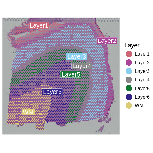
We noted that the authors used cellular density to aid in discerning layers. Let’s see how those H&E-derived cell counts vary across layers.
R
# Make a boxplot of spot-level cell counts, faceted by layer annotation.
# As above, remove any spots without annotations (*i.e.*, having NA values).
g <- ggplot(na.omit(filter_st[[]][, c("layer_guess", "cell_count")]),
            aes(x = layer_guess, y = cell_count))
g <- g + geom_boxplot() + xlab("Layer") + ylab("Cell Count")
g
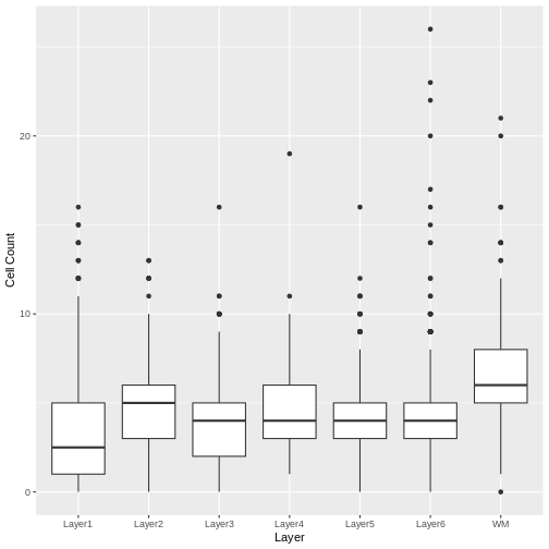
We see that the white matter (WM) has increased cells per spot, whereas Layer 1 has fewer cells per spot.
We can also plot these cell counts spatially.
R
SpatialFeaturePlot(filter_st, "cell_count")
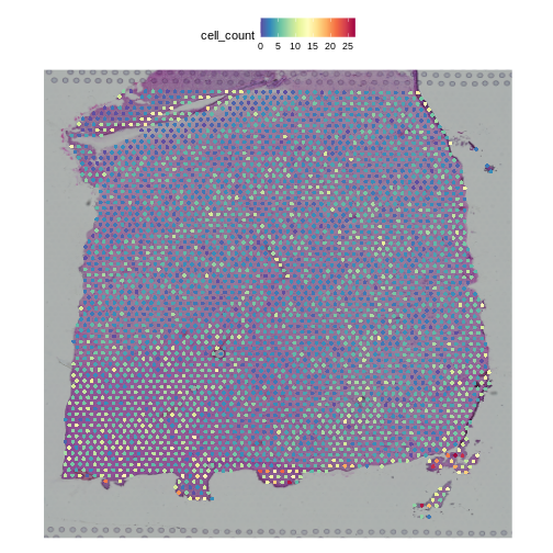
The cell counts partially reflect the banding of the layers.
As a potential surrogate for cell count, let’s plot the total counts (number of UMIs or library size) per spot as a function of layer.
R
# Make a boxplot of spot-level total read counts (library size), faceted by layer annotation.
# Remove any spots without annotations (*i.e.*, having NA values).
g <- ggplot(na.omit(filter_st[[]][, c("layer_guess", "nCount_Spatial")]),
            aes(x = layer_guess, y = nCount_Spatial))
g <- g + geom_boxplot()
g
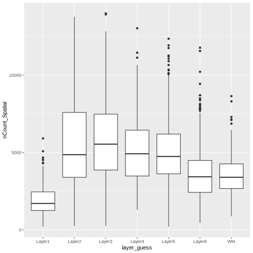
Layer 1 has fewer total read counts, consistent with its lower cell count. An increase in total read counts consistent with that in cell count is not observed for the white matter, however. Regardless, there are clear differences in total read counts across brain layers.
In summary, we have observed that both total read counts (library size) and feature counts (number of detected genes) can encode biological information. As such, we strongly recommend visualizing raw gene and features counts prior to normalization, which would remove differences in library size across spots.
Normalization Techniques to Mitigate Sources of Technical Variation in Total Counts
“Counts Per Million” Library Size Normalization
The first technical issue we noted above was a difference in total counts or library size across spots. A straightfoward means of addressing this is simply to divide all gene counts within the spot by the total counts in that spot. Conventionally, we then multiply by a million, which yields “counts per million” (CPM). Adopting this particular factor consistently establishes a standard scale across studies.
You should be aware, however, that the CPM approach is susceptible to “compositional bias” – if a small number of genes make a large contribution to the total count, any significant fluctuation in their expression across samples will impact the quantification of all other genes. To overcome this, more robust measures of library size that are more resilient to compositional bias are sometimes used, including the 75th percentile of counts within a sample (or here, spot). For simplicity, here we will use CPM.
In Seurat, we can apply this transformation via the
NormalizeData function, parameterized by the relative
counts (or “RC”) normalization method. We scale the results to a million
cells through the scale.factor parameter.
R
# Apply CPM normalization using NormalizeData, by specifying the relative
# counts (RC) normalization.method and a scale factor of one million.
cpm_st <- NormalizeData(filter_st,
                        assay                = "Spatial",
                        normalization.method = "RC",
                        scale.factor         = 1e6)
NormalizeData adds a data object to the
Seurat object.
R
# Access the layers of the Seurat object
Layers(cpm_st)
OUTPUT
[1] "counts" "data" We can confirm that we have indeed normalized away differences in total counts – all spots now have one million reads:
R
# Examine the total counts in each spot, as the sum of the columns.
# As above, we could have also used nCount_Spatial in the metadata.
head(colSums(LayerData(cpm_st, "data")))
OUTPUT
AAACAAGTATCTCCCA-1 AAACAATCTACTAGCA-1 AAACACCAATAACTGC-1 AAACAGAGCGACTCCT-1
             1e+06              1e+06              1e+06              1e+06
AAACAGCTTTCAGAAG-1 AAACAGGGTCTATATT-1
             1e+06              1e+06
Our second concern was that variance might differ across genes in an expression dependent manner. To diagnose this, we will make a so-called mean-variance plot, with each gene’s mean expression across spots on the x axis and its variance across spots on the y axis. This shows any potential trends between each gene’s mean expression and the variance of that expression.
R
# Extract the CPM data computed above
cpms      <- LayerData(cpm_st, "data")

# Calculate the mean and variance of the CPMs
means     <- apply(cpms, 1, mean)
vars      <- apply(cpms, 1, var)

# Assemble the mean and variance into a data.frame
gene.info <- data.frame(mean = means, variance = vars)

# Plot the mean expression on the x axis and the variance in expression on
# the y axis
g <- ggplot() + geom_point(data = gene.info, aes(x = mean, y = variance))
# Log transform both axes
g <- g + scale_x_continuous(trans='log2') + scale_y_continuous(trans='log2')
g <- g + xlab("Log Mean Expression") + ylab("Log Mean Variance")
g
WARNING
Warning in scale_x_continuous(trans = "log2"): log-2 transformation introduced
infinite values.
WARNING
Warning in scale_y_continuous(trans = "log2"): log-2 transformation introduced
infinite values.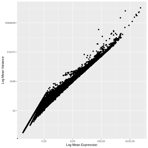
There is a clear relationship between the mean and variance of gene expression. Our goal was instead that the variance be independent of the mean. One way of achieving this is to detrend the data by fitting a smooth curve to the mean-variance plot. This fit will capture the general behavior of most genes. And, since we expect most genes to exhibit technical variability only and not biological variability additionally, this trend will reflect technical variance. Let’s start by characterizing the trend in the data by fitting them with a smooth line. We will use LOESS (locally estimated scatterplot smoothing) regression, an approach originally developed to fit a smooth line through data points in a scatterplot.
R
# This is the default LOESS span used by Seurat in FindVariableFeatures
loess.span <- 0.3

# Exclude genes with constant variance from our fit.
not.const  <- gene.info$variance > 0

# Fit a LOESS trend line relating the (log10) gene expression variance
# to the (log10) gene expression mean, but only for the non-constant
# variance genes.
fit <- loess(formula = log10(x = variance) ~ log10(x = mean),
             data = gene.info[not.const, ], span = loess.span)
Let’s now plot the fitted/expected variances as a function of the observed means.
R
# The expected variance computed from the model are in fit$fitted.
# Exponentiate because the original model was fit to log10-transformed means and variances.
gene.info$variance.expected               <- NA
gene.info[not.const, "variance.expected"] <- 10^fit$fitted

# Plot the expected variance as a function of the observed means for only
# the non-constant variance genes.
g <- g + geom_line(data = na.omit(gene.info[not.const,]),
                   aes(x = mean, y = variance.expected), linewidth = 3, color = "blue")
g
WARNING
Warning in scale_x_continuous(trans = "log2"): log-2 transformation introduced
infinite values.
WARNING
Warning in scale_y_continuous(trans = "log2"): log-2 transformation introduced
infinite values.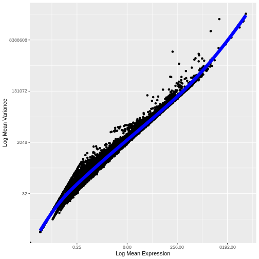
We see that the trend line nicely fits the data – i.e., it characterizes the observed variance as a function of the mean for the vast majority of genes.
We now follow the logic applied in Seurat, as described by Hafemeister and Satija. We define the “standardized variance” as the variance in the expression values after those expression values have been standardized by the trend line (i.e., they have been mean centered and divided by the predicted variance).
As we did above, we can use a mean-variance plot to diagnose whether our transformation, here the standardized variance, has indeed stabilized the variance across different mean expression ranges. In particular, since we expect most genes to have only technical (and not also biological) variance, the trend line should be dominated by those genes and will capture the technical variance. As such, the standardized variance should be near one for most genes – those with only technical variance. Genes with additional biological variance will deviate from the trend line and also from the near-one standardized variance. Is this what we observe?
R
gene.info$variance.standardized <- NA

# Compute standardized CPM = ( CPM - mean_CPM ) / sqrt(expected_variance)
standardized.cpms <-
   (cpms[not.const,] - means[not.const]) / sqrt(gene.info[not.const, "variance.expected"])

# Calculate the "standardized variance" -- *i.e.*, the variance of the standardized CPMs
gene.info[not.const, "variance.standardized"] <- apply(standardized.cpms, 1, var)

# Plot the standardized variance for the non-constant variance genes
g <- ggplot() + geom_point(data = gene.info[not.const,], aes(x = mean, y = variance.standardized))
g <- g + geom_hline(yintercept = 1, colour = "yellow")
# Log10-transform the x axis
g <- g + scale_x_log10()
g <- g + xlab("Log Mean CPM") + ylab("Variance of\nTrend-Standardized CPMs")
g
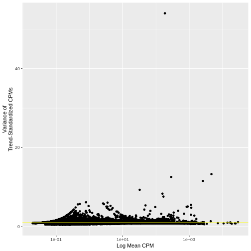
Indeed, many genes do have a variance near one.
Seurat provides more efficient means for calculating expression
means, variances, variances predicted from the trend, and the variance
of means standardized by the predicted variances, namely FindVariableFeatures.
The computed results can then be formatted into a data frame using HVFInfo.
Be advised that these functions can calculate expected variances using
models that are dependent on input parameters and, sometimes implicitly,
based on different data formats (e.g., raw counts or normalized
expression values). In this case, the values we computed above
manually:
R
head(gene.info)
OUTPUT
                  mean    variance variance.expected variance.standardized
MIR1302-2HG 0.04896898    8.711791          7.998485             1.0891801
AL627309.1  0.71174425  141.672131        212.427026             0.6669214
AL669831.5  5.45042760 1452.565233       1698.941124             0.8549827
FAM87B      0.09675030   34.007136         21.967802             1.5480446
LINC00115   0.81579878  188.767639        245.068894             0.7702636
FAM41C      1.36714334  338.634811        418.031204             0.8100707
are the same, with few exceptions, to those computed by the equivalent Seurat functions:
R
# Compute expression means and variances using FindVariableFeatures.
# By passing the total number of genes as nfeatures, we force FindVariableFeatures to
# compute these metrics for all genes, not just the most variable ones.
# The metrics will be computed on the specified layer ("data") of the active assay -- here, the
# CPMs we computed above.
# Finally, we will use the "vst" (variance-stabilizing transformation) method for selecting highly
# variable genes.
cpm_st <- FindVariableFeatures(cpm_st, nfeatures = dim(cpm_st)[1], layer="data", selection.method = "vst")
cinfo <- HVFInfo(cpm_st)
head(cinfo)
OUTPUT
                  mean    variance variance.expected variance.standardized
MIR1302-2HG 0.04896898    8.711791          7.998485             1.0005751
AL627309.1  0.71174425  141.672131        212.427026             0.6669214
AL669831.5  5.45042760 1452.565233       1698.941124             0.8549827
FAM87B      0.09675030   34.007136         21.967802             1.0007014
LINC00115   0.81579878  188.767639        245.068894             0.7702636
FAM41C      1.36714334  338.634811        418.031204             0.8100707
The above code applies the “vst” or variance-stabilizing
transformation to detect highly variable genes. This is essentially the
loess fitting and standardized variance computation that we performed
above. More details are available in the FindVariableFeatures
documentation. We can verify that this FindVariableFeatures functions
gives us similar results to those we manually computed above by using VariableFeaturePlot
to plot the relationship between the mean expression and the variance of
the trend-standardized expression.
R
VariableFeaturePlot(cpm_st) + NoLegend()
WARNING
Warning in scale_x_log10(): log-10 transformation introduced infinite values.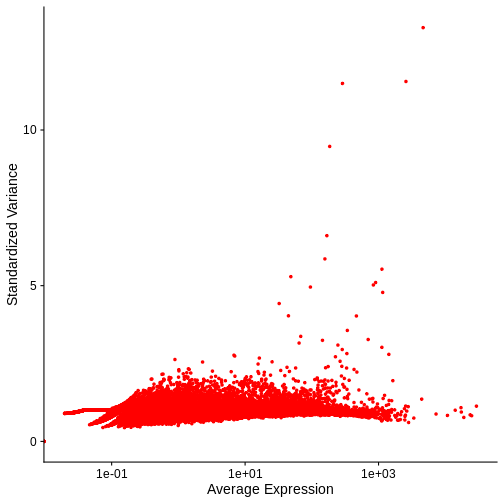
Notice that this plot is similar to that we created manually.
In both our manual plot and the one created by FindVariableFeatures/VariableFeaturePlot the “standardized” variance of most genes is near one. Achieving such a flat trend line is our objective and a good indication that we have stabilized the variance across a wide range of expression values. Yet, in both, there remains an evident, if subtle, trend in the plot between mean and variance. Let’s next look at two common transformations aimed at further stabilizing the variance across genes – i.e., for further mitigating the relationship between gene expression and variance – log-normalization and SCTransform.
LogNormalize
One common approach that attempts to meet our two objectives above – normalizing for different total spot counts and for expression-dependent variance – is log-transformation of normalized counts. The resulting values are often ambiguously referred to as log-normalized counts, which elides stating that the raw counts are first normalized or scaled and then log transformed. Scaling accounts for the differences in spot-specific RNA counts, as with CPMs above. The log transformation reduces skewness caused by highly expressed genes and stabilizes the variance, at least for certain mean-variance relationships. In practice, the log transformation is applied to 1+x, where x is the scaled expression value – the so-called log1p transformation. This avoids taking the log of zero.
In Seurat, we can apply this transformation by specifying
LogNormalize as the normalization.method
parameter to the same NormalizeData function we applied
above to compute CPMs.
R
# Apply log normalization using NormalizeData, by specifying the
# LogNormalize normalization.method and a scale factor of one million.
lognorm_st <- NormalizeData(filter_st,
                           assay                = "Spatial",
                           normalization.method = "LogNormalize",
                           scale.factor         = 1e6)
This function first normalizes the raw counts by
scale.factor before applying the log1p transformation. As
above, we set the scale.factor parameter such that we first
compute CPMs and then apply log1p to these CPMs.
As above, log normalization adds a data object to the
Seurat object.
R
# Access the layers of the Seurat object
Layers(lognorm_st)
OUTPUT
[1] "counts" "data" Let’s again plot the relationship between the expression mean and its standardized variance. Additionally, we will highlight those genes that have standardized variance significantly larger than one. These are likely to exhibit biological variation.
R
# Compute highly variable genes and their expression means and variances using FindVariableFeatures.
# Apply this to the log-transformed data, by specifying the "data" layer of the active assay.
# As above, use the vst method for computing variable genes.
lognorm_st <- FindVariableFeatures(lognorm_st, layer="data", selection.method = "vst")

# Extract the top 15 most variable genes
top15        <- head(VariableFeatures(lognorm_st, layer="data", method="vst"), 15)

# Make a mean-variance plot of the log-transformed data
plot_lognorm <- VariableFeaturePlot(lognorm_st) +
                  ggtitle("Variable Features - Log normalization")

# Add the names of the top 15 most variable genes
plot_lognorm <- LabelPoints(plot = plot_lognorm, points = top15, repel = TRUE)
plot_lognorm
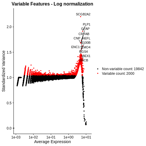
As with the standardized CPM values above, we have significantly reduced the dependence of variance in gene expression on its mean – at least at all but the highest end of the expression. By default, Seurat selects a set of 2,000 variable genes which are colored in red. Note that a majority of the highly variable genes, and all of the top 15 most variable that we labeled, are peaked in a narrow range of high expression values. We would not expect this a priori, and it signals inadequate normalization.
Putting this concern aside for a moment, let’s look at the spatial, normalized expression of the two most variable genes.
R
# Seurat's nomenclature is inconsistent. Here slot is the same as layer.
SpatialFeaturePlot(lognorm_st, slot="data", c("SCGB2A2", "PLP1"))
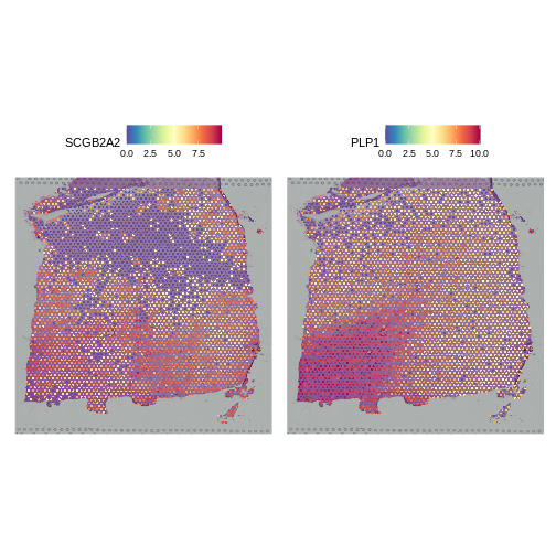
Both clearly show significant spatial variability – despite the fact that we did not explicitly query for genes whose expression varied spatially. We will look at approaches for doing that later, such as the Moran’s I statistic. PLP1 shows coherent spatial variability closely linked to brain morphology – this is a marker for the white matter. SCGB2A2 also shows strong spatial variability, though it does not appear to reflect the underlying neocortical layers. It should not surprise us that there is spatially variable gene expression beyond that caused by the (known) layered architecture of the brain. This is one such example.
As a further sanity check that the normalization is doing something sensible, let’s look at the expression of two, known layer-restricted marker genes – MOBP and PCP4. MOBP is known to be restricted to the white matter, while PCP4 is expressed in Layer 5.
R
SpatialFeaturePlot(lognorm_st, slot="data", c("MOBP", "PCP4"))
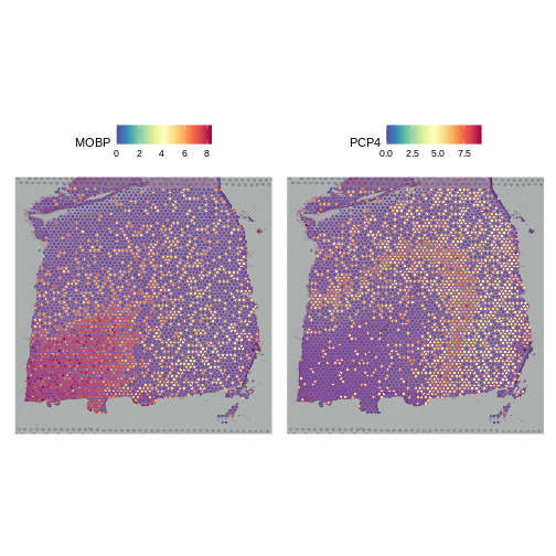
Indeed, this is what we observe.
SCTransform
Let’s see if we can improve on two aspects of the above
log-normalization: 1) the non-uniform standardized variance of highly
expressed genes and 2) the bias of highly variable genes towards highly
expressed genes. We will apply SCTransform,
a normalization approach that uses a regularized negative binomial
regression to stabilize variance across expression levels (Choudhary
et al., Genome Biol 23, 27 (2022)).
R
# Apply SCTransform to the raw count data in the Spatial assay
sct_st <- SCTransform(filter_st, assay = "Spatial")
The SCTransform method added a new assay called
SCT, as we can see below by assessing the assays of the
Seurat object:
R
# Access assays of the Seurat object
Assays(sct_st)
OUTPUT
[1] "Spatial" "SCT" It made this new assay the default. Be aware that Seurat functions
often operate on the DefaultAssay.
R
# Access the default assay of the Seurat object
DefaultAssay(sct_st)
OUTPUT
[1] "SCT"Within this new SCT Assay, SCTransform has
created three Layers to store data, not to be confused with
the neocortical layers of the brain.
R
# Assess the layers of the default assay of the Seurat object
Layers(sct_st)
OUTPUT
[1] "counts" "data" "scale.data"As you can see by reading the SCTransform documentation
with
R
?SCTransform
these new Layers are counts (counts
corrected for differences in sequencing depth between cells),
data (log1p transformation of the corrected
counts), and scale.data (scaled Pearson residuals,
i.e., the difference between an observed count and its expected
value under the model used by SCTransform, divided by the
standard deviation in that count under the model).
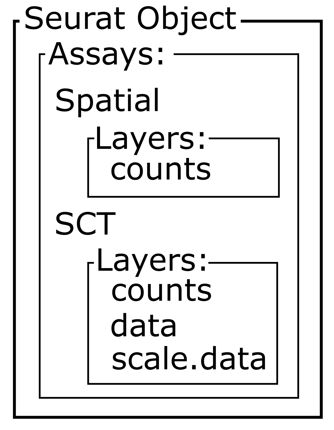
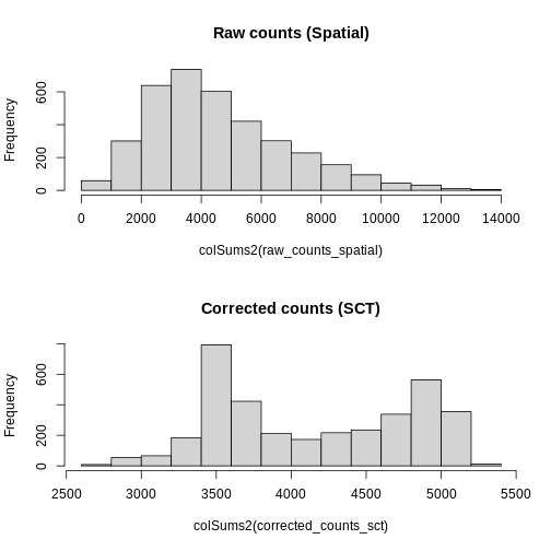
Notice, in particular, that the counts Layers in the
Spatial and SCT Assays are different. As
mentioned above, the latter have been corrected for differences in
sequencing depth between cells. As such, the distribution in total
counts per cell is much more uniform in the latter case.
R
# Create a one-column plot with two panels
layout(matrix(1:2, ncol = 1))

# Extract the raw count data from the counts layer of the Spatial assay
raw_counts_spatial <- LayerData(sct_st, layer = "counts", assay = "Spatial")
# Plot a histogram of the total counts (column sum) of the raw counts
hist(colSums2(raw_counts_spatial), main = "Raw counts (Spatial)")

# Extract the corrected counts from the data layer of the SCT assay
corrected_counts_sct <- LayerData(sct_st, layer = "counts", assay = "SCT")
# Plot a histogram of the total corrected counts (column sum)
hist(colSums2(corrected_counts_sct), main = "Corrected counts (SCT)")
Let’s plot the mean-variance relationship. Notice that SCTransform implicitly computes variable features, so we do not need to explicitly call FindVariableFeatures, as we did above.
R
# Extract the top 15 most variable genes, as computed from the SCTransformed data.
top15SCT    <- head(VariableFeatures(sct_st), 15)

# Make a mean-variance plot of the SCTransformed data.
plot_sct    <- VariableFeaturePlot(sct_st) +
                 ggtitle("Variable Features - SCT")

# Add the names of the top 15 most variable genes.
plot_sct    <- LabelPoints(plot = plot_sct, points = top15SCT, repel = TRUE)
plot_sct
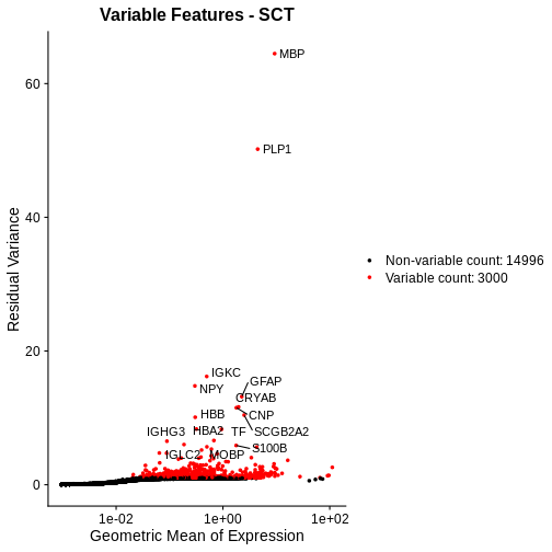
Notice that VariableFeaturePlot outputs slightly different axes, depending on the transformed data to display. In this case, for SCTransformed data, it plots the geometric mean (mean of the log counts) on the x axis and the “residual variance” on the y axis. “Residual variance” is a confusing term; it refers to the variance in the Pearson residuals, similar to the standardized variance we encountered above.
We will compare this mean-variance plot to the one derived using log-normalization below. Before we do, let’s look at the spatial expression of the two most variable genes following SCTransform. One of these, PLP1, we have already seen above.
R
# Plot the SCTransformed values (specifically, the log-transformed correct counts)
# of the genes MBP and PLP1 spatially, by accessing the "data" slot (or layer).
SpatialFeaturePlot(sct_st, slot="data", c("MBP", "PLP1"))
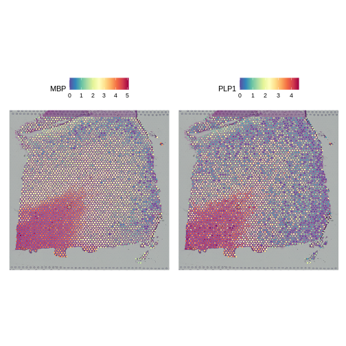
Both genes have stunning spatially variable expresion. And, here, that variability happens to reflect the underlying layered architecture of the brain. As we noted above, it needn’t have been the case that spatially variable genes are also layer restricted. That the top variable genes following SCTransform are layer restricted, whereas only one but not the other is following log normalization, should not in and of itself imply that the former transformation is “better” than the latter.
Let’s again check that the two marker genes show the appropriate layer-restricted expression following normalization with SCTransform.
R
# Plot the SCTransformed values (specifically, the log-transformed correct counts)
# of the known marker genes MOBP and PCP4 spatially, by accessing the "data" slot (or layer).
SpatialFeaturePlot(sct_st, slot="data", c("MOBP", "PCP4"))
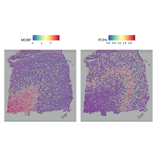
Indeed, they do. We conclude that SCTransform normalization looks reasonable.
Challenge 1: Compare Mean-Variance Plots
Above, we created mean-variance plots for the SCTransform and log normalizations. Which method does a better job of stabilizing the variance across genes? Turn to the person next to you and put the log-normalized plot on one of your screens and the SCTransform plot on the other person’s screen. Discuss the mean-variance relationship in each plot and decide which one you think stabilizes the variance across genes better.
We will compare the two plots in the next section.
Comparing Normalizations
First, let’s look at the sum of the normalized expression values per
spot for each method. Recall from above that NormalizeData
put the log-transformed values in the data layer.
Similarly, SCTransform puts the log1p transformed values of
the corrected counts in the data layer. So, we access that
layer below.
R
# Create a one-column plot with two panels
layout(matrix(1:2, ncol = 1))

# Extract the log-normalized data from the data layer of the lognorm_st Seurat object
sum_log <- LayerData(lognorm_st, layer = "data")
# Plot a histogram of the column sum of the log-normalized data
hist(colSums2(sum_log), main = "Log-norm", xlab = "Summed, Normalized Expression Values")

# Extract the SCTransformed (log-transformed corrected count) data from the data layer of the sct_st Seurat object
sum_sct <- LayerData(sct_st, layer = "data")
# Plot a histogram of the column sum of the SCTransformed (log-transformed corrected count) data
hist(colSums2(sum_sct), main = "SCT", xlab = "Summed, Normalized Expression Values")
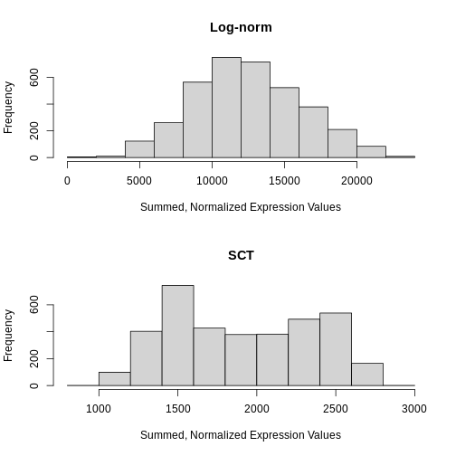
Notice that the log-normalization has a range of summed expression values per spot spanning several orders of magnitude. The SCTransform has a more uniform distribution of summed normalized expression values that spans a factor of three, from ~1000 to ~2700.
Next, we will compare the mean-variance plots between the two methods.
R
plot_lognorm

R
plot_sct
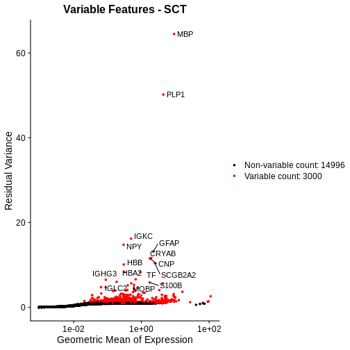
Following SCTransform, the variance is largely stable across a range of mean expression values. Certainly, we do not observe the wild ripple in the mean-variance trend at the high expression end that we saw with log-normalization. Secondly, the highly variable genes are spread across a larger region and not overly biased towards the high end of the expression spectrum.
We conclude that SCTransform is more appropriate for these data than log normalization for those two reasons:
- The variance is stable throughout the entire range of mean expression values, i.e., the standardized variance is near one throughout this range.
- The highly variable genes, i.e., those whose standardized variance deviates from one, are spread throughout the expression spectrum and not localized to highly expressed genes.
No One-Size-Fits-All Approach
Raw read counts provide essential insights into absolute cell densities within a sample. In some cases, this may reflect morphologically distinct regions and / or regions enriched for particular cell types. We advise assessing raw gene and count spatial distributions prior to normalization for this reason.
In this particular example, we found that SCTransform better ameliorated the mean-variance trend than log-normalization. We make no claim that this will hold universally across samples. Indeed, rather than advocating for one particular normalization approach, our goal was to introduce you to means of diagnosing the impact of normalization methods and of comparing them.
- Normalization is necessary to deal with technical artifacts, in particular, varying total counts (library size) across spots and the dependence of a gene’s variance on its mean expression.
- Nevertheless, raw (unnormalized) data can provide biologically meaningful insights such as region-specific differences in cell type or density that impact total reads.
- Popular methods aim to address these artifacts and include, but are not limited to, CPM normalization, log normalization, and SCTransform.
- The ability of a normalization method to stabilize expression variance across its mean (i.e., to remove the dependence of the former on the latter) can be assessed visually with a mean-variance plot.