Putting it all Together
Last updated on 2025-10-07 | Edit this page
Overview
Questions
- How do I put the whole spatial transcriptomics analysis together?
Objectives
- Understand the steps in spatial transcriptomics analysis.
- Perform a spatial transcriptomics analysis on another sample.
Introduction
Over the past day and a half, we have reviewed the steps in a spatial transcriptomics analysis. There were many steps and many lines of code. In this final lesson, you will run through the spatial transcriptomics analysis on your own with another sample.
Challenge 1: Reading in a new sample.
Look back through the lessons. What libraries and auxiliary functions did we use? Load those in now.
R
suppressPackageStartupMessages(library(tidyverse))
suppressPackageStartupMessages(library(Seurat))
suppressPackageStartupMessages(library(spacexr))

source("https://raw.githubusercontent.com/smcclatchy/spatial-transcriptomics/main/code/spatial_utils.R")
Challenge 2: Reading in a new sample.
The publication which used this data has several tissue sections. As part of the setup, you should have downloaded sample 151508. Look in the Data Preprocessing lesson and read in the filtered sample file for this sample.
R
st_obj <- Load10X_Spatial(data.dir  = "./data/151508",
                          filename  = "151508_raw_feature_bc_matrix.h5")
Challenge 3: Reading in sample metadata.
In the Data Preprocessing lesson, we showed you how to read in sample metadata and add it to the Seurat object. Find that code and add the new sample’s metadata to your Seurat object.
R
# Read in the tissue spot positions.
tissue_position <- read_csv("./data/151508/spatial/tissue_positions_list.csv",
                            col_names = FALSE, show_col_types = FALSE) %>%
                     column_to_rownames('X1')
colnames(tissue_position) <- c("in_tissue",
                               "array_row",
                               "array_col",
                               "pxl_row_in_fullres",
                               "pxl_col_in_fullres")

# Align the spot barcodes to match between the Seurat object and the new
# metadata.
tissue_position <- tissue_position[Cells(st_obj),]
stopifnot(rownames(tissue_position) == Cells(st_obj))

# Add the metadata to the Seurat object.
st_obj <- AddMetaData(object = st_obj, metadata = tissue_position)
Challenge 4: Plot the spot positions over the tissue section.
Look for the code to plot the number of counts in each spot in the Data Preprocessing lesson and adapt it to your tissue sample.
R
SpatialFeaturePlot(st_obj, features = "nCount_Spatial")
WARNING
Warning: `aes_string()` was deprecated in ggplot2 3.0.0.
ℹ Please use tidy evaluation idioms with `aes()`.
ℹ See also `vignette("ggplot2-in-packages")` for more information.
ℹ The deprecated feature was likely used in the Seurat package.
  Please report the issue at <https://github.com/satijalab/seurat/issues>.
This warning is displayed once every 8 hours.
Call `lifecycle::last_lifecycle_warnings()` to see where this warning was
generated.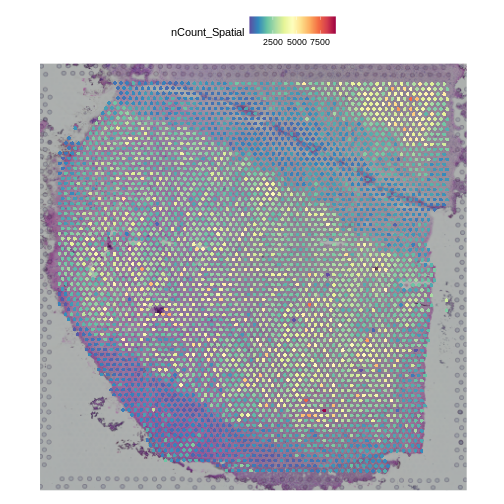
Challenge 5: Filter counts to retain expressed genes.
Look in the Data Preprocessing lesson and filter the counts in your Seurat object to retain genes which have a total sum across all samples of at least 10 counts. How many genes did you end up with?
R
# Get the counts from the Seurat object.
counts     <- LayerData(st_obj, 'counts')
# Sum total counts across all samples for each gene.
gene_sums  <- rowSums(counts)
# Select genes with total counts above our threshold.
keep_genes <- which(gene_sums > 10)
# Filter the Seurat object.
st_obj     <- st_obj[keep_genes,]
# Print out the number of genes that we retained.
print(length(keep_genes))
OUTPUT
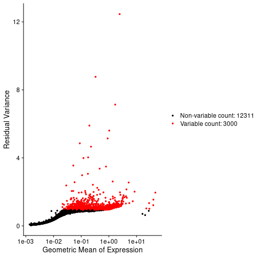
[1] 15311Challenge 6: Normalize data using SCTransform
In the Normalization lesson, we used the SCTransform to normalize the counts. Normalize the counts in your Seurat object an plot the mean expression versus the residual variance for each gene. Use the built in Seurat function to do this. How many variable genes did the method select?
R
# Perform SCTransform on the counts.
st_obj <- SCTransform(st_obj,
                      assay = "Spatial")
OUTPUT
Running SCTransform on assay: SpatialWARNING
Warning: The `slot` argument of `GetAssayData()` is deprecated as of SeuratObject 5.0.0.
ℹ Please use the `layer` argument instead.
ℹ The deprecated feature was likely used in the Seurat package.
  Please report the issue at <https://github.com/satijalab/seurat/issues>.
This warning is displayed once every 8 hours.
Call `lifecycle::last_lifecycle_warnings()` to see where this warning was
generated.
OUTPUT
vst.flavor='v2' set. Using model with fixed slope and excluding poisson genes.OUTPUT
`vst.flavor` is set to 'v2' but could not find glmGamPoi installed.
Please install the glmGamPoi package for much faster estimation.
--------------------------------------------
install.packages('BiocManager')
BiocManager::install('glmGamPoi')
--------------------------------------------
Falling back to native (slower) implementation.
OUTPUT
Calculating cell attributes from input UMI matrix: log_umiOUTPUT
Variance stabilizing transformation of count matrix of size 15311 by 4992OUTPUT
Model formula is y ~ log_umiOUTPUT
Get Negative Binomial regression parameters per geneOUTPUT
Using 2000 genes, 4992 cellsWARNING
Warning in theta.ml(Y, mu, sum(w), w, limit = control$maxit, trace =
control$trace > : iteration limit reached
WARNING
Warning in theta.ml(Y, mu, sum(w), w, limit = control$maxit, trace =
control$trace > : iteration limit reached
Warning in theta.ml(Y, mu, sum(w), w, limit = control$maxit, trace =
control$trace > : iteration limit reached
Warning in theta.ml(Y, mu, sum(w), w, limit = control$maxit, trace =
control$trace > : iteration limit reached
Warning in theta.ml(Y, mu, sum(w), w, limit = control$maxit, trace =
control$trace > : iteration limit reached
Warning in theta.ml(Y, mu, sum(w), w, limit = control$maxit, trace =
control$trace > : iteration limit reached
Warning in theta.ml(Y, mu, sum(w), w, limit = control$maxit, trace =
control$trace > : iteration limit reached
Warning in theta.ml(Y, mu, sum(w), w, limit = control$maxit, trace =
control$trace > : iteration limit reached
Warning in theta.ml(Y, mu, sum(w), w, limit = control$maxit, trace =
control$trace > : iteration limit reached
Warning in theta.ml(Y, mu, sum(w), w, limit = control$maxit, trace =
control$trace > : iteration limit reached
Warning in theta.ml(Y, mu, sum(w), w, limit = control$maxit, trace =
control$trace > : iteration limit reached
Warning in theta.ml(Y, mu, sum(w), w, limit = control$maxit, trace =
control$trace > : iteration limit reached
Warning in theta.ml(Y, mu, sum(w), w, limit = control$maxit, trace =
control$trace > : iteration limit reached
Warning in theta.ml(Y, mu, sum(w), w, limit = control$maxit, trace =
control$trace > : iteration limit reached
Warning in theta.ml(Y, mu, sum(w), w, limit = control$maxit, trace =
control$trace > : iteration limit reached
Warning in theta.ml(Y, mu, sum(w), w, limit = control$maxit, trace =
control$trace > : iteration limit reached
Warning in theta.ml(Y, mu, sum(w), w, limit = control$maxit, trace =
control$trace > : iteration limit reached
Warning in theta.ml(Y, mu, sum(w), w, limit = control$maxit, trace =
control$trace > : iteration limit reached
Warning in theta.ml(Y, mu, sum(w), w, limit = control$maxit, trace =
control$trace > : iteration limit reached
Warning in theta.ml(Y, mu, sum(w), w, limit = control$maxit, trace =
control$trace > : iteration limit reached
Warning in theta.ml(Y, mu, sum(w), w, limit = control$maxit, trace =
control$trace > : iteration limit reached
Warning in theta.ml(Y, mu, sum(w), w, limit = control$maxit, trace =
control$trace > : iteration limit reached
Warning in theta.ml(Y, mu, sum(w), w, limit = control$maxit, trace =
control$trace > : iteration limit reached
Warning in theta.ml(Y, mu, sum(w), w, limit = control$maxit, trace =
control$trace > : iteration limit reached
Warning in theta.ml(Y, mu, sum(w), w, limit = control$maxit, trace =
control$trace > : iteration limit reached
Warning in theta.ml(Y, mu, sum(w), w, limit = control$maxit, trace =
control$trace > : iteration limit reached
Warning in theta.ml(Y, mu, sum(w), w, limit = control$maxit, trace =
control$trace > : iteration limit reached
Warning in theta.ml(Y, mu, sum(w), w, limit = control$maxit, trace =
control$trace > : iteration limit reached
Warning in theta.ml(Y, mu, sum(w), w, limit = control$maxit, trace =
control$trace > : iteration limit reached
Warning in theta.ml(Y, mu, sum(w), w, limit = control$maxit, trace =
control$trace > : iteration limit reached
Warning in theta.ml(Y, mu, sum(w), w, limit = control$maxit, trace =
control$trace > : iteration limit reached
Warning in theta.ml(Y, mu, sum(w), w, limit = control$maxit, trace =
control$trace > : iteration limit reached
Warning in theta.ml(Y, mu, sum(w), w, limit = control$maxit, trace =
control$trace > : iteration limit reached
Warning in theta.ml(Y, mu, sum(w), w, limit = control$maxit, trace =
control$trace > : iteration limit reached
Warning in theta.ml(Y, mu, sum(w), w, limit = control$maxit, trace =
control$trace > : iteration limit reached
Warning in theta.ml(Y, mu, sum(w), w, limit = control$maxit, trace =
control$trace > : iteration limit reached
Warning in theta.ml(Y, mu, sum(w), w, limit = control$maxit, trace =
control$trace > : iteration limit reached
Warning in theta.ml(Y, mu, sum(w), w, limit = control$maxit, trace =
control$trace > : iteration limit reached
Warning in theta.ml(Y, mu, sum(w), w, limit = control$maxit, trace =
control$trace > : iteration limit reached
Warning in theta.ml(Y, mu, sum(w), w, limit = control$maxit, trace =
control$trace > : iteration limit reached
WARNING
Warning in glm.nb(formula = as.formula(new_formula), data = data): alternation
limit reached
WARNING
Warning in theta.ml(Y, mu, sum(w), w, limit = control$maxit, trace =
control$trace > : iteration limit reached
Warning in theta.ml(Y, mu, sum(w), w, limit = control$maxit, trace =
control$trace > : iteration limit reached
Warning in theta.ml(Y, mu, sum(w), w, limit = control$maxit, trace =
control$trace > : iteration limit reached
Warning in theta.ml(Y, mu, sum(w), w, limit = control$maxit, trace =
control$trace > : iteration limit reached
Warning in theta.ml(Y, mu, sum(w), w, limit = control$maxit, trace =
control$trace > : iteration limit reached
Warning in theta.ml(Y, mu, sum(w), w, limit = control$maxit, trace =
control$trace > : iteration limit reached
Warning in theta.ml(Y, mu, sum(w), w, limit = control$maxit, trace =
control$trace > : iteration limit reached
Warning in theta.ml(Y, mu, sum(w), w, limit = control$maxit, trace =
control$trace > : iteration limit reached
Warning in theta.ml(Y, mu, sum(w), w, limit = control$maxit, trace =
control$trace > : iteration limit reached
Warning in theta.ml(Y, mu, sum(w), w, limit = control$maxit, trace =
control$trace > : iteration limit reached
Warning in theta.ml(Y, mu, sum(w), w, limit = control$maxit, trace =
control$trace > : iteration limit reached
Warning in theta.ml(Y, mu, sum(w), w, limit = control$maxit, trace =
control$trace > : iteration limit reached
Warning in theta.ml(Y, mu, sum(w), w, limit = control$maxit, trace =
control$trace > : iteration limit reached
Warning in theta.ml(Y, mu, sum(w), w, limit = control$maxit, trace =
control$trace > : iteration limit reached
Warning in theta.ml(Y, mu, sum(w), w, limit = control$maxit, trace =
control$trace > : iteration limit reached
Warning in theta.ml(Y, mu, sum(w), w, limit = control$maxit, trace =
control$trace > : iteration limit reached
Warning in theta.ml(Y, mu, sum(w), w, limit = control$maxit, trace =
control$trace > : iteration limit reached
Warning in theta.ml(Y, mu, sum(w), w, limit = control$maxit, trace =
control$trace > : iteration limit reached
Warning in theta.ml(Y, mu, sum(w), w, limit = control$maxit, trace =
control$trace > : iteration limit reached
Warning in theta.ml(Y, mu, sum(w), w, limit = control$maxit, trace =
control$trace > : iteration limit reached
Warning in theta.ml(Y, mu, sum(w), w, limit = control$maxit, trace =
control$trace > : iteration limit reached
Warning in theta.ml(Y, mu, sum(w), w, limit = control$maxit, trace =
control$trace > : iteration limit reached
Warning in theta.ml(Y, mu, sum(w), w, limit = control$maxit, trace =
control$trace > : iteration limit reached
Warning in theta.ml(Y, mu, sum(w), w, limit = control$maxit, trace =
control$trace > : iteration limit reached
Warning in theta.ml(Y, mu, sum(w), w, limit = control$maxit, trace =
control$trace > : iteration limit reached
Warning in theta.ml(Y, mu, sum(w), w, limit = control$maxit, trace =
control$trace > : iteration limit reached
Warning in theta.ml(Y, mu, sum(w), w, limit = control$maxit, trace =
control$trace > : iteration limit reached
Warning in theta.ml(Y, mu, sum(w), w, limit = control$maxit, trace =
control$trace > : iteration limit reached
Warning in theta.ml(Y, mu, sum(w), w, limit = control$maxit, trace =
control$trace > : iteration limit reached
Warning in theta.ml(Y, mu, sum(w), w, limit = control$maxit, trace =
control$trace > : iteration limit reached
Warning in theta.ml(Y, mu, sum(w), w, limit = control$maxit, trace =
control$trace > : iteration limit reached
Warning in theta.ml(Y, mu, sum(w), w, limit = control$maxit, trace =
control$trace > : iteration limit reached
Warning in theta.ml(Y, mu, sum(w), w, limit = control$maxit, trace =
control$trace > : iteration limit reached
Warning in theta.ml(Y, mu, sum(w), w, limit = control$maxit, trace =
control$trace > : iteration limit reached
Warning in theta.ml(Y, mu, sum(w), w, limit = control$maxit, trace =
control$trace > : iteration limit reached
Warning in theta.ml(Y, mu, sum(w), w, limit = control$maxit, trace =
control$trace > : iteration limit reached
Warning in theta.ml(Y, mu, sum(w), w, limit = control$maxit, trace =
control$trace > : iteration limit reached
Warning in theta.ml(Y, mu, sum(w), w, limit = control$maxit, trace =
control$trace > : iteration limit reached
Warning in theta.ml(Y, mu, sum(w), w, limit = control$maxit, trace =
control$trace > : iteration limit reached
Warning in theta.ml(Y, mu, sum(w), w, limit = control$maxit, trace =
control$trace > : iteration limit reached
Warning in theta.ml(Y, mu, sum(w), w, limit = control$maxit, trace =
control$trace > : iteration limit reached
Warning in theta.ml(Y, mu, sum(w), w, limit = control$maxit, trace =
control$trace > : iteration limit reached
Warning in theta.ml(Y, mu, sum(w), w, limit = control$maxit, trace =
control$trace > : iteration limit reached
Warning in theta.ml(Y, mu, sum(w), w, limit = control$maxit, trace =
control$trace > : iteration limit reached
WARNING
Warning in glm.nb(formula = as.formula(new_formula), data = data): alternation
limit reached
WARNING
Warning in theta.ml(Y, mu, sum(w), w, limit = control$maxit, trace =
control$trace > : iteration limit reached
Warning in theta.ml(Y, mu, sum(w), w, limit = control$maxit, trace =
control$trace > : iteration limit reached
Warning in theta.ml(Y, mu, sum(w), w, limit = control$maxit, trace =
control$trace > : iteration limit reached
Warning in theta.ml(Y, mu, sum(w), w, limit = control$maxit, trace =
control$trace > : iteration limit reached
Warning in theta.ml(Y, mu, sum(w), w, limit = control$maxit, trace =
control$trace > : iteration limit reached
Warning in theta.ml(Y, mu, sum(w), w, limit = control$maxit, trace =
control$trace > : iteration limit reached
Warning in theta.ml(Y, mu, sum(w), w, limit = control$maxit, trace =
control$trace > : iteration limit reached
Warning in theta.ml(Y, mu, sum(w), w, limit = control$maxit, trace =
control$trace > : iteration limit reached
Warning in theta.ml(Y, mu, sum(w), w, limit = control$maxit, trace =
control$trace > : iteration limit reached
Warning in theta.ml(Y, mu, sum(w), w, limit = control$maxit, trace =
control$trace > : iteration limit reached
Warning in theta.ml(Y, mu, sum(w), w, limit = control$maxit, trace =
control$trace > : iteration limit reached
Warning in theta.ml(Y, mu, sum(w), w, limit = control$maxit, trace =
control$trace > : iteration limit reached
Warning in theta.ml(Y, mu, sum(w), w, limit = control$maxit, trace =
control$trace > : iteration limit reached
Warning in theta.ml(Y, mu, sum(w), w, limit = control$maxit, trace =
control$trace > : iteration limit reached
Warning in theta.ml(Y, mu, sum(w), w, limit = control$maxit, trace =
control$trace > : iteration limit reached
Warning in theta.ml(Y, mu, sum(w), w, limit = control$maxit, trace =
control$trace > : iteration limit reached
Warning in theta.ml(Y, mu, sum(w), w, limit = control$maxit, trace =
control$trace > : iteration limit reached
Warning in theta.ml(Y, mu, sum(w), w, limit = control$maxit, trace =
control$trace > : iteration limit reached
Warning in theta.ml(Y, mu, sum(w), w, limit = control$maxit, trace =
control$trace > : iteration limit reached
Warning in theta.ml(Y, mu, sum(w), w, limit = control$maxit, trace =
control$trace > : iteration limit reached
Warning in theta.ml(Y, mu, sum(w), w, limit = control$maxit, trace =
control$trace > : iteration limit reached
Warning in theta.ml(Y, mu, sum(w), w, limit = control$maxit, trace =
control$trace > : iteration limit reached
Warning in theta.ml(Y, mu, sum(w), w, limit = control$maxit, trace =
control$trace > : iteration limit reached
Warning in theta.ml(Y, mu, sum(w), w, limit = control$maxit, trace =
control$trace > : iteration limit reached
Warning in theta.ml(Y, mu, sum(w), w, limit = control$maxit, trace =
control$trace > : iteration limit reached
Warning in theta.ml(Y, mu, sum(w), w, limit = control$maxit, trace =
control$trace > : iteration limit reached
Warning in theta.ml(Y, mu, sum(w), w, limit = control$maxit, trace =
control$trace > : iteration limit reached
Warning in theta.ml(Y, mu, sum(w), w, limit = control$maxit, trace =
control$trace > : iteration limit reached
Warning in theta.ml(Y, mu, sum(w), w, limit = control$maxit, trace =
control$trace > : iteration limit reached
Warning in theta.ml(Y, mu, sum(w), w, limit = control$maxit, trace =
control$trace > : iteration limit reached
Warning in theta.ml(Y, mu, sum(w), w, limit = control$maxit, trace =
control$trace > : iteration limit reached
Warning in theta.ml(Y, mu, sum(w), w, limit = control$maxit, trace =
control$trace > : iteration limit reached
Warning in theta.ml(Y, mu, sum(w), w, limit = control$maxit, trace =
control$trace > : iteration limit reached
Warning in theta.ml(Y, mu, sum(w), w, limit = control$maxit, trace =
control$trace > : iteration limit reached
Warning in theta.ml(Y, mu, sum(w), w, limit = control$maxit, trace =
control$trace > : iteration limit reached
Warning in theta.ml(Y, mu, sum(w), w, limit = control$maxit, trace =
control$trace > : iteration limit reached
WARNING
Warning in glm.nb(formula = as.formula(new_formula), data = data): alternation
limit reached
WARNING
Warning in theta.ml(Y, mu, sum(w), w, limit = control$maxit, trace =
control$trace > : iteration limit reached
Warning in theta.ml(Y, mu, sum(w), w, limit = control$maxit, trace =
control$trace > : iteration limit reached
Warning in theta.ml(Y, mu, sum(w), w, limit = control$maxit, trace =
control$trace > : iteration limit reached
Warning in theta.ml(Y, mu, sum(w), w, limit = control$maxit, trace =
control$trace > : iteration limit reached
Warning in theta.ml(Y, mu, sum(w), w, limit = control$maxit, trace =
control$trace > : iteration limit reached
Warning in theta.ml(Y, mu, sum(w), w, limit = control$maxit, trace =
control$trace > : iteration limit reached
Warning in theta.ml(Y, mu, sum(w), w, limit = control$maxit, trace =
control$trace > : iteration limit reached
Warning in theta.ml(Y, mu, sum(w), w, limit = control$maxit, trace =
control$trace > : iteration limit reached
Warning in theta.ml(Y, mu, sum(w), w, limit = control$maxit, trace =
control$trace > : iteration limit reached
Warning in theta.ml(Y, mu, sum(w), w, limit = control$maxit, trace =
control$trace > : iteration limit reached
Warning in theta.ml(Y, mu, sum(w), w, limit = control$maxit, trace =
control$trace > : iteration limit reached
Warning in theta.ml(Y, mu, sum(w), w, limit = control$maxit, trace =
control$trace > : iteration limit reached
Warning in theta.ml(Y, mu, sum(w), w, limit = control$maxit, trace =
control$trace > : iteration limit reached
Warning in theta.ml(Y, mu, sum(w), w, limit = control$maxit, trace =
control$trace > : iteration limit reached
Warning in theta.ml(Y, mu, sum(w), w, limit = control$maxit, trace =
control$trace > : iteration limit reached
Warning in theta.ml(Y, mu, sum(w), w, limit = control$maxit, trace =
control$trace > : iteration limit reached
Warning in theta.ml(Y, mu, sum(w), w, limit = control$maxit, trace =
control$trace > : iteration limit reached
Warning in theta.ml(Y, mu, sum(w), w, limit = control$maxit, trace =
control$trace > : iteration limit reached
Warning in theta.ml(Y, mu, sum(w), w, limit = control$maxit, trace =
control$trace > : iteration limit reached
Warning in theta.ml(Y, mu, sum(w), w, limit = control$maxit, trace =
control$trace > : iteration limit reached
Warning in theta.ml(Y, mu, sum(w), w, limit = control$maxit, trace =
control$trace > : iteration limit reached
Warning in theta.ml(Y, mu, sum(w), w, limit = control$maxit, trace =
control$trace > : iteration limit reached
Warning in theta.ml(Y, mu, sum(w), w, limit = control$maxit, trace =
control$trace > : iteration limit reached
Warning in theta.ml(Y, mu, sum(w), w, limit = control$maxit, trace =
control$trace > : iteration limit reached
Warning in theta.ml(Y, mu, sum(w), w, limit = control$maxit, trace =
control$trace > : iteration limit reached
Warning in theta.ml(Y, mu, sum(w), w, limit = control$maxit, trace =
control$trace > : iteration limit reached
Warning in theta.ml(Y, mu, sum(w), w, limit = control$maxit, trace =
control$trace > : iteration limit reached
Warning in theta.ml(Y, mu, sum(w), w, limit = control$maxit, trace =
control$trace > : iteration limit reached
Warning in theta.ml(Y, mu, sum(w), w, limit = control$maxit, trace =
control$trace > : iteration limit reached
Warning in theta.ml(Y, mu, sum(w), w, limit = control$maxit, trace =
control$trace > : iteration limit reached
Warning in theta.ml(Y, mu, sum(w), w, limit = control$maxit, trace =
control$trace > : iteration limit reached
Warning in theta.ml(Y, mu, sum(w), w, limit = control$maxit, trace =
control$trace > : iteration limit reached
Warning in theta.ml(Y, mu, sum(w), w, limit = control$maxit, trace =
control$trace > : iteration limit reached
Warning in theta.ml(Y, mu, sum(w), w, limit = control$maxit, trace =
control$trace > : iteration limit reached
Warning in theta.ml(Y, mu, sum(w), w, limit = control$maxit, trace =
control$trace > : iteration limit reached
Warning in theta.ml(Y, mu, sum(w), w, limit = control$maxit, trace =
control$trace > : iteration limit reached
Warning in theta.ml(Y, mu, sum(w), w, limit = control$maxit, trace =
control$trace > : iteration limit reached
Warning in theta.ml(Y, mu, sum(w), w, limit = control$maxit, trace =
control$trace > : iteration limit reached
Warning in theta.ml(Y, mu, sum(w), w, limit = control$maxit, trace =
control$trace > : iteration limit reached
Warning in theta.ml(Y, mu, sum(w), w, limit = control$maxit, trace =
control$trace > : iteration limit reached
Warning in theta.ml(Y, mu, sum(w), w, limit = control$maxit, trace =
control$trace > : iteration limit reached
Warning in theta.ml(Y, mu, sum(w), w, limit = control$maxit, trace =
control$trace > : iteration limit reached
Warning in theta.ml(Y, mu, sum(w), w, limit = control$maxit, trace =
control$trace > : iteration limit reached
Warning in theta.ml(Y, mu, sum(w), w, limit = control$maxit, trace =
control$trace > : iteration limit reached
Warning in theta.ml(Y, mu, sum(w), w, limit = control$maxit, trace =
control$trace > : iteration limit reached
Warning in theta.ml(Y, mu, sum(w), w, limit = control$maxit, trace =
control$trace > : iteration limit reached
Warning in theta.ml(Y, mu, sum(w), w, limit = control$maxit, trace =
control$trace > : iteration limit reached
Warning in theta.ml(Y, mu, sum(w), w, limit = control$maxit, trace =
control$trace > : iteration limit reached
Warning in theta.ml(Y, mu, sum(w), w, limit = control$maxit, trace =
control$trace > : iteration limit reached
Warning in theta.ml(Y, mu, sum(w), w, limit = control$maxit, trace =
control$trace > : iteration limit reached
Warning in theta.ml(Y, mu, sum(w), w, limit = control$maxit, trace =
control$trace > : iteration limit reached
Warning in theta.ml(Y, mu, sum(w), w, limit = control$maxit, trace =
control$trace > : iteration limit reached
Warning in theta.ml(Y, mu, sum(w), w, limit = control$maxit, trace =
control$trace > : iteration limit reached
Warning in theta.ml(Y, mu, sum(w), w, limit = control$maxit, trace =
control$trace > : iteration limit reached
Warning in theta.ml(Y, mu, sum(w), w, limit = control$maxit, trace =
control$trace > : iteration limit reached
Warning in theta.ml(Y, mu, sum(w), w, limit = control$maxit, trace =
control$trace > : iteration limit reached
Warning in theta.ml(Y, mu, sum(w), w, limit = control$maxit, trace =
control$trace > : iteration limit reached
Warning in theta.ml(Y, mu, sum(w), w, limit = control$maxit, trace =
control$trace > : iteration limit reached
WARNING
Warning in glm.nb(formula = as.formula(new_formula), data = data): alternation
limit reached
WARNING
Warning in theta.ml(Y, mu, sum(w), w, limit = control$maxit, trace =
control$trace > : iteration limit reached
Warning in theta.ml(Y, mu, sum(w), w, limit = control$maxit, trace =
control$trace > : iteration limit reached
Warning in theta.ml(Y, mu, sum(w), w, limit = control$maxit, trace =
control$trace > : iteration limit reached
Warning in theta.ml(Y, mu, sum(w), w, limit = control$maxit, trace =
control$trace > : iteration limit reached
Warning in theta.ml(Y, mu, sum(w), w, limit = control$maxit, trace =
control$trace > : iteration limit reached
Warning in theta.ml(Y, mu, sum(w), w, limit = control$maxit, trace =
control$trace > : iteration limit reached
Warning in theta.ml(Y, mu, sum(w), w, limit = control$maxit, trace =
control$trace > : iteration limit reached
Warning in theta.ml(Y, mu, sum(w), w, limit = control$maxit, trace =
control$trace > : iteration limit reached
Warning in theta.ml(Y, mu, sum(w), w, limit = control$maxit, trace =
control$trace > : iteration limit reached
Warning in theta.ml(Y, mu, sum(w), w, limit = control$maxit, trace =
control$trace > : iteration limit reached
Warning in theta.ml(Y, mu, sum(w), w, limit = control$maxit, trace =
control$trace > : iteration limit reached
Warning in theta.ml(Y, mu, sum(w), w, limit = control$maxit, trace =
control$trace > : iteration limit reached
Warning in theta.ml(Y, mu, sum(w), w, limit = control$maxit, trace =
control$trace > : iteration limit reached
Warning in theta.ml(Y, mu, sum(w), w, limit = control$maxit, trace =
control$trace > : iteration limit reached
Warning in theta.ml(Y, mu, sum(w), w, limit = control$maxit, trace =
control$trace > : iteration limit reached
Warning in theta.ml(Y, mu, sum(w), w, limit = control$maxit, trace =
control$trace > : iteration limit reached
Warning in theta.ml(Y, mu, sum(w), w, limit = control$maxit, trace =
control$trace > : iteration limit reached
Warning in theta.ml(Y, mu, sum(w), w, limit = control$maxit, trace =
control$trace > : iteration limit reached
Warning in theta.ml(Y, mu, sum(w), w, limit = control$maxit, trace =
control$trace > : iteration limit reached
Warning in theta.ml(Y, mu, sum(w), w, limit = control$maxit, trace =
control$trace > : iteration limit reached
Warning in theta.ml(Y, mu, sum(w), w, limit = control$maxit, trace =
control$trace > : iteration limit reached
Warning in theta.ml(Y, mu, sum(w), w, limit = control$maxit, trace =
control$trace > : iteration limit reached
Warning in theta.ml(Y, mu, sum(w), w, limit = control$maxit, trace =
control$trace > : iteration limit reached
Warning in theta.ml(Y, mu, sum(w), w, limit = control$maxit, trace =
control$trace > : iteration limit reached
Warning in theta.ml(Y, mu, sum(w), w, limit = control$maxit, trace =
control$trace > : iteration limit reached
Warning in theta.ml(Y, mu, sum(w), w, limit = control$maxit, trace =
control$trace > : iteration limit reached
Warning in theta.ml(Y, mu, sum(w), w, limit = control$maxit, trace =
control$trace > : iteration limit reached
Warning in theta.ml(Y, mu, sum(w), w, limit = control$maxit, trace =
control$trace > : iteration limit reached
Warning in theta.ml(Y, mu, sum(w), w, limit = control$maxit, trace =
control$trace > : iteration limit reached
Warning in theta.ml(Y, mu, sum(w), w, limit = control$maxit, trace =
control$trace > : iteration limit reached
Warning in theta.ml(Y, mu, sum(w), w, limit = control$maxit, trace =
control$trace > : iteration limit reached
Warning in theta.ml(Y, mu, sum(w), w, limit = control$maxit, trace =
control$trace > : iteration limit reached
Warning in theta.ml(Y, mu, sum(w), w, limit = control$maxit, trace =
control$trace > : iteration limit reached
Warning in theta.ml(Y, mu, sum(w), w, limit = control$maxit, trace =
control$trace > : iteration limit reached
Warning in theta.ml(Y, mu, sum(w), w, limit = control$maxit, trace =
control$trace > : iteration limit reached
Warning in theta.ml(Y, mu, sum(w), w, limit = control$maxit, trace =
control$trace > : iteration limit reached
Warning in theta.ml(Y, mu, sum(w), w, limit = control$maxit, trace =
control$trace > : iteration limit reached
Warning in theta.ml(Y, mu, sum(w), w, limit = control$maxit, trace =
control$trace > : iteration limit reached
Warning in theta.ml(Y, mu, sum(w), w, limit = control$maxit, trace =
control$trace > : iteration limit reached
Warning in theta.ml(Y, mu, sum(w), w, limit = control$maxit, trace =
control$trace > : iteration limit reached
Warning in theta.ml(Y, mu, sum(w), w, limit = control$maxit, trace =
control$trace > : iteration limit reached
Warning in theta.ml(Y, mu, sum(w), w, limit = control$maxit, trace =
control$trace > : iteration limit reached
Warning in theta.ml(Y, mu, sum(w), w, limit = control$maxit, trace =
control$trace > : iteration limit reached
Warning in theta.ml(Y, mu, sum(w), w, limit = control$maxit, trace =
control$trace > : iteration limit reached
Warning in theta.ml(Y, mu, sum(w), w, limit = control$maxit, trace =
control$trace > : iteration limit reached
Warning in theta.ml(Y, mu, sum(w), w, limit = control$maxit, trace =
control$trace > : iteration limit reached
Warning in theta.ml(Y, mu, sum(w), w, limit = control$maxit, trace =
control$trace > : iteration limit reached
Warning in theta.ml(Y, mu, sum(w), w, limit = control$maxit, trace =
control$trace > : iteration limit reached
WARNING
Warning in glm.nb(formula = as.formula(new_formula), data = data): alternation
limit reached
WARNING
Warning in theta.ml(Y, mu, sum(w), w, limit = control$maxit, trace =
control$trace > : iteration limit reached
Warning in theta.ml(Y, mu, sum(w), w, limit = control$maxit, trace =
control$trace > : iteration limit reached
Warning in theta.ml(Y, mu, sum(w), w, limit = control$maxit, trace =
control$trace > : iteration limit reached
Warning in theta.ml(Y, mu, sum(w), w, limit = control$maxit, trace =
control$trace > : iteration limit reached
Warning in theta.ml(Y, mu, sum(w), w, limit = control$maxit, trace =
control$trace > : iteration limit reached
Warning in theta.ml(Y, mu, sum(w), w, limit = control$maxit, trace =
control$trace > : iteration limit reached
Warning in theta.ml(Y, mu, sum(w), w, limit = control$maxit, trace =
control$trace > : iteration limit reached
Warning in theta.ml(Y, mu, sum(w), w, limit = control$maxit, trace =
control$trace > : iteration limit reached
Warning in theta.ml(Y, mu, sum(w), w, limit = control$maxit, trace =
control$trace > : iteration limit reached
Warning in theta.ml(Y, mu, sum(w), w, limit = control$maxit, trace =
control$trace > : iteration limit reached
Warning in theta.ml(Y, mu, sum(w), w, limit = control$maxit, trace =
control$trace > : iteration limit reached
Warning in theta.ml(Y, mu, sum(w), w, limit = control$maxit, trace =
control$trace > : iteration limit reached
Warning in theta.ml(Y, mu, sum(w), w, limit = control$maxit, trace =
control$trace > : iteration limit reached
Warning in theta.ml(Y, mu, sum(w), w, limit = control$maxit, trace =
control$trace > : iteration limit reached
Warning in theta.ml(Y, mu, sum(w), w, limit = control$maxit, trace =
control$trace > : iteration limit reached
Warning in theta.ml(Y, mu, sum(w), w, limit = control$maxit, trace =
control$trace > : iteration limit reached
Warning in theta.ml(Y, mu, sum(w), w, limit = control$maxit, trace =
control$trace > : iteration limit reached
Warning in theta.ml(Y, mu, sum(w), w, limit = control$maxit, trace =
control$trace > : iteration limit reached
Warning in theta.ml(Y, mu, sum(w), w, limit = control$maxit, trace =
control$trace > : iteration limit reached
Warning in theta.ml(Y, mu, sum(w), w, limit = control$maxit, trace =
control$trace > : iteration limit reached
Warning in theta.ml(Y, mu, sum(w), w, limit = control$maxit, trace =
control$trace > : iteration limit reached
Warning in theta.ml(Y, mu, sum(w), w, limit = control$maxit, trace =
control$trace > : iteration limit reached
Warning in theta.ml(Y, mu, sum(w), w, limit = control$maxit, trace =
control$trace > : iteration limit reached
Warning in theta.ml(Y, mu, sum(w), w, limit = control$maxit, trace =
control$trace > : iteration limit reached
Warning in theta.ml(Y, mu, sum(w), w, limit = control$maxit, trace =
control$trace > : iteration limit reached
Warning in theta.ml(Y, mu, sum(w), w, limit = control$maxit, trace =
control$trace > : iteration limit reached
Warning in theta.ml(Y, mu, sum(w), w, limit = control$maxit, trace =
control$trace > : iteration limit reached
Warning in theta.ml(Y, mu, sum(w), w, limit = control$maxit, trace =
control$trace > : iteration limit reached
WARNING
Warning in glm.nb(formula = as.formula(new_formula), data = data): alternation
limit reached
WARNING
Warning in theta.ml(Y, mu, sum(w), w, limit = control$maxit, trace =
control$trace > : iteration limit reached
Warning in theta.ml(Y, mu, sum(w), w, limit = control$maxit, trace =
control$trace > : iteration limit reached
Warning in theta.ml(Y, mu, sum(w), w, limit = control$maxit, trace =
control$trace > : iteration limit reached
Warning in theta.ml(Y, mu, sum(w), w, limit = control$maxit, trace =
control$trace > : iteration limit reached
Warning in theta.ml(Y, mu, sum(w), w, limit = control$maxit, trace =
control$trace > : iteration limit reached
Warning in theta.ml(Y, mu, sum(w), w, limit = control$maxit, trace =
control$trace > : iteration limit reached
Warning in theta.ml(Y, mu, sum(w), w, limit = control$maxit, trace =
control$trace > : iteration limit reached
Warning in theta.ml(Y, mu, sum(w), w, limit = control$maxit, trace =
control$trace > : iteration limit reached
Warning in theta.ml(Y, mu, sum(w), w, limit = control$maxit, trace =
control$trace > : iteration limit reached
Warning in theta.ml(Y, mu, sum(w), w, limit = control$maxit, trace =
control$trace > : iteration limit reached
Warning in theta.ml(Y, mu, sum(w), w, limit = control$maxit, trace =
control$trace > : iteration limit reached
Warning in theta.ml(Y, mu, sum(w), w, limit = control$maxit, trace =
control$trace > : iteration limit reached
Warning in theta.ml(Y, mu, sum(w), w, limit = control$maxit, trace =
control$trace > : iteration limit reached
Warning in theta.ml(Y, mu, sum(w), w, limit = control$maxit, trace =
control$trace > : iteration limit reached
Warning in theta.ml(Y, mu, sum(w), w, limit = control$maxit, trace =
control$trace > : iteration limit reached
Warning in theta.ml(Y, mu, sum(w), w, limit = control$maxit, trace =
control$trace > : iteration limit reached
Warning in theta.ml(Y, mu, sum(w), w, limit = control$maxit, trace =
control$trace > : iteration limit reached
Warning in theta.ml(Y, mu, sum(w), w, limit = control$maxit, trace =
control$trace > : iteration limit reached
Warning in theta.ml(Y, mu, sum(w), w, limit = control$maxit, trace =
control$trace > : iteration limit reached
Warning in theta.ml(Y, mu, sum(w), w, limit = control$maxit, trace =
control$trace > : iteration limit reached
Warning in theta.ml(Y, mu, sum(w), w, limit = control$maxit, trace =
control$trace > : iteration limit reached
Warning in theta.ml(Y, mu, sum(w), w, limit = control$maxit, trace =
control$trace > : iteration limit reached
Warning in theta.ml(Y, mu, sum(w), w, limit = control$maxit, trace =
control$trace > : iteration limit reached
Warning in theta.ml(Y, mu, sum(w), w, limit = control$maxit, trace =
control$trace > : iteration limit reached
Warning in theta.ml(Y, mu, sum(w), w, limit = control$maxit, trace =
control$trace > : iteration limit reached
Warning in theta.ml(Y, mu, sum(w), w, limit = control$maxit, trace =
control$trace > : iteration limit reached
Warning in theta.ml(Y, mu, sum(w), w, limit = control$maxit, trace =
control$trace > : iteration limit reached
Warning in theta.ml(Y, mu, sum(w), w, limit = control$maxit, trace =
control$trace > : iteration limit reached
Warning in theta.ml(Y, mu, sum(w), w, limit = control$maxit, trace =
control$trace > : iteration limit reached
Warning in theta.ml(Y, mu, sum(w), w, limit = control$maxit, trace =
control$trace > : iteration limit reached
Warning in theta.ml(Y, mu, sum(w), w, limit = control$maxit, trace =
control$trace > : iteration limit reached
Warning in theta.ml(Y, mu, sum(w), w, limit = control$maxit, trace =
control$trace > : iteration limit reached
Warning in theta.ml(Y, mu, sum(w), w, limit = control$maxit, trace =
control$trace > : iteration limit reached
Warning in theta.ml(Y, mu, sum(w), w, limit = control$maxit, trace =
control$trace > : iteration limit reached
Warning in theta.ml(Y, mu, sum(w), w, limit = control$maxit, trace =
control$trace > : iteration limit reached
Warning in theta.ml(Y, mu, sum(w), w, limit = control$maxit, trace =
control$trace > : iteration limit reached
Warning in theta.ml(Y, mu, sum(w), w, limit = control$maxit, trace =
control$trace > : iteration limit reached
Warning in theta.ml(Y, mu, sum(w), w, limit = control$maxit, trace =
control$trace > : iteration limit reached
Warning in theta.ml(Y, mu, sum(w), w, limit = control$maxit, trace =
control$trace > : iteration limit reached
Warning in theta.ml(Y, mu, sum(w), w, limit = control$maxit, trace =
control$trace > : iteration limit reached
WARNING
Warning in glm.nb(formula = as.formula(new_formula), data = data): alternation
limit reached
WARNING
Warning in theta.ml(Y, mu, sum(w), w, limit = control$maxit, trace =
control$trace > : iteration limit reached
Warning in theta.ml(Y, mu, sum(w), w, limit = control$maxit, trace =
control$trace > : iteration limit reached
Warning in theta.ml(Y, mu, sum(w), w, limit = control$maxit, trace =
control$trace > : iteration limit reached
Warning in theta.ml(Y, mu, sum(w), w, limit = control$maxit, trace =
control$trace > : iteration limit reached
Warning in theta.ml(Y, mu, sum(w), w, limit = control$maxit, trace =
control$trace > : iteration limit reached
Warning in theta.ml(Y, mu, sum(w), w, limit = control$maxit, trace =
control$trace > : iteration limit reached
Warning in theta.ml(Y, mu, sum(w), w, limit = control$maxit, trace =
control$trace > : iteration limit reached
Warning in theta.ml(Y, mu, sum(w), w, limit = control$maxit, trace =
control$trace > : iteration limit reached
Warning in theta.ml(Y, mu, sum(w), w, limit = control$maxit, trace =
control$trace > : iteration limit reached
Warning in theta.ml(Y, mu, sum(w), w, limit = control$maxit, trace =
control$trace > : iteration limit reached
Warning in theta.ml(Y, mu, sum(w), w, limit = control$maxit, trace =
control$trace > : iteration limit reached
Warning in theta.ml(Y, mu, sum(w), w, limit = control$maxit, trace =
control$trace > : iteration limit reached
Warning in theta.ml(Y, mu, sum(w), w, limit = control$maxit, trace =
control$trace > : iteration limit reached
Warning in theta.ml(Y, mu, sum(w), w, limit = control$maxit, trace =
control$trace > : iteration limit reached
Warning in theta.ml(Y, mu, sum(w), w, limit = control$maxit, trace =
control$trace > : iteration limit reached
Warning in theta.ml(Y, mu, sum(w), w, limit = control$maxit, trace =
control$trace > : iteration limit reached
Warning in theta.ml(Y, mu, sum(w), w, limit = control$maxit, trace =
control$trace > : iteration limit reached
Warning in theta.ml(Y, mu, sum(w), w, limit = control$maxit, trace =
control$trace > : iteration limit reached
Warning in theta.ml(Y, mu, sum(w), w, limit = control$maxit, trace =
control$trace > : iteration limit reached
Warning in theta.ml(Y, mu, sum(w), w, limit = control$maxit, trace =
control$trace > : iteration limit reached
Warning in theta.ml(Y, mu, sum(w), w, limit = control$maxit, trace =
control$trace > : iteration limit reached
Warning in theta.ml(Y, mu, sum(w), w, limit = control$maxit, trace =
control$trace > : iteration limit reached
Warning in theta.ml(Y, mu, sum(w), w, limit = control$maxit, trace =
control$trace > : iteration limit reached
Warning in theta.ml(Y, mu, sum(w), w, limit = control$maxit, trace =
control$trace > : iteration limit reached
Warning in theta.ml(Y, mu, sum(w), w, limit = control$maxit, trace =
control$trace > : iteration limit reached
Warning in theta.ml(Y, mu, sum(w), w, limit = control$maxit, trace =
control$trace > : iteration limit reached
Warning in theta.ml(Y, mu, sum(w), w, limit = control$maxit, trace =
control$trace > : iteration limit reached
Warning in theta.ml(Y, mu, sum(w), w, limit = control$maxit, trace =
control$trace > : iteration limit reached
Warning in theta.ml(Y, mu, sum(w), w, limit = control$maxit, trace =
control$trace > : iteration limit reached
Warning in theta.ml(Y, mu, sum(w), w, limit = control$maxit, trace =
control$trace > : iteration limit reached
Warning in theta.ml(Y, mu, sum(w), w, limit = control$maxit, trace =
control$trace > : iteration limit reached
Warning in theta.ml(Y, mu, sum(w), w, limit = control$maxit, trace =
control$trace > : iteration limit reached
Warning in theta.ml(Y, mu, sum(w), w, limit = control$maxit, trace =
control$trace > : iteration limit reached
Warning in theta.ml(Y, mu, sum(w), w, limit = control$maxit, trace =
control$trace > : iteration limit reached
Warning in theta.ml(Y, mu, sum(w), w, limit = control$maxit, trace =
control$trace > : iteration limit reached
Warning in theta.ml(Y, mu, sum(w), w, limit = control$maxit, trace =
control$trace > : iteration limit reached
Warning in theta.ml(Y, mu, sum(w), w, limit = control$maxit, trace =
control$trace > : iteration limit reached
Warning in theta.ml(Y, mu, sum(w), w, limit = control$maxit, trace =
control$trace > : iteration limit reached
Warning in theta.ml(Y, mu, sum(w), w, limit = control$maxit, trace =
control$trace > : iteration limit reached
Warning in theta.ml(Y, mu, sum(w), w, limit = control$maxit, trace =
control$trace > : iteration limit reached
Warning in theta.ml(Y, mu, sum(w), w, limit = control$maxit, trace =
control$trace > : iteration limit reached
Warning in theta.ml(Y, mu, sum(w), w, limit = control$maxit, trace =
control$trace > : iteration limit reached
Warning in theta.ml(Y, mu, sum(w), w, limit = control$maxit, trace =
control$trace > : iteration limit reached
Warning in theta.ml(Y, mu, sum(w), w, limit = control$maxit, trace =
control$trace > : iteration limit reached
Warning in theta.ml(Y, mu, sum(w), w, limit = control$maxit, trace =
control$trace > : iteration limit reached
Warning in theta.ml(Y, mu, sum(w), w, limit = control$maxit, trace =
control$trace > : iteration limit reached
Warning in theta.ml(Y, mu, sum(w), w, limit = control$maxit, trace =
control$trace > : iteration limit reached
Warning in theta.ml(Y, mu, sum(w), w, limit = control$maxit, trace =
control$trace > : iteration limit reached
Warning in theta.ml(Y, mu, sum(w), w, limit = control$maxit, trace =
control$trace > : iteration limit reached
Warning in theta.ml(Y, mu, sum(w), w, limit = control$maxit, trace =
control$trace > : iteration limit reached
Warning in theta.ml(Y, mu, sum(w), w, limit = control$maxit, trace =
control$trace > : iteration limit reached
Warning in theta.ml(Y, mu, sum(w), w, limit = control$maxit, trace =
control$trace > : iteration limit reached
Warning in theta.ml(Y, mu, sum(w), w, limit = control$maxit, trace =
control$trace > : iteration limit reached
Warning in theta.ml(Y, mu, sum(w), w, limit = control$maxit, trace =
control$trace > : iteration limit reached
Warning in theta.ml(Y, mu, sum(w), w, limit = control$maxit, trace =
control$trace > : iteration limit reached
Warning in theta.ml(Y, mu, sum(w), w, limit = control$maxit, trace =
control$trace > : iteration limit reached
Warning in theta.ml(Y, mu, sum(w), w, limit = control$maxit, trace =
control$trace > : iteration limit reached
Warning in theta.ml(Y, mu, sum(w), w, limit = control$maxit, trace =
control$trace > : iteration limit reached
Warning in theta.ml(Y, mu, sum(w), w, limit = control$maxit, trace =
control$trace > : iteration limit reached
Warning in theta.ml(Y, mu, sum(w), w, limit = control$maxit, trace =
control$trace > : iteration limit reached
Warning in theta.ml(Y, mu, sum(w), w, limit = control$maxit, trace =
control$trace > : iteration limit reached
Warning in theta.ml(Y, mu, sum(w), w, limit = control$maxit, trace =
control$trace > : iteration limit reached
Warning in theta.ml(Y, mu, sum(w), w, limit = control$maxit, trace =
control$trace > : iteration limit reached
Warning in theta.ml(Y, mu, sum(w), w, limit = control$maxit, trace =
control$trace > : iteration limit reached
Warning in theta.ml(Y, mu, sum(w), w, limit = control$maxit, trace =
control$trace > : iteration limit reached
Warning in theta.ml(Y, mu, sum(w), w, limit = control$maxit, trace =
control$trace > : iteration limit reached
Warning in theta.ml(Y, mu, sum(w), w, limit = control$maxit, trace =
control$trace > : iteration limit reached
Warning in theta.ml(Y, mu, sum(w), w, limit = control$maxit, trace =
control$trace > : iteration limit reached
Warning in theta.ml(Y, mu, sum(w), w, limit = control$maxit, trace =
control$trace > : iteration limit reached
Warning in theta.ml(Y, mu, sum(w), w, limit = control$maxit, trace =
control$trace > : iteration limit reached
Warning in theta.ml(Y, mu, sum(w), w, limit = control$maxit, trace =
control$trace > : iteration limit reached
Warning in theta.ml(Y, mu, sum(w), w, limit = control$maxit, trace =
control$trace > : iteration limit reached
Warning in theta.ml(Y, mu, sum(w), w, limit = control$maxit, trace =
control$trace > : iteration limit reached
Warning in theta.ml(Y, mu, sum(w), w, limit = control$maxit, trace =
control$trace > : iteration limit reached
Warning in theta.ml(Y, mu, sum(w), w, limit = control$maxit, trace =
control$trace > : iteration limit reached
Warning in theta.ml(Y, mu, sum(w), w, limit = control$maxit, trace =
control$trace > : iteration limit reached
Warning in theta.ml(Y, mu, sum(w), w, limit = control$maxit, trace =
control$trace > : iteration limit reached
Warning in theta.ml(Y, mu, sum(w), w, limit = control$maxit, trace =
control$trace > : iteration limit reached
WARNING
Warning in glm.nb(formula = as.formula(new_formula), data = data): alternation
limit reached
WARNING
Warning in theta.ml(Y, mu, sum(w), w, limit = control$maxit, trace =
control$trace > : iteration limit reached
Warning in theta.ml(Y, mu, sum(w), w, limit = control$maxit, trace =
control$trace > : iteration limit reached
Warning in theta.ml(Y, mu, sum(w), w, limit = control$maxit, trace =
control$trace > : iteration limit reached
Warning in theta.ml(Y, mu, sum(w), w, limit = control$maxit, trace =
control$trace > : iteration limit reached
Warning in theta.ml(Y, mu, sum(w), w, limit = control$maxit, trace =
control$trace > : iteration limit reached
Warning in theta.ml(Y, mu, sum(w), w, limit = control$maxit, trace =
control$trace > : iteration limit reached
Warning in theta.ml(Y, mu, sum(w), w, limit = control$maxit, trace =
control$trace > : iteration limit reached
Warning in theta.ml(Y, mu, sum(w), w, limit = control$maxit, trace =
control$trace > : iteration limit reached
Warning in theta.ml(Y, mu, sum(w), w, limit = control$maxit, trace =
control$trace > : iteration limit reached
Warning in theta.ml(Y, mu, sum(w), w, limit = control$maxit, trace =
control$trace > : iteration limit reached
Warning in theta.ml(Y, mu, sum(w), w, limit = control$maxit, trace =
control$trace > : iteration limit reached
Warning in theta.ml(Y, mu, sum(w), w, limit = control$maxit, trace =
control$trace > : iteration limit reached
Warning in theta.ml(Y, mu, sum(w), w, limit = control$maxit, trace =
control$trace > : iteration limit reached
Warning in theta.ml(Y, mu, sum(w), w, limit = control$maxit, trace =
control$trace > : iteration limit reached
Warning in theta.ml(Y, mu, sum(w), w, limit = control$maxit, trace =
control$trace > : iteration limit reached
Warning in theta.ml(Y, mu, sum(w), w, limit = control$maxit, trace =
control$trace > : iteration limit reached
Warning in theta.ml(Y, mu, sum(w), w, limit = control$maxit, trace =
control$trace > : iteration limit reached
Warning in theta.ml(Y, mu, sum(w), w, limit = control$maxit, trace =
control$trace > : iteration limit reached
Warning in theta.ml(Y, mu, sum(w), w, limit = control$maxit, trace =
control$trace > : iteration limit reached
Warning in theta.ml(Y, mu, sum(w), w, limit = control$maxit, trace =
control$trace > : iteration limit reached
Warning in theta.ml(Y, mu, sum(w), w, limit = control$maxit, trace =
control$trace > : iteration limit reached
Warning in theta.ml(Y, mu, sum(w), w, limit = control$maxit, trace =
control$trace > : iteration limit reached
Warning in theta.ml(Y, mu, sum(w), w, limit = control$maxit, trace =
control$trace > : iteration limit reached
Warning in theta.ml(Y, mu, sum(w), w, limit = control$maxit, trace =
control$trace > : iteration limit reached
Warning in theta.ml(Y, mu, sum(w), w, limit = control$maxit, trace =
control$trace > : iteration limit reached
Warning in theta.ml(Y, mu, sum(w), w, limit = control$maxit, trace =
control$trace > : iteration limit reached
Warning in theta.ml(Y, mu, sum(w), w, limit = control$maxit, trace =
control$trace > : iteration limit reached
Warning in theta.ml(Y, mu, sum(w), w, limit = control$maxit, trace =
control$trace > : iteration limit reached
Warning in theta.ml(Y, mu, sum(w), w, limit = control$maxit, trace =
control$trace > : iteration limit reached
Warning in theta.ml(Y, mu, sum(w), w, limit = control$maxit, trace =
control$trace > : iteration limit reached
Warning in theta.ml(Y, mu, sum(w), w, limit = control$maxit, trace =
control$trace > : iteration limit reached
Warning in theta.ml(Y, mu, sum(w), w, limit = control$maxit, trace =
control$trace > : iteration limit reached
Warning in theta.ml(Y, mu, sum(w), w, limit = control$maxit, trace =
control$trace > : iteration limit reached
Warning in theta.ml(Y, mu, sum(w), w, limit = control$maxit, trace =
control$trace > : iteration limit reached
Warning in theta.ml(Y, mu, sum(w), w, limit = control$maxit, trace =
control$trace > : iteration limit reached
Warning in theta.ml(Y, mu, sum(w), w, limit = control$maxit, trace =
control$trace > : iteration limit reached
Warning in theta.ml(Y, mu, sum(w), w, limit = control$maxit, trace =
control$trace > : iteration limit reached
Warning in theta.ml(Y, mu, sum(w), w, limit = control$maxit, trace =
control$trace > : iteration limit reached
Warning in theta.ml(Y, mu, sum(w), w, limit = control$maxit, trace =
control$trace > : iteration limit reached
Warning in theta.ml(Y, mu, sum(w), w, limit = control$maxit, trace =
control$trace > : iteration limit reached
Warning in theta.ml(Y, mu, sum(w), w, limit = control$maxit, trace =
control$trace > : iteration limit reached
Warning in theta.ml(Y, mu, sum(w), w, limit = control$maxit, trace =
control$trace > : iteration limit reached
Warning in theta.ml(Y, mu, sum(w), w, limit = control$maxit, trace =
control$trace > : iteration limit reached
Warning in theta.ml(Y, mu, sum(w), w, limit = control$maxit, trace =
control$trace > : iteration limit reached
Warning in theta.ml(Y, mu, sum(w), w, limit = control$maxit, trace =
control$trace > : iteration limit reached
Warning in theta.ml(Y, mu, sum(w), w, limit = control$maxit, trace =
control$trace > : iteration limit reached
Warning in theta.ml(Y, mu, sum(w), w, limit = control$maxit, trace =
control$trace > : iteration limit reached
Warning in theta.ml(Y, mu, sum(w), w, limit = control$maxit, trace =
control$trace > : iteration limit reached
Warning in theta.ml(Y, mu, sum(w), w, limit = control$maxit, trace =
control$trace > : iteration limit reached
Warning in theta.ml(Y, mu, sum(w), w, limit = control$maxit, trace =
control$trace > : iteration limit reached
Warning in theta.ml(Y, mu, sum(w), w, limit = control$maxit, trace =
control$trace > : iteration limit reached
Warning in theta.ml(Y, mu, sum(w), w, limit = control$maxit, trace =
control$trace > : iteration limit reached
Warning in theta.ml(Y, mu, sum(w), w, limit = control$maxit, trace =
control$trace > : iteration limit reached
Warning in theta.ml(Y, mu, sum(w), w, limit = control$maxit, trace =
control$trace > : iteration limit reached
Warning in theta.ml(Y, mu, sum(w), w, limit = control$maxit, trace =
control$trace > : iteration limit reached
Warning in theta.ml(Y, mu, sum(w), w, limit = control$maxit, trace =
control$trace > : iteration limit reached
Warning in theta.ml(Y, mu, sum(w), w, limit = control$maxit, trace =
control$trace > : iteration limit reached
Warning in theta.ml(Y, mu, sum(w), w, limit = control$maxit, trace =
control$trace > : iteration limit reached
Warning in theta.ml(Y, mu, sum(w), w, limit = control$maxit, trace =
control$trace > : iteration limit reached
Warning in theta.ml(Y, mu, sum(w), w, limit = control$maxit, trace =
control$trace > : iteration limit reached
Warning in theta.ml(Y, mu, sum(w), w, limit = control$maxit, trace =
control$trace > : iteration limit reached
Warning in theta.ml(Y, mu, sum(w), w, limit = control$maxit, trace =
control$trace > : iteration limit reached
Warning in theta.ml(Y, mu, sum(w), w, limit = control$maxit, trace =
control$trace > : iteration limit reached
Warning in theta.ml(Y, mu, sum(w), w, limit = control$maxit, trace =
control$trace > : iteration limit reached
Warning in theta.ml(Y, mu, sum(w), w, limit = control$maxit, trace =
control$trace > : iteration limit reached
Warning in theta.ml(Y, mu, sum(w), w, limit = control$maxit, trace =
control$trace > : iteration limit reached
Warning in theta.ml(Y, mu, sum(w), w, limit = control$maxit, trace =
control$trace > : iteration limit reached
Warning in theta.ml(Y, mu, sum(w), w, limit = control$maxit, trace =
control$trace > : iteration limit reached
Warning in theta.ml(Y, mu, sum(w), w, limit = control$maxit, trace =
control$trace > : iteration limit reached
Warning in theta.ml(Y, mu, sum(w), w, limit = control$maxit, trace =
control$trace > : iteration limit reached
Warning in theta.ml(Y, mu, sum(w), w, limit = control$maxit, trace =
control$trace > : iteration limit reached
Warning in theta.ml(Y, mu, sum(w), w, limit = control$maxit, trace =
control$trace > : iteration limit reached
Warning in theta.ml(Y, mu, sum(w), w, limit = control$maxit, trace =
control$trace > : iteration limit reached
Warning in theta.ml(Y, mu, sum(w), w, limit = control$maxit, trace =
control$trace > : iteration limit reached
Warning in theta.ml(Y, mu, sum(w), w, limit = control$maxit, trace =
control$trace > : iteration limit reached
Warning in theta.ml(Y, mu, sum(w), w, limit = control$maxit, trace =
control$trace > : iteration limit reached
Warning in theta.ml(Y, mu, sum(w), w, limit = control$maxit, trace =
control$trace > : iteration limit reached
Warning in theta.ml(Y, mu, sum(w), w, limit = control$maxit, trace =
control$trace > : iteration limit reached
Warning in theta.ml(Y, mu, sum(w), w, limit = control$maxit, trace =
control$trace > : iteration limit reached
Warning in theta.ml(Y, mu, sum(w), w, limit = control$maxit, trace =
control$trace > : iteration limit reached
Warning in theta.ml(Y, mu, sum(w), w, limit = control$maxit, trace =
control$trace > : iteration limit reached
Warning in theta.ml(Y, mu, sum(w), w, limit = control$maxit, trace =
control$trace > : iteration limit reached
Warning in theta.ml(Y, mu, sum(w), w, limit = control$maxit, trace =
control$trace > : iteration limit reached
Warning in theta.ml(Y, mu, sum(w), w, limit = control$maxit, trace =
control$trace > : iteration limit reached
Warning in theta.ml(Y, mu, sum(w), w, limit = control$maxit, trace =
control$trace > : iteration limit reached
Warning in theta.ml(Y, mu, sum(w), w, limit = control$maxit, trace =
control$trace > : iteration limit reached
Warning in theta.ml(Y, mu, sum(w), w, limit = control$maxit, trace =
control$trace > : iteration limit reached
Warning in theta.ml(Y, mu, sum(w), w, limit = control$maxit, trace =
control$trace > : iteration limit reached
Warning in theta.ml(Y, mu, sum(w), w, limit = control$maxit, trace =
control$trace > : iteration limit reached
Warning in theta.ml(Y, mu, sum(w), w, limit = control$maxit, trace =
control$trace > : iteration limit reached
Warning in theta.ml(Y, mu, sum(w), w, limit = control$maxit, trace =
control$trace > : iteration limit reached
Warning in theta.ml(Y, mu, sum(w), w, limit = control$maxit, trace =
control$trace > : iteration limit reached
Warning in theta.ml(Y, mu, sum(w), w, limit = control$maxit, trace =
control$trace > : iteration limit reached
Warning in theta.ml(Y, mu, sum(w), w, limit = control$maxit, trace =
control$trace > : iteration limit reached
Warning in theta.ml(Y, mu, sum(w), w, limit = control$maxit, trace =
control$trace > : iteration limit reached
Warning in theta.ml(Y, mu, sum(w), w, limit = control$maxit, trace =
control$trace > : iteration limit reached
Warning in theta.ml(Y, mu, sum(w), w, limit = control$maxit, trace =
control$trace > : iteration limit reached
Warning in theta.ml(Y, mu, sum(w), w, limit = control$maxit, trace =
control$trace > : iteration limit reached
Warning in theta.ml(Y, mu, sum(w), w, limit = control$maxit, trace =
control$trace > : iteration limit reached
Warning in theta.ml(Y, mu, sum(w), w, limit = control$maxit, trace =
control$trace > : iteration limit reached
Warning in theta.ml(Y, mu, sum(w), w, limit = control$maxit, trace =
control$trace > : iteration limit reached
Warning in theta.ml(Y, mu, sum(w), w, limit = control$maxit, trace =
control$trace > : iteration limit reached
Warning in theta.ml(Y, mu, sum(w), w, limit = control$maxit, trace =
control$trace > : iteration limit reached
Warning in theta.ml(Y, mu, sum(w), w, limit = control$maxit, trace =
control$trace > : iteration limit reached
Warning in theta.ml(Y, mu, sum(w), w, limit = control$maxit, trace =
control$trace > : iteration limit reached
Warning in theta.ml(Y, mu, sum(w), w, limit = control$maxit, trace =
control$trace > : iteration limit reached
Warning in theta.ml(Y, mu, sum(w), w, limit = control$maxit, trace =
control$trace > : iteration limit reached
Warning in theta.ml(Y, mu, sum(w), w, limit = control$maxit, trace =
control$trace > : iteration limit reached
Warning in theta.ml(Y, mu, sum(w), w, limit = control$maxit, trace =
control$trace > : iteration limit reached
Warning in theta.ml(Y, mu, sum(w), w, limit = control$maxit, trace =
control$trace > : iteration limit reached
Warning in theta.ml(Y, mu, sum(w), w, limit = control$maxit, trace =
control$trace > : iteration limit reached
Warning in theta.ml(Y, mu, sum(w), w, limit = control$maxit, trace =
control$trace > : iteration limit reached
Warning in theta.ml(Y, mu, sum(w), w, limit = control$maxit, trace =
control$trace > : iteration limit reached
Warning in theta.ml(Y, mu, sum(w), w, limit = control$maxit, trace =
control$trace > : iteration limit reached
Warning in theta.ml(Y, mu, sum(w), w, limit = control$maxit, trace =
control$trace > : iteration limit reached
Warning in theta.ml(Y, mu, sum(w), w, limit = control$maxit, trace =
control$trace > : iteration limit reached
Warning in theta.ml(Y, mu, sum(w), w, limit = control$maxit, trace =
control$trace > : iteration limit reached
Warning in theta.ml(Y, mu, sum(w), w, limit = control$maxit, trace =
control$trace > : iteration limit reached
Warning in theta.ml(Y, mu, sum(w), w, limit = control$maxit, trace =
control$trace > : iteration limit reached
WARNING
Warning in glm.nb(formula = as.formula(new_formula), data = data): alternation
limit reached
WARNING
Warning in theta.ml(Y, mu, sum(w), w, limit = control$maxit, trace =
control$trace > : iteration limit reached
Warning in theta.ml(Y, mu, sum(w), w, limit = control$maxit, trace =
control$trace > : iteration limit reached
Warning in theta.ml(Y, mu, sum(w), w, limit = control$maxit, trace =
control$trace > : iteration limit reached
Warning in theta.ml(Y, mu, sum(w), w, limit = control$maxit, trace =
control$trace > : iteration limit reached
Warning in theta.ml(Y, mu, sum(w), w, limit = control$maxit, trace =
control$trace > : iteration limit reached
Warning in theta.ml(Y, mu, sum(w), w, limit = control$maxit, trace =
control$trace > : iteration limit reached
Warning in theta.ml(Y, mu, sum(w), w, limit = control$maxit, trace =
control$trace > : iteration limit reached
Warning in theta.ml(Y, mu, sum(w), w, limit = control$maxit, trace =
control$trace > : iteration limit reached
Warning in theta.ml(Y, mu, sum(w), w, limit = control$maxit, trace =
control$trace > : iteration limit reached
Warning in theta.ml(Y, mu, sum(w), w, limit = control$maxit, trace =
control$trace > : iteration limit reached
Warning in theta.ml(Y, mu, sum(w), w, limit = control$maxit, trace =
control$trace > : iteration limit reached
Warning in theta.ml(Y, mu, sum(w), w, limit = control$maxit, trace =
control$trace > : iteration limit reached
Warning in theta.ml(Y, mu, sum(w), w, limit = control$maxit, trace =
control$trace > : iteration limit reached
Warning in theta.ml(Y, mu, sum(w), w, limit = control$maxit, trace =
control$trace > : iteration limit reached
Warning in theta.ml(Y, mu, sum(w), w, limit = control$maxit, trace =
control$trace > : iteration limit reached
Warning in theta.ml(Y, mu, sum(w), w, limit = control$maxit, trace =
control$trace > : iteration limit reached
Warning in theta.ml(Y, mu, sum(w), w, limit = control$maxit, trace =
control$trace > : iteration limit reached
Warning in theta.ml(Y, mu, sum(w), w, limit = control$maxit, trace =
control$trace > : iteration limit reached
Warning in theta.ml(Y, mu, sum(w), w, limit = control$maxit, trace =
control$trace > : iteration limit reached
Warning in theta.ml(Y, mu, sum(w), w, limit = control$maxit, trace =
control$trace > : iteration limit reached
Warning in theta.ml(Y, mu, sum(w), w, limit = control$maxit, trace =
control$trace > : iteration limit reached
Warning in theta.ml(Y, mu, sum(w), w, limit = control$maxit, trace =
control$trace > : iteration limit reached
Warning in theta.ml(Y, mu, sum(w), w, limit = control$maxit, trace =
control$trace > : iteration limit reached
Warning in theta.ml(Y, mu, sum(w), w, limit = control$maxit, trace =
control$trace > : iteration limit reached
Warning in theta.ml(Y, mu, sum(w), w, limit = control$maxit, trace =
control$trace > : iteration limit reached
Warning in theta.ml(Y, mu, sum(w), w, limit = control$maxit, trace =
control$trace > : iteration limit reached
Warning in theta.ml(Y, mu, sum(w), w, limit = control$maxit, trace =
control$trace > : iteration limit reached
Warning in theta.ml(Y, mu, sum(w), w, limit = control$maxit, trace =
control$trace > : iteration limit reached
Warning in theta.ml(Y, mu, sum(w), w, limit = control$maxit, trace =
control$trace > : iteration limit reached
Warning in theta.ml(Y, mu, sum(w), w, limit = control$maxit, trace =
control$trace > : iteration limit reached
Warning in theta.ml(Y, mu, sum(w), w, limit = control$maxit, trace =
control$trace > : iteration limit reached
Warning in theta.ml(Y, mu, sum(w), w, limit = control$maxit, trace =
control$trace > : iteration limit reached
Warning in theta.ml(Y, mu, sum(w), w, limit = control$maxit, trace =
control$trace > : iteration limit reached
Warning in theta.ml(Y, mu, sum(w), w, limit = control$maxit, trace =
control$trace > : iteration limit reached
Warning in theta.ml(Y, mu, sum(w), w, limit = control$maxit, trace =
control$trace > : iteration limit reached
Warning in theta.ml(Y, mu, sum(w), w, limit = control$maxit, trace =
control$trace > : iteration limit reached
Warning in theta.ml(Y, mu, sum(w), w, limit = control$maxit, trace =
control$trace > : iteration limit reached
Warning in theta.ml(Y, mu, sum(w), w, limit = control$maxit, trace =
control$trace > : iteration limit reached
Warning in theta.ml(Y, mu, sum(w), w, limit = control$maxit, trace =
control$trace > : iteration limit reached
Warning in theta.ml(Y, mu, sum(w), w, limit = control$maxit, trace =
control$trace > : iteration limit reached
WARNING
Warning in glm.nb(formula = as.formula(new_formula), data = data): alternation
limit reached
WARNING
Warning in theta.ml(Y, mu, sum(w), w, limit = control$maxit, trace =
control$trace > : iteration limit reached
Warning in theta.ml(Y, mu, sum(w), w, limit = control$maxit, trace =
control$trace > : iteration limit reached
Warning in theta.ml(Y, mu, sum(w), w, limit = control$maxit, trace =
control$trace > : iteration limit reached
Warning in theta.ml(Y, mu, sum(w), w, limit = control$maxit, trace =
control$trace > : iteration limit reached
Warning in theta.ml(Y, mu, sum(w), w, limit = control$maxit, trace =
control$trace > : iteration limit reached
Warning in theta.ml(Y, mu, sum(w), w, limit = control$maxit, trace =
control$trace > : iteration limit reached
Warning in theta.ml(Y, mu, sum(w), w, limit = control$maxit, trace =
control$trace > : iteration limit reached
Warning in theta.ml(Y, mu, sum(w), w, limit = control$maxit, trace =
control$trace > : iteration limit reached
Warning in theta.ml(Y, mu, sum(w), w, limit = control$maxit, trace =
control$trace > : iteration limit reached
Warning in theta.ml(Y, mu, sum(w), w, limit = control$maxit, trace =
control$trace > : iteration limit reached
Warning in theta.ml(Y, mu, sum(w), w, limit = control$maxit, trace =
control$trace > : iteration limit reached
Warning in theta.ml(Y, mu, sum(w), w, limit = control$maxit, trace =
control$trace > : iteration limit reached
Warning in theta.ml(Y, mu, sum(w), w, limit = control$maxit, trace =
control$trace > : iteration limit reached
Warning in theta.ml(Y, mu, sum(w), w, limit = control$maxit, trace =
control$trace > : iteration limit reached
Warning in theta.ml(Y, mu, sum(w), w, limit = control$maxit, trace =
control$trace > : iteration limit reached
Warning in theta.ml(Y, mu, sum(w), w, limit = control$maxit, trace =
control$trace > : iteration limit reached
Warning in theta.ml(Y, mu, sum(w), w, limit = control$maxit, trace =
control$trace > : iteration limit reached
Warning in theta.ml(Y, mu, sum(w), w, limit = control$maxit, trace =
control$trace > : iteration limit reached
Warning in theta.ml(Y, mu, sum(w), w, limit = control$maxit, trace =
control$trace > : iteration limit reached
Warning in theta.ml(Y, mu, sum(w), w, limit = control$maxit, trace =
control$trace > : iteration limit reached
Warning in theta.ml(Y, mu, sum(w), w, limit = control$maxit, trace =
control$trace > : iteration limit reached
Warning in theta.ml(Y, mu, sum(w), w, limit = control$maxit, trace =
control$trace > : iteration limit reached
Warning in theta.ml(Y, mu, sum(w), w, limit = control$maxit, trace =
control$trace > : iteration limit reached
Warning in theta.ml(Y, mu, sum(w), w, limit = control$maxit, trace =
control$trace > : iteration limit reached
Warning in theta.ml(Y, mu, sum(w), w, limit = control$maxit, trace =
control$trace > : iteration limit reached
Warning in theta.ml(Y, mu, sum(w), w, limit = control$maxit, trace =
control$trace > : iteration limit reached
Warning in theta.ml(Y, mu, sum(w), w, limit = control$maxit, trace =
control$trace > : iteration limit reached
Warning in theta.ml(Y, mu, sum(w), w, limit = control$maxit, trace =
control$trace > : iteration limit reached
Warning in theta.ml(Y, mu, sum(w), w, limit = control$maxit, trace =
control$trace > : iteration limit reached
Warning in theta.ml(Y, mu, sum(w), w, limit = control$maxit, trace =
control$trace > : iteration limit reached
Warning in theta.ml(Y, mu, sum(w), w, limit = control$maxit, trace =
control$trace > : iteration limit reached
Warning in theta.ml(Y, mu, sum(w), w, limit = control$maxit, trace =
control$trace > : iteration limit reached
WARNING
Warning in glm.nb(formula = as.formula(new_formula), data = data): alternation
limit reached
WARNING
Warning in theta.ml(Y, mu, sum(w), w, limit = control$maxit, trace =
control$trace > : iteration limit reached
Warning in theta.ml(Y, mu, sum(w), w, limit = control$maxit, trace =
control$trace > : iteration limit reached
Warning in theta.ml(Y, mu, sum(w), w, limit = control$maxit, trace =
control$trace > : iteration limit reached
Warning in theta.ml(Y, mu, sum(w), w, limit = control$maxit, trace =
control$trace > : iteration limit reached
Warning in theta.ml(Y, mu, sum(w), w, limit = control$maxit, trace =
control$trace > : iteration limit reached
Warning in theta.ml(Y, mu, sum(w), w, limit = control$maxit, trace =
control$trace > : iteration limit reached
OUTPUT
Found 11 outliers - those will be ignored in fitting/regularization stepOUTPUT
Second step: Get residuals using fitted parameters for 15311 genesOUTPUT
Computing corrected count matrix for 15311 genesOUTPUT
Calculating gene attributesOUTPUT
Wall clock passed: Time difference of 5.207818 minsOUTPUT
Determine variable featuresOUTPUT
Centering data matrixOUTPUT
Place corrected count matrix in counts slotWARNING
Warning: The `slot` argument of `SetAssayData()` is deprecated as of SeuratObject 5.0.0.
ℹ Please use the `layer` argument instead.
ℹ The deprecated feature was likely used in the Seurat package.
  Please report the issue at <https://github.com/satijalab/seurat/issues>.
This warning is displayed once every 8 hours.
Call `lifecycle::last_lifecycle_warnings()` to see where this warning was
generated.
OUTPUT
Set default assay to SCTR
# Plot the mean veruss the variance for each gene.
VariableFeaturePlot(st_obj, log = NULL)
OUTPUT
Running SCTransform on assay: Spatial
Running SCTransform on layer: counts
vst.flavor='v2' set. Using model with fixed slope and excluding poisson genes.
Variance stabilizing transformation of count matrix of size 15311 by 4992
Model formula is y ~ log_umi
Get Negative Binomial regression parameters per gene
Using 2000 genes, 4992 cells
Found 91 outliers - those will be ignored in fitting/regularization step

Second step: Get residuals using fitted parameters for 15311 genes
Computing corrected count matrix for 15311 genes
Calculating gene attributes
Wall clock passed: Time difference of 36.59206 secs
Determine variable features
Centering data matrix
  |===================================================================================================================================================================| 100%
Set default assay to SCT
Challenge 7: Apply dimensionality reduction to your data.
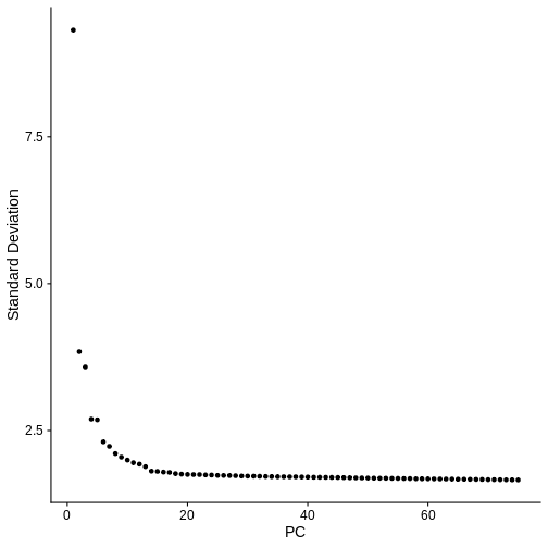
In the Feature Selection lesson, we used the variable genes to calculate principal components of the data. Scale the data, calculate 75 PCs and plot the “Elbow Plot” of PCs versus standard deviation accounted for by each PC.
R
num_pcs <- 75
st_obj  <- st_obj %>%
             ScaleData() %>%
             RunPCA(npcs = num_pcs, verbose = FALSE)
OUTPUT
Centering and scaling data matrixR
ElbowPlot(st_obj, ndims = num_pcs)
Challenge 8: Cluster the spots in your data
In the Feature Selection lesson, we made a call about how many PCs to use. Make some decision about how many PCs you will use and assign this to a variable called “num_pcs”. Also, select a cluster resolution for the clustering function. It may be instructive for each person in the class to use a different number of PCs and compare results. What new column was added to the Seurat object metadata by the clustering algorithm?
We selected 50 PCs and a cluster resoltion of 1 for this exercise. This may not be optimal. You will have a chance to vary these parameters in a later exercise.
R
num_pcs <- 50
st_obj  <- st_obj %>%
             FindNeighbors(reduction = "pca",
                           dims      = 1:num_pcs) %>%
             FindClusters(resolution = 1)
OUTPUT
Computing nearest neighbor graphOUTPUT
Computing SNNOUTPUT
Modularity Optimizer version 1.3.0 by Ludo Waltman and Nees Jan van Eck

Number of nodes: 4992
Number of edges: 227931

Running Louvain algorithm...
Maximum modularity in 10 random starts: 0.7701
Number of communities: 9
Elapsed time: 0 seconds
R
colnames(st_obj[[]])[ncol(st_obj[[]])]
OUTPUT
[1] "seurat_clusters"Challenge 9: Plot UMAP of spot clusters.
Look in the Feature Selection lesson and find the code to run UMAP and plot the spot clusters in UMAP space. You can use the default colors in Seurat.
R
st_obj <- RunUMAP(st_obj,
                  reduction = 'pca',
                  dims      = 1:num_pcs,
                  verbose   = FALSE)
WARNING
Warning: The default method for RunUMAP has changed from calling Python UMAP via reticulate to the R-native UWOT using the cosine metric
To use Python UMAP via reticulate, set umap.method to 'umap-learn' and metric to 'correlation'
This message will be shown once per session
R
UMAPPlot(st_obj,
         label      = TRUE,
         pt.size    = 2,
         group.by   = "seurat_clusters",
         label.size = 6)
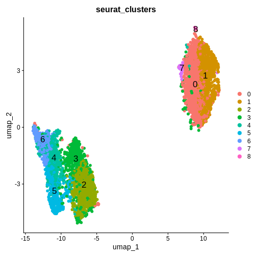
Challenge 10: Plot spot clusters over tissue section
Look in the Feature Selection lesson and find the code to plot the spots in the tissue section, colored by cluster. Compare this to the tissue section Supplemental Figure 5 in Maynard et al..
R
SpatialDimPlot(st_obj,
               group.by = "seurat_clusters") +
  ggtitle(label = 'Sample 151508')
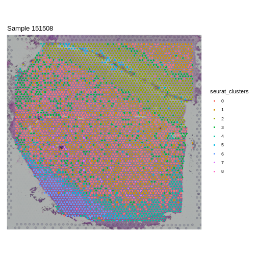
Challenge 11: Varying number of PCs and cluster resolution.
Return to Challenge 8 and change either the number of PCs or the cluster resolution and re-run the subsequent Challenges. How does this change the output? Does a certain set of values make the SpatialDimPlot look more like the results in the manuscript?
For class discussion.
- There are many decisions which need to be made in spatial transcriptomics.
- It is essential to have an understanding of the tissue morphology before proceeding with a spatial transcriptomics analysis.