Last updated on 2025-10-07 | Edit this page
Overview
Questions
- Why is feature selection important in spatial transcriptomics?
- What are the implications of using different proportions of highly variable genes (HVGs) in data analysis?
- Why is feature selection in spatial transcriptomics not typically necessary with normalization techniques like SCTransform?
- How do PCA and UMAP differ in their approach to dimensionality reduction in spatial transcriptomics?
- What advantages do linear methods like PCA offer before applying nonlinear methods like UMAP?
- How do these dimensionality reduction techniques impact downstream analysis such as clustering and visualization?
Objectives
- Identify appropriate feature selection methods for different normalization techniques in spatial transcriptomics.
- Evaluate the effects of varying the proportion of highly variable genes on the resolution of clustering and PCA outcomes.
- Understand the rationale behind the dependency of feature selection on specific normalization methods like NormalizeData.
- Differentiate between linear and nonlinear dimensionality reduction methods and their applications in spatial transcriptomics.
- Implement PCA to preprocess data before applying UMAP to enhance interpretability and structure recognition.
- Assess the effectiveness of each method in revealing spatial and molecular patterns within the data.
Understanding the Morphology of your Tissue
In any analysis, it is important that you understand the structure and cell types in the tissue which you are analyzing. While it would be ideal to have an unbiased analysis that uses normalizations and clustering methods to automatically assign cell types and define tissue structure, in practice we adjust these parameters based on the tissue structure that we expect to find.
Understanding Feature Selection in Spatial Transcriptomics
Feature selection in spatial transcriptomics is essential for reducing the dimensionality of high-dimensional datasets, enhancing model performance, and improving interpretability. This process is crucial because it helps in minimizing computational demands, reducing noise, and speeding up downstream analyses like clustering and principal components analysis (PCA). By focusing on a subset of genes that show significant variability or are biologically relevant, researchers can achieve more robust and generalizable models, draw clearer conclusions, and facilitate hypothesis testing.
Choosing Feature Selection Methods
Importance of High Variable Gene Selection
Feature selection methods such as variance stabilizing transformation (VST) and mean-variance plotting are crucial for refining the dataset to include genes that exhibit meaningful variability across different spatial regions. These methods help focus on genes that are most informative for downstream analyses like clustering and dimensionality reduction.
Feature Selection with NormalizeData
When using normalization methods like NormalizeData,
which focuses on scaling gene expression data without variance
stabilization, applying feature selection becomes essential. This method
requires the selection of highly variable genes to enhance the analysis,
particularly in clustering and PCA. Typically, you will select in the
range of 2,000 to 5,000 highly variable genes.
Feature Selection with SCTransform
SCTransform, a normalization method, adjusts gene
expression data to stabilize the variance, and it also provides default
feature selection. This method ensures that the genes retained are
already adjusted for technical variability, highlighting those with
biological significance.
The SCTransform selects 3,000 variable features by
default. We will use those variable features to calculate principal
components (PCs) of the gene expression data. As always, we must
first scale (or standardize) the normalized counts data.
Challenge 1: Number of Variable Genes
How do you think that your results would be affected by selecting too few highly variable genes? What about too many highly variable genes?
Too few variable genes may underestimate the variance between spots and tissue sections and would reduce our ability to discern tissue structure. Too many variable genes would increase computational time and might add noise to the analysis.
Dimensionality Reduction using Principal Components
Dimensionality reduction is a crucial step in managing high-dimensional spatial transcriptomics data, enhancing analytical clarity, and reducing computational load. Linear methods like PCA and nonlinear methods like UMAP each play distinct roles in processing and interpreting complex datasets.
PCA is a linear technique that reduces dimensionality by transforming data into a set of uncorrelated variables called principal components (PCs). This method efficiently captures the main variance in the data, which is vital for preliminary data exploration and noise reduction.
In order to cluster the spots by similarity, we use PCs to reduce the number of dimensions in the data. Using a smaller number of PCs allows us to capture the variability in the dataset while using a smaller number of dimensions. The PCs are then used to cluster the spots by similarity.
R
sct_st <- ScaleData(sct_st) %>%
               RunPCA(npcs = 75, verbose = FALSE)
WARNING
Warning: The `slot` argument of `SetAssayData()` is deprecated as of SeuratObject 5.0.0.
ℹ Please use the `layer` argument instead.
ℹ The deprecated feature was likely used in the Seurat package.
  Please report the issue at <https://github.com/satijalab/seurat/issues>.
This warning is displayed once every 8 hours.
Call `lifecycle::last_lifecycle_warnings()` to see where this warning was
generated.
WARNING
Warning: The `slot` argument of `GetAssayData()` is deprecated as of SeuratObject 5.0.0.
ℹ Please use the `layer` argument instead.
ℹ The deprecated feature was likely used in the Seurat package.
  Please report the issue at <https://github.com/satijalab/seurat/issues>.
This warning is displayed once every 8 hours.
Call `lifecycle::last_lifecycle_warnings()` to see where this warning was
generated.
OUTPUT
Centering and scaling data matrixIn the command above, we specifically asked Seurat to calculate 75
principal components. There are thousands of genes and we know that we
don’t need to calculate all PCs. By default, the RunPCA
method calculates 50 PCs. Let’s make an elbow plot of the number of PCs
versus the standard deviation explained by each PC. Traditionally, there
is a bend in the curve which indicates that adding more PCs doesn’t
account for more of the variance.
R
ElbowPlot(sct_st, ndims = 75)
WARNING
Warning: `aes_string()` was deprecated in ggplot2 3.0.0.
ℹ Please use tidy evaluation idioms with `aes()`.
ℹ See also `vignette("ggplot2-in-packages")` for more information.
ℹ The deprecated feature was likely used in the Seurat package.
  Please report the issue at <https://github.com/satijalab/seurat/issues>.
This warning is displayed once every 8 hours.
Call `lifecycle::last_lifecycle_warnings()` to see where this warning was
generated.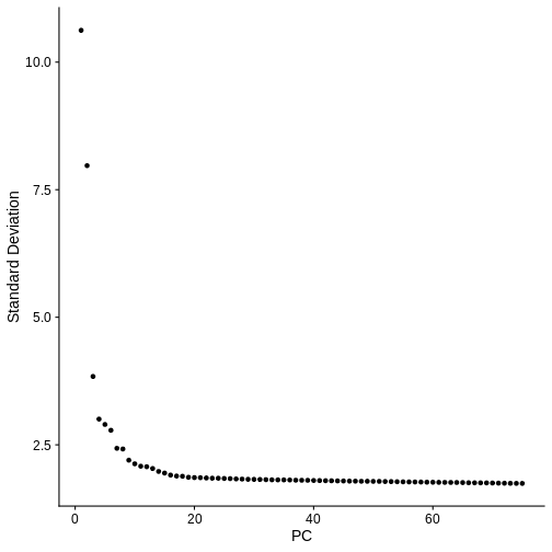
From the plot above, we would normally select somewhere between 10 and 20 PCs because there seems to be little benefit in adding more PCs. Adding more PCs does not seem to add more explanatory variance.
But in spatial transcriptomics, the elbow plot often does not tell the whole story. We want to select a number of PCs such that we are able to discern the structure and cell type composition of our tissue. So it is better to try a range of number of PCs.
For now, let’s use all 75 PCs.
R
n_pcs = 75
In the next step, we will cluster the spots based on expression
similarity using the principal components that we just generated. We
will use Seurat’s FindNeighbors
and FindClusters
functions. FindNeighbors find the K nearest neighbors of
each spot in the dataset. The default values is to use the 20 nearest
neighbors in the dataset and we will use this value in this lesson.
However, as with the number of features used to create the PCs, this is
another parameter that is worth varying before proceeding with your
analysis.
R
sct_st <- FindNeighbors(sct_st,
                        reduction = "pca",
                        dims      = 1:n_pcs) %>%
               FindClusters(resolution = 1)
OUTPUT
Computing nearest neighbor graphOUTPUT
Computing SNNOUTPUT
Modularity Optimizer version 1.3.0 by Ludo Waltman and Nees Jan van Eck

Number of nodes: 3633
Number of edges: 198594

Running Louvain algorithm...
Maximum modularity in 10 random starts: 0.7227
Number of communities: 9
Elapsed time: 0 seconds
The clustering has added a new column to the spot metadata in the
Seurat object called seurat_clusters. Let’s look the
metadata to see this.
R
head(sct_st[[]])
OUTPUT
                      orig.ident nCount_Spatial nFeature_Spatial in_tissue
AAACAAGTATCTCCCA-1 SeuratProject           8458             3586         1
AAACAATCTACTAGCA-1 SeuratProject           1667             1150         1
AAACACCAATAACTGC-1 SeuratProject           3769             1960         1
AAACAGAGCGACTCCT-1 SeuratProject           5433             2424         1
AAACAGCTTTCAGAAG-1 SeuratProject           4278             2264         1
AAACAGGGTCTATATT-1 SeuratProject           4004             2178         1
                   array_row array_col pxl_row_in_fullres pxl_col_in_fullres
AAACAAGTATCTCCCA-1        50       102               8468               9791
AAACAATCTACTAGCA-1         3        43               2807               5769
AAACACCAATAACTGC-1        59        19               9505               4068
AAACAGAGCGACTCCT-1        14        94               4151               9271
AAACAGCTTTCAGAAG-1        43         9               7583               3393
AAACAGGGTCTATATT-1        47        13               8064               3665
                   percent.mt keep layer_guess cell_count nCount_SCT
AAACAAGTATCTCCCA-1   16.63514 TRUE      Layer3          6       5167
AAACAATCTACTAGCA-1   12.23755 TRUE      Layer1         16       3404
AAACACCAATAACTGC-1   11.40886 TRUE          WM          5       3828
AAACAGAGCGACTCCT-1   24.22234 TRUE      Layer3          2       4683
AAACAGCTTTCAGAAG-1   15.21739 TRUE      Layer5          4       4228
AAACAGGGTCTATATT-1   15.50949 TRUE      Layer6          6       3991
                   nFeature_SCT SCT_snn_res.1 seurat_clusters
AAACAAGTATCTCCCA-1         3192             0               0
AAACAATCTACTAGCA-1         1264             2               2
AAACACCAATAACTGC-1         1941             7               7
AAACAGAGCGACTCCT-1         2393             6               6
AAACAGCTTTCAGAAG-1         2239             5               5
AAACAGGGTCTATATT-1         2148             3               3
We previously discussed the layer annotations provided by Maynard and colleagues. We added them to our Seurat object and plotted them. Let’s look at them again to compare them to our clusters.
R
SpatialDimPlotColorSafe(sct_st[, !is.na(sct_st[[]]$layer_guess)], "layer_guess") +
  labs(fill="Layer")
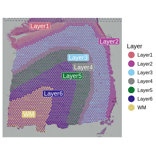
The authors describe six layers arranged from the upper right to the lower left, and a white matter (WM) later. At this stage of the analysis, we have nine clusters, but they do not show the clear separation of the ground truth in the source publication.
We will now plot the spots in the tissue, colored by the clusters
which we have identified in seurat_clusters to evaluate the
quality of the cluster identities by looking for the clarity of the
stripes forming each layer.
R
SpatialDimPlotColorSafe(sct_st, "seurat_clusters") + labs(fill="Cluster")
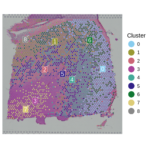
How many layers do we have compared to the publication? What do you think about the quality of the layers in this plot? Are there clear layers in the tissue?
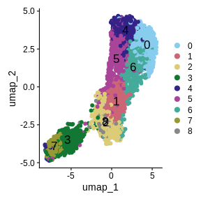
Another way for us to look at the clusters it to plot them in a Uniform Manifold Approximation and Projection (UMAP). UMAP is a non-linear dimension reduction technique that can be used to visualize data. This is often used in single-cell RNASeq to identify different cell types. Here, each spot is potentially composed of more than one cell type, so the clustering may not be as clear.
R
num_clusters <- length(unique(sct_st[[]]$seurat_clusters))
color_pal    <- setNames(carto_pal(num_clusters, "Safe"), 0:(num_clusters - 1))

sct_st <- RunUMAP(sct_st,
                  reduction = 'pca',
                  dims      = 1:n_pcs,
                  verbose   = FALSE)

UMAPPlot(sct_st,
         label      = TRUE,
         cols       = color_pal,
         pt.size    = 2,
         label.size = 6)
We have made some decisions above which might affect the quality of our spot clusters, including the number of nearest neighbors, the number of variable features, the number of PCs, and the cluster resolution. As we have mentioned, it is critical to have some understanding of the structure of the tissue that you are analyzing. In the absence of “ground truth”, you will need to try several different parameters and look at how the clusters group in your tissue. Below, we have included code which plots the tissue with different numbers of nearest neighbors, principal components, and cluster resolutions. We will not run this code because it takes a long time to run, but we show the output below this code block.
R
# Set several cluster resolution values.
resol <- c(0.5, 1, 2)
# Set several numbers of principal components.
npcs  <- c(25, 50, 75)

num_clusters <- 12
color_pal    <- setNames(carto_pal(num_clusters, "Safe"), 0:(num_clusters - 1))

umap_plots <- vector('list', length(resol) * length(npcs))
plots      <- vector('list', length(resol) * length(npcs))

for(i in seq_along(resol)) {
  for(j in seq_along(npcs)) {

    index     <- (i-1) * length(npcs) + j
    print(paste('Index =', index))

    sct_st <- FindNeighbors(sct_st,
                            reduction = "pca",
                            dims      = 1:npcs[j]) %>%
                   FindClusters(resolution = resol[i]) %>%
                   RunUMAP(reduction = 'pca',
                           dims      = 1:npcs[j],
                           verbose   = FALSE)

    umap_plots[[index]] <- UMAPPlot(sct_st, label = TRUE, cols = color_pal,
                                    pt.size = 2, label.size = 4) +
                             ggtitle(paste("res =", resol[i], ": pc =", npcs[j])) +
                             theme(legend.position = "none")

    plots[[index]]      <- SpatialDimPlot(sct_st,
                                          group.by = "seurat_clusters",
                                          cols = color_pal) +
                          ggtitle(paste("res =", resol[i], ": pc =", npcs[j])) +
                          theme(legend.position = "none")

  } # for(j)

} # for(i)

png(file.path('episodes', 'fig', 'tissue_cluster_resol.png'),
    width = 1000, height = 1000, res = 128)
print(gridExtra::grid.arrange(grobs = plots, nrow = 3))
dev.off()

png(file.path('episodes', 'fig', 'umap_cluster_resol.png'),
    width = 1000, height = 1000, res = 128)
print(gridExtra::grid.arrange(grobs = umap_plots, nrow = 3))
dev.off()
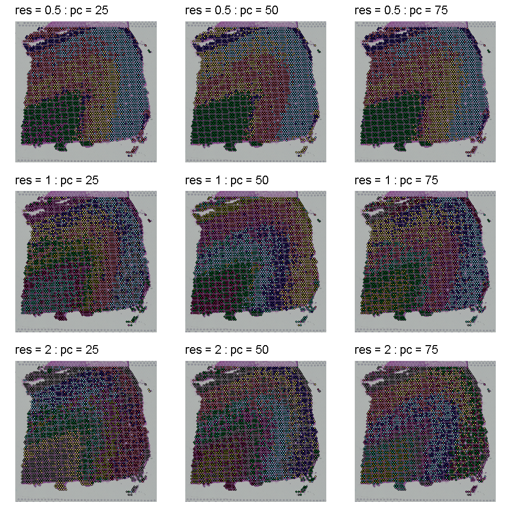
The plot below shows the clusters as colors overlayed on the tissue. Each row shows a different cluster resolution and each column shows the number of PCs.
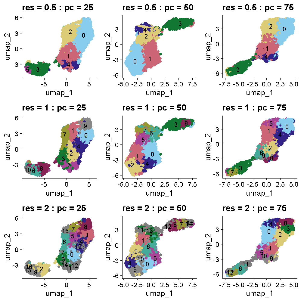
The plot below shows the UMAP clustering for the same set of parameters in the same order. The cluster colors are the same in the plots above and below. Increasing the cluster resolution increases the number of clusters.
Challenge 1: Select cluster resolution and number of PCs
Look at the two plots above which show the tissue and UMAP clusters at different cluster resolutions and number of PCs. Think about which settings seem to produce clustering that matches the expectations from the publication. Turn to the person next to you and discuss your opinions about which settings to use.
All of the plots in the tissue clustering show layers which broadly conform to the publication’s “ground truth.” In the top row at a resolution of 0.5, we see about four layers with varying levels of clarity, depending on the number of PCs. As we move down in the tissue clustering plot, the layers become clearer at a resolution of 1, but then become less clear at a resolution of 2 in the bottom row. When we look at the corresponding row in the UMAP plots, we see that the white matter is clearly separated in all of the plots. The number of clusters increases with increasing cluster resolution, with the middle row (cluster resolution = 1), having close to seven layers, like the publication ground truth. The middle plot in the middle row has nine clusters, which is also close to the publication.
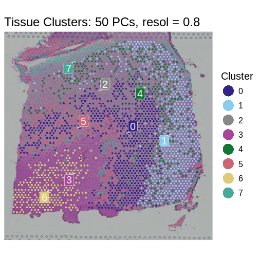
We selected a cluster resolution of 0.8 and 50 PCs for the following work.
R
sct_st <- FindNeighbors(sct_st,
                        reduction = "pca",
                        dims      = 1:50) %>%
               FindClusters(resolution = 0.8)
OUTPUT
Modularity Optimizer version 1.3.0 by Ludo Waltman and Nees Jan van Eck

Number of nodes: 3633
Number of edges: 175530

Running Louvain algorithm...
Maximum modularity in 10 random starts: 0.7508
Number of communities: 8
Elapsed time: 0 seconds
R
SpatialDimPlotColorSafe(sct_st, "seurat_clusters") +
  ggtitle(label = "Tissue Clusters: 50 PCs, resol = 0.8") +
  labs(fill = "Cluster")
- Feature selection is a crucial step in spatial transcriptomics
analysis, particularly for non-variance-stabilizing normalization
methods like
NormalizeData. - Techniques such as VST and mean-variance plotting enable researchers to focus on genes that provide the most biological insight.
- Different proportions of highly variable genes and feature selection methods can significantly influence the analytical outcomes, emphasizing the need for tailored approaches based on the specific characteristics of each dataset.
- Linear dimensionality reduction methods like PCA are crucial for initial data simplification and noise reduction.
- Nonlinear methods like UMAP are valuable for detailed exploration of data structures post-linear preprocessing.
- The sequential application of PCA and UMAP can provide a comprehensive view of the spatial transcriptomics data, leveraging the strengths of both linear and nonlinear approaches.