Performing a Genome Scan
Last updated on 2025-09-30 | Edit this page
Estimated time: 90 minutes
Overview
Questions
- How do I perform a genome scan?
- How do I plot a genome scan?
- How do additive covariates differ from interactive covariates?
Objectives
- Map one trait using additive covariates.
- Map the sample trait using additive and interactive covariates.
- Plot a genome scan.
The freely available chapter on single-QTL analysis from Broman and Sen’s A Guide to QTL Mapping with R/qtl describes different methods for QTL analysis. We will present two of these methods here - marker regression and Haley-Knott regression. The chapter provides the statistical background behind these and other QTL mapping methods.
Linear regression can be employed to identify presence of QTL in a cross. To identify QTL using regression, we compare the fit for two models: 1) the null hypothesis that there are no QTL anywhere in the genome; and 2) the alternative hypothesis that there is a QTL near a specific position. A sloped line indicates that there is a difference in mean phenotype between genotype groups, and that a QTL is present. A line with no slope indicates that there is no difference in mean phenotype between genotype groups, and that no QTL exists. Regression aims to find the line of best fit to the data.
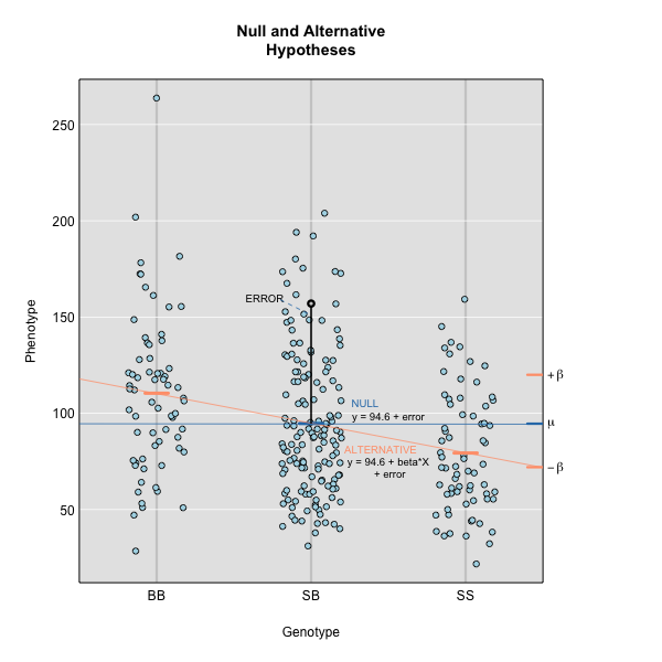
To find the line of best fit, the residuals or errors are calculated, then squared for each data point. A residual, also known as an error, is the distance from the line to a data point.
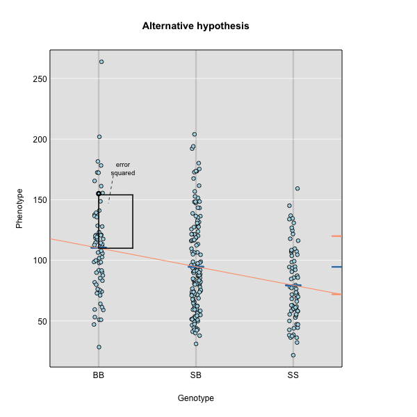
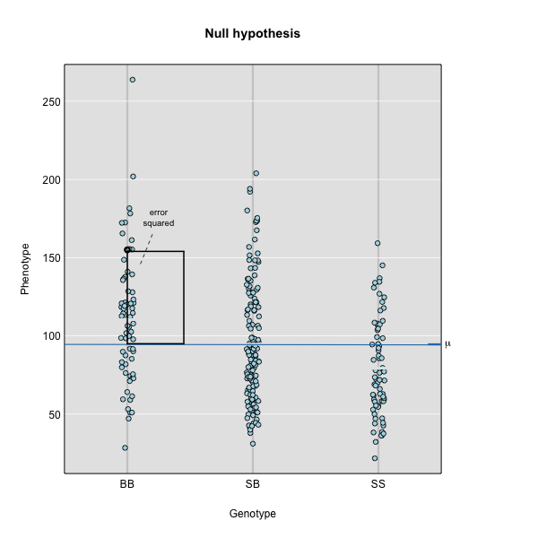
The line of best fit will be the one that minimizes the sum of squared residuals, which maximizes the likelihood of the data.
Marker regression produces a LOD (logarithm of odds) score comparing the null hypothesis to the alternative. The LOD score is calculated using the sum of squared residuals (RSS) for the null and alternative hypotheses. The LOD score is the difference between the log10 likelihood of the null hypothesis and the log10 likelihood of the alternative hypothesis. It is related to the regression model above by identifying the line of best fit to the data.
LOD = \(n/2 \times log10(RSS_0/RSS_1)\)
A higher LOD score indicates greater likelihood of the alternative hypothesis. A LOD score closer to zero favors the null hypothesis.
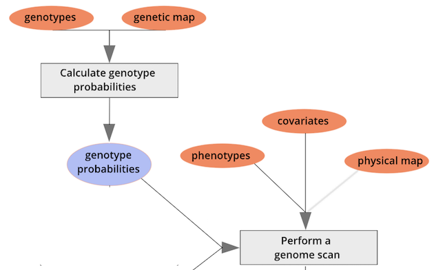
Marker regression can identify the existence and effect of a QTL by comparing means between groups, however, it requires known marker genotypes and can’t identify QTL in between typed markers. To identify QTL between typed markers, we use Haley-Knott regression. After calculating genotype probabilities, we can regress the phenotypes for animals of unknown genotype on these conditional genotype probabilities (conditional on known marker genotypes). In Haley-Knott regression, phenotype values can be plotted and a regression line drawn through the phenotype mean for the untyped individuals.
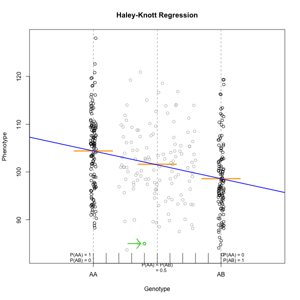
As shown by the green circle in the figure, an individual of unknown genotype is placed between known genotypes according to the probability of its genotype being BB or BR. In this case, the probability of this individual having genotype BB is 0.6, and the probability of having genotype BR is 0.4.
To perform a genome scan by Haley-Knott regression (Haley and Knott
1992), use the function scan1(). scan1()
takes as input the genotype probabilities, a matrix of phenotypes, and
then optional additive and interactive covariates. Another option is to
provide a vector of weights.
Additive Genome Scan
There are two potential covariates in the Attie data set. Let’s look
at the top of the covariates in the cross object.
R
head(cross$covar)
OUTPUT
             Sex pgm adipose_batch gastroc_batch hypo_batch islet_batch
Mouse3051   Male   1    12/19/2007     8/11/2008 11/26/2007  11/28/2007
Mouse3551   Male   1    12/19/2007     8/12/2008 11/27/2007  12/03/2007
Mouse3430   Male   1    12/19/2007     8/12/2008 11/27/2007  12/03/2007
Mouse3476   Male   1    12/19/2007     8/12/2008 11/27/2007  12/03/2007
Mouse3414   Male   1    12/18/2007     8/11/2008 11/26/2007  11/28/2007
Mouse3145 Female   1    12/19/2007     8/11/2008         NA  11/28/2007
          kidney_batch liver_batch
Mouse3051   07/15/2008       other
Mouse3551   07/16/2008  12/10/2007
Mouse3430   07/15/2008  12/05/2007
Mouse3476   07/16/2008  12/05/2007
Mouse3414   07/15/2008  12/05/2007
Mouse3145   07/15/2008  12/10/2007
Sex is a potential covariate. It is a good idea to
always include sex in any analysis. Even if you perform an ANOVA and
think that sex is not important, it doesn’t hurt to add in one extra
degree of freedom to your model. Examples of other covariates might be
age, diet, treatment, or experimental batch. It is worth taking time to
identify covariates that may affect your results.
First, we will make sex a factor, which is the term that
R uses for categorical variables. This is required for the next function
to work correctly. Then we will use model.matrix to create
a matrix of “dummy” variables which encode the sex of each mouse.
R
cross$covar$Sex <- factor(cross$covar$Sex)

addcovar <- model.matrix(~Sex, data = cross$covar)[,-1, drop = FALSE]
When we perform a genome scan with additive covariates, we are searching for loci that have the same effect in both covariate groups. In this case, we are searching for loci that affect females and males in the same way.
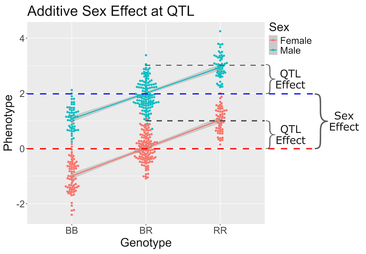
In the figure above, we plotted simulated phenotype values versus the genotypes BB, BR and RR. Each point represents one mouse, with females shown in red and males in blue. We show the sex effect at the mean of each sex group. The difference between sexes is the same for all three genotype groups. This is different from the QTL effect, which is the difference between the mean of each sex and the homozygous group(s).
When we add sex into the model as an additive covariate, we regress the sex effect out of the phenotype data and then estimate the overall QTL effect.
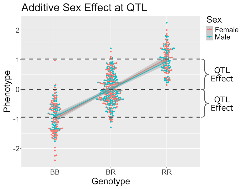
In the figure above, we have plotted the same simulated phenotype with sex regressed out. Now the female and male means are the same, but the QTL effect remains.
With that introduction to additive covariates, let’s map the insulin phenotype.
First, we will make a data.frame called insulin
so that we don’t have to type quite as many characters every time that
we map insulin.
R
insulin <- cross$pheno[,'log10_insulin_10wk', drop = FALSE]
Next, we will use the qtl2 function scan1 to map insulin
values across the genome with sex as an additive covariate.
R
lod_add <- scan1(genoprobs = probs,
                 pheno     = insulin,
                 addcovar  = addcovar)
On a multi-core machine, you can get some speed-up via the
cores argument, as with calc_genoprob() and
calc_kinship().
R
lod_add <- scan1(genoprobs = probs,
                 pheno     = insulin,
                 addcovar  = addcovar,
                 cores     = 4)
The output of scan1() is a matrix of LOD scores, with
markers in rows and phenotypes in columns.
Take a look at the first ten rows of the scan object. The numerical values are the LOD scores for the marker named at the beginning of the row. LOD values are shown for circulating insulin.
R
head(lod_add, n = 10)
OUTPUT
           log10_insulin_10wk
rs13475697         0.04674829
rs3681603          0.04674829
rs13475703         0.04680494
rs13475710         0.12953382
rs6367205          0.13734728
rs13475716         0.13735534
rs13475717         0.13735534
rs13475719         0.13735534
rs13459050         0.13735534
rs3680898          0.13735541
The function plot_scan1() can be used to plot the LOD
curves. If you have more than one phenotype, use the
lodcolumn argument to indicate which column to plot. In
this case, we have only one column and plot_scan will plot
it by default.
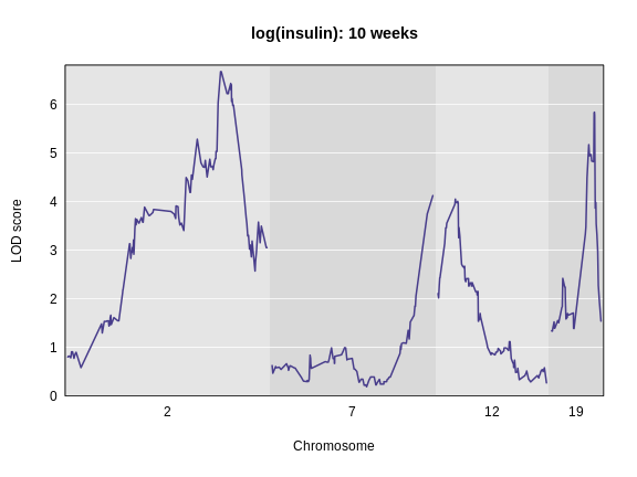
R
plot_scan1(lod_add,
           map  = cross$pmap,
           main = 'log(insulin): 10 weeks')
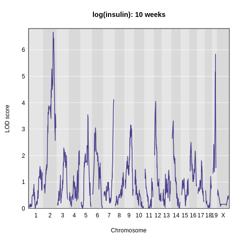
The LOD plot for insulin shows several peaks, with the largest peak on chromosome 2. There are smaller peaks on other chromosomes. Which of these peaks is significant, and why? We’ll evaluate the significance of genome scan results in a later episode in Finding Significant Peaks via Permutation.
Challenge 1: Find the marker with the highest LOD.
- What is the highest LOD score for insulin? (Hint: use the
max()function) - Which marker does the highest LOD score occur at? (Hint: use
which.max())
- You can find the maximum LOD score using the
maxfunction.
R
max(lod_add[, 'log10_insulin_10wk'])
OUTPUT
[1] 6.668835- You can find the marker name with the maximum LOD score using the
which.maxfunction.
R
rownames(lod_add)[which.max(lod_add[, 'log10_insulin_10wk'])]
OUTPUT
[1] "rs13476803"Challenge 2: Find the chromosome and position of the maximum LOD score.
Look up the qtl2 function find_markerpos in
the Help and find the chromosome and Mb position of the marker with the
maximum LOD.
R
max_mkr <- rownames(lod_add)[which.max(lod_add[, 'log10_insulin_10wk'])]
find_markerpos(cross = cross, markers = max_mkr)
OUTPUT
           chr     gmap     pmap
rs13476803   2 67.07116 138.9448
Challenge 3: Plot the LOD on specific chromosomes.
The plot_scan1 function has a chr argument
that allows you to only plot specific chromosomes. Use this to plot the
insulin LOD on chromosomes 2, 7, 12, and 19. Add a title to the plot
using the main argument, which is part of the basic
plotting function.
R
plot_scan1(lod_add, map = cross$pmap, chr = c(2, 7, 12, 19),
           main = "log(insulin): 10 weeks")
Interactive Genome Scan
Above, we mapped insulin levels using sex as an additive covariate and searched for loci where both sexes had the same QTL effect. But what if the two sexes have different effects? You might think that we could map each sex separately. But this approach reduces your sample size, and hence statistical power, in each sex. A better way is to use all of the data and map with sex as an additive and an interactive covariate. Mapping with an interactive covariate allows each sex to have different effects. We do this by including sex as an interactive covariate in the genome scan.
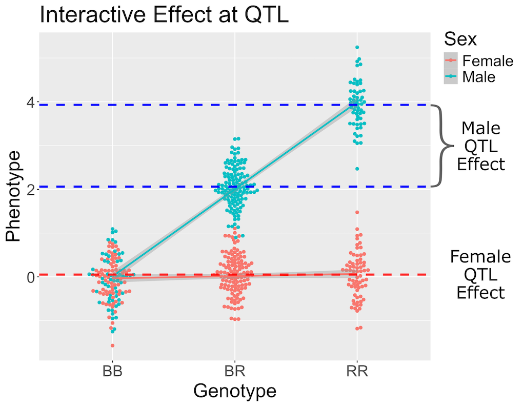
In the figure above, female (red) and male (blue) phenotypes are plotted versus the three genotypes. In females, there is no QTL effect because the mean values in each genotype group are not different. In males, there is a QTL effect because the mean in each genotype group changes.
You should always include an interactive covariate as an additive covariate as well. In this case, we only have sex as a covariate, so we can use the additive covariate matrix for the interactive covariate. For clarity, we will make a copy and name it for the interactive covariates.
R
intcovar = addcovar
R
lod_int <- scan1(genoprobs = probs,
                 pheno     = insulin,
                 addcovar  = addcovar,
                 intcovar  = intcovar)
R
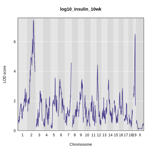
plot_scan1(x    = lod_int,
           map  = cross$pmap,
           main = 'log(insulin): 10 weeks: Sex Interactive')
It is difficult to tell if there is a difference in LOD scores
between the additive and interactive scans. To resolve this, we can plot
both genome scans in the same plot using the add = TRUE
argument. We will also color the additive scan in blue.
R
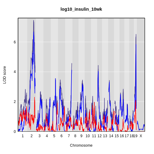
plot_scan1(x    = lod_int,
           map  = cross$pmap,
           main = 'log(insulin): 10 weeks')
plot_scan1(x    = lod_add,
           map  = cross$pmap,
           col  = 'blue',
           add  = TRUE)
legend(x = 1000, y = 7.6, legend = c('Additive', 'Interactive'),
       col = c('blue', 'black'), lwd = 2)
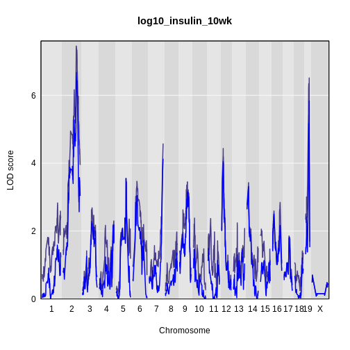
It is still difficult to tell whether any peaks differ by sex. Another way to view the plot is to plot the difference between the interactive and additive scans.
R
plot_scan1(x    = lod_int - lod_add,
           map  = cross$pmap,
           main = 'log10(insulin): Interactive - Additive')
While it was important to look at the effect of sex on the trait, in this experiment, there do not appear to be any sex-specific peaks. Without performing a formal test, we usually look for peaks with a LOD greater than 3 and there do not appear to be any in this scan.
Challenge 4: Why didn’t we map and plot males and females separately?
Map and plot the males and females separately. Now explain why we didn’t do things this way.
- A qtl2 genome scan requires genotype probabilities and a phenotype matrix.
- The output from a genome scan contains a LOD score matrix, map positions, and phenotypes.
- LOD curve plots for a genome scan can be viewed with plot_scan1().
- A genome scan using sex as an additive covariate searches for QTL which affect both sexes.
- A genome scan using sex as an interactive covariate searches for QTL which affect each sex differently.