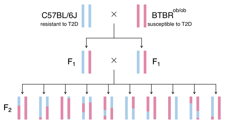
Introduction to the Data Set
Figure 1
 Created in
BioRender.com
Created in
BioRender.com
Figure 2
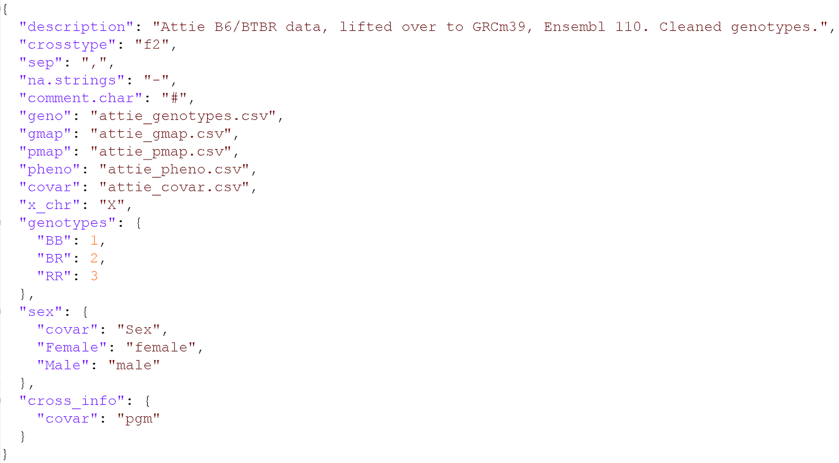
Input File Format
Figure 1
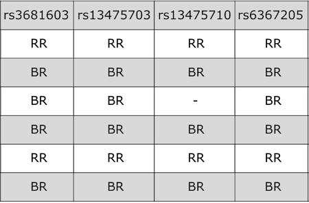
Figure 2
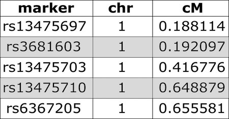
Figure 3
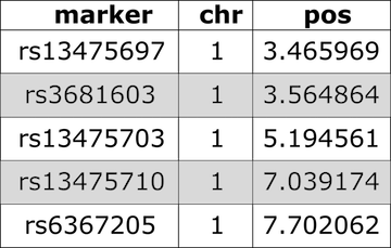
Figure 4
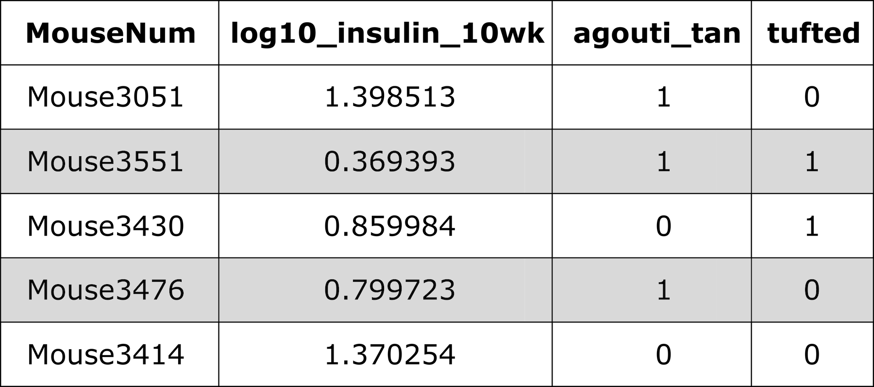
Figure 5
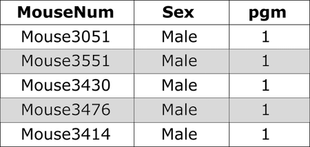
Figure 6
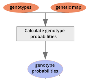
Calculating Genotype Probabilities
Figure 1
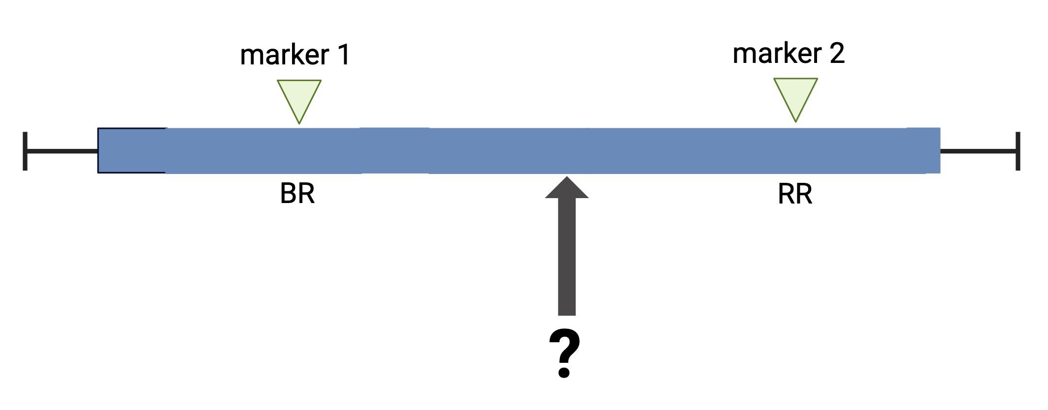
Figure 2
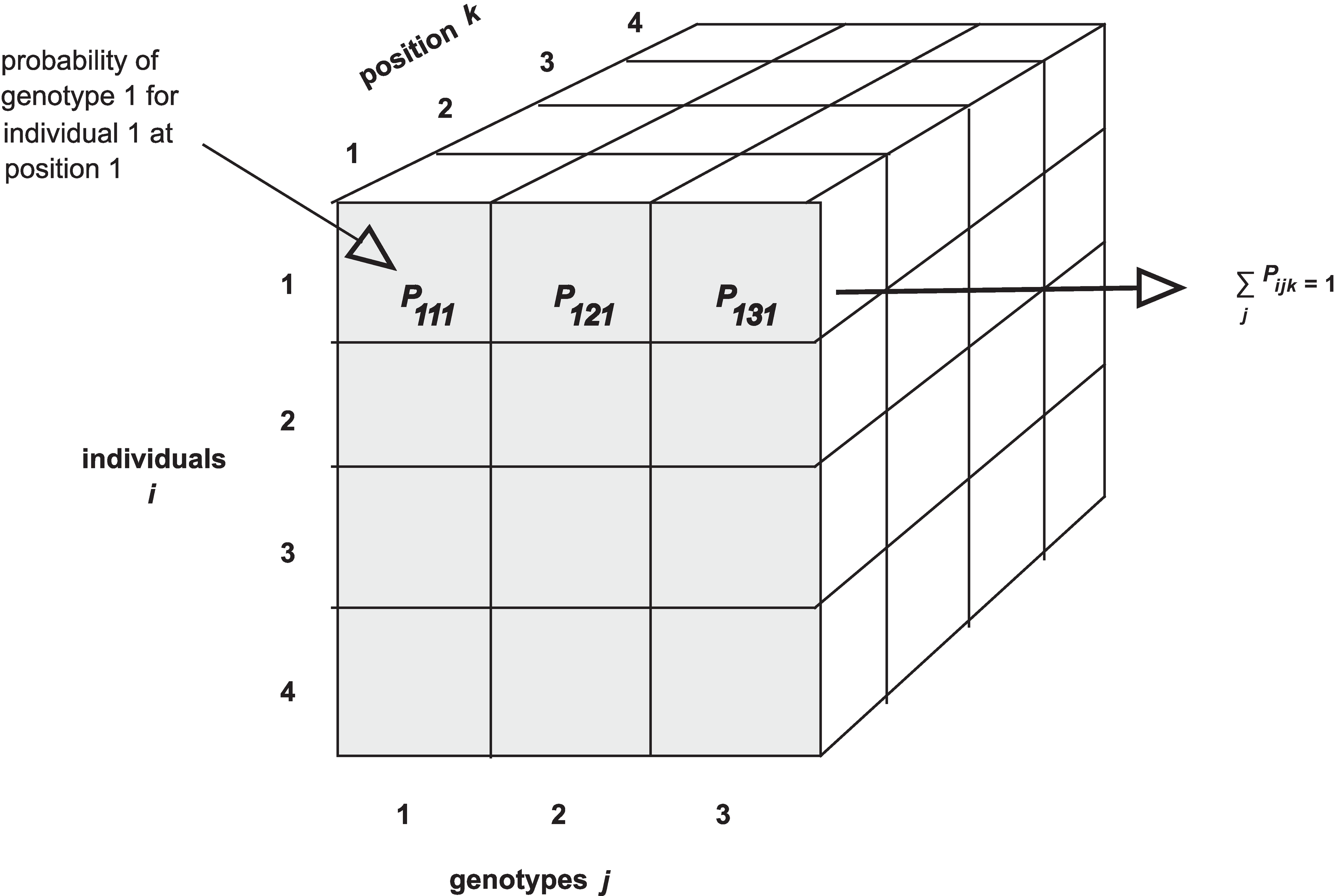
Figure 3
 Notice that arrays in R require data to be all of the same type - all
numeric, all character, all Boolean, etc. If you are familiar with data
frames in R you know that you can mix different kinds of data in that
structure. The first column might contain numeric data, the second
column character data, the third Boolean (True / False), and so on.
Arrays won’t accept mixed data types though.
Notice that arrays in R require data to be all of the same type - all
numeric, all character, all Boolean, etc. If you are familiar with data
frames in R you know that you can mix different kinds of data in that
structure. The first column might contain numeric data, the second
column character data, the third Boolean (True / False), and so on.
Arrays won’t accept mixed data types though.
Figure 4
Figure 5
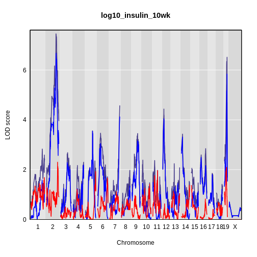
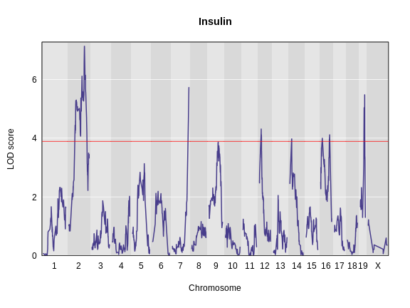
Performing a Genome Scan
Figure 1
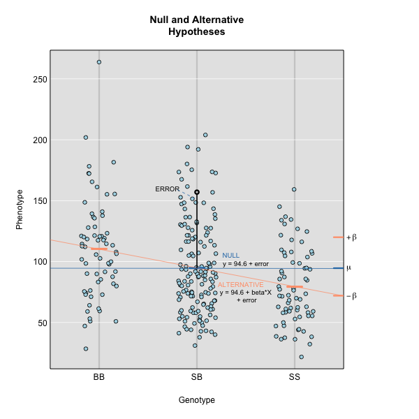
Figure 2
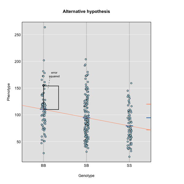
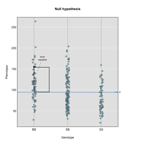
Figure 3
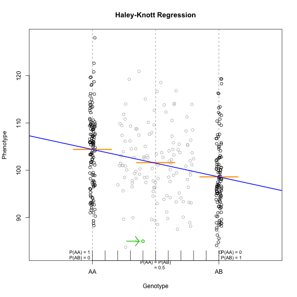
Figure 4
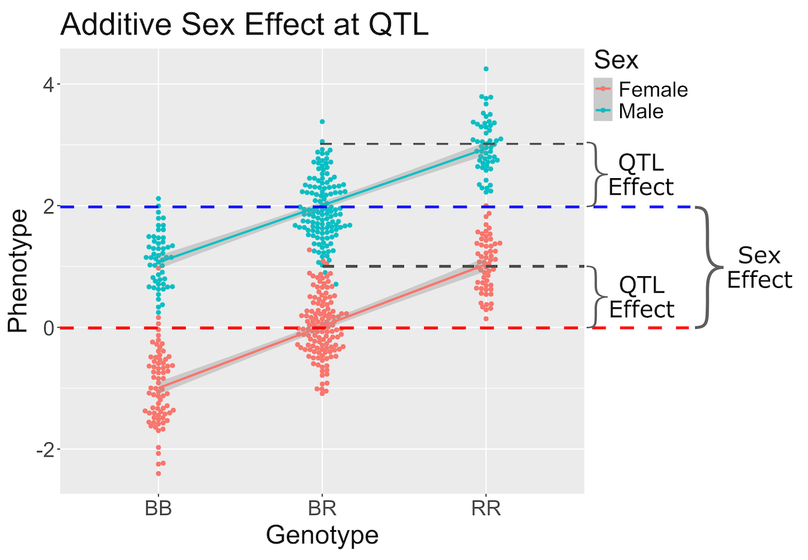
Figure 5
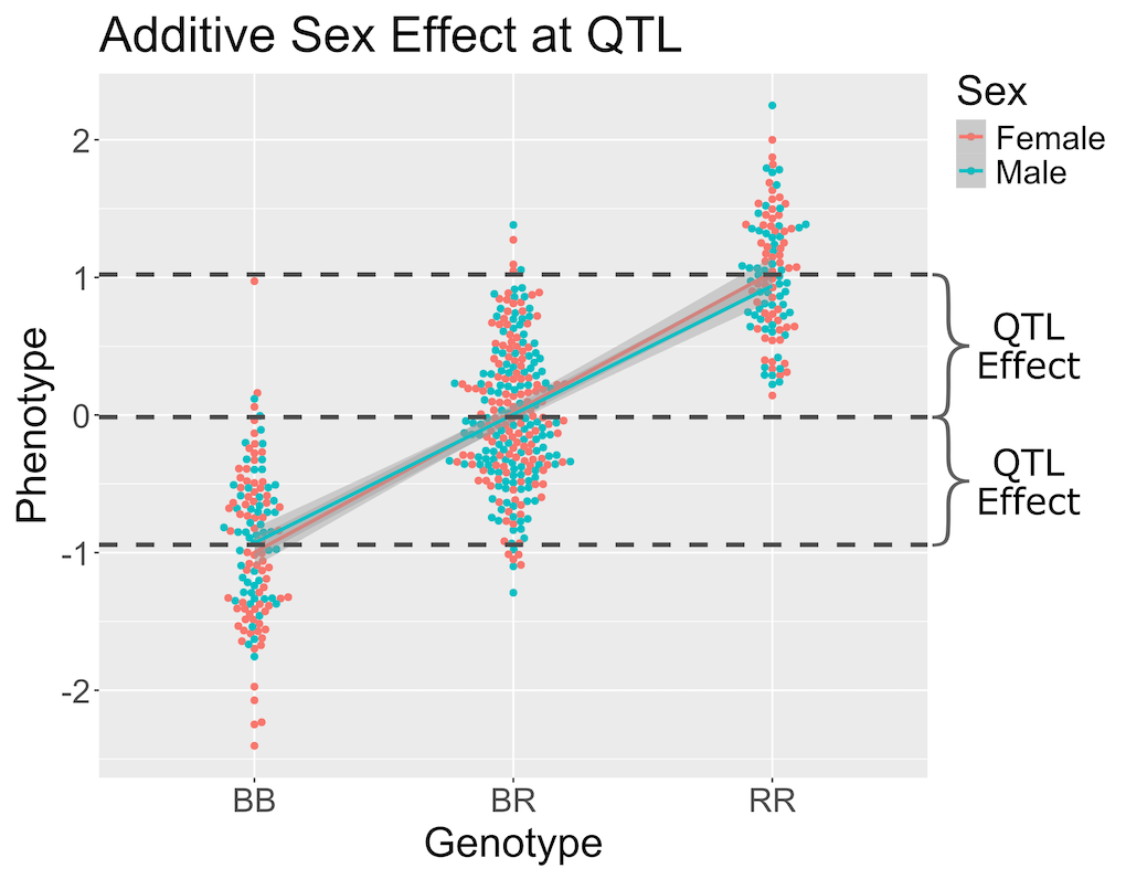
Figure 6
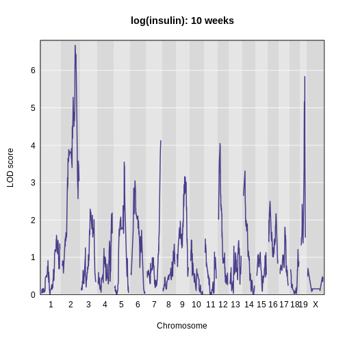
Figure 7
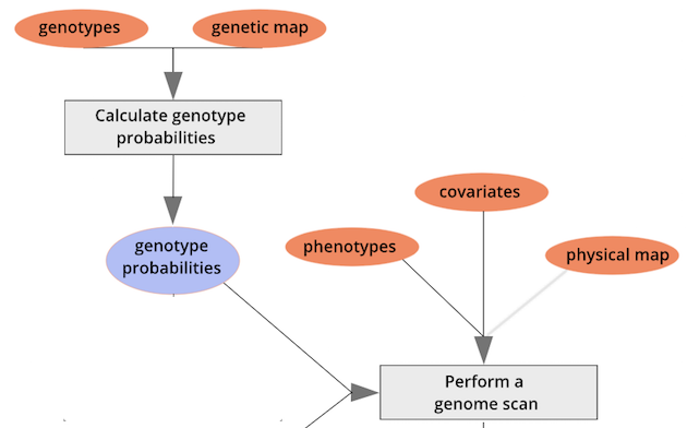
Figure 8
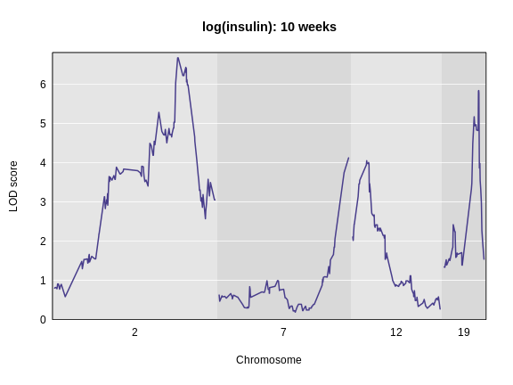
Figure 9
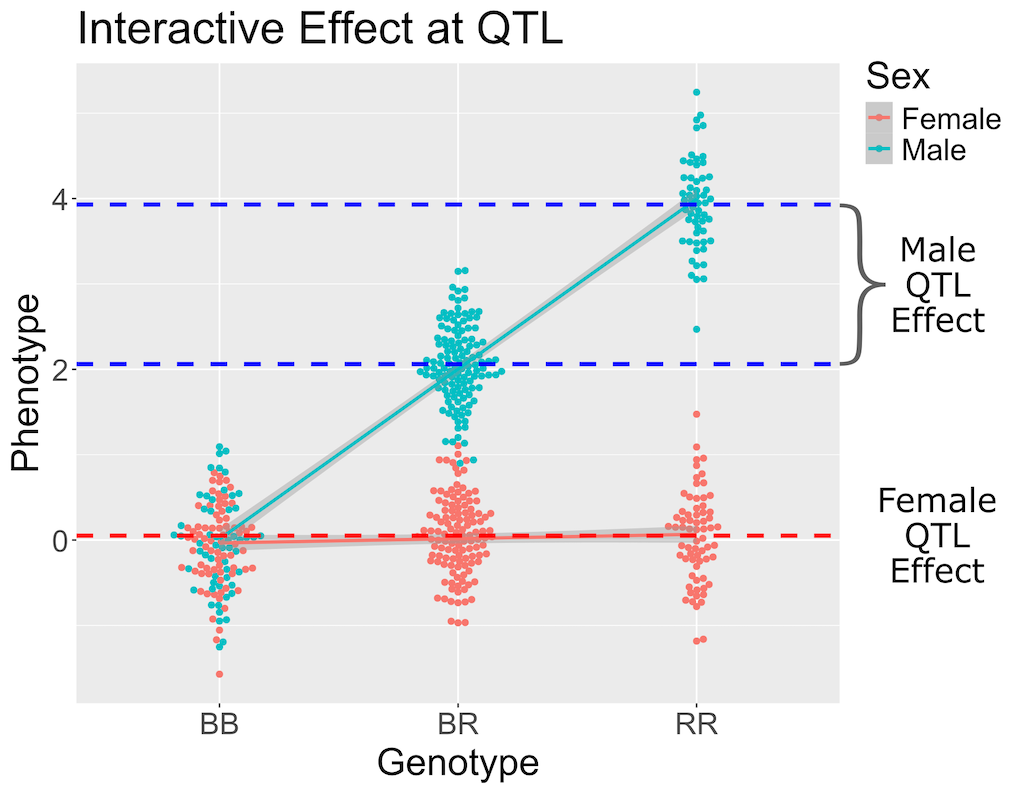
Figure 10
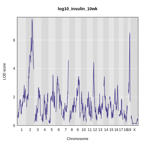
Figure 11
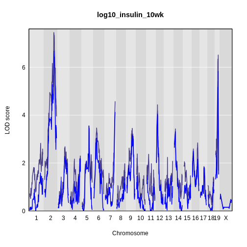
Figure 12
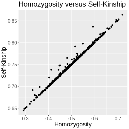
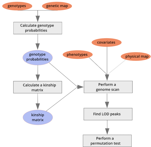
Calculating A Kinship Matrix
Figure 1
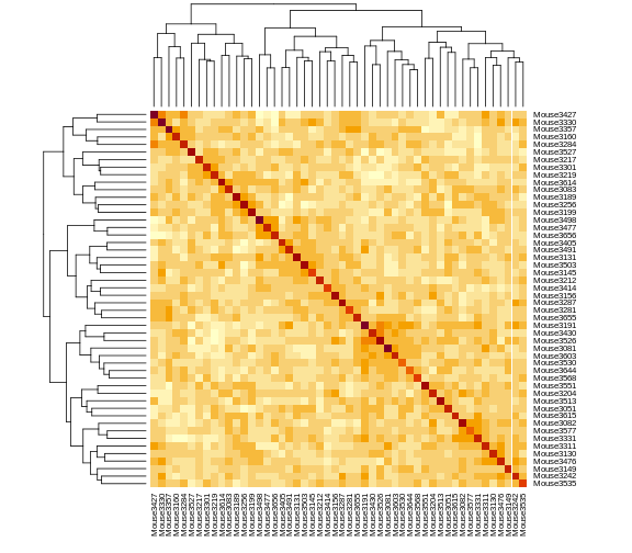
Figure 2
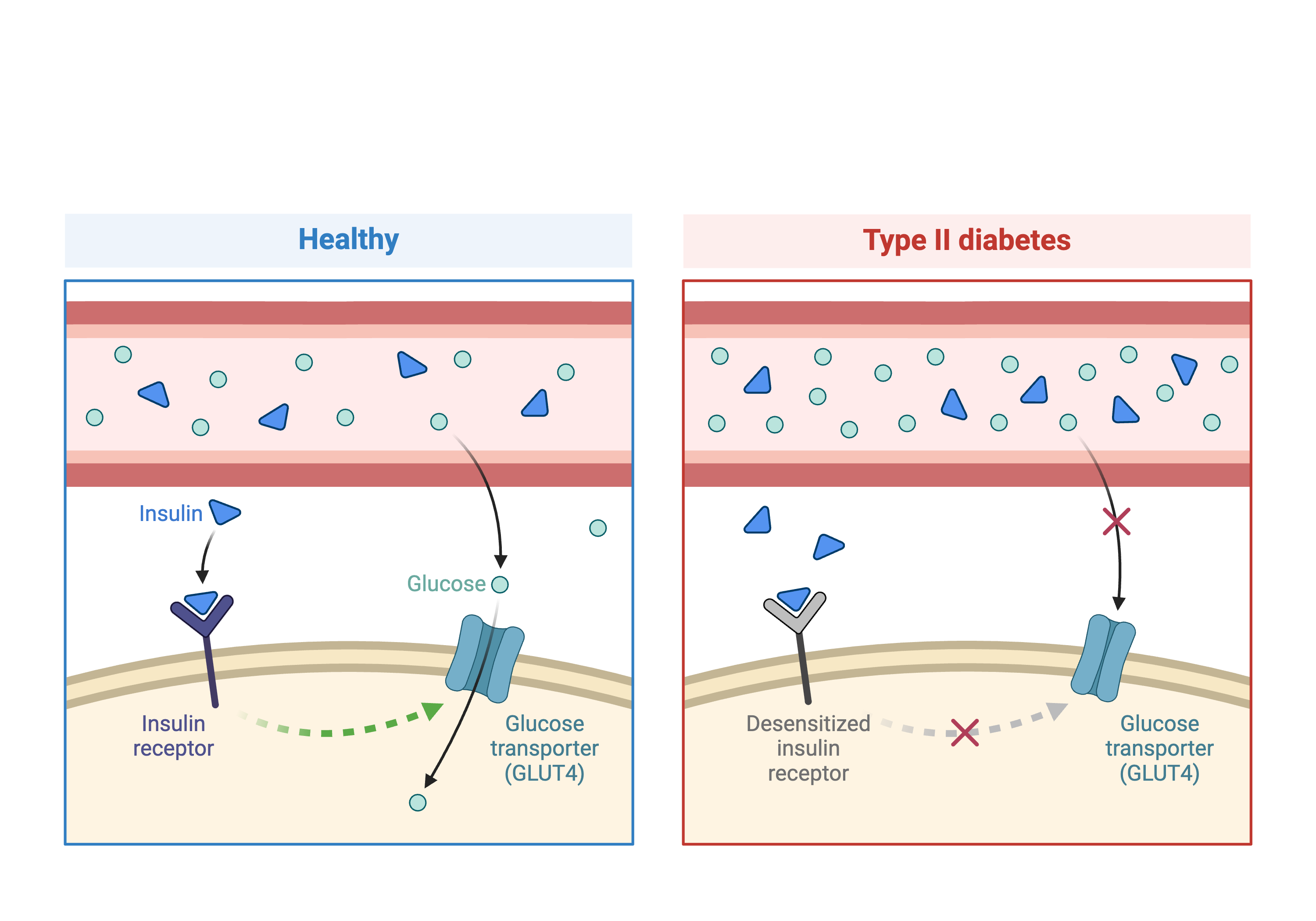
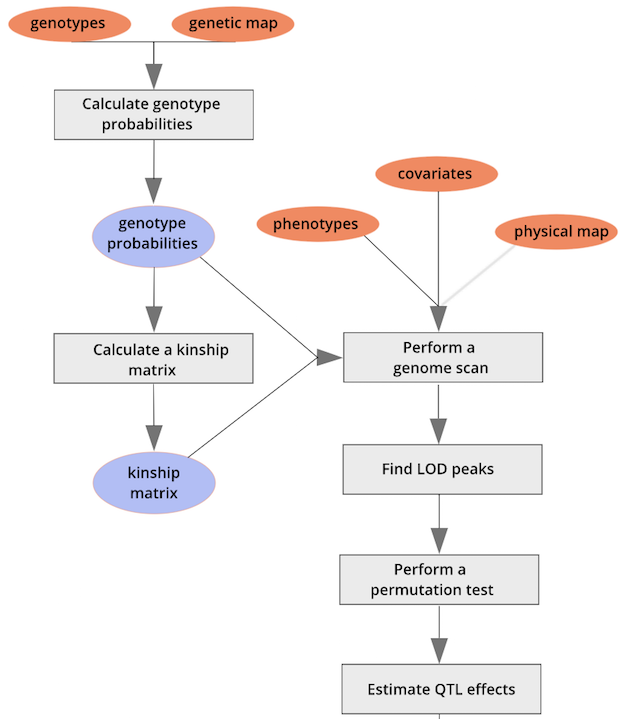
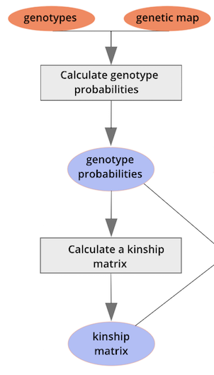 {alt=“Part
of the mapping workflow starting with genotypes and a genetic map used
to calculate genotype probabilities, which are then used to calculate
kinship between individuals in the data.} By default, the genotype
probabilities are converted to allele probabilities, and the kinship
matrix is calculated as the proportion of shared alleles. Also by
default we omit the X chromosome and only use the autosomes. To include
the X chromosome, use
{alt=“Part
of the mapping workflow starting with genotypes and a genetic map used
to calculate genotype probabilities, which are then used to calculate
kinship between individuals in the data.} By default, the genotype
probabilities are converted to allele probabilities, and the kinship
matrix is calculated as the proportion of shared alleles. Also by
default we omit the X chromosome and only use the autosomes. To include
the X chromosome, use omit_x=FALSE.
Figure 3
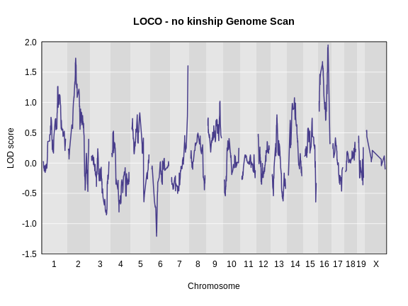
Performing a genome scan with a linear mixed model
Figure 1
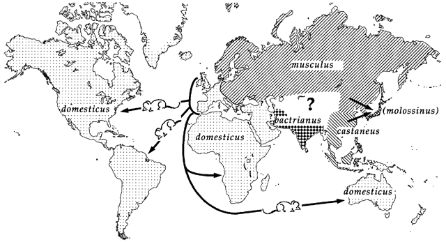
Figure 2
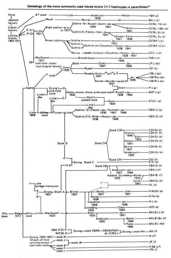
Figure 3
Figure 4
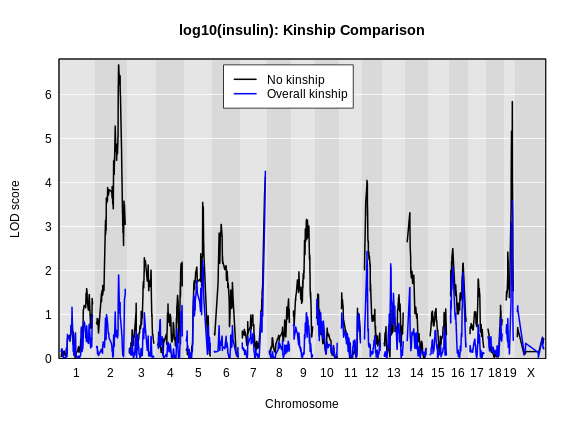
Figure 5
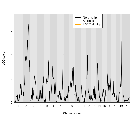
Figure 6
Performing a Genome Scan with Binary Traits
Figure 1
Figure 2
Figure 3
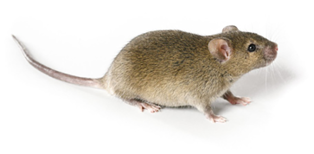
Figure 4
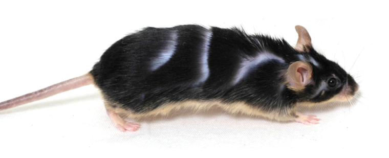
Figure 5
Figure 6
Figure 7
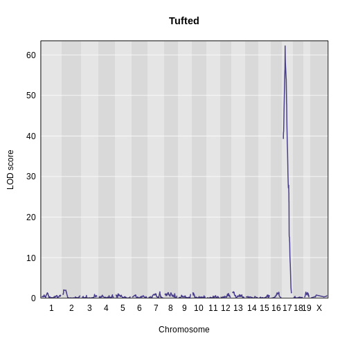
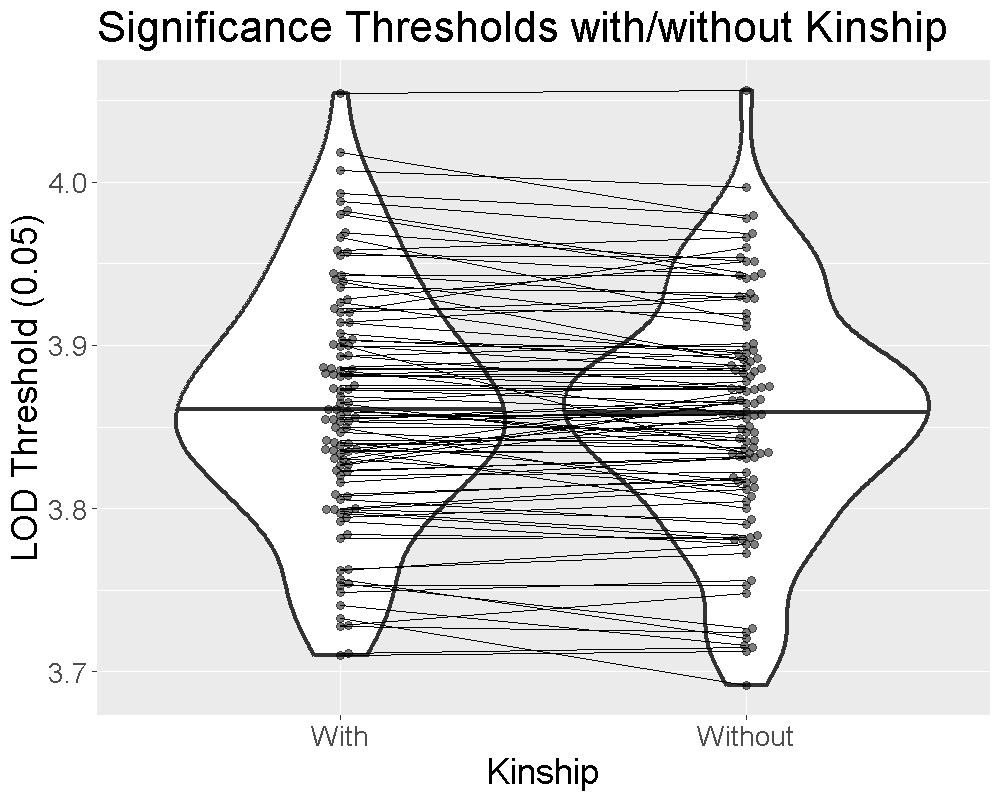
Finding Significant Peaks via Permutation
Figure 1
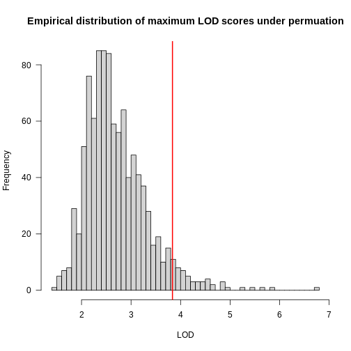
Figure 2
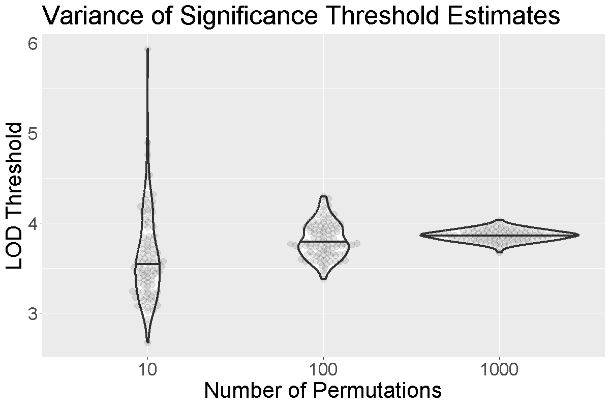
Figure 3
 As with
 scan1(), you can speed up the calculations on a
multi-core machine by specifying the argument cores. With
cores=0, the number of available cores will be detected via
parallel::detectCores(). Otherwise, specify the number of
cores as a positive integer. For large data sets, be mindful of the
amount of memory that will be needed; you may need to use fewer than the
maximum number of cores, to avoid going beyond the available memory.
Figure 4
Finding QTL peaks
Figure 1
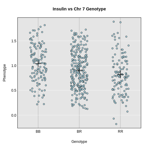
Estimating QTL effects
Figure 1
Figure 2
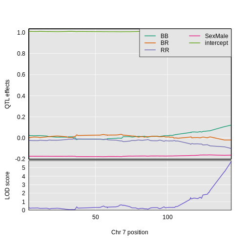
Figure 3
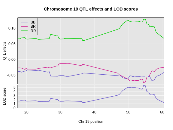
Figure 4
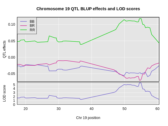
Figure 5
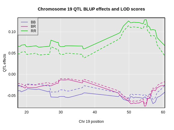
Figure 6
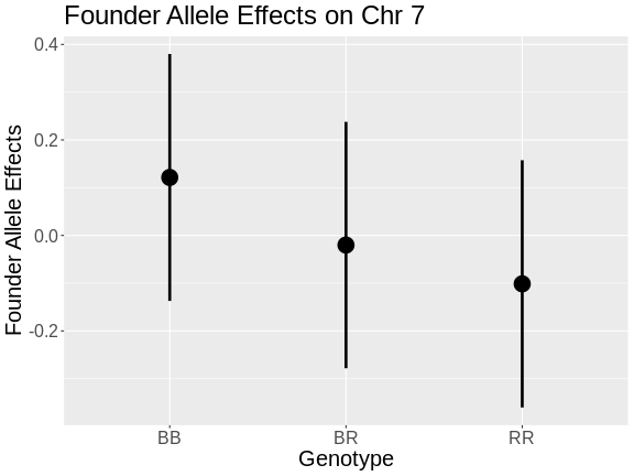
Figure 7
 ::::::::::::::::::::::::::::::::::::: challenge
Figure 8
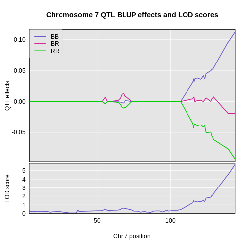
Figure 9
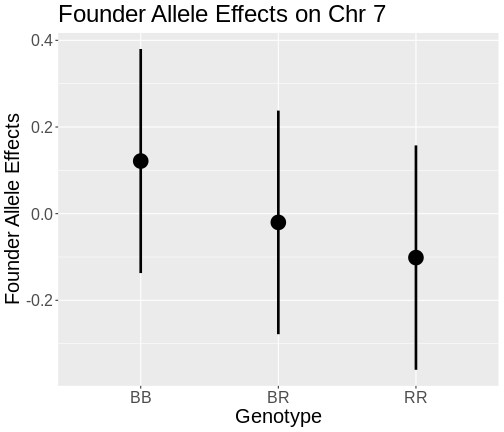
Figure 10
Figure 11
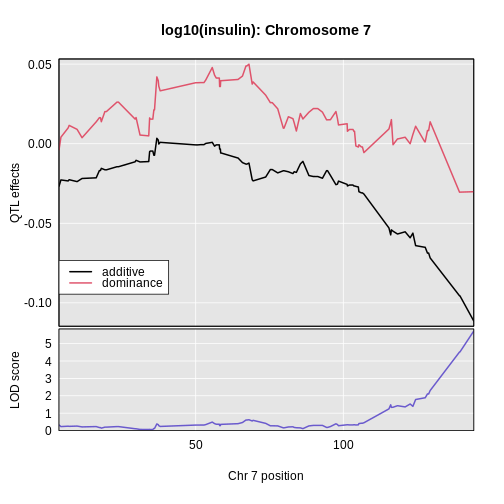
Figure 12
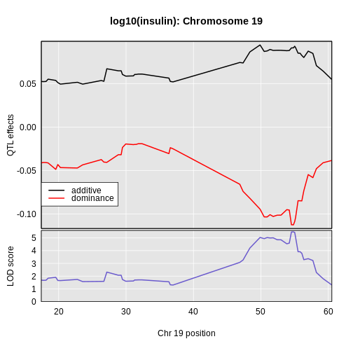
Figure 13
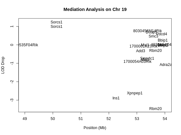
Integrating Gene Expression Data
Figure 1
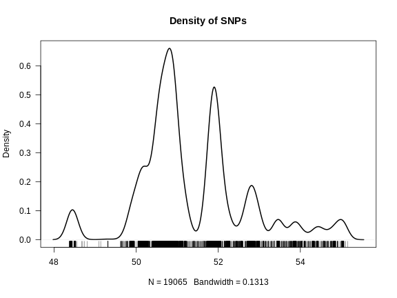
Figure 2
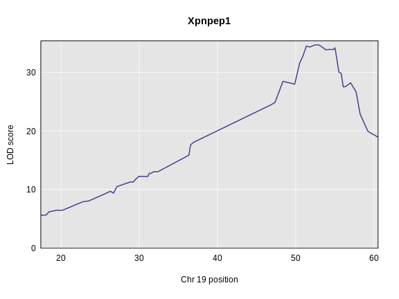
Figure 3
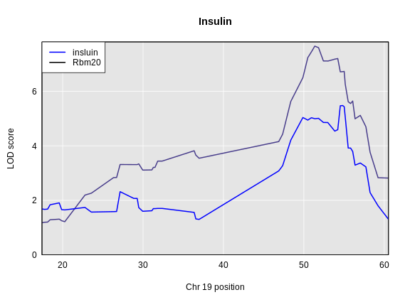
Figure 4
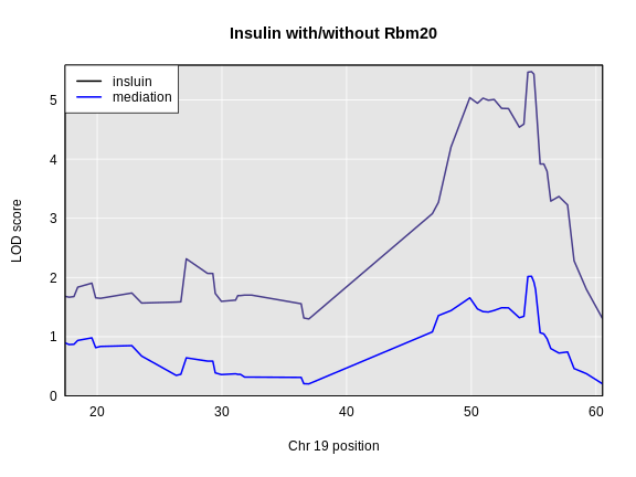
Figure 5
QTL Mapping in Diversity Outbred Mice
Figure 1
Figure 2
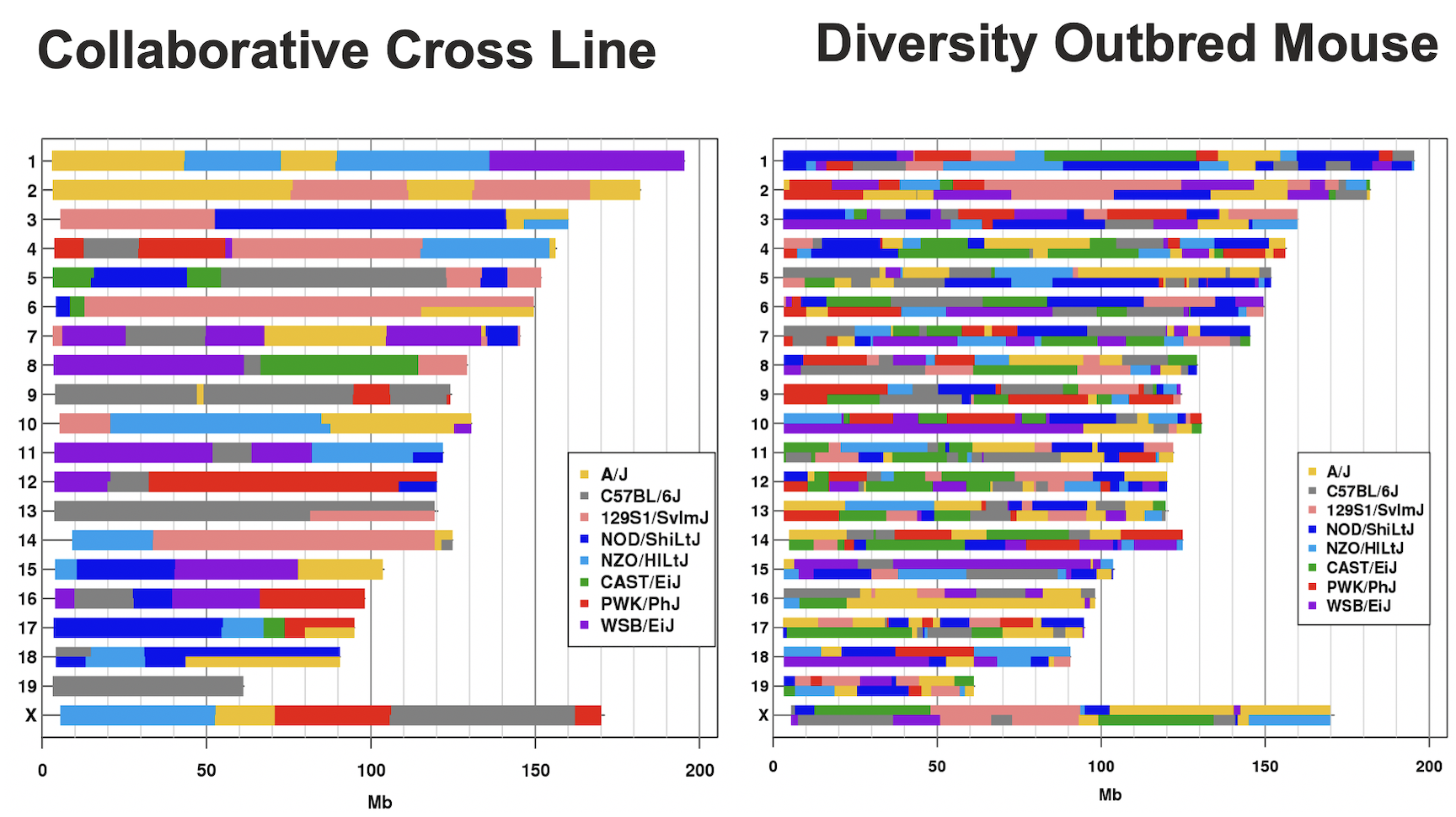
Figure 3
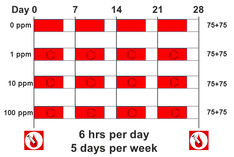
Figure 4
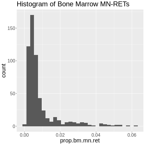
Figure 5
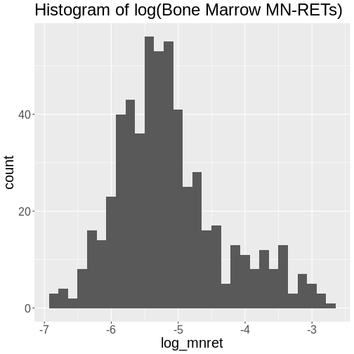
Figure 6
Figure 7
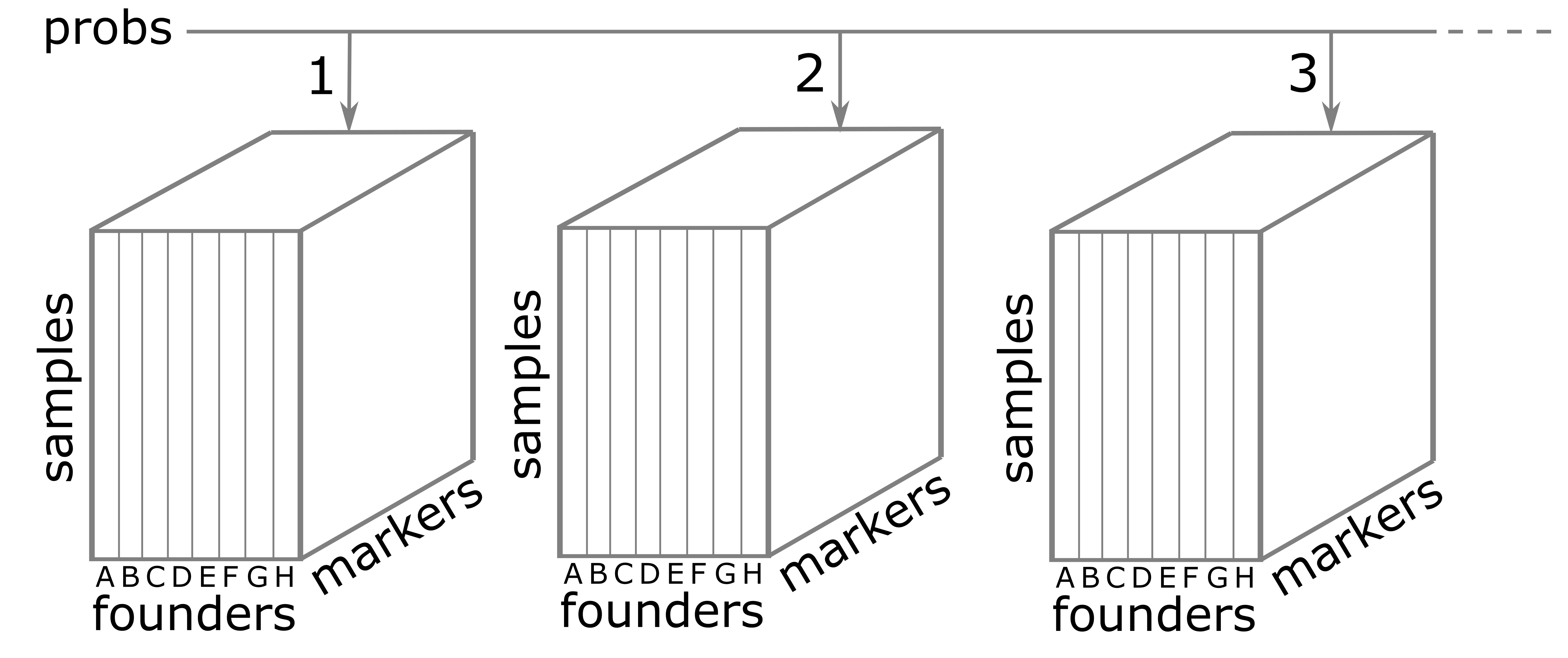
Figure 8
Figure 9
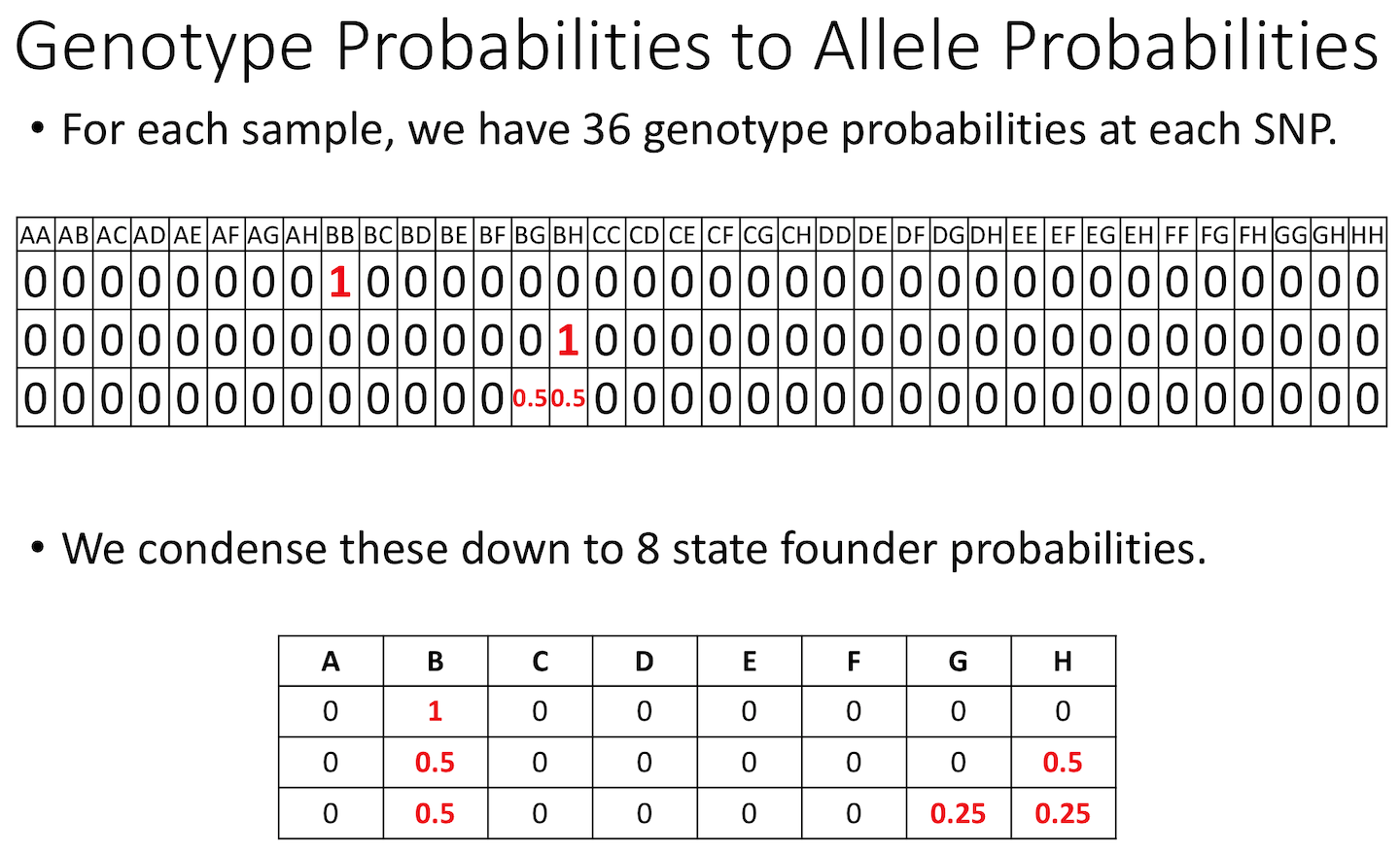
Figure 10
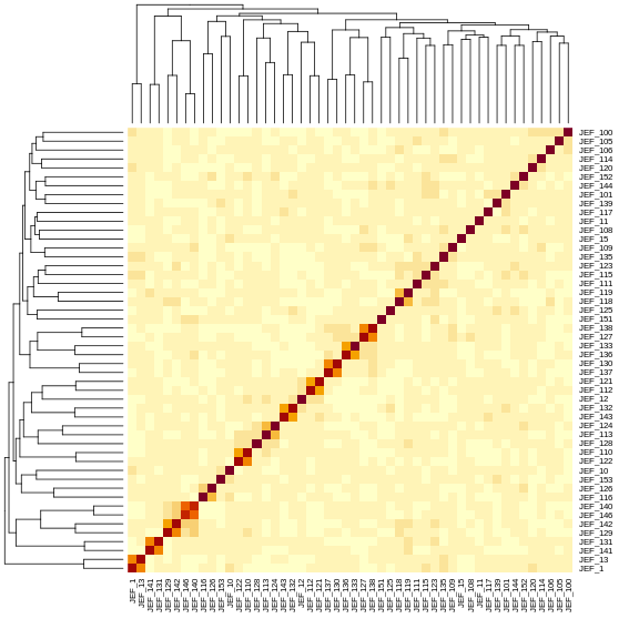
Figure 11
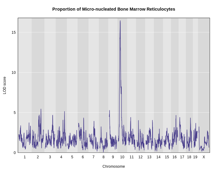
Figure 12
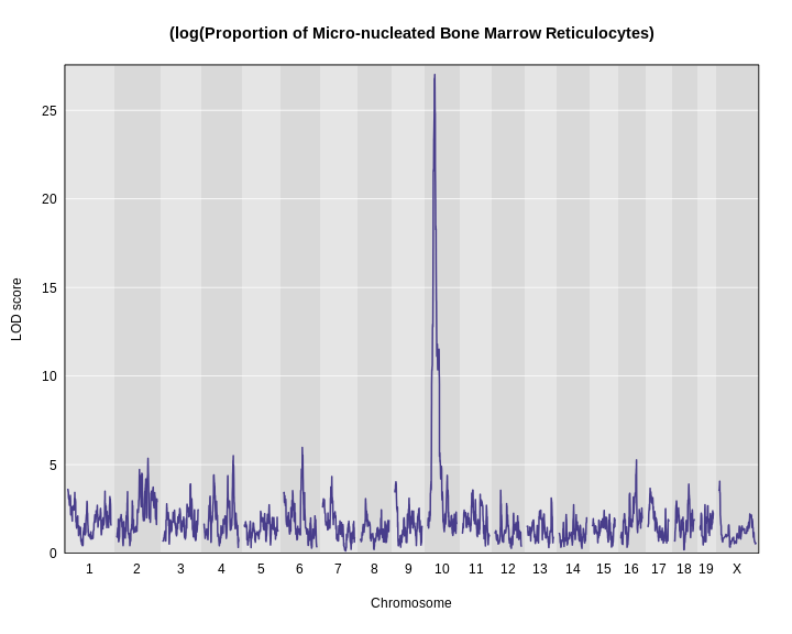
Figure 13
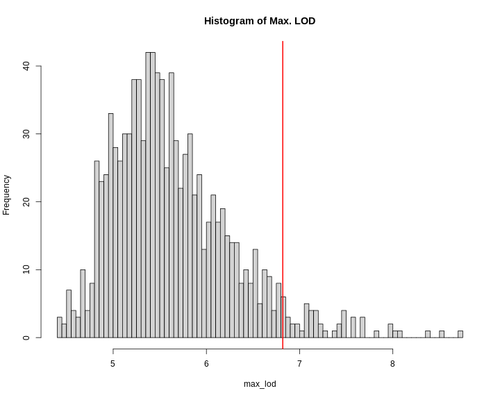
Figure 14
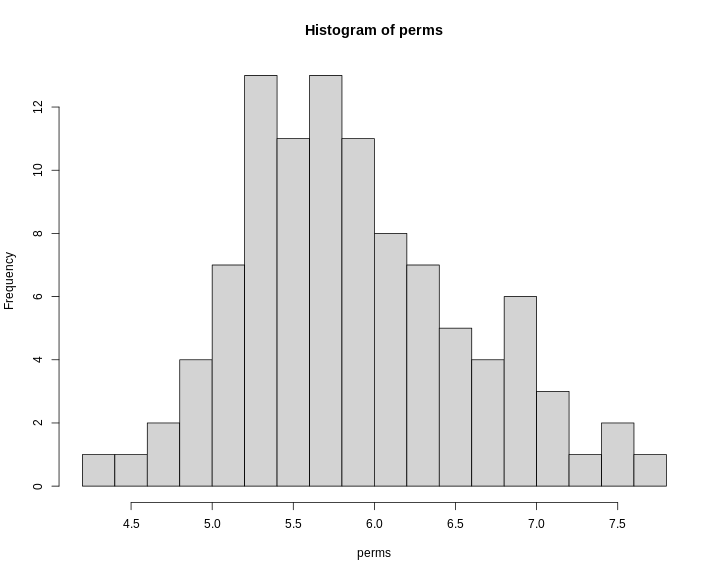
Figure 15
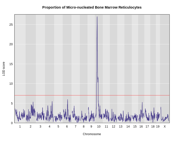
Figure 16
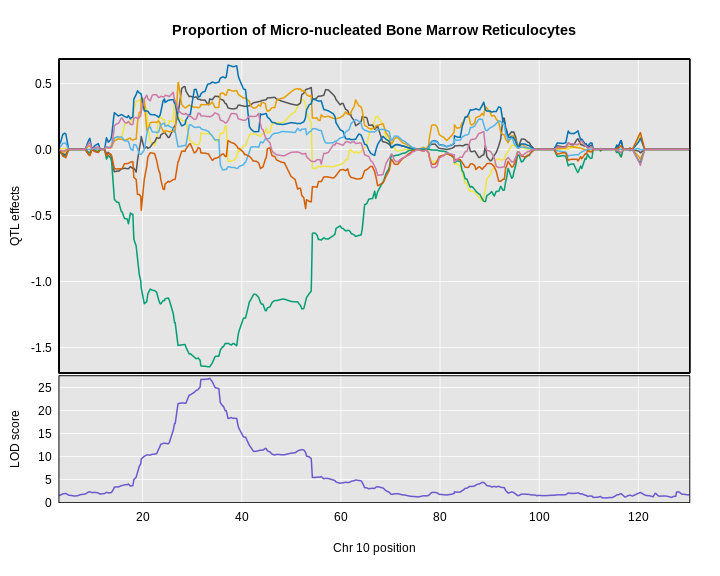
Figure 17
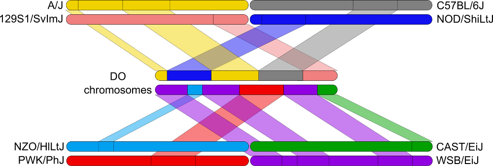
Figure 18
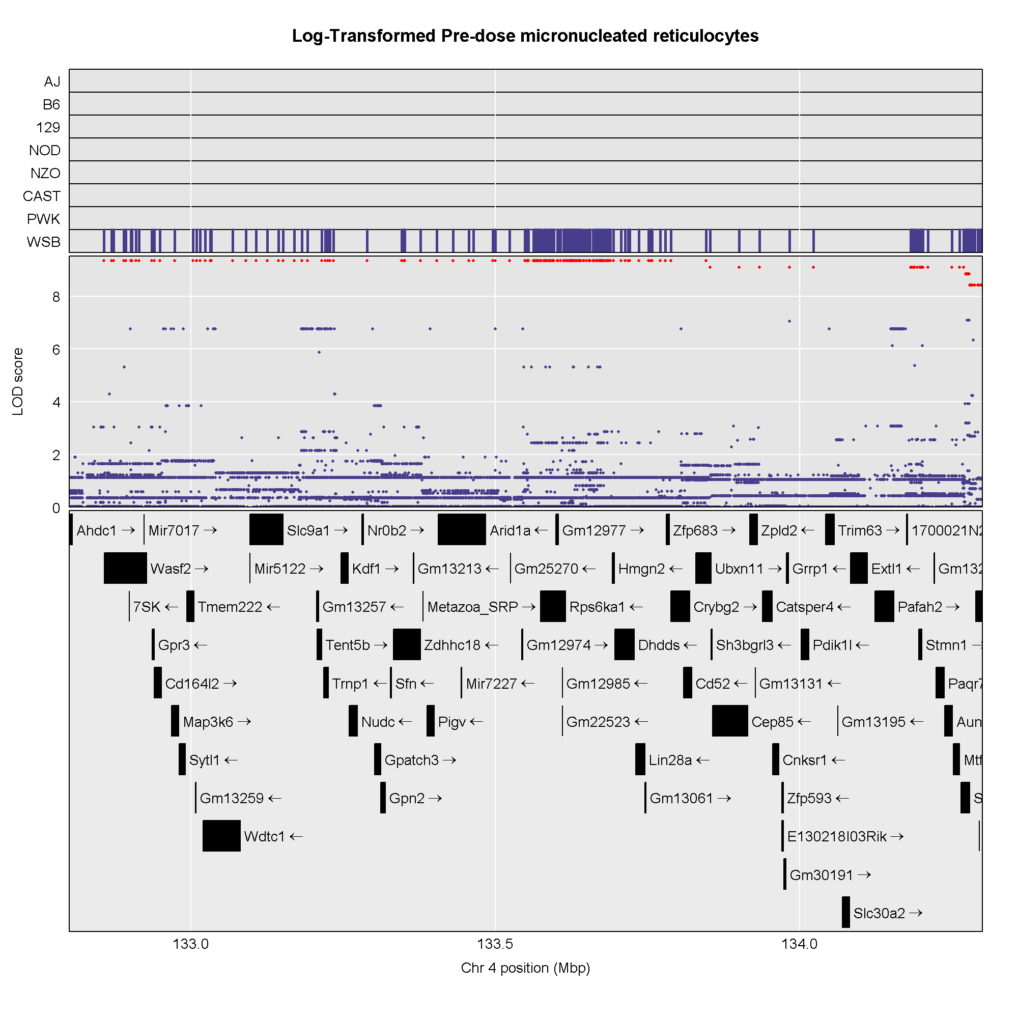
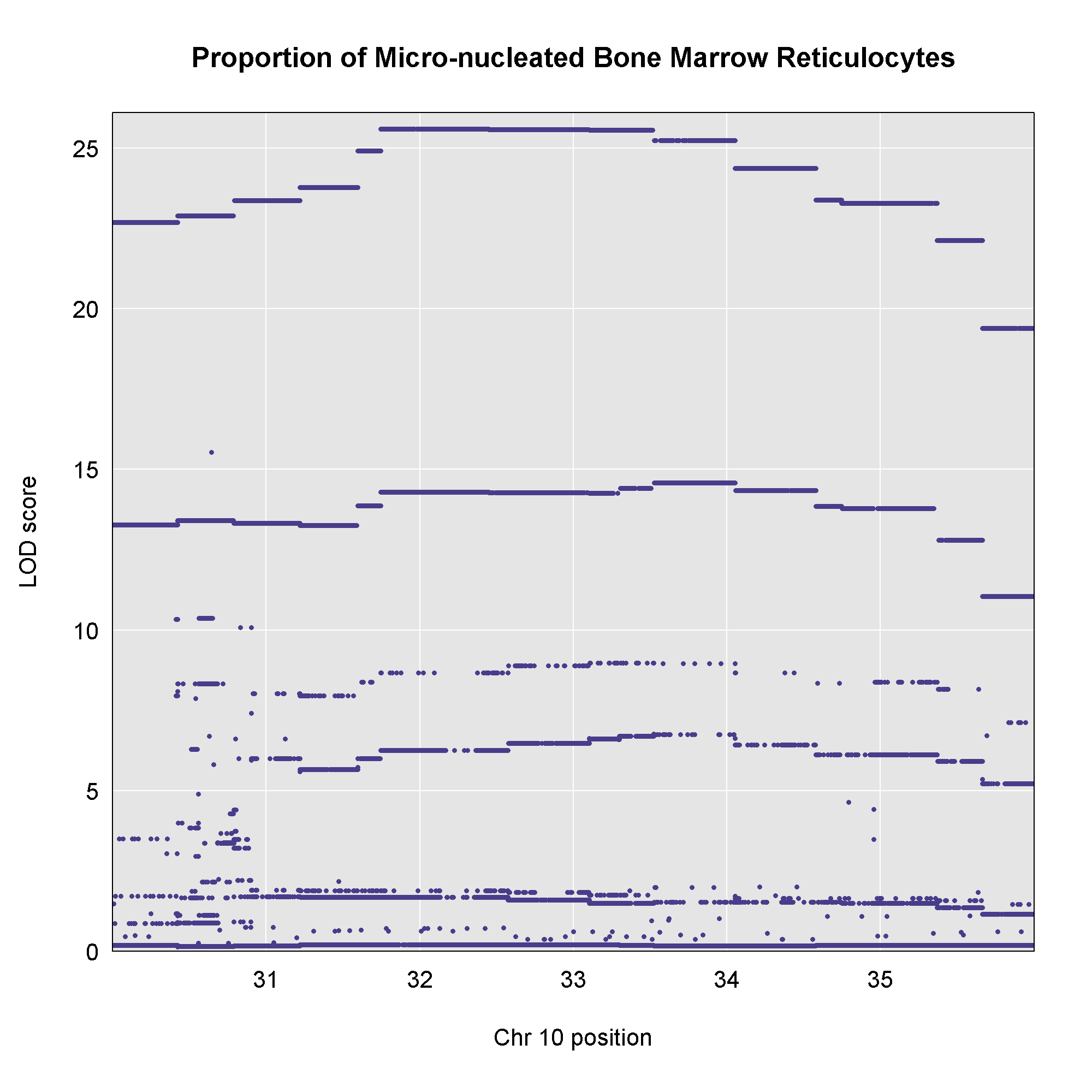 This plot shows
the LOD score for each SNP in the QTL interval. The SNPs occur in
“shelves” because all of the SNPs in a haplotype block have the same
founder strain pattern. The SNPs with the highest LOD scores are the
ones for which CAST/EiJ contributes the alternate allele.
This plot shows
the LOD score for each SNP in the QTL interval. The SNPs occur in
“shelves” because all of the SNPs in a haplotype block have the same
founder strain pattern. The SNPs with the highest LOD scores are the
ones for which CAST/EiJ contributes the alternate allele.
Figure 19
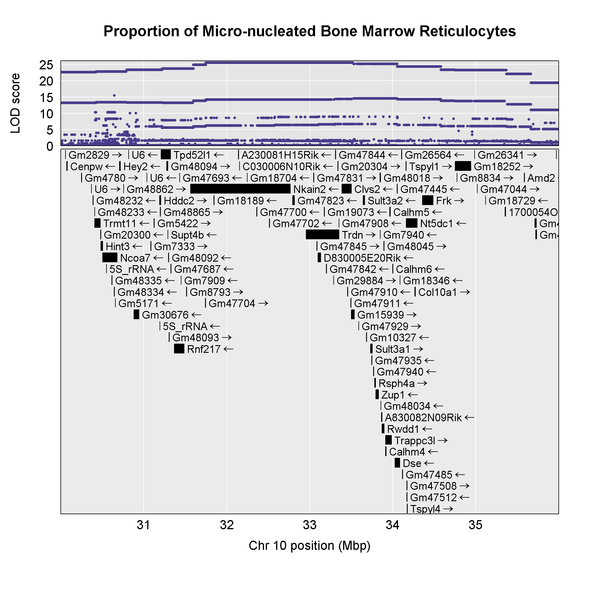 Now that we have the genes in this interval, we would like to know which
founders have the minor allele for the SNPs with the highest LOD scores.
To do this, we will highlight SNPs that are within a 1 LOD drop of the
highest LOD and we will add an argument to show which founder
contributes the minor allele at the highlighted SNPs.
Now that we have the genes in this interval, we would like to know which
founders have the minor allele for the SNPs with the highest LOD scores.
To do this, we will highlight SNPs that are within a 1 LOD drop of the
highest LOD and we will add an argument to show which founder
contributes the minor allele at the highlighted SNPs.
Figure 20
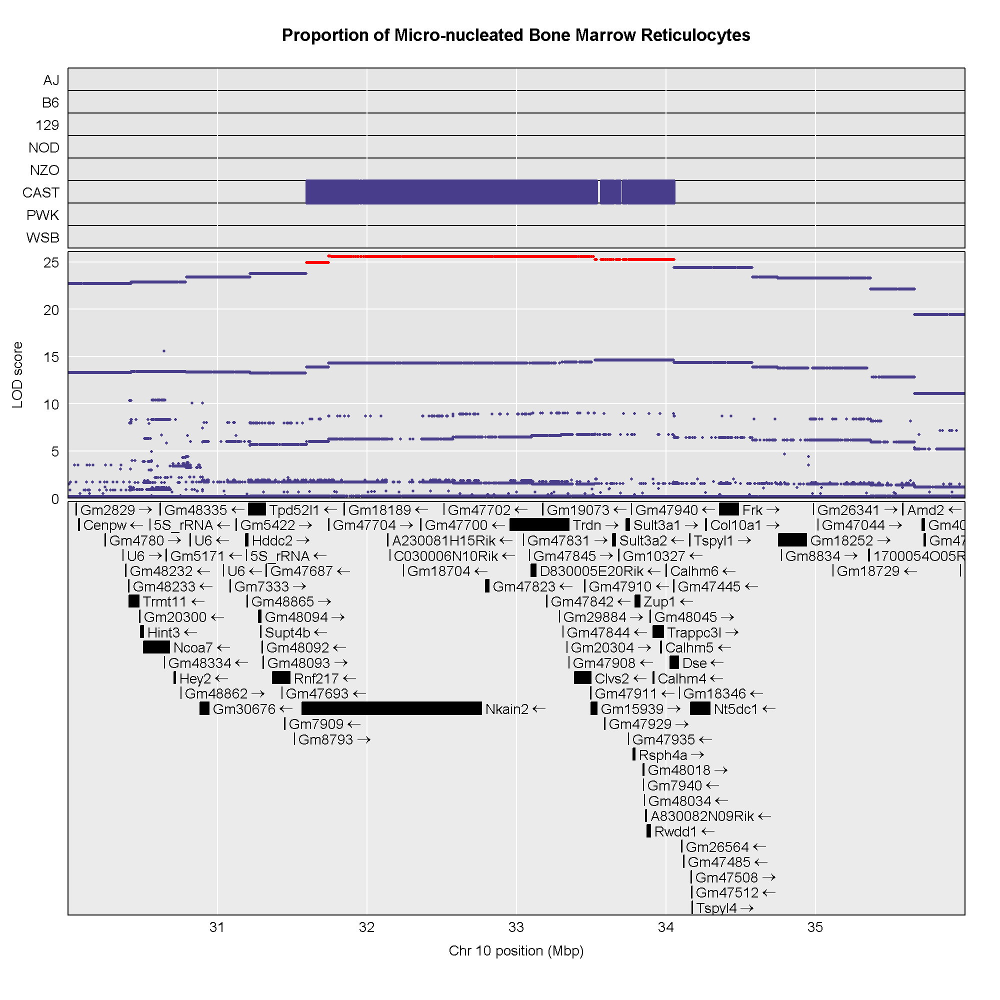
Figure 21
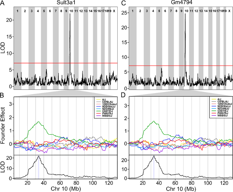 The plot above shows the genome scane for two genes: Sult3a1
and Gm4794. Gm4794 has been renamed to
Sult3a2. As you can see, both Sult3a1 Sult3a2
have eQTL in the same location at the MN-RET QTL on chromosome 10. Mice
carrying the CAST allele (in green) express these genes more highly.
Sult3a1 is a sulfotransferase
that may be involved in adding a sulfate group to phenol, one of the
metabolites of benzene.
The plot above shows the genome scane for two genes: Sult3a1
and Gm4794. Gm4794 has been renamed to
Sult3a2. As you can see, both Sult3a1 Sult3a2
have eQTL in the same location at the MN-RET QTL on chromosome 10. Mice
carrying the CAST allele (in green) express these genes more highly.
Sult3a1 is a sulfotransferase
that may be involved in adding a sulfate group to phenol, one of the
metabolites of benzene.
Figure 22
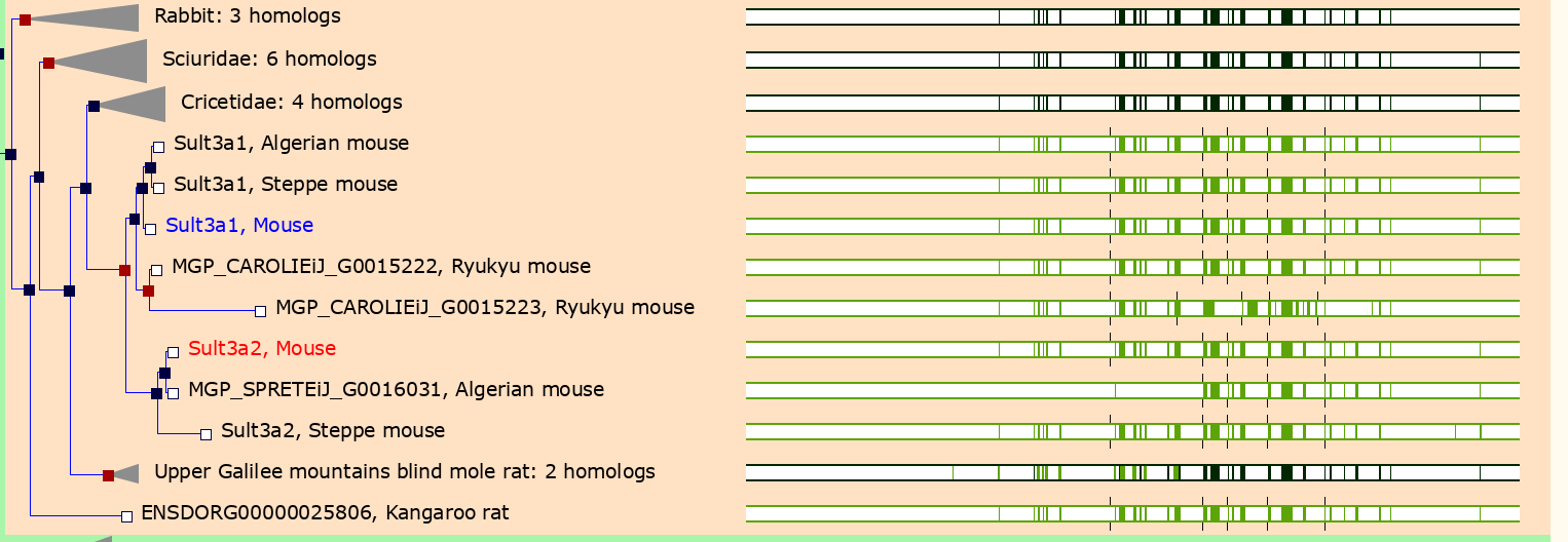
Figure 23
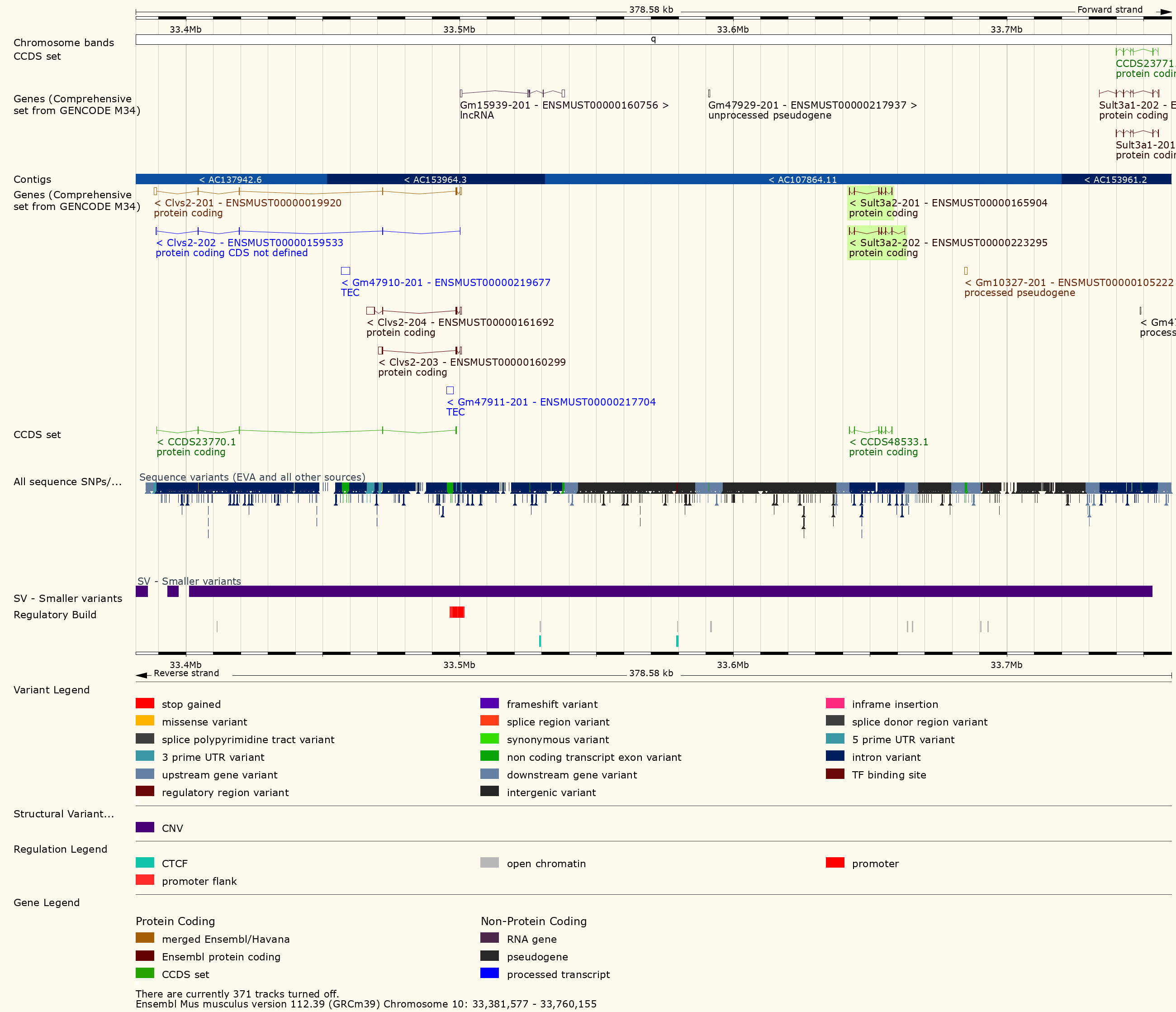
Figure 24
Figure 25
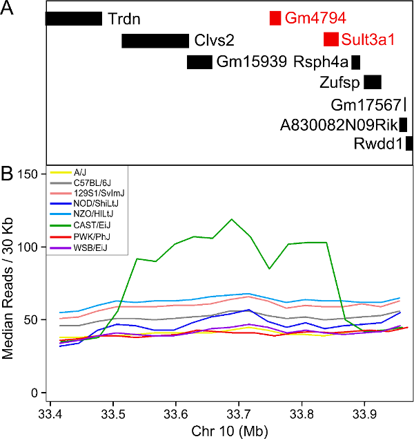
Figure 26
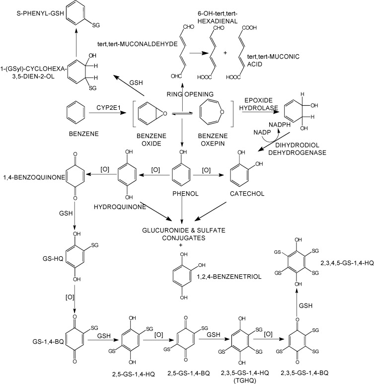
Figure 27
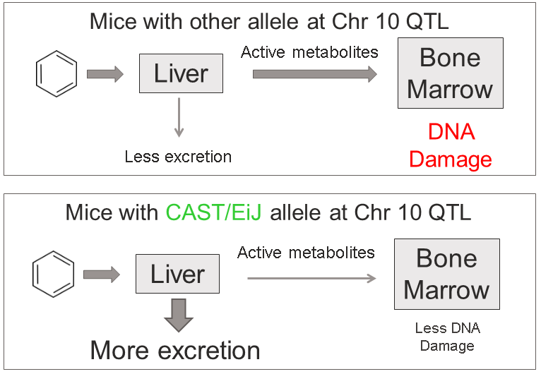
Figure 28
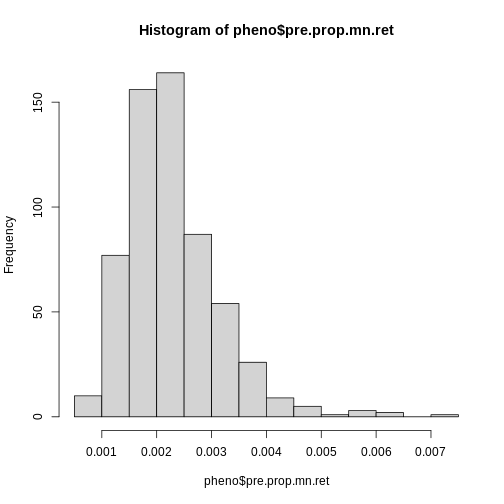
Figure 29
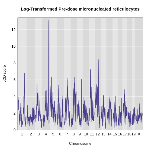
Figure 30
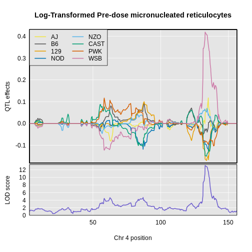
Figure 31