Content from Spatially Resolved Transcriptomics in Life Sciences Research
Last updated on 2025-10-07 | Edit this page
Estimated time: 15 minutes
Overview
Questions
- What is spatial transcriptomics?
- What research questions or problems can spatial transcriptomics address?
- How do the technologies work?
- Which technology will we learn about in this lesson?
Objectives
- Describe why and how spatial transcriptomics can be used in research.
- Describe how spatial transcriptomics technology works.
- Describe how spatial transcriptomics addresses the limitations of single-cell or bulk RNA sequencing technologies.
Spatial transcriptomics in biomedical research
Investigating the organization of cells and tissues is fundamental to life sciences research. Cells and tissues situated in different regions of an organ can possess diverse functions and cell types. These cells in turn are influenced by varying tissue microenvironments, receiving and processing distinct information from that microenvironment. Co-located cells can communicate directly with one another through chemical and mechanical signals, responding to these signals with changes in their own state. Thus, knowing the spatial organization of cells in a tissue can reveal cell and tissue function.

Department of Histology, Jagiellonian University Medical College CC BY-SA 3.0 DEED
Spatially resolved transcriptomics describes spatial organization and cell signals, specifically gene expression signals. Spatial patterns of gene expression determine how genes are regulated within a tissue system and how those tissues and their component cells function. Spatial transcriptomic (ST) methods map cell position in a tissue, clarifying the physical relationships between cells and cellular structures. ST simultaneously measures gene expression, delivering valuable information about cell phenotype, state, and cell and tissue organization and function. The combination of cellular expression and position sheds light on signals a cell sends or receives through cell-to-cell interactions. Spatial information localizes cell signaling while delivering comprehensive gene expression profiling within tissues.

Fred the Oyster Public domain, via Wikimedia Commons CC BY-SA 4.0 DEED
Spatial transcriptomics addresses a key obstacle in single-cell and bulk RNA sequencing studies: their loss of spatial information. Spatial organization and structure determine function in most tissues and organs, so capturing both spatial and expression information is critical for understanding tissue function in neuroscience, immuno-oncology, developmental biology, and most other fields.
Spatial transcriptomics technologies
Spatial transcriptomics technologies broadly fall within two groups: imaging-based and sequencing-based methods. Both imaging- and sequence-based datasets are available through the The BRAIN Initiative - Cell Census Network. Sequencing-based datasets are featured in the Human Cell Atlas. These technologies vary in ability to profile entire transcriptomes, deliver single-cell resolution, and detect genes efficiently.
Imaging-based technologies
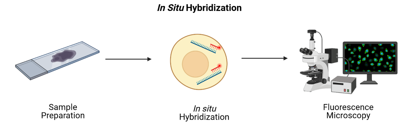
Imaging-based technologies read transcriptomes in place using microscopy at single-cell or even single-molecule resolution. They identify messenger RNA (mRNA) species fluorescence in situ hybridization (FISH), i.e., by hybridizing mRNA to gene-specific fluorescent probes.
Adapted from Spatial Transcriptomics Overview by SlifertheRyeDragon. Image created with Biorender.com. Public domain, via Wikimedia Commons CC BY-SA 4.0 DEED
RNA can be visualized in place in the original tissue environment by hybridizing labeled probes to their specific targets. Current FISH methods employ multiple hybridization rounds, with risk of error for each transcript growing exponentially with each round. FISH methods are limited in the size of tissue that they can profile and most are applicable only to fresh-frozen (FF) tissue. They can also be time-consuming and expensive due to microscopic imaging they require. Since they target specific genes, they can only detect genes that are in the probe set. They have high spatial resolution though, even delivering single-molecule resolution in single-molecule FISH (smFISH). Even technologies that can profile hundreds or thousands of mRNA transcripts simultaneously, though, target throughput is low and spectral overlap of fluorophores complicates microscopy.
Conventional FISH methods have few distinct color channels that limit the number of genes that can be simultaneously analyzed. Multiplexed error-robust FISH (MERFISH) overcomes this problem, greatly increasing the number of RNA species that can be simultaneously imaged in single cells by using binary code gene labeling in multiple rounds of hybridization.

SlifertheRyeDragon, CC BY-SA 4.0, via Wikimedia Commons
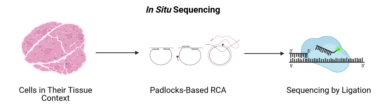
A second imaging-based method, in situ sequencing, amplifies and sequences mRNAs directly within a block or section of fresh-frozen (FF) or formalin-fixed paraffin embedded (FFPE) tissue.
 Adapted from Spatial Transcriptomics Overview by SlifertheRyeDragon.
Image created with Biorender.com. Public domain, via Wikimedia Commons
CC
BY-SA 4.0 DEED
Adapted from Spatial Transcriptomics Overview by SlifertheRyeDragon.
Image created with Biorender.com. Public domain, via Wikimedia Commons
CC
BY-SA 4.0 DEED
Messenger RNA (mRNA) is reverse transcribed to complementary DNA (cDNA) within tissue sections. A padlock probe binds to the cDNA, which is then circularized. Following circularization, the cDNA is amplified by rolling-circle amplification (RCA), then sequenced by ligation for decoding. Probes profile one or two bases at a time using different fluorophores, eventually revealing the identity of the cDNA through imaging. Since it requires imaging, in situ sequencing is an imaging-based method even though it involves sequencing. In situ sequencing can accommodate larger tissue sections than can FISH, though FISH methods are more efficient at detecting mRNA of genes in the probe set. Like FISH, in situ sequencing requires considerable imaging time on a microscope but delivers high spatial resolution. Both methods require a priori knowledge of target mRNA.
Sequencing-based technologies
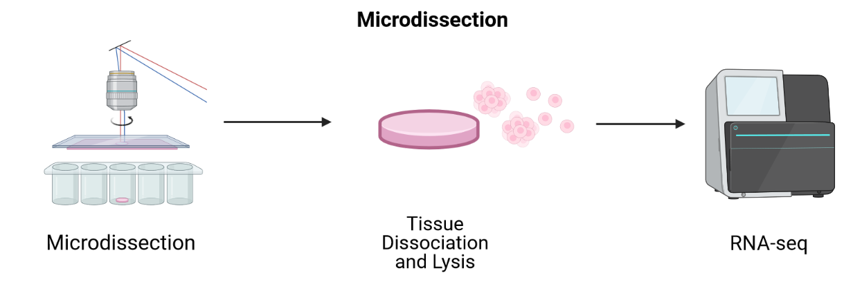
Sequencing-based methods capture, sequence, and count mRNA using next-generation sequencing while retaining positional information. This is distinct from in situ sequencing because next-generation sequencing is employed. Sequencing-based methods may be unbiased, in which they capture the entire transcriptome, or probe-based, in which they typically capture the majority of protein-coding genes. Sequencing-based methods retain spatial information through laser-capture microdissection (LCM), microfluidics, or through ligation of mRNAs to arrays of barcoded probes that record position.
LCM-based methods employ lasers to cut a tissue slice or fuse tissue to a membrane followed by sequencing of individual cells.
 Adapted from Spatial Transcriptomics Overview by SlifertheRyeDragon.
Image created with Biorender.com. Public domain, via Wikimedia Commons
CC
BY-SA 4.0 DEED
Adapted from Spatial Transcriptomics Overview by SlifertheRyeDragon.
Image created with Biorender.com. Public domain, via Wikimedia Commons
CC
BY-SA 4.0 DEED
LCM techniques process tissue sections for transcriptomic profiling by isolating regions of interest. They are useful for profiling transcriptomes as a first pass and for identifying RNA isoforms, but their blunt approach to capturing spatial expression data limits spatial resolution and requires many samples for sequencing. Since they focus on regions of interest, it is difficult to grasp spatial expression across a whole tissue. LCM is an older technology that has long been used with FFPE tissues. Modern LCM-based approaches include Nanostring’s GeoMx DSP and STRP-seq.
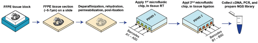
Microfluidics places a chip with multiple barcode-containing channels onto a tissue section followed by a second chip with channels perpendicular to the first. The barcodes are then ligated to each other to create an array of unique barcodes on the tissue. This deterministic barcoding is employed in DBiT-seq. DBiT-seq can be used with FFPE tissues. This approach is helpful to avoid diffusion of mRNA away from capture areas, though a disadvantage is that cells often sit astride multiple capture areas.
 Adapted from
Liu
Y, Enninful A, Deng Y, & Fan R (2020). Spatial transcriptome
sequencing of FFPE tissues at cellular level. Preprint.
CC
BY-SA 4.0 DEED
Adapted from
Liu
Y, Enninful A, Deng Y, & Fan R (2020). Spatial transcriptome
sequencing of FFPE tissues at cellular level. Preprint.
CC
BY-SA 4.0 DEED
Other array-based methods capture mRNA with spatially-barcoded probes and sequence them. They can profile larger tissue sections than can FISH or in situ sequencing and they don’t rely on time-consuming microscopic imaging. Spatial resolution is lower, however.
In this lesson we will use data from positionally barcoded arrays.

James Chell, Spatial transcriptomics ii, CC BY-SA 4.0
| Technology | Gene detection efficiency | Transcriptome-wide profiling | Spatial resolution | Tissue area |
|---|---|---|---|---|
| FISH | + | - | + | - |
| In situ sequencing | - | - | + | + |
| LCM-based | + | + | - | - |
| Microfluidics | - | + | - | + |
| Array-based | - | + | - | + |
Table 1. Relative strengths and weaknesses of spatial transcriptomics technologies by general category.
This introduction to the technologies is intended to help you navigate a complex technological landscape so that you can learn more about existing technologies. It is not intended to be comprehensive.
The diversity in spatial transcriptomics technologies is enormous and rapidly developing. If you would like to learn more about spatial transcriptomics technologies, please see the list of references located here.
Discussion: Which technology is right for your research?
Would an imaging-based or a sequencing-based solution be preferable for your research? Why?
From the descriptions above, which technology do you think would best suit your research? Would you use fresh-frozen (FF) or formalin-fixed tissues embedded in paraffin (FFPE)? Even if your institution does not offer service using a specific technology, describe which best suits your research and why you think it’s best suited.
Which technology you use depends on your experimental aim. If you are testing hypotheses about specific genes, you can profile those genes at high resolution and sensitivity with an imaging-based method. If instead you aim to generate hypotheses, next generation sequencing-based methods that profile many genes in an unbiased manner would be best.
10X Genomics Visium technology
In this lesson we will use data from an array-based method called Visium that is offered by 10X Genomics. Visium is an upgrade and commercialization of the spatial transcriptomics method described in 2016 in Science, 353(6294) and illustrated in general in the figure above. A more specific schematic is given below.
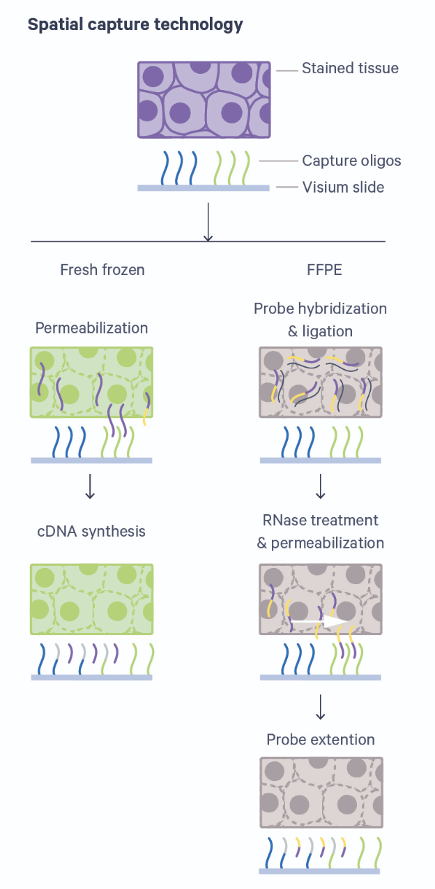
Thin tissue sections are placed atop spots printed with spatial barcodes. For fresh-frozen (FF) tissues, tissue fixing and permeabilization discharges mRNA to bind with spatially barcoded probes that indicate the position on the slide. The assay is sensitive to permeabilization time, which is often optimized in a separate experimental procedure. Captured mRNA is then reverse transcribed to cDNA and sequencing libraries created from these. The formalin-fixed paraffin embedded (FFPE) assay utilizes probe pairs that identify each gene in the probe set and capture target genes by hybridizing to them. Permeabilization discharges the captured mRNA to spatially barcoded probes on the slide, but does not require a separate optimization step as in the FF protocol. The capture mRNA is then extended to include complements of the spatial barcodes. Sequencing libraries are then formed from the captured and barcoded mRNA.
Spatial transcriptomics combines two key modes: histological imaging and gene expression profiling. Histological imaging captures tissue morphology with standard staining protocols while expression profiling is captured by sequencing spatially barcoded cDNA.
Sequencing-based datasets have grown faster than have imaging-based datasets, with Visium dominating published datasets. Unlike most other sequencing-based technologies, Visium accommodates both FF or FFPE tissue. Each spot provides average gene expression measurements from between one to a few tens of cells, approaching single-cell resolution. Average gene expression measurements are combined with histological images that couple molecular detail and tissue morphology and structure.
- Spatial transcriptomics provides the location of cells relative to neighboring cells and cell structures.
- A cell’s location is useful data for describing its phenotype, state, and cell and tissue function.
- Spatial transcriptomics addresses a key obstacle in bulk and single-cell RNA sequencing studies: their loss of spatial information.
- The main goal of spatial transcriptomics studies is to integrate expression with spatial information.
Content from Data and Study Design
Last updated on 2025-10-07 | Edit this page
Estimated time: 30 minutes
Overview
Questions
- Which data will we explore in this course?
- How was the study that generated the data designed?
- What are some critical design elements for rigorous, reproducible spatial transcriptomics experiments?
Objectives
- Describe a spatial transcriptomics experiment.
- Identify important elements for good experimental design.
The Data
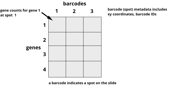
Recall that tissue is laid on a glass slide containing spots with primers to capture mRNA. The graphic below details a Visium slide with four capture areas. Each capture area has arrays of barcoded spots containing oligonucleotides. The oligonucleotides each contain a poly(dT) sequence for capture of polyadenylated molecules, a unique molecular identifier (UMI) to identify duplicate molecules, a spatial barcode shared by all oligonucleotides within the same spot, and a partial read for library preparation and sequencing.
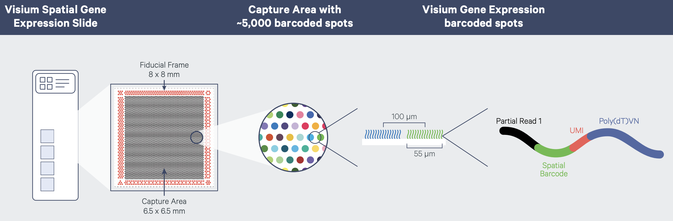
In spatial transcriptomics the barcode indicates the x-y coordinates of the spot. Barcodes are generic identifiers that identify different things in different technologies. A barcode in single-cell transcriptomics, for example, refers to a single cell, not to a spot on a slide. When you see barcodes in ST data, think spot, not single cell. In fact, one spot can capture mRNA from many cells. This is a feature of ST experiments that is distinct from single-cell transcriptomics experiments. As a result, many single-cell methods won’t work with ST data. Later we will look at methods to deconvolve cell types per spot to determine the number and types of cells in each spot. Spots can contain zero, one, or many cells.
The graphic below shows a Visium workflow for fresh-frozen tissues.
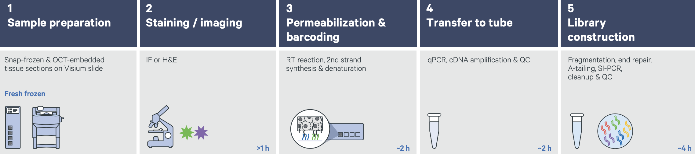 Graphic from
Grant
application resources for Visium products at 10X Genomics
Graphic from
Grant
application resources for Visium products at 10X Genomics
Count data for each mRNA are mapped back to spots on the slide to indicate the tissue position of gene expression. An image of the tissue overlaid on the array of spots pinpoints spatial gene expression in the tissue.
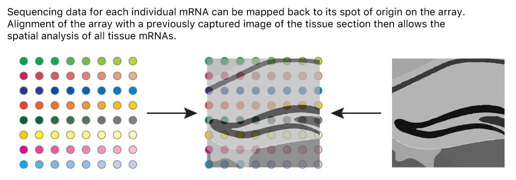
Adapted from James Chell, Spatial transcriptomics ii, CC BY-SA 4.0
Data from the 10X Genomics Visium platform contain gene identifiers in rows and barcode identifiers in columns. In the graphic below, row 1 of column 1 contains the mRNA counts for gene 1 at barcode (spot) 1.
Challenge 1: Row and column sums
What does the sum of a single row signify?
What does the sum of a single column signify?
The row sum is the total expression of one gene across all spots on the slide.
R
sum('data[1, ]')
The column sum is the total expression of all genes for one spot on the slide.
R
sum('data[ , 1]')
Design and Motivation of Prefrontal Cortex Study
We will use data from a study of the human prefrontal cortex published in Transcriptome-scale spatial gene expression in the human dorsolateral prefrontal cortex by Maynard et al, Nat Neurosci 24, 425–436 (2021). This region of the brain, involved in higher-order cognition and managing thoughts and actions in conformance with internal goals, is particularly amenable to spatial analyses because its structure is intimately tied to its function. Specifically, the six cortical layers and the white matter shown below are comprised of cells with distinct gene expression profiles and differing patterns of morphology, physiology, and connectivity.
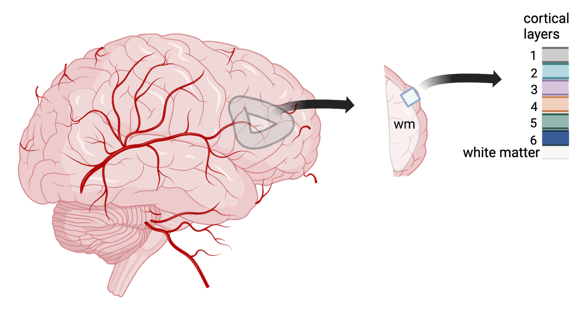
Adapted from Maynard et al, Nat Neurosci 24, 425–436 (2021). Created with BioRender.com.
The dorsolateral prefrontal cortex is implicated in some neuropsychiatric disorders such as autism spectrum disorder (ASD) and schizophrenia disorder (SCZD), and differences in gene expression and pathology are located in specific cortical layers. Localizing gene expression at cellular resolution within the six layers can illuminate disease mechanisms and brain development. As such, the authors aimed to map gene expression to the spatial organization of the six cortical layers. This course will largely follow their analyses in defining the gene expression markers of the cortical layers.
Spatial transcriptomics has several advantages relative to other technologies in meeting the authors’ objective. Owing to their large size and fragility, human neurons are difficult to isolate with scRNA-seq. This has motivated the use of single-nucleus(sn)RNA-seq in most studies. Unfortunately, this modality fails to capture cytoplasmic compartments of the cell, as well as axons and dendrites, and the genes within these regions have been associated with SCZD and ASD. Laser capture microdissection followed by sequencing does capture all cellular compartments, but can not be use to detect spatial gradients of gene expression since it removes tissues from their spatial context. Spatial transcriptomics offers the ability both to capture the entire repertoire of cells resident in the brain and to establish the expression gradient across them within the spatial context of the intact tissue.
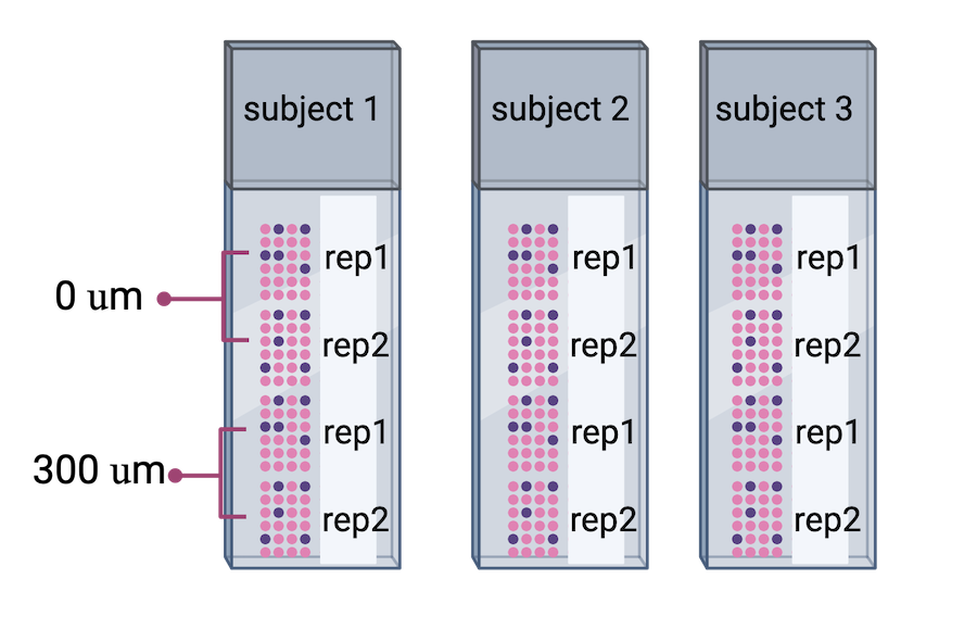
The authors proceeded in their spatial transcriptomics study by selecting wwo pairs of spatially adjacent replicates from three neurotypical donors. The second pair of replicates was taken from 300 microns posterior to the first pair of replicates.
 Adapted from
Maynard et al, Nat
Neurosci 24, 425–436 (2021).
Created with BioRender.com.
Adapted from
Maynard et al, Nat
Neurosci 24, 425–436 (2021).
Created with BioRender.com.
Challenge 2: What do you notice?
What do you notice about the experimental design that might create issues during data analysis? Why might the authors have done the experiment this way? Is there anything that can be done about this?
Human brain tissues start to deteriorate at death. Brain banks that provide tissue for studies requiring intact mRNA will quickly remove the brain and rapidly weigh, examine, dissect and freeze it to optimize mRNA integrity. For this study, dorsolateral prefrontal cortex samples were embedded in a medium (see Methods section) and then cryosectioned. Sections were then placed on chilled Visium slides, fixed and stained.
This whole process might have depended on donor availability. All three donors were neurotypical, and it’s not clear how they died (e.g., an accident, a terminal illness, old age) and how that might have impacted availability or mRNA quality. Suffice it to say that it might not have been possible to predict when samples would be available, so it might not have been possible to randomize the samples from each donor to different Visium slides.
Sometimes you might have to confound variables in your study due to sample availability or other factors. The key thing is to know that confounding has occurred.
Important considerations for rigorous, reproducible experiments
Good experimental design plays a critical role in obtaining reliable and meaningful results and is an essential feature of rigorous, reproducible experiments. Designed experiments aim to describe and explain variability under experimental conditions. Variability is natural in the real world. A medication given to a group of patients will affect each of them differently. A specific diet given to a cage of mice will affect each mouse differently. Ideally if something is measured many times, each measurement will give exactly the same result and will represent the true value. This ideal doesn’t exist in the real world. Variability is a feature of natural systems and also a natural part of every experiment we undertake.
Replication
To figure out whether a difference in responses is real or inherently random, replication applies the same treatment to multiple experimental units. The variability of the responses within a set of replicates provides a measure against which we can compare differences among different treatments. Experimental error describes the variability in the responses. Random variation (a.k.a random error or noise) reflects imprecision, but not inaccuracy. Larger sample sizes reduce this imprecision.
In addition to random (experimental) error, systematic error or bias occurs when there are deviations in measurements or observations that consistently either overestimate or underestimate the true value. As an example, a scale might be calibrated so that mass measurements are consistently too high or too low. Unlike random error, systematic error is consistent in one direction, is predictable and follows a pattern. Larger sample sizes don’t correct for systematic bias; equipment or measurement calibration does. Technical replicates define this systematic bias by running the same sample through the machine or measurement protocol multiple times to characterize the variation caused by equipment or protocols.
A biological replicate measures different biological samples in parallel to estimate the variation caused by the unique biology of the samples. The sample or group of samples are derived from the same biological source, such as cells, tissues, organisms, or individuals. Biological replicates assess the variability and reproducibility of experimental results. The greater the number of biological replicates, the greater the precision (the closeness of two or more measurements to each other). Having a large enough sample size to ensure high precision is necessary to ensure reproducible results. Note that increasing the number of technical replicates will not help to characterize biological variability! It is used to characterize systematic error, not experimental error.
Challenge 3: Which kind of error?
A study used to determine the effect of a drug on weight loss could
have the following sources of experimental error. Classify the following
sources as either biological, systematic, or random error.
1). A scale is broken and provides inconsistent readings.
2). A scale is calibrated wrongly and consistently measures mice 1 gram
heavier.
3). A mouse has an unusually high weight compared to its experimental
group (e.g., it is an outlier).
4). Strong atmospheric low pressure and accompanying storms affect
instrument readings, animal behavior, and indoor relative humidity.
1). random, because the scale is broken and provides any kind of
random reading it comes up with (inconsistent reading)
2). systematic
3). biological
4). random or systematic; you argue which and explain why
Challenge 4: How many technical and biological replicates?
In each scenario described below, identify how many technical and how many biological replicates are represented. What conclusions can be drawn about experimental error in each scenario?
1). One person is weighed on a scale five times.
2). Five people are weighed on a scale one time each.
3). Five people are weighed on a scale three times each.
4). A cell line is equally divided into four samples. Two samples
receive a drug treatment, and the other two samples receive a different
treatment. The response of each sample is measured three times to
produce twelve total observations. In addition to the number of
replicates, can you identify how many experimental units there
are?
5). A cell line is equally divided into two samples. One sample receives
a drug treatment, and the other sample receives a different treatment.
Each sample is then further divided into two subsamples, each of which
is measured three times to produce twelve total observations. In
addition to the number of replicates, can you identify how many
experimental units there are?
1). One biological sample (not replicated) with five technical
replicates. The only conclusion to be drawn from the measurements would
be better characterization of systematic error in measuring. It would
help to describe variation produced by the instrument itself, the scale.
The measurements would not generalize to other people.
2). Five biological replicates with one technical measurement (not
replicated). The conclusion would be a single snapshot of the weight of
each person, which would not capture systematic error or variation in
measurement of the scale. There are five biological replicates, which
would increase precision, however, there is considerable other variation
that is unaccounted for.
3). Five biological replicates with three technical replicates each. The
three technical replicates would help to characterize systematic error,
while the five biological replicates would help to characterize
biological variability.
4). Four biological replicates with three technical replicates each. The
three technical replicates would help to characterize systematic error,
while the four biological replicates would help to characterize
biological variability. Since the treatments are applied to each of the
four samples, there are four experimental units.
5). Two biological replicates with three technical replicates each.
Since the treatments are applied to only the two original samples, there
are only two experimental units.
Randomization
Randomization minimizes bias, moderates experimental error (a.k.a. noise), and ensures that our comparisons between treatment groups are valid. Randomized studies assign experimental units to treatment groups randomly by pulling a number out of a hat or using a computer’s random number generator. The main purpose for randomization comes later during statistical analysis, where we compare the data we have with the data distribution we might have obtained by random chance. Random assignment (allocation) of experimental units to treatment groups prevents the subjective bias that might be introduced by an experimenter who selects, even in good faith and with good intention, which experimental units should get which treatment.
Randomization also accounts for or cancels out effects of “nuisance” variables like the time or day of the experiment, the investigator or technician, equipment calibration, exposure to light or ventilation in animal rooms, or other variables that are not being studied but that do influence the responses. Randomization balances out the effects of nuisance variables between treatment groups by giving an equal probability for an experimental unit to be assigned to any treatment group.
Challenge 5: Treatment and control samples
You plan to place samples of treated tissue on one slide and samples
of the controls on another slide. What will happen when it is time for
data analysis? What could you have done differently? 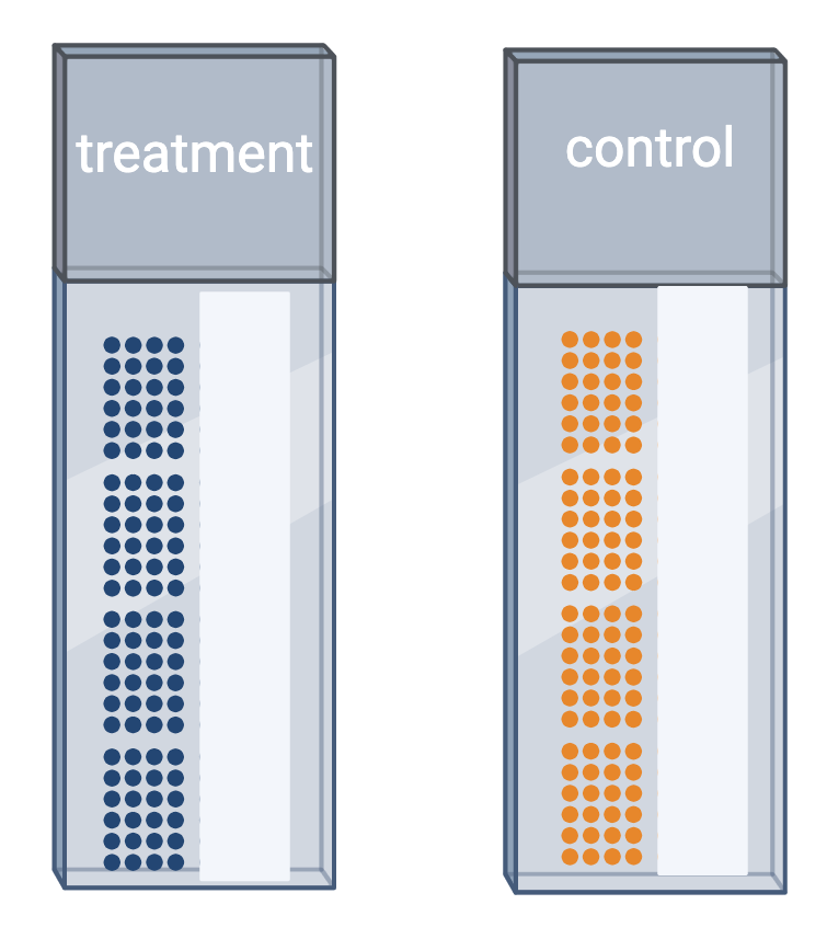
Challenge 6: Time points
Your study requires data collection at three time points: 5, 10, and 15 weeks. At the end of 5 weeks, you will run samples through the entire Visium workflow. You will repeat this for the 10- and 15-week samples when each of those time points is reached. What will happen when it is time for data analysis? What could you have done differently?
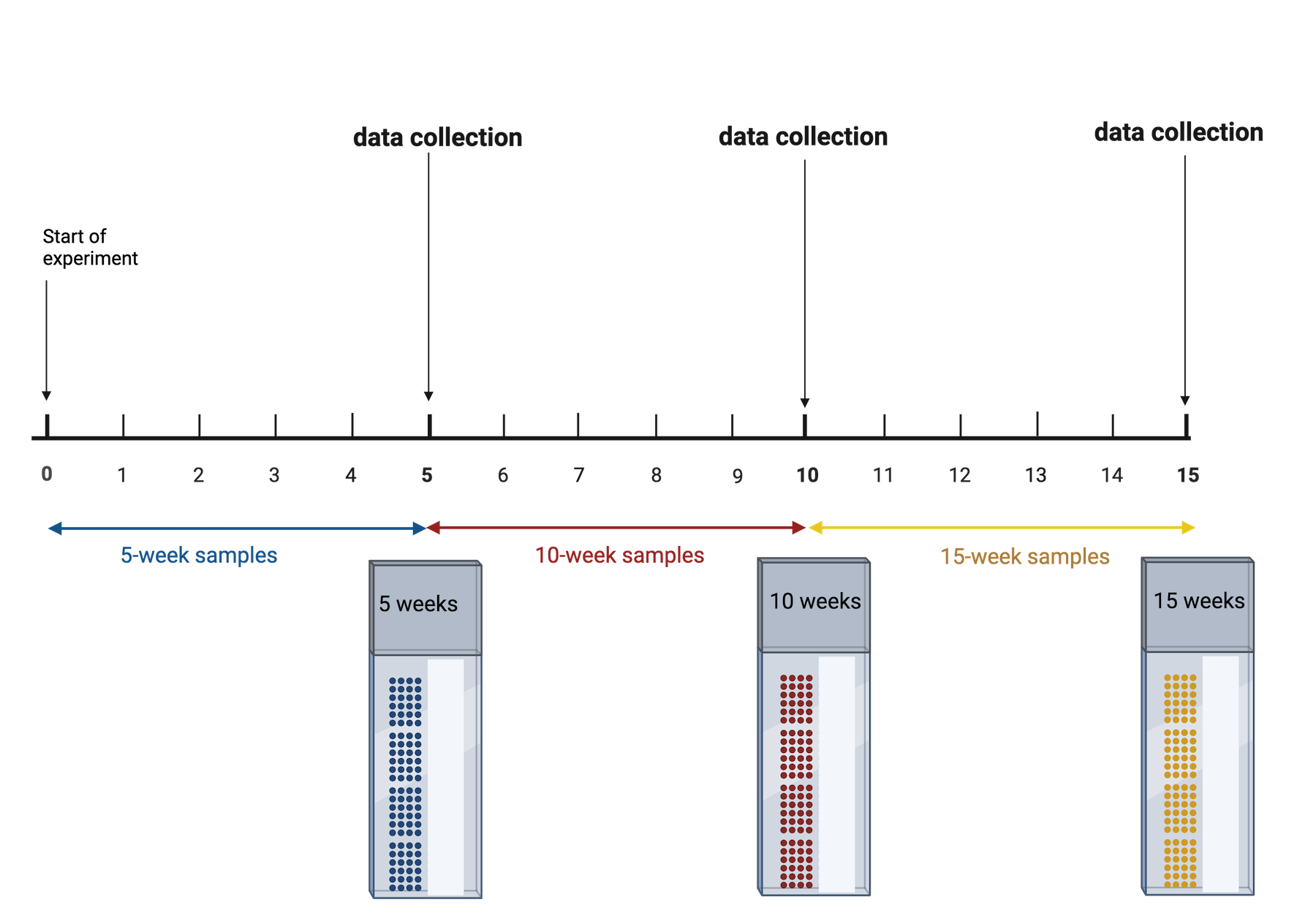
The issue is that time point is now confounded. A better approach would be to start the 15-week samples, then 5 weeks later start the 10-week samples, then 5 weeks later start the 5-week samples. This way you can run all of your samples at the same time. None of your samples will have spent a long time in the freezer, so you won’t need to worry about the variation that might cause. You won’t need to worry about the time point confounding the results.
Challenge 7: The efficient technician
Your technician colleague finds a way to simplify and expedite an
experiment. The experiment applies four different wheel-running
treatments to twenty different mice over the course of five days. Four
mice are treated individually each day for two hours each with a random
selection of the four treatments. Your clever colleague decides that a
simplified protocol would work just as well and save time. Run treatment
1 five times on day 1, treatment 2 five times on day 2, and so on. Some
overtime would be required each day but the experiment would be
completed in only four days, and then they can take Friday off! Does
this adjustment make sense to you?
Can you foresee any problems with the experimental results?
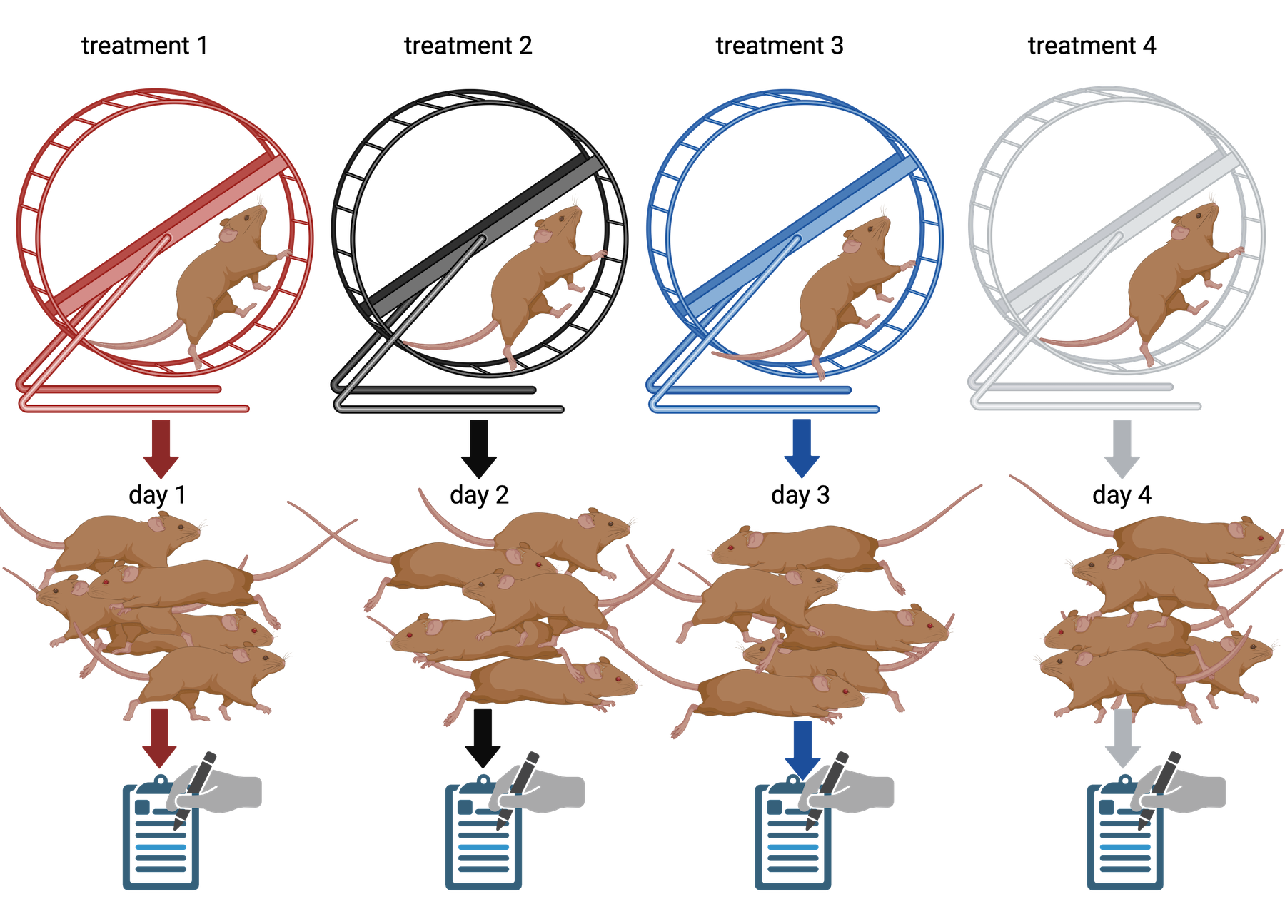
Since each treatment is run on only one day, the day effectively becomes the experimental unit (explain this). Each experimental unit (day) has five samples (mice), but only one replication of each treatment. There is no valid way to compare treatments as a result. There is no way to separate the treatment effect from the day-to-day differences in environment, equipment setup, personnel, and other extraneous variables.
Statistical power
Statistical power represents the probability of detecting a real treatment effect. Review the following figure to explore the relationships between effect size, sample size, and power. What is the relationship between effect size and sample size? Between sample size and power?
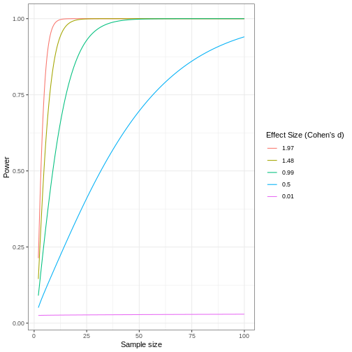
Adapted from How to Create Power Curves in ggplot by Levi Baguley
Notice that to detect a standardized effect size of 0.5 at 80% power, you would need a sample size of approximately 70. Larger effect sizes require much smaller sample sizes. Very small effects such as .01 never reach the 80% power threshold without enormous samples sizes in the hundreds of thousands.
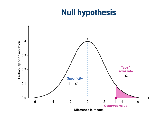
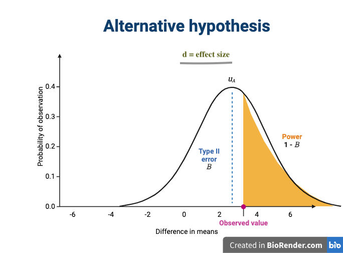
The effect size is shown in the figure above as the difference in means between the null and alternative hypotheses. Statistical power, also known as sensitivity, is the power to detect this effect.
To learn more about statistical power, effect sizes and sample size calculations, see Power and sample size by Krzywinski & Altman , Nature Methods 10, pages 1139–1140 (2013).
- Use
.mdfiles for episodes when you want static content - Use
.Rmdfiles for episodes when you need to generate output - Run
sandpaper::check_lesson()to identify any issues with your lesson - Run
sandpaper::build_lesson()to preview your lesson locally
Content from Data Preprocessing
Last updated on 2025-10-07 | Edit this page
Estimated time: 95 minutes
Overview
Questions
- What data files should I expect from the Visium assay?
- Which data preprocessing steps are required to prepare the raw data files for further analysis?
- What software will we use for data preprocessing?
Objectives
- Explain how to use markdown with the new lesson template
- Demonstrate how to include pieces of code, figures, and nested challenge blocks
Introduction
The Space Ranger
software is a popular, though by no means only, set of pipelines for
preprocessing of Visium data. We focus on it here. It provides the
following output:
| File Name | Description |
|---|---|
| web_summary.html | Run summary metrics and plots in HTML format |
| cloupe.cloupe | Loupe Browser visualization and analysis file |
| spatial/ | Folder containing outputs that capture the spatiality of the data. |
| spatial/aligned_fiducials.jpg | Aligned fiducials QC image |
| spatial/aligned_tissue_image.jpg | Aligned CytAssist and Microscope QC image. Present only for CytAssist workflow |
| spatial/barcode_fluorescence_intensity.csv | CSV file containing the mean and standard deviation of fluorescence intensity for each spot and each channel. Present for the fluorescence image input specified by –darkimage |
| spatial/cytassist_image.tiff | Input CytAssist image in original resolution that can be used to re-run the pipeline. Present only for CytAssist workflow |
| spatial/detected_tissue_image.jpg | Detected tissue QC image. |
| spatial/scalefactors_json.json | Scale conversion factors for spot diameter and coordinates at various image resolutions |
| spatial/spatial_enrichment.csv | Feature spatial autocorrelation analysis using Moran’s I in CSV format |
| spatial/tissue_hires_image.png | Downsampled full resolution image. The image dimensions depend on the input image and slide version |
| spatial/tissue_lowres_image.png | Full resolution image downsampled to 600 pixels on the longest dimension |
| spatial/tissue_positions.csv | CSV containing spot barcode; if the spot was called under (1) or out (0) of tissue, the array position, image pixel position x, and image pixel position y for the full resolution image |
| analysis/ | Folder containing secondary analysis data including graph-based clustering and K-means clustering (K = 2-10); differential gene expression between clusters; PCA, t-SNE, and UMAP dimensionality reduction. |
| metrics_summary.csv | Run summary metrics in CSV format |
| probe_set.csv | Copy of the input probe set reference CSV file. Present for Visium FFPE and CytAssist workflow |
| possorted_genome_bam.bam | Indexed BAM file containing position-sorted reads aligned to the genome and transcriptome, annotated with barcode information |
| possorted_genome_bam.bam.bai | Index for possorted_genome_bam.bam. In cases where the reference transcriptome is generated from a genome with very long chromosomes (>512 Mbp), Space Ranger v2.0+ generates a possorted_genome_bam.bam.csi index file instead. |
| filtered_feature_bc_matrix/ | Contains only tissue-associated barcodes in MEX format. Each element of the matrix is the number of UMIs associated with a feature (row) and a barcode (column). This file can be input into third-party packages and allows users to wrangle the barcode-feature matrix (e.g. to filter outlier spots, run dimensionality reduction, normalize gene expression). |
| filtered_feature_bc_matrix.h5 | Same information as filtered_feature_bc_matrix/ but in HDF5 format. |
| raw_feature_bc_matrices/ | Contains all detected barcodes in MEX format. Each element of the matrix is the number of UMIs associated with a feature (row) and a barcode (column). |
| raw_feature_bc_matrix.h5 | Same information as raw_feature_bc_matrices/ in HDF5 format. |
| | raw_probe_bc_matrix.h5 |
| molecule_info.h5 | Contains per-molecule information for all molecules that contain a valid barcode, valid UMI, and were assigned with high confidence to a gene or protein barcode. This file is required for additional analysis spaceranger pipelines including aggr, targeted-compare and targeted-depth. |
Fortunately, you will not need to look at all of these files. We provide a brief description for you in case you are curious or need to look at one of the files for technical reasons.
The two files that you will use are
raw_feature_bc_matrix.h5 and
filtered_feature_bc_matrix.h5. These files have an
h5 suffix, which means that they are HDF5 files. HDF5 is
a compressed file format for storing complex high-dimensional data. HDF5
stands for Hierarchical Data Formats, version 5. There is an R
package designed to read and write HDF5 files called rhdf5.
This was one of the packages which you installed during the lesson
setup.
Briefly, HDF5 organizes data into directories within the
compressed file. There are three “files” within the HDF5
file:
| File Name | Description |
|---|---|
| features.csv | Contains the features (i.e. genes in this case) for each row in the data matrix. |
| barcodes.csv | Contains the probe barcodes for each spot on the tissue block. |
| matrix.mtx | Contains the counts for each gene in each spot. Features (e.g. genes) are in rows and barcodes (e.g. spots) are in columns. |
Set up Environment
Go to the File menu and select
Open Project. Open the spatialRNA project
which you created in the workshop setup.
First, we will load in some utility functions to make our lives a bit
easier. The source
function reads an R file and runs the code in it. In this case, this
will load several useful functions.
We will then load the libraries that we need for this lesson.
R
suppressPackageStartupMessages(library(tidyverse))
suppressPackageStartupMessages(library(hdf5r))
suppressPackageStartupMessages(library(Seurat))

source("https://raw.githubusercontent.com/smcclatchy/spatial-transcriptomics/main/code/spatial_utils.R")
Load Raw and Filtered Spatial Expression Data
In this course, we will use the Seurat R environment, which was
originally designed for analysis of single-cell RNA-seq data, but has
been extended for spatial transcriptomics data. The Seurat website
provides helpful vignettes
and a concise command cheat
sheet. SpatialExperiment
in R and scanpy
in python, amongst others, are also frequently used in analyzing spatial
transcriptomics data.
We will use the Load10X_Spatial
function from Seurat to read in the spatial transcriptomics data. These
are the data which you downloaded in the setup section.
First, we will read in the raw data for sample 151673.
R
raw_st <- Load10X_Spatial(data.dir      = "./data/151673",
                          filename      = "151673_raw_feature_bc_matrix.h5",
                          filter.matrix = FALSE)
If you did not see any error messages, then the data loaded in and
you should see an raw_st object in your
Environment tab on the right.
If the data does not load in correctly, verify that the students used the mode = “wb” argument in download.file() during the Setup. We have found that Windows users have to use this.
Let’s look at raw_st, which is a Seurat object.
R
raw_st
OUTPUT
An object of class Seurat
33538 features across 4992 samples within 1 assay
Active assay: Spatial (33538 features, 0 variable features)
 1 layer present: counts
 1 spatial field of view present: slice1
The output says that we have 33,538 features and 4,992 samples with one assay. Feature is a generic term for anything that we measured. In this case, we measured gene expression, so each feature is a gene. Each sample is one spot on the spatial slide. So this tissue sample has 33,538 genes assayed across 4,992 spots.
An experiment may have more than one assay. For example, you may run both RNA sequencing and chromatin accessibility in the same set of samples. In this case, we have one assay – RNA-seq. Each assay will, in turn, have one or more layers. Each layer stores a different form of the data. Initially, our Seurat object has a single counts layer, holding the raw, un-normalized RNA-seq counts for each spot. Subsequent downstream analyses can populate other layers, including normalized counts (conventionally stored in a data layer) or variance-stabilized counts (conventionally stored in a scale.data layer).
There is also a single image called slice1 attached to the Seurat object.
Next, we will load in the filtered data. Use the code above and look
in a file browser to identify the filtered file for sample
151673.
Challenge 1: Read in filtered HDF5 file for sample 151673.
Open a file browser and navigate to
Desktop/spatialRNA/data/151673. Can you find an HDF5 file
(with an .h5 suffix) that has the word “filtered” in
it?
If so, read that file in and assign it to a variable called
filter_st.
R
filter_st <- Load10X_Spatial(data.dir = "./data/151673",
                             filename = "151673_filtered_feature_bc_matrix.h5")
Once you have the filtered data loaded in, look at the object.
R
filter_st
OUTPUT
An object of class Seurat
33538 features across 3639 samples within 1 assay
Active assay: Spatial (33538 features, 0 variable features)
 1 layer present: counts
 1 spatial field of view present: slice1
The raw and filtered data both have the same number of genes (33,538). But the two objects have different numbers of spots. The raw data has 4,992 spots and the filtered data has 3,639 spots.
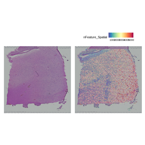
Look at the H&E slide below and notice the grey fiducial spots around the border. These are used by the spatial transcriptomics software to register the H&E image and the spatially-barcoded sequences.
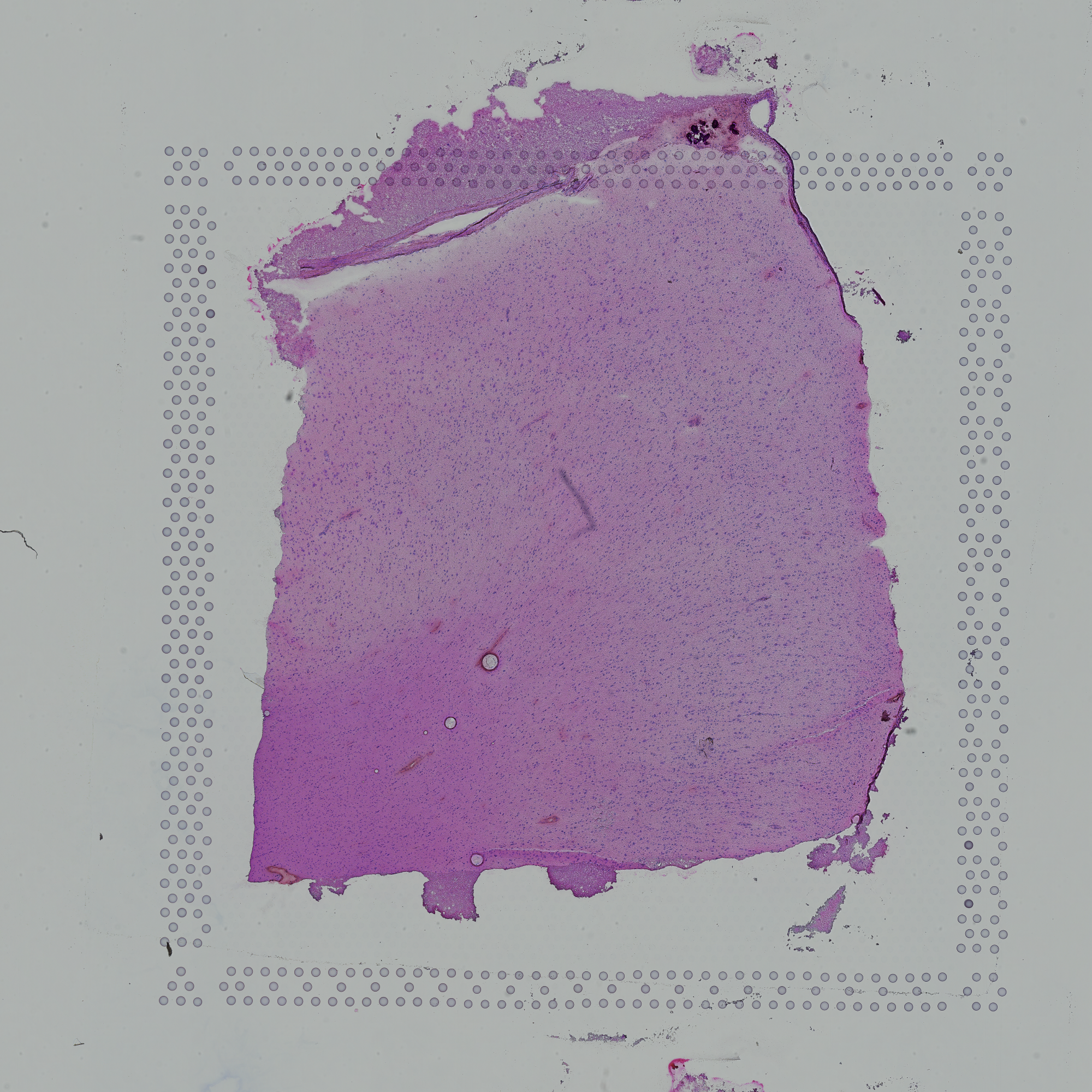
Challenge 2: How does the computer know how to orient the image?
Look carefully at the spots in the H&E image above. Are the spots symmetric? Is there anything different about the spots that might help a computer to assign up/down and left/right to the image?
Look at the spots in each corner. In the upper-left, you will see the following patterns:
The patterns in each corner allow the spatial transcriptomics software to orient the slide.
Add Spot Metadata
The 10x Space Ranger pipeline automatically segments the tissue to
identify it within the background of the slide. This information is
encoded in the “tissue positions” file. Each row in the file corresponds
to a spot. The first column indicates whether the spot was (1) or was
not (0) identified as being within the tissue region by the segmentation
procedure. This file does not contain column names in earlier versions
of Space Ranger, but does starting with version SpaceRanger 2.0.
R
tissue_position <- read_csv("./data/151673/spatial/tissue_positions_list.csv",
                            col_names = FALSE, show_col_types = FALSE) %>%
                     column_to_rownames('X1')
colnames(tissue_position) <- c("in_tissue",
                               "array_row",
                               "array_col",
                               "pxl_row_in_fullres",
                               "pxl_col_in_fullres")
It is important to note that the order of the spots differs between
the Seurat object and the tissue position file. We need to reorder the
tissue positions to match the Seurat object. We can extract the spot
barcodes using the Cells
function. This is named for the earlier versions of Seurat, which
processed single cell transcriptomic data. In this case, we are getting
spot IDs, even though the function is called
Cells.
Next, we will add the tissue positions to the Seurat object’s metadata. Note that Seurat will align the spot barcodes in this process.
R
raw_st    <- AddMetaData(object = raw_st,    metadata = tissue_position)
filter_st <- AddMetaData(object = filter_st, metadata = tissue_position)
Next, we will plot the spot annotation, indicating spots that are in the tissue in blue and background spots in red.
R
SpatialPlot(raw_st, group.by = "in_tissue", alpha = 0.3)
WARNING
Warning: `aes_string()` was deprecated in ggplot2 3.0.0.
ℹ Please use tidy evaluation idioms with `aes()`.
ℹ See also `vignette("ggplot2-in-packages")` for more information.
ℹ The deprecated feature was likely used in the Seurat package.
  Please report the issue at <https://github.com/satijalab/seurat/issues>.
This warning is displayed once every 8 hours.
Call `lifecycle::last_lifecycle_warnings()` to see where this warning was
generated.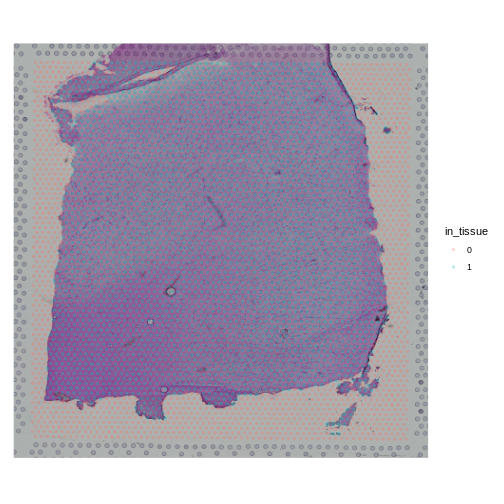
The 10x platform tags each molecule with a Unique Molecular
Identifier (UMI). This allows us to keep only one unique sequencing read
per molecule and to exclude those arising from PCR duplication. We
expect most of the UMI counts to be in the tissue spots. The Seurat
object metadata contains the UMI count in each spot in a column called
nCount_Spatial. Let’s plot the UMI counts in the tissue and
background spots.
R
raw_st@meta.data %>%
  ggplot(aes(as.logical(in_tissue), nCount_Spatial)) +
    geom_boxplot() +
    labs(title = 'UMI Counts in Tissue and Background',
         x     = 'In Tissue?',
         y     = 'Counts')
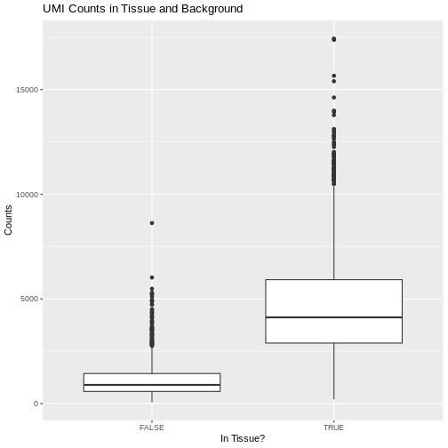
As expected, we see most of the counts in the tissue spots.
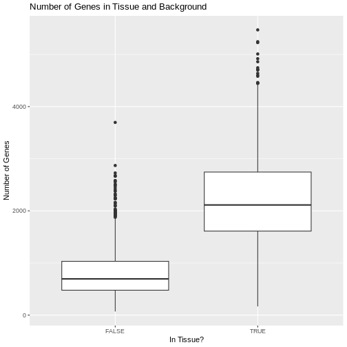
We can also plot the number of genes detected in each spot. Seurat
calls genes features, so we will plot the
nFeature_Spatial value. This is stored in the metadata of
the Seurat object.
R
raw_st@meta.data %>%
  ggplot(aes(as.logical(in_tissue), nFeature_Spatial)) +
    geom_boxplot() +
    labs(title = 'Number of Genes in Tissue and Background',
         x     = 'In Tissue?',
         y     = 'Number of Genes')
Challenge 3: Why might there be UMI counts outside of the tissue boundaries?
We expect UMI counts in the spots which overlap with the tissue section. What reasons can you think of that might lead UMI counts to occur in the background spots?
- When the tissue section is lysed, some transcripts may leak out of the cells and into the background region of the slide.
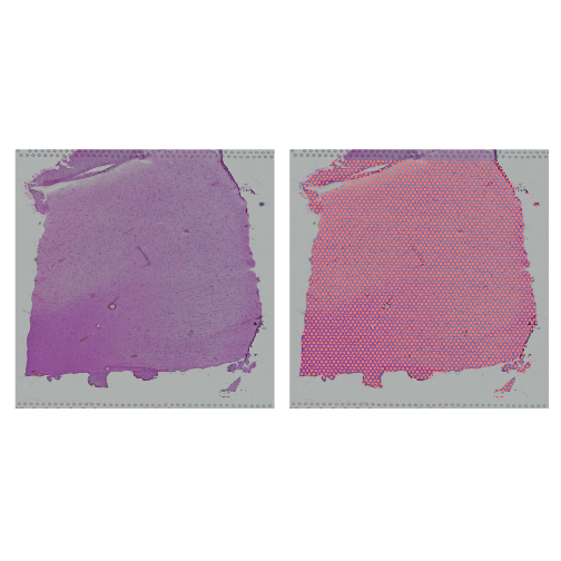
Up to this point, we have been working with the raw, unfiltered data to show you how the spots are filtered. However, in most workflows, you will work directly with the filtered file. From this point forward, we will work with the filtered data object.
Let’s plot the spots in the tissue in the filtered object to verify that it is only using spots in the tissue.
R
plot1 <- SpatialDimPlot(filter_st, alpha = c(0, 0)) +
           NoLegend()
plot2 <- SpatialDimPlot(filter_st) +
           NoLegend()
plot1 | plot2
Plot UMI and Gene Counts across Tissue
Next, we want to look at the distribution of UMI counts and numbers of genes in each spot across the tissue. This can be helpful in identifying technical issues with the sample processing.
It is useful to first think about what we expect. In the publication associated with this data, the authors show the structure that they expect in this tissue section of the human dorsolateral prefrontal cortex (DLPFC). In the figure below, they show a series of layers, from L1 to L6, arranged from the upper right to the lower left. In the lower left corner, they expect to see White Matter (WM). So we expect to see some series of layers arranged from the upper right to the lower left.
We will use Seurat’s SpatialFeaturePlot
function to look at these values. We can color the spots based on the
spot metadata stored in the Seurat object. You can find these column
names by looking at the meta.data slot of the Seurat
object.
R
head(filter_st@meta.data)
OUTPUT
                      orig.ident nCount_Spatial nFeature_Spatial in_tissue
AAACAAGTATCTCCCA-1 SeuratProject           8458             3586         1
AAACAATCTACTAGCA-1 SeuratProject           1667             1150         1
AAACACCAATAACTGC-1 SeuratProject           3769             1960         1
AAACAGAGCGACTCCT-1 SeuratProject           5433             2424         1
AAACAGCTTTCAGAAG-1 SeuratProject           4278             2264         1
AAACAGGGTCTATATT-1 SeuratProject           4004             2178         1
                   array_row array_col pxl_row_in_fullres pxl_col_in_fullres
AAACAAGTATCTCCCA-1        50       102               8468               9791
AAACAATCTACTAGCA-1         3        43               2807               5769
AAACACCAATAACTGC-1        59        19               9505               4068
AAACAGAGCGACTCCT-1        14        94               4151               9271
AAACAGCTTTCAGAAG-1        43         9               7583               3393
AAACAGGGTCTATATT-1        47        13               8064               3665
To plot the UMI counts, we will use the nCount_Spatial
column in the spot metadata.
R
plot1 <- SpatialDimPlot(filter_st, alpha = c(0, 0)) +
           NoLegend()
plot2 <- SpatialFeaturePlot(filter_st, features = "nCount_Spatial")
plot1 | plot2
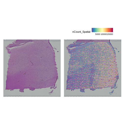
In this case, we see a band of higher counts running from upper left to lower right. There are also bands of lower counts above and below this band. The band in the upper right corner may be due to the fissure in the tissue. It is less clear why the expression is low in the lower-left corner.
We can also look at the number of genes detected in each spot using
nFeature_Spatial.
R
plot1 <- SpatialDimPlot(filter_st, alpha = c(0, 0)) +
           NoLegend()
plot2 <- SpatialFeaturePlot(filter_st, features = "nFeature_Spatial")
plot1 | plot2
It is difficult to lay out a broad set of rules that will work for all types of tissues and samples. Some tissues may have homogeneous UMI counts across the section, while others may show variation in UMI counts due to tissue structure. For example, in cancer tissue sections, stromal cells tend to have lower counts than tumor cells and this should be evident in a UMI count plot. In the brain sample below, we might expect some variation in UMI counts in different layers of the brain.
Removing Genes with Low Expression
In order to build this lesson, we needed to reduce the size of the data. To do this, we are going to filter out genes that have no expression across the cells.
How many genes to we have before filtering?
R
paste(nrow(filter_st), "genes.")
OUTPUT
[1] "33538 genes."Next, we will get the raw counts, calculate the sum of each gene’s exprsssion across all spots, and filter the Seurat object to retain genes with summed counts greater than zero.
R
counts     <- LayerData(filter_st, 'counts')
gene_sums  <- rowSums(counts)
keep_genes <- which(gene_sums > 0)

filter_st  <- filter_st[keep_genes,]
WARNING
Warning: Not validating Centroids objects
Not validating Centroids objects
WARNING
Warning: Not validating FOV objects
Not validating FOV objects
Not validating FOV objects
Not validating FOV objects
Not validating FOV objects
Not validating FOV objects
WARNING
Warning: Not validating Seurat objectsHow many genes to we have after filtering?
R
paste(nrow(filter_st), "genes.")
OUTPUT
[1] "21842 genes."So we removed about 11,700 genes that had zero counts.
Conclusion
- The 10x Space Ranger pipeline provides you with an unfiltered and a filtered data file.
- The HDF5 file ends with an
h5extension and contains the barcodes, features (genes), and counts matrix. - Seurat is one of several popular environments for analyzing spatial transcriptomics data.
- It is important to know something about the structure of the tissue which you are analyzing.
- Plotting total counts and genes in each spot may help to identify quality control issues.
Content from Remove Low-quality Spots
Last updated on 2025-10-07 | Edit this page
Estimated time: 75 minutes
Overview
Questions
- How do I remove low-quality spots?
- What kinds of problems produce low-quality spots?
- What happens if I skip quality control and proceed with analysis?
Objectives
- Understand how to look for low quality spots.
- Decide whether to retain or remove low quality spots.
Introduction
Spatial transcriptomics involves a complex process that may involve some technical failures. If the processing of the entire slide fails, it should be obvious due to a large number of gene appearing in spots outside of the tissue or low UMIs across the whole tissue.
However, there can also be variation in spot quality in a slide that has largely high-quality spots. These artifacts are much rarer than in single-cell transcriptomics because the process of tissue sectioning is less disruptive than tissue dissociation. Because of this, we recommend light spot filtering.
There are three metrics that we will use to identify and remove low-quality spots:
- Mitochondrial gene expression,
- Total UMI counts,
- Number of detected genes.
During tissue processing, it is possible that some cells will be lysed, spilling out the transcripts, but retaining the mitochondria. These spots will appear with much higher mitochondrial gene expression. High UMI counts or number of detected genes might also indicate spots with bleed over of lysed content from neighboring cells.
There may be regions of the slide with artifacts introduced during slide preparation. These include tearing and folding of the tissue. As mentioned above, the 10x Space Ranger pipeline automatically segments the tissue boundary. This generally performs well at a large scale. However, at high resolution, it may fail to properly assign spots within small tears or along the jagged edge to the background. Such spots might be identified by low UMI counts or number of detected genes. Conversely, folded tissue may have a higher density of cells, which could result in high UMI counts or number of detected genes. Pathologist annotation of H&E image can flag artifactual regions that are then excluded from downstream analysis. Image processing techniques may also be able to automatically identify and exclude artifactual regions, particularly folds. Using pathologist annotation or image processing to identify tissue abnormalities is less common than using the simple data-driven metrics considered here, and we do not discuss them further.
These metrics may be tissue-dependent. In some tissues, there may be biological reasons for differential expression across the tissue. For example, in a cancer sample, mitochondrial or total gene expression may vary between stromal and tumor regions. It will be important for you to familiarize yourself with the structure of the tissue that you are analyzing in order to make rational judgments about filtering.
Filtering by Mitochondrial Gene Count
In single-cell RNA sequencing experiments, the tissue is digested and the cells are dissociated. This mechanical disruption is stressful to the cells and some of them are damaged in the process. Elevated levels of mitochondrial genes often indicate cell death or damage because, when a cell’s membrane is compromised, it loses most cytoplasmic content while retaining mitochondrial RNA. Therefore, spots with high mitochondrial RNA may represent damaged or dying cells, and their exclusion helps focus the analysis on healthy, intact cells.
More details on this relationship can be found in the literature on mitochondrial DNA and cell death.
However, in spatial transcriptomics, the tissue is either frozen or formalin-fixed and there is much less mechanical disruption of the tissue. Because of this, we are skeptical of the value of filtering spots based on mitochondrial gene counts.
For completeness, we show how to obtain the mitochondrial genes, calculate the percentage of counts produced by these genes in each spot, and add this to the Seurat object metadata.
We will search the gene symbols in the feature metadata to identify mitochondrial genes. We do not need to find all genes in these categories, so we will search for genes with symbols that start with “MT”.
The Seurat object is designed to be flexible and may contains several data types. For example, it may contain both gene counts and open chromatin peaks. In this analysis, the Seurat object only contains gene counts. The different types of data are called “Layers” in Seurat and may be accessed using the Layers function.
R
Layers(filter_st)
OUTPUT
[1] "counts"This tells us that the “filter_st” object only contains one data Layer called “counts”. We can access this using the LayerData function using “counts” as an argument.
R
counts <- LayerData(filter_st, 'counts')
head(counts)[,1:5]
OUTPUT
6 x 5 sparse Matrix of class "dgCMatrix"
            AAACAAGTATCTCCCA-1 AAACAATCTACTAGCA-1 AAACACCAATAACTGC-1
MIR1302-2HG                  .                  .                  .
AL627309.1                   .                  .                  .
AL669831.5                   .                  .                  .
FAM87B                       .                  .                  .
LINC00115                    .                  .                  .
FAM41C                       .                  .                  .
            AAACAGAGCGACTCCT-1 AAACAGCTTTCAGAAG-1
MIR1302-2HG                  .                  .
AL627309.1                   .                  .
AL669831.5                   .                  .
FAM87B                       .                  .
LINC00115                    .                  .
FAM41C                       .                  .
The output above may look odd to you since there are no numbers. Notice that the text above the table says “sparse Matrix”. Many of the counts in the file are likely to be zero. Due to the manner in which numbers are stored in computer memory, a zero takes up as much space as a number. If we had to store all of these zeros, it would consume a lot of computer memory. A sparse matrix is a special data structure which only stores the non-zero values. In the table above, each dot (.) represents a position with zero counts.
You don’t have to have the students type out the next block. It may be better to let them focus on the concept rather than typing.
If we look at another part of the “counts” matrix, we can see numbers.
R
counts[20000:20005,1:5]
OUTPUT
6 x 5 sparse Matrix of class "dgCMatrix"
       AAACAAGTATCTCCCA-1 AAACAATCTACTAGCA-1 AAACACCAATAACTGC-1
DNAJB1                  .                  .                  .
TECR                    3                  1                  .
NDUFB7                  3                  1                  1
ZNF333                  .                  .                  .
ADGRE2                  .                  .                  .
OR7C1                   .                  .                  .
       AAACAGAGCGACTCCT-1 AAACAGCTTTCAGAAG-1
DNAJB1                  1                  .
TECR                    2                  1
NDUFB7                  2                  4
ZNF333                  .                  .
ADGRE2                  .                  .
OR7C1                   .                  .
As you can see in the table above, the gene symbols are stored in the rownames of “counts”. We will find find mitochondrial genes by searching for gene symbols which start with “MT”.
R
mito_pattern <- '^[Mm][Tt]-'
mito_genes   <- rownames(counts)[grep(mito_pattern, rownames(counts))]
mito_genes
OUTPUT
 [1] "MT-ND1"  "MT-ND2"  "MT-CO1"  "MT-CO2"  "MT-ATP8" "MT-ATP6" "MT-CO3"
 [8] "MT-ND3"  "MT-ND4L" "MT-ND4"  "MT-ND5"  "MT-ND6"  "MT-CYB"
We now have a set of mitochondrial genes. We will use these genes to estimate the percentage of gene counts expressed by mitochondrial genes in each cell and add this to the Seurat object. We will pass the mitochondrial gene symbols into PercentageFeatureSet, which will perform the calculation for us.
R
filter_st[["percent.mt"]] <- PercentageFeatureSet(filter_st, pattern = mito_pattern)
This syntax adds a new column called “percent.mt” to the spot metadata.
R
colnames(filter_st@meta.data)
OUTPUT
[1] "orig.ident"         "nCount_Spatial"     "nFeature_Spatial"
[4] "in_tissue"          "array_row"          "array_col"
[7] "pxl_row_in_fullres" "pxl_col_in_fullres" "percent.mt" There is no need to have students type out the figure titles and axis labels.
Let’s look at histograms of the ribosomal and mitochondrial gene percentages.
R
hist(FetchData(filter_st, "percent.mt")[,1],   main = "% Mitochondrial Genes",
     xlab = "%")
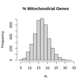
In these plots, we are looking for spots which are outside of a normal distribution. It is difficult to generalize how to select a filtering threshold. Some tissue or cell types may have higher mitochondrial gene expression. Further, heterogeneous tissues may have subsets of cells with differing levels of mitochondrial gene expression.
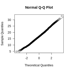
Let’s visually check whether the mitochondrial gene expression is normally distributed.
R
mito_expr <- FetchData(filter_st, "percent.mt")[,1]
qqnorm(mito_expr, las = 1)
qqline(mito_expr)
In this case, there may be a reason to filter out spots with greater than 35% mitochondrial counts.
Filter by UMI Count and Number of Detected Genes
In the previous lesson, we plotted number of UMIs and genes detected spatially across the tissue. Let’s plot these values again, but this time as a histogram.
There is no need to have students type out the figure titles and axis labels.
R
layout(matrix(1:2, ncol = 1))
hist(FetchData(filter_st, "nCount_Spatial")[,1],
     main = 'UMIs per Spot', xlab = 'Counts', las = 1)
hist(FetchData(filter_st, "nFeature_Spatial")[,1],
     main = 'Genes per Spot', xlab = 'Genes', las = 1)
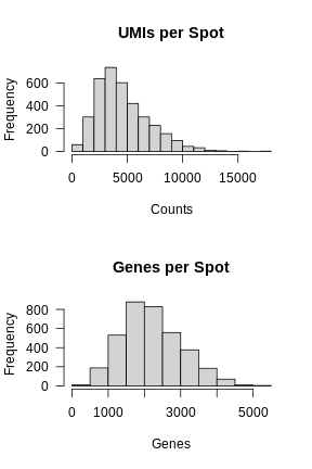
Again, most of the spots fall within a reasonable distribution. The right tail of the distribution is not very thick. We might filter spots with over 14,000 UMIs or 3,000 genes. We will use these thresholds to add a “keep” column to the Seurat object metadata.
First, we will create variables for each threshold. While we could type the numbers directly into the logical comparison statements, creating variables makes it clear what each number represents.
R
mito_thr     <- 32
counts_thr   <- 14000
features_thr <- 5000
Next, we will create a “keep” variable which will be TRUE for spots that we want to keep.
R
keep <- FetchData(filter_st, "percent.mt")[,1]       < mito_thr
keep <- FetchData(filter_st, "nCount_Spatial")[,1]   < counts_thr   & keep
keep <- FetchData(filter_st, "nFeature_Spatial")[,1] < features_thr & keep

filter_st$keep <- keep
Now let’s plot the spots on the tissue and color them based on whether we will keep them.
R
SpatialDimPlot(filter_st, group.by = "keep")
WARNING
Warning: `aes_string()` was deprecated in ggplot2 3.0.0.
ℹ Please use tidy evaluation idioms with `aes()`.
ℹ See also `vignette("ggplot2-in-packages")` for more information.
ℹ The deprecated feature was likely used in the Seurat package.
  Please report the issue at <https://github.com/satijalab/seurat/issues>.
This warning is displayed once every 8 hours.
Call `lifecycle::last_lifecycle_warnings()` to see where this warning was
generated.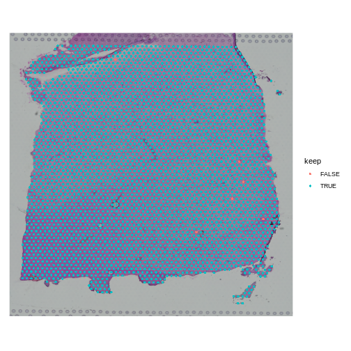
When you examine the spots that have been flagged, it is important to look for patterns. If a contiguous section of tissue contains spots that will be removed, it is worth looking at the histology slide to see if there are structures that correlate with the removed spots. If it is a section of necrotic tissue, then, depending on your experimental question, you may want to remove those spots. But you should always look for patterns in the removed spots and convince yourself that they are not biasing your results.
Note that we will only remove a few spots in this filtering step.
R
table(FetchData(filter_st, "keep")[,1])
OUTPUT
FALSE  TRUE
    6  3633
We can remove the spots directly using the following syntax. In this case, the “columns” of the Seurat object correspond to the spots.
R
filter_st <- filter_st[,keep]
Challenge 1: Change the total counts spot filtering threshold.
- Make a copy of the seurat object.
- Change the threshold for the number of UMIs per spot to keep spots with more than 2000 counts. Note that we are filtering on the lower side of the distribution.
- Add new variable called “keep_counts” to the Seurat object.
- Plot the spot overlaid on the tissue section, colored by whether you are keeping them.
Is there a pattern to the removed spots that seems to correlate with the tissue structure?
R
obj             <- filter_st
new_counts_thr  <- 2000
keep_counts     <- FetchData(obj, "nCount_Spatial")[,1] > new_counts_thr
obj$keep_counts <- keep_counts
SpatialDimPlot(obj, group.by = "keep_counts")
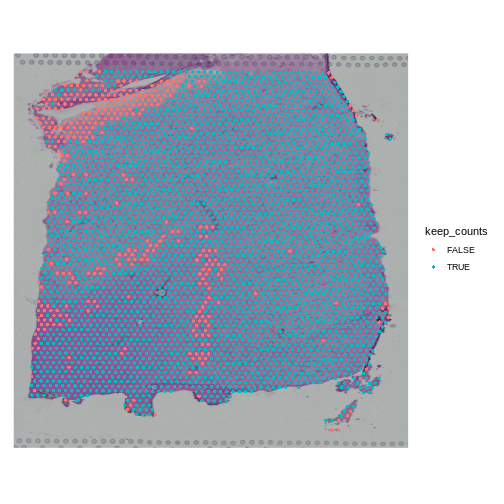
Note that the spots that we have flagged seem to correspond to stripes in the tissue section. These may be regions of the brain which have lower levels of gene expression, so we may want to revise or remove this threshold. Overall, this exercise shows that it is important to use judgement when filtering spots.
Challenge 2: Change the mitochondrial spot filtering thresholds.
- Make a copy of the seurat object.
- Change the threshold for the percent mitochondrial expression per spot to keep spots with less than 25% mitochondrial expression. This might happen if you decide that too much mitochondrial expression indicates some technical error.
- Add new variable called “keep_counts” to the Seurat object.
- Plot the spot overlaid on the tissue section, colored by whether you are keeping them.
Is there a pattern to the removed spots that seems to correlate with the tissue structure?
R
obj          <- filter_st
new_mito_thr <- 20
keep_counts  <- FetchData(obj, "percent.mt")[,1] < new_mito_thr
obj$keep_counts <- keep_counts
SpatialDimPlot(obj, group.by = "keep_counts")
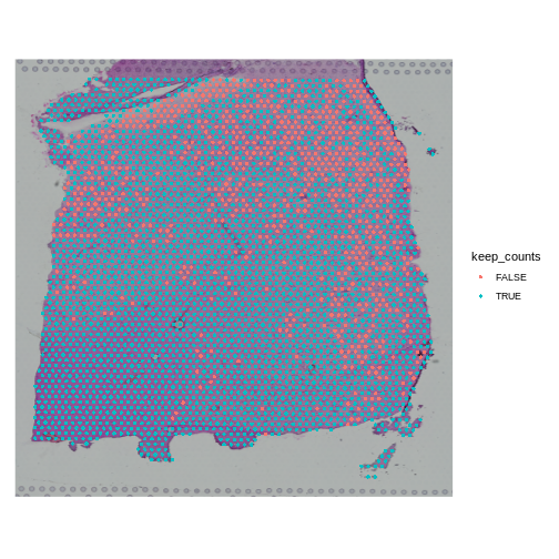
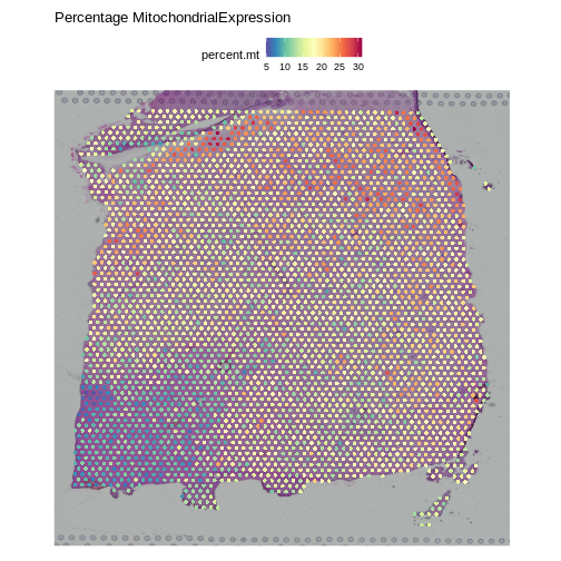
Note that the spots that we have flagged are largely outside of the lower left. Later in the lesson, we will find that this is the “white matter”, and this region has different expression from the rest of the tissue section. In fact, mitochondrial expression in general seems to be higher in the upper right area.
R
SpatialFeaturePlot(obj, features = "percent.mt") +
  labs(title = "Percentage MitochondrialExpression")
R
rm(obj)
- Spot filtering should be light.
- Inspect the spots that you are filtering to confirm that you are not discarding important tissue structures.
Content from Normalization in Spatial Transcriptomics
Last updated on 2025-10-07 | Edit this page
Estimated time: 70 minutes
Overview
Questions
- What technical and biological factors impact spatial transcriptomics data?
- How do these factors motivate the need for normalization?
- What are popular normalization methods?
- How do we assess the impact of normalization?
Objectives
- Understand and learn to apply popular normalization techniques, such as CPM normalization, log normalization, and SCTransform.
- Diagnose the impact of normalization.
Understanding Normalization in Spatial Transcriptomics
As with scRNA-seq data, normalization is necessary to overcome two technical artifacts in spatial transcriptomics:
- the difference in total counts across spots, and
- the dependence of a gene’s expression variance on its expression level.
The number of total counts in a spot is termed its library size. Since library sizes differ across spots, it will be difficult to compare gene expression values between them in a meaningful way because the denominator (total spot counts) is different in each spot. On the other hand, different spots may contain different types of cells, which may express differing numbers of transcripts. So there is a balance between normalizing all spots to have the same total counts and leaving some variation in total counts which may be due to the biology of the tissue. In general, we want to be cautious that removing the above technical artifacts may also obscure true biological differences.
Regarding the second artifact, we will see below that the variance in a gene’s expression scales with its expression. If we do not correct for this effect, differentially expressed genes will be skewed towards the high end of the expression spectrum. Hence, we seek to stabilize the variance – i.e., transform the data such that expression variance is independent of mean expression.
In this lesson we will:
- Observe that total spots per spot are variable
- Explore biological factors that contribute to that variability
- See that gene expression variance is correlated with mean expression
- Apply three methods aimed at mitigating one or both of these technical observations: counts per million (CPM) normalization, log normalization, and Seurat’s SCTransform
Total Counts per Spot are Variable
Let’s first assess the variability in the total counts per spot.
The spots are arranged in columns in the data matrix. We will look at the distribution of total counts per spot by summing the counts in each column and making a histogram.
R
# Extract the raw counts (gene by spot matrix) from the Seurat object
counts <- LayerData(filter_st, layer = 'counts')

# Plot a histogram of the total counts (library size or sum across genes).
# Note that this column sum is also encoded in the nCount_Spatial metadata
# variable. We could have simply made a histogram of that variable.
hist(colSums2(counts), breaks = 100,
     main = "Histogram of Counts per Spot")
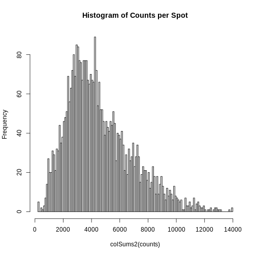
As you can see, the total counts per spot ranges cross four orders of magnitude. Some of this may be due to the biology of the tissue, i.e. some cells may express more transcripts. But some of this may be due to technical issues. Let’s explore each of these two considerations further.
Sources of Biological Variation in Total Counts
Hematoxylin and Eosin (H&E) staining is routinely performed on tissue sections in the clinic for diagnosis. Hematoxylin stains nuclei purple or blue and eosin stains cytoplasm and extracellular matrix pink. Collectively, they elucidate tissue and cellular morphology, which can guide interpretation of transcriptomic data. For example, observing high RNA counts in a necrotic region, which should instead have fewer cells, might suggest technical artifacts and, thus, indicate a need for normalization.
Maynard and colleagues used the information encoded in the H&E, in particular cellular organization, morphology, and density, in conjunction with expression data to annotate the six layers and the white matter of the neocortex. Additionally, they applied standard image processing techniques to the H&E image to segment and count nuclei under each spot. They provide this as metadata. Let’s load that layer annotation and cell count metadata and add it to our Seurat object.
R
# Load the metadata provided by Maynard et al.
spot_metadata <- read.table("./data/spot-meta.tsv", sep="\t")

# Subset the metadata (across all samples) to our sample
spot_metadata <- subset(spot_metadata, sample_name == 151673)

# Format the metadata by setting rowname to the barcode (id) of each spot,
# by ensuring that each spot in our data is represented in the metadata,
# and by ordering the spots within the metadata consistently with the data.
rownames(spot_metadata) <- spot_metadata$barcode
stopifnot(all(Cells(filter_st) %in% rownames(spot_metadata)))
spot_metadata <- spot_metadata[Cells(filter_st),]

# Add the layer annotation (layer_guess) and cell count as
# metadata to the Seurat object using AddMetaData.
filter_st <- AddMetaData(object = filter_st,
                         metadata = spot_metadata[, c("layer_guess", "cell_count"), drop=FALSE])
Now, we can plot the layer annotations to understand the structure of
the tissue. We will use a simple wrapper,
SpatialDimPlotColorSafe, around the Seurat function
SpatialDimPlot. This is defined in
code/spatial_utils.R and uses a color-blind safe
palette.
R
# Plot the layer annotations on the tissue, omitting any spots
# that do not have annotations (*i.e.*, having NA values)
SpatialDimPlotColorSafe(filter_st[, !is.na(filter_st[[]]$layer_guess)],
                        "layer_guess") + labs(fill="Layer")

We noted that the authors used cellular density to aid in discerning layers. Let’s see how those H&E-derived cell counts vary across layers.
R
# Make a boxplot of spot-level cell counts, faceted by layer annotation.
# As above, remove any spots without annotations (*i.e.*, having NA values).
g <- ggplot(na.omit(filter_st[[]][, c("layer_guess", "cell_count")]),
            aes(x = layer_guess, y = cell_count))
g <- g + geom_boxplot() + xlab("Layer") + ylab("Cell Count")
g
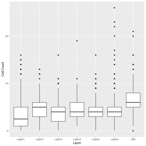
We see that the white matter (WM) has increased cells per spot, whereas Layer 1 has fewer cells per spot.
We can also plot these cell counts spatially.
R
SpatialFeaturePlot(filter_st, "cell_count")
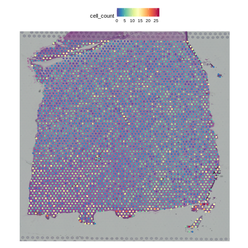
The cell counts partially reflect the banding of the layers.
As a potential surrogate for cell count, let’s plot the total counts (number of UMIs or library size) per spot as a function of layer.
R
# Make a boxplot of spot-level total read counts (library size), faceted by layer annotation.
# Remove any spots without annotations (*i.e.*, having NA values).
g <- ggplot(na.omit(filter_st[[]][, c("layer_guess", "nCount_Spatial")]),
            aes(x = layer_guess, y = nCount_Spatial))
g <- g + geom_boxplot()
g
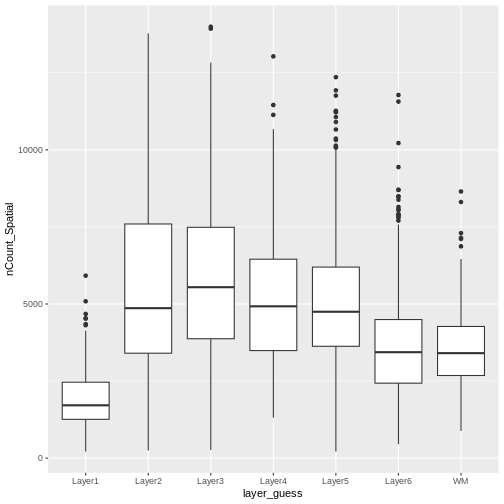
Layer 1 has fewer total read counts, consistent with its lower cell count. An increase in total read counts consistent with that in cell count is not observed for the white matter, however. Regardless, there are clear differences in total read counts across brain layers.
In summary, we have observed that both total read counts (library size) and feature counts (number of detected genes) can encode biological information. As such, we strongly recommend visualizing raw gene and features counts prior to normalization, which would remove differences in library size across spots.
Normalization Techniques to Mitigate Sources of Technical Variation in Total Counts
“Counts Per Million” Library Size Normalization
The first technical issue we noted above was a difference in total counts or library size across spots. A straightfoward means of addressing this is simply to divide all gene counts within the spot by the total counts in that spot. Conventionally, we then multiply by a million, which yields “counts per million” (CPM). Adopting this particular factor consistently establishes a standard scale across studies.
You should be aware, however, that the CPM approach is susceptible to “compositional bias” – if a small number of genes make a large contribution to the total count, any significant fluctuation in their expression across samples will impact the quantification of all other genes. To overcome this, more robust measures of library size that are more resilient to compositional bias are sometimes used, including the 75th percentile of counts within a sample (or here, spot). For simplicity, here we will use CPM.
In Seurat, we can apply this transformation via the
NormalizeData function, parameterized by the relative
counts (or “RC”) normalization method. We scale the results to a million
cells through the scale.factor parameter.
R
# Apply CPM normalization using NormalizeData, by specifying the relative
# counts (RC) normalization.method and a scale factor of one million.
cpm_st <- NormalizeData(filter_st,
                        assay                = "Spatial",
                        normalization.method = "RC",
                        scale.factor         = 1e6)
NormalizeData adds a data object to the
Seurat object.
R
# Access the layers of the Seurat object
Layers(cpm_st)
OUTPUT
[1] "counts" "data" We can confirm that we have indeed normalized away differences in total counts – all spots now have one million reads:
R
# Examine the total counts in each spot, as the sum of the columns.
# As above, we could have also used nCount_Spatial in the metadata.
head(colSums(LayerData(cpm_st, "data")))
OUTPUT
AAACAAGTATCTCCCA-1 AAACAATCTACTAGCA-1 AAACACCAATAACTGC-1 AAACAGAGCGACTCCT-1
             1e+06              1e+06              1e+06              1e+06
AAACAGCTTTCAGAAG-1 AAACAGGGTCTATATT-1
             1e+06              1e+06
Our second concern was that variance might differ across genes in an expression dependent manner. To diagnose this, we will make a so-called mean-variance plot, with each gene’s mean expression across spots on the x axis and its variance across spots on the y axis. This shows any potential trends between each gene’s mean expression and the variance of that expression.
R
# Extract the CPM data computed above
cpms      <- LayerData(cpm_st, "data")

# Calculate the mean and variance of the CPMs
means     <- apply(cpms, 1, mean)
vars      <- apply(cpms, 1, var)

# Assemble the mean and variance into a data.frame
gene.info <- data.frame(mean = means, variance = vars)

# Plot the mean expression on the x axis and the variance in expression on
# the y axis
g <- ggplot() + geom_point(data = gene.info, aes(x = mean, y = variance))
# Log transform both axes
g <- g + scale_x_continuous(trans='log2') + scale_y_continuous(trans='log2')
g <- g + xlab("Log Mean Expression") + ylab("Log Mean Variance")
g
WARNING
Warning in scale_x_continuous(trans = "log2"): log-2 transformation introduced
infinite values.
WARNING
Warning in scale_y_continuous(trans = "log2"): log-2 transformation introduced
infinite values.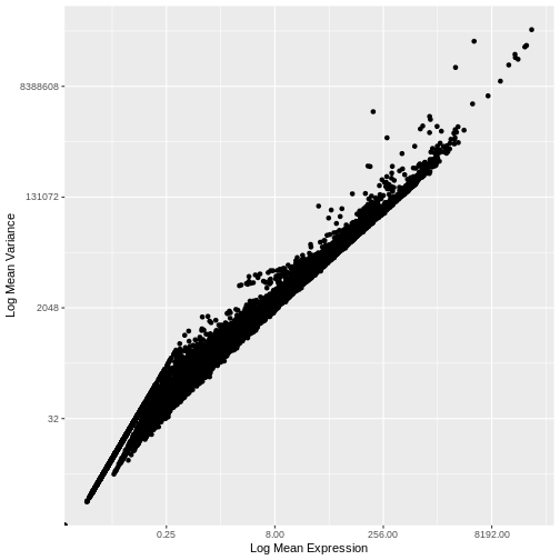
There is a clear relationship between the mean and variance of gene expression. Our goal was instead that the variance be independent of the mean. One way of achieving this is to detrend the data by fitting a smooth curve to the mean-variance plot. This fit will capture the general behavior of most genes. And, since we expect most genes to exhibit technical variability only and not biological variability additionally, this trend will reflect technical variance. Let’s start by characterizing the trend in the data by fitting them with a smooth line. We will use LOESS (locally estimated scatterplot smoothing) regression, an approach originally developed to fit a smooth line through data points in a scatterplot.
R
# This is the default LOESS span used by Seurat in FindVariableFeatures
loess.span <- 0.3

# Exclude genes with constant variance from our fit.
not.const  <- gene.info$variance > 0

# Fit a LOESS trend line relating the (log10) gene expression variance
# to the (log10) gene expression mean, but only for the non-constant
# variance genes.
fit <- loess(formula = log10(x = variance) ~ log10(x = mean),
             data = gene.info[not.const, ], span = loess.span)
Let’s now plot the fitted/expected variances as a function of the observed means.
R
# The expected variance computed from the model are in fit$fitted.
# Exponentiate because the original model was fit to log10-transformed means and variances.
gene.info$variance.expected               <- NA
gene.info[not.const, "variance.expected"] <- 10^fit$fitted

# Plot the expected variance as a function of the observed means for only
# the non-constant variance genes.
g <- g + geom_line(data = na.omit(gene.info[not.const,]),
                   aes(x = mean, y = variance.expected), linewidth = 3, color = "blue")
g
WARNING
Warning in scale_x_continuous(trans = "log2"): log-2 transformation introduced
infinite values.
WARNING
Warning in scale_y_continuous(trans = "log2"): log-2 transformation introduced
infinite values.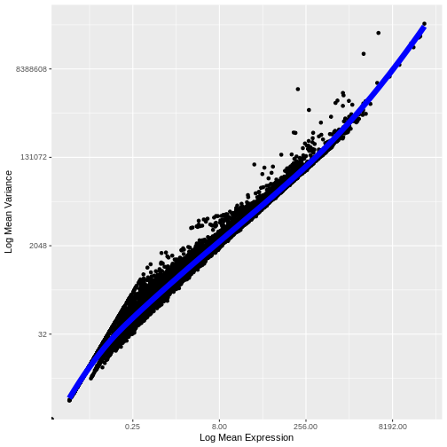
We see that the trend line nicely fits the data – i.e., it characterizes the observed variance as a function of the mean for the vast majority of genes.
We now follow the logic applied in Seurat, as described by Hafemeister and Satija. We define the “standardized variance” as the variance in the expression values after those expression values have been standardized by the trend line (i.e., they have been mean centered and divided by the predicted variance).
As we did above, we can use a mean-variance plot to diagnose whether our transformation, here the standardized variance, has indeed stabilized the variance across different mean expression ranges. In particular, since we expect most genes to have only technical (and not also biological) variance, the trend line should be dominated by those genes and will capture the technical variance. As such, the standardized variance should be near one for most genes – those with only technical variance. Genes with additional biological variance will deviate from the trend line and also from the near-one standardized variance. Is this what we observe?
R
gene.info$variance.standardized <- NA

# Compute standardized CPM = ( CPM - mean_CPM ) / sqrt(expected_variance)
standardized.cpms <-
   (cpms[not.const,] - means[not.const]) / sqrt(gene.info[not.const, "variance.expected"])

# Calculate the "standardized variance" -- *i.e.*, the variance of the standardized CPMs
gene.info[not.const, "variance.standardized"] <- apply(standardized.cpms, 1, var)

# Plot the standardized variance for the non-constant variance genes
g <- ggplot() + geom_point(data = gene.info[not.const,], aes(x = mean, y = variance.standardized))
g <- g + geom_hline(yintercept = 1, colour = "yellow")
# Log10-transform the x axis
g <- g + scale_x_log10()
g <- g + xlab("Log Mean CPM") + ylab("Variance of\nTrend-Standardized CPMs")
g
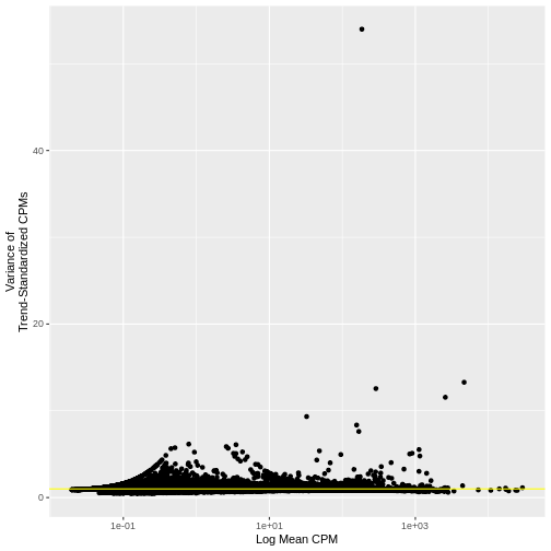
Indeed, many genes do have a variance near one.
Seurat provides more efficient means for calculating expression
means, variances, variances predicted from the trend, and the variance
of means standardized by the predicted variances, namely FindVariableFeatures.
The computed results can then be formatted into a data frame using HVFInfo.
Be advised that these functions can calculate expected variances using
models that are dependent on input parameters and, sometimes implicitly,
based on different data formats (e.g., raw counts or normalized
expression values). In this case, the values we computed above
manually:
R
head(gene.info)
OUTPUT
                  mean    variance variance.expected variance.standardized
MIR1302-2HG 0.04896898    8.711791          7.998485             1.0891801
AL627309.1  0.71174425  141.672131        212.427026             0.6669214
AL669831.5  5.45042760 1452.565233       1698.941124             0.8549827
FAM87B      0.09675030   34.007136         21.967802             1.5480446
LINC00115   0.81579878  188.767639        245.068894             0.7702636
FAM41C      1.36714334  338.634811        418.031204             0.8100707
are the same, with few exceptions, to those computed by the equivalent Seurat functions:
R
# Compute expression means and variances using FindVariableFeatures.
# By passing the total number of genes as nfeatures, we force FindVariableFeatures to
# compute these metrics for all genes, not just the most variable ones.
# The metrics will be computed on the specified layer ("data") of the active assay -- here, the
# CPMs we computed above.
# Finally, we will use the "vst" (variance-stabilizing transformation) method for selecting highly
# variable genes.
cpm_st <- FindVariableFeatures(cpm_st, nfeatures = dim(cpm_st)[1], layer="data", selection.method = "vst")
cinfo <- HVFInfo(cpm_st)
head(cinfo)
OUTPUT
                  mean    variance variance.expected variance.standardized
MIR1302-2HG 0.04896898    8.711791          7.998485             1.0005751
AL627309.1  0.71174425  141.672131        212.427026             0.6669214
AL669831.5  5.45042760 1452.565233       1698.941124             0.8549827
FAM87B      0.09675030   34.007136         21.967802             1.0007014
LINC00115   0.81579878  188.767639        245.068894             0.7702636
FAM41C      1.36714334  338.634811        418.031204             0.8100707
The above code applies the “vst” or variance-stabilizing
transformation to detect highly variable genes. This is essentially the
loess fitting and standardized variance computation that we performed
above. More details are available in the FindVariableFeatures
documentation. We can verify that this FindVariableFeatures functions
gives us similar results to those we manually computed above by using VariableFeaturePlot
to plot the relationship between the mean expression and the variance of
the trend-standardized expression.
R
VariableFeaturePlot(cpm_st) + NoLegend()
WARNING
Warning in scale_x_log10(): log-10 transformation introduced infinite values.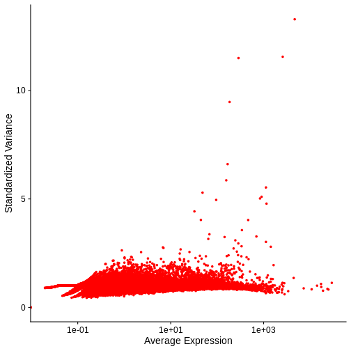
Notice that this plot is similar to that we created manually.
In both our manual plot and the one created by FindVariableFeatures/VariableFeaturePlot the “standardized” variance of most genes is near one. Achieving such a flat trend line is our objective and a good indication that we have stabilized the variance across a wide range of expression values. Yet, in both, there remains an evident, if subtle, trend in the plot between mean and variance. Let’s next look at two common transformations aimed at further stabilizing the variance across genes – i.e., for further mitigating the relationship between gene expression and variance – log-normalization and SCTransform.
LogNormalize
One common approach that attempts to meet our two objectives above – normalizing for different total spot counts and for expression-dependent variance – is log-transformation of normalized counts. The resulting values are often ambiguously referred to as log-normalized counts, which elides stating that the raw counts are first normalized or scaled and then log transformed. Scaling accounts for the differences in spot-specific RNA counts, as with CPMs above. The log transformation reduces skewness caused by highly expressed genes and stabilizes the variance, at least for certain mean-variance relationships. In practice, the log transformation is applied to 1+x, where x is the scaled expression value – the so-called log1p transformation. This avoids taking the log of zero.
In Seurat, we can apply this transformation by specifying
LogNormalize as the normalization.method
parameter to the same NormalizeData function we applied
above to compute CPMs.
R
# Apply log normalization using NormalizeData, by specifying the
# LogNormalize normalization.method and a scale factor of one million.
lognorm_st <- NormalizeData(filter_st,
                           assay                = "Spatial",
                           normalization.method = "LogNormalize",
                           scale.factor         = 1e6)
This function first normalizes the raw counts by
scale.factor before applying the log1p transformation. As
above, we set the scale.factor parameter such that we first
compute CPMs and then apply log1p to these CPMs.
As above, log normalization adds a data object to the
Seurat object.
R
# Access the layers of the Seurat object
Layers(lognorm_st)
OUTPUT
[1] "counts" "data" Let’s again plot the relationship between the expression mean and its standardized variance. Additionally, we will highlight those genes that have standardized variance significantly larger than one. These are likely to exhibit biological variation.
R
# Compute highly variable genes and their expression means and variances using FindVariableFeatures.
# Apply this to the log-transformed data, by specifying the "data" layer of the active assay.
# As above, use the vst method for computing variable genes.
lognorm_st <- FindVariableFeatures(lognorm_st, layer="data", selection.method = "vst")

# Extract the top 15 most variable genes
top15        <- head(VariableFeatures(lognorm_st, layer="data", method="vst"), 15)

# Make a mean-variance plot of the log-transformed data
plot_lognorm <- VariableFeaturePlot(lognorm_st) +
                  ggtitle("Variable Features - Log normalization")

# Add the names of the top 15 most variable genes
plot_lognorm <- LabelPoints(plot = plot_lognorm, points = top15, repel = TRUE)
plot_lognorm
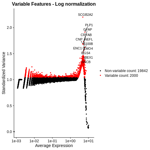
As with the standardized CPM values above, we have significantly reduced the dependence of variance in gene expression on its mean – at least at all but the highest end of the expression. By default, Seurat selects a set of 2,000 variable genes which are colored in red. Note that a majority of the highly variable genes, and all of the top 15 most variable that we labeled, are peaked in a narrow range of high expression values. We would not expect this a priori, and it signals inadequate normalization.
Putting this concern aside for a moment, let’s look at the spatial, normalized expression of the two most variable genes.
R
# Seurat's nomenclature is inconsistent. Here slot is the same as layer.
SpatialFeaturePlot(lognorm_st, slot="data", c("SCGB2A2", "PLP1"))
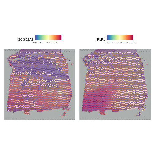
Both clearly show significant spatial variability – despite the fact that we did not explicitly query for genes whose expression varied spatially. We will look at approaches for doing that later, such as the Moran’s I statistic. PLP1 shows coherent spatial variability closely linked to brain morphology – this is a marker for the white matter. SCGB2A2 also shows strong spatial variability, though it does not appear to reflect the underlying neocortical layers. It should not surprise us that there is spatially variable gene expression beyond that caused by the (known) layered architecture of the brain. This is one such example.
As a further sanity check that the normalization is doing something sensible, let’s look at the expression of two, known layer-restricted marker genes – MOBP and PCP4. MOBP is known to be restricted to the white matter, while PCP4 is expressed in Layer 5.
R
SpatialFeaturePlot(lognorm_st, slot="data", c("MOBP", "PCP4"))
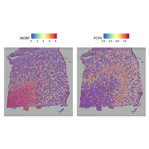
Indeed, this is what we observe.
SCTransform
Let’s see if we can improve on two aspects of the above
log-normalization: 1) the non-uniform standardized variance of highly
expressed genes and 2) the bias of highly variable genes towards highly
expressed genes. We will apply SCTransform,
a normalization approach that uses a regularized negative binomial
regression to stabilize variance across expression levels (Choudhary
et al., Genome Biol 23, 27 (2022)).
R
# Apply SCTransform to the raw count data in the Spatial assay
sct_st <- SCTransform(filter_st, assay = "Spatial")
The SCTransform method added a new assay called
SCT, as we can see below by assessing the assays of the
Seurat object:
R
# Access assays of the Seurat object
Assays(sct_st)
OUTPUT
[1] "Spatial" "SCT" It made this new assay the default. Be aware that Seurat functions
often operate on the DefaultAssay.
R
# Access the default assay of the Seurat object
DefaultAssay(sct_st)
OUTPUT
[1] "SCT"Within this new SCT Assay, SCTransform has
created three Layers to store data, not to be confused with
the neocortical layers of the brain.
R
# Assess the layers of the default assay of the Seurat object
Layers(sct_st)
OUTPUT
[1] "counts" "data" "scale.data"As you can see by reading the SCTransform documentation
with
R
?SCTransform
these new Layers are counts (counts
corrected for differences in sequencing depth between cells),
data (log1p transformation of the corrected
counts), and scale.data (scaled Pearson residuals,
i.e., the difference between an observed count and its expected
value under the model used by SCTransform, divided by the
standard deviation in that count under the model).
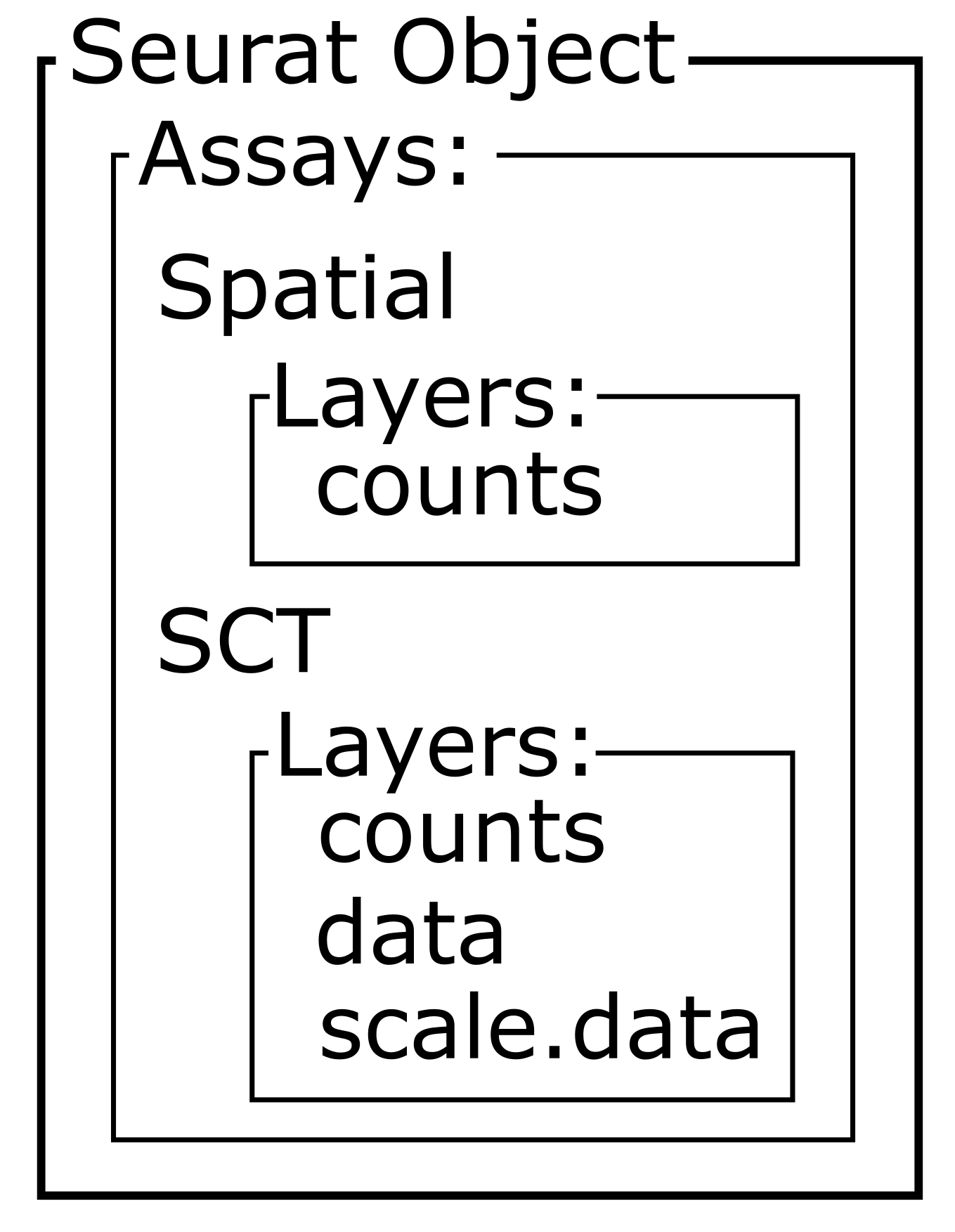
Notice, in particular, that the counts Layers in the
Spatial and SCT Assays are different. As
mentioned above, the latter have been corrected for differences in
sequencing depth between cells. As such, the distribution in total
counts per cell is much more uniform in the latter case.
R
# Create a one-column plot with two panels
layout(matrix(1:2, ncol = 1))

# Extract the raw count data from the counts layer of the Spatial assay
raw_counts_spatial <- LayerData(sct_st, layer = "counts", assay = "Spatial")
# Plot a histogram of the total counts (column sum) of the raw counts
hist(colSums2(raw_counts_spatial), main = "Raw counts (Spatial)")

# Extract the corrected counts from the data layer of the SCT assay
corrected_counts_sct <- LayerData(sct_st, layer = "counts", assay = "SCT")
# Plot a histogram of the total corrected counts (column sum)
hist(colSums2(corrected_counts_sct), main = "Corrected counts (SCT)")
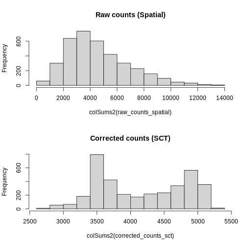
Let’s plot the mean-variance relationship. Notice that SCTransform implicitly computes variable features, so we do not need to explicitly call FindVariableFeatures, as we did above.
R
# Extract the top 15 most variable genes, as computed from the SCTransformed data.
top15SCT    <- head(VariableFeatures(sct_st), 15)

# Make a mean-variance plot of the SCTransformed data.
plot_sct    <- VariableFeaturePlot(sct_st) +
                 ggtitle("Variable Features - SCT")

# Add the names of the top 15 most variable genes.
plot_sct    <- LabelPoints(plot = plot_sct, points = top15SCT, repel = TRUE)
plot_sct
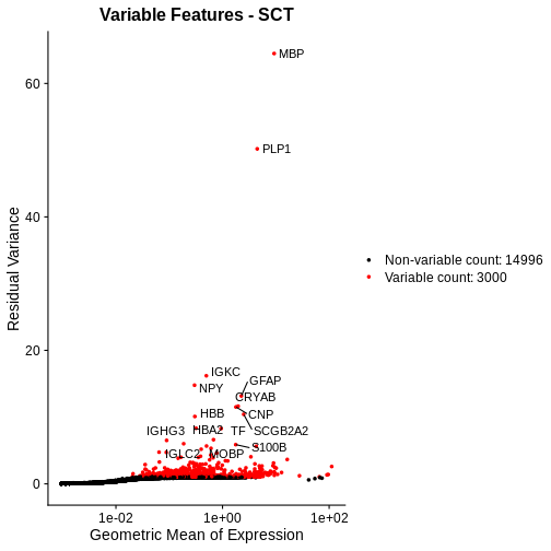
Notice that VariableFeaturePlot outputs slightly different axes, depending on the transformed data to display. In this case, for SCTransformed data, it plots the geometric mean (mean of the log counts) on the x axis and the “residual variance” on the y axis. “Residual variance” is a confusing term; it refers to the variance in the Pearson residuals, similar to the standardized variance we encountered above.
We will compare this mean-variance plot to the one derived using log-normalization below. Before we do, let’s look at the spatial expression of the two most variable genes following SCTransform. One of these, PLP1, we have already seen above.
R
# Plot the SCTransformed values (specifically, the log-transformed correct counts)
# of the genes MBP and PLP1 spatially, by accessing the "data" slot (or layer).
SpatialFeaturePlot(sct_st, slot="data", c("MBP", "PLP1"))
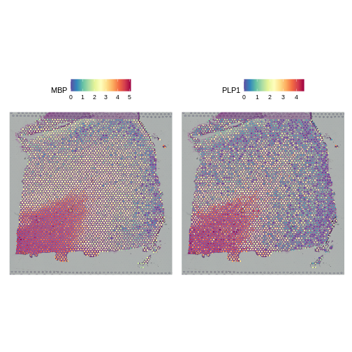
Both genes have stunning spatially variable expresion. And, here, that variability happens to reflect the underlying layered architecture of the brain. As we noted above, it needn’t have been the case that spatially variable genes are also layer restricted. That the top variable genes following SCTransform are layer restricted, whereas only one but not the other is following log normalization, should not in and of itself imply that the former transformation is “better” than the latter.
Let’s again check that the two marker genes show the appropriate layer-restricted expression following normalization with SCTransform.
R
# Plot the SCTransformed values (specifically, the log-transformed correct counts)
# of the known marker genes MOBP and PCP4 spatially, by accessing the "data" slot (or layer).
SpatialFeaturePlot(sct_st, slot="data", c("MOBP", "PCP4"))
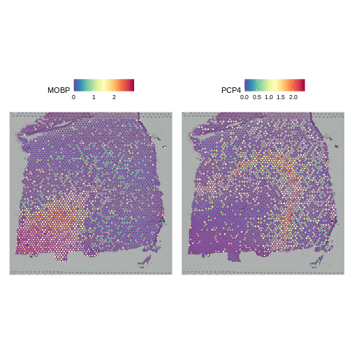
Indeed, they do. We conclude that SCTransform normalization looks reasonable.
Challenge 1: Compare Mean-Variance Plots
Above, we created mean-variance plots for the SCTransform and log normalizations. Which method does a better job of stabilizing the variance across genes? Turn to the person next to you and put the log-normalized plot on one of your screens and the SCTransform plot on the other person’s screen. Discuss the mean-variance relationship in each plot and decide which one you think stabilizes the variance across genes better.
We will compare the two plots in the next section.
Comparing Normalizations
Don’t have the students type this. Show the plots and discuss them.
First, let’s look at the sum of the normalized expression values per
spot for each method. Recall from above that NormalizeData
put the log-transformed values in the data layer.
Similarly, SCTransform puts the log1p transformed values of
the corrected counts in the data layer. So, we access that
layer below.
R
# Create a one-column plot with two panels
layout(matrix(1:2, ncol = 1))

# Extract the log-normalized data from the data layer of the lognorm_st Seurat object
sum_log <- LayerData(lognorm_st, layer = "data")
# Plot a histogram of the column sum of the log-normalized data
hist(colSums2(sum_log), main = "Log-norm", xlab = "Summed, Normalized Expression Values")

# Extract the SCTransformed (log-transformed corrected count) data from the data layer of the sct_st Seurat object
sum_sct <- LayerData(sct_st, layer = "data")
# Plot a histogram of the column sum of the SCTransformed (log-transformed corrected count) data
hist(colSums2(sum_sct), main = "SCT", xlab = "Summed, Normalized Expression Values")
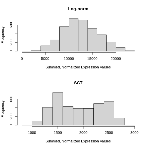
Notice that the log-normalization has a range of summed expression values per spot spanning several orders of magnitude. The SCTransform has a more uniform distribution of summed normalized expression values that spans a factor of three, from ~1000 to ~2700.
Next, we will compare the mean-variance plots between the two methods.
R
plot_lognorm

R
plot_sct
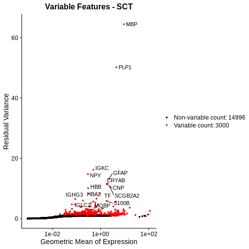
Following SCTransform, the variance is largely stable across a range of mean expression values. Certainly, we do not observe the wild ripple in the mean-variance trend at the high expression end that we saw with log-normalization. Secondly, the highly variable genes are spread across a larger region and not overly biased towards the high end of the expression spectrum.
We conclude that SCTransform is more appropriate for these data than log normalization for those two reasons:
- The variance is stable throughout the entire range of mean expression values, i.e., the standardized variance is near one throughout this range.
- The highly variable genes, i.e., those whose standardized variance deviates from one, are spread throughout the expression spectrum and not localized to highly expressed genes.
No One-Size-Fits-All Approach
Raw read counts provide essential insights into absolute cell densities within a sample. In some cases, this may reflect morphologically distinct regions and / or regions enriched for particular cell types. We advise assessing raw gene and count spatial distributions prior to normalization for this reason.
In this particular example, we found that SCTransform better ameliorated the mean-variance trend than log-normalization. We make no claim that this will hold universally across samples. Indeed, rather than advocating for one particular normalization approach, our goal was to introduce you to means of diagnosing the impact of normalization methods and of comparing them.
- Normalization is necessary to deal with technical artifacts, in particular, varying total counts (library size) across spots and the dependence of a gene’s variance on its mean expression.
- Nevertheless, raw (unnormalized) data can provide biologically meaningful insights such as region-specific differences in cell type or density that impact total reads.
- Popular methods aim to address these artifacts and include, but are not limited to, CPM normalization, log normalization, and SCTransform.
- The ability of a normalization method to stabilize expression variance across its mean (i.e., to remove the dependence of the former on the latter) can be assessed visually with a mean-variance plot.
Last updated on 2025-10-07 | Edit this page
Overview
Questions
- Why is feature selection important in spatial transcriptomics?
- What are the implications of using different proportions of highly variable genes (HVGs) in data analysis?
- Why is feature selection in spatial transcriptomics not typically necessary with normalization techniques like SCTransform?
- How do PCA and UMAP differ in their approach to dimensionality reduction in spatial transcriptomics?
- What advantages do linear methods like PCA offer before applying nonlinear methods like UMAP?
- How do these dimensionality reduction techniques impact downstream analysis such as clustering and visualization?
Objectives
- Identify appropriate feature selection methods for different normalization techniques in spatial transcriptomics.
- Evaluate the effects of varying the proportion of highly variable genes on the resolution of clustering and PCA outcomes.
- Understand the rationale behind the dependency of feature selection on specific normalization methods like NormalizeData.
- Differentiate between linear and nonlinear dimensionality reduction methods and their applications in spatial transcriptomics.
- Implement PCA to preprocess data before applying UMAP to enhance interpretability and structure recognition.
- Assess the effectiveness of each method in revealing spatial and molecular patterns within the data.
Understanding the Morphology of your Tissue
In any analysis, it is important that you understand the structure and cell types in the tissue which you are analyzing. While it would be ideal to have an unbiased analysis that uses normalizations and clustering methods to automatically assign cell types and define tissue structure, in practice we adjust these parameters based on the tissue structure that we expect to find.
Understanding Feature Selection in Spatial Transcriptomics
Feature selection in spatial transcriptomics is essential for reducing the dimensionality of high-dimensional datasets, enhancing model performance, and improving interpretability. This process is crucial because it helps in minimizing computational demands, reducing noise, and speeding up downstream analyses like clustering and principal components analysis (PCA). By focusing on a subset of genes that show significant variability or are biologically relevant, researchers can achieve more robust and generalizable models, draw clearer conclusions, and facilitate hypothesis testing.
Choosing Feature Selection Methods
Importance of High Variable Gene Selection
Feature selection methods such as variance stabilizing transformation (VST) and mean-variance plotting are crucial for refining the dataset to include genes that exhibit meaningful variability across different spatial regions. These methods help focus on genes that are most informative for downstream analyses like clustering and dimensionality reduction.
Feature Selection with NormalizeData
When using normalization methods like NormalizeData,
which focuses on scaling gene expression data without variance
stabilization, applying feature selection becomes essential. This method
requires the selection of highly variable genes to enhance the analysis,
particularly in clustering and PCA. Typically, you will select in the
range of 2,000 to 5,000 highly variable genes.
Feature Selection with SCTransform
SCTransform, a normalization method, adjusts gene
expression data to stabilize the variance, and it also provides default
feature selection. This method ensures that the genes retained are
already adjusted for technical variability, highlighting those with
biological significance.
The SCTransform selects 3,000 variable features by
default. We will use those variable features to calculate principal
components (PCs) of the gene expression data. As always, we must
first scale (or standardize) the normalized counts data.
Challenge 1: Number of Variable Genes
How do you think that your results would be affected by selecting too few highly variable genes? What about too many highly variable genes?
Too few variable genes may underestimate the variance between spots and tissue sections and would reduce our ability to discern tissue structure. Too many variable genes would increase computational time and might add noise to the analysis.
Dimensionality Reduction using Principal Components
Dimensionality reduction is a crucial step in managing high-dimensional spatial transcriptomics data, enhancing analytical clarity, and reducing computational load. Linear methods like PCA and nonlinear methods like UMAP each play distinct roles in processing and interpreting complex datasets.
PCA is a linear technique that reduces dimensionality by transforming data into a set of uncorrelated variables called principal components (PCs). This method efficiently captures the main variance in the data, which is vital for preliminary data exploration and noise reduction.
In order to cluster the spots by similarity, we use PCs to reduce the number of dimensions in the data. Using a smaller number of PCs allows us to capture the variability in the dataset while using a smaller number of dimensions. The PCs are then used to cluster the spots by similarity.
R
sct_st <- ScaleData(sct_st) %>%
               RunPCA(npcs = 75, verbose = FALSE)
WARNING
Warning: The `slot` argument of `SetAssayData()` is deprecated as of SeuratObject 5.0.0.
ℹ Please use the `layer` argument instead.
ℹ The deprecated feature was likely used in the Seurat package.
  Please report the issue at <https://github.com/satijalab/seurat/issues>.
This warning is displayed once every 8 hours.
Call `lifecycle::last_lifecycle_warnings()` to see where this warning was
generated.
WARNING
Warning: The `slot` argument of `GetAssayData()` is deprecated as of SeuratObject 5.0.0.
ℹ Please use the `layer` argument instead.
ℹ The deprecated feature was likely used in the Seurat package.
  Please report the issue at <https://github.com/satijalab/seurat/issues>.
This warning is displayed once every 8 hours.
Call `lifecycle::last_lifecycle_warnings()` to see where this warning was
generated.
OUTPUT
Centering and scaling data matrixIn the command above, we specifically asked Seurat to calculate 75
principal components. There are thousands of genes and we know that we
don’t need to calculate all PCs. By default, the RunPCA
method calculates 50 PCs. Let’s make an elbow plot of the number of PCs
versus the standard deviation explained by each PC. Traditionally, there
is a bend in the curve which indicates that adding more PCs doesn’t
account for more of the variance.
R
ElbowPlot(sct_st, ndims = 75)
WARNING
Warning: `aes_string()` was deprecated in ggplot2 3.0.0.
ℹ Please use tidy evaluation idioms with `aes()`.
ℹ See also `vignette("ggplot2-in-packages")` for more information.
ℹ The deprecated feature was likely used in the Seurat package.
  Please report the issue at <https://github.com/satijalab/seurat/issues>.
This warning is displayed once every 8 hours.
Call `lifecycle::last_lifecycle_warnings()` to see where this warning was
generated.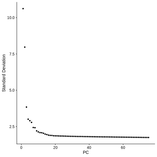
From the plot above, we would normally select somewhere between 10 and 20 PCs because there seems to be little benefit in adding more PCs. Adding more PCs does not seem to add more explanatory variance.
But in spatial transcriptomics, the elbow plot often does not tell the whole story. We want to select a number of PCs such that we are able to discern the structure and cell type composition of our tissue. So it is better to try a range of number of PCs.
For now, let’s use all 75 PCs.
R
n_pcs = 75
In the next step, we will cluster the spots based on expression
similarity using the principal components that we just generated. We
will use Seurat’s FindNeighbors
and FindClusters
functions. FindNeighbors find the K nearest neighbors of
each spot in the dataset. The default values is to use the 20 nearest
neighbors in the dataset and we will use this value in this lesson.
However, as with the number of features used to create the PCs, this is
another parameter that is worth varying before proceeding with your
analysis.
R
sct_st <- FindNeighbors(sct_st,
                        reduction = "pca",
                        dims      = 1:n_pcs) %>%
               FindClusters(resolution = 1)
OUTPUT
Computing nearest neighbor graphOUTPUT
Computing SNNOUTPUT
Modularity Optimizer version 1.3.0 by Ludo Waltman and Nees Jan van Eck

Number of nodes: 3633
Number of edges: 198594

Running Louvain algorithm...
Maximum modularity in 10 random starts: 0.7227
Number of communities: 9
Elapsed time: 0 seconds
The clustering has added a new column to the spot metadata in the
Seurat object called seurat_clusters. Let’s look the
metadata to see this.
R
head(sct_st[[]])
OUTPUT
                      orig.ident nCount_Spatial nFeature_Spatial in_tissue
AAACAAGTATCTCCCA-1 SeuratProject           8458             3586         1
AAACAATCTACTAGCA-1 SeuratProject           1667             1150         1
AAACACCAATAACTGC-1 SeuratProject           3769             1960         1
AAACAGAGCGACTCCT-1 SeuratProject           5433             2424         1
AAACAGCTTTCAGAAG-1 SeuratProject           4278             2264         1
AAACAGGGTCTATATT-1 SeuratProject           4004             2178         1
                   array_row array_col pxl_row_in_fullres pxl_col_in_fullres
AAACAAGTATCTCCCA-1        50       102               8468               9791
AAACAATCTACTAGCA-1         3        43               2807               5769
AAACACCAATAACTGC-1        59        19               9505               4068
AAACAGAGCGACTCCT-1        14        94               4151               9271
AAACAGCTTTCAGAAG-1        43         9               7583               3393
AAACAGGGTCTATATT-1        47        13               8064               3665
                   percent.mt keep layer_guess cell_count nCount_SCT
AAACAAGTATCTCCCA-1   16.63514 TRUE      Layer3          6       5167
AAACAATCTACTAGCA-1   12.23755 TRUE      Layer1         16       3404
AAACACCAATAACTGC-1   11.40886 TRUE          WM          5       3828
AAACAGAGCGACTCCT-1   24.22234 TRUE      Layer3          2       4683
AAACAGCTTTCAGAAG-1   15.21739 TRUE      Layer5          4       4228
AAACAGGGTCTATATT-1   15.50949 TRUE      Layer6          6       3991
                   nFeature_SCT SCT_snn_res.1 seurat_clusters
AAACAAGTATCTCCCA-1         3192             0               0
AAACAATCTACTAGCA-1         1264             2               2
AAACACCAATAACTGC-1         1941             7               7
AAACAGAGCGACTCCT-1         2393             6               6
AAACAGCTTTCAGAAG-1         2239             5               5
AAACAGGGTCTATATT-1         2148             3               3
We previously discussed the layer annotations provided by Maynard and colleagues. We added them to our Seurat object and plotted them. Let’s look at them again to compare them to our clusters.
R
SpatialDimPlotColorSafe(sct_st[, !is.na(sct_st[[]]$layer_guess)], "layer_guess") +
  labs(fill="Layer")
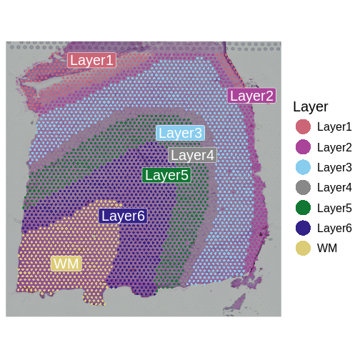
The authors describe six layers arranged from the upper right to the lower left, and a white matter (WM) later. At this stage of the analysis, we have nine clusters, but they do not show the clear separation of the ground truth in the source publication.
We will now plot the spots in the tissue, colored by the clusters
which we have identified in seurat_clusters to evaluate the
quality of the cluster identities by looking for the clarity of the
stripes forming each layer.
R
SpatialDimPlotColorSafe(sct_st, "seurat_clusters") + labs(fill="Cluster")
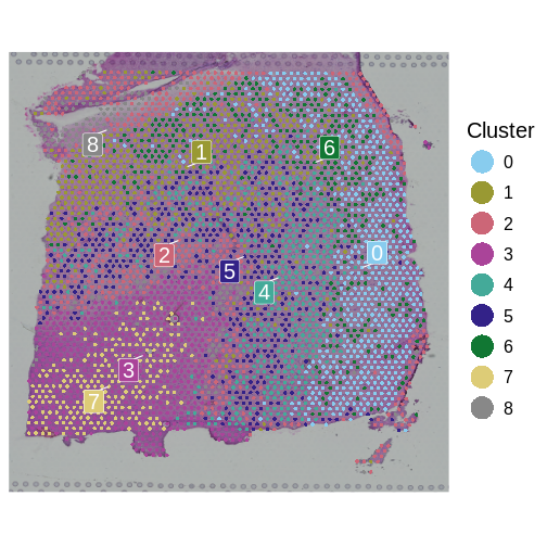
How many layers do we have compared to the publication? What do you think about the quality of the layers in this plot? Are there clear layers in the tissue?
Another way for us to look at the clusters it to plot them in a Uniform Manifold Approximation and Projection (UMAP). UMAP is a non-linear dimension reduction technique that can be used to visualize data. This is often used in single-cell RNASeq to identify different cell types. Here, each spot is potentially composed of more than one cell type, so the clustering may not be as clear.
R
num_clusters <- length(unique(sct_st[[]]$seurat_clusters))
color_pal    <- setNames(carto_pal(num_clusters, "Safe"), 0:(num_clusters - 1))

sct_st <- RunUMAP(sct_st,
                  reduction = 'pca',
                  dims      = 1:n_pcs,
                  verbose   = FALSE)

UMAPPlot(sct_st,
         label      = TRUE,
         cols       = color_pal,
         pt.size    = 2,
         label.size = 6)
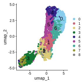
We have made some decisions above which might affect the quality of our spot clusters, including the number of nearest neighbors, the number of variable features, the number of PCs, and the cluster resolution. As we have mentioned, it is critical to have some understanding of the structure of the tissue that you are analyzing. In the absence of “ground truth”, you will need to try several different parameters and look at how the clusters group in your tissue. Below, we have included code which plots the tissue with different numbers of nearest neighbors, principal components, and cluster resolutions. We will not run this code because it takes a long time to run, but we show the output below this code block.
R
# Set several cluster resolution values.
resol <- c(0.5, 1, 2)
# Set several numbers of principal components.
npcs  <- c(25, 50, 75)

num_clusters <- 12
color_pal    <- setNames(carto_pal(num_clusters, "Safe"), 0:(num_clusters - 1))

umap_plots <- vector('list', length(resol) * length(npcs))
plots      <- vector('list', length(resol) * length(npcs))

for(i in seq_along(resol)) {
  for(j in seq_along(npcs)) {

    index     <- (i-1) * length(npcs) + j
    print(paste('Index =', index))

    sct_st <- FindNeighbors(sct_st,
                            reduction = "pca",
                            dims      = 1:npcs[j]) %>%
                   FindClusters(resolution = resol[i]) %>%
                   RunUMAP(reduction = 'pca',
                           dims      = 1:npcs[j],
                           verbose   = FALSE)

    umap_plots[[index]] <- UMAPPlot(sct_st, label = TRUE, cols = color_pal,
                                    pt.size = 2, label.size = 4) +
                             ggtitle(paste("res =", resol[i], ": pc =", npcs[j])) +
                             theme(legend.position = "none")

    plots[[index]]      <- SpatialDimPlot(sct_st,
                                          group.by = "seurat_clusters",
                                          cols = color_pal) +
                          ggtitle(paste("res =", resol[i], ": pc =", npcs[j])) +
                          theme(legend.position = "none")

  } # for(j)

} # for(i)

png(file.path('episodes', 'fig', 'tissue_cluster_resol.png'),
    width = 1000, height = 1000, res = 128)
print(gridExtra::grid.arrange(grobs = plots, nrow = 3))
dev.off()

png(file.path('episodes', 'fig', 'umap_cluster_resol.png'),
    width = 1000, height = 1000, res = 128)
print(gridExtra::grid.arrange(grobs = umap_plots, nrow = 3))
dev.off()
The plot below shows the clusters as colors overlayed on the tissue. Each row shows a different cluster resolution and each column shows the number of PCs.
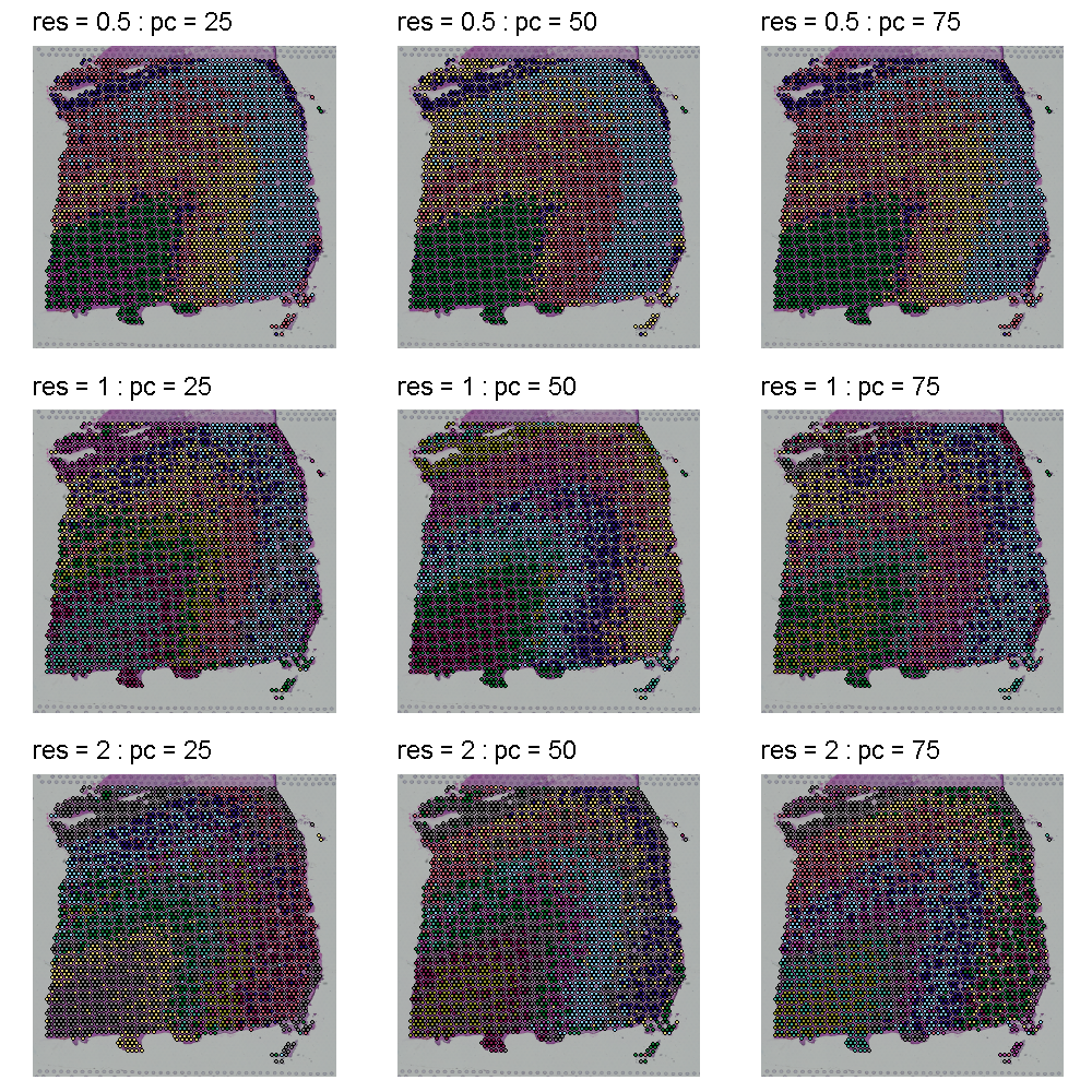
The plot below shows the UMAP clustering for the same set of parameters in the same order. The cluster colors are the same in the plots above and below. Increasing the cluster resolution increases the number of clusters.
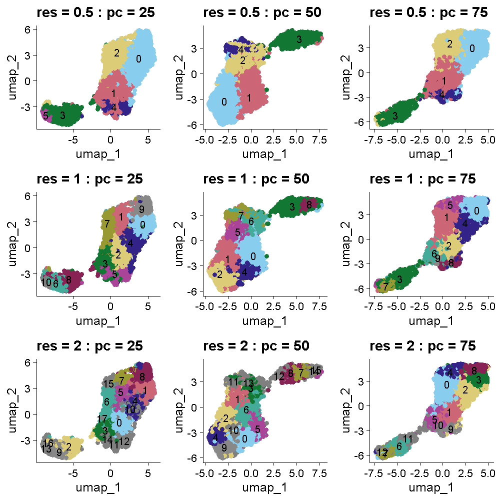
Challenge 1: Select cluster resolution and number of PCs
Look at the two plots above which show the tissue and UMAP clusters at different cluster resolutions and number of PCs. Think about which settings seem to produce clustering that matches the expectations from the publication. Turn to the person next to you and discuss your opinions about which settings to use.
All of the plots in the tissue clustering show layers which broadly conform to the publication’s “ground truth.” In the top row at a resolution of 0.5, we see about four layers with varying levels of clarity, depending on the number of PCs. As we move down in the tissue clustering plot, the layers become clearer at a resolution of 1, but then become less clear at a resolution of 2 in the bottom row. When we look at the corresponding row in the UMAP plots, we see that the white matter is clearly separated in all of the plots. The number of clusters increases with increasing cluster resolution, with the middle row (cluster resolution = 1), having close to seven layers, like the publication ground truth. The middle plot in the middle row has nine clusters, which is also close to the publication.
We selected a cluster resolution of 0.8 and 50 PCs for the following work.
R
sct_st <- FindNeighbors(sct_st,
                        reduction = "pca",
                        dims      = 1:50) %>%
               FindClusters(resolution = 0.8)
OUTPUT
Modularity Optimizer version 1.3.0 by Ludo Waltman and Nees Jan van Eck

Number of nodes: 3633
Number of edges: 175530

Running Louvain algorithm...
Maximum modularity in 10 random starts: 0.7508
Number of communities: 8
Elapsed time: 0 seconds
R
SpatialDimPlotColorSafe(sct_st, "seurat_clusters") +
  ggtitle(label = "Tissue Clusters: 50 PCs, resol = 0.8") +
  labs(fill = "Cluster")
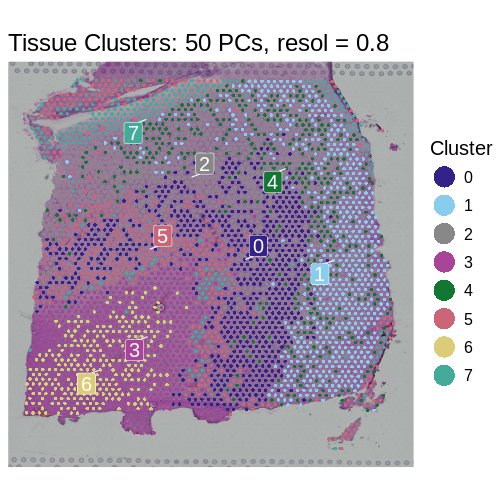
- Feature selection is a crucial step in spatial transcriptomics
analysis, particularly for non-variance-stabilizing normalization
methods like
NormalizeData. - Techniques such as VST and mean-variance plotting enable researchers to focus on genes that provide the most biological insight.
- Different proportions of highly variable genes and feature selection methods can significantly influence the analytical outcomes, emphasizing the need for tailored approaches based on the specific characteristics of each dataset.
- Linear dimensionality reduction methods like PCA are crucial for initial data simplification and noise reduction.
- Nonlinear methods like UMAP are valuable for detailed exploration of data structures post-linear preprocessing.
- The sequential application of PCA and UMAP can provide a comprehensive view of the spatial transcriptomics data, leveraging the strengths of both linear and nonlinear approaches.
Content from Deconvolution in Spatial Transcriptomics
Last updated on 2025-10-07 | Edit this page
Estimated time: 50 minutes
Overview
Questions
- How can we bring single-cell resolution to multi-cellular spatial transcriptomics spots?
- What are different algorithmic approaches for doing so?
Objectives
- Explain spot deconvolution.
- Perform deconvolution to quantify different cell types in spatial transcriptomics spots using a supervised approach that employs scRNA-seq data.
Deconvolution in Spatial Transcriptomics
Each spatial spot in an ST experiment generally contains multiple cells. For example, spots in the Visium assay are 55 microns in diameter, whereas a typical T cell has a diameter of ~10 microns. As such, the expression read out from the spot mixes together the expression of the individual cells encompassed by it. Deconvolution is the approach for unmixing this combined expression signal. Most often, deconvolution methods predict the fraction of each spot’s expression derived from each particular cell type. Supervised methods deconvolve spot expression using cell type expression profiles (e.g., from scRNA-seq) or marker genes. Therefore, we will need a prior knowledge or data for these methods. Unsupervised approaches instead infer the expression of the cell types without using priori information about cell types.
 Zhang
et al, Comput Struct Biotechnol J 21, 176–184 (2023)
CC
BY-NC-ND 4.0
Zhang
et al, Comput Struct Biotechnol J 21, 176–184 (2023)
CC
BY-NC-ND 4.0
Deconvolution with Robust Cell Type Decomposition (RCTD)
We will deconvolve spots by applying Robust Cell Type Decomposition
(RCTD; Cable, D.
M., et al., Nature Biotechnology, 2021), which is implemented in the
spacexr
package. The algorithm uses scRNA-seq data as a reference to deconvolve
the spatial transcriptomics data, estimating the proportions of
different cell types in each spatial spot. This method is considered
supervised method since we are using a prior knowledge about this
dataset. RCTD models the observed gene expression in each spatial spot
as a mixture of the gene expression profiles of different cell types,
where the estimated proportions are the coefficients of the expression
profiles in a linear model. Its procedure guarantees the
estimated proportions are non-negative, but note that they sum
to one. RCTD can operate in several modes: in doublet mode
it fits at most two cell types per spot, in full mode it
fits potentially all cell types in the reference per spot, and in
multi mode it again fits more than two cell types per spot
by extending the doublet approach. Here, we will use
full mode.
Loading scRNA-seq reference data
First, we load the scRNA-seq data that will serve as a reference for
deconvolution. Individual cells are assumed to be annotated according to
their type. RCTD will use these cell type-specific expression profiles
to deconvolve each spot’s expression. Please note the use of fread
from the data.table package. This provides an efficient means of loading
large data tables in csv and tsv format.
R
# # Load scRNA-seq data
sc.counts <- fread("data/scRNA-seq/sc_counts.tsv.gz") %>%
               column_to_rownames('V1') %>%
               as.matrix()

# Load cell type annotations
sc.metadata   <- read.delim("data/scRNA-seq/sc_cell_types.tsv")
sc.cell.types <- setNames(factor(sc.metadata$Value), sc.metadata$Name)

# Verify that the barcodes in counts and cell types match.
stopifnot(colnames(sc.counts) == names(sc.cell.types))
Next, we will create the reference object encapsulating this
scRNA-seq data. We will use the Reference
function, which will organize and store the scRNA-seq data for the next
steps.
R
sc_reference <- Reference(sc.counts, sc.cell.types)
Applying RCTD for spot deconvolution
Let’s write a wrapper function that performs RCTD deconvolution. This
will facilitate running RCTD on other samples within this dataset. It
calls SpatialRNA
to create an object representing the ST data, much as we did for the
scRNA-seq data with Reference above. It then links the ST
and scRNA-seq in an RCTD object created with create.RCTD
and finally performs deconvolution by calling run.RCTD.
R
# Write the wrapper function which takes the "reference" built above and calculates cell type propotions for current dataset, st.obj
run.rctd <- function(reference, st.obj) {

  # Get raw ST counts
  st.counts <- GetAssayData(st.obj, assay = "Spatial", layer = "counts")

  # Get the spot coordinates
  st.coords           <- st.obj[[]][, c("array_col", "array_row")]
  colnames(st.coords) <- c("x","y")

  # Create the RCTD 'puck', representing the ST data
  puck   <- SpatialRNA(st.coords, st.counts)

  myRCTD <- create.RCTD(puck, reference, max_cores = 1,
                        keep_reference = TRUE)

  # Run deconvolution -- note that we are using 'full' mode to devolve a spot
  # into (potentially) all available cell types.
  myRCTD <- suppressWarnings(run.RCTD(myRCTD, doublet_mode = 'full'))

  myRCTD
}
Running Deconvolution on Brain Samples
We apply the RCTD wrapper to our spatial transcriptomics data to deconvolve the spots and quantify the cell types. This may take ~10 minutes. If you prefer, you can load the precomputed results directly.
R
# Change this variable to TRUE to load precomputed results, or FALSE to
# compute the results here.
load.precomputed.results <- TRUE

rds.file <- paste0("data/rctd-sample-1.rds")

if(!load.precomputed.results || !file.exists(rds.file)) {

  result_1 <- run.rctd(sc_reference, sct_st)

  # The RCTD file is large. To save space, we will remove the reference
  # counts. This is necessary owing to constraints on sizes of files
  # uploaded to github during the automated build of this site. It will
  # not be required for your own analyses.
  # We use the remove.RCTD.reference.counts utility function defined in
  # code/spatial_utils.R.
  result_1 <- remove.RCTD.reference.counts(result_1)

  saveRDS(result_1, rds.file)

} else {

  result_1 <- readRDS(rds.file)

}
Interpreting Deconvolution Results
RCTD outputs the proportion of different cell types in each spatial
spot. These are held in the spatialRNA@counts slot. Let’s
see the proportions it predicts for this sample:
R
# Defining propotion of each cell type per spot.
props <- as.data.frame(result_1@results$weights)

# Print the first few lines of the deconvolution results
# Each row is a spot and each column is propotion of each cell type in that spot
head(props)
OUTPUT
                      AST-FB         L2-3           L4         L5-6
AAACAAGTATCTCCCA-1 0.2906892 1.989539e-01 3.568361e-01 9.495123e-04
AAACAATCTACTAGCA-1 0.3665241 4.652610e-04 4.652610e-04 4.601510e-01
AAACACCAATAACTGC-1 0.1069532 5.473749e-05 5.473749e-05 5.473749e-05
AAACAGAGCGACTCCT-1 0.3845201 4.758347e-01 3.256827e-04 3.256827e-04
AAACAGCTTTCAGAAG-1 0.2411203 3.694851e-01 1.995963e-01 6.646586e-04
AAACAGGGTCTATATT-1 0.2096408 3.256827e-04 3.624793e-04 5.117059e-01
                   Oligodendrocytes
AAACAAGTATCTCCCA-1       0.04291383
AAACAATCTACTAGCA-1       0.12784650
AAACACCAATAACTGC-1       1.25940541
AAACAGAGCGACTCCT-1       0.06181266
AAACAGCTTTCAGAAG-1       0.23374357
AAACAGGGTCTATATT-1       0.46602478
Notice that the proportions don’t sum exactly to one:
R
# Print sum of cell type propotions in each spot
head(rowSums(props))
OUTPUT
AAACAAGTATCTCCCA-1 AAACAATCTACTAGCA-1 AAACACCAATAACTGC-1 AAACAGAGCGACTCCT-1
         0.8903426          0.9554521          1.3665228          0.9228188
AAACAGCTTTCAGAAG-1 AAACAGGGTCTATATT-1
         1.0446099          1.1880596
Let’s classify each spot according to the layer type with highest proportion:
R
# Classifying each spot based on the maximum propotion of a cell type in that spot.
props$classification <- colnames(props)[apply(props, 1, which.max)]
Let’s add the deconvolution results to our Seurat object, so that they can be visualized and analyzed alongside other data organized there.
R
# Adding cell type propotions to seurat object.
sct_st <- AddMetaData(object = sct_st, metadata =  props)
We can now visualize the predicted layer classifications and compare them alongside the authors’ annotations that we saw previously.
R
# Plot classification of each spot based on RCTD results.
SpatialDimPlotColorSafe(sct_st[, !is.na(sct_st[[]]$classification)],
                        "classification")
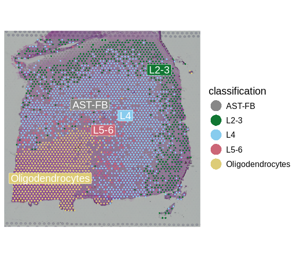
R
# Plot classification of each spot based on annotation of a biologist.
SpatialDimPlotColorSafe(sct_st[, !is.na(sct_st[[]]$layer_guess)],
                        "layer_guess")
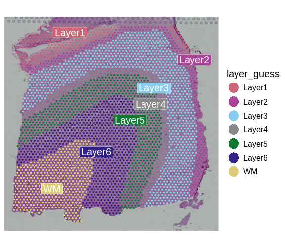
To be more quantitative, we can compute a confusion matrix comparing the layers predicted by RCTD with those annotated by the authors.
R
# Compare predictions from RCTD with annotation done by biologist.
df            <- as.data.frame(table(sct_st[[]]$layer_guess,
                                     sct_st[[]]$classification))
colnames(df)  <- c("Annotation", "Prediction", "Freq")
df$Annotation <- factor(df$Annotation)
df$Prediction <- factor(df$Prediction)

ggplot(data = df, aes(x = Annotation, y = Prediction, fill = Freq)) +
  geom_tile() +
  theme(text = element_text(size = 20),
        axis.text.x = element_text(angle = 45, vjust = 1, hjust=1))
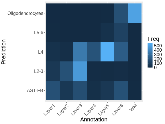
Note that there is a fairly strong correlation between the predicted and observed layers, particularly for the pairs Oligodendrocytes and WM (White Matter), L4 and Layer 4, and L2-3 and Layer 3.
Summary
Deconvolution quantifies the cell type composition of each spot. Doing so enables downstream analyses, such as the proportion of various cell types across a sample, heterogeneity of cell types across the sample, or co-localization analyses of cell types within the sample. Supervised (i.e., reference-based) and unsupervised approaches have been developed.
Here, we applied deconvolution supervised by scRNA-seq annotations, as implemented in RCTD, to a brain sample. The highly structured organization of the brain allows clear visual confirmation of deconvolution results. Other tissues may have less structure and more intermingling of cell types. For example, a typical use of deconvolution in a cancer setting is to explore co-localization of tumor and immune cells.
- Deconvolution enhances spatial transcriptomics by quantifying the different cell types within spatial spots.
- Integrating scRNA-seq data with spatial transcriptomics data facilitates accurate deconvolution.
- RCTD is a supervised deconvolution method that quantifies the proportion of different cell types in spatial transcriptomics data.
Content from Differential Expression Testing
Last updated on 2025-10-07 | Edit this page
Estimated time: 50 minutes
Overview
Questions
- How can we assess region-specific gene expression using differential expression?
- How can we assess spatially varying gene expression using spatial statistics?
Objectives
- Identify differentially expressed genes across different layers defined by expert annotations.
- Utilize the Moran’s I statistic to find spatially variable genes.
- Explore the relationship between layer-specific genes identified by differential expression and spatially varying genes identified by Moran’s I.
Spot-level Differential Expression Across Annotated Regions
We will begin by performing differential expression (DE) across the
annotated layers. We will use the source publication’s spot annotation,
which is stored in the layer_guess column of the metadata.
As a reminder, those look like:
R
SpatialDimPlotColorSafe(sct_st[, !is.na(sct_st[[]]$layer_guess)],
                        "layer_guess") +
  labs(fill = "Layer")

We identify genes that are upregulated in each annotated brain region
using the FindAllMarkers
function in Seurat. This performs a “one versus rest” comparison of a
gene’s expression in one region relative to that gene’s expression in
all other regions. The default test used here, the Wilcoxon Rank Sum
test, will use an efficient implementation within the presto
library, if installed. The speedup over the default implementation is
substantial, and we highly recommend installing presto and
using Seurat v5, which leverages it.
R
Idents(sct_st)  <- "layer_guess"
de_genes           <- FindAllMarkers(sct_st,
                                     assay    = "SCT",
                                     verbose  = FALSE,
                                     only.pos = TRUE,
                                     min.pct  = 0.25,
                                     logfc.threshold = 0.25)
WARNING
Warning: The `slot` argument of `GetAssayData()` is deprecated as of SeuratObject 5.0.0.
ℹ Please use the `layer` argument instead.
ℹ The deprecated feature was likely used in the Seurat package.
  Please report the issue at <https://github.com/satijalab/seurat/issues>.
This warning is displayed once every 8 hours.
Call `lifecycle::last_lifecycle_warnings()` to see where this warning was
generated.
WARNING
Warning: `PackageCheck()` was deprecated in SeuratObject 5.0.0.
ℹ Please use `rlang::check_installed()` instead.
ℹ The deprecated feature was likely used in the Seurat package.
  Please report the issue at <https://github.com/satijalab/seurat/issues>.
This warning is displayed once every 8 hours.
Call `lifecycle::last_lifecycle_warnings()` to see where this warning was
generated.
The resulting table indicates DE p-values and adjusted p-values for each gene, along with the percentage of spots in which the gene was detected (pct.1) in the corresponding cluster and the percentage of spots in which it was detected in all other clusters (pct.2):
R
head(de_genes)
OUTPUT
                p_val avg_log2FC pct.1 pct.2     p_val_adj cluster    gene
MT-CO1  7.490920e-163  0.3732349 1.000  1.00 1.348066e-158  Layer3  MT-CO1
ENC1    1.306480e-142  0.8693104 0.998  0.93 2.351142e-138  Layer3    ENC1
MT-ATP6 7.395810e-127  0.3333148 1.000  1.00 1.330950e-122  Layer3 MT-ATP6
MT-CYB  1.306736e-117  0.3288096 1.000  1.00 2.351602e-113  Layer3  MT-CYB
MT-CO2  3.611734e-116  0.2869348 1.000  1.00 6.499677e-112  Layer3  MT-CO2
MT-CO3  6.536277e-105  0.2765344 1.000  1.00 1.176268e-100  Layer3  MT-CO3
It is not uncommon to have pathologist annotations of regions. The Visium assay is performed on a tissue that is also stained for hematoxylin and eosin (H&E) – a routine practice in pathology for diagnosing cancer, for example. A pathologist could manually annotate this H&E image using a histology viewer, such as QuPath.
Spot-level Differential Expression Across Clusters
In cases where we do not have expert annotations, we could perform the analysis above across clusters. Indeed, this is often the first step to interpreting a cluster – comparing its marker genes to those of regions expected within the tissue. It is important to remember, however, that these markers are for clusters of spots – aggregations of cells – not individual cells, as would be the case in scRNA-seq. Those aggregations may be of cells with similar types, in which case analysis may be similar to that of scRNA-seq, or of different cell types, in which case the interpretation would be quite different than with scRNA-seq. Let’s try this.
First, let’s remind ourselves what the clusters look like:
R
SpatialDimPlotColorSafe(sct_st, "seurat_clusters") +
  labs(fill = "Cluster")
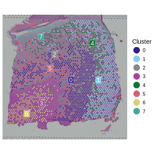
Now, we will use nearly identical code as above to perform the
differential expression analysis. We only change each cell’s identity
class with the Idents
function, to associate each cell with its cluster.
R
Idents(sct_st)  <- "seurat_clusters"
de_genes_cluster   <- FindAllMarkers(sct_st,
                                     assay    = "SCT",
                                     verbose  = FALSE,
                                     only.pos = TRUE,
                                     min.pct  = 0.25,
                                     logfc.threshold = 0.25)
Let’s visualize the overlap between genes differentially expressed across annotated layers and those differentially expressed across clusters. We will do so using a confusion matrix.
R
de_genes_all <- merge(subset(de_genes, p_val_adj < 0.05),
                      subset(de_genes_cluster, p_val_adj < 0.05),
                      by=c("gene"), all=TRUE,
                      suffixes = c(".anno", ".cluster"))
layer.order <- c("WM", "Layer1", "Layer2", "Layer3", "Layer4",
                 "Layer5", "Layer6")
df            <- as.data.frame(table(de_genes_all$cluster.anno,
                                     de_genes_all$cluster.cluster))
colnames(df)  <- c("de.anno", "de.cluster", "Freq")
df$de.anno <- factor(df$de.anno, levels = c("NA", layer.order))
df$de.cluster <- factor(df$de.cluster)

ggplot(data = df, aes(x = de.anno, y = de.cluster, fill = Freq)) +
  geom_tile() +
  theme(text = element_text(size = 20),
        axis.text.x = element_text(angle = 45, vjust = 1, hjust=1)) +
  xlab("Annotation-based DE Genes") + ylab("Cluster-based DE Genes")
The above plot shows only marginal overlap between the annotation-derived DE genes on the x axis and the cluster-derived DE genes on the y axis. This might indicate that the two approaches are complementary. In fact, they could be used in conjunction. We could have performed clustering within the annotated regions to assess intra-layer heterogeneity.
Moran’s I Statistic
We next consider an alternative to the above approaches that both rely on defined regions – be they defined from expert annotation or via clustering. Instead, we will apply the Moran’s I statistic. Moran’s I is a measure used to assess spatial autocorrelation in data, indicating whether similar values of a feature (e.g., expression levels of a gene) are clustered, dispersed, or random (Jackson, et al. 2010). These correspond to Moran’s I values that are positive, negative, or near zero, respectively.

Image by WikiNukalito, CC BY-SA 4.0, via Wikimedia Commons.
Here, we can apply it to detect genes whose expression patterns exhibit spatial structure, which may reflect region-specific, biological function. That is, we anticipate that spatially variable genes will exhibit region-specific expression. Let’s check that hypothesis by first computing spatially variable genes and then assessing whether they are differentially expressed across regions.
Spatial Differential Expression Using Moran’s I
We identify the genes whose expression patterns exhibit clear spatial
structure using Moran’s I algorithm, as implemented in FindSpatiallyVariableFeatures.
We have selected the top 1,000 genes, which should be sufficient to
identify brain regions. The following will take several minutes to
run.
R
svg <-
  FindSpatiallyVariableFeatures(sct_st,
                                assay            = "SCT",
                                features         = VariableFeatures(sct_st)[1:1000],
                                selection.method = "moransi")
ERROR
Error: 'RunMoransI' requires either Rfast2 or ape to be installedFindSpatiallyVariableFeatures returns a Seurat object,
populated with Moran’s I-derived results. Normally, we would use the SpatiallyVariableFeatures
function to query those results. But, there is a bug in that function as
described in
Seurat’s issue pages. So, instead we will manually extract the top
100 ranked spatially variable genes, along with their Moran’s I values
and associated p-values:
R
# Get and sort 'MoransI_observed' values
morans_i_genes <- svg@assays[["SCT"]]@meta.features %>%
                    rownames_to_column("gene") %>%
                    arrange(desc(MoransI_observed)) %>%
                    slice_head(n = 100)
ERROR
Error in svg@assays: no applicable method for `@` applied to an object of class "function"R
head(morans_i_genes)
ERROR
Error in h(simpleError(msg, call)): error in evaluating the argument 'x' in selecting a method for function 'head': object 'morans_i_genes' not foundCorrelation of Region-specific Differentially Expressed Genes and Spatially Variable Genes
Heatmap of Differential Expression
As a sanity check of both the region-specific differential expression and the Moran’s I approaches, let’s check our hypothesis that spatially variable genes are likely to show regional differential expression. To do this, we will plot a heatmap of the differential expression p-values for the top 100 spatially variable genes, organized by brain region.
R
# Merge the Moran's I values with the DE genes
df <- merge(morans_i_genes, de_genes, all.x = TRUE, by = "gene")
ERROR
Error in h(simpleError(msg, call)): error in evaluating the argument 'x' in selecting a method for function 'merge': object 'morans_i_genes' not foundR
df <- subset(df, !is.na(cluster))
ERROR
Error in eval(e, x, parent.frame()): object 'cluster' not foundR
# We will plot the -log2 pvalues. Compute this and adjust for taking
# log of 0.
df$log_p_val_adj <- -log2(df$p_val_adj)
ERROR
Error in log2(df$p_val_adj): non-numeric argument to mathematical functionR
df$log_p_val_adj[is.infinite(df$log_p_val_adj)] <-
  max(df$log_p_val_adj[!is.infinite(df$log_p_val_adj)])
WARNING
Warning in max(df$log_p_val_adj[!is.infinite(df$log_p_val_adj)]): no
non-missing arguments to max; returning -Inf
ERROR
Error in `$<-.data.frame`(`*tmp*`, log_p_val_adj, value = numeric(0)): replacement has 0 rows, data has 56R
# Create a matrix whose rows are the spatially variable genes
# (indicated by Moran's I), whose columns are the clusters, and whose
# entries are the adjusted DE pvalue for the corresponding gene and cluster.
p_val_adj_matrix <- df %>%
                       select(gene, cluster,log_p_val_adj) %>%
                       pivot_wider(names_from = cluster,
                                   values_from = log_p_val_adj,
                                   values_fill = 0) %>%
                       column_to_rownames("gene") %>%
                       as.matrix()
ERROR
Error in (function (cond) : error in evaluating the argument 'x' in selecting a method for function 'as.matrix': Can't select columns that don't exist.
✖ Column `gene` doesn't exist.
R
# Order the regions according to their spatial organization from
# inner to outer layers
p_val_adj_matrix <- p_val_adj_matrix[, layer.order]
ERROR
Error: object 'p_val_adj_matrix' not foundR
# Create a heatmap of the DE p-values of spatially variable genes
Heatmap(p_val_adj_matrix,
        column_title      = "Heatmap of DE p-values of spatially variable genes",
        name              = "DE -log2(p-values)", # Title for the heatmap legend
        row_title         = "Spatially variable genes",
        cluster_rows      = TRUE,
        cluster_columns   = FALSE,
        show_row_names    = FALSE,
        show_column_names = TRUE,
        show_row_dend     = FALSE,
        show_column_dend  = TRUE)
ERROR
Error: object 'p_val_adj_matrix' not foundThe heatmap visualization reveals a key finding of our analysis: genes displaying the highest Moran’s I values show distinct expression patterns that align with specific brain regions identified through expert annotations. This observation underscores the spatial correlation of gene expression, highlighting its potential relevance in understanding regional brain functions and pathologies.
Differential Expression Analysis for Multiple Samples
Till now we have explored spot-level analysis within one sample. However, most studies (including the published one that furnished the data we used here) include multiple samples. This has some similarities to single cell-level DE analysis in scRNA-seq. In the scRNA-seq setting, several studies, including one by Squair, et al., have emphasized drawbacks of performing DE on individual cells. Single-cell DE may be caused by technical variability across single cells, biological variability that may not be of interest across conditions studied (e.g., transcriptional bursting), or simply by the large number of individual cells that inflate false positives. One solution is to perform pseudobulking of the scRNA-seq and then to use conventional bulk RNA-seq DE tools (e.g., DESeq2) to compare the pseudobulks. A Seurat vignette describing the approach for scRNA-seq should likewise be applicable for spatial transcriptomics. However, we note the caveat that spots are not cells – the former may have considerably more intra- and inter-spot biological heterogeneity. Hence, pseudobulking should be done with caution.
We selected one sample from each subject (151508,
151669, and 151673), as detailed in the
referenced study (Maynard et al, Nat
Neurosci 24, 425–436 (2021)). This selection allows us to analyze
the consistency of differential expression across individuals while
accounting for subject-specific batch effects. We start by loading our
samples:
R
# Define the list of selected sample IDs
selected_samples <- c("151508", "151669","151673")

# Initialize an empty list to store Seurat objects
st_objects <- list()

# Loop over each sample ID to process the corresponding data
for (sample_id in selected_samples) {
  # Construct the directory and filename for data loading
  data_dir <- paste0("./data/", sample_id)
  filename <- paste0(sample_id, "_filtered_feature_bc_matrix.h5")

  # Load the spatial transcriptomics data for the current sample
  st_obj <- Load10X_Spatial(data.dir = data_dir, filename = filename)

  # Read in the tissue spot positions from the CSV file
  tissue_positions_file <- paste0(data_dir, "/spatial/tissue_positions_list.csv")
  tissue_position <- read_csv(tissue_positions_file,
                              col_names = FALSE, show_col_types = FALSE) %>%
                     column_to_rownames('X1')

  # Define column names for the tissue position data
  colnames(tissue_position) <- c("in_tissue", "array_row", "array_col",
                                 "pxl_row_in_fullres", "pxl_col_in_fullres")

  # Align spot barcodes between the Seurat object and the tissue position metadata
  tissue_position <- tissue_position[Cells(st_obj),]
  stopifnot(rownames(tissue_position) == Cells(st_obj))

  # Add the aligned tissue position metadata to the Seurat object
  st_obj <- AddMetaData(object = st_obj, metadata = tissue_position)

  # Additionally we add the "layer_guess" and "cell-count" metadata
  spot_metadata <- read.table("./data/spot-meta.tsv", sep="\t")
  # Subset to our sample
  spot_metadata <- subset(spot_metadata, sample_name == sample_id)
  rownames(spot_metadata) <- spot_metadata$barcode
  stopifnot(all(Cells(st_obj) %in% rownames(spot_metadata)))
  spot_metadata <- spot_metadata[Cells(st_obj),]

  st_obj <- AddMetaData(object = st_obj,
                           metadata = spot_metadata[, c("layer_guess", "cell_count"), drop=FALSE])

  # Store the updated Seurat object in the list, using the sample ID as the key
  st_objects[[sample_id]] <- st_obj
}
Now, st_objects variable contains all the Seurat objects for each selected sample, indexed by their respective sample IDs.
Batch correction Analysis
When working with multiple samples, batch effects can introduce technical variability that may confound biological signals. Batch correction methods can help mitigate these effects. In this section, we perform pseudobulk analysis and apply PCA to visualize any potential batch effects across layers.
R
# Initialize an empty list to store pseudobulked Seurat objects
pseudobulked_objs <- list()

# Pseudobulk each selected sample by aggregating expression within annotated layers
for (i in selected_samples) {
  pseudobulk_seurat <- AggregateExpression(st_objects[[i]],
                                           assays = 'Spatial',
                                           return.seurat = TRUE,
                                           group.by = 'layer_guess')
  pseudobulk_seurat@meta.data$sample <- names(st_objects[i])
  pseudobulk_seurat@meta.data$layer <- colnames(pseudobulk_seurat@assays[["Spatial"]])

  # Store the pseudobulked Seurat object in the list
  pseudobulked_objs[[i]] <- pseudobulk_seurat
}

# Merge all pseudobulked Seurat objects into a single Seurat object
merged_pseudobulk <- Reduce(function(x, y) merge(x, y), pseudobulked_objs)

# Normalize, find variable features, and scale the data
merged_pseudobulk <- NormalizeData(merged_pseudobulk, normalization.method = "LogNormalize", scale.factor = 1e6)
merged_pseudobulk <- FindVariableFeatures(merged_pseudobulk)
merged_pseudobulk <- ScaleData(merged_pseudobulk)

# Run PCA on the merged pseudobulked data
merged_pseudobulk <- RunPCA(merged_pseudobulk, features = VariableFeatures(object = merged_pseudobulk), npcs = 2)
To assess the presence of batch effects, we visualize the PCA results. Ideally, the samples should cluster by layer rather than by sample, indicating that batch effects are not a significant concern.
R
# Visualize PCA grouped by layer with increased point size and different shapes
PCAPlot_layer_symbol <- DimPlot(merged_pseudobulk, reduction = "pca", shape.by = "sample", pt.size = 3) +
  theme(legend.position = "right") +
  ggtitle("PCA Plot Annotated by Layer (Shapes)")
PCAPlot_layer_symbol
 #
#
The PCA plot indeed shows that the dots are clustered by layer rather than by sample, validating that the layers are the primary source of variation, rather than differences between samples from different subjects.
To examine potential batch effects more rigorously, we extended our analysis beyond PCA visualization and conducted a second-level assessment by comparing a simple merge approach with two widely used batch correction algorithms: anchor-based integration and Hamrony. The anchor-based strategy merges datasets at the expression level, effectively aligning similar cell populations across batches. In contrast, Harmony performs batch correction on low-dimensional embeddings (e.g., PCA), which can be computationally efficient while maintaining the global structure of the data.
This comparative analysis will allow us to evaluate how well each method mitigates sample-specific variation while preserving biological structure.
R
# Set analysis parameters
n_features   <- 3000
s_resolution1 <- 0.3
s_resolution2 <- 0.2
s_resolution3 <- 0.1
n_pcs        <- 100

# First, we annotate each dataset with a specific sample id
for (nm in names(st_objects)) {
  obj <- st_objects[[nm]]
  sample_tag <- rep(nm, ncol(obj))
  st_objects[[nm]] <- AddMetaData(obj, metadata = sample_tag, col.name = "sample_id")
}

# Approach 1:  SCT merging
# Each sample is normalised with SCTransform separately, then merged. This serves as a baseline without explicit batch correction.

st_objects_sct <- lapply(st_objects, function(obj) {
  SCTransform(
    obj,
    assay               = "Spatial",
    new.assay.name      = "SCT",
    method              = "glmGamPoi",
    return.only.var.genes = FALSE,
    verbose             = FALSE
  )
})

# Merge individually normalised objects
merged_obj1 <- merge(st_objects_sct[[1]],st_objects_sct[-1])
names(merged_obj1@images) <- names(st_objects_sct)

DefaultAssay(merged_obj1) <- "SCT"

# Use union of variable features
var_feats_union <- unique(unlist(lapply(st_objects_sct, VariableFeatures)))
VariableFeatures(merged_obj1) <- var_feats_union

# Perform PCA and neighbors calculation
merged_obj1 <- RunPCA(merged_obj1, npcs = n_pcs, verbose = FALSE)
merged_obj1 <- FindNeighbors(merged_obj1, dims = 1:n_pcs, verbose = FALSE)

# Approach 2: SCT Anchor Integration
# Seurat's anchor-based integration aligns gene expression across datasets.

# Ensure SCT is the default assay
for (i in seq_along(st_objects_sct)) {
  DefaultAssay(st_objects_sct[[i]]) <- "SCT"
}

# Select integration features
features_2 <- SelectIntegrationFeatures(st_objects_sct, nfeatures = n_features)
processed_seurat_list <- PrepSCTIntegration(st_objects_sct, anchor.features = features_2)

# Identify integration anchors
anchors2 <- FindIntegrationAnchors(
  object.list          = processed_seurat_list,
  normalization.method = "SCT",
  anchor.features      = features_2
)

# Create the integrated object
integrated_obj2 <- IntegrateData(anchorset = anchors2, normalization.method = "SCT")
OUTPUT
[1] 1OUTPUT
[1] 2OUTPUT
[1] 3R
DefaultAssay(integrated_obj2) <- "integrated"

# Perform PCA and neighbors calculation
integrated_obj2 <- RunPCA(integrated_obj2, npcs = n_pcs, verbose = FALSE)
integrated_obj2 <- FindNeighbors(integrated_obj2, dims = 1:n_pcs, verbose = FALSE)

# Approach 3: SCT Harmony Integration
# Harmony corrects batch effects in PCA space, making it computationally efficient.

# Use PCA embeddings from merged SCTransformed object for creating hamrony object
merged_obj3 <- RunHarmony(
  object         = merged_obj1,
  group.by.vars  = "sample_id",  # Correct for sample-specific effects
  reduction.use  = "pca",
  reduction.save = "harmony"
)

# Calculate neighbors, in this approach PCA is not needed as harmony is an "modified" version of PCA to mitigate batch effects
merged_obj3 <- FindNeighbors(merged_obj3, reduction = "harmony", dims = 1:n_pcs, verbose = FALSE)
After computing the three different integration strategies—simple SCT merge, anchor-based integration, and Harmony-based integration—we aimed to evaluate their effectiveness in preserving biological structure while mitigating batch effects. In our case, this evaluation was performed by comparing the clustering results from each approach to the expert-provided layer annotations using the Adjusted Rand Index (ARI). ARI quantifies the similarity between computed clusters and expert-defined brain layers, with higher values indicating better alignment.
Since the clustering of Visium spots depends on the selected resolution parameter, the ARI values can vary across different resolutions. Some methods may perform better at lower resolutions, capturing broad anatomical patterns, while others excel at higher resolutions by resolving finer substructures. To compare the consistency and overall effectiveness of each integration approach, we computed ARI scores across a range of clustering resolutions for all three approaches and visualized the results using a boxplot.
R
resolutions <- c(0.05,0.1,0.15,0.2,0.25,0.3,0.35,0.4)
ari1 <- numeric(length(resolutions))
ari2 <- numeric(length(resolutions))
ari3 <- numeric(length(resolutions))

# Run analysis per unique resolution
for(i in seq_along(resolutions)){
      merged_obj1 <- FindClusters(merged_obj1, resolution = i, verbose = FALSE)
    ari1[i] <- adjustedRandIndex(merged_obj1@meta.data$seurat_clusters, y =                 merged_obj1@meta.data$layer_guess)
    integrated_obj2 <- FindClusters(integrated_obj2, resolution = i, verbose = FALSE)
    ari2[i] <- adjustedRandIndex(integrated_obj2@meta.data$seurat_clusters,
                                     integrated_obj2@meta.data$layer_guess)
    merged_obj3 <- FindClusters(merged_obj3, resolution = i, verbose = FALSE)
    ari3[i] <- adjustedRandIndex(merged_obj3@meta.data$seurat_clusters,
                                     merged_obj3@meta.data$layer_guess)
}

# Save box plot
png(file.path(getwd(), "ARI_boxplot.png"),
    width = 2000, height = 1600, res = 300)
par(mar = c(4.5, 4.5, 2, 1))  # Adjust margins

bp <- boxplot(list(Merge=ari1, Integrate=ari2, Harmony=ari3),
              col = viridis::viridis(3),
              main = "ARI Distribution Across Resolutions",
              ylab = "Adjusted Rand Index",
              xlab = "Clustering Method",
              cex.axis = 0.8,
              las = 1)
#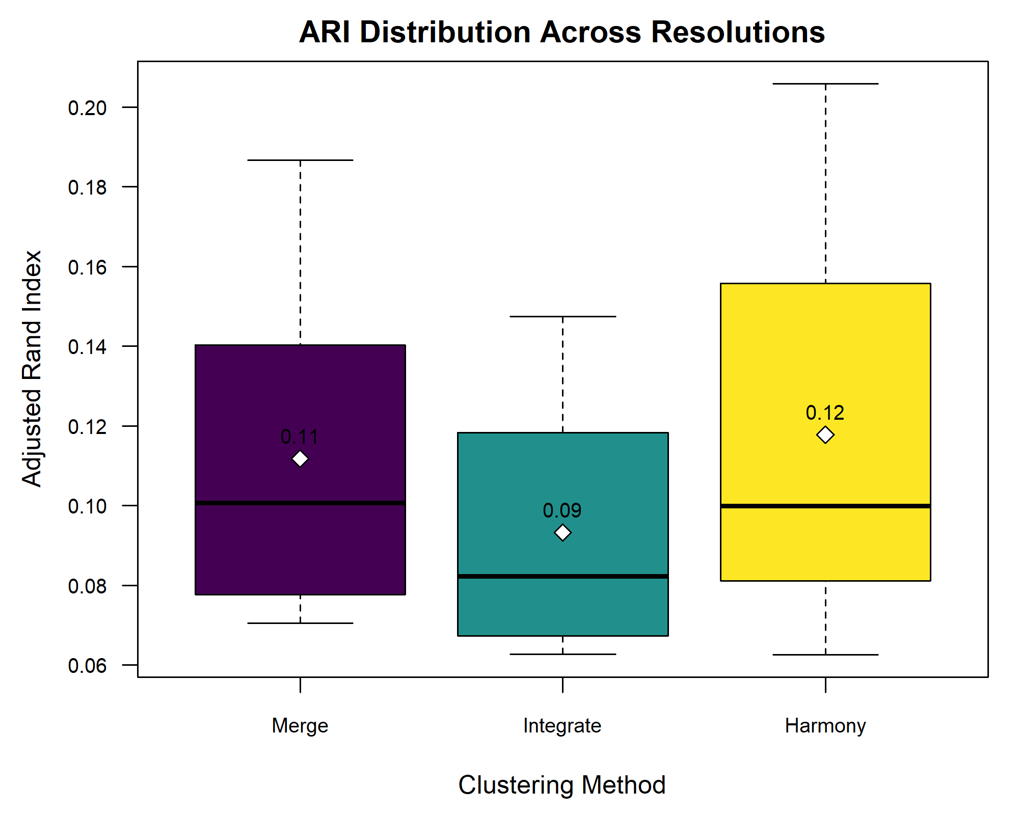
The boxplot shows minimal differences in ARI across the three integration methods, suggesting that batch effects were negligible. This aligns with the earlier PCA plot, where clustering was driven by layer annotations rather than sample identity.
Pseudobulk Analysis with DESeq2
Pseudobulk analysis allows for the aggregation of single-cell or spot-level data into larger groups, which can reduce noise and enhance the detection of biologically meaningful signals. In this section, we perform differential expression analysis using DESeq2 on pseudobulked data. DESeq2 is a tool for differential expression analysis, particularly well-suited for count data, which is the type of data we have after aggregating the spatial transcriptomics spots into pseudobulks. It employs a statistical model that accounts for variability in read counts while controlling for factors such as sample size and sequencing depth. This makes it particularly powerful in situations where we expect relatively small changes in gene expression but need to ensure robustness against noise, making it an ideal choice for our pseudobulk analysis.
In this case, we compare White Matter (aggregated expression from spots labeled as White Matter) versus the rest of the tissue (aggregated expression from spots belonging to all other cotrical layers). This binary comparison is straightforward yet powerful, as the White Matter in the brain is distinct from the cortical layers in terms of both structure and function. By comparing the gene expression in White Matter to that in all other layers, we aim to identify genes that are uniquely or predominantly expressed in White Matter and associated with its functions or pathologies
R
all_columns <- list()

# Function to process each sample and create a new matrix with WM vs. others
process_sample <- function(sample_name, pseudobulked_objs) {
  counts_matrix <- pseudobulked_objs[[sample_name]]@assays[["Spatial"]]@layers[["counts"]]
  counts_matrix <- as(counts_matrix, "dgCMatrix")
  layer_info <- pseudobulked_objs[[sample_name]]@meta.data[["layer_guess"]]
  white_matter_col <- which(layer_info == "WM")
  other_counts <- rowSums(counts_matrix[, -white_matter_col])
  white_matter_counts <- counts_matrix[, white_matter_col]
  new_matrix <- cbind(white_matter_counts, other_counts)
  colnames(new_matrix) <- c(paste0("white_matter_", sample_name), paste0("other_", sample_name))
  return(new_matrix)
}

# Process each sample and store the resulting matrices
for (sample in selected_samples) {
  new_matrix <- process_sample(sample, pseudobulked_objs)
  all_columns[[sample]] <- new_matrix
}

# Combine all processed matrices into a single matrix
combined_matrix <- do.call(cbind, all_columns)
rownames(combined_matrix) <- rownames(pseudobulked_objs[[1]])

# Create a dataframe for DESeq2 with sample and layer information
sample <- rep(selected_samples, each = 2)
layer <- rep(c('WM', 'others'), times = length(selected_samples))
new_dataframe <- data.frame(sample = sample, layer = layer)
rownames(new_dataframe) <- colnames(combined_matrix)

# Perform differential expression analysis using DESeq2
# Unfortunately, there are still dependency issues between DESeq2 and Seurat,
# so we recommend not running this part. To prevent execution, we wrap the code in an `if (FALSE)` statement.
#if (FALSE) {
#  BiocManager::install("DESeq2")
#  library(DESeq2)
dds <- DESeqDataSetFromMatrix(countData = combined_matrix,
                              colData = new_dataframe,
                              design = ~ layer + sample)
dds <- DESeq(dds)
resultsNames(dds)
OUTPUT
[1] "Intercept"               "layer_WM_vs_others"
[3] "sample_151669_vs_151508" "sample_151673_vs_151508"
R
res <- results(dds, name = "layer_WM_vs_others")
head(res[order(res$padj),])
OUTPUT
log2 fold change (MLE): layer WM vs others
Wald test p-value: layer WM vs others
DataFrame with 6 rows and 6 columns
        baseMean log2FoldChange     lfcSE      stat      pvalue        padj
       <numeric>      <numeric> <numeric> <numeric>   <numeric>   <numeric>
MOBP    1364.273        3.04042  0.334509   9.08921 9.97603e-20 1.26825e-15
AQP1     160.269        3.22379  0.359589   8.96523 3.09639e-19 1.31215e-15
MBP    16027.210        2.72729  0.303229   8.99418 2.37995e-19 1.31215e-15
MOG      422.622        2.94064  0.357036   8.23624 1.77704e-16 5.64789e-13
MYRF     318.623        2.72961  0.338574   8.06208 7.50046e-16 1.90707e-12
NKX6-2   325.542        2.91717  0.368060   7.92579 2.26698e-15 4.80335e-12
R
#}
We have selected to plot spatially the differentially expressed genes with the highest mean values, namely “MBP” and “MOBP”
R
plot_sample_expression <- function(sample, gene, sample_id) {
  sample@meta.data$temp_feat <- sample@assays[["Spatial"]]$counts[gene,]
  p1 <- SpatialFeaturePlot(sample, features = "temp_feat") +
    ggtitle(paste("Spatial Expression of", gene, "in Sample", sample_id)) +
    theme(plot.title = element_text(hjust = 0.5))
  return(p1)
}

plot_layer_expression <- function(sample, sample_id) {
  p1 <- SpatialDimPlot(sample, group.by = "layer_guess") +
    ggtitle(paste("Layer guess of Sample", sample_id)) +
    theme(plot.title = element_text(hjust = 0.5),
          legend.text = element_text(size = 12))
  return(p1)
}

# Plot and save the top DE genes across samples
plots <- list()
for (sample_id in selected_samples) {
  p1 <- plot_sample_expression(st_objects[[sample_id]], "MOBP", sample_id)
  p2 <- plot_sample_expression(st_objects[[sample_id]], "MBP" , sample_id)
  p3 <- plot_layer_expression(st_objects[[sample_id]], sample_id)
  combined <- p1 + p2 + p3
  plots[[sample_id]] <- combined
}

# Combine and save plots
combined_plot <- wrap_plots(plots, ncol = 1)
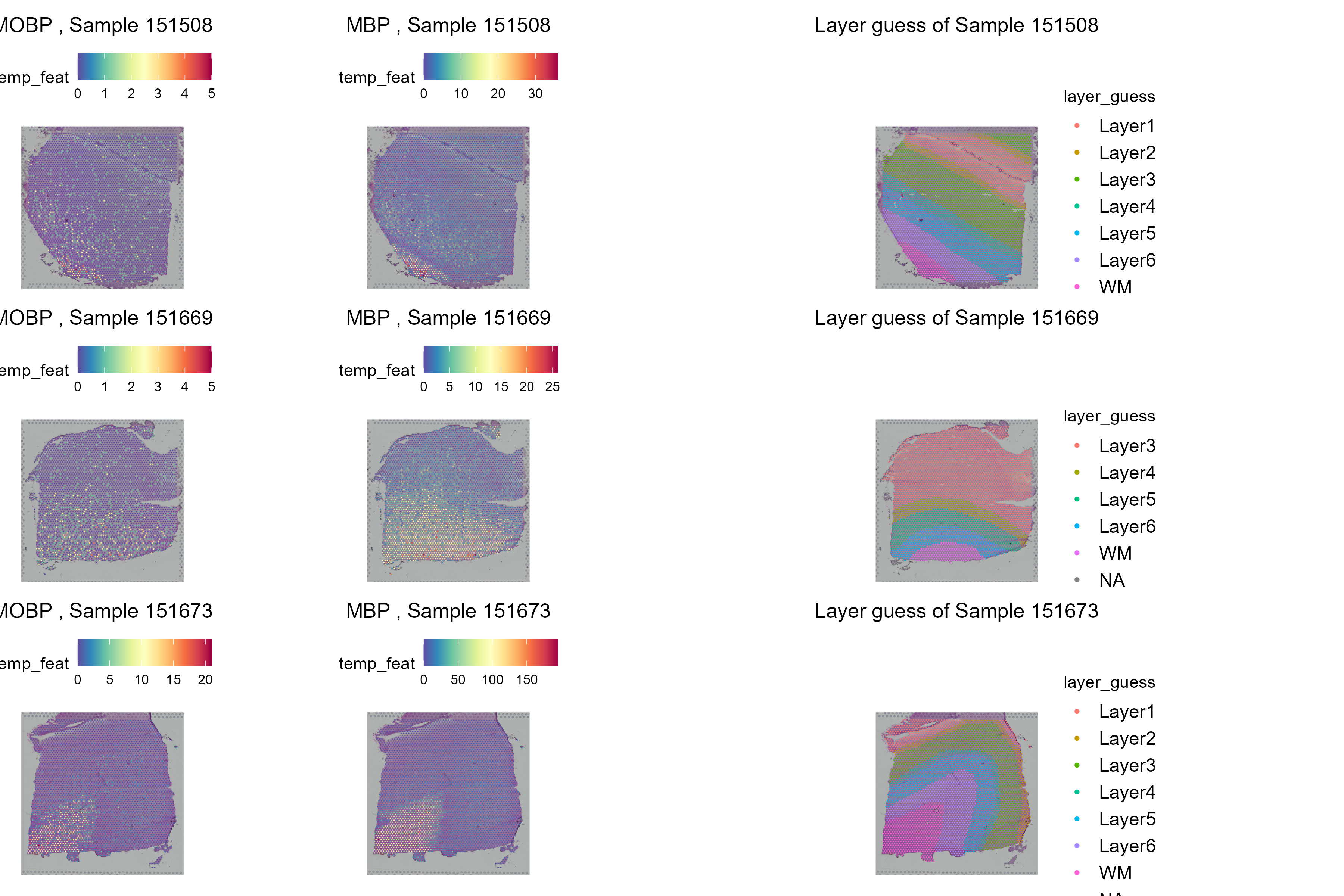
As it is evident from the spatila distribution of the genes, they are mostly expressed specifically in the White Matter for all samples.
Other Considerations
We here explored the very basics of differential expression analysis and differential expression analysis with multiple samples. For batch correction procedures, such as those just mentioned, may remove biological variability along with technical variability. An alternative approach is to perform analyses within samples and then to perform meta-analysis across them. One intriguing possibility is to compare rank-based statistics across samples, which should be less susceptible to batch effects. Another is to cluster across samples based on overlapping sets of genes within intra-cluster samples. Such an approach has been applied in the “meta-programs” defined in cancer by Gavish and colleagues.
There is unlikely to be one turn-key approach to addressing the above issues. You will likely need to explore the data – and that exploration should be guided by some biological expectations that anchor your choices.
- Differential expression testing pinpoints genes with significant expression variations across regions or clusters.
- Moran’s I statistic reveals spatial autocorrelation in gene expression, critical for examining spatially dependent biological activities.
- Moran’s I algorithm effectively identifies genes expressed in anatomically distinct regions, as validated from the correlation analysis with the DE genes from the annotated regions.
#{r echo=FALSE,include=FALSE} #save_seurat_object(obj = sct_st, file_prefix = 'detesting') #
Content from Putting it all Together
Last updated on 2025-10-07 | Edit this page
Estimated time: 85 minutes
Overview
Questions
- How do I put the whole spatial transcriptomics analysis together?
Objectives
- Understand the steps in spatial transcriptomics analysis.
- Perform a spatial transcriptomics analysis on another sample.
Introduction
Over the past day and a half, we have reviewed the steps in a spatial transcriptomics analysis. There were many steps and many lines of code. In this final lesson, you will run through the spatial transcriptomics analysis on your own with another sample.
Challenge 1: Reading in a new sample.
Look back through the lessons. What libraries and auxiliary functions did we use? Load those in now.
R
suppressPackageStartupMessages(library(tidyverse))
suppressPackageStartupMessages(library(Seurat))
suppressPackageStartupMessages(library(spacexr))

source("https://raw.githubusercontent.com/smcclatchy/spatial-transcriptomics/main/code/spatial_utils.R")
Challenge 2: Reading in a new sample.
The publication which used this data has several tissue sections. As part of the setup, you should have downloaded sample 151508. Look in the Data Preprocessing lesson and read in the filtered sample file for this sample.
R
st_obj <- Load10X_Spatial(data.dir  = "./data/151508",
                          filename  = "151508_raw_feature_bc_matrix.h5")
Challenge 3: Reading in sample metadata.
In the Data Preprocessing lesson, we showed you how to read in sample metadata and add it to the Seurat object. Find that code and add the new sample’s metadata to your Seurat object.
R
# Read in the tissue spot positions.
tissue_position <- read_csv("./data/151508/spatial/tissue_positions_list.csv",
                            col_names = FALSE, show_col_types = FALSE) %>%
                     column_to_rownames('X1')
colnames(tissue_position) <- c("in_tissue",
                               "array_row",
                               "array_col",
                               "pxl_row_in_fullres",
                               "pxl_col_in_fullres")

# Align the spot barcodes to match between the Seurat object and the new
# metadata.
tissue_position <- tissue_position[Cells(st_obj),]
stopifnot(rownames(tissue_position) == Cells(st_obj))

# Add the metadata to the Seurat object.
st_obj <- AddMetaData(object = st_obj, metadata = tissue_position)
Challenge 4: Plot the spot positions over the tissue section.
Look for the code to plot the number of counts in each spot in the Data Preprocessing lesson and adapt it to your tissue sample.
R
SpatialFeaturePlot(st_obj, features = "nCount_Spatial")
WARNING
Warning: `aes_string()` was deprecated in ggplot2 3.0.0.
ℹ Please use tidy evaluation idioms with `aes()`.
ℹ See also `vignette("ggplot2-in-packages")` for more information.
ℹ The deprecated feature was likely used in the Seurat package.
  Please report the issue at <https://github.com/satijalab/seurat/issues>.
This warning is displayed once every 8 hours.
Call `lifecycle::last_lifecycle_warnings()` to see where this warning was
generated.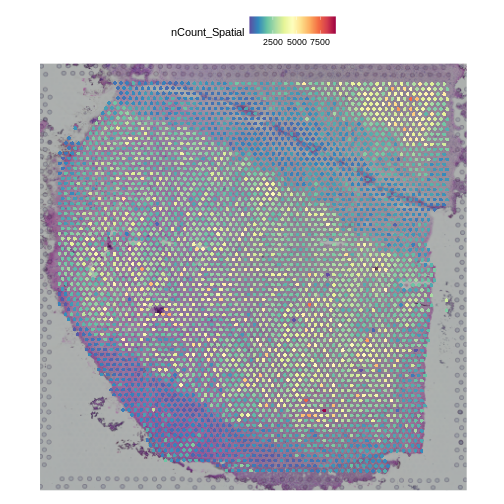
Challenge 5: Filter counts to retain expressed genes.
Look in the Data Preprocessing lesson and filter the counts in your Seurat object to retain genes which have a total sum across all samples of at least 10 counts. How many genes did you end up with?
R
# Get the counts from the Seurat object.
counts     <- LayerData(st_obj, 'counts')
# Sum total counts across all samples for each gene.
gene_sums  <- rowSums(counts)
# Select genes with total counts above our threshold.
keep_genes <- which(gene_sums > 10)
# Filter the Seurat object.
st_obj     <- st_obj[keep_genes,]
# Print out the number of genes that we retained.
print(length(keep_genes))
OUTPUT
[1] 15311Challenge 6: Normalize data using SCTransform
In the Normalization lesson, we used the SCTransform to normalize the counts. Normalize the counts in your Seurat object an plot the mean expression versus the residual variance for each gene. Use the built in Seurat function to do this. How many variable genes did the method select?
R
# Perform SCTransform on the counts.
st_obj <- SCTransform(st_obj,
                      assay = "Spatial")
OUTPUT
Running SCTransform on assay: SpatialWARNING
Warning: The `slot` argument of `GetAssayData()` is deprecated as of SeuratObject 5.0.0.
ℹ Please use the `layer` argument instead.
ℹ The deprecated feature was likely used in the Seurat package.
  Please report the issue at <https://github.com/satijalab/seurat/issues>.
This warning is displayed once every 8 hours.
Call `lifecycle::last_lifecycle_warnings()` to see where this warning was
generated.
OUTPUT
vst.flavor='v2' set. Using model with fixed slope and excluding poisson genes.OUTPUT
`vst.flavor` is set to 'v2' but could not find glmGamPoi installed.
Please install the glmGamPoi package for much faster estimation.
--------------------------------------------
install.packages('BiocManager')
BiocManager::install('glmGamPoi')
--------------------------------------------
Falling back to native (slower) implementation.
OUTPUT
Calculating cell attributes from input UMI matrix: log_umiOUTPUT
Variance stabilizing transformation of count matrix of size 15311 by 4992OUTPUT
Model formula is y ~ log_umiOUTPUT
Get Negative Binomial regression parameters per geneOUTPUT
Using 2000 genes, 4992 cellsWARNING
Warning in theta.ml(Y, mu, sum(w), w, limit = control$maxit, trace =
control$trace > : iteration limit reached
WARNING
Warning in theta.ml(Y, mu, sum(w), w, limit = control$maxit, trace =
control$trace > : iteration limit reached
Warning in theta.ml(Y, mu, sum(w), w, limit = control$maxit, trace =
control$trace > : iteration limit reached
Warning in theta.ml(Y, mu, sum(w), w, limit = control$maxit, trace =
control$trace > : iteration limit reached
Warning in theta.ml(Y, mu, sum(w), w, limit = control$maxit, trace =
control$trace > : iteration limit reached
Warning in theta.ml(Y, mu, sum(w), w, limit = control$maxit, trace =
control$trace > : iteration limit reached
Warning in theta.ml(Y, mu, sum(w), w, limit = control$maxit, trace =
control$trace > : iteration limit reached
Warning in theta.ml(Y, mu, sum(w), w, limit = control$maxit, trace =
control$trace > : iteration limit reached
Warning in theta.ml(Y, mu, sum(w), w, limit = control$maxit, trace =
control$trace > : iteration limit reached
Warning in theta.ml(Y, mu, sum(w), w, limit = control$maxit, trace =
control$trace > : iteration limit reached
Warning in theta.ml(Y, mu, sum(w), w, limit = control$maxit, trace =
control$trace > : iteration limit reached
Warning in theta.ml(Y, mu, sum(w), w, limit = control$maxit, trace =
control$trace > : iteration limit reached
Warning in theta.ml(Y, mu, sum(w), w, limit = control$maxit, trace =
control$trace > : iteration limit reached
Warning in theta.ml(Y, mu, sum(w), w, limit = control$maxit, trace =
control$trace > : iteration limit reached
Warning in theta.ml(Y, mu, sum(w), w, limit = control$maxit, trace =
control$trace > : iteration limit reached
Warning in theta.ml(Y, mu, sum(w), w, limit = control$maxit, trace =
control$trace > : iteration limit reached
Warning in theta.ml(Y, mu, sum(w), w, limit = control$maxit, trace =
control$trace > : iteration limit reached
Warning in theta.ml(Y, mu, sum(w), w, limit = control$maxit, trace =
control$trace > : iteration limit reached
Warning in theta.ml(Y, mu, sum(w), w, limit = control$maxit, trace =
control$trace > : iteration limit reached
Warning in theta.ml(Y, mu, sum(w), w, limit = control$maxit, trace =
control$trace > : iteration limit reached
Warning in theta.ml(Y, mu, sum(w), w, limit = control$maxit, trace =
control$trace > : iteration limit reached
Warning in theta.ml(Y, mu, sum(w), w, limit = control$maxit, trace =
control$trace > : iteration limit reached
Warning in theta.ml(Y, mu, sum(w), w, limit = control$maxit, trace =
control$trace > : iteration limit reached
Warning in theta.ml(Y, mu, sum(w), w, limit = control$maxit, trace =
control$trace > : iteration limit reached
Warning in theta.ml(Y, mu, sum(w), w, limit = control$maxit, trace =
control$trace > : iteration limit reached
Warning in theta.ml(Y, mu, sum(w), w, limit = control$maxit, trace =
control$trace > : iteration limit reached
Warning in theta.ml(Y, mu, sum(w), w, limit = control$maxit, trace =
control$trace > : iteration limit reached
Warning in theta.ml(Y, mu, sum(w), w, limit = control$maxit, trace =
control$trace > : iteration limit reached
Warning in theta.ml(Y, mu, sum(w), w, limit = control$maxit, trace =
control$trace > : iteration limit reached
Warning in theta.ml(Y, mu, sum(w), w, limit = control$maxit, trace =
control$trace > : iteration limit reached
Warning in theta.ml(Y, mu, sum(w), w, limit = control$maxit, trace =
control$trace > : iteration limit reached
Warning in theta.ml(Y, mu, sum(w), w, limit = control$maxit, trace =
control$trace > : iteration limit reached
Warning in theta.ml(Y, mu, sum(w), w, limit = control$maxit, trace =
control$trace > : iteration limit reached
Warning in theta.ml(Y, mu, sum(w), w, limit = control$maxit, trace =
control$trace > : iteration limit reached
Warning in theta.ml(Y, mu, sum(w), w, limit = control$maxit, trace =
control$trace > : iteration limit reached
Warning in theta.ml(Y, mu, sum(w), w, limit = control$maxit, trace =
control$trace > : iteration limit reached
Warning in theta.ml(Y, mu, sum(w), w, limit = control$maxit, trace =
control$trace > : iteration limit reached
Warning in theta.ml(Y, mu, sum(w), w, limit = control$maxit, trace =
control$trace > : iteration limit reached
Warning in theta.ml(Y, mu, sum(w), w, limit = control$maxit, trace =
control$trace > : iteration limit reached
Warning in theta.ml(Y, mu, sum(w), w, limit = control$maxit, trace =
control$trace > : iteration limit reached
WARNING
Warning in glm.nb(formula = as.formula(new_formula), data = data): alternation
limit reached
WARNING
Warning in theta.ml(Y, mu, sum(w), w, limit = control$maxit, trace =
control$trace > : iteration limit reached
Warning in theta.ml(Y, mu, sum(w), w, limit = control$maxit, trace =
control$trace > : iteration limit reached
Warning in theta.ml(Y, mu, sum(w), w, limit = control$maxit, trace =
control$trace > : iteration limit reached
Warning in theta.ml(Y, mu, sum(w), w, limit = control$maxit, trace =
control$trace > : iteration limit reached
Warning in theta.ml(Y, mu, sum(w), w, limit = control$maxit, trace =
control$trace > : iteration limit reached
Warning in theta.ml(Y, mu, sum(w), w, limit = control$maxit, trace =
control$trace > : iteration limit reached
Warning in theta.ml(Y, mu, sum(w), w, limit = control$maxit, trace =
control$trace > : iteration limit reached
Warning in theta.ml(Y, mu, sum(w), w, limit = control$maxit, trace =
control$trace > : iteration limit reached
Warning in theta.ml(Y, mu, sum(w), w, limit = control$maxit, trace =
control$trace > : iteration limit reached
Warning in theta.ml(Y, mu, sum(w), w, limit = control$maxit, trace =
control$trace > : iteration limit reached
Warning in theta.ml(Y, mu, sum(w), w, limit = control$maxit, trace =
control$trace > : iteration limit reached
Warning in theta.ml(Y, mu, sum(w), w, limit = control$maxit, trace =
control$trace > : iteration limit reached
Warning in theta.ml(Y, mu, sum(w), w, limit = control$maxit, trace =
control$trace > : iteration limit reached
Warning in theta.ml(Y, mu, sum(w), w, limit = control$maxit, trace =
control$trace > : iteration limit reached
Warning in theta.ml(Y, mu, sum(w), w, limit = control$maxit, trace =
control$trace > : iteration limit reached
Warning in theta.ml(Y, mu, sum(w), w, limit = control$maxit, trace =
control$trace > : iteration limit reached
Warning in theta.ml(Y, mu, sum(w), w, limit = control$maxit, trace =
control$trace > : iteration limit reached
Warning in theta.ml(Y, mu, sum(w), w, limit = control$maxit, trace =
control$trace > : iteration limit reached
Warning in theta.ml(Y, mu, sum(w), w, limit = control$maxit, trace =
control$trace > : iteration limit reached
Warning in theta.ml(Y, mu, sum(w), w, limit = control$maxit, trace =
control$trace > : iteration limit reached
Warning in theta.ml(Y, mu, sum(w), w, limit = control$maxit, trace =
control$trace > : iteration limit reached
Warning in theta.ml(Y, mu, sum(w), w, limit = control$maxit, trace =
control$trace > : iteration limit reached
Warning in theta.ml(Y, mu, sum(w), w, limit = control$maxit, trace =
control$trace > : iteration limit reached
Warning in theta.ml(Y, mu, sum(w), w, limit = control$maxit, trace =
control$trace > : iteration limit reached
Warning in theta.ml(Y, mu, sum(w), w, limit = control$maxit, trace =
control$trace > : iteration limit reached
Warning in theta.ml(Y, mu, sum(w), w, limit = control$maxit, trace =
control$trace > : iteration limit reached
Warning in theta.ml(Y, mu, sum(w), w, limit = control$maxit, trace =
control$trace > : iteration limit reached
Warning in theta.ml(Y, mu, sum(w), w, limit = control$maxit, trace =
control$trace > : iteration limit reached
Warning in theta.ml(Y, mu, sum(w), w, limit = control$maxit, trace =
control$trace > : iteration limit reached
Warning in theta.ml(Y, mu, sum(w), w, limit = control$maxit, trace =
control$trace > : iteration limit reached
Warning in theta.ml(Y, mu, sum(w), w, limit = control$maxit, trace =
control$trace > : iteration limit reached
Warning in theta.ml(Y, mu, sum(w), w, limit = control$maxit, trace =
control$trace > : iteration limit reached
Warning in theta.ml(Y, mu, sum(w), w, limit = control$maxit, trace =
control$trace > : iteration limit reached
Warning in theta.ml(Y, mu, sum(w), w, limit = control$maxit, trace =
control$trace > : iteration limit reached
Warning in theta.ml(Y, mu, sum(w), w, limit = control$maxit, trace =
control$trace > : iteration limit reached
Warning in theta.ml(Y, mu, sum(w), w, limit = control$maxit, trace =
control$trace > : iteration limit reached
Warning in theta.ml(Y, mu, sum(w), w, limit = control$maxit, trace =
control$trace > : iteration limit reached
Warning in theta.ml(Y, mu, sum(w), w, limit = control$maxit, trace =
control$trace > : iteration limit reached
Warning in theta.ml(Y, mu, sum(w), w, limit = control$maxit, trace =
control$trace > : iteration limit reached
Warning in theta.ml(Y, mu, sum(w), w, limit = control$maxit, trace =
control$trace > : iteration limit reached
Warning in theta.ml(Y, mu, sum(w), w, limit = control$maxit, trace =
control$trace > : iteration limit reached
Warning in theta.ml(Y, mu, sum(w), w, limit = control$maxit, trace =
control$trace > : iteration limit reached
Warning in theta.ml(Y, mu, sum(w), w, limit = control$maxit, trace =
control$trace > : iteration limit reached
Warning in theta.ml(Y, mu, sum(w), w, limit = control$maxit, trace =
control$trace > : iteration limit reached
WARNING
Warning in glm.nb(formula = as.formula(new_formula), data = data): alternation
limit reached
WARNING
Warning in theta.ml(Y, mu, sum(w), w, limit = control$maxit, trace =
control$trace > : iteration limit reached
Warning in theta.ml(Y, mu, sum(w), w, limit = control$maxit, trace =
control$trace > : iteration limit reached
Warning in theta.ml(Y, mu, sum(w), w, limit = control$maxit, trace =
control$trace > : iteration limit reached
Warning in theta.ml(Y, mu, sum(w), w, limit = control$maxit, trace =
control$trace > : iteration limit reached
Warning in theta.ml(Y, mu, sum(w), w, limit = control$maxit, trace =
control$trace > : iteration limit reached
Warning in theta.ml(Y, mu, sum(w), w, limit = control$maxit, trace =
control$trace > : iteration limit reached
Warning in theta.ml(Y, mu, sum(w), w, limit = control$maxit, trace =
control$trace > : iteration limit reached
Warning in theta.ml(Y, mu, sum(w), w, limit = control$maxit, trace =
control$trace > : iteration limit reached
Warning in theta.ml(Y, mu, sum(w), w, limit = control$maxit, trace =
control$trace > : iteration limit reached
Warning in theta.ml(Y, mu, sum(w), w, limit = control$maxit, trace =
control$trace > : iteration limit reached
Warning in theta.ml(Y, mu, sum(w), w, limit = control$maxit, trace =
control$trace > : iteration limit reached
Warning in theta.ml(Y, mu, sum(w), w, limit = control$maxit, trace =
control$trace > : iteration limit reached
Warning in theta.ml(Y, mu, sum(w), w, limit = control$maxit, trace =
control$trace > : iteration limit reached
Warning in theta.ml(Y, mu, sum(w), w, limit = control$maxit, trace =
control$trace > : iteration limit reached
Warning in theta.ml(Y, mu, sum(w), w, limit = control$maxit, trace =
control$trace > : iteration limit reached
Warning in theta.ml(Y, mu, sum(w), w, limit = control$maxit, trace =
control$trace > : iteration limit reached
Warning in theta.ml(Y, mu, sum(w), w, limit = control$maxit, trace =
control$trace > : iteration limit reached
Warning in theta.ml(Y, mu, sum(w), w, limit = control$maxit, trace =
control$trace > : iteration limit reached
Warning in theta.ml(Y, mu, sum(w), w, limit = control$maxit, trace =
control$trace > : iteration limit reached
Warning in theta.ml(Y, mu, sum(w), w, limit = control$maxit, trace =
control$trace > : iteration limit reached
Warning in theta.ml(Y, mu, sum(w), w, limit = control$maxit, trace =
control$trace > : iteration limit reached
Warning in theta.ml(Y, mu, sum(w), w, limit = control$maxit, trace =
control$trace > : iteration limit reached
Warning in theta.ml(Y, mu, sum(w), w, limit = control$maxit, trace =
control$trace > : iteration limit reached
Warning in theta.ml(Y, mu, sum(w), w, limit = control$maxit, trace =
control$trace > : iteration limit reached
Warning in theta.ml(Y, mu, sum(w), w, limit = control$maxit, trace =
control$trace > : iteration limit reached
Warning in theta.ml(Y, mu, sum(w), w, limit = control$maxit, trace =
control$trace > : iteration limit reached
Warning in theta.ml(Y, mu, sum(w), w, limit = control$maxit, trace =
control$trace > : iteration limit reached
Warning in theta.ml(Y, mu, sum(w), w, limit = control$maxit, trace =
control$trace > : iteration limit reached
Warning in theta.ml(Y, mu, sum(w), w, limit = control$maxit, trace =
control$trace > : iteration limit reached
Warning in theta.ml(Y, mu, sum(w), w, limit = control$maxit, trace =
control$trace > : iteration limit reached
Warning in theta.ml(Y, mu, sum(w), w, limit = control$maxit, trace =
control$trace > : iteration limit reached
Warning in theta.ml(Y, mu, sum(w), w, limit = control$maxit, trace =
control$trace > : iteration limit reached
Warning in theta.ml(Y, mu, sum(w), w, limit = control$maxit, trace =
control$trace > : iteration limit reached
Warning in theta.ml(Y, mu, sum(w), w, limit = control$maxit, trace =
control$trace > : iteration limit reached
Warning in theta.ml(Y, mu, sum(w), w, limit = control$maxit, trace =
control$trace > : iteration limit reached
Warning in theta.ml(Y, mu, sum(w), w, limit = control$maxit, trace =
control$trace > : iteration limit reached
WARNING
Warning in glm.nb(formula = as.formula(new_formula), data = data): alternation
limit reached
WARNING
Warning in theta.ml(Y, mu, sum(w), w, limit = control$maxit, trace =
control$trace > : iteration limit reached
Warning in theta.ml(Y, mu, sum(w), w, limit = control$maxit, trace =
control$trace > : iteration limit reached
Warning in theta.ml(Y, mu, sum(w), w, limit = control$maxit, trace =
control$trace > : iteration limit reached
Warning in theta.ml(Y, mu, sum(w), w, limit = control$maxit, trace =
control$trace > : iteration limit reached
Warning in theta.ml(Y, mu, sum(w), w, limit = control$maxit, trace =
control$trace > : iteration limit reached
Warning in theta.ml(Y, mu, sum(w), w, limit = control$maxit, trace =
control$trace > : iteration limit reached
Warning in theta.ml(Y, mu, sum(w), w, limit = control$maxit, trace =
control$trace > : iteration limit reached
Warning in theta.ml(Y, mu, sum(w), w, limit = control$maxit, trace =
control$trace > : iteration limit reached
Warning in theta.ml(Y, mu, sum(w), w, limit = control$maxit, trace =
control$trace > : iteration limit reached
Warning in theta.ml(Y, mu, sum(w), w, limit = control$maxit, trace =
control$trace > : iteration limit reached
Warning in theta.ml(Y, mu, sum(w), w, limit = control$maxit, trace =
control$trace > : iteration limit reached
Warning in theta.ml(Y, mu, sum(w), w, limit = control$maxit, trace =
control$trace > : iteration limit reached
Warning in theta.ml(Y, mu, sum(w), w, limit = control$maxit, trace =
control$trace > : iteration limit reached
Warning in theta.ml(Y, mu, sum(w), w, limit = control$maxit, trace =
control$trace > : iteration limit reached
Warning in theta.ml(Y, mu, sum(w), w, limit = control$maxit, trace =
control$trace > : iteration limit reached
Warning in theta.ml(Y, mu, sum(w), w, limit = control$maxit, trace =
control$trace > : iteration limit reached
Warning in theta.ml(Y, mu, sum(w), w, limit = control$maxit, trace =
control$trace > : iteration limit reached
Warning in theta.ml(Y, mu, sum(w), w, limit = control$maxit, trace =
control$trace > : iteration limit reached
Warning in theta.ml(Y, mu, sum(w), w, limit = control$maxit, trace =
control$trace > : iteration limit reached
Warning in theta.ml(Y, mu, sum(w), w, limit = control$maxit, trace =
control$trace > : iteration limit reached
Warning in theta.ml(Y, mu, sum(w), w, limit = control$maxit, trace =
control$trace > : iteration limit reached
Warning in theta.ml(Y, mu, sum(w), w, limit = control$maxit, trace =
control$trace > : iteration limit reached
Warning in theta.ml(Y, mu, sum(w), w, limit = control$maxit, trace =
control$trace > : iteration limit reached
Warning in theta.ml(Y, mu, sum(w), w, limit = control$maxit, trace =
control$trace > : iteration limit reached
Warning in theta.ml(Y, mu, sum(w), w, limit = control$maxit, trace =
control$trace > : iteration limit reached
Warning in theta.ml(Y, mu, sum(w), w, limit = control$maxit, trace =
control$trace > : iteration limit reached
Warning in theta.ml(Y, mu, sum(w), w, limit = control$maxit, trace =
control$trace > : iteration limit reached
Warning in theta.ml(Y, mu, sum(w), w, limit = control$maxit, trace =
control$trace > : iteration limit reached
Warning in theta.ml(Y, mu, sum(w), w, limit = control$maxit, trace =
control$trace > : iteration limit reached
Warning in theta.ml(Y, mu, sum(w), w, limit = control$maxit, trace =
control$trace > : iteration limit reached
Warning in theta.ml(Y, mu, sum(w), w, limit = control$maxit, trace =
control$trace > : iteration limit reached
Warning in theta.ml(Y, mu, sum(w), w, limit = control$maxit, trace =
control$trace > : iteration limit reached
Warning in theta.ml(Y, mu, sum(w), w, limit = control$maxit, trace =
control$trace > : iteration limit reached
Warning in theta.ml(Y, mu, sum(w), w, limit = control$maxit, trace =
control$trace > : iteration limit reached
Warning in theta.ml(Y, mu, sum(w), w, limit = control$maxit, trace =
control$trace > : iteration limit reached
Warning in theta.ml(Y, mu, sum(w), w, limit = control$maxit, trace =
control$trace > : iteration limit reached
Warning in theta.ml(Y, mu, sum(w), w, limit = control$maxit, trace =
control$trace > : iteration limit reached
Warning in theta.ml(Y, mu, sum(w), w, limit = control$maxit, trace =
control$trace > : iteration limit reached
Warning in theta.ml(Y, mu, sum(w), w, limit = control$maxit, trace =
control$trace > : iteration limit reached
Warning in theta.ml(Y, mu, sum(w), w, limit = control$maxit, trace =
control$trace > : iteration limit reached
Warning in theta.ml(Y, mu, sum(w), w, limit = control$maxit, trace =
control$trace > : iteration limit reached
Warning in theta.ml(Y, mu, sum(w), w, limit = control$maxit, trace =
control$trace > : iteration limit reached
Warning in theta.ml(Y, mu, sum(w), w, limit = control$maxit, trace =
control$trace > : iteration limit reached
Warning in theta.ml(Y, mu, sum(w), w, limit = control$maxit, trace =
control$trace > : iteration limit reached
Warning in theta.ml(Y, mu, sum(w), w, limit = control$maxit, trace =
control$trace > : iteration limit reached
Warning in theta.ml(Y, mu, sum(w), w, limit = control$maxit, trace =
control$trace > : iteration limit reached
Warning in theta.ml(Y, mu, sum(w), w, limit = control$maxit, trace =
control$trace > : iteration limit reached
Warning in theta.ml(Y, mu, sum(w), w, limit = control$maxit, trace =
control$trace > : iteration limit reached
Warning in theta.ml(Y, mu, sum(w), w, limit = control$maxit, trace =
control$trace > : iteration limit reached
Warning in theta.ml(Y, mu, sum(w), w, limit = control$maxit, trace =
control$trace > : iteration limit reached
Warning in theta.ml(Y, mu, sum(w), w, limit = control$maxit, trace =
control$trace > : iteration limit reached
Warning in theta.ml(Y, mu, sum(w), w, limit = control$maxit, trace =
control$trace > : iteration limit reached
Warning in theta.ml(Y, mu, sum(w), w, limit = control$maxit, trace =
control$trace > : iteration limit reached
Warning in theta.ml(Y, mu, sum(w), w, limit = control$maxit, trace =
control$trace > : iteration limit reached
Warning in theta.ml(Y, mu, sum(w), w, limit = control$maxit, trace =
control$trace > : iteration limit reached
Warning in theta.ml(Y, mu, sum(w), w, limit = control$maxit, trace =
control$trace > : iteration limit reached
Warning in theta.ml(Y, mu, sum(w), w, limit = control$maxit, trace =
control$trace > : iteration limit reached
Warning in theta.ml(Y, mu, sum(w), w, limit = control$maxit, trace =
control$trace > : iteration limit reached
WARNING
Warning in glm.nb(formula = as.formula(new_formula), data = data): alternation
limit reached
WARNING
Warning in theta.ml(Y, mu, sum(w), w, limit = control$maxit, trace =
control$trace > : iteration limit reached
Warning in theta.ml(Y, mu, sum(w), w, limit = control$maxit, trace =
control$trace > : iteration limit reached
Warning in theta.ml(Y, mu, sum(w), w, limit = control$maxit, trace =
control$trace > : iteration limit reached
Warning in theta.ml(Y, mu, sum(w), w, limit = control$maxit, trace =
control$trace > : iteration limit reached
Warning in theta.ml(Y, mu, sum(w), w, limit = control$maxit, trace =
control$trace > : iteration limit reached
Warning in theta.ml(Y, mu, sum(w), w, limit = control$maxit, trace =
control$trace > : iteration limit reached
Warning in theta.ml(Y, mu, sum(w), w, limit = control$maxit, trace =
control$trace > : iteration limit reached
Warning in theta.ml(Y, mu, sum(w), w, limit = control$maxit, trace =
control$trace > : iteration limit reached
Warning in theta.ml(Y, mu, sum(w), w, limit = control$maxit, trace =
control$trace > : iteration limit reached
Warning in theta.ml(Y, mu, sum(w), w, limit = control$maxit, trace =
control$trace > : iteration limit reached
Warning in theta.ml(Y, mu, sum(w), w, limit = control$maxit, trace =
control$trace > : iteration limit reached
Warning in theta.ml(Y, mu, sum(w), w, limit = control$maxit, trace =
control$trace > : iteration limit reached
Warning in theta.ml(Y, mu, sum(w), w, limit = control$maxit, trace =
control$trace > : iteration limit reached
Warning in theta.ml(Y, mu, sum(w), w, limit = control$maxit, trace =
control$trace > : iteration limit reached
Warning in theta.ml(Y, mu, sum(w), w, limit = control$maxit, trace =
control$trace > : iteration limit reached
Warning in theta.ml(Y, mu, sum(w), w, limit = control$maxit, trace =
control$trace > : iteration limit reached
Warning in theta.ml(Y, mu, sum(w), w, limit = control$maxit, trace =
control$trace > : iteration limit reached
Warning in theta.ml(Y, mu, sum(w), w, limit = control$maxit, trace =
control$trace > : iteration limit reached
Warning in theta.ml(Y, mu, sum(w), w, limit = control$maxit, trace =
control$trace > : iteration limit reached
Warning in theta.ml(Y, mu, sum(w), w, limit = control$maxit, trace =
control$trace > : iteration limit reached
Warning in theta.ml(Y, mu, sum(w), w, limit = control$maxit, trace =
control$trace > : iteration limit reached
Warning in theta.ml(Y, mu, sum(w), w, limit = control$maxit, trace =
control$trace > : iteration limit reached
Warning in theta.ml(Y, mu, sum(w), w, limit = control$maxit, trace =
control$trace > : iteration limit reached
Warning in theta.ml(Y, mu, sum(w), w, limit = control$maxit, trace =
control$trace > : iteration limit reached
Warning in theta.ml(Y, mu, sum(w), w, limit = control$maxit, trace =
control$trace > : iteration limit reached
Warning in theta.ml(Y, mu, sum(w), w, limit = control$maxit, trace =
control$trace > : iteration limit reached
Warning in theta.ml(Y, mu, sum(w), w, limit = control$maxit, trace =
control$trace > : iteration limit reached
Warning in theta.ml(Y, mu, sum(w), w, limit = control$maxit, trace =
control$trace > : iteration limit reached
Warning in theta.ml(Y, mu, sum(w), w, limit = control$maxit, trace =
control$trace > : iteration limit reached
Warning in theta.ml(Y, mu, sum(w), w, limit = control$maxit, trace =
control$trace > : iteration limit reached
Warning in theta.ml(Y, mu, sum(w), w, limit = control$maxit, trace =
control$trace > : iteration limit reached
Warning in theta.ml(Y, mu, sum(w), w, limit = control$maxit, trace =
control$trace > : iteration limit reached
Warning in theta.ml(Y, mu, sum(w), w, limit = control$maxit, trace =
control$trace > : iteration limit reached
Warning in theta.ml(Y, mu, sum(w), w, limit = control$maxit, trace =
control$trace > : iteration limit reached
Warning in theta.ml(Y, mu, sum(w), w, limit = control$maxit, trace =
control$trace > : iteration limit reached
Warning in theta.ml(Y, mu, sum(w), w, limit = control$maxit, trace =
control$trace > : iteration limit reached
Warning in theta.ml(Y, mu, sum(w), w, limit = control$maxit, trace =
control$trace > : iteration limit reached
Warning in theta.ml(Y, mu, sum(w), w, limit = control$maxit, trace =
control$trace > : iteration limit reached
Warning in theta.ml(Y, mu, sum(w), w, limit = control$maxit, trace =
control$trace > : iteration limit reached
Warning in theta.ml(Y, mu, sum(w), w, limit = control$maxit, trace =
control$trace > : iteration limit reached
Warning in theta.ml(Y, mu, sum(w), w, limit = control$maxit, trace =
control$trace > : iteration limit reached
Warning in theta.ml(Y, mu, sum(w), w, limit = control$maxit, trace =
control$trace > : iteration limit reached
Warning in theta.ml(Y, mu, sum(w), w, limit = control$maxit, trace =
control$trace > : iteration limit reached
Warning in theta.ml(Y, mu, sum(w), w, limit = control$maxit, trace =
control$trace > : iteration limit reached
Warning in theta.ml(Y, mu, sum(w), w, limit = control$maxit, trace =
control$trace > : iteration limit reached
Warning in theta.ml(Y, mu, sum(w), w, limit = control$maxit, trace =
control$trace > : iteration limit reached
Warning in theta.ml(Y, mu, sum(w), w, limit = control$maxit, trace =
control$trace > : iteration limit reached
Warning in theta.ml(Y, mu, sum(w), w, limit = control$maxit, trace =
control$trace > : iteration limit reached
WARNING
Warning in glm.nb(formula = as.formula(new_formula), data = data): alternation
limit reached
WARNING
Warning in theta.ml(Y, mu, sum(w), w, limit = control$maxit, trace =
control$trace > : iteration limit reached
Warning in theta.ml(Y, mu, sum(w), w, limit = control$maxit, trace =
control$trace > : iteration limit reached
Warning in theta.ml(Y, mu, sum(w), w, limit = control$maxit, trace =
control$trace > : iteration limit reached
Warning in theta.ml(Y, mu, sum(w), w, limit = control$maxit, trace =
control$trace > : iteration limit reached
Warning in theta.ml(Y, mu, sum(w), w, limit = control$maxit, trace =
control$trace > : iteration limit reached
Warning in theta.ml(Y, mu, sum(w), w, limit = control$maxit, trace =
control$trace > : iteration limit reached
Warning in theta.ml(Y, mu, sum(w), w, limit = control$maxit, trace =
control$trace > : iteration limit reached
Warning in theta.ml(Y, mu, sum(w), w, limit = control$maxit, trace =
control$trace > : iteration limit reached
Warning in theta.ml(Y, mu, sum(w), w, limit = control$maxit, trace =
control$trace > : iteration limit reached
Warning in theta.ml(Y, mu, sum(w), w, limit = control$maxit, trace =
control$trace > : iteration limit reached
Warning in theta.ml(Y, mu, sum(w), w, limit = control$maxit, trace =
control$trace > : iteration limit reached
Warning in theta.ml(Y, mu, sum(w), w, limit = control$maxit, trace =
control$trace > : iteration limit reached
Warning in theta.ml(Y, mu, sum(w), w, limit = control$maxit, trace =
control$trace > : iteration limit reached
Warning in theta.ml(Y, mu, sum(w), w, limit = control$maxit, trace =
control$trace > : iteration limit reached
Warning in theta.ml(Y, mu, sum(w), w, limit = control$maxit, trace =
control$trace > : iteration limit reached
Warning in theta.ml(Y, mu, sum(w), w, limit = control$maxit, trace =
control$trace > : iteration limit reached
Warning in theta.ml(Y, mu, sum(w), w, limit = control$maxit, trace =
control$trace > : iteration limit reached
Warning in theta.ml(Y, mu, sum(w), w, limit = control$maxit, trace =
control$trace > : iteration limit reached
Warning in theta.ml(Y, mu, sum(w), w, limit = control$maxit, trace =
control$trace > : iteration limit reached
Warning in theta.ml(Y, mu, sum(w), w, limit = control$maxit, trace =
control$trace > : iteration limit reached
Warning in theta.ml(Y, mu, sum(w), w, limit = control$maxit, trace =
control$trace > : iteration limit reached
Warning in theta.ml(Y, mu, sum(w), w, limit = control$maxit, trace =
control$trace > : iteration limit reached
Warning in theta.ml(Y, mu, sum(w), w, limit = control$maxit, trace =
control$trace > : iteration limit reached
Warning in theta.ml(Y, mu, sum(w), w, limit = control$maxit, trace =
control$trace > : iteration limit reached
Warning in theta.ml(Y, mu, sum(w), w, limit = control$maxit, trace =
control$trace > : iteration limit reached
Warning in theta.ml(Y, mu, sum(w), w, limit = control$maxit, trace =
control$trace > : iteration limit reached
Warning in theta.ml(Y, mu, sum(w), w, limit = control$maxit, trace =
control$trace > : iteration limit reached
Warning in theta.ml(Y, mu, sum(w), w, limit = control$maxit, trace =
control$trace > : iteration limit reached
WARNING
Warning in glm.nb(formula = as.formula(new_formula), data = data): alternation
limit reached
WARNING
Warning in theta.ml(Y, mu, sum(w), w, limit = control$maxit, trace =
control$trace > : iteration limit reached
Warning in theta.ml(Y, mu, sum(w), w, limit = control$maxit, trace =
control$trace > : iteration limit reached
Warning in theta.ml(Y, mu, sum(w), w, limit = control$maxit, trace =
control$trace > : iteration limit reached
Warning in theta.ml(Y, mu, sum(w), w, limit = control$maxit, trace =
control$trace > : iteration limit reached
Warning in theta.ml(Y, mu, sum(w), w, limit = control$maxit, trace =
control$trace > : iteration limit reached
Warning in theta.ml(Y, mu, sum(w), w, limit = control$maxit, trace =
control$trace > : iteration limit reached
Warning in theta.ml(Y, mu, sum(w), w, limit = control$maxit, trace =
control$trace > : iteration limit reached
Warning in theta.ml(Y, mu, sum(w), w, limit = control$maxit, trace =
control$trace > : iteration limit reached
Warning in theta.ml(Y, mu, sum(w), w, limit = control$maxit, trace =
control$trace > : iteration limit reached
Warning in theta.ml(Y, mu, sum(w), w, limit = control$maxit, trace =
control$trace > : iteration limit reached
Warning in theta.ml(Y, mu, sum(w), w, limit = control$maxit, trace =
control$trace > : iteration limit reached
Warning in theta.ml(Y, mu, sum(w), w, limit = control$maxit, trace =
control$trace > : iteration limit reached
Warning in theta.ml(Y, mu, sum(w), w, limit = control$maxit, trace =
control$trace > : iteration limit reached
Warning in theta.ml(Y, mu, sum(w), w, limit = control$maxit, trace =
control$trace > : iteration limit reached
Warning in theta.ml(Y, mu, sum(w), w, limit = control$maxit, trace =
control$trace > : iteration limit reached
Warning in theta.ml(Y, mu, sum(w), w, limit = control$maxit, trace =
control$trace > : iteration limit reached
Warning in theta.ml(Y, mu, sum(w), w, limit = control$maxit, trace =
control$trace > : iteration limit reached
Warning in theta.ml(Y, mu, sum(w), w, limit = control$maxit, trace =
control$trace > : iteration limit reached
Warning in theta.ml(Y, mu, sum(w), w, limit = control$maxit, trace =
control$trace > : iteration limit reached
Warning in theta.ml(Y, mu, sum(w), w, limit = control$maxit, trace =
control$trace > : iteration limit reached
Warning in theta.ml(Y, mu, sum(w), w, limit = control$maxit, trace =
control$trace > : iteration limit reached
Warning in theta.ml(Y, mu, sum(w), w, limit = control$maxit, trace =
control$trace > : iteration limit reached
Warning in theta.ml(Y, mu, sum(w), w, limit = control$maxit, trace =
control$trace > : iteration limit reached
Warning in theta.ml(Y, mu, sum(w), w, limit = control$maxit, trace =
control$trace > : iteration limit reached
Warning in theta.ml(Y, mu, sum(w), w, limit = control$maxit, trace =
control$trace > : iteration limit reached
Warning in theta.ml(Y, mu, sum(w), w, limit = control$maxit, trace =
control$trace > : iteration limit reached
Warning in theta.ml(Y, mu, sum(w), w, limit = control$maxit, trace =
control$trace > : iteration limit reached
Warning in theta.ml(Y, mu, sum(w), w, limit = control$maxit, trace =
control$trace > : iteration limit reached
Warning in theta.ml(Y, mu, sum(w), w, limit = control$maxit, trace =
control$trace > : iteration limit reached
Warning in theta.ml(Y, mu, sum(w), w, limit = control$maxit, trace =
control$trace > : iteration limit reached
Warning in theta.ml(Y, mu, sum(w), w, limit = control$maxit, trace =
control$trace > : iteration limit reached
Warning in theta.ml(Y, mu, sum(w), w, limit = control$maxit, trace =
control$trace > : iteration limit reached
Warning in theta.ml(Y, mu, sum(w), w, limit = control$maxit, trace =
control$trace > : iteration limit reached
Warning in theta.ml(Y, mu, sum(w), w, limit = control$maxit, trace =
control$trace > : iteration limit reached
Warning in theta.ml(Y, mu, sum(w), w, limit = control$maxit, trace =
control$trace > : iteration limit reached
Warning in theta.ml(Y, mu, sum(w), w, limit = control$maxit, trace =
control$trace > : iteration limit reached
Warning in theta.ml(Y, mu, sum(w), w, limit = control$maxit, trace =
control$trace > : iteration limit reached
Warning in theta.ml(Y, mu, sum(w), w, limit = control$maxit, trace =
control$trace > : iteration limit reached
Warning in theta.ml(Y, mu, sum(w), w, limit = control$maxit, trace =
control$trace > : iteration limit reached
Warning in theta.ml(Y, mu, sum(w), w, limit = control$maxit, trace =
control$trace > : iteration limit reached
WARNING
Warning in glm.nb(formula = as.formula(new_formula), data = data): alternation
limit reached
WARNING
Warning in theta.ml(Y, mu, sum(w), w, limit = control$maxit, trace =
control$trace > : iteration limit reached
Warning in theta.ml(Y, mu, sum(w), w, limit = control$maxit, trace =
control$trace > : iteration limit reached
Warning in theta.ml(Y, mu, sum(w), w, limit = control$maxit, trace =
control$trace > : iteration limit reached
Warning in theta.ml(Y, mu, sum(w), w, limit = control$maxit, trace =
control$trace > : iteration limit reached
Warning in theta.ml(Y, mu, sum(w), w, limit = control$maxit, trace =
control$trace > : iteration limit reached
Warning in theta.ml(Y, mu, sum(w), w, limit = control$maxit, trace =
control$trace > : iteration limit reached
Warning in theta.ml(Y, mu, sum(w), w, limit = control$maxit, trace =
control$trace > : iteration limit reached
Warning in theta.ml(Y, mu, sum(w), w, limit = control$maxit, trace =
control$trace > : iteration limit reached
Warning in theta.ml(Y, mu, sum(w), w, limit = control$maxit, trace =
control$trace > : iteration limit reached
Warning in theta.ml(Y, mu, sum(w), w, limit = control$maxit, trace =
control$trace > : iteration limit reached
Warning in theta.ml(Y, mu, sum(w), w, limit = control$maxit, trace =
control$trace > : iteration limit reached
Warning in theta.ml(Y, mu, sum(w), w, limit = control$maxit, trace =
control$trace > : iteration limit reached
Warning in theta.ml(Y, mu, sum(w), w, limit = control$maxit, trace =
control$trace > : iteration limit reached
Warning in theta.ml(Y, mu, sum(w), w, limit = control$maxit, trace =
control$trace > : iteration limit reached
Warning in theta.ml(Y, mu, sum(w), w, limit = control$maxit, trace =
control$trace > : iteration limit reached
Warning in theta.ml(Y, mu, sum(w), w, limit = control$maxit, trace =
control$trace > : iteration limit reached
Warning in theta.ml(Y, mu, sum(w), w, limit = control$maxit, trace =
control$trace > : iteration limit reached
Warning in theta.ml(Y, mu, sum(w), w, limit = control$maxit, trace =
control$trace > : iteration limit reached
Warning in theta.ml(Y, mu, sum(w), w, limit = control$maxit, trace =
control$trace > : iteration limit reached
Warning in theta.ml(Y, mu, sum(w), w, limit = control$maxit, trace =
control$trace > : iteration limit reached
Warning in theta.ml(Y, mu, sum(w), w, limit = control$maxit, trace =
control$trace > : iteration limit reached
Warning in theta.ml(Y, mu, sum(w), w, limit = control$maxit, trace =
control$trace > : iteration limit reached
Warning in theta.ml(Y, mu, sum(w), w, limit = control$maxit, trace =
control$trace > : iteration limit reached
Warning in theta.ml(Y, mu, sum(w), w, limit = control$maxit, trace =
control$trace > : iteration limit reached
Warning in theta.ml(Y, mu, sum(w), w, limit = control$maxit, trace =
control$trace > : iteration limit reached
Warning in theta.ml(Y, mu, sum(w), w, limit = control$maxit, trace =
control$trace > : iteration limit reached
Warning in theta.ml(Y, mu, sum(w), w, limit = control$maxit, trace =
control$trace > : iteration limit reached
Warning in theta.ml(Y, mu, sum(w), w, limit = control$maxit, trace =
control$trace > : iteration limit reached
Warning in theta.ml(Y, mu, sum(w), w, limit = control$maxit, trace =
control$trace > : iteration limit reached
Warning in theta.ml(Y, mu, sum(w), w, limit = control$maxit, trace =
control$trace > : iteration limit reached
Warning in theta.ml(Y, mu, sum(w), w, limit = control$maxit, trace =
control$trace > : iteration limit reached
Warning in theta.ml(Y, mu, sum(w), w, limit = control$maxit, trace =
control$trace > : iteration limit reached
Warning in theta.ml(Y, mu, sum(w), w, limit = control$maxit, trace =
control$trace > : iteration limit reached
Warning in theta.ml(Y, mu, sum(w), w, limit = control$maxit, trace =
control$trace > : iteration limit reached
Warning in theta.ml(Y, mu, sum(w), w, limit = control$maxit, trace =
control$trace > : iteration limit reached
Warning in theta.ml(Y, mu, sum(w), w, limit = control$maxit, trace =
control$trace > : iteration limit reached
Warning in theta.ml(Y, mu, sum(w), w, limit = control$maxit, trace =
control$trace > : iteration limit reached
Warning in theta.ml(Y, mu, sum(w), w, limit = control$maxit, trace =
control$trace > : iteration limit reached
Warning in theta.ml(Y, mu, sum(w), w, limit = control$maxit, trace =
control$trace > : iteration limit reached
Warning in theta.ml(Y, mu, sum(w), w, limit = control$maxit, trace =
control$trace > : iteration limit reached
Warning in theta.ml(Y, mu, sum(w), w, limit = control$maxit, trace =
control$trace > : iteration limit reached
Warning in theta.ml(Y, mu, sum(w), w, limit = control$maxit, trace =
control$trace > : iteration limit reached
Warning in theta.ml(Y, mu, sum(w), w, limit = control$maxit, trace =
control$trace > : iteration limit reached
Warning in theta.ml(Y, mu, sum(w), w, limit = control$maxit, trace =
control$trace > : iteration limit reached
Warning in theta.ml(Y, mu, sum(w), w, limit = control$maxit, trace =
control$trace > : iteration limit reached
Warning in theta.ml(Y, mu, sum(w), w, limit = control$maxit, trace =
control$trace > : iteration limit reached
Warning in theta.ml(Y, mu, sum(w), w, limit = control$maxit, trace =
control$trace > : iteration limit reached
Warning in theta.ml(Y, mu, sum(w), w, limit = control$maxit, trace =
control$trace > : iteration limit reached
Warning in theta.ml(Y, mu, sum(w), w, limit = control$maxit, trace =
control$trace > : iteration limit reached
Warning in theta.ml(Y, mu, sum(w), w, limit = control$maxit, trace =
control$trace > : iteration limit reached
Warning in theta.ml(Y, mu, sum(w), w, limit = control$maxit, trace =
control$trace > : iteration limit reached
Warning in theta.ml(Y, mu, sum(w), w, limit = control$maxit, trace =
control$trace > : iteration limit reached
Warning in theta.ml(Y, mu, sum(w), w, limit = control$maxit, trace =
control$trace > : iteration limit reached
Warning in theta.ml(Y, mu, sum(w), w, limit = control$maxit, trace =
control$trace > : iteration limit reached
Warning in theta.ml(Y, mu, sum(w), w, limit = control$maxit, trace =
control$trace > : iteration limit reached
Warning in theta.ml(Y, mu, sum(w), w, limit = control$maxit, trace =
control$trace > : iteration limit reached
Warning in theta.ml(Y, mu, sum(w), w, limit = control$maxit, trace =
control$trace > : iteration limit reached
Warning in theta.ml(Y, mu, sum(w), w, limit = control$maxit, trace =
control$trace > : iteration limit reached
Warning in theta.ml(Y, mu, sum(w), w, limit = control$maxit, trace =
control$trace > : iteration limit reached
Warning in theta.ml(Y, mu, sum(w), w, limit = control$maxit, trace =
control$trace > : iteration limit reached
Warning in theta.ml(Y, mu, sum(w), w, limit = control$maxit, trace =
control$trace > : iteration limit reached
Warning in theta.ml(Y, mu, sum(w), w, limit = control$maxit, trace =
control$trace > : iteration limit reached
Warning in theta.ml(Y, mu, sum(w), w, limit = control$maxit, trace =
control$trace > : iteration limit reached
Warning in theta.ml(Y, mu, sum(w), w, limit = control$maxit, trace =
control$trace > : iteration limit reached
Warning in theta.ml(Y, mu, sum(w), w, limit = control$maxit, trace =
control$trace > : iteration limit reached
Warning in theta.ml(Y, mu, sum(w), w, limit = control$maxit, trace =
control$trace > : iteration limit reached
Warning in theta.ml(Y, mu, sum(w), w, limit = control$maxit, trace =
control$trace > : iteration limit reached
Warning in theta.ml(Y, mu, sum(w), w, limit = control$maxit, trace =
control$trace > : iteration limit reached
Warning in theta.ml(Y, mu, sum(w), w, limit = control$maxit, trace =
control$trace > : iteration limit reached
Warning in theta.ml(Y, mu, sum(w), w, limit = control$maxit, trace =
control$trace > : iteration limit reached
Warning in theta.ml(Y, mu, sum(w), w, limit = control$maxit, trace =
control$trace > : iteration limit reached
Warning in theta.ml(Y, mu, sum(w), w, limit = control$maxit, trace =
control$trace > : iteration limit reached
Warning in theta.ml(Y, mu, sum(w), w, limit = control$maxit, trace =
control$trace > : iteration limit reached
Warning in theta.ml(Y, mu, sum(w), w, limit = control$maxit, trace =
control$trace > : iteration limit reached
Warning in theta.ml(Y, mu, sum(w), w, limit = control$maxit, trace =
control$trace > : iteration limit reached
Warning in theta.ml(Y, mu, sum(w), w, limit = control$maxit, trace =
control$trace > : iteration limit reached
Warning in theta.ml(Y, mu, sum(w), w, limit = control$maxit, trace =
control$trace > : iteration limit reached
Warning in theta.ml(Y, mu, sum(w), w, limit = control$maxit, trace =
control$trace > : iteration limit reached
WARNING
Warning in glm.nb(formula = as.formula(new_formula), data = data): alternation
limit reached
WARNING
Warning in theta.ml(Y, mu, sum(w), w, limit = control$maxit, trace =
control$trace > : iteration limit reached
Warning in theta.ml(Y, mu, sum(w), w, limit = control$maxit, trace =
control$trace > : iteration limit reached
Warning in theta.ml(Y, mu, sum(w), w, limit = control$maxit, trace =
control$trace > : iteration limit reached
Warning in theta.ml(Y, mu, sum(w), w, limit = control$maxit, trace =
control$trace > : iteration limit reached
Warning in theta.ml(Y, mu, sum(w), w, limit = control$maxit, trace =
control$trace > : iteration limit reached
Warning in theta.ml(Y, mu, sum(w), w, limit = control$maxit, trace =
control$trace > : iteration limit reached
Warning in theta.ml(Y, mu, sum(w), w, limit = control$maxit, trace =
control$trace > : iteration limit reached
Warning in theta.ml(Y, mu, sum(w), w, limit = control$maxit, trace =
control$trace > : iteration limit reached
Warning in theta.ml(Y, mu, sum(w), w, limit = control$maxit, trace =
control$trace > : iteration limit reached
Warning in theta.ml(Y, mu, sum(w), w, limit = control$maxit, trace =
control$trace > : iteration limit reached
Warning in theta.ml(Y, mu, sum(w), w, limit = control$maxit, trace =
control$trace > : iteration limit reached
Warning in theta.ml(Y, mu, sum(w), w, limit = control$maxit, trace =
control$trace > : iteration limit reached
Warning in theta.ml(Y, mu, sum(w), w, limit = control$maxit, trace =
control$trace > : iteration limit reached
Warning in theta.ml(Y, mu, sum(w), w, limit = control$maxit, trace =
control$trace > : iteration limit reached
Warning in theta.ml(Y, mu, sum(w), w, limit = control$maxit, trace =
control$trace > : iteration limit reached
Warning in theta.ml(Y, mu, sum(w), w, limit = control$maxit, trace =
control$trace > : iteration limit reached
Warning in theta.ml(Y, mu, sum(w), w, limit = control$maxit, trace =
control$trace > : iteration limit reached
Warning in theta.ml(Y, mu, sum(w), w, limit = control$maxit, trace =
control$trace > : iteration limit reached
Warning in theta.ml(Y, mu, sum(w), w, limit = control$maxit, trace =
control$trace > : iteration limit reached
Warning in theta.ml(Y, mu, sum(w), w, limit = control$maxit, trace =
control$trace > : iteration limit reached
Warning in theta.ml(Y, mu, sum(w), w, limit = control$maxit, trace =
control$trace > : iteration limit reached
Warning in theta.ml(Y, mu, sum(w), w, limit = control$maxit, trace =
control$trace > : iteration limit reached
Warning in theta.ml(Y, mu, sum(w), w, limit = control$maxit, trace =
control$trace > : iteration limit reached
Warning in theta.ml(Y, mu, sum(w), w, limit = control$maxit, trace =
control$trace > : iteration limit reached
Warning in theta.ml(Y, mu, sum(w), w, limit = control$maxit, trace =
control$trace > : iteration limit reached
Warning in theta.ml(Y, mu, sum(w), w, limit = control$maxit, trace =
control$trace > : iteration limit reached
Warning in theta.ml(Y, mu, sum(w), w, limit = control$maxit, trace =
control$trace > : iteration limit reached
Warning in theta.ml(Y, mu, sum(w), w, limit = control$maxit, trace =
control$trace > : iteration limit reached
Warning in theta.ml(Y, mu, sum(w), w, limit = control$maxit, trace =
control$trace > : iteration limit reached
Warning in theta.ml(Y, mu, sum(w), w, limit = control$maxit, trace =
control$trace > : iteration limit reached
Warning in theta.ml(Y, mu, sum(w), w, limit = control$maxit, trace =
control$trace > : iteration limit reached
Warning in theta.ml(Y, mu, sum(w), w, limit = control$maxit, trace =
control$trace > : iteration limit reached
Warning in theta.ml(Y, mu, sum(w), w, limit = control$maxit, trace =
control$trace > : iteration limit reached
Warning in theta.ml(Y, mu, sum(w), w, limit = control$maxit, trace =
control$trace > : iteration limit reached
Warning in theta.ml(Y, mu, sum(w), w, limit = control$maxit, trace =
control$trace > : iteration limit reached
Warning in theta.ml(Y, mu, sum(w), w, limit = control$maxit, trace =
control$trace > : iteration limit reached
Warning in theta.ml(Y, mu, sum(w), w, limit = control$maxit, trace =
control$trace > : iteration limit reached
Warning in theta.ml(Y, mu, sum(w), w, limit = control$maxit, trace =
control$trace > : iteration limit reached
Warning in theta.ml(Y, mu, sum(w), w, limit = control$maxit, trace =
control$trace > : iteration limit reached
Warning in theta.ml(Y, mu, sum(w), w, limit = control$maxit, trace =
control$trace > : iteration limit reached
Warning in theta.ml(Y, mu, sum(w), w, limit = control$maxit, trace =
control$trace > : iteration limit reached
Warning in theta.ml(Y, mu, sum(w), w, limit = control$maxit, trace =
control$trace > : iteration limit reached
Warning in theta.ml(Y, mu, sum(w), w, limit = control$maxit, trace =
control$trace > : iteration limit reached
Warning in theta.ml(Y, mu, sum(w), w, limit = control$maxit, trace =
control$trace > : iteration limit reached
Warning in theta.ml(Y, mu, sum(w), w, limit = control$maxit, trace =
control$trace > : iteration limit reached
Warning in theta.ml(Y, mu, sum(w), w, limit = control$maxit, trace =
control$trace > : iteration limit reached
Warning in theta.ml(Y, mu, sum(w), w, limit = control$maxit, trace =
control$trace > : iteration limit reached
Warning in theta.ml(Y, mu, sum(w), w, limit = control$maxit, trace =
control$trace > : iteration limit reached
Warning in theta.ml(Y, mu, sum(w), w, limit = control$maxit, trace =
control$trace > : iteration limit reached
Warning in theta.ml(Y, mu, sum(w), w, limit = control$maxit, trace =
control$trace > : iteration limit reached
Warning in theta.ml(Y, mu, sum(w), w, limit = control$maxit, trace =
control$trace > : iteration limit reached
Warning in theta.ml(Y, mu, sum(w), w, limit = control$maxit, trace =
control$trace > : iteration limit reached
Warning in theta.ml(Y, mu, sum(w), w, limit = control$maxit, trace =
control$trace > : iteration limit reached
Warning in theta.ml(Y, mu, sum(w), w, limit = control$maxit, trace =
control$trace > : iteration limit reached
Warning in theta.ml(Y, mu, sum(w), w, limit = control$maxit, trace =
control$trace > : iteration limit reached
Warning in theta.ml(Y, mu, sum(w), w, limit = control$maxit, trace =
control$trace > : iteration limit reached
Warning in theta.ml(Y, mu, sum(w), w, limit = control$maxit, trace =
control$trace > : iteration limit reached
Warning in theta.ml(Y, mu, sum(w), w, limit = control$maxit, trace =
control$trace > : iteration limit reached
Warning in theta.ml(Y, mu, sum(w), w, limit = control$maxit, trace =
control$trace > : iteration limit reached
Warning in theta.ml(Y, mu, sum(w), w, limit = control$maxit, trace =
control$trace > : iteration limit reached
Warning in theta.ml(Y, mu, sum(w), w, limit = control$maxit, trace =
control$trace > : iteration limit reached
Warning in theta.ml(Y, mu, sum(w), w, limit = control$maxit, trace =
control$trace > : iteration limit reached
Warning in theta.ml(Y, mu, sum(w), w, limit = control$maxit, trace =
control$trace > : iteration limit reached
Warning in theta.ml(Y, mu, sum(w), w, limit = control$maxit, trace =
control$trace > : iteration limit reached
Warning in theta.ml(Y, mu, sum(w), w, limit = control$maxit, trace =
control$trace > : iteration limit reached
Warning in theta.ml(Y, mu, sum(w), w, limit = control$maxit, trace =
control$trace > : iteration limit reached
Warning in theta.ml(Y, mu, sum(w), w, limit = control$maxit, trace =
control$trace > : iteration limit reached
Warning in theta.ml(Y, mu, sum(w), w, limit = control$maxit, trace =
control$trace > : iteration limit reached
Warning in theta.ml(Y, mu, sum(w), w, limit = control$maxit, trace =
control$trace > : iteration limit reached
Warning in theta.ml(Y, mu, sum(w), w, limit = control$maxit, trace =
control$trace > : iteration limit reached
Warning in theta.ml(Y, mu, sum(w), w, limit = control$maxit, trace =
control$trace > : iteration limit reached
Warning in theta.ml(Y, mu, sum(w), w, limit = control$maxit, trace =
control$trace > : iteration limit reached
Warning in theta.ml(Y, mu, sum(w), w, limit = control$maxit, trace =
control$trace > : iteration limit reached
Warning in theta.ml(Y, mu, sum(w), w, limit = control$maxit, trace =
control$trace > : iteration limit reached
Warning in theta.ml(Y, mu, sum(w), w, limit = control$maxit, trace =
control$trace > : iteration limit reached
Warning in theta.ml(Y, mu, sum(w), w, limit = control$maxit, trace =
control$trace > : iteration limit reached
Warning in theta.ml(Y, mu, sum(w), w, limit = control$maxit, trace =
control$trace > : iteration limit reached
Warning in theta.ml(Y, mu, sum(w), w, limit = control$maxit, trace =
control$trace > : iteration limit reached
Warning in theta.ml(Y, mu, sum(w), w, limit = control$maxit, trace =
control$trace > : iteration limit reached
Warning in theta.ml(Y, mu, sum(w), w, limit = control$maxit, trace =
control$trace > : iteration limit reached
Warning in theta.ml(Y, mu, sum(w), w, limit = control$maxit, trace =
control$trace > : iteration limit reached
Warning in theta.ml(Y, mu, sum(w), w, limit = control$maxit, trace =
control$trace > : iteration limit reached
Warning in theta.ml(Y, mu, sum(w), w, limit = control$maxit, trace =
control$trace > : iteration limit reached
Warning in theta.ml(Y, mu, sum(w), w, limit = control$maxit, trace =
control$trace > : iteration limit reached
Warning in theta.ml(Y, mu, sum(w), w, limit = control$maxit, trace =
control$trace > : iteration limit reached
Warning in theta.ml(Y, mu, sum(w), w, limit = control$maxit, trace =
control$trace > : iteration limit reached
Warning in theta.ml(Y, mu, sum(w), w, limit = control$maxit, trace =
control$trace > : iteration limit reached
Warning in theta.ml(Y, mu, sum(w), w, limit = control$maxit, trace =
control$trace > : iteration limit reached
Warning in theta.ml(Y, mu, sum(w), w, limit = control$maxit, trace =
control$trace > : iteration limit reached
Warning in theta.ml(Y, mu, sum(w), w, limit = control$maxit, trace =
control$trace > : iteration limit reached
Warning in theta.ml(Y, mu, sum(w), w, limit = control$maxit, trace =
control$trace > : iteration limit reached
Warning in theta.ml(Y, mu, sum(w), w, limit = control$maxit, trace =
control$trace > : iteration limit reached
Warning in theta.ml(Y, mu, sum(w), w, limit = control$maxit, trace =
control$trace > : iteration limit reached
Warning in theta.ml(Y, mu, sum(w), w, limit = control$maxit, trace =
control$trace > : iteration limit reached
Warning in theta.ml(Y, mu, sum(w), w, limit = control$maxit, trace =
control$trace > : iteration limit reached
Warning in theta.ml(Y, mu, sum(w), w, limit = control$maxit, trace =
control$trace > : iteration limit reached
Warning in theta.ml(Y, mu, sum(w), w, limit = control$maxit, trace =
control$trace > : iteration limit reached
Warning in theta.ml(Y, mu, sum(w), w, limit = control$maxit, trace =
control$trace > : iteration limit reached
Warning in theta.ml(Y, mu, sum(w), w, limit = control$maxit, trace =
control$trace > : iteration limit reached
Warning in theta.ml(Y, mu, sum(w), w, limit = control$maxit, trace =
control$trace > : iteration limit reached
Warning in theta.ml(Y, mu, sum(w), w, limit = control$maxit, trace =
control$trace > : iteration limit reached
Warning in theta.ml(Y, mu, sum(w), w, limit = control$maxit, trace =
control$trace > : iteration limit reached
Warning in theta.ml(Y, mu, sum(w), w, limit = control$maxit, trace =
control$trace > : iteration limit reached
Warning in theta.ml(Y, mu, sum(w), w, limit = control$maxit, trace =
control$trace > : iteration limit reached
Warning in theta.ml(Y, mu, sum(w), w, limit = control$maxit, trace =
control$trace > : iteration limit reached
Warning in theta.ml(Y, mu, sum(w), w, limit = control$maxit, trace =
control$trace > : iteration limit reached
Warning in theta.ml(Y, mu, sum(w), w, limit = control$maxit, trace =
control$trace > : iteration limit reached
Warning in theta.ml(Y, mu, sum(w), w, limit = control$maxit, trace =
control$trace > : iteration limit reached
Warning in theta.ml(Y, mu, sum(w), w, limit = control$maxit, trace =
control$trace > : iteration limit reached
Warning in theta.ml(Y, mu, sum(w), w, limit = control$maxit, trace =
control$trace > : iteration limit reached
Warning in theta.ml(Y, mu, sum(w), w, limit = control$maxit, trace =
control$trace > : iteration limit reached
Warning in theta.ml(Y, mu, sum(w), w, limit = control$maxit, trace =
control$trace > : iteration limit reached
Warning in theta.ml(Y, mu, sum(w), w, limit = control$maxit, trace =
control$trace > : iteration limit reached
Warning in theta.ml(Y, mu, sum(w), w, limit = control$maxit, trace =
control$trace > : iteration limit reached
Warning in theta.ml(Y, mu, sum(w), w, limit = control$maxit, trace =
control$trace > : iteration limit reached
Warning in theta.ml(Y, mu, sum(w), w, limit = control$maxit, trace =
control$trace > : iteration limit reached
Warning in theta.ml(Y, mu, sum(w), w, limit = control$maxit, trace =
control$trace > : iteration limit reached
Warning in theta.ml(Y, mu, sum(w), w, limit = control$maxit, trace =
control$trace > : iteration limit reached
Warning in theta.ml(Y, mu, sum(w), w, limit = control$maxit, trace =
control$trace > : iteration limit reached
WARNING
Warning in glm.nb(formula = as.formula(new_formula), data = data): alternation
limit reached
WARNING
Warning in theta.ml(Y, mu, sum(w), w, limit = control$maxit, trace =
control$trace > : iteration limit reached
Warning in theta.ml(Y, mu, sum(w), w, limit = control$maxit, trace =
control$trace > : iteration limit reached
Warning in theta.ml(Y, mu, sum(w), w, limit = control$maxit, trace =
control$trace > : iteration limit reached
Warning in theta.ml(Y, mu, sum(w), w, limit = control$maxit, trace =
control$trace > : iteration limit reached
Warning in theta.ml(Y, mu, sum(w), w, limit = control$maxit, trace =
control$trace > : iteration limit reached
Warning in theta.ml(Y, mu, sum(w), w, limit = control$maxit, trace =
control$trace > : iteration limit reached
Warning in theta.ml(Y, mu, sum(w), w, limit = control$maxit, trace =
control$trace > : iteration limit reached
Warning in theta.ml(Y, mu, sum(w), w, limit = control$maxit, trace =
control$trace > : iteration limit reached
Warning in theta.ml(Y, mu, sum(w), w, limit = control$maxit, trace =
control$trace > : iteration limit reached
Warning in theta.ml(Y, mu, sum(w), w, limit = control$maxit, trace =
control$trace > : iteration limit reached
Warning in theta.ml(Y, mu, sum(w), w, limit = control$maxit, trace =
control$trace > : iteration limit reached
Warning in theta.ml(Y, mu, sum(w), w, limit = control$maxit, trace =
control$trace > : iteration limit reached
Warning in theta.ml(Y, mu, sum(w), w, limit = control$maxit, trace =
control$trace > : iteration limit reached
Warning in theta.ml(Y, mu, sum(w), w, limit = control$maxit, trace =
control$trace > : iteration limit reached
Warning in theta.ml(Y, mu, sum(w), w, limit = control$maxit, trace =
control$trace > : iteration limit reached
Warning in theta.ml(Y, mu, sum(w), w, limit = control$maxit, trace =
control$trace > : iteration limit reached
Warning in theta.ml(Y, mu, sum(w), w, limit = control$maxit, trace =
control$trace > : iteration limit reached
Warning in theta.ml(Y, mu, sum(w), w, limit = control$maxit, trace =
control$trace > : iteration limit reached
Warning in theta.ml(Y, mu, sum(w), w, limit = control$maxit, trace =
control$trace > : iteration limit reached
Warning in theta.ml(Y, mu, sum(w), w, limit = control$maxit, trace =
control$trace > : iteration limit reached
Warning in theta.ml(Y, mu, sum(w), w, limit = control$maxit, trace =
control$trace > : iteration limit reached
Warning in theta.ml(Y, mu, sum(w), w, limit = control$maxit, trace =
control$trace > : iteration limit reached
Warning in theta.ml(Y, mu, sum(w), w, limit = control$maxit, trace =
control$trace > : iteration limit reached
Warning in theta.ml(Y, mu, sum(w), w, limit = control$maxit, trace =
control$trace > : iteration limit reached
Warning in theta.ml(Y, mu, sum(w), w, limit = control$maxit, trace =
control$trace > : iteration limit reached
Warning in theta.ml(Y, mu, sum(w), w, limit = control$maxit, trace =
control$trace > : iteration limit reached
Warning in theta.ml(Y, mu, sum(w), w, limit = control$maxit, trace =
control$trace > : iteration limit reached
Warning in theta.ml(Y, mu, sum(w), w, limit = control$maxit, trace =
control$trace > : iteration limit reached
Warning in theta.ml(Y, mu, sum(w), w, limit = control$maxit, trace =
control$trace > : iteration limit reached
Warning in theta.ml(Y, mu, sum(w), w, limit = control$maxit, trace =
control$trace > : iteration limit reached
Warning in theta.ml(Y, mu, sum(w), w, limit = control$maxit, trace =
control$trace > : iteration limit reached
Warning in theta.ml(Y, mu, sum(w), w, limit = control$maxit, trace =
control$trace > : iteration limit reached
Warning in theta.ml(Y, mu, sum(w), w, limit = control$maxit, trace =
control$trace > : iteration limit reached
Warning in theta.ml(Y, mu, sum(w), w, limit = control$maxit, trace =
control$trace > : iteration limit reached
Warning in theta.ml(Y, mu, sum(w), w, limit = control$maxit, trace =
control$trace > : iteration limit reached
Warning in theta.ml(Y, mu, sum(w), w, limit = control$maxit, trace =
control$trace > : iteration limit reached
Warning in theta.ml(Y, mu, sum(w), w, limit = control$maxit, trace =
control$trace > : iteration limit reached
Warning in theta.ml(Y, mu, sum(w), w, limit = control$maxit, trace =
control$trace > : iteration limit reached
Warning in theta.ml(Y, mu, sum(w), w, limit = control$maxit, trace =
control$trace > : iteration limit reached
Warning in theta.ml(Y, mu, sum(w), w, limit = control$maxit, trace =
control$trace > : iteration limit reached
WARNING
Warning in glm.nb(formula = as.formula(new_formula), data = data): alternation
limit reached
WARNING
Warning in theta.ml(Y, mu, sum(w), w, limit = control$maxit, trace =
control$trace > : iteration limit reached
Warning in theta.ml(Y, mu, sum(w), w, limit = control$maxit, trace =
control$trace > : iteration limit reached
Warning in theta.ml(Y, mu, sum(w), w, limit = control$maxit, trace =
control$trace > : iteration limit reached
Warning in theta.ml(Y, mu, sum(w), w, limit = control$maxit, trace =
control$trace > : iteration limit reached
Warning in theta.ml(Y, mu, sum(w), w, limit = control$maxit, trace =
control$trace > : iteration limit reached
Warning in theta.ml(Y, mu, sum(w), w, limit = control$maxit, trace =
control$trace > : iteration limit reached
Warning in theta.ml(Y, mu, sum(w), w, limit = control$maxit, trace =
control$trace > : iteration limit reached
Warning in theta.ml(Y, mu, sum(w), w, limit = control$maxit, trace =
control$trace > : iteration limit reached
Warning in theta.ml(Y, mu, sum(w), w, limit = control$maxit, trace =
control$trace > : iteration limit reached
Warning in theta.ml(Y, mu, sum(w), w, limit = control$maxit, trace =
control$trace > : iteration limit reached
Warning in theta.ml(Y, mu, sum(w), w, limit = control$maxit, trace =
control$trace > : iteration limit reached
Warning in theta.ml(Y, mu, sum(w), w, limit = control$maxit, trace =
control$trace > : iteration limit reached
Warning in theta.ml(Y, mu, sum(w), w, limit = control$maxit, trace =
control$trace > : iteration limit reached
Warning in theta.ml(Y, mu, sum(w), w, limit = control$maxit, trace =
control$trace > : iteration limit reached
Warning in theta.ml(Y, mu, sum(w), w, limit = control$maxit, trace =
control$trace > : iteration limit reached
Warning in theta.ml(Y, mu, sum(w), w, limit = control$maxit, trace =
control$trace > : iteration limit reached
Warning in theta.ml(Y, mu, sum(w), w, limit = control$maxit, trace =
control$trace > : iteration limit reached
Warning in theta.ml(Y, mu, sum(w), w, limit = control$maxit, trace =
control$trace > : iteration limit reached
Warning in theta.ml(Y, mu, sum(w), w, limit = control$maxit, trace =
control$trace > : iteration limit reached
Warning in theta.ml(Y, mu, sum(w), w, limit = control$maxit, trace =
control$trace > : iteration limit reached
Warning in theta.ml(Y, mu, sum(w), w, limit = control$maxit, trace =
control$trace > : iteration limit reached
Warning in theta.ml(Y, mu, sum(w), w, limit = control$maxit, trace =
control$trace > : iteration limit reached
Warning in theta.ml(Y, mu, sum(w), w, limit = control$maxit, trace =
control$trace > : iteration limit reached
Warning in theta.ml(Y, mu, sum(w), w, limit = control$maxit, trace =
control$trace > : iteration limit reached
Warning in theta.ml(Y, mu, sum(w), w, limit = control$maxit, trace =
control$trace > : iteration limit reached
Warning in theta.ml(Y, mu, sum(w), w, limit = control$maxit, trace =
control$trace > : iteration limit reached
Warning in theta.ml(Y, mu, sum(w), w, limit = control$maxit, trace =
control$trace > : iteration limit reached
Warning in theta.ml(Y, mu, sum(w), w, limit = control$maxit, trace =
control$trace > : iteration limit reached
Warning in theta.ml(Y, mu, sum(w), w, limit = control$maxit, trace =
control$trace > : iteration limit reached
Warning in theta.ml(Y, mu, sum(w), w, limit = control$maxit, trace =
control$trace > : iteration limit reached
Warning in theta.ml(Y, mu, sum(w), w, limit = control$maxit, trace =
control$trace > : iteration limit reached
Warning in theta.ml(Y, mu, sum(w), w, limit = control$maxit, trace =
control$trace > : iteration limit reached
WARNING
Warning in glm.nb(formula = as.formula(new_formula), data = data): alternation
limit reached
WARNING
Warning in theta.ml(Y, mu, sum(w), w, limit = control$maxit, trace =
control$trace > : iteration limit reached
Warning in theta.ml(Y, mu, sum(w), w, limit = control$maxit, trace =
control$trace > : iteration limit reached
Warning in theta.ml(Y, mu, sum(w), w, limit = control$maxit, trace =
control$trace > : iteration limit reached
Warning in theta.ml(Y, mu, sum(w), w, limit = control$maxit, trace =
control$trace > : iteration limit reached
Warning in theta.ml(Y, mu, sum(w), w, limit = control$maxit, trace =
control$trace > : iteration limit reached
Warning in theta.ml(Y, mu, sum(w), w, limit = control$maxit, trace =
control$trace > : iteration limit reached
OUTPUT
Found 11 outliers - those will be ignored in fitting/regularization stepOUTPUT
Second step: Get residuals using fitted parameters for 15311 genesOUTPUT
Computing corrected count matrix for 15311 genesOUTPUT
Calculating gene attributesOUTPUT
Wall clock passed: Time difference of 5.207818 minsOUTPUT
Determine variable featuresOUTPUT
Centering data matrixOUTPUT
Place corrected count matrix in counts slotWARNING
Warning: The `slot` argument of `SetAssayData()` is deprecated as of SeuratObject 5.0.0.
ℹ Please use the `layer` argument instead.
ℹ The deprecated feature was likely used in the Seurat package.
  Please report the issue at <https://github.com/satijalab/seurat/issues>.
This warning is displayed once every 8 hours.
Call `lifecycle::last_lifecycle_warnings()` to see where this warning was
generated.
OUTPUT
Set default assay to SCTR
# Plot the mean veruss the variance for each gene.
VariableFeaturePlot(st_obj, log = NULL)
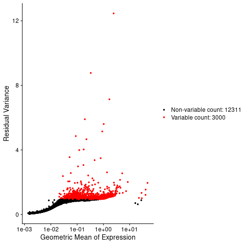
OUTPUT
Running SCTransform on assay: Spatial
Running SCTransform on layer: counts
vst.flavor='v2' set. Using model with fixed slope and excluding poisson genes.
Variance stabilizing transformation of count matrix of size 15311 by 4992
Model formula is y ~ log_umi
Get Negative Binomial regression parameters per gene
Using 2000 genes, 4992 cells
Found 91 outliers - those will be ignored in fitting/regularization step

Second step: Get residuals using fitted parameters for 15311 genes
Computing corrected count matrix for 15311 genes
Calculating gene attributes
Wall clock passed: Time difference of 36.59206 secs
Determine variable features
Centering data matrix
  |===================================================================================================================================================================| 100%
Set default assay to SCT
Challenge 7: Apply dimensionality reduction to your data.
In the Feature Selection lesson, we used the variable genes to calculate principal components of the data. Scale the data, calculate 75 PCs and plot the “Elbow Plot” of PCs versus standard deviation accounted for by each PC.
R
num_pcs <- 75
st_obj  <- st_obj %>%
             ScaleData() %>%
             RunPCA(npcs = num_pcs, verbose = FALSE)
OUTPUT
Centering and scaling data matrixR
ElbowPlot(st_obj, ndims = num_pcs)
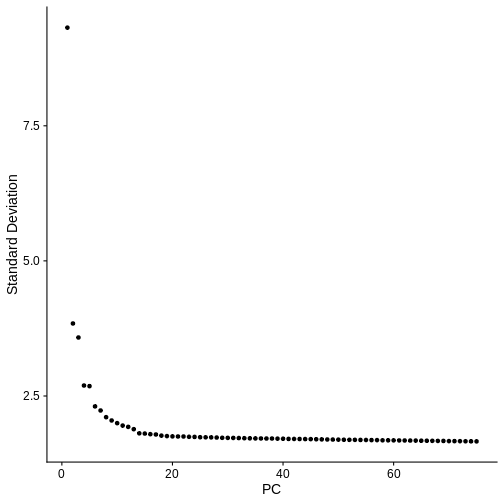
In the next Challenge, you can assign a certain number of principal components and cluster resolution to each student or group of students and compare the clustering results.
Challenge 8: Cluster the spots in your data
In the Feature Selection lesson, we made a call about how many PCs to use. Make some decision about how many PCs you will use and assign this to a variable called “num_pcs”. Also, select a cluster resolution for the clustering function. It may be instructive for each person in the class to use a different number of PCs and compare results. What new column was added to the Seurat object metadata by the clustering algorithm?
We selected 50 PCs and a cluster resoltion of 1 for this exercise. This may not be optimal. You will have a chance to vary these parameters in a later exercise.
R
num_pcs <- 50
st_obj  <- st_obj %>%
             FindNeighbors(reduction = "pca",
                           dims      = 1:num_pcs) %>%
             FindClusters(resolution = 1)
OUTPUT
Computing nearest neighbor graphOUTPUT
Computing SNNOUTPUT
Modularity Optimizer version 1.3.0 by Ludo Waltman and Nees Jan van Eck

Number of nodes: 4992
Number of edges: 227931

Running Louvain algorithm...
Maximum modularity in 10 random starts: 0.7701
Number of communities: 9
Elapsed time: 0 seconds
R
colnames(st_obj[[]])[ncol(st_obj[[]])]
OUTPUT
[1] "seurat_clusters"Challenge 9: Plot UMAP of spot clusters.
Look in the Feature Selection lesson and find the code to run UMAP and plot the spot clusters in UMAP space. You can use the default colors in Seurat.
R
st_obj <- RunUMAP(st_obj,
                  reduction = 'pca',
                  dims      = 1:num_pcs,
                  verbose   = FALSE)
WARNING
Warning: The default method for RunUMAP has changed from calling Python UMAP via reticulate to the R-native UWOT using the cosine metric
To use Python UMAP via reticulate, set umap.method to 'umap-learn' and metric to 'correlation'
This message will be shown once per session
R
UMAPPlot(st_obj,
         label      = TRUE,
         pt.size    = 2,
         group.by   = "seurat_clusters",
         label.size = 6)
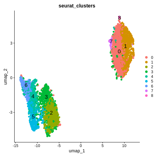
Challenge 10: Plot spot clusters over tissue section
Look in the Feature Selection lesson and find the code to plot the spots in the tissue section, colored by cluster. Compare this to the tissue section Supplemental Figure 5 in Maynard et al..
R
SpatialDimPlot(st_obj,
               group.by = "seurat_clusters") +
  ggtitle(label = 'Sample 151508')
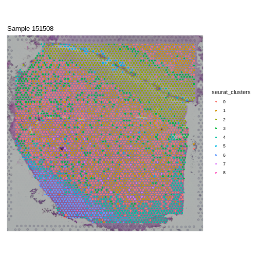
Challenge 11: Varying number of PCs and cluster resolution.
Return to Challenge 8 and change either the number of PCs or the cluster resolution and re-run the subsequent Challenges. How does this change the output? Does a certain set of values make the SpatialDimPlot look more like the results in the manuscript?
For class discussion.
- There are many decisions which need to be made in spatial transcriptomics.
- It is essential to have an understanding of the tissue morphology before proceeding with a spatial transcriptomics analysis.