Descriptive Calculations
Overview
Teaching: 20 min
Exercises: 20 minQuestions
How do I obtain summary statistics for data?
What do the mean, median, and standard deviation of a data set summarize?
Objectives
Summarize specific observations from data.
Group observations and summarize.
Differentiate between measures of central tendency and dispersion.
Descriptive Calculations
Getting to know your data
We start by exploring and describe the data. Load the filtered data set created previously that contains days 0 and 13 only.
tumor_subset <- read_csv("../data/tumor_filtered.csv")
Have a look at the data subset. Each row is an observation and each column is a variable.
tumor_subset
# A tibble: 60 × 4
   Group    ID   Day   Size
   <dbl> <dbl> <dbl>  <dbl>
 1     1   101     0   41.8
 2     1   101    13 1030.
 3     1   102     0   79.4
 4     1   102    13  619.
 5     1   103     0   44.8
 6     1   104     0   67.7
 7     1   105     0   54.7
 8     1   105    13 1699.
 9     1   106     0   60
10     1   107     0   46.8
# … with 50 more rows
What are the unique group numbers?
tumor_subset$Group %>%
  unique()
[1] 1 2 3 4
Recall that when a tumor grew to around 40-60 $mm^3$, the animal was assigned to one of 4 experimental groups on day 0:
1) Control (CTR, n=8);
2) Drug only (D, n=10);
3) Radiation only (R, n=10); and
4) Drug + Radiation (D+R, n=9).
How many total observations are there for each group?
tumor_subset %>%
  count(Group)
# A tibble: 4 × 2
  Group     n
  <dbl> <int>
1     1    13
2     2    14
3     3    20
4     4    13
Notice that group 3 has many more observations than the others. The number of observations for the other groups are well balanced.
What days are represented?
tumor_subset$Day %>%
  unique()
[1] 0 13
How many observations are there for each day?
tumor_subset %>%
  count(Day)
# A tibble: 2 × 2
    Day     n
  <dbl> <int>
1     0    37
2    13    23
There are many more observations for day 1 than for day 13.
How many observations are there for each combination of group and day?
tumor_subset %>%
  count(Group, Day)
# A tibble: 8 × 3
  Group   Day     n
  <dbl> <dbl> <int>
1     1     0     8
2     1    13     5
3     2     0    10
4     2    13     4
5     3     0    10
6     3    13    10
7     4     0     9
8     4    13     4
Balanced and unbalanced data
- Which combinations of group and day are well-balanced, with more or less equal numbers of observations?
- Why might there be imbalances in the data?
- What kinds of problems might imbalanced data present?
Solution
- All groups start with approximately the same number of animals on day 0. Group 3 has equal numbers of observations (10) for both days. Groups 2 and 4 have 4 observations each for day 13, and group 1 has 5 observations for day
- When data are missing the question to ask is why. In this case
survival to day 13 is the cause of missing values and imbalances in the data. Rarely are missing values completely random in any dataset. In this dataset, observations are not missing completely at random, rather,
they are missing depending on one of the variables in the dataset (Day).- The main concern with unbalanced data is why there is an imbalance. If observations are missing completely at random, then this is not a problem.
If attrition of study subjects in your data over time is not random, then this sample selection may bias your estimates in analysis and modeling. In this dataset, imagine that those that survived to day 13 were all in the same location or were all under the care of the same technicians, for example.
Missing data occur in nearly all statistical analyses. There are many ways to handle missing data. The simplest methods is to exclude observations with missing values and analyze only those that are complete. This loses information, though, and can result in biased analyses. To retain all of the data, missing values can be filled in or “imputed”. For now we will be aware of missing values in our data.
Summary statistics
Descriptive statistics summarize and organize characteristics of a data set. The first step of statistical analysis is to describe characteristics of the responses, such as the average of one variable (e.g., age), or the relation between two variables (e.g., age and weight). Inferential statistics, the next step in an analysis, helps to determine whether data confirms or refutes your hypothesis and whether it is generalizable to a larger population. We focus on descriptive statistics here with some statistical summaries of the filtered data.
What is the mean tumor size for all groups and both days?
tumor_subset$Size %>%
  mean()
[1] 401.945
This is not very informative because measurements were taken 13 days apart in
four different treatment groups, so they will vary widely. We can use the
range function to view the minimum and maximum tumor sizes.
tumor_subset$Size %>%
  range()
[1] 39.5 2342.6
pull extracts a single column of data in the same way the the $
operator specifies a column. pull is a verb though, and reads more easily in
piped operations like this one.
Filter out observations for day 0 only and look at the Size variable.
tumor_subset %>%
  filter(Day == 0) %>%
  pull(Size)
 [1] 41.8 79.4 44.8 67.7 54.7 60.0 46.8 49.4 49.1 60.6 41.5 46.8 39.5 53.5 43.5
[16] 64.4 47.5 71.7 44.1 42.1 42.5 56.9 46.7 51.2 44.0 59.8 40.7 58.2 41.3 53.5
[31] 45.8 48.2 47.7 69.2 43.9 59.3 51.1
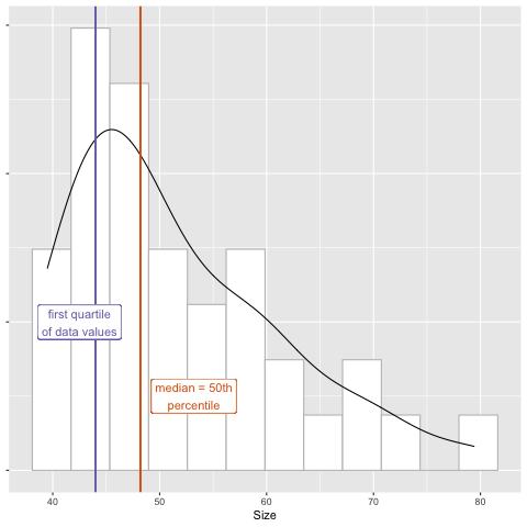
The mean is one statistical summary showing the central tendency of the data. It is the most commonly used measure of central tendency, however, it is sensitive to outliers. Extreme values pull the mean toward them and have a disproportional effect on its value. The median value is another measure of central tendency as well as a measure of position. This value lies directly in the center of the ordered data with half of the values above and half below it. It is not sensitive to extreme values - only its rank in the ordered values is considered. In the plot below, the median lies directly at the center of the 60 data values when they are ordered from smallest to largest.
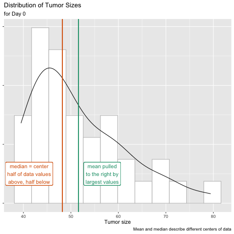
The distribution of tumor sizes shows a right skew, in which the mean is pulled to the right of the median by a few very large tumors. Values on the x-axis with a greater density on the y-axis (e.g. between 42-45 mm3) have a higher probability of occurring, while those with a lower density (e.g. between 71-74 mm3) have a low probability of occurring.
The mean
The mean of a sample is the average of all the values in that sample, and estimates the mean of the entire population. Since we can’t afford to buy or house the entire population of all nude mice in the world, we use a sample of these mice in our data to estimate the mean of the entire population. In the case of tumor size, the mean for day 0 is summarized as:
tumor_subset %>%
  filter(Day == 0) %>%
  pull(Size) %>%
  mean()
[1] 51.59189
The sample mean is represented below as x-bar. The sample mean is the average of
the values of a variable in a sample, which is the sum of those values divided
by the number of values. Using mathematical notation, if a sample of n
observations on variable x is taken from the population, the sample mean is:
where $n = 60$.
Find mean tumor size for day 0 for group 1.
tumor_subset %>%
  filter(Group == 1, Day == 0) %>%
  pull(Size) %>%
  mean()
[1] 55.575
Find mean tumor size for day 0 for group 2.
tumor_subset %>%
  filter(Group == 2, Day == 0) %>%
  pull(Size) %>%
  mean()
[1] 51.81
Find mean tumor size for day 0 for group 3.
tumor_subset %>%
  filter(Group == 3, Day == 0) %>%
  pull(Size) %>%
  mean()
[1] 48.62
Find mean tumor size for day 0 for group 4.
tumor_subset %>%
  filter(Group == 4, Day == 0) %>%
  pull(Size) %>%
  mean()
[1] 51.11111
The variance
The sample variance is the average squared difference between values in the sample and the mean of the sample. This is a mouthful, so it is useful to look at the equation for sample variance. The sample variance is expressed as $s^2$:
\[s^2 = \underset{(n - 1)}{\underline{\sum (x_{i} - \bar{x})^2}}\]Breaking this down, we see that the sample variance is calculated using:
- $\sum (x_{i} - \bar{x})$, i.e. the difference between an observed tumor size and the mean tumor size of the sample.
- $\sum (x_{i} - \bar{x})^2$, i.e. the squared difference between an observed tumor size and the sample mean tumor size.
- $n - 1$, the number of observations in the sample minus 1.
Why are we interested in the sample variance? We are mainly interested in the sample variance because it allows us to calculate the standard deviation, which can be interpreted on the original scale. Let’s look at this below.
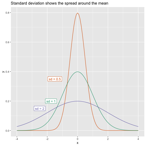
The standard deviation
The standard deviation of a sample is the square root of the sample variance. The standard deviation is expressed as $s$:
\[s = \sqrt{s^2}\]The standard deviation is interpreted as a measure of the difference between values in the distribution and the mean of the distribution. A higher standard deviation indicates that the spread around the mean is greater. There is no “good” or “bad” standard deviation - its purpose is to give us an idea of the spread of observations in the population.
 Find the standard deviation of tumor size for day 0 for all groups.
tumor_subset %>%
  filter(Day == 0) %>%
  pull(Size) %>%
  sd()
[1] 9.807321
Now do the same for day 13.
tumor_subset %>%
  filter(Day == 13) %>%
  pull(Size) %>%
  sd()
[1] 618.9181
We can create simple histograms to visualize the distribution of tumor sizes on
days 0 and 13. Notice that the range of x-axis values is much greater for day 13,
illustrating the much greater standard deviation (spread) of values for day 13.
Later we will create much nicer plots with the ggplot package. For now, simple
histograms with the hist function from base R serve to visualize data
distribution.
tumor_subset %>%
  filter(Day == 0) %>%
  pull(Size) %>%
  hist(main = "Histogram of tumor size on day 0")

tumor_subset %>%
  filter(Day == 13) %>%
  pull(Size) %>%
  hist(main = "Histogram of tumor size  on day 13")

Outliers and standard deviation
- Do outliers affect the value of the standard deviation? Why or why not?
- Suppose that your data set has a point that is much lower than the rest. What type of effect (if any) would this have on the value of the standard deviation?
a.) It would make it larger.
b.) It would make is smaller.
c.) It would stay the same.
d.) Unable to be determined.- Suppose that your data set has a point that is much higher than the rest.
What type of effect (if any) would this have on the value of the standard deviation?
a.) It would make it larger.
b.) It would make is smaller.
c.) It would stay the same.
d.) Unable to be determined.Solution
- Outliers do affect the standard deviation. The sd is computed from the variance, which is computed from the mean. The mean is sensitive to outliers, so statistical summaries (e.g. sd) computed from the mean value will be affected by outliers as well.
- a.) It would make it larger. sd is a measure of spread of the data, so a low outlier will increase the spread of the data. When a large negative difference between an observed and the mean tumor size is squared
$(y - E(y))^2 )$, the squared difference becomes a large positive value. The variance increases as a result and so does standard deviation.- a.) It would make it larger. sd is a measure of spread of the data, so a high outlier will increase the spread of the data. When a large positive difference between an observed and the mean tumor size is squared, the squared difference becomes a much larger positive value. The variance increases as a result and so does standard deviation.
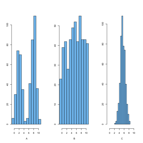
Distributions and standard deviation
Which of the histograms above has the smallest standard deviation? How can you know?
Solution
Plot C has the smallest standard deviation or narrowest spread. The average distance of points from the mean is less than in the other histograms. In histograms A and B, more of the points are a further distance from the mean.
Groups and statistical summaries
Use group_by and summarize to view group means and standard deviations for
all groups on day 0.
tumor_subset %>%
  filter(Day == 0) %>%
  group_by(Group) %>%
  summarize(avg_size = mean(Size),
            std_dev = sd(Size))
# A tibble: 4 × 3
  Group avg_size std_dev
  <dbl>    <dbl>   <dbl>
1     1     55.6   12.9
2     2     51.8   10.6
3     3     48.6    7.30
4     4     51.1    8.64
Comparing mean with median
Repeat the previous summary, but add the median in addition to the mean and standard deviation.
1). What do you notice when you compare the mean and median values for each group?
2). What would cause the differences in the mean and median values for each group?
3). How might you check your answer to number 2 above?Solution
tumor_subset %>%
  filter(Day == 0) %>%
  group_by(Group) %>%
  summarize(avg_size = mean(Size),
           median_size = median(Size),
           std_dev = sd(Size)
           )
1). The median values are smaller than the mean values for each group.
2). Since the median is not sensitive to outliers and is smaller than the mean for each group, it appears that there are large sizes in each group that pull the mean toward them.
3) You could list all size values for each group to see if there are very large values that pull the mean toward them. The mean values are between 48 and 56, so values much above this will strongly influence the mean. You can look at all values by group.tumor_subset %>% filter(Day == 0) %>% group_by(Group) %>% pull(Size, Group)If you only want to see the maximum value for each group, you can use
max.tumor_subset %>% filter(Day == 0) %>% group_by(Group) %>% summarize(avg_size = mean(Size), max_value = max(Size))Each group has a maximum value well outside of the range of group means.
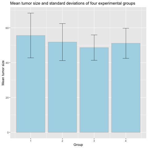
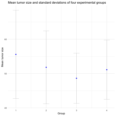
Means and error bars
The bar plots above show the means and standard deviations for each group. Group means are indicated by the height of the bar, and standard deviations for each group shown as an “error bar” extending equally above and below the mean value for each group.
1). What information does this plot give you about the experimental groups?
2). What does the error bar tell you about each group?
3). What does the zero at the bottom of each bar mean? Do tumor sizes begin at zero?Solution
1). The top of each bar tells you what the mean tumor size is for each group. The error bar shows the standard deviation for each group, indicating the spread or variation of the data.
2). The error bars show that while the means might be different for each group, but the standard deviations overlap for all groups and as such there is overlap in the data for all groups. The bars do not indicate error in measurement.
3). The zero at the bottom of each bar is meaningless and confusing. Tumor sizes don’t begin at zero, and the bars don’t show the range of the data. In fact, the only meaningful part of the bar is the top of it. Everything beneath the top of the bar (the group mean) is wasted ink.
A better way to visualize group means with error bars is with a mean-and-error plot with a single point representing the mean and error bars showing standard deviation.
 It isn’t as visually striking as a bar plot, which is one of the reasons they
aren’t often seen. Bar plots are also more common because spreadsheet software like Excel make it easy to make bar plots, but not so easy to visualize means
and errors in other ways that might be more suitable to the task. For more on
this, see Nature Methods
Kick the bar chart habit
and Error bars.
It isn’t as visually striking as a bar plot, which is one of the reasons they
aren’t often seen. Bar plots are also more common because spreadsheet software like Excel make it easy to make bar plots, but not so easy to visualize means
and errors in other ways that might be more suitable to the task. For more on
this, see Nature Methods
Kick the bar chart habit
and Error bars.
Quantiles
Mean and median both summarize the center of the data. Median lies directly at
center of the ordered data values - it lies at the midpoint of these values and
is a measure of location.
The quantile defines a specific part of a data set above or below some limit.
For example, quartiles divide a data set into fourths, and percentiles by
100ths. The median is the 50th percentile of the data - half lies above this
value and half below. quantile takes an argument probs that gives the
probability of values falling beneath a specific quantile. For example,
probs = .25 means that 25% of the values will be less than this quantile.
This is the first quarter, or quartile, of the data.
tumor_subset %>%
  filter(Day == 0) %>%
  summarize(quartile_1 = quantile(Size, probs = .25))
# A tibble: 1 × 1
  quartile_1
       <dbl>
1         44
We can further explore mean, median, and first quartile by calculating each for groups 1 to 4.
tumor_subset %>%
  group_by(Group) %>%
  filter(Day == 0) %>%
  summarize(avg_size = mean(Size),
            sd_size = sd(Size),
            median_size = median(Size),
            quartile_1 = quantile(Size, probs = .25)
            )
# A tibble: 4 × 5
  Group avg_size sd_size median_size quartile_1
  <dbl>    <dbl>   <dbl>       <dbl>      <dbl>
1     1     55.6   12.9         52.0       46.3
2     2     51.8   10.6         48.3       44.3
3     3     48.6    7.30        45.4       42.9
4     4     51.1    8.64        48.2       45.8
Measures of variability and location
1). For each day, which group has the largest mean tumor size? the largest variability? Which has the smallest mean size? the smallest variability?
2) How confident are you that the mean values represent a “typical” data value? How could you check whether the means represent typical values?
3). For these combinations of group and day, what values do 25% of the data values fall under?Solution
1). Group 1 on day 0 has the greatest mean size and standard deviation.
Group 1 on day 13 also has the greatest mean size and standard deviation.
Group 3 on day 0 has the smallest mean size and variability. For day 13
Group 2 has the smallest mean size and variability.
2). Greater variability means that data values lie farther from the mean, so the mean might not represent a typical data value well. You could make a histogram and include the mean value. Group 1 means are not the best representatives.
3). Group 1, day 0: 25% of data values are less than 46.3.
Group 1, day 13: 25% < 1030.4
Group 3, day 0: 25% < 42.875
Group 2, day 13: 25% < 357.225
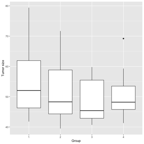
Box plots to visualize data
The box plots above show data for each group.
1). Add the third quartile to the data summary we created earlier (hint: usequantilewith the argumentprobs = .75).
2). How do the 1st, 2nd (median), and 3rd quartile values for each group compare to the boxplots above?
3). Is the mean value for each group shown in the boxplots?
4). What do you think the lines extending above and below the boxes represent?
5). For group 4, what does the dot near tumor size 70 represent?
6). How do the boxplots compare to the bar plots we saw earlier? What information do they convey or not convey?Solution
1).
tumor_subset %>%
  group_by(Group) %>%
  filter(Day == 0) %>%
  summarize(avg_size = mean(Size),
            sd_size = sd(Size),
            median_size = median(Size),
            q1 = quantile(Size, probs = .25),
            q3 = quantile(Size, probs = .75)
            )
2). The 1st and 3rd quartile values for each group are shown as the bottom and top of each box respectively. The 2nd quartile (median) is shown as a horizontal bar inside the boxes. The length of the box is called the the interquartile range or IQR.
3). The mean value for each group isn’t shown in the boxplots. The horizontal line across each box represents the median, not the mean.
4). The lines extending above and below show the data values below the 1st quartile or above the 3rd quartile (the interquartile range or IQR). The length of these “whiskers” is 1.5 times the interquartile range. For example, the IQR for group 4 is 53.5 - 45.8 = 7.7. The whisker length will be a maximum of 7.7 * 1.5 = 11.55, as long as there are data points this far away from the 1st and 3rd quartiles. If there aren’t any, the whisker goes only as far as there are data points. For group 4, the upper whisker extends from the 3rd quartile value plus 1.5 * IQR = 53.5 + 11.55 = 65.05.
5). The dot represents on outlier in group 4. In this case the outlier lies more than 1.5 * IQR away from the 3rd quartile of the data (65.05). You can use themaxfunction to find that the value of this outlier is 69.2.tumor_subset %>% filter(Day == 0) %>% group_by(Group) %>% summarize(max_value = max(Size))6). While box plots don’t show the mean or standard deviation, they do show the spread of the data with the length of the boxes and whiskers. There is no confusion about where the data start (e.g. the values don’t start at zero). Since they don’t rely on the mean value to convey information, extreme high or low values are not obscured by the visualization.
There is much more information in a box plot than in a bar chart, and there are ways to add in a point and error bars representing the mean. For more on this, see Nature Methods Visualizing samples with box plots.
Key Points