Data visualization
Overview
Teaching: 30 min
Exercises: 20 minQuestions
How do I visualize data in R?
Objectives
Explore differences between continuous, discrete, nominal, ordinal, and binary data values.
Learn to implement a grammar of graphics.
Explore plots for different kinds of data values.
Build a plot layer by layer.
Visualization
Introduction
Data visualization is critical to understanding the shape and other characteristics of your data. Unless you plot your data, how would you know that it forms a donut, or a star, or a datasaurus Rex? Summary statistics like means and standard deviations don’t provide enough insight into your data. In the graphic below, notice that the means, standard deviations, and correlation of x and y variables are the same regardless of the shape of the data.
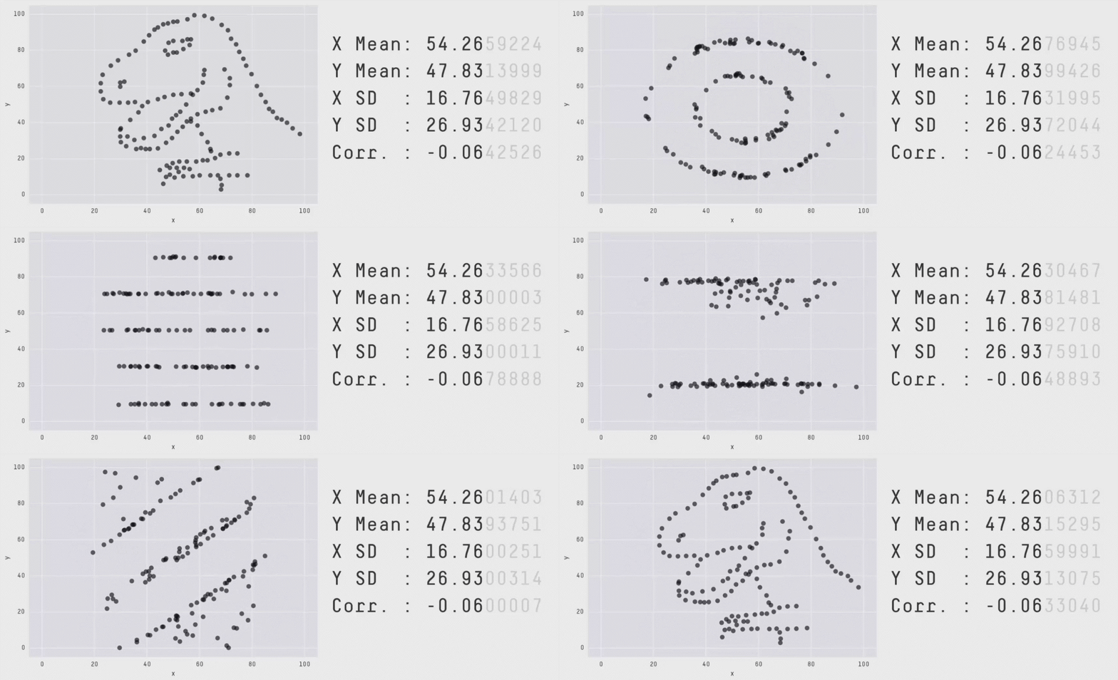
The animation above is from Same Stats, Different Graphs: Generating Datasets with Varied Appearance and Identical Statistics through Simulated Annealing by Justin Matejka and George Fitzmaurice.
(Example: Use side-by-side boxplots to compare two groups, then use two- sample t-tests on the same data) Use histograms to investigate shape, and then later in the course to verify conditions for hypothesis tests.
This next section uses a blood storage dataset from a study of prostate cancer
recurrence. This dataset was contributed by Dr. Amy Nowacki, Associate
Professor, Cleveland Clinic. This dataset is one of many from the
medicaldata R package,
curated by Dr. Peter Higgins, M.D. at the
University of Michigan Medical School.
More information about the blood storage data is available at the
TSHS Resources Portal. A brief
description of the study follows.
[A retrospective cohort study of] 316 men who had undergone radical prostatectomy and received tranfusion during or within 30 days of the surgical procedure and had available prostate specific antigen (PSA) follow-up data. The outcome [of interest] was time to biochemical cancer recurrence. The study evaluated the association between red blood cells (RBC) storage duration and biochemical prostate cancer recurrence after radical prostatectomy. Specifically tested was the hypothesis that perioperative transfusion of allogeneic RBCs stored for a prolonged period is associated with earlier biochemical recurrence of prostate cancer after prostatectomy.
In cancer studies and other kinds of studies that measure time to an event such as cancer recurrence, survival analysis is employed. Read more about how to do this in Clark TG, Bradburn MJ, Love SB, Altman DG. Survival analysis part I: basic concepts and first analyses. British journal of cancer. 2003 Jul;89(2):232-8.
To get started, install the medicaldata package and load the library.
library(medicaldata)
Now access the blood dataset within this package.
blood <- medicaldata::blood_storage
head(blood) # use head to look at the first 6 rows
  RBC.Age.Group Median.RBC.Age  Age AA FamHx  PVol TVol T.Stage bGS BN+
1             3             25 72.1  0     0  54.0    3       1   3   0
2             3             25 73.6  0     0  43.2    3       2   2   0
3             3             25 67.5  0     0 102.7    1       1   3   0
4             2             15 65.8  0     0  46.0    1       1   1   0
5             2             15 63.2  0     0  60.0    2       1   2   0
6             3             25 65.4  0     0  45.9    2       1   1   0
  OrganConfined PreopPSA PreopTherapy Units sGS AnyAdjTherapy AdjRadTherapy
1             0    14.08            1     6   1             0             0
2             1    10.50            0     2   3             0             0
3             1     6.98            1     1   1             0             0
4             1     4.40            0     2   3             0             0
5             1    21.40            0     3   3             0             0
6             0     5.10            0     1   3             0             0
  Recurrence Censor TimeToRecurrence
1          1      0             2.67
2          1      0            47.63
3          0      1            14.10
4          0      1            59.47
5          0      1             1.23
6          0      1            74.70
class(blood)
[1] "data.frame"
# get just the column names for a dataset
names(blood)
 [1] "RBC.Age.Group"    "Median.RBC.Age"   "Age"              "AA"
 [5] "FamHx"            "PVol"             "TVol"             "T.Stage"
 [9] "bGS"              "BN+"              "OrganConfined"    "PreopPSA"
[13] "PreopTherapy"     "Units"            "sGS"              "AnyAdjTherapy"
[17] "AdjRadTherapy"    "Recurrence"       "Censor"           "TimeToRecurrence"
This data dictionary describes each variable in the dataset.
Data Types
While exploring a dataset, you want to know what each variable’s role in the analysis will be.
- What is the variable (i.e., column) of interest?
- response, dependent, y, outcome
- which are your predictor variables?
- predictor, independent variable, x
For each variable, you want to know what possible values it can take on.
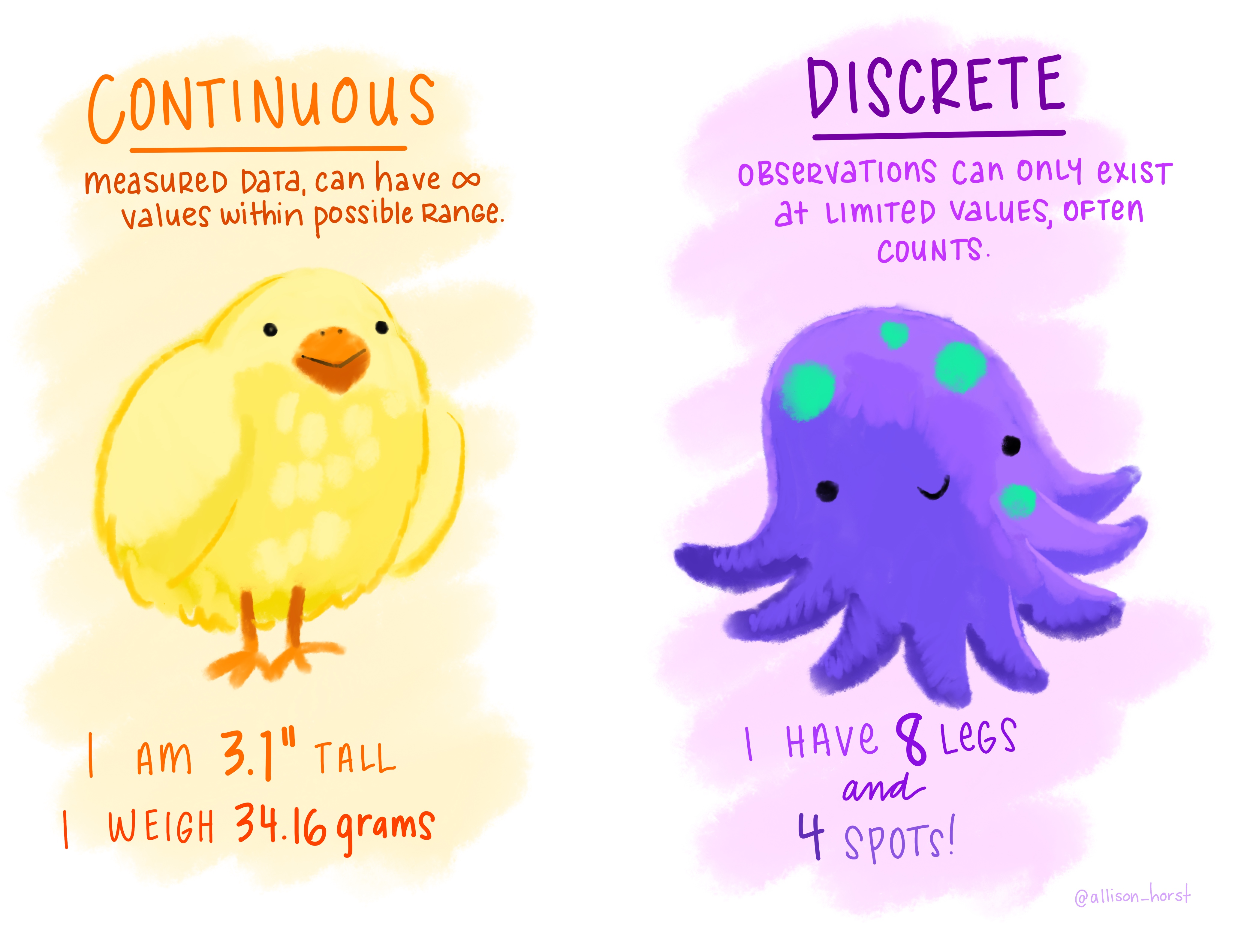
Continuous variables can take an infinite number of values within a range. Weight of a chick, for example, can range from 38.95 to 43.26 grams and can take any of infinite number of decimal values within that range. Discrete variables can only have a finite number of integer values.
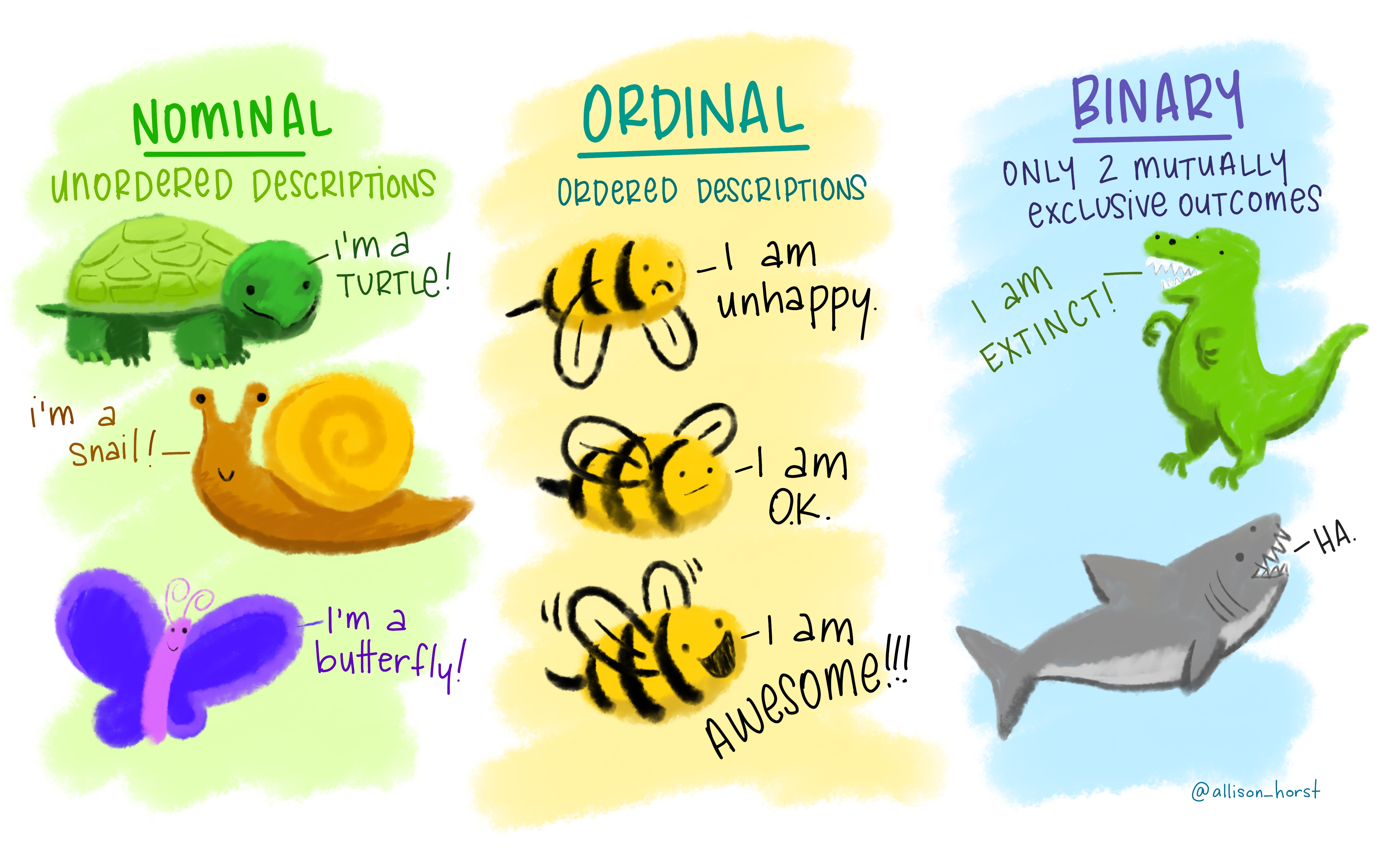
The type of information a variable holds will dictate the summary statistics you can make, the visualizations you can create, and the models you can fit. Categorical variables are of three types: nominal, ordinal or binary. Nominal variables are purely qualitative, with no order, rank or hierarchy of categories. Ordinal variables have order or rank to the variables and can be transformed to quantitative for use in modeling. For example, unhappy can be set to 0, O.K. to 1, and awesome! to 2. Binary variables take only 2 mutually exclusive values and can be represented as 0 and 1, for example.
Ordinal, binary, and discrete variables should be converted into factor
variables in R. A factor is R’s way of naming a categorical variable.
This is different from a character string, e.g., a person’s name or the name
of an animal e.g., turtle, snail, butterfly.
The outcome of interest is the recurrence of cancer (no = 0 or yes = 1).
What kind of variable?
What kind of variable is recurrence?
Solution
Recurrence is a binary variable. The cancer either returned or it did not.
These are mutually exclusive outcomes.
To visualize data we will use a grammar of graphics. We build up a visualization
from component parts starting with the data. We can then layer on top of this
data until we have built a graphic that precisely communicates what we choose.
ggplot implements a grammar of graphics to produce publication-quality
graphics.
Grammar of Graphics
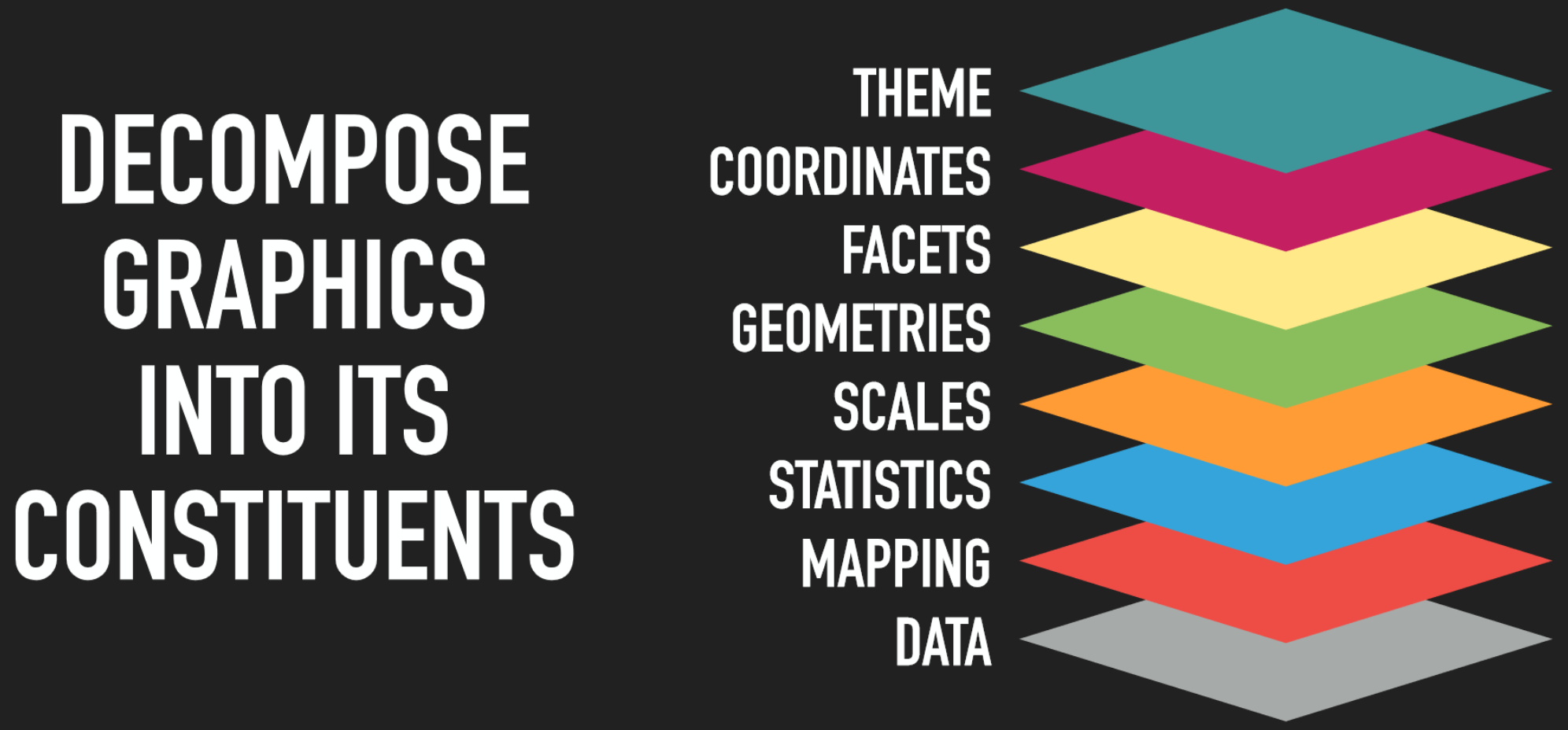
Data + geometries
The base layer for a graphic is the data.
# add a data layer
ggplot(data = blood)

This creates a blank plot. In order to plot the data, we need to map one or more
variables using the aes mapping function in ggplot. Here we map cancer
recurrence (0 or 1) on the x axis.
# add a data layer with an aesthetic mapping
ggplot(data = blood, mapping = aes(x = Recurrence))
To display the x-axis as categorical instead of decimal values, re-assign Recurrence as a factor variable.
blood$Recurrence <- as.factor(blood$Recurrence)
We don’t see our data yet. ggplot needs to know what kind of plot to make. We
provide a geom layer to tell ggplot that we want a bar plot showing the
numbers in each category. Bar charts are good for displaying numbers represented
in each category. They are not good for showing differences in means between
groups. For more on this, see Nature Methods
Kick the bar chart habit.
# add a geometry layer
# by default the stat layer for geom_bar will count values
ggplot(data =  blood, mapping = aes(x = Recurrence)) + geom_bar()
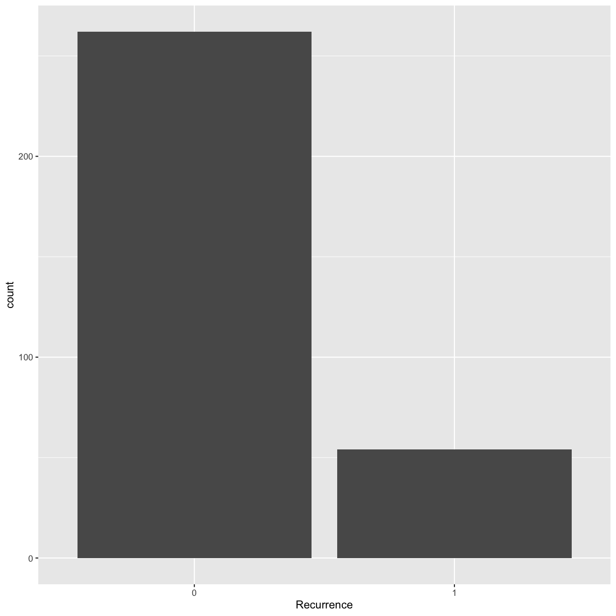
Something to think about: we have highly unbalanced classes. This might be something to think about when you fit models and only look at blind performance metrics. Imagine your data has 100 patients, 99 healthy and 1 sick. If the model classifies them as healthy every time, it’s still 99% accurate. This is not good for the 1 person who is sick and needs treatment.
Geometries
We’ll explore some of the other geoms in ggplot. The kind of variable
determines what kind of geom or plot type you should use.
Univariate
Continuous
For a single continuous variable, use a histogram to show the distribution of the data. Make a histogram of the age distribution.
ggplot(blood, aes(x = Age)) + geom_histogram()
`stat_bin()` using `bins = 30`. Pick better value with `binwidth`.
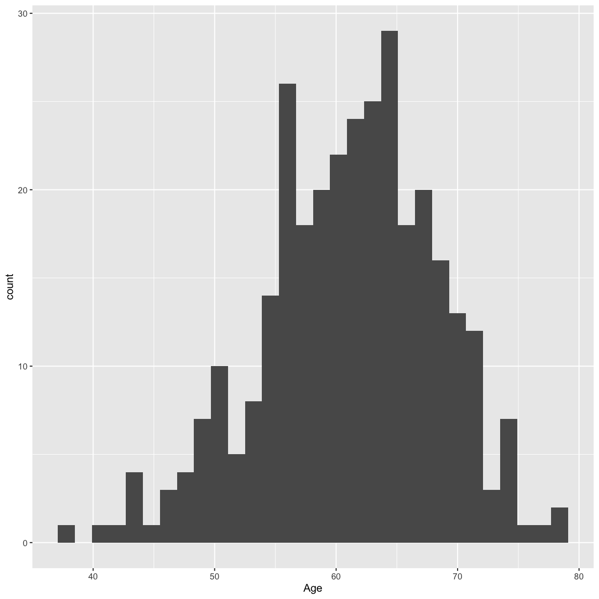
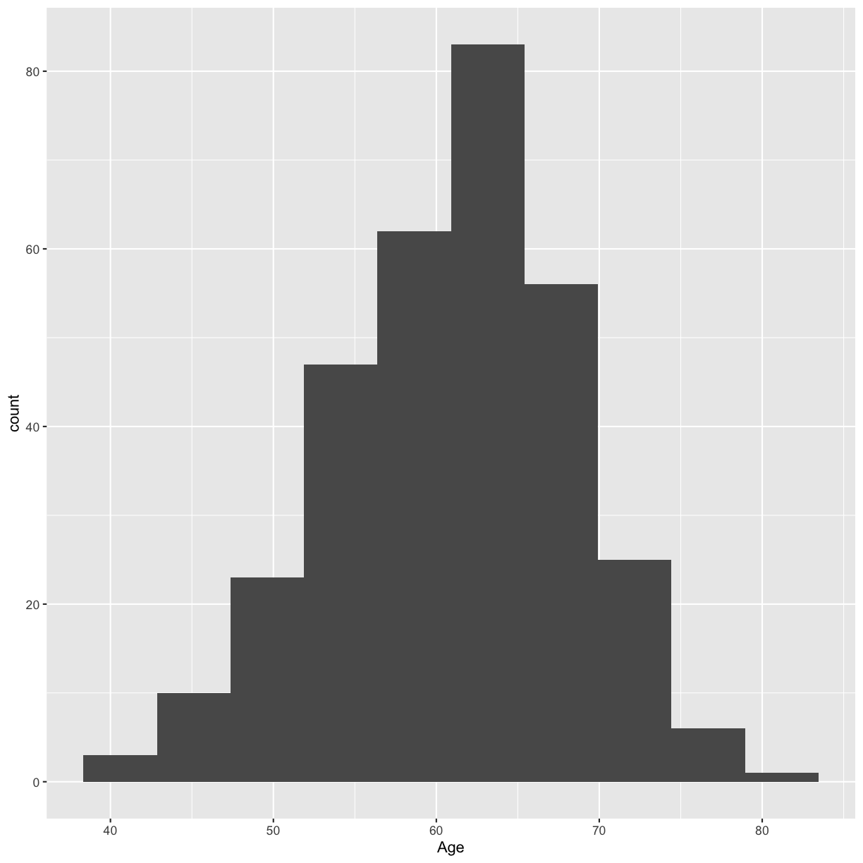
Try a smaller number of bins to smooth out the histogram.
ggplot(blood, aes(x = Age)) + geom_histogram(bins = 10)
Bivariate
Boxplots and scatterplots are good ways to visualize two different variables.
The TVol column represents the Tumor volume as an ordinal variable
- 1 = Low
- 2 = Medium
- 3 = Extensive
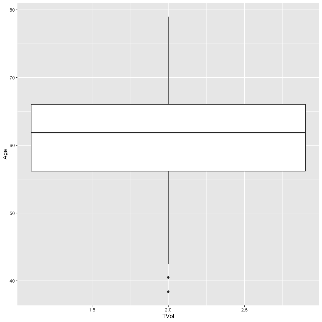
However, the way it is encoded in the dataset is as a (discrete) numeric variable, even though it actually represents a categorical variable. If we create a boxplot of tumor volume and age, the categories are not represented separately.
# Does not show TVol properly
ggplot(blood) + geom_boxplot(aes(x = TVol, y = Age))
Warning: Continuous x aesthetic -- did you forget aes(group=...)?
Warning: Removed 6 rows containing missing values (stat_boxplot).
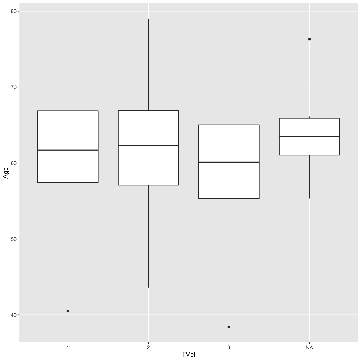
To convert the numeric column (or any column) into a categorical factor we can use the as.factor function.
# box plot for each value of TVol as a factor
blood$TVol <- as.factor(blood$TVol)
ggplot(blood) + geom_boxplot(aes(x = TVol, y = Age))
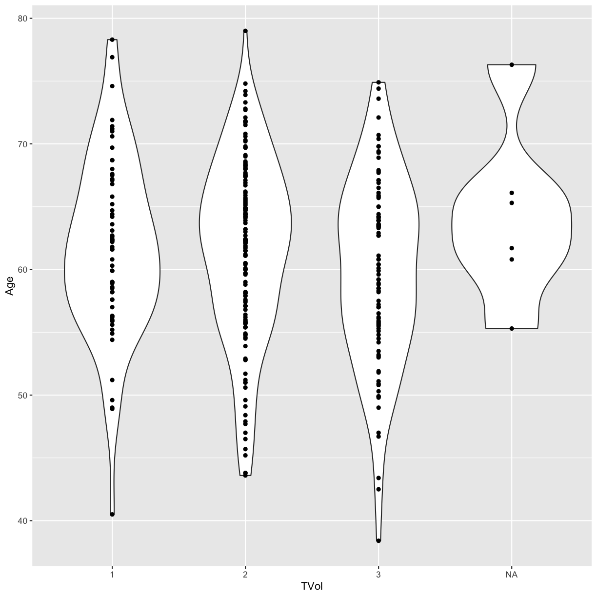
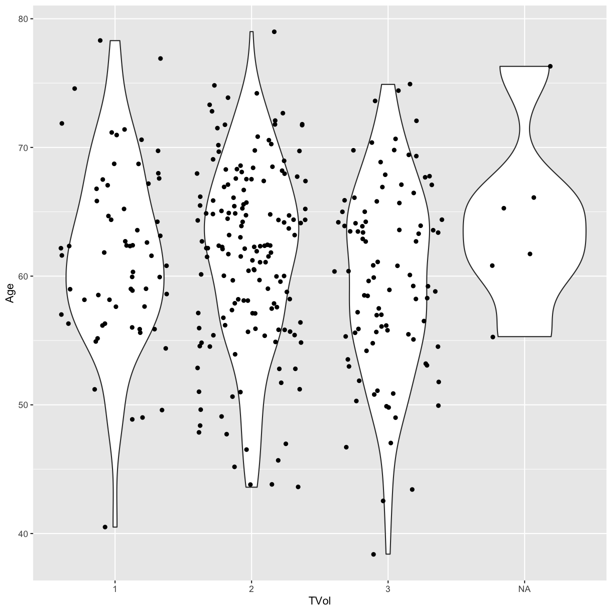
We can also use a violin plot, to better show the distribution of the dataset, instead of using a boxplot.
And we can also overlay a different geometry on top. In this example, layer
the data points on top of the violin plots with geom_point.
ggplot(blood) +
  geom_violin(aes(x = TVol, y = Age)) +
  geom_point(aes(x = TVol, y = Age))
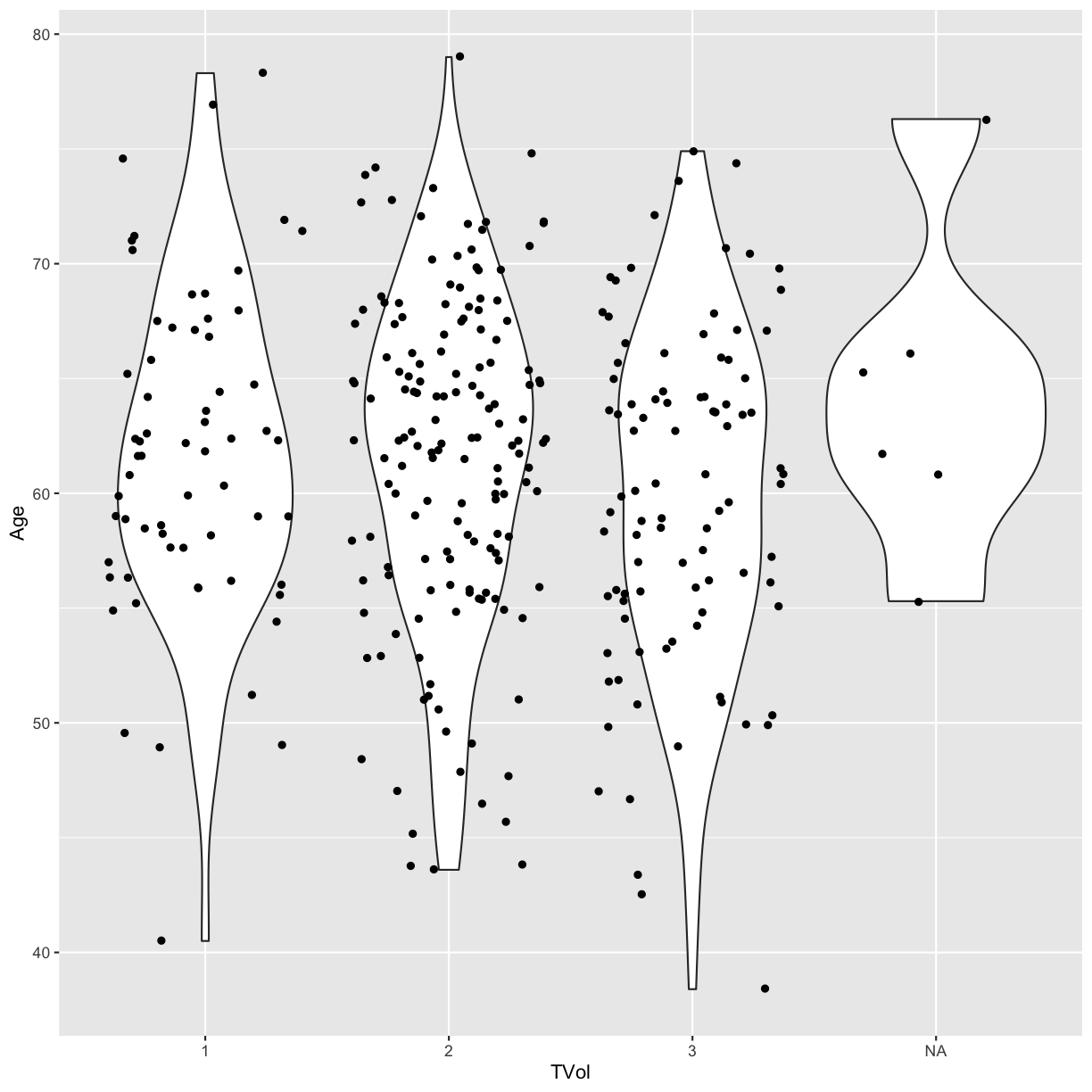
Jitter the points so that they are easier to distinguish from one another.
ggplot(blood) +
  geom_violin(aes(x = TVol, y = Age)) +
  geom_jitter(aes(x = TVol, y = Age))
We can move around our data layers to save some typing,
and have the geometry layer use the same data and mapping layer. If the mapping
function aes is located within the call to ggplot, every succeeding layer
will inherit this mapping.
ggplot(blood, aes(x = TVol, y = Age)) +
  geom_violin() +
  geom_jitter()
Other Aesthetic mappings
We can also set other aesthetic mappings, e.g., color
PVol: Prostate volume in grams (g)PreopPSA: Preoperative prostate specification antigen (PSA) in ng/mLsGS: Surgical Gleason score- 1 = Not assigned
- 2 = No residual disease or score 0-6
- 3 = Score 7
- 4 = Score 8-10
ggplot(blood) +
  geom_point(aes(x = PVol, y = PreopPSA, color = sGS))
Warning: Removed 11 rows containing missing values (geom_point).
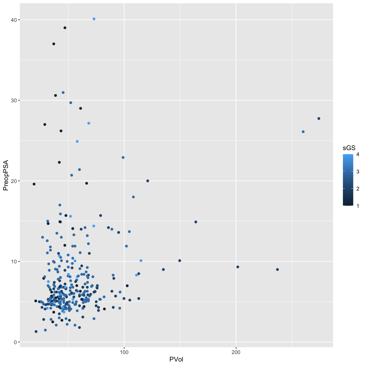
Again, we have a numeric variable that is really an ordinal categorical
variable, not a continuous variable. We can convert it to a factor with
as.factor.
ggplot(blood) +
  geom_point(aes(x = PVol, y = PreopPSA, color = as.factor(sGS)))
Warning: Removed 11 rows containing missing values (geom_point).
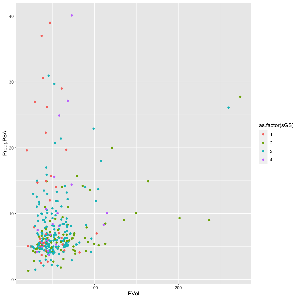
Now the surgical Gleason score appears as discrete colored categories.
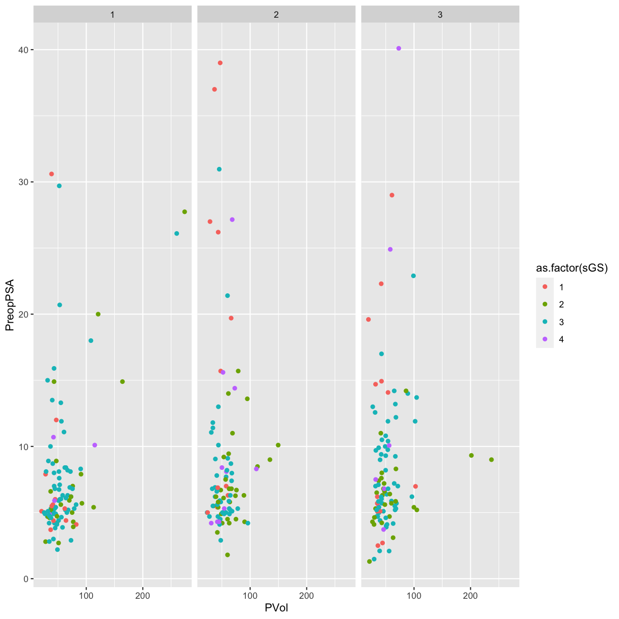
Facets
Facets allow us to re-plot the same figure by separate groups. Think of this as
the group_by version for plotting. Here separate panels display the red blood
cell storage duration group.
RBC.Age.Group: RBC storage duration group- 1 = less than or equal to 13 days (younger)
- 2 = 13-18 days (middle)
- 3 = greater than or equal to 18 days (older)
# use facet wrap for a single variable
ggplot(blood) +
  geom_point(aes(x = PVol, y = PreopPSA, color = as.factor(sGS))) +
  facet_wrap(~ RBC.Age.Group)
Warning: Removed 11 rows containing missing values (geom_point).
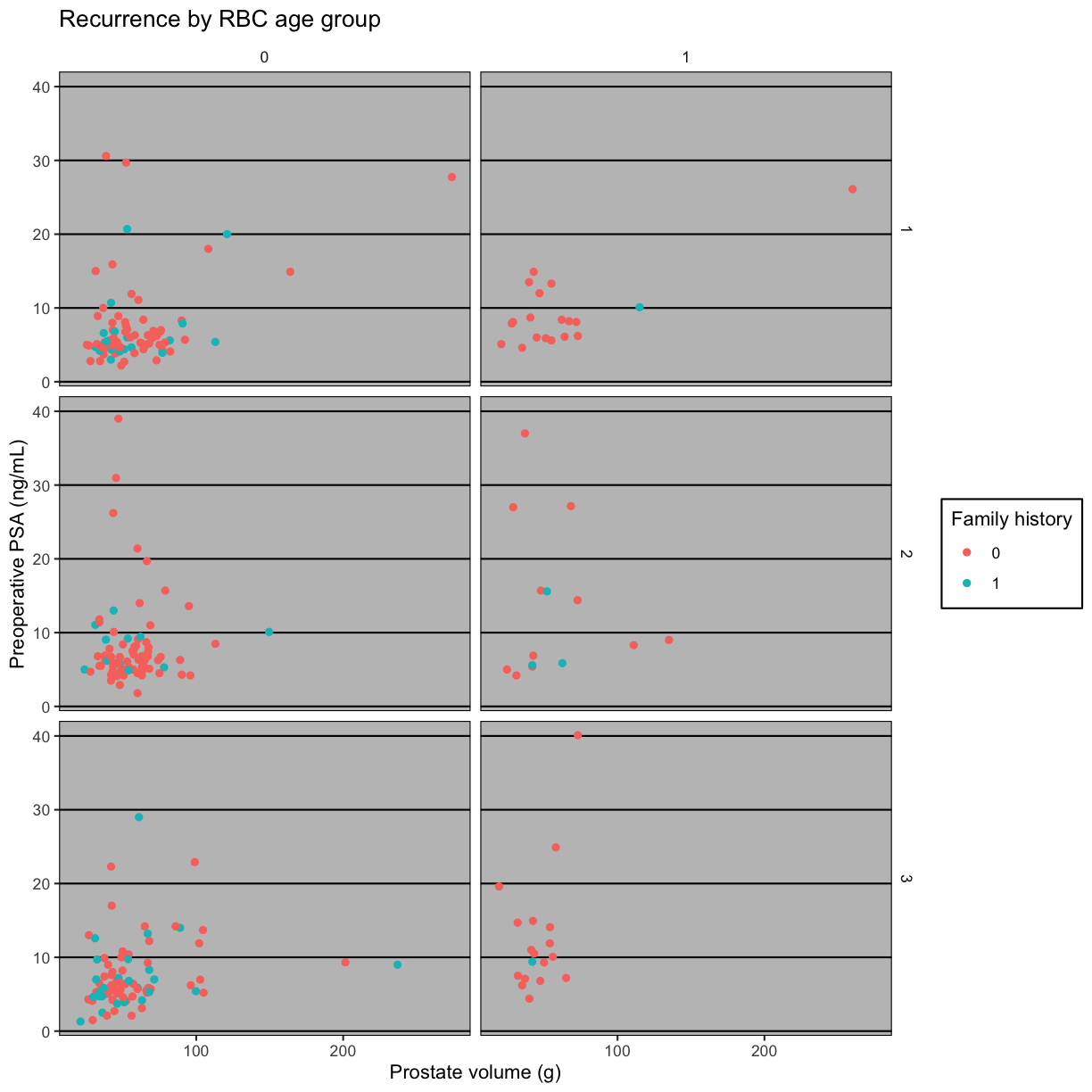
We can also create a grid of panels (facets) colored by family history of
disease (FamHx) and grouped by RBC.Age.Group and Recurrence. Zeroes
represent no family history or no recurrence. The categories 1, 2 and 3 for
RBC storage duration group are as listed above (younger, middle, older).
# use facet grid for 2 variables
ggplot(blood) +
  geom_point(aes(x = PVol, y = PreopPSA, color = as.factor(FamHx))) +
  facet_grid(RBC.Age.Group ~ Recurrence)
Warning: Removed 11 rows containing missing values (geom_point).
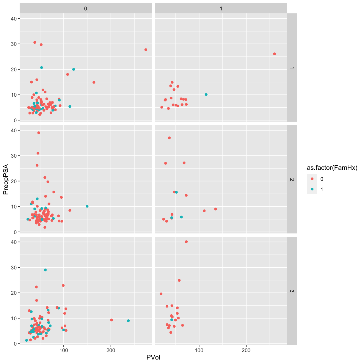 We can make this a bit easier to interpret by adding axis and legend labels.
Since this involves a lot of typing, save the plot as an object named
 g.
# use facet grid for 2 variables
g <- ggplot(blood) +
  geom_point(aes(x = PVol, y = PreopPSA, color = as.factor(FamHx))) +
  facet_grid(RBC.Age.Group ~ Recurrence) +
  labs(x = "Prostate volume (g)",
       y = "Preoperative PSA (ng/mL)",
       color = "Family history",
       title = "Recurrence by RBC age group")
Themes
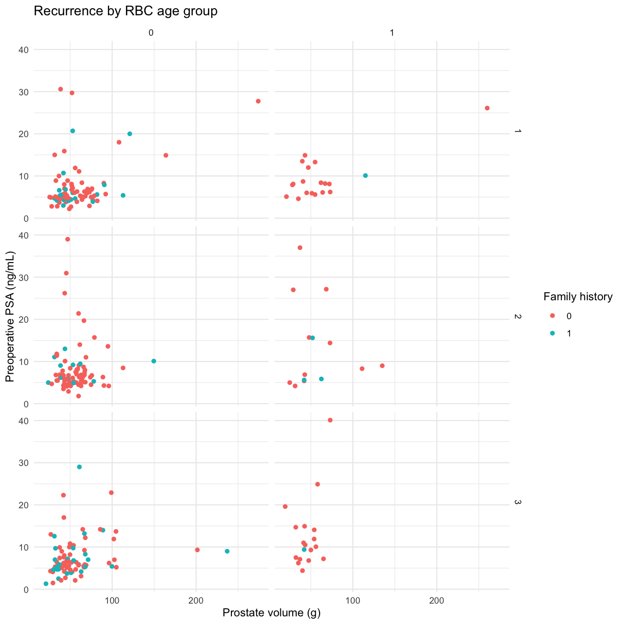
Themes customize the non-data parts of your plots and come in many different styles. The minimal theme is clean and spare. Add it to the plot we saved.
g + theme_minimal()
Warning: Removed 11 rows containing missing values (geom_point).
The ggthemes package extends themes from ggplot. Install the ggthemes
package and load the library.
library(ggthemes)
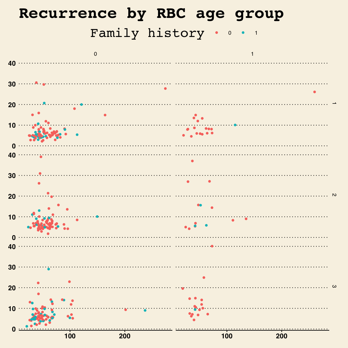
Style the plot after the Wall Street Journal theme.
g + theme_wsj()
Warning: Removed 11 rows containing missing values (geom_point).
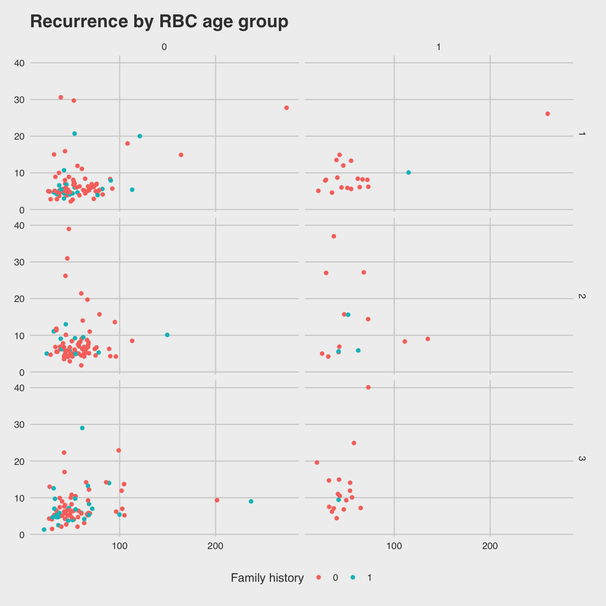
Try Nate Silver’s FiveThirtyEight style.
g + theme_fivethirtyeight()
Warning: Removed 11 rows containing missing values (geom_point).
This style looks like an Excel spreadsheet.
g + theme_excel()
Warning: Removed 11 rows containing missing values (geom_point).
Exercise
- Load the cytomegalovirus dataset from the
medicaldatapackage by running the code above. This dataset contains measurements from 64 patients who underwent hematopoietic stem cell transplant. This data dictionary describes each variable in the dataset.- Create a bar chart of the
cmvresponse variableggplot(data = cytomegalovirus) + ______(aes(x = ______))
- bar plot of
prior.transplant, colored bycmvvaluesggplot(______, aes(as.factor(______))) + geom_bar(aes(fill = as.factor(______)))
- facet by both
donor.cmvandrecipient.cmvggplot(data = cytomegalovirus, aes(as.factor(prior.transplant))) + geom_bar(aes(fill = as.factor(cmv))) + ______(______ ~ ______)Solution
ggplot(data = cytomegalovirus) +
geom_bar(aes(x = cmv))
ggplot(data = cytomegalovirus, aes(as.factor(prior.transplant))) +
geom_bar(aes(fill = as.factor(cmv)))
ggplot(data = cytomegalovirus, aes(as.factor(prior.transplant))) +
geom_bar(aes(fill = as.factor(cmv))) +
facet_grid(donor.cmv ~ recipient.cmv)
Additional Resources
Publication Quality Graphics with R Ggplot2 reference R Graphics Cookbook Thomas Lin Pedersen’s ggplot workshop
Key Points


