Introduction
Overview
Teaching: 10 min
Exercises: 10 minQuestions
What are expression quantitative trait loci (eQTL)?
How are eQTL used in genetic studies?
Objectives
Describe how an expression quantitative trait locus (eQTL) impacts gene expression.
Describe how eQTL are used in genetic studies.
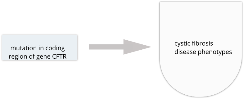
Genome variability influences differential disease risk among individuals. Identifying the effects of genome variants is key to understanding disease biology or organismal phenotype. The effects of variants in many single-gene disorders, such as cystic fibrosis, are generally well-characterized and their disease biology well understood. In cystic fibrosis for example, mutations in the coding region of the CFTR gene alters the three-dimensional structure of resulting chloride channel proteins in epithelial cells, affecting not only chloride transport but also sodium and potassium transport in the lungs, pancreas and skin. The path from gene mutation to altered protein to disease phenotype is relatively simple and well understood.
The most common human disorders, however, involve many genes interacting with the environment and with one another, a far more complicated path to follow than the path from a single gene mutation to its resulting protein to a disease phenotype. Cardiovascular disease, Alzheimer’s disease, arthritis, diabetes and cancer involve a complex interplay of genes with environment, and their mechanisms are not well understood. Genome-wide association studies (GWAS) associate genetic loci with disease traits, yet most GWAS variants for common diseases like diabetes are located in non-coding regions of the genome. These variants are therefore likely to be involved in gene regulation.
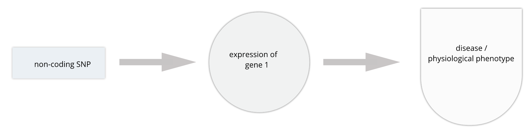
Gene regulation controls the quantity, timing and locale of gene expression. Analyzing genome variants through cell or tissue gene expression is known as expression quantitative trait locus (eQTL) analysis. An eQTL is a locus associated with expression of a gene or genes. An eQTL explains some of the variation in gene expression. Specifically, genetic variants underlying eQTL explain variation in gene expression levels. eQTL studies can reveal the architecture of quantitative traits, connect DNA sequence variation to phenotypic variation, and shed light on transcriptional regulation and regulatory variation. Traditional analytic techniques like linkage and association mapping can be applied to thousands of gene expression traits (transcripts) in eQTL analysis, such that gene expression can be mapped in much the same way as a physiological phenotype like blood pressure or heart rate. Joining gene expression and physiological phenotypes with genetic variation can uncover genes with variants affecting disease phenotypes.
To the simple diagram above we’ll add two more details. Non-coding SNPs can regulate gene expression from nearby on the same chromosome (in cis):
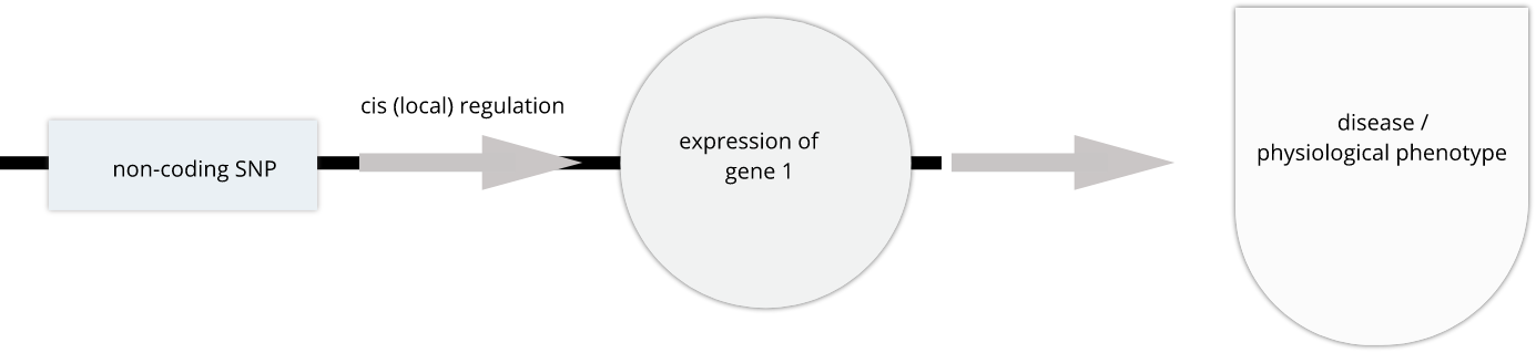
SNPs that affect gene expression from afar, often from a different chromosome from the gene that they regulate are called trans regulators.

In this lesson we revisit genetic mapping of quantitative traist and apply its methods to gene expression. The examples are from Genetic Drivers of Pancreatic Islet Function by Keller, et al. This study offers supporting evidence for type 2 diabetes-associated loci in human GWAS, most of which affect pancreatic islet function. The study assessed pancreatic islet gene expression in Diversity Outbred mice on either a regular chow or high-fat high-sugar diet. Islet mRNA abundance was quantified and analyzed, and the study identified more than 18,000 eQTL.
What are eQTL?
With a partner, discuss
- your understanding of eQTL.
- how mutations result in eQTL and ultimately in disease phenotypes.
- the methods that can be used for eQTL analysis.
Solution
Key Points
An expression quantitative trait locus (eQTL) explains part of the variation in gene expression.
Traditional linkage and association mapping can be applied to gene expression traits (transcripts).
Genetic variants, such as single nucleotide polymorphisms (SNPs), that underlie eQTL illuminate transcriptional regulation and variation.
Genetic Drivers of Pancreatic Islet Function
Overview
Teaching: 15 min
Exercises: 15 minQuestions
How I can learn more from an example eQTL study?
What is the hypothesis of an example eQTL study?
Objectives
Describe an example eQTL study in Diversity Outbred mice.
State the hypothesis from an example eQTL study in Diversity Outbred mice.
Genome-wide association studies (GWAS) often identify variants in non-coding regions of the genome, indicating that regulation of gene expression predominates in common diseases like type II diabetes. Most of the more than 100 genetic loci associated with type II diabetes affect the function of pancreatic islets, which produce insulin for regulating blood glucose levels. Susceptibility to type II diabetes (T2D) increases with obesity, such that T2D-associated genetic loci operate mainly under conditions of obesity (See Keller, Mark P et al. “Genetic Drivers of Pancreatic Islet Function.” Genetics vol. 209,1 (2018): 335-356). Like most GWAS loci, the T2D-associated genetic loci identified from genome-wide association studies (GWAS) have very small effect sizes and odds ratios just slightly more than 1.
This study explored islet gene expression in diabetes. The authors hypothesized that gene expression changes in response to dietary challenge would reveal signaling pathways involved in stress responses. The expression of many genes often map to the same locus, indicating that expression of these genes is controlled in common. If their mRNAs encode proteins with common physiological functions, the function of the controlling gene(s) is revealed. Variation in expression of the controlling gene(s), rather than a genetic variant, can be tested as an immediate cause of a disease-related phenotype.
In this study, Diversity Outbred (DO) mice were fed a high-fat, high-sugar diet as a stressor, sensitizing the mice to develop diabetic traits. Body weight and plasma glucose, insulin, and triglyceride measurements were taken biweekly. Food intake could be measured since animals were individually housed. A glucose tolerance test at 18 weeks of age provided measurement of dynamic glucose and insulin changes at 5, 15, 30, 60 and 120 minutes after glucose administration. Area under the curve (AUC) was determined from these time points for both plasma glucose and insulin levels. Homeostatic model assessment (HOMA) of insulin resistance (IR) and pancreatic islet function (B) were determined after the glucose tolerance test was given. Islet cells were isolated from pancreas, and RNA extracted and libraries constructed from isolated RNA for gene expression measurements.
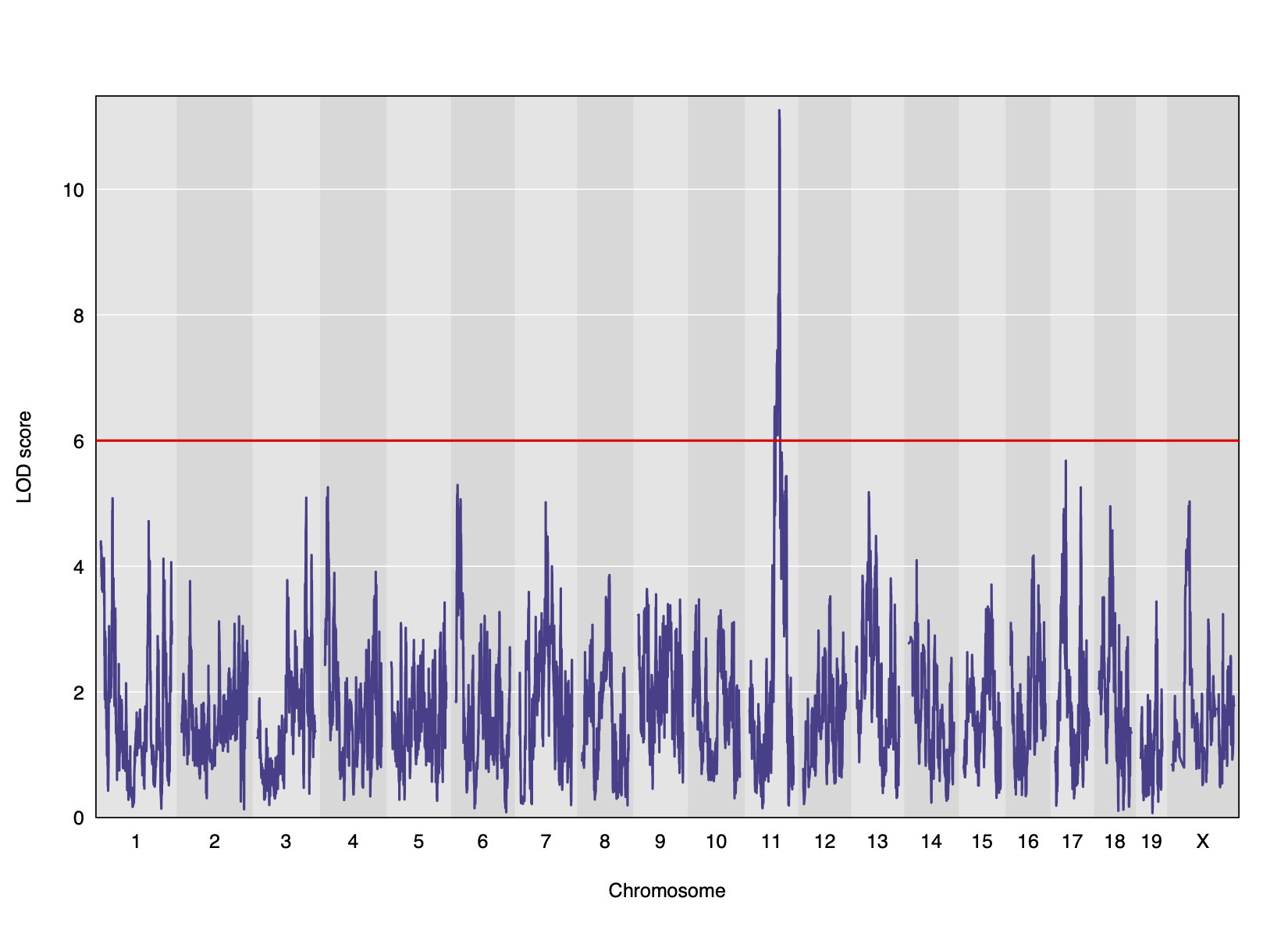
Genome scans were performed with the leave-one-chromosome-out (LOCO) method for kinship correction. Sex and experimental cohort (DO wave) were used as covariates. The results of one scan for insulin area under the curve (AUC) is shown below with a strong peak on chromosome 11. In this lesson, we will look into genes located under this peak.
Key Points
.
.
Load and explore the data
Overview
Teaching: 15 min
Exercises: 30 minQuestions
What data are required for eqtl mapping?
Objectives
To provide an example and exploration of data used for eqtl mapping.
Load the libraries.
library(ggbeeswarm)
library(tidyverse)
library(knitr)
library(corrplot)
# the following analysis is derived from supplementary
# File S1 Attie_eQTL_paper_physiology.Rmd
# by Daniel Gatti. See Data Dryad entry for more information.
Physiological Phenotypes
The complete data used in these analyses are available from Data Dryad.
Load in the clinical phenotypes.
# load the data
load("../data/attie_DO500_clinical.phenotypes.RData")
See the data dictionary to see a description of each of these phenotypes. You can also view a table of the data dictionary.
pheno_clin_dict %>%
  select(description, formula) %>%
  kable()
| description | formula | |
|---|---|---|
| mouse | Animal identifier. | NA |
| sex | Male (M) or female (F). | NA |
| sac_date | Date when mouse was sacrificed; used to compute days on diet, using birth dates. | NA |
| partial_inflation | Some mice showed a partial pancreatic inflation which would negatively effect the total number of islets collected from these mice. | NA |
| coat_color | Visual inspection by Kathy Schuler on coat color. | NA |
| oGTT_date | Date the oGTT was performed. | NA |
| FAD_NAD_paired | A change in the method that was used to make this measurement by Matt Merrins’ lab. Paired was the same islet for the value at 3.3mM vs. 8.3mM glucose; unpaired was where averages were used for each glucose concentration and used to compute ratio. | NA |
| FAD_NAD_filter_set | A different filter set was used on the microscope to make the fluorescent measurement; may have influenced the values. | NA |
| crumblers | Some mice store food in their bedding (hoarders) which would be incorrectly interpreted as consumed. | NA |
| birthdate | Birth date | NA |
| diet_days | Number of days. | NA |
| num_islets | Total number of islets harvested per mouse; negatively impacted by those with partial inflation. | NA |
| Ins_per_islet | Amount of insulin per islet in units of ng/ml/islet. | NA |
| WPIC | Derived number; equal to total number of islets times insulin content per islet. | Ins_per_islet * num_islets |
| HOMA_IR_0min | glucose*insulin/405 at time t=0 for the oGTT | Glu_0min * Ins_0min / 405 |
| HOMA_B_0min | 360 * Insulin / (Glucose - 63) at time t=0 for the oGTT | 360 * Ins_0min / (Glu_0min - 63) |
| Glu_tAUC | Area under the curve (AUC) calculation without any correction for baseline differences. | complicated |
| Ins_tAUC | Area under the curve (AUC) calculation without any correction for baseline differences. | complicated |
| Glu_6wk | Plasma glucose with units of mg/dl; fasting. | NA |
| Ins_6wk | Plasma insulin with units of ng/ml; fasting. | NA |
| TG_6wk | Plasma triglyceride (TG) with units of mg/dl; fasting. | NA |
| Glu_10wk | Plasma glucose with units of mg/dl; fasting. | NA |
| Ins_10wk | Plasma insulin with units of ng/ml; fasting. | NA |
| TG_10wk | Plasma triglyceride (TG) with units of mg/dl; fasting. | NA |
| Glu_14wk | Plasma glucose with units of mg/dl; fasting. | NA |
| Ins_14wk | Plasma insulin with units of ng/ml; fasting. | NA |
| TG_14wk | Plasma triglyceride (TG) with units of mg/dl; fasting. | NA |
| food_ave | Average food consumption over the measurements made for each mouse. | complicated |
| weight_2wk | Body weight at indicated date; units are gm. | NA |
| weight_6wk | Body weight at indicated date; units are gm. | NA |
| weight_10wk | Body weight at indicated date; units are gm. | NA |
| DOwave | Wave (i.e., batch) of DO mice | NA |
Phenotype Distributions
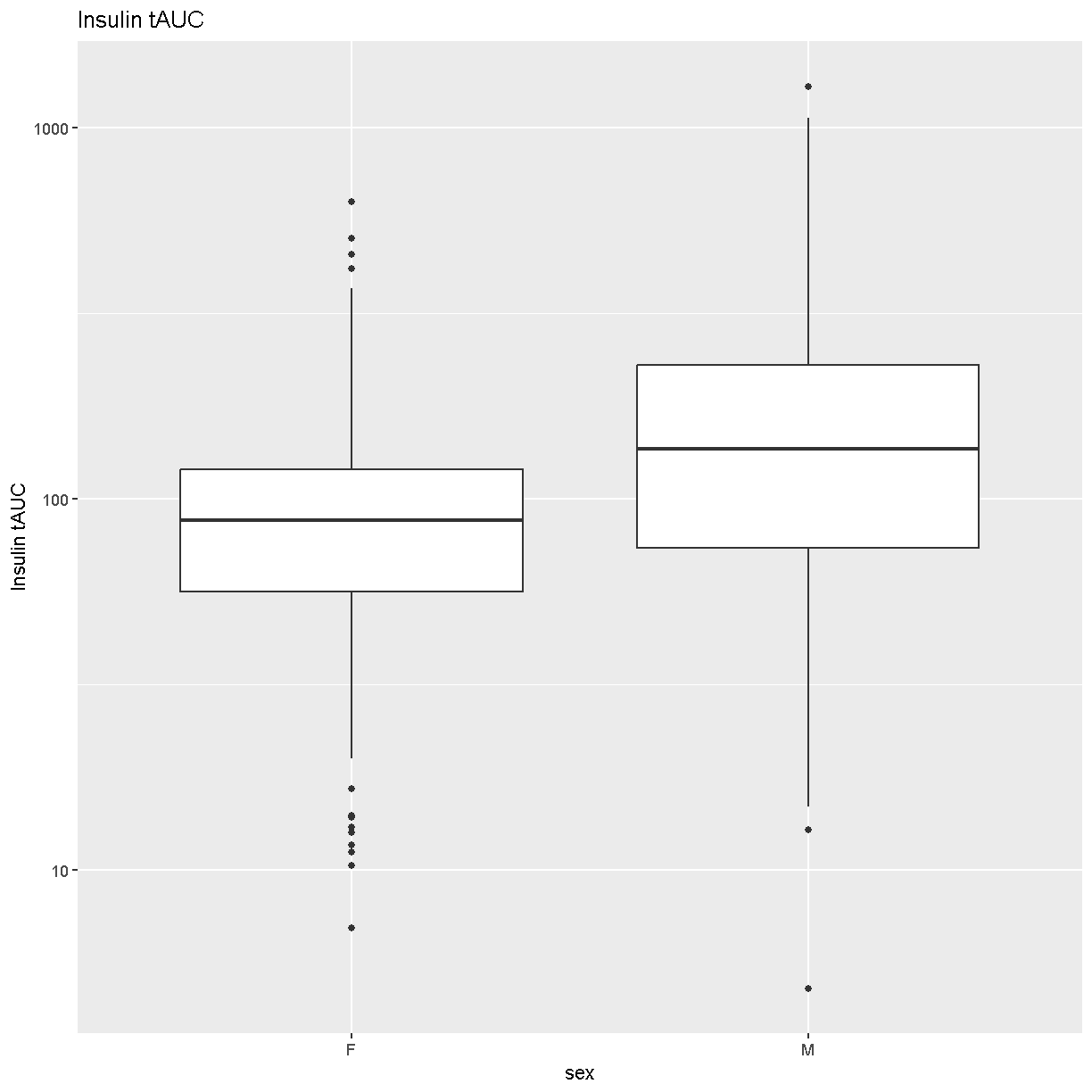
Boxplots are a great way to view the distribution of the data and to identify any outliers. We will be using the total area under the curve of insulin from the glucose tolerance test (Ins_tAUC). We will also log-transform the data using the [scale_y_log10()][scale_y_log10] function.
# plot Insulin on a log 10 scale
ggplot(pheno_clin, aes(sex, Ins_tAUC)) +
  geom_boxplot() +
  scale_y_log10() +
  labs(title = "Insulin tAUC", y = "Insulin tAUC")
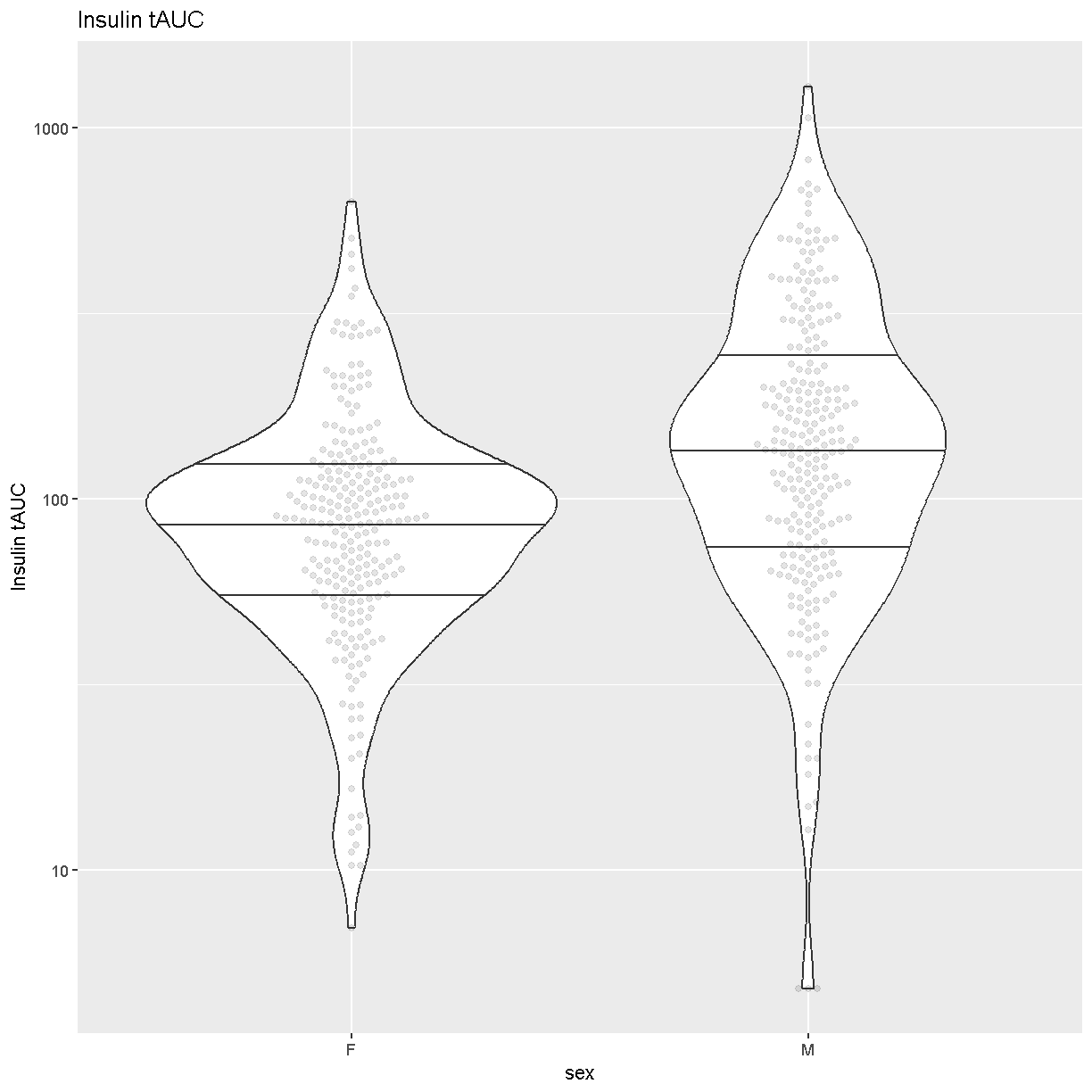
Another visualization that has become popular is the
[Violin Plot][https://en.wikipedia.org/wiki/Violin_plot]. We can create one
using ggplot’s [geom_violin][https://ggplot2.tidyverse.org/reference/geom_violin.html].
Whereas the boxplot automatically adds the median, we must tell geom_violin()
which quantiles that we want to draw using the argument
“draw_quantiles = c(0.25, 0.5, 0.75)”. We have also overlaid the data points
using ggbeeswarm’s
[geom_beeswarm][https://www.rdocumentation.org/packages/ggbeeswarm/versions/0.5.3/topics/geom_beeswarm].
We have told geom_beeswarm() to plot the points using the argument
“alpha = 0.1”. The alpha argument ranges between 0 (completely transparent) to
1 (completely opaque). A value of 0.1 means mostly transparent.
# plot Insulin on a log 10 scale
ggplot(pheno_clin, aes(sex, Ins_tAUC)) +
  geom_violin(draw_quantiles = c(0.25, 0.5, 0.75)) +
  geom_beeswarm(alpha = 0.1) +
  scale_y_log10() +
  labs(title = "Insulin tAUC", y = "Insulin tAUC")
Challenge 1
How many orders of magnitude (powers of 10) does Insulin tAUC span?
Solution
Insulin tAUC spans three orders of magnitude, from near 10 to over 1000.
Challenge 2
Which sex has higher median Insulin tAUC values?
Solution
Males have higher Insulin tAUC than females.
Both of the boxplot and the violin plot are useful visualizations which you can use to get some sense of the distribution of your data.
Quality Control of Data
Many statistical tests rely upon the data having a “normal” (or Gaussian) distribution. Many biological phenotypes do not follow this distribution and must be transformed before analysis. This is why we log-transformed the data in the plots above.
While we can “eyeball” the distributions in the violin plot, it would be better to use a “quantile-quantile” plot.
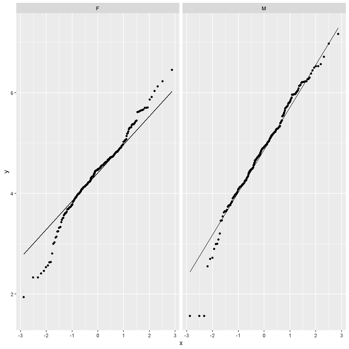
pheno_clin %>%
  ggplot(aes(sample = Ins_tAUC)) +
    stat_qq() +
    geom_qq_line() +
    facet_wrap(~sex)
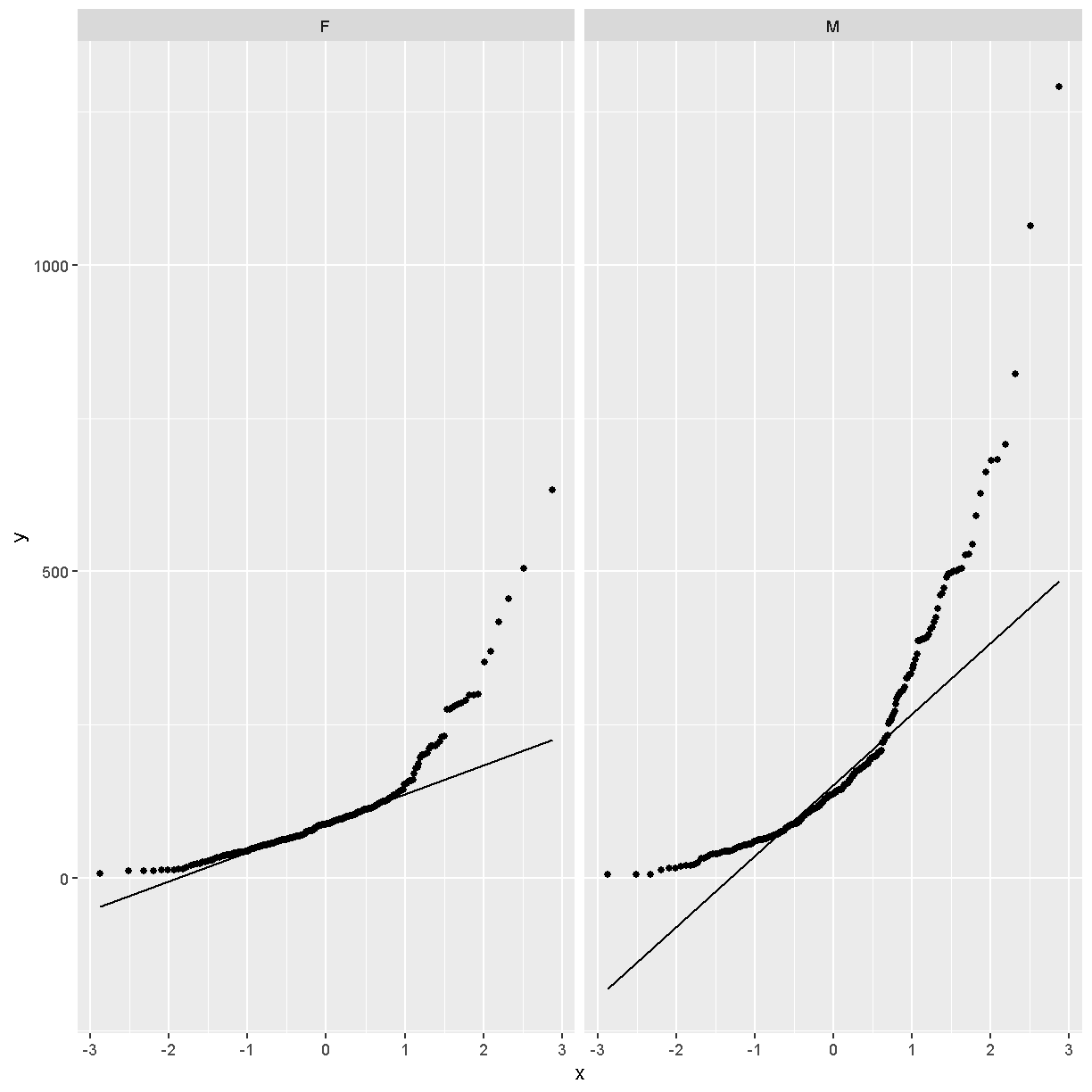
In these plots, the “quantiles” of the normal distribution are plotted on the X-axis and the data are plotted on the Y-axis. The line indicates the quantiles that would be followed by a normal distribution. The untransformed data do not follow a normal distribution because the points are far from the line.
Next, we will loag-transform the data and then create a quantile-quantile plot.
pheno_clin %>%
  mutate(Ins_tAUC = log(Ins_tAUC)) %>%
  ggplot(aes(sample = Ins_tAUC)) +
    stat_qq() +
    geom_qq_line() +
    facet_wrap(~sex)
Challenge 3
Does the log transformation make the data more normally distributed? Explain your answer.
Solution
Yes. The log transformation makes the data more normally distributed because the data points follow the normality line more closely.
Challenge 4
Do any data points look suspicious to you? Explain your answer.
Solution
The data points that deviate from the normality line would be worth investigating. All data deviates somewhat from normality, but the three lowest points in the male data plot would be worth investigating. They may be real, but there may also have been mishap in the assay.
Another way to identify outliers is to standardize the data and look for data points that are more than four standard deviations from the mean.
To do this, we will log transform and standardize Insulin tAUC.
ins_tauc = pheno_clin %>%
             select(mouse, sex, Ins_tAUC) %>%
             group_by(sex) %>%
             mutate(Ins_tAUC = log(Ins_tAUC),
                    Ins_tAUC = scale(Ins_tAUC))

ins_tauc %>%
  ggplot(aes(x = sex, y = Ins_tAUC)) +
    geom_boxplot() +
    geom_hline(aes(yintercept = -4), color = 'red') +
    geom_hline(aes(yintercept =  4), color = 'red') +
    labs(title = "Distribution of Standardized Ins_tAUC")
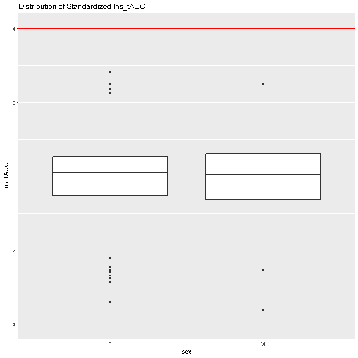
There are no data points outside of the four standard deviation limits.
Gene Expression Phenotypes
# load the expression data along with annotations and metadata
load("../data/dataset.islet.rnaseq.RData")
names(dataset.islet.rnaseq)
[1] "annots"        "covar"         "covar.factors" "datatype"
[5] "display.name"  "expr"          "lod.peaks"     "raw"
[9] "samples"
# look at gene annotations
dataset.islet.rnaseq$annots[1:6,]
                              gene_id symbol chr     start       end strand
ENSMUSG00000000001 ENSMUSG00000000001  Gnai3   3 108.10728 108.14615     -1
ENSMUSG00000000028 ENSMUSG00000000028  Cdc45  16  18.78045  18.81199     -1
ENSMUSG00000000037 ENSMUSG00000000037  Scml2   X 161.11719 161.25821      1
ENSMUSG00000000049 ENSMUSG00000000049   Apoh  11 108.34335 108.41440      1
ENSMUSG00000000056 ENSMUSG00000000056   Narf  11 121.23725 121.25586      1
ENSMUSG00000000058 ENSMUSG00000000058   Cav2   6  17.28119  17.28911      1
                      middle nearest.marker.id        biotype      module
ENSMUSG00000000001 108.12671       3_108090236 protein_coding   darkgreen
ENSMUSG00000000028  18.79622       16_18817262 protein_coding        grey
ENSMUSG00000000037 161.18770       X_161182677 protein_coding        grey
ENSMUSG00000000049 108.37887      11_108369225 protein_coding greenyellow
ENSMUSG00000000056 121.24655      11_121200487 protein_coding       brown
ENSMUSG00000000058  17.28515        6_17288298 protein_coding       brown
                   hotspot
ENSMUSG00000000001    <NA>
ENSMUSG00000000028    <NA>
ENSMUSG00000000037    <NA>
ENSMUSG00000000049    <NA>
ENSMUSG00000000056    <NA>
ENSMUSG00000000058    <NA>
# look at raw counts
dataset.islet.rnaseq$raw[1:6,1:6]
      ENSMUSG00000000001 ENSMUSG00000000028 ENSMUSG00000000037
DO021              10247                108                 29
DO022              11838                187                 35
DO023              12591                160                 19
DO024              12424                216                 30
DO025              10906                 76                 21
DO026              12248                110                 34
      ENSMUSG00000000049 ENSMUSG00000000056 ENSMUSG00000000058
DO021                 15                120                703
DO022                 18                136                747
DO023                 18                275               1081
DO024                 81                160                761
DO025                  7                163                770
DO026                 18                204                644
# look at sample metadata
# summarize mouse sex, birth dates and DO waves
table(dataset.islet.rnaseq$samples[, c("sex", "birthdate")])
   birthdate
sex 2014-05-29 2014-10-15 2015-02-25 2015-09-22
  F         46         46         49         47
  M         45         48         50         47
table(dataset.islet.rnaseq$samples[, c("sex", "DOwave")])
   DOwave
sex  1  2  3  4  5
  F 46 46 49 47  0
  M 45 48 50 47  0
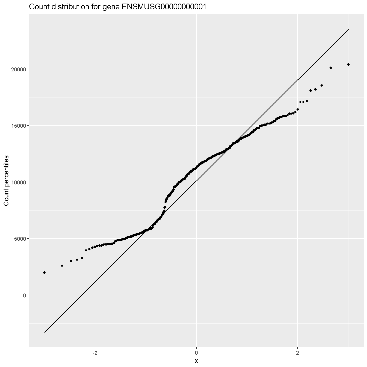
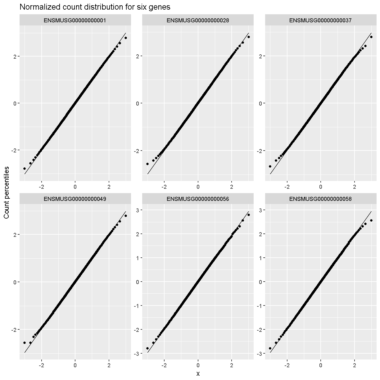
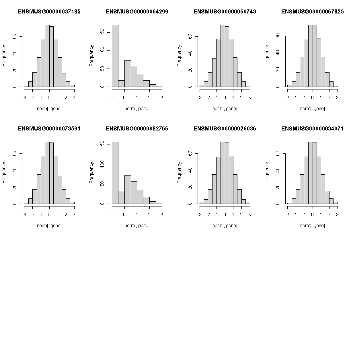
In order to make reasonable gene comparisons between samples, the count data need to be normalized. In the quantile-quantile (Q-Q) plot below, count data for the first gene are plotted over a diagonal line tracing a normal distribution for those counts. Notice that most of the count data values lie off of this line, indicating that these gene counts are not normally distributed.
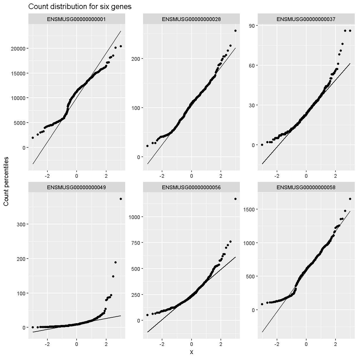
Q-Q plots for the first six genes show that count data for these genes are not normally distributed. They are also not on the same scale. The y-axis values for each subplot range to 20,000 counts in the first subplot, 250 in the second, 90 in the third, and so on.
dataset.islet.rnaseq$raw %>%
  as.data.frame() %>%
  select(ENSMUSG00000000001:ENSMUSG00000000058) %>%
  pivot_longer(cols = everything(), names_to = 'gene', values_to = 'value') %>%
  ggplot(aes(sample = value)) +
    stat_qq() +
    geom_qq_line() +
    facet_wrap(~gene, scales = 'free') +
    labs(title = 'Count distribution for six genes',
         xlab = 'Normal percentiles', y = 'Count percentiles')
Q-Q plots of the normalized expression data for the first six genes show that the data values match the diagonal line well, meaning that they are now normally distributed. They are also all on the same scale now as well.
dataset.islet.rnaseq$expr %>%
  as.data.frame() %>%
  select(ENSMUSG00000000001:ENSMUSG00000000058) %>%
  pivot_longer(cols = everything(), names_to = 'gene', values_to = 'value') %>%
  ggplot(aes(sample = value)) +
    stat_qq() +
    geom_qq_line() +
    facet_wrap(~gene, scales = 'free') +
    labs(title = 'Normalized count distribution for six genes',
         xlab = 'Normal percentiles', y = 'Count percentiles')
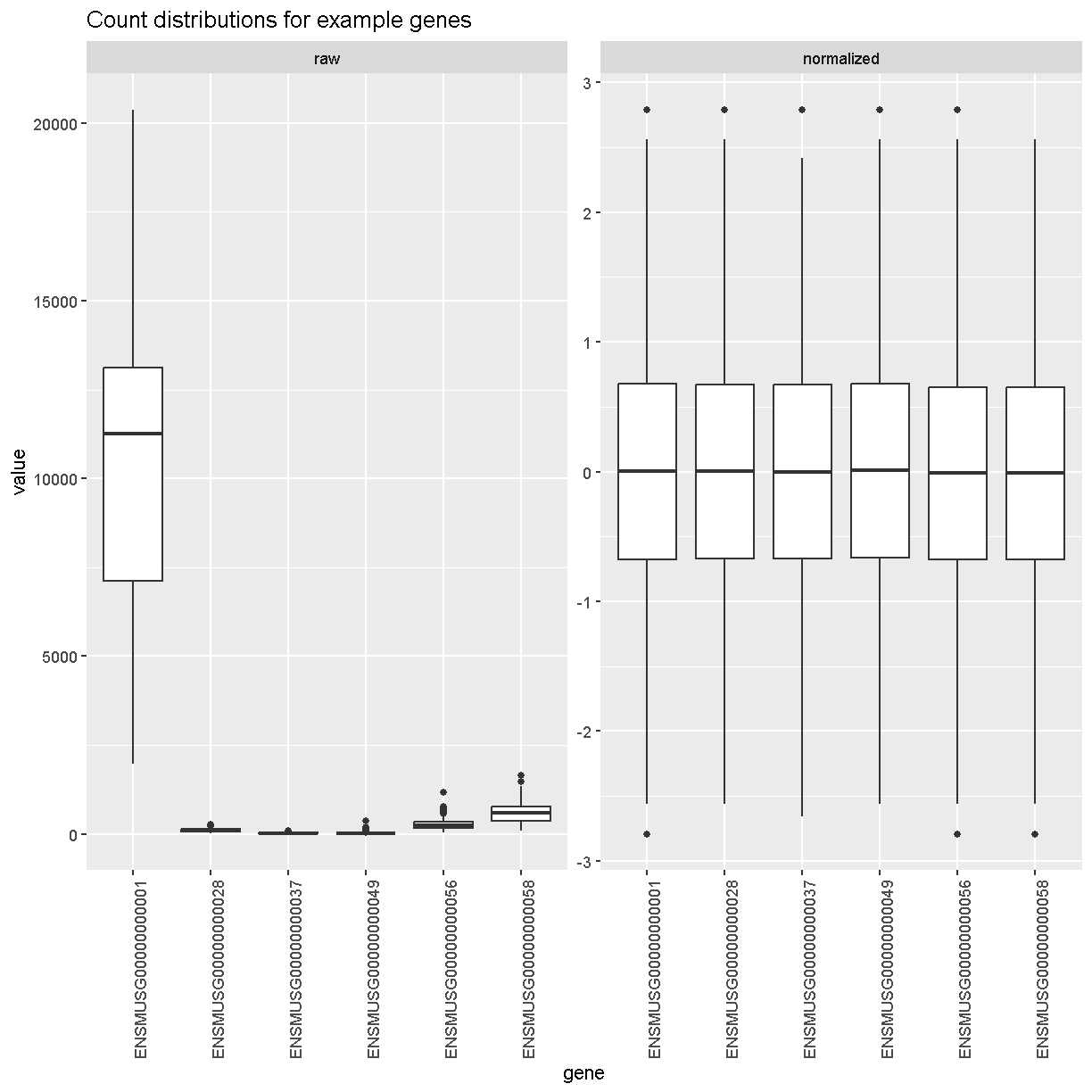
Boxplots of raw counts for six example genes are shown at left below. Notice that the median count values (horizontal black bar in each boxplot) are not comparable between the genes because the counts are not on the same scale. At right, boxplots for the same genes show normalized count data on the same scale.
raw = dataset.islet.rnaseq$raw %>%
        as.data.frame() %>%
        select(ENSMUSG00000000001:ENSMUSG00000000058) %>%
        pivot_longer(cols = everything(), names_to = 'gene', values_to = 'value') %>%
        mutate(type = 'raw')

norm = dataset.islet.rnaseq$expr %>%
         as.data.frame() %>%
         select(ENSMUSG00000000001:ENSMUSG00000000058) %>%
         pivot_longer(cols = everything(), names_to = 'gene', values_to = 'value') %>%
         mutate(type = 'normalized')

bind_rows(raw, norm) %>%
  mutate(type = factor(type, levels = c('raw', 'normalized'))) %>%
  ggplot(aes(gene, value)) +
    geom_boxplot() +
    facet_wrap(~type, scales = 'free') +
    labs(title = 'Count distributions for example genes') +
    theme(axis.text.x = element_text(angle = 90, hjust = 0.5, vjust = 1))
rm(raw, norm)
Have a look at the first several rows of normalized count data.
# look at normalized counts
dataset.islet.rnaseq$expr[1:6,1:6]
      ENSMUSG00000000001 ENSMUSG00000000028 ENSMUSG00000000037
DO021        -0.09858728         0.19145703          0.5364855
DO022         0.97443030         2.41565800          1.1599398
DO023         0.75497867         1.62242658         -0.4767954
DO024         1.21299720         2.79216889          0.7205211
DO025         1.62242658        -0.27918258          0.3272808
DO026         0.48416010         0.03281516          0.8453674
      ENSMUSG00000000049 ENSMUSG00000000056 ENSMUSG00000000058
DO021         0.67037652         -1.4903750          0.6703765
DO022         1.03980755         -1.1221937          0.9744303
DO023         0.89324170          0.2317220          1.8245906
DO024         2.15179362         -0.7903569          0.9957498
DO025        -0.03281516         -0.2587715          1.5530179
DO026         0.86427916         -0.3973634          0.2791826
The expression data loaded provides LOD peaks for the eQTL analyses performed in this study. As a preview of what you will be doing next, look at the first several rows of LOD peak values and extract the LOD peaks for chromosome 11.
# look at LOD peaks
dataset.islet.rnaseq$lod.peaks[1:6,]
            annot.id   marker.id chrom        pos       lod
1 ENSMUSG00000037922 3_136728699     3 136.728699 11.976856
2 ENSMUSG00000037926 2_164758936     2 164.758936  7.091543
3 ENSMUSG00000037926 5_147178504     5 147.178504  6.248598
4 ENSMUSG00000037933 5_147253583     5 147.253583  8.581871
5 ENSMUSG00000037933  13_6542783    13   6.542783  6.065497
6 ENSMUSG00000037935 11_99340415    11  99.340415  8.089051
# look at chromosome 11 LOD peaks
chr11_peaks <- dataset.islet.rnaseq$annots %>%
   select(gene_id, chr) %>%
   filter(chr=="11") %>%
   left_join(dataset.islet.rnaseq$lod.peaks,
             by = c("chr" = "chrom", "gene_id" = "annot.id"))

# look at the first several rows of chromosome 11 peaks
head(chr11_peaks)
             gene_id chr    marker.id       pos       lod
1 ENSMUSG00000000049  11 11_109408556 109.40856  8.337996
2 ENSMUSG00000000056  11 11_121434933 121.43493 11.379449
3 ENSMUSG00000000093  11  11_74732783  74.73278  9.889119
4 ENSMUSG00000000120  11  11_95962181  95.96218 11.257591
5 ENSMUSG00000000125  11         <NA>        NA        NA
6 ENSMUSG00000000126  11  11_26992236  26.99224  6.013533
# how many rows?
dim(chr11_peaks)
[1] 1810 5
# how many rows have LOD scores?
chr11_peaks %>% filter(!is.na(lod)) %>% dim()
[1] 1208 5
# sort chromosome 11 peaks by LOD score
chr11_peaks %>% arrange(desc(lod)) %>% head()
             gene_id chr   marker.id      pos      lod
1 ENSMUSG00000020268  11 11_55073940 55.07394 189.2332
2 ENSMUSG00000020333  11 11_53961279 53.96128 147.8134
3 ENSMUSG00000017404  11 11_98062374 98.06237 136.0430
4 ENSMUSG00000093483  11 11_83104215 83.10421 135.1067
5 ENSMUSG00000058546  11 11_78204410 78.20441 132.3365
6 ENSMUSG00000078695  11 11_97596132 97.59613 131.8005
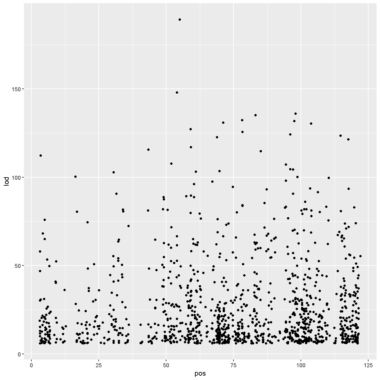
# range of LOD scores and positions
range(chr11_peaks$lod, na.rm = TRUE)
[1] 6.000975 189.233211
range(chr11_peaks$pos, na.rm = TRUE)
[1] 3.126009 122.078650
# view LOD scores by position
chr11_peaks %>% arrange(desc(lod)) %>%
  ggplot(aes(pos, lod)) + geom_point()
Key Points
Review Mapping Steps
Overview
Teaching: 30 min
Exercises: 30 minQuestions
What are the steps involved in running QTL mapping in Diversity Outbred mice?
Objectives
Reviewing the QTL mapping steps learnt in the first two days
Before we begin to run QTL mapping on gene expression data to find eQTLs, let’s review the main QTL mapping steps that we learnt in the QTL mapping course. As a reminder, we are using data from the Keller et al. paper that are freely available to download.
Make sure that you are in your main directory. If you’re not sure where you are working right now, you can check your working directory with getwd(). If you are not in your main directory, run setwd("code") in the Console or Session -> Set Working Directory -> Choose Directory in the RStudio menu to set your working directory to the code directory.
Load Libraries
Below are the neccessary libraries that we require for this review. They are already installed on your machines so go ahead an load them using the following code:
library(tidyverse)
library(knitr)
library(broom)
library(qtl2)
Load Data
The data for this tutorial has been saved as several R binary files which contain several data objects, including phenotypes and mapping data as well as the genoprobs.
Load the data in now by running the following command in your new script.
##phenotypes
load("../data/attie_DO500_clinical.phenotypes.RData")

##mapping data
load("../data/attie_DO500_mapping.data.RData")

##genotype probabilities
probs = readRDS("../data/attie_DO500_genoprobs_v5.rds")
We loaded in a few data objects today. Check the Environment tab to see what was loaded. You should see a phenotypes object called pheno_clin with 500 observations (in rows) of 32 variables (in columns), an object called map (physical map), and an object called probs (genotype probabilities).
Phenotypes
In this data set, we have 20 phenotypes for 500 Diversity Outbred mice. pheno_clin is a data frame containing the phenotype data as well as covariate information. Click on the triangle to the left of pheno_clin in the Environment pane to view its contents. Run names(pheno_clin) to list the variables.
pheno_clin_dict is the phenotype dictionary. This data frame contains information on each variable in pheno_clin, including name,short name, pheno_type, formula (if used) and description.
Since the paper is interested in type 2 diabetes and insulin secretion, we will choose insulin tAUC (area under the curve (AUC) which was calculated without any correction for baseline differences) for this review
Many statistical models, including the QTL mapping model in qtl2, expect that the incoming data will be normally distributed. You may use transformations such as log or square root to make your data more normally distributed. Here, we will log transform the data.
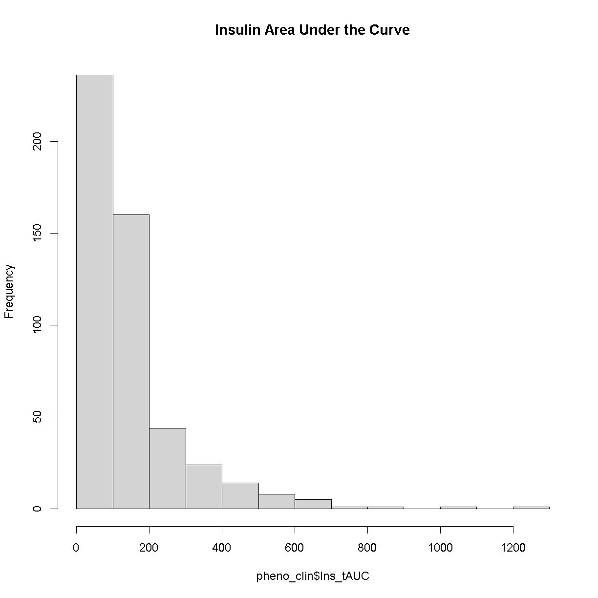
Here is a histogram of the untransformed data.
hist(pheno_clin$Ins_tAUC, main = "Insulin Area Under the Curve")
Now, let’s apply the log() function to this data to correct the distribution.
pheno_clin$Ins_tAUC_log <- log(pheno_clin$Ins_tAUC)
Now, let’s make a histogram of the log-transformed data.
hist(pheno_clin$Ins_tAUC_log, main = "insulin tAUC (log-transformed)")
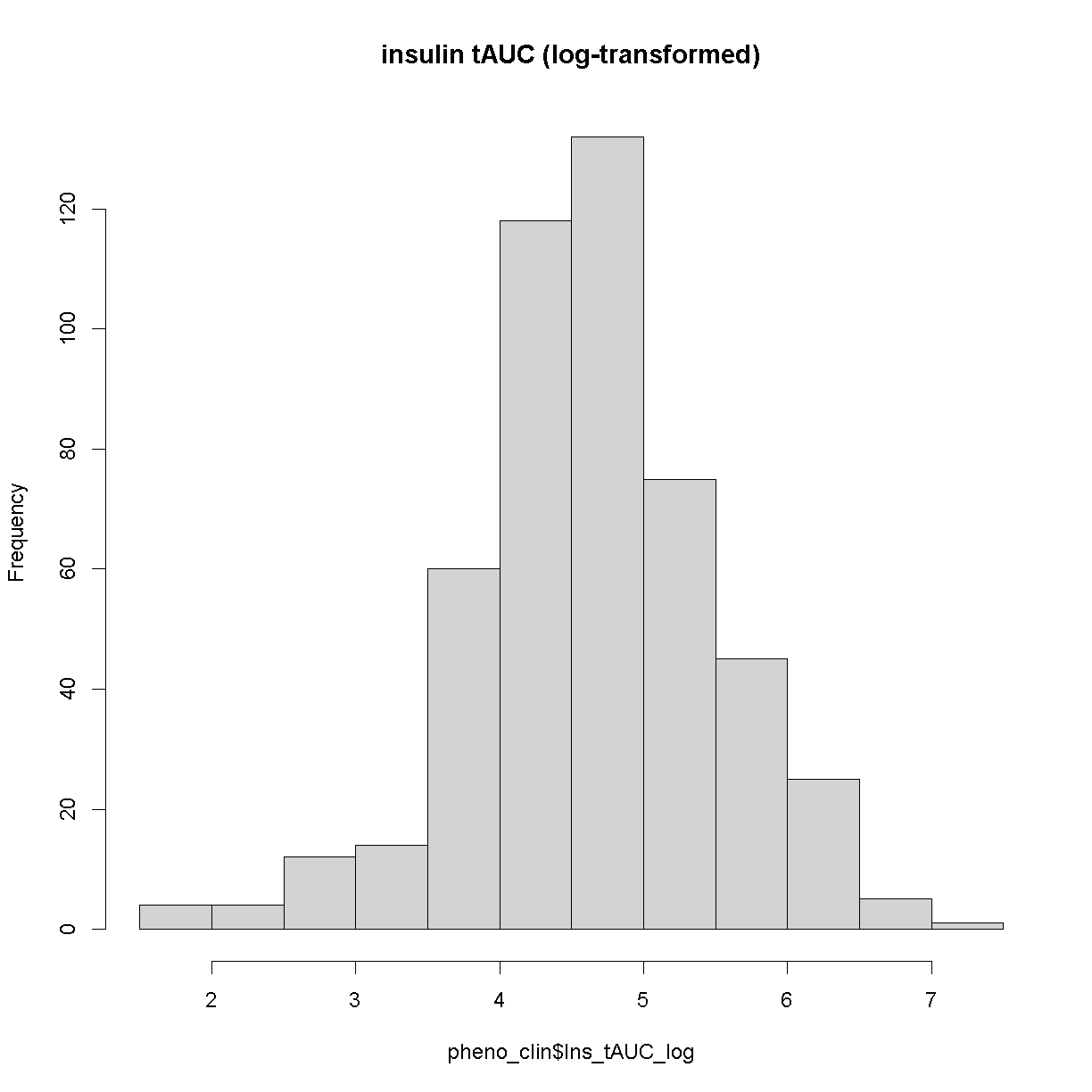
This looks much better!
The Marker Map
The marker map for each chromosome is stored in the map object. This is used to plot the LOD scores calculated at each marker during QTL mapping. Each list element is a numeric vector with each marker position in megabases (Mb). Here we are using the 69K grid marker file. Often when there are numerous genotype arrays used in a study, we interoplate all to a 69k grid file so we are able to combine all samples across different array types.
Look at the structure of map in the Environment tab by clicking the triangle to the left or by running str(map) in the Console.
Genotype probabilities
Each element of probs is a 3 dimensional array containing the founder allele dosages for each sample at each marker on one chromosome. These are the 8 state alelle probabilities (not 32) using the 69k marker grid for same 500 DO mice that also have clinical phenotypes. We have already calculated genotype probabilities for you, so you can skip the step for calculating genotype probabilities and the optional step for calculating allele probabilities.
Next, we look at the dimensions of probs for chromosome 1:
dim(probs[[1]])
[1] 500 8 4711
plot_genoprob(probs, map, ind = 1, chr = 1)
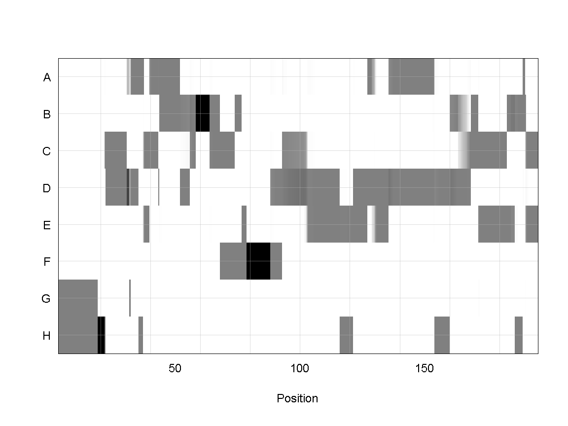
In the plot above, the founder contributions, which range between 0 and 1, are colored from white (= 0) to black (= 1.0). A value of ~0.5 is grey. The markers are on the X-axis and the eight founders (denoted by the letters A through H) on the Y-axis. Starting at the left, we see that this sample has genotype GH because the rows for G & H are grey, indicating values of 0.5 for both alleles. Moving along the genome to the right, the genotype becomes HH where where the row is black indicating a value of 1.0. This is followed by CD, DD, DG, AD, AH, CE, etc. The values at each marker sum to 1.0.
Kinship Matrix
The kinship matrix has already been calculated and loaded in above
n_samples <- 50
heatmap(K[[1]][1:n_samples, 1:n_samples])
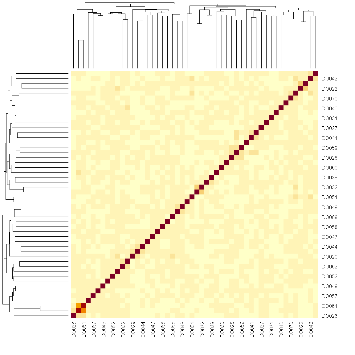
The figure above shows kinship between all pairs of samples. Light yellow indicates low kinship and dark red indicates higher kinship. Orange values indicate varying levels of kinship between 0 and 1. The dark red diagonal of the matrix indicates that each sample is identical to itself. The orange blocks along the diagonal may indicate close relatives (i.e. siblings or cousins).
Covariates
Next, we need to create additive covariates that will be used in the mapping model. First, we need to see which covariates are significant. In the data set, we have sex, DOwave (Wave (i.e., batch) of DO mice)
and diet_days (number of days on diet) to test whether there are any gender, batch or diet effects.
First we are going to select out the covariates and phenotype we want from pheno_clin data frame. Then reformat these selected variables into a long format (using the gather command) grouped by the phenotypes (in this case, we only have Ins_tAUC_log)
### Tests for sex, wave and diet_days.

tmp = pheno_clin %>%
        dplyr::select(mouse, sex, DOwave, diet_days, Ins_tAUC_log) %>%
        gather(phenotype, value, -mouse, -sex, -DOwave, -diet_days) %>%
        group_by(phenotype) %>%
        nest()
Let’s create a linear model function that will regress the covariates and the phenotype.
mod_fxn = function(df) {
  lm(value ~ sex + DOwave + diet_days, data = df)
}
Now let’s apply that function to the data object tmp that we created above.
tmp = tmp %>%
  mutate(model = map(data, mod_fxn)) %>%
  mutate(summ  = map(model, tidy)) %>%
  unnest(summ)

tmp
# A tibble: 7 x 8
# Groups:   phenotype [1]
  phenotype    data               model  term  estimate std.e~1 stati~2  p.value
  <chr>        <list>             <list> <chr>    <dbl>   <dbl>   <dbl>    <dbl>
1 Ins_tAUC_log <tibble [500 x 5]> <lm>   (Int~  4.49    0.447    10.1   1.10e-21
2 Ins_tAUC_log <tibble [500 x 5]> <lm>   sexM   0.457   0.0742    6.17  1.48e- 9
3 Ins_tAUC_log <tibble [500 x 5]> <lm>   DOwa~ -0.294   0.118    -2.49  1.33e- 2
4 Ins_tAUC_log <tibble [500 x 5]> <lm>   DOwa~ -0.395   0.118    -3.36  8.46e- 4
5 Ins_tAUC_log <tibble [500 x 5]> <lm>   DOwa~ -0.176   0.118    -1.49  1.38e- 1
6 Ins_tAUC_log <tibble [500 x 5]> <lm>   DOwa~ -0.137   0.118    -1.16  2.46e- 1
7 Ins_tAUC_log <tibble [500 x 5]> <lm>   diet~  0.00111 0.00346   0.322 7.48e- 1
# ... with abbreviated variable names 1: std.error, 2: statistic
tmp %>%
  filter(term != "(Intercept)") %>%
  mutate(neg.log.p = -log10(p.value)) %>%
  ggplot(aes(term, neg.log.p)) +
    geom_point() +
    facet_wrap(~phenotype) +
    labs(title = "Significance of Sex, Wave & Diet Days on Phenotypes") +
    theme(axis.text.x = element_text(angle = 90, hjust = 1, vjust = 0.5)) +
rm(tmp)
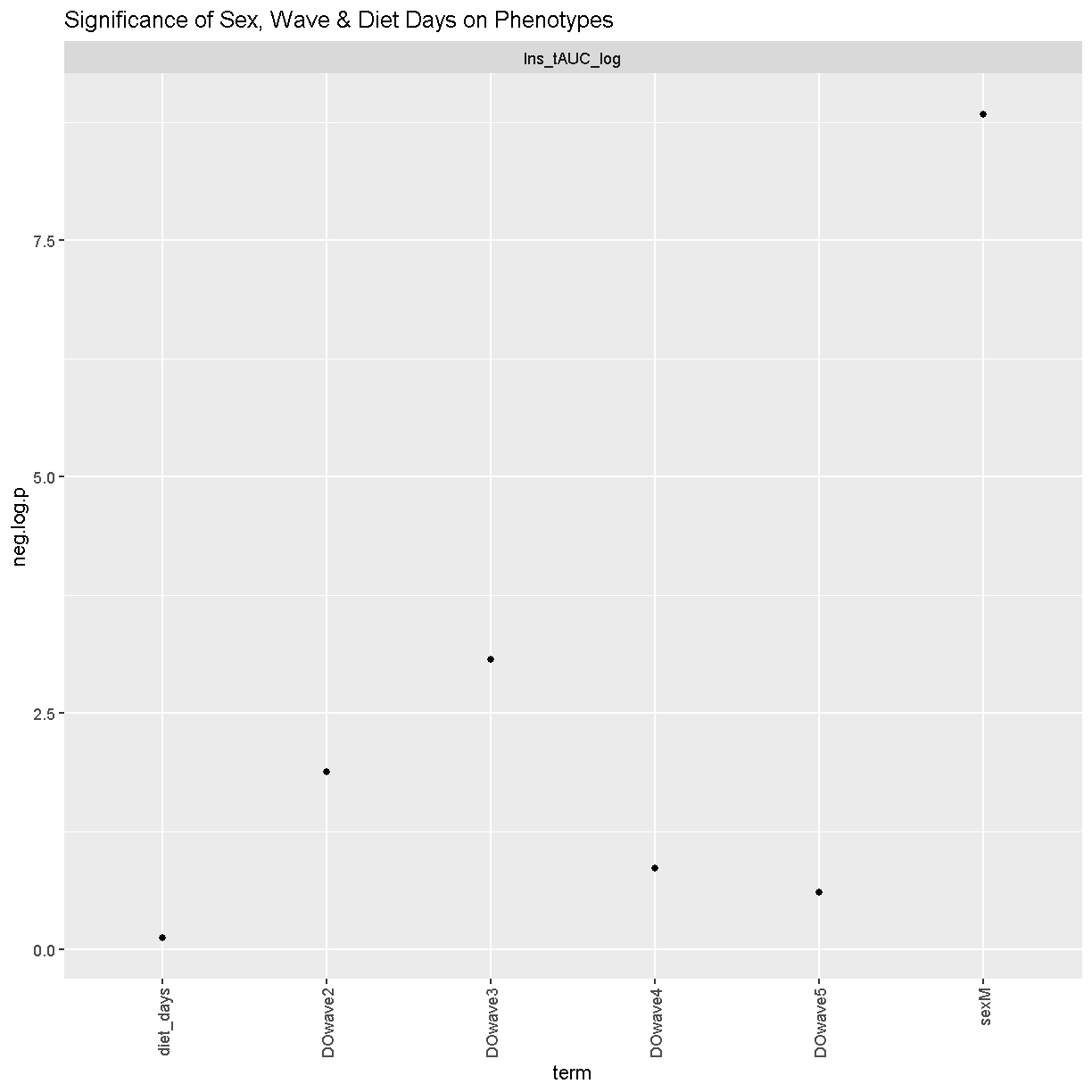
We can see that sex and DOwave (especially the third batch) are significant. Here DOwave is the group or batch number as not all mice are in the experient at the same time. Because of this, we now have to correct for it.
# convert sex and DO wave (batch) to factors
pheno_clin$sex    = factor(pheno_clin$sex)
pheno_clin$DOwave = factor(pheno_clin$DOwave)

covar = model.matrix(~sex + DOwave, data = pheno_clin)[,-1]
REMEMBER: the sample IDs must be in the rownames of pheno, addcovar, genoprobs and K. qtl2 uses the sample IDs to align the samples between objects.
Performing a genome scan
At each marker on the genotyping array, we will fit a model that regresses the phenotype (insulin secretion AUC) on covariates and the founder allele proportions. Note that this model will give us an estimate of the effect of each founder allele at each marker. There are eight founder strains that contributed to the DO, so we will get eight founder allele effects.
[Permutations]
First, we need to work out the signifcance level. Let’s find the signifance level for 0.1, 0.05 and 0.01.
operm <- scan1perm(genoprobs = probs,
                   pheno     = pheno_clin[,"Ins_tAUC_log", drop = FALSE],
                   addcovar  = covar,
                   n_perm    = 1000)
Note DO NOT RUN THIS (it will take too long). Instead, I have run it earlier and will load it in here. We will also perform a summary to find the summary level for 0.1, 0.05 and 0.01
load("../data/operm_Ins_tAUC_log_1000.Rdata")

summary(operm, alpha = c(0.1, 0.05, 0.01))
LOD thresholds (1000 permutations)
     Ins_tAUC_log
0.1          7.19
0.05         7.63
0.01         8.43
Genome Scan
qtl = scan1(genoprobs = probs,
            pheno     = pheno_clin[,"Ins_tAUC_log", drop = FALSE],
            kinship   = K,
            addcovar  = covar)
Next, we plot the genome scan.
plot_scan1(x   = qtl,
           map = map,
           lodcolumn = "Ins_tAUC_log")
           add_threshold(map,  summary(operm, alpha = 0.1),  col = 'purple')
           add_threshold(map,  summary(operm, alpha = 0.05), col = 'red')
           add_threshold(map,  summary(operm, alpha = 0.01), col = 'blue')
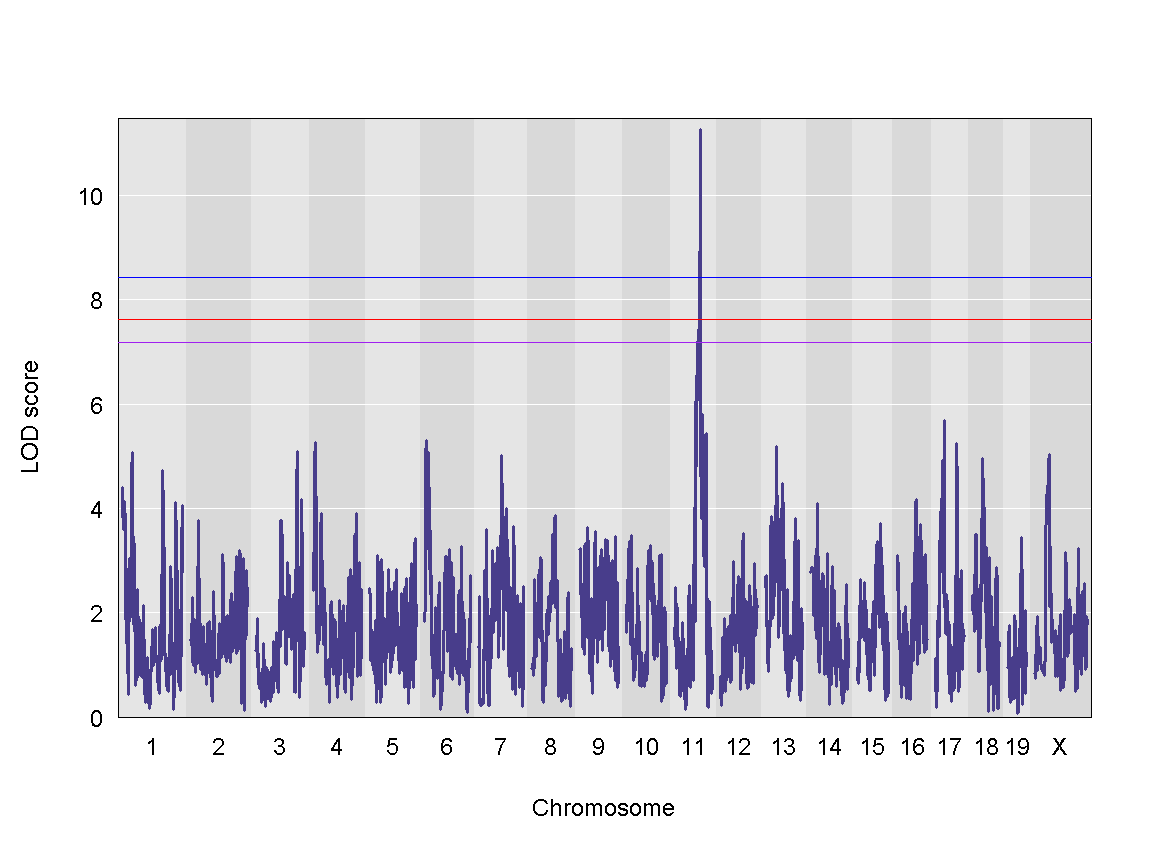
We can see a very strong peak on chromosome 11 with no other distinguishable peaks.
Finding LOD peaks
We can find all of the peaks above the significance threshold using the find_peaks function.
The support interval is determined using the Bayesian Credible Interval and represents the region most likely to contain the causal polymorphism(s). We can obtain this interval by adding a prob argument to find_peaks. We pass in a value of 0.95 to request a support interval that contains the causal SNP 95% of the time.
In case there are multiple peaks are found on a chromosome, the peakdrop argument allows us to the find the peak which has a certain LOD score drop between other peaks.
Let’s find LOD peaks. Here we are choosing to find peaks with a LOD score greater than 6.
lod_threshold = summary(operm, alpha=0.01)
peaks = find_peaks(scan1_output = qtl, map = map,
                   threshold = lod_threshold,
                   peakdrop = 4,
                   prob = 0.95)

kable(peaks %>% dplyr::select (-lodindex) %>%
        arrange(chr, pos), caption = "Phenotype QTL Peaks with LOD >= 6")
Table: Phenotype QTL Peaks with LOD >= 6
| lodcolumn | chr | pos | lod | ci_lo | ci_hi |
|---|---|---|---|---|---|
| Ins_tAUC_log | 11 | 83.59467 | 11.25884 | 83.58553 | 84.95444 |
QTL effects
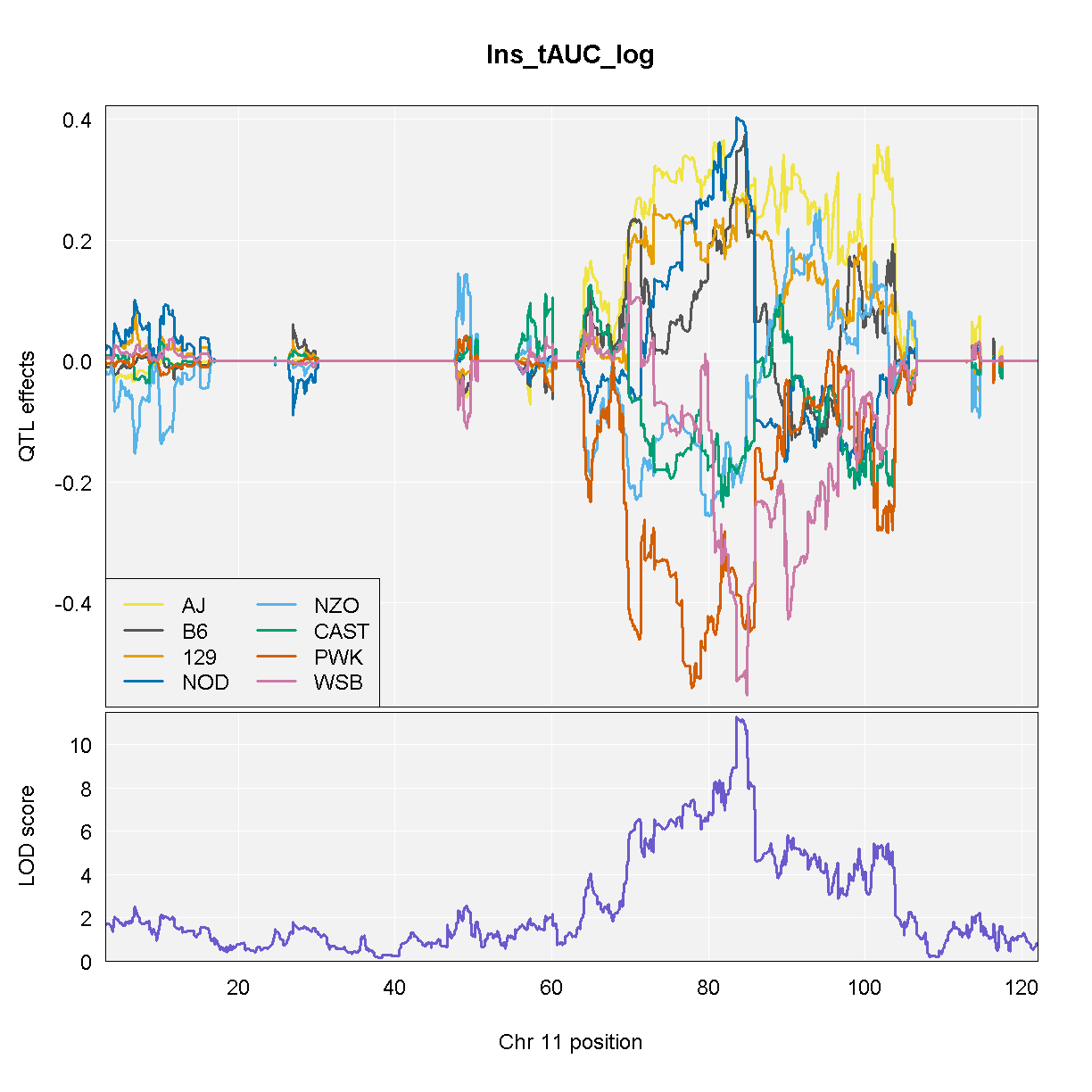
Once we have selected a QTL peak to investigate, we can make several types of plots to view the founder allele effects. In the mapping model, we can estimate the magnitude and direction of the founder allele effects. One method is to estimate the allele effects across the entire chromosome. This can be informative for complex peaks that span many Mb. We use the [scan1blup][https://github.com/kbroman/qtl2/blob/main/R/scan1blup.R] fuction to estimate the allele effects and the [plot_coefCC][https://github.com/kbroman/qtl2/blob/main/R/plot_coef.R] fuction to plot the results.
# g <- maxmarg(probs = probs,
#              map   = map,
#              chr   = peaks$chr[1],
#              pos   = peaks$pos[1],
#              minprob     = 0.4,
#              return_char = TRUE)
#
# plot_pxg(geno  = g,
#          pheno = pheno_clin[,peaks$lodcolumn[1]],
#          ylab  = peaks$lodcolumn[1],
#          sort  = FALSE)

chr = 11

blup <- scan1blup(genoprobs = probs[,chr],
                  pheno     = pheno_clin[,"Ins_tAUC_log", drop = FALSE],
                  kinship   = K[[chr]],
                  addcovar  = covar)

plot_coefCC(x            = blup,
            map          = map,
            columns      = 1:8,
            bgcolor      = "gray95",
            legend       = "bottomleft",
            scan1_output = qtl,
            main         = "Ins_tAUC_log")
NOTE: Don’t run the code above because it takes a long time. We have provided the code and the output so that you can run this for your data.
From the plot above, DO mice carrying the A/J, c57BL/6J, 129S1/SvImJ, or NOD/ShiLtJ alleles at the chromosome 11 QTL peak have higher Insulint tAUC than DO mice carrying the other founder alleles.
If we are only interested in the allele effects at the marker with the highest LOD score, we can extract the genoprobs at that marker and estimate and plot the allele effects.
# Get the marker with the highest LOD score.
max_mkr = find_marker(map = map, chr = peaks$chr, pos = peaks$pos)

max_pr = pull_genoprobpos(genoprobs = probs, marker = max_mkr)

mod = fit1(genoprobs = max_pr,
           pheno     = pheno_clin[,"Ins_tAUC_log", drop = FALSE],
           kinship   = K[[chr]],
           addcovar  = covar)

data.frame(founder = names(mod$coef[1:8]),
           coef    = mod$coef[1:8],
           se      = mod$SE[1:8]) %>%
  ggplot(aes(x = founder, y = coef)) +
    geom_pointrange(aes(ymin = coef - se, ymax = coef + se)) +
    labs(title = "Founder Allele Effects at Chr 11 Ins_tAUC QTL")
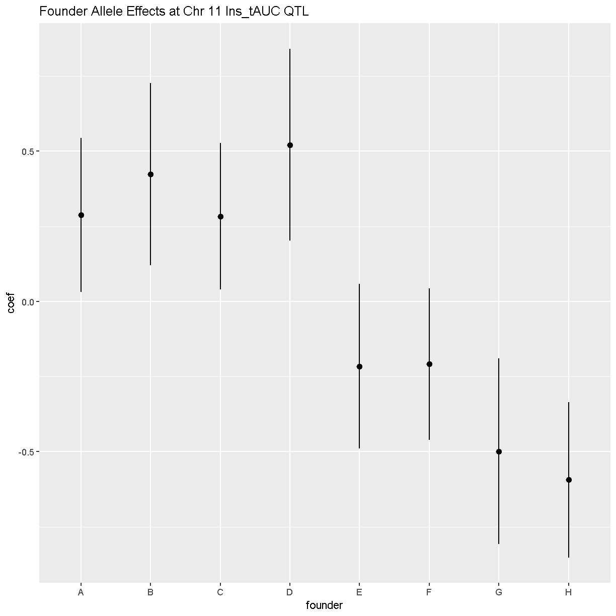
In this plot, you can see that DO mice carrying the four founder alleles on the left (A/J, c57BL/6J, 129S1/SvImJ, NOD/ShiLtJ) have higher Insulin tAUC values than DO mice carrying the other founders.
As a reference, here are the DO founder letter codes:
kable(data.frame(Letter = LETTERS[1:8],
                 Strain = c("A/J",       "C57BL/6J", "129S1/SvImJ", "NOD/ShiLtJ",
                            "NZO/HlLtJ", "CAST/EiJ", "PWK/PhJ",     "WSB/EiJ")))
| Letter | Strain |
|---|---|
| A | A/J |
| B | C57BL/6J |
| C | 129S1/SvImJ |
| D | NOD/ShiLtJ |
| E | NZO/HlLtJ |
| F | CAST/EiJ |
| G | PWK/PhJ |
| H | WSB/EiJ |
Challenge
Now choose another phenotype in
pheno_clinand perform the same steps.
1). Check the distribution. Does it need transforming? If so, how would you do it? 2). Are there any sex, batch, diet effects?
3). Run a genome scan with the genotype probabilities and kinship provided.
4). Plot the genome scan for this phenotype.
5). Find the peaks above LOD score of 6.Solution
Replace
<pheno name>with your choice of phenotype#1). hist(pheno_clin$<pheno name>) pheno_clin$<pheno name>_log <- log(pheno_clin$<pheno name>) hist(pheno_clin$<pheno name>_log) #2). tmp = pheno_clin %>% dplyr::select(mouse, sex, DOwave, diet_days, <pheno name>) %>% gather(phenotype, value, -mouse, -sex, -DOwave, -diet_days) %>% group_by(phenotype) %>% nest() mod_fxn = function(df) { lm(value ~ sex + DOwave + diet_days, data = df) } tmp = tmp %>% mutate(model = map(data, mod_fxn)) %>% mutate(summ = map(model, tidy)) %>% unnest(summ) tmp tmp %>% filter(term != "(Intercept)") %>% mutate(neg.log.p = -log10(p.value)) %>% ggplot(aes(term, neg.log.p)) + geom_point() + facet_wrap(~phenotype) + labs(title = "Significance of Sex, Wave & Diet Days on Phenotypes") + theme(axis.text.x = element_text(angle = 90, hjust = 1, vjust = 0.5)) + rm(tmp) #3). qtl = scan1(genoprobs = probs, pheno = pheno_clin[,"<pheno name>", drop = FALSE], kinship = K, addcovar = covar) #4). plot_scan1(x = qtl, map = map, lodcolumn = "<pheno name>") abline(h = 6, col = 2, lwd = 2) #5). peaks = find_peaks(scan1_output = qtl, map = map, threshold = lod_threshold, peakdrop = 4, prob = 0.95)
Key Points
To understand the key steps running a QTL mapping analysis
Mapping A Single Gene Expression Trait
Overview
Teaching: 30 min
Exercises: 30 minQuestions
How do I map one gene expression trait?
Objectives
QTL mapping of an expression data set
In this tutorial, we are going to use the gene expression data as our phenotype to map QTLs. That is, we are looking to find any QTLs (cis or trans) that are responsible for variation in gene expression across samples.
We are using the same directory as our previous tutorial, which you can check by typing getwd() in the Console. If you are not in the correct directory, type in setwd("code") in the console or Session -> Set Working Directory -> Choose Directory in the RStudio menu to set your working directory to the main directory.
If you have started a new R session, you will need to load the libraries again. If you haven’t, the libraries listed below are already loaded.
Load Libraries
library(tidyverse)
library(knitr)
library(broom)
library(qtl2)
Load Data
In this lesson, we are loading in gene expression data for 21,771 genes: attie_DO500_expr.datasets.RData that includes normalised and raw gene expression data. dataset.islet.rnaseq is the dataset you can download directly from Dryad. Again, if you are using the same R session, you will not need to the load the mapping, phenotypes and genotype probabilities data, again.
# expression data
load("../data/attie_DO500_expr.datasets.RData")

# data from paper
load("../data/dataset.islet.rnaseq.RData")

# phenotypes
load("../data/attie_DO500_clinical.phenotypes.RData")

# mapping data
load("../data/attie_DO500_mapping.data.RData")

# genotype probabilities
probs = readRDS("../data/attie_DO500_genoprobs_v5.rds")
Expression Data
Raw gene expression counts are in the counts data object. These counts have been normalised and saved in the norm data object. More information is about normalisation is here.
To view the contents of either one of these data , click the table on the right hand side either norm or counts in the Environment tab. If you type in names(counts), you will see the names all start with ENSMUSG. These are Ensembl IDs. If we want to see which gene these IDs correspond to, type in dataset.islet.rnaseq$annots, which gives information about each gene, including ensemble id, gene symbol as well as start & stop location of the gene and chromsome on which the gene lies.
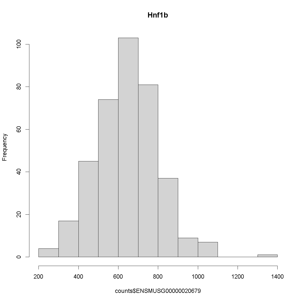
Because we are working with the insulin tAUC phenotype, let’s map the expression counts for Hnf1b which is known to influence this phenotype is these data. First, we need to find the Ensembl ID for this gene:
dataset.islet.rnaseq$annots[dataset.islet.rnaseq$annots$symbol == "Hnf1b",]
                              gene_id symbol chr    start      end strand
ENSMUSG00000020679 ENSMUSG00000020679  Hnf1b  11 83.85006 83.90592      1
                     middle nearest.marker.id        biotype       module
ENSMUSG00000020679 83.87799       11_84097611 protein_coding midnightblue
                   hotspot
ENSMUSG00000020679    <NA>
We can see that the ensembl ID of Hnf1b is ENSMUSG00000020679. If we check the distribution for Hnf1b expression data between the raw and normalised data, we can see there distribution has been corrected. Here is the distribution of the raw counts:
hist(counts$ENSMUSG00000020679, main = "Hnf1b")
and here is the distribution of the normalised counts:
hist(norm$ENSMUSG00000020679, main = "Hnf1b")
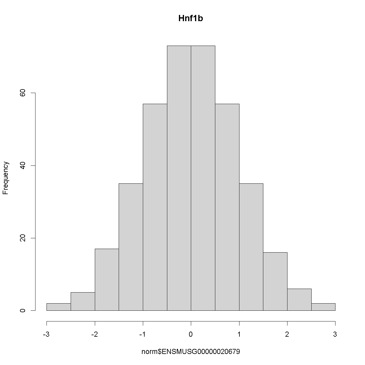
The histogram indicates that distribution of these counts are normalised.
The Marker Map
We are using the same marker map as in the previous lesson
Genotype probabilities
We have explored this earlier in th previous lesson. But, as a reminder, we have already calculated genotype probabilities which we loaded above called probs. This contains the 8 state genotype probabilities using the 69k grid map of the same 500 DO mice that also have clinical phenotypes.
Kinship Matrix
We have explored the kinship matrix in the previous lesson. It has already been calculated and loaded in above.
Covariates
Now let’s add the necessary covariates. For Hnf1b expression data, let’s see which covariates are significant.
###merging covariate data and expression data to test for sex, wave and diet_days.

cov.counts <- merge(covar, norm, by=c("row.names"), sort=F)

#testing covairates on expression data

tmp = cov.counts %>%
        dplyr::select(mouse, sex, DOwave, diet_days, ENSMUSG00000020679) %>%
        gather(expression, value, -mouse, -sex, -DOwave, -diet_days) %>%
        group_by(expression) %>%
        nest()
mod_fxn = function(df) {
  lm(value ~ sex + DOwave + diet_days, data = df)
}
tmp = tmp %>%
  mutate(model = map(data, mod_fxn)) %>%
  mutate(summ = map(model, tidy)) %>%
  unnest(summ)
#  kable(tmp, caption = "Effects of Sex, Wave & Diet Days on Expression")

tmp
# A tibble: 4 x 8
# Groups:   expression [1]
  expression         data     model  term      estimate std.e~1 stati~2  p.value
  <chr>              <list>   <list> <chr>        <dbl>   <dbl>   <dbl>    <dbl>
1 ENSMUSG00000020679 <tibble> <lm>   (Interce~ -1.70    0.506     -3.36 8.72e- 4
2 ENSMUSG00000020679 <tibble> <lm>   sexM      -0.199   0.0824    -2.42 1.60e- 2
3 ENSMUSG00000020679 <tibble> <lm>   DOwave     0.510   0.0370    13.8  3.73e-35
4 ENSMUSG00000020679 <tibble> <lm>   diet_days  0.00403 0.00386    1.04 2.97e- 1
# ... with abbreviated variable names 1: std.error, 2: statistic
tmp %>%
  filter(term != "(Intercept)") %>%
  mutate(neg.log.p = -log10(p.value)) %>%
  ggplot(aes(term, neg.log.p)) +
    geom_point() +
    facet_wrap(~expression) +
    labs(title = "Significance of Sex, Wave & Diet Days on Expression") +
    theme(axis.text.x = element_text(angle = 90, hjust = 1, vjust = 0.5)) +
rm(tmp)

We can see that sex and DOwave are significant. Here DOwave is the group or batch number as not all mice were submitted for genotyping at the same time. Because of this, we now have to correct for it. Considering the paper included the covariate, diet_days, we will include that as well.
# convert sex and DO wave (batch) to factors
pheno_clin$sex = factor(pheno_clin$sex)
pheno_clin$DOwave = factor(pheno_clin$DOwave)
pheno_clin$diet_days = factor(pheno_clin$DOwave)

covar = model.matrix(~sex + DOwave + diet_days, data = pheno_clin)[,-1]
Performing a genome scan
[Permutations]
First, we need to work out the signifcance level. Let’s find the signifance level for 0.1, 0.05 and 0.01.
operm <- scan1perm(genoprobs = probs,
                   pheno = norm[,"ENSMUSG00000020679", drop = FALSE],
                   addcovar=covar,
                   n_perm=1000)
Note DO NOT RUN THIS (it will take too long). Instead, I have run it earlier and will load it in here. We will also perform a summary to find the summary level for 0.1, 0.05 and 0.01
load("../data/operm_ENSMUSG00000020679_1000.Rdata")

summary(operm,alpha=c(0.1, 0.05, 0.01))
LOD thresholds (1000 permutations)
     ENSMUSG00000020679
0.1                7.29
0.05               7.73
0.01               8.30
Genome Scan
qtl = scan1(genoprobs = probs,
            pheno = norm[,"ENSMUSG00000020679", drop = FALSE],
            kinship = K,
            addcovar = covar)
Next, we plot the genome scan.
plot_scan1(x = qtl,
           map = map,
           lodcolumn = "ENSMUSG00000020679",
           main = colnames(qtl))
           add_threshold(map,  summary(operm, alpha=0.1), col = 'purple')
           add_threshold(map,  summary(operm, alpha=0.05), col = 'red')
           add_threshold(map,  summary(operm, alpha=0.01), col = 'blue')
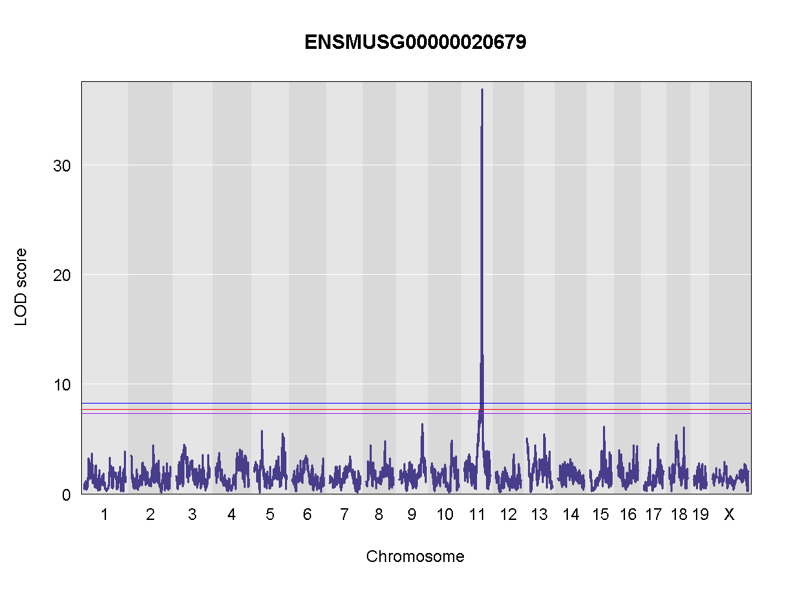
Finding LOD peaks
Let’s find LOD peaks
lod_threshold = summary(operm, alpha=0.01)
peaks = find_peaks(scan1_output = qtl,
                   map = map,
                   threshold = lod_threshold,
                   peakdrop = 4, prob = 0.95)
kable(peaks %>%
        dplyr::select(-lodindex) %>%
        arrange(chr, pos), caption = "Phenotype QTL Peaks with LOD >= 6")
Table: Phenotype QTL Peaks with LOD >= 6
| lodcolumn | chr | pos | lod | ci_lo | ci_hi |
|---|---|---|---|---|---|
| ENSMUSG00000020679 | 11 | 84.40138 | 36.87894 | 83.64714 | 84.40138 |
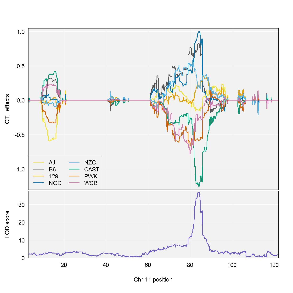
QTL effects
blup <- scan1blup(genoprobs=probs[,peaks$chr[1]],
                  norm[,peaks$lodcolumn[1], drop=FALSE])

plot_coefCC(blup,
       map=map,
       columns=1:8,
       bgcolor="gray95",
       legend="bottomleft",
       scan1_output = qtl )
Challenge
Now choose another gene expression trait in
normdata object and perform the same steps.
1). Check the distribution of the raw counts and normalised counts 2). Are there any sex, batch, diet effects?
3). Run a genome scan with the genotype probabilities and kinship provided.
4). Plot the genome scan for this gene.
5). Find the peaks above LOD score of 6.Solution
Replace
<ensembl id>with your choice of gene expression trait#1). hist(pheno_clin$<ensembl id>) pheno_clin$<ensembl id>_log <- log(pheno_clin$<ensembl id>) hist(pheno_clin$<ensembl id>_log) #2). tmp = pheno_clin %>% dplyr::select(mouse, sex, DOwave, diet_days, <ensembl id>) %>% gather(expression, value, -mouse, -sex, -DOwave, -diet_days) %>% group_by(expression) %>% nest() mod_fxn = function(df) { lm(value ~ sex + DOwave + diet_days, data = df) } tmp = tmp %>% mutate(model = map(data, mod_fxn)) %>% mutate(summ = map(model, tidy)) %>% unnest(summ) tmp tmp %>% filter(term != "(Intercept)") %>% mutate(neg.log.p = -log10(p.value)) %>% ggplot(aes(term, neg.log.p)) + geom_point() + facet_wrap(~expression) + labs(title = "Significance of Sex, Wave & Diet Days on Phenotypes") + theme(axis.text.x = element_text(angle = 90, hjust = 1, vjust = 0.5)) + rm(tmp) #3). qtl = scan1(genoprobs = probs, pheno = pheno_clin[,"<ensembl id>", drop = FALSE], kinship = K, addcovar = covar) #4). plot_scan1(x = qtl, map = map, lodcolumn = "<ensembl id>") abline(h = 6, col = 2, lwd = 2) #5). peaks = find_peaks(scan1_output = qtl, map = map, threshold = lod_threshold, peakdrop = 4, prob = 0.95)
Key Points
To run a QTL analysis for expression data
Mapping Many Gene Expression Traits
Overview
Teaching: 30 min
Exercises: 30 minQuestions
How do I map many genes?
Objectives
To map several genes at the same time
Load Libraries
For this lesson, we need to install two more libraries and load them. You can do this by typing the following code:
BiocManager::install(c("AnnotationHub","rtracklayer"))
Let’s install our libraries, and source two other R scripts.
library(tidyverse)
library(knitr)
library(broom)
library(qtl2)
library(qtl2ggplot)
library(RColorBrewer)

source("../code/gg_transcriptome_map.R")
source("../code/qtl_heatmap.R")
Before we begin this lesson, we need to create another directory called results in our main directory. You can do this by clicking on the “Files” tab and navigate into the main directory. Then select “New Folder” and name it “results”.
Load Data
# expression data
load("../data/attie_DO500_expr.datasets.RData")

# data from paper
load("../data/dataset.islet.rnaseq.RData")

# phenotypes
load("../data/attie_DO500_clinical.phenotypes.RData")

# mapping data
load("../data/attie_DO500_mapping.data.RData")

# genotype probabilities
probs = readRDS("../data/attie_DO500_genoprobs_v5.rds")
Data Selection
For this lesson, lets choose a random set of 50 gene expression phenotypes.
genes = colnames(norm)

sams <- sample(length(genes), 50, replace = FALSE, prob = NULL)
genes <- genes[sams]

gene.info <- dataset.islet.rnaseq$annots[genes,]
rownames(gene.info) = NULL
kable(gene.info[1:10,])
| gene_id | symbol | chr | start | end | strand | middle | nearest.marker.id | biotype | module | hotspot |
|---|---|---|---|---|---|---|---|---|---|---|
| ENSMUSG00000028182 | Lrriq3 | 3 | 155.09343 | 155.19428 | 1 | 155.14386 | 3_155141204 | protein_coding | brown | NA |
| ENSMUSG00000025437 | Usp33 | 3 | 152.34648 | 152.39361 | 1 | 152.37005 | 3_152372563 | protein_coding | pink | NA |
| ENSMUSG00000022354 | Ndufb9 | 15 | 58.93381 | 58.93949 | 1 | 58.93665 | 15_58956707 | protein_coding | blue | NA |
| ENSMUSG00000086905 | Gm13716 | 2 | 85.19693 | 85.19867 | 1 | 85.19780 | 2_85202802 | antisense | grey | NA |
| ENSMUSG00000022812 | Gsk3b | 16 | 38.08900 | 38.24608 | 1 | 38.16754 | 16_38137342 | protein_coding | midnightblue | NA |
| ENSMUSG00000018974 | Sart3 | 5 | 113.74245 | 113.77165 | -1 | 113.75705 | 5_113653421 | protein_coding | purple | NA |
| ENSMUSG00000021013 | Ttc8 | 12 | 98.92057 | 98.98324 | 1 | 98.95191 | 12_98904979 | protein_coding | grey | NA |
| ENSMUSG00000075558 | Gm17151 | 10 | 80.76686 | 80.76899 | -1 | 80.76792 | 10_80824573 | antisense | grey | NA |
| ENSMUSG00000049699 | Ucn2 | 9 | 108.98616 | 108.98716 | 1 | 108.98666 | 9_108986207 | protein_coding | grey | NA |
| ENSMUSG00000050534 | Htr5b | 1 | 121.50984 | 121.52846 | -1 | 121.51915 | 1_121401626 | protein_coding | grey | NA |
Expression Data
Lets check the distribution for the first 20 gene expression phenotypes. If you would like to check the distribution of all 50 genes, change for(gene in genes[1:20]) in the code below to for(gene in genes).
par(mfrow=c(3,4))
for(gene in genes[1:20]){
  hist(norm[,gene], main = gene)
  }
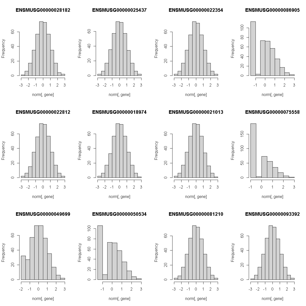
Check the distributions. Do they all have a normal distribution?
You will notice that the distribtion of some genes are skewed to the left. This means that that only a small amount of samples have data and therefore, will need to be removed. A suitable qc would be keeping expression data that have at least 5% of the samples with more than 10 reads.
genes_qc <- which(as.numeric(colSums(counts[,genes] > 10)) >= 0.05 * nrow(counts[,genes]))
genes <- genes[genes_qc]
The Marker Map
We are using the same marker map as in the previous lesson
Genotype probabilities
We have explored this earlier in th previous lesson. But, as a reminder, we have already calculated genotype probabilities which we loaded above called probs. This contains the 8 state genotype probabilities using the 69k grid map of the same 500 DO mice that also have clinical phenotypes.
Kinship Matrix
We have explored the kinship matrix in the previous lesson. It has already been calculated and loaded in above.
Covariates
Now let’s add the necessary covariates. For these 50 gene expression data, we will correct for DOwave,sex and diet_days.
# convert sex and DO wave (batch) to factors
pheno_clin$sex = factor(pheno_clin$sex)
pheno_clin$DOwave = factor(pheno_clin$DOwave)
pheno_clin$diet_days = factor(pheno_clin$DOwave)

covar = model.matrix(~sex + DOwave + diet_days, data = pheno_clin)[,-1]
Performing a genome scan
Now lets perform the genome scan! We are also going to save our qtl results in an Rdata file to be used in further lessons. We will not perform permutations in this lesson as it will take too long. Instead we will use 6, which is the LOD score used in the paper to determine significance.
QTL Scans
qtl.file = "../results/gene.norm_qtl_cis.trans.Rdata"

if(file.exists(qtl.file)) {
  load(qtl.file)
  } else {
    qtl = scan1(genoprobs = probs,
                pheno = norm[,genes, drop = FALSE],
                kinship = K,
                addcovar = covar,
                cores = 2)
    save(qtl, file = qtl.file)
    }
QTL plots
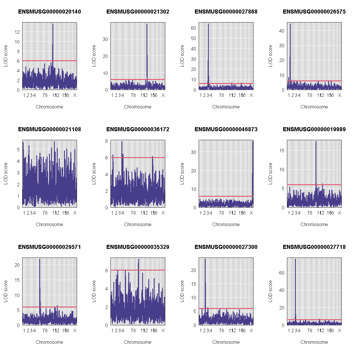
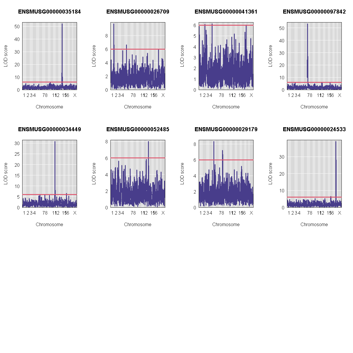
Let’s plot the first 20 gene expression phenotypes. If you would like to plot all 50, change for(i in 1:20) in the code below to for(i in 1:ncol(qtl)).
par(mfrow=c(3,4))
for(i in 1:20) {
  plot_scan1(x = qtl,
             map = map,
             lodcolumn = i,
             main = colnames(qtl)[i])
  abline(h = 6, col = 2, lwd = 2)
  }
QTL Peaks
We are also going to save our peak results so we can use these again else where. First, lets get out peaks with a LOD score greater than 6.
lod_threshold = 6
peaks = find_peaks(scan1_output = qtl,
                   map = map,
                   threshold = lod_threshold,
                   peakdrop = 4,
                   prob = 0.95)
We will save these peaks into a csv file.
kable(peaks[1:10,] %>%
        dplyr::select(-lodindex) %>%
        arrange(chr, pos), caption = "Expression QTL (eQTL) Peaks with LOD >= 6")

write_csv(peaks, "../results/gene.norm_qtl_peaks_cis.trans.csv")
Table: Phenotype QTL Peaks with LOD >= 6
| lodcolumn | chr | pos | lod | ci_lo | ci_hi |
|---|---|---|---|---|---|
| ENSMUSG00000026575 | 1 | 58.22118 | 8.209107 | 57.626420 | 59.24670 |
| ENSMUSG00000026575 | 1 | 159.09013 | 27.718407 | 156.733003 | 159.16100 |
| ENSMUSG00000026575 | 1 | 164.84588 | 44.516456 | 163.460361 | 164.85502 |
| ENSMUSG00000027868 | 3 | 92.66069 | 28.519024 | 91.152799 | 92.68765 |
| ENSMUSG00000027868 | 3 | 98.14651 | 63.870847 | 98.144249 | 99.88818 |
| ENSMUSG00000020140 | 10 | 115.85360 | 13.645956 | 115.451100 | 115.89945 |
| ENSMUSG00000027868 | 11 | 106.62472 | 6.454471 | 9.144667 | 107.71252 |
| ENSMUSG00000021302 | 13 | 14.93271 | 39.030453 | 13.564744 | 14.93875 |
| ENSMUSG00000026575 | 15 | 12.40748 | 6.070807 | 9.260173 | 18.72732 |
| ENSMUSG00000027868 | 15 | 66.27724 | 6.502607 | 65.853995 | 67.86561 |
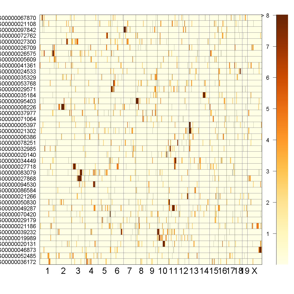
QTL Peaks Figure
qtl_heatmap(qtl = qtl, map = map, low.thr = 3.5)
Challenge
What do the qtl scans for all gene exression traits look like? Note: Don’t worry, we’ve done the qtl scans for you!!! You can read in this file,
../data/gene.norm_qtl_all.genes.Rdata, which are thescan1results for all gene expression traits.Solution
load("../data/gene.norm_qtl_all.genes.Rdata")

lod_threshold = 6
peaks = find_peaks(scan1_output = qtl.all,
               map = map,
               threshold = lod_threshold,
               peakdrop = 4,
               prob = 0.95)
write_csv(peaks, "../results/gene.norm_qtl_all.genes_peaks.csv")

## Heat Map
qtl_heatmap(qtl = qtl, map = map, low.thr = 3.5)
Key Points
Creating A Transcriptome Map
Overview
Teaching: 30 min
Exercises: 30 minQuestions
How do I create and interpret a transcriptome map?
Objectives
Describe a transcriptome map.
Interpret a transcriptome map.
Load Libraries
library(tidyverse)
library(qtl2)
library(qtl2convert)
library(RColorBrewer)
library(qtl2ggplot)

source("../code/gg_transcriptome_map.R")
Load Data
Load in the LOD peaks over 6 from previous lesson.
# REad in the LOD peaks from the previous lesson.
lod_summary <- read.csv("../results/gene.norm_qtl_peaks_cis.trans.csv")
In order to use the ggtmap function, we need to provide specific column names. These are documented in the “gg_transcriptome_map.R” file in the code directory of this workshop. The required column names are:
- data: data.frame (or tibble) with the following columns:
- ensembl: (required) character string containing the Ensembl gene ID.
- qtl_chr: (required) character string containing QTL chromsome.
- qtl_pos: (required) floating point number containing the QTL position in Mb.
- qtl_lod: (optional) floating point number containing the LOD score.
- gene_chr: (optional) character string containing transcript chromosome.
- gene_start: (optional) character string containing transcript start postion in Mb.
- gene_end: (optional) character string containing transcript end position in Mb.
# Get gene positions.
ensembl <- get_ensembl_genes()
df <- data.frame(ensembl    = ensembl$gene_id,
                 gene_chr   = seqnames(ensembl),
                 gene_start = start(ensembl) * 1e-6,
                 gene_end   = end(ensembl)   * 1e-6,
                 stringsAsFactors = F)

lod_summary <- lod_summary %>%
                 rename(lodcolumn = "ensembl",
                        chr       = "qtl_chr",
                        pos       = "qtl_pos",
                        lod       = "qtl_lod") %>%
                 left_join(df, by = "ensembl") %>%
                 mutate(marker.id = str_c(qtl_chr, qtl_pos * 1e6, sep = "_"),
                        gene_chr  = factor(gene_chr, levels = c(1:19, "X")),
                        qtl_chr   = factor(qtl_chr, levels = c(1:19, "X")))

rm(df)
Some of the genes will have a QTL in the same location as the gene and others will have a QTL on a chromosome where the gene is not located.
Challenge
a. What do we call eQTL that are co-colocated with the gene? b. What do we call eQTL that are located on a different chromosome than the gene?
Solution
a. A cis-eQTL is an eQTL that is co-colocated with the gene. b. A trans-eQTL is an eQTL that is located on a chromosome other than the gene that was mapped.
We can tabluate the number of cis- and trans-eQTL that we have and add this to our QTL summary table. A cis-eQTL occurs when the QTL peaks is directly over the gene position. But what if it is 2 Mb away? Or 10 Mb? It’s possible that a gene may have a trans eQTL on the same chromosome if the QTL is “far enough” from the gene. We have selected 4 Mb as a good rule of thumb.
lod_summary <- lod_summary %>%
                     mutate(cis = if_else(qtl_chr == gene_chr & abs(gene_start - qtl_pos) < 4, "cis", "trans"))
count(lod_summary, cis)
    cis  n
1   cis 33
2 trans 55
Plot Transcriptome Map
ggtmap(data = lod_summary %>% filter(qtl_lod >= 7.18), cis.points = TRUE, cis.radius = 4)
The plot above is called a “Transcriptome Map” because it shows the postions of the genes (or transcripts) and their corresponding QTL. The QTL position is shown on the X-axis and the gene position is shown on the Y-axis. The chromosomes are listed along the top and right of the plot. What type of QTL are the genes with QTL that are located along the diagonal?
Key Points
Transcriptome maps aid in understanding gene expression regulation.
Transcriptome Map of cis and trans eQTL
Overview
Teaching: 10 min
Exercises: 20 minQuestions
How do I create a full transcriptome map?
Objectives
Load Libraries
library(tidyverse)
library(qtl2)
library(knitr)
library(RColorBrewer)
library(qtl2ggplot)

source("../code/gg_transcriptome_map.R")
Load Data
Load in the RNA-seq eQTL mapping results.
##loading previous results
load("../data/dataset.islet.rnaseq.RData")
Next, we need to format the column names of our eQTL results to that the ggtmap function can use the results.
lod_summary = dataset.islet.rnaseq$lod.peaks

# Get gene positions.
ensembl <- get_ensembl_genes()
df <- data.frame(ensembl    = ensembl$gene_id,
                 gene_chr   = seqnames(ensembl),
                 gene_start = start(ensembl) * 1e-6,
                 gene_end   = end(ensembl)   * 1e-6,
                 stringsAsFactors = F)

# Create eQTL table for transcriptome map function.
lod_summary <- lod_summary %>%
                 rename(annot.id  = "ensembl",
                        chrom     = "qtl_chr",
                        pos       = "qtl_pos",
                        lod       = "qtl_lod") %>%
                 left_join(df, by = "ensembl") %>%
                 mutate(marker.id = str_c(qtl_chr, qtl_pos * 1e6, sep = "_"),
                        gene_chr  = factor(gene_chr, levels = c(1:19, "X")),
                        qtl_chr   = factor(qtl_chr, levels = c(1:19, "X"))) %>%
                 mutate(cis = if_else(qtl_chr == gene_chr & abs(gene_start - qtl_pos) < 4, "cis", "trans"))

rm(df)
Plot Transcriptome Map
In the previous lesson, we mapped the QTL locations of 50 genes. In this lesson, we will map the QTL positions of 39958 genes.
ggtmap(data = lod_summary %>% filter(qtl_lod >= 7.18), cis.points = TRUE, cis.radius = 4)
This transcriptome map is definitely a lot more crowded than the one in the previous lesson. Again, the gene locations are shown on the X-axis and the QTL locations are shown on the Y-axis.
Challenge
What patterns among the points do you see in the transcriptome map?
Solution
There are at least two patterns. One is the dense diagonal line of cis-eQTL. The other is the increased density of QTL in vertical lines.
Challenge
What would a vertical band in the transcriptome map mean?
Solution
A vertical band indicates that one locus regulates the expression of many genes.
Challenge
What would a horizontal band in the transcriptome map mean?
Solution
A horizontal band would mean that one gene has strong QTL on many chromosomes. While one gene might be regulated by more than one locus, it is unlikely that dozens of loci would have strong QTL for one gene. So a horizontal band would mean that there is a problem with the data.
Look at the transcriptome map. How many vertical bands do you see and which chromosomes are they on?
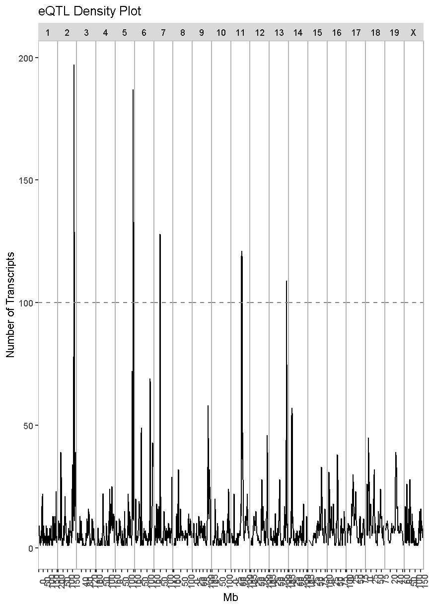
QTL Density Plot
In the transcriptome map above, we noticed vertical banding patterns in the eQTL, which indicate that one locus may regulate the expression of dozens of genes. How many genes are regulated by each locus and which genes are they? In order to address this question, we need to make a plot of the density of eQTL along the genome. This is like stacking up the eQTL onto the X-axis.
We have provided a function to do this in the “gg_transcriptome_map.R” file in the “code” directory of this lesson. The function is called eqtl_density_plot and takes the following arguments:
- data: data.frame (or tibble) with the following columns:
- ensembl: (required) character string containing the Ensembl gene ID.
- qtl_chr: (required) character string containing QTL chromsome.
- qtl_pos: (required) floating point number containing the QTL position in Mb.
- qtl_lod: (optional) floating point number containing the LOD score.
- gene_chr: (optional) character string containing transcript chromosome.
- gene_start: (optional) character string containing transcript start postion in Mb.
- gene_end: (optional) character string containing transcript end position in Mb.
- lod_thr: numeric value that is the LOD above which QTL will be retained. Default = 7.
This function has been designed to use the same data structure as we used to create the transcriptome map. First, we will look at the overall QTL density for all peaks with LOD > 7.18.
eqtl_density_plot(data = lod_summary, lod_thr = 7.18)
`summarise()` has grouped output by 'qtl_chr'. You can override using the `.groups` argument.
`summarise()` has grouped output by 'qtl_chr'. You can override using the `.groups` argument.
`summarise()` has grouped output by 'qtl_chr'. You can override using the `.groups` argument.
`summarise()` has grouped output by 'qtl_chr'. You can override using the `.groups` argument.
There are clearly some loci that have an enrichment of eQTL. We have drawn a dashed line at “100” as an aribtrary cutoff as a potential cutoff to use when selecting peaks.
Compare this plot with the transcriptome map, in which we saw vertical bands of eQTL. Do the peaks in the eQTL density plot match the bands in the transcriptome map?
Next, we will look at the locations of the cis-eQTL. We must also select a LOD threshold. We will use 7.18 since this is what was used in the Keller et al. paper.
eqtl_density_plot(data = filter(lod_summary, cis == "cis"), lod_thr = 7.18)
`summarise()` has grouped output by 'qtl_chr'. You can override using the `.groups` argument.
`summarise()` has grouped output by 'qtl_chr'. You can override using the `.groups` argument.
`summarise()` has grouped output by 'qtl_chr'. You can override using the `.groups` argument.
`summarise()` has grouped output by 'qtl_chr'. You can override using the `.groups` argument.
In the plot above, there are many loci that have many genes associated with their expression. Some loci have over 100 genes associated with them. For example, there is a locus on chromosome 17 that may regulate over 100 genes. In this case, we are looking at cis-eQTL, QTL which are co-located with the gene. What might this mean biologically? Perhaps there is a mutation which causes a region of chromatin to open, which leads to increased expression of a set of genes. This increased expression may have biological consequences.
Next, we will create an eQTL density plot of the trans-eQTL. These are QTL for which the gene and QTL are far from each other.
eqtl_density_plot(data = filter(lod_summary, cis == "trans"), lod_thr = 7.18)
`summarise()` has grouped output by 'qtl_chr'. You can override using the `.groups` argument.
`summarise()` has grouped output by 'qtl_chr'. You can override using the `.groups` argument.
`summarise()` has grouped output by 'qtl_chr'. You can override using the `.groups` argument.
`summarise()` has grouped output by 'qtl_chr'. You can override using the `.groups` argument.
In this case, we see much taller peaks than in the cis-eQTL density plot and these peaks match the ones in the overall eQTL density plot.
There are many potential explanations for a trans-eQTL band. There may be a polymorphism in a transcription factor which alters the expression of many other genes. Or there may be a polymorphism that alters an amino acid and prevents it from binding properly to another protein in a signalling cascade. Biologists are often interested in these trans-eQTL bands, which are called “eQTL hotspots”. A set of over 100 genes with differential expression between genotypes may help us to understand the biology behind variation in higher level phenotypes. It is also possible that one of the genes with a cis-eQTL under the eQTL hotspot regulates the expression of the remaining hotspot genes.
Islet RNASeq eQTL Hotspots
Select eQTL Hotspots
There are several decisions to make when selecting eQTL hotspots. What LOD threshold should you use to select the genes that comprise hotspots? What number of genes should you use as a threshold to call a peak an eQTL hotspot? In this case, the authors select a LOD of 7.18 and decided that 100 trans-regulated genes was a useful threshold.
TBD: Add references for eQTL module selection. Possibly augment lesson?
In order to identify eQTL hotspots, we will look at the density of trans-eQTL along the genome using the density function. We will filter to retain QTL with LOD > 7.8 and will get the position on each chromosome with the highest density of eQTL.
qtl_dens = lod_summary %>%
             filter(qtl_lod > 7.18 & cis == 'trans') %>%
             group_by(qtl_chr) %>%
             summarize(dens_x = density(qtl_pos, adjust = 0.1)$x,
                       dens_y = density(qtl_pos, adjust = 0.1)$y) %>%
             slice_max(dens_y, n = 1)
`summarise()` has grouped output by 'qtl_chr'. You can override using the
`.groups` argument.
qtl_dens
# A tibble: 20 x 3
# Groups:   qtl_chr [20]
   qtl_chr dens_x dens_y
   <fct>    <dbl>  <dbl>
 1 1         40.0 0.0178
 2 2        164.  0.0797
 3 3        100.  0.0213
 4 4        136.  0.0246
 5 5        147.  0.114
 6 6        125.  0.0530
 7 7         45.7 0.117
 8 8         34.0 0.0420
 9 9        108.  0.0581
10 10       121.  0.0384
11 11        71.5 0.162
12 12       113.  0.0626
13 13       112.  0.129
14 14        19.6 0.0890
15 15        76.3 0.0765
16 16        57.0 0.0448
17 17        31.3 0.0442
18 18        12.1 0.0616
19 19        37.8 0.159
20 X         50.4 0.0256
In the table above, there is one row per chromosome. ‘x’ is the position on each chromosome with the highest density of eQTL. ‘y’ is the density, which we needed to obtain the ‘x’ position but is not used further.
Now that we have the location of maximum eQTL density on each chromosome, we will count the number of eQTL within +/- 2 Mb of the center.
hotspots = left_join(lod_summary, select(qtl_dens, qtl_chr, dens_x)) %>%
             filter(qtl_lod > 7.18 & cis == 'trans') %>%
             mutate(pos_diff = abs(dens_x - qtl_pos)) %>%
             filter(pos_diff <= 2) %>%
             select(-pos_diff) %>%
             rename(dens_x = 'center')
Joining, by = "qtl_chr"
head(hotspots)
             ensembl   marker.id qtl_chr   qtl_pos   qtl_lod gene_chr
1 ENSMUSG00000037933 5_147253583       5 147.25358  8.581871       13
2 ENSMUSG00000037944 16_57539943      16  57.53994  7.496052       11
3 ENSMUSG00000037966 6_125504286       6 125.50429  9.288287       13
4 ENSMUSG00000037996 9_108975487       9 108.97549  8.870252        4
5 ENSMUSG00000038009 2_164027702       2 164.02770 13.722130       15
6 ENSMUSG00000038011 11_72996574      11  72.99657  8.085680        5
  gene_start  gene_end   cis    center
1   49.34158  49.38703 trans 147.17681
2   99.14420  99.15508 trans  57.03061
3   49.18748  49.19624 trans 125.27843
4   86.98312  87.23048 trans 108.41948
5   99.09317  99.10474 trans 163.96464
6  124.72508 124.83431 trans  71.47168
Now that we have a list of genes near the position of highest eQTL density on each chromosome, we can count the number of genes in each potential hotspot and retain the ones containing more than 100 genes.
hotspots = hotspots %>%
             count(qtl_chr, center) %>%
             filter(n >= 100)
kable(hotspots, caption = "Islet trans-eQTL hotspots")
Table: Islet trans-eQTL hotspots
| qtl_chr | center | n |
|---|---|---|
| 2 | 163.96464 | 197 |
| 5 | 147.17681 | 136 |
| 7 | 45.74287 | 125 |
| 11 | 71.47168 | 163 |
| 13 | 112.17218 | 108 |
Chr 11 eQTL Hotspot
From this analysis, we have identified five eQTL hotspots. Due to time constraints, we will not examine all of them in depth. We will look at the chromosome 11 eQTL hotspot in greater depth. It contains 163 trans-eQTL. First, we will get all of the genes with an eQTL in within +/- 2 Mb of the chromosome 11 eQTL hotspot.
chr11_mid =  hotspots %>%
               filter(qtl_chr == '11') %>%
               pull(center)
chr11_eqtl = lod_summary %>%
               filter(qtl_lod >  7.18 &
                      qtl_chr == '11' &
                      abs(chr11_mid - qtl_pos) < 2 &
                      !is.na(cis))
Next, we will filter to retain the cis-eQTL in the same interval. It is possible that one or more genes near 71.5 Mb on chromosome 11 have a cis-eQTL, which in turn alters the expression of the trans-eQTL genes.
chr11_cis = chr11_eqtl %>%
              filter(cis == 'cis')
kable(chr11_cis, caption = 'Chr 11 cis-eQTL')
Table: Chr 11 cis-eQTL
| ensembl | marker.id | qtl_chr | qtl_pos | qtl_lod | gene_chr | gene_start | gene_end | cis |
|---|---|---|---|---|---|---|---|---|
| ENSMUSG00000038046 | 11_73111862 | 11 | 73.11186 | 9.418198 | 11 | 76.24371 | 76.25062 | cis |
| ENSMUSG00000038195 | 11_71859513 | 11 | 71.85951 | 22.038342 | 11 | 75.51009 | 75.51317 | cis |
| ENSMUSG00000038268 | 11_73171837 | 11 | 73.17184 | 73.706247 | 11 | 75.17594 | 75.17884 | cis |
| ENSMUSG00000038351 | 11_73111862 | 11 | 73.11186 | 10.562423 | 11 | 74.84926 | 74.89706 | cis |
| ENSMUSG00000040483 | 11_72314268 | 11 | 72.31427 | 52.999651 | 11 | 72.30163 | 72.31373 | cis |
| ENSMUSG00000040554 | 11_72040688 | 11 | 72.04069 | 18.837109 | 11 | 72.02796 | 72.03751 | cis |
| ENSMUSG00000040599 | 11_71418821 | 11 | 71.41882 | 38.560032 | 11 | 71.01961 | 71.02737 | cis |
| ENSMUSG00000040667 | 11_71354568 | 11 | 71.35457 | 21.371028 | 11 | 70.94306 | 70.96997 | cis |
| ENSMUSG00000040746 | 11_70750402 | 11 | 70.75040 | 40.707077 | 11 | 70.64723 | 70.65142 | cis |
| ENSMUSG00000040904 | 11_71120660 | 11 | 71.12066 | 13.954750 | 11 | 70.23521 | 70.23983 | cis |
| ENSMUSG00000040938 | 11_70616235 | 11 | 70.61624 | 21.419463 | 11 | 70.21275 | 70.21642 | cis |
| ENSMUSG00000041165 | 11_72512588 | 11 | 72.51259 | 14.412941 | 11 | 69.82088 | 69.82218 | cis |
| ENSMUSG00000041329 | 11_69796313 | 11 | 69.79631 | 13.450483 | 11 | 69.59974 | 69.60594 | cis |
| ENSMUSG00000041346 | 11_69542556 | 11 | 69.54256 | 21.965771 | 11 | 69.56176 | 69.58025 | cis |
| ENSMUSG00000043602 | 11_70750402 | 11 | 70.75040 | 8.038654 | 11 | 70.76421 | 70.77293 | cis |
| ENSMUSG00000044367 | 11_70609170 | 11 | 70.60917 | 14.453236 | 11 | 70.21679 | 70.22106 | cis |
| ENSMUSG00000046731 | 11_69924127 | 11 | 69.92413 | 24.173013 | 11 | 69.87826 | 69.88141 | cis |
| ENSMUSG00000047284 | 11_72989681 | 11 | 72.98968 | 7.856942 | 11 | 69.90107 | 69.91382 | cis |
| ENSMUSG00000050675 | 11_71354568 | 11 | 71.35457 | 43.000217 | 11 | 70.63912 | 70.64204 | cis |
| ENSMUSG00000053574 | 11_72210521 | 11 | 72.21052 | 40.827446 | 11 | 72.21514 | 72.21844 | cis |
| ENSMUSG00000055670 | 11_72601385 | 11 | 72.60138 | 14.770236 | 11 | 72.79623 | 72.92712 | cis |
| ENSMUSG00000057054 | 11_69810287 | 11 | 69.81029 | 20.916548 | 11 | 70.68836 | 70.70015 | cis |
| ENSMUSG00000057135 | 11_69978753 | 11 | 69.97875 | 11.966446 | 11 | 70.79093 | 70.81259 | cis |
| ENSMUSG00000057778 | 11_72944065 | 11 | 72.94406 | 36.253118 | 11 | 72.77723 | 72.79614 | cis |
| ENSMUSG00000059796 | 11_69592546 | 11 | 69.59255 | 24.995852 | 11 | 69.66694 | 69.67242 | cis |
| ENSMUSG00000060216 | 11_71198629 | 11 | 71.19863 | 19.656292 | 11 | 70.43264 | 70.44083 | cis |
| ENSMUSG00000060600 | 11_69978753 | 11 | 69.97875 | 56.825370 | 11 | 70.65720 | 70.66251 | cis |
| ENSMUSG00000069814 | 11_73111862 | 11 | 73.11186 | 14.586188 | 11 | 74.61961 | 74.64152 | cis |
| ENSMUSG00000069830 | 11_71120660 | 11 | 71.12066 | 130.829473 | 11 | 71.09224 | 71.14470 | cis |
| ENSMUSG00000069835 | 11_69768364 | 11 | 69.76836 | 54.752195 | 11 | 69.62202 | 69.62387 | cis |
| ENSMUSG00000070390 | 11_69978753 | 11 | 69.97875 | 11.205844 | 11 | 71.15310 | 71.23073 | cis |
| ENSMUSG00000070394 | 11_69924127 | 11 | 69.92413 | 9.059992 | 11 | 69.83851 | 69.83962 | cis |
| ENSMUSG00000084139 | 11_71793079 | 11 | 71.79308 | 16.754042 | 11 | 70.90926 | 70.90964 | cis |
| ENSMUSG00000085178 | 11_69484146 | 11 | 69.48415 | 14.780695 | 11 | 69.40151 | 69.40270 | cis |
| ENSMUSG00000018286 | 11_69829176 | 11 | 69.82918 | 12.644749 | 11 | 70.52537 | 70.52786 | cis |
| ENSMUSG00000018442 | 11_71354568 | 11 | 71.35457 | 24.331853 | 11 | 71.00716 | 71.01984 | cis |
| ENSMUSG00000018446 | 11_71937774 | 11 | 71.93777 | 13.821042 | 11 | 70.97784 | 70.98303 | cis |
| ENSMUSG00000018449 | 11_71443287 | 11 | 71.44329 | 15.495242 | 11 | 70.97021 | 70.97783 | cis |
| ENSMUSG00000018451 | 11_71120660 | 11 | 71.12066 | 66.532115 | 11 | 71.03194 | 71.03351 | cis |
| ENSMUSG00000018559 | 11_69663280 | 11 | 69.66328 | 8.892792 | 11 | 69.98116 | 69.99060 | cis |
| ENSMUSG00000018565 | 11_70728481 | 11 | 70.72848 | 10.131916 | 11 | 69.96822 | 69.98252 | cis |
| ENSMUSG00000018566 | 11_69876397 | 11 | 69.87640 | 17.154645 | 11 | 69.94254 | 69.94819 | cis |
| ENSMUSG00000086976 | 11_69810287 | 11 | 69.81029 | 9.754274 | 11 | 70.61121 | 70.61321 | cis |
| ENSMUSG00000087523 | 11_71782692 | 11 | 71.78269 | 7.895661 | 11 | 70.65474 | 70.65649 | cis |
| ENSMUSG00000089876 | 11_69484146 | 11 | 69.48415 | 14.365592 | 11 | 69.80360 | 69.80562 | cis |
| ENSMUSG00000018570 | 11_69876397 | 11 | 69.87640 | 10.841222 | 11 | 69.89735 | 69.90099 | cis |
| ENSMUSG00000018740 | 11_69505599 | 11 | 69.50560 | 9.305293 | 11 | 68.96813 | 68.97437 | cis |
| ENSMUSG00000018750 | 11_70785072 | 11 | 70.78507 | 10.780532 | 11 | 69.76591 | 69.78402 | cis |
| ENSMUSG00000018752 | 11_69484146 | 11 | 69.48415 | 19.739891 | 11 | 69.68258 | 69.69610 | cis |
| ENSMUSG00000018761 | 11_69796313 | 11 | 69.79631 | 13.644976 | 11 | 69.65670 | 69.66264 | cis |
| ENSMUSG00000018765 | 11_69810287 | 11 | 69.81029 | 11.424120 | 11 | 69.63299 | 69.65330 | cis |
| ENSMUSG00000018923 | 11_71449172 | 11 | 71.44917 | 10.540510 | 11 | 70.45192 | 70.45373 | cis |
| ENSMUSG00000000320 | 11_69844926 | 11 | 69.84493 | 29.387372 | 11 | 70.24146 | 70.25535 | cis |
| ENSMUSG00000093989 | 11_71429405 | 11 | 71.42941 | 24.860846 | 11 | 70.23812 | 70.23984 | cis |
| ENSMUSG00000019461 | 11_73196729 | 11 | 73.19673 | 7.312520 | 11 | 69.84638 | 69.85206 | cis |
| ENSMUSG00000097328 | 11_69796313 | 11 | 69.79631 | 25.915259 | 11 | 69.68625 | 69.69585 | cis |
| ENSMUSG00000020783 | 11_73079353 | 11 | 73.07935 | 20.382003 | 11 | 73.04778 | 73.08932 | cis |
| ENSMUSG00000020785 | 11_73034987 | 11 | 73.03499 | 15.100649 | 11 | 73.01901 | 73.04207 | cis |
| ENSMUSG00000020787 | 11_73002626 | 11 | 73.00263 | 9.314557 | 11 | 72.99910 | 73.01520 | cis |
| ENSMUSG00000020788 | 11_73111862 | 11 | 73.11186 | 7.497799 | 11 | 72.96117 | 72.99304 | cis |
| ENSMUSG00000020794 | 11_72040688 | 11 | 72.04069 | 9.550537 | 11 | 72.60728 | 72.68648 | cis |
| ENSMUSG00000020799 | 11_72366456 | 11 | 72.36646 | 73.157007 | 11 | 72.34472 | 72.36244 | cis |
| ENSMUSG00000020801 | 11_72210521 | 11 | 72.21052 | 28.775964 | 11 | 72.21172 | 72.21559 | cis |
| ENSMUSG00000020803 | 11_71859513 | 11 | 71.85951 | 12.298288 | 11 | 72.20755 | 72.21001 | cis |
| ENSMUSG00000020808 | 11_71782692 | 11 | 71.78269 | 7.709167 | 11 | 72.04203 | 72.04737 | cis |
| ENSMUSG00000020811 | 11_71782692 | 11 | 71.78269 | 28.561910 | 11 | 71.74992 | 71.78965 | cis |
| ENSMUSG00000020817 | 11_71354568 | 11 | 71.35457 | 11.510839 | 11 | 70.84478 | 70.94311 | cis |
| ENSMUSG00000020827 | 11_70661194 | 11 | 70.66119 | 18.670941 | 11 | 70.56288 | 70.61448 | cis |
| ENSMUSG00000020828 | 11_71354568 | 11 | 71.35457 | 25.935898 | 11 | 70.54006 | 70.55811 | cis |
| ENSMUSG00000020884 | 11_70785072 | 11 | 70.78507 | 10.521628 | 11 | 70.05409 | 70.05789 | cis |
| ENSMUSG00000020886 | 11_73046018 | 11 | 73.04602 | 9.613890 | 11 | 70.01694 | 70.04752 | cis |
| ENSMUSG00000001583 | 11_69837051 | 11 | 69.83705 | 103.526684 | 11 | 69.85101 | 69.85873 | cis |
| ENSMUSG00000005198 | 11_69796313 | 11 | 69.79631 | 10.102583 | 11 | 69.73400 | 69.75864 | cis |
| ENSMUSG00000005204 | 11_69782339 | 11 | 69.78234 | 13.126534 | 11 | 69.67311 | 69.68208 | cis |
| ENSMUSG00000005947 | 11_73079353 | 11 | 73.07935 | 16.341791 | 11 | 73.09058 | 73.14745 | cis |
| ENSMUSG00000005949 | 11_73146945 | 11 | 73.14695 | 20.545167 | 11 | 73.18360 | 73.19904 | cis |
As you can see, there are 76 cis-eQTL genes under the chromosome 11 eQTL hotspot. This is a large number of candidate genes to screen. There may be more genes with non-synonymous, splice, or stop mutations under the eQTL hotspot as well. The Sanger Mouse Genomes website has been removed and we are uncertain if it will be replaced. There are two websites where you can find this information:
- Ensembl: Once you search for a gene, you can select the “Variant Table” under “Genetic Variation” in the left navigation panel.
- Founder Variant Search: You can use this site to search for variants in specific genes or genomic intervals.
Next, we will get the expression of the genes in the chromosome 11 eQTL hotspot. The expression data is a numeric matrix, so we will use the colnames to filter the genes.
chr11_genes = dataset.islet.rnaseq$expr[,chr11_eqtl$ensembl]
Next, we will join the eQTL and expression data and write it out to a file. This way you will have all of the data for the hotspot in one place.
chr11_expr = tibble(ensembl = colnames(chr11_genes),
              data.frame(t(chr11_genes)))
chr11_all = left_join(chr11_eqtl, chr11_expr, by = 'ensembl')

write_csv(chr11_all, file = file.path('../results/', 'chr11_eqtl_genes.csv'))
Key Points
.
Maximum eQTL Peaks and Nearby Genes
Overview
Teaching: 20 min
Exercises: 10 minQuestions
How do I display maximum eQTL peaks and nearby genes?
Objectives
.
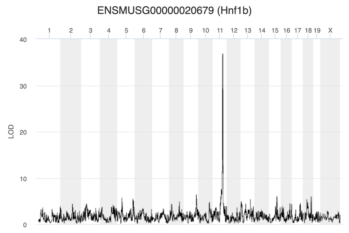
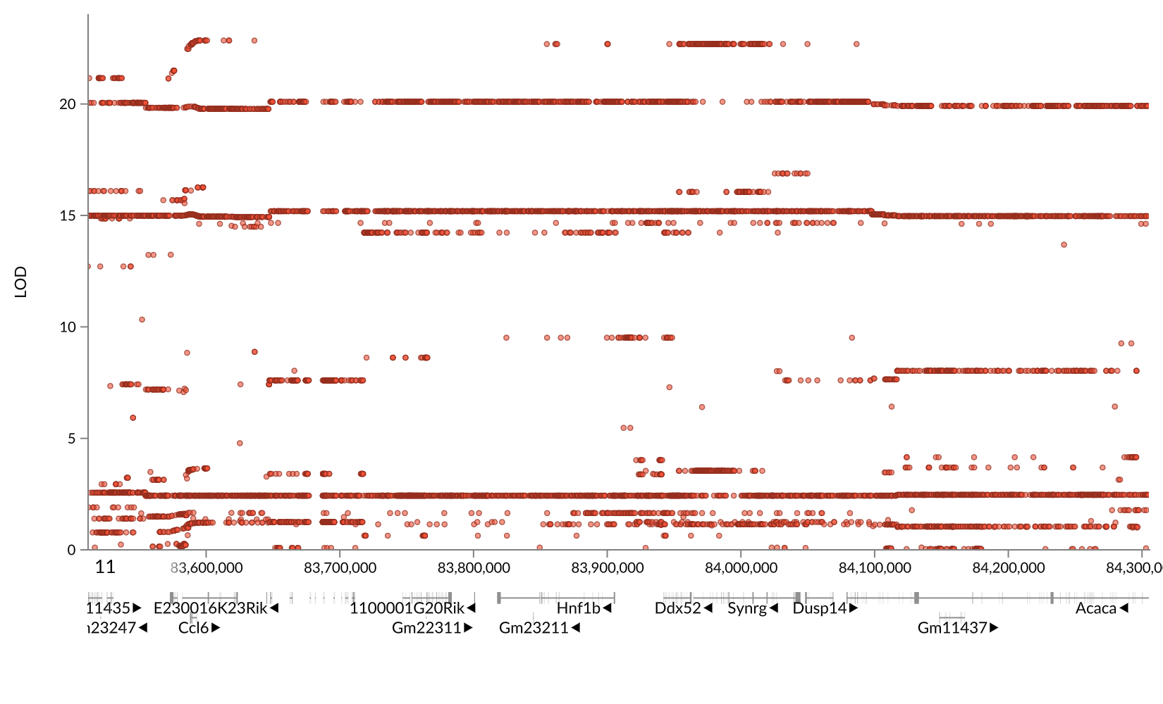
Key Points
.
Interpreting qtl2 results
Overview
Teaching: 10 min
Exercises: 2 minQuestions
How do I interpret qtl2 results?
Objectives
Interpret the relationship between sequence, expression and phenotype variation from qtl2 mapping results.
Challenge: Interpreting qtl2 results
Refer to the figure above.
1). What does panel A show? What conclusions could you draw from panel A?
2). What does panel B show? What conclusions could you draw from panel B?
3). What does panel C show? What conclusions could you draw from panel C?
4). How are panels A through C related to one another? What story do they tell together?Solution
Key Points
Edit the .Rmd files not the .md files
Mediation Analysis
Overview
Teaching: 10 min
Exercises: 2 minQuestions
What is mediation analysis?
How is mediation analysis used in genetics and genomics?
How do I explore causal relations with mediation analysis?
Objectives
Describe mediation analysis as applied in genetics and genomics.
GWAS studies show that most disease-associated variants are found in non-coding regions. This fact leads to the idea that regulation of gene expression is an important mechanism enabling genetic variants to affect complex traits. Mediation analysis can identify a causal chain from genetic variants to molecular and clinical phenotypes. The graphic below shows complete mediation, in which a predictor variable does not directly impact the response variable, but does directly the mediator. The mediator has a direct impact on the response variable. We would observe the relationship between predictor and response, not knowing that a mediator intervenes in this relationship.
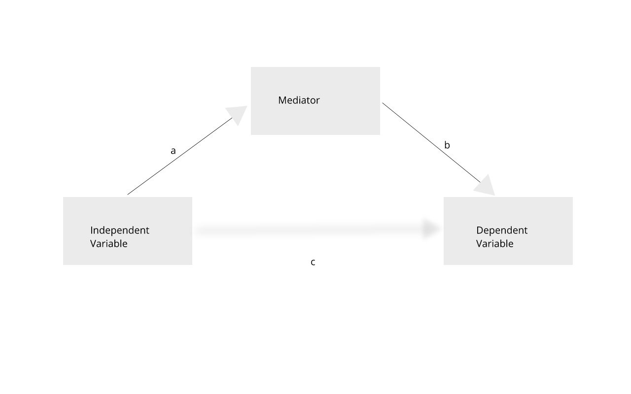 Mediation analysis is widely used in the social sciences
including psychology. In biomedicine, mediation analysis has been employed to
investigate how gene expression mediates the effects of genetic variants on
complex phenotypes and disease.
Mediation analysis is widely used in the social sciences
including psychology. In biomedicine, mediation analysis has been employed to
investigate how gene expression mediates the effects of genetic variants on
complex phenotypes and disease.
For example, a genetic variant (non-coding SNP) indirectly regulates expression of gene 2 through a mediator, gene 1. The SNP regulates expression of gene 1 in cis, and expression of gene 1 influences expression of gene 2 in trans.
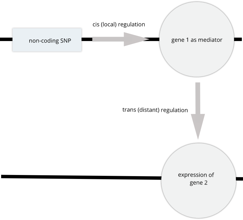 Instead of the expression of one gene impacting another, expression of gene 1 in
the graphic above could impact a physiological phenotype like blood glucose.
Expression of gene 1 would mediate the relationship between the non-coding SNP
and the glucose phenotype.
Instead of the expression of one gene impacting another, expression of gene 1 in
the graphic above could impact a physiological phenotype like blood glucose.
Expression of gene 1 would mediate the relationship between the non-coding SNP
and the glucose phenotype.
Gene Akr1e1 is located on chromosome 13 in mouse. How would you interpret the LOD plot below? On which chromosome(s) would you expect to find the driver gene(s)? The SNP(s)?
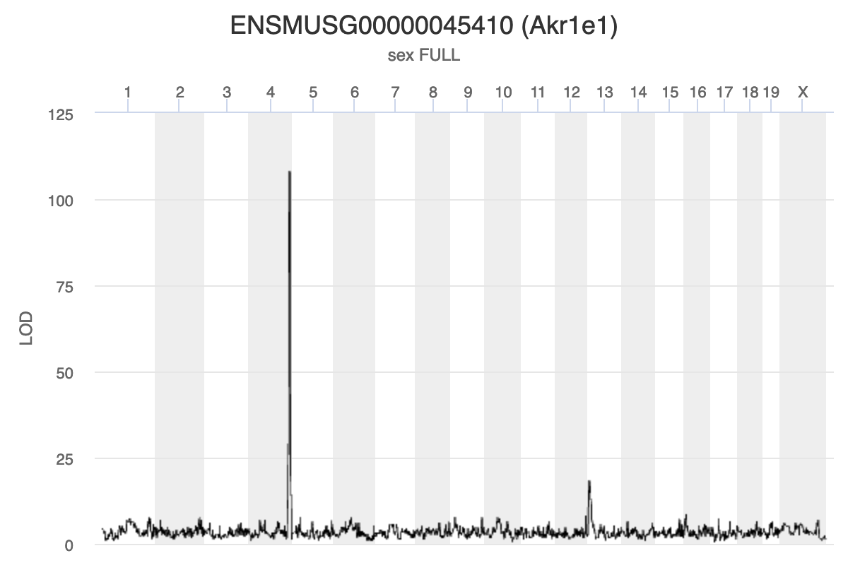 Myo15b is located on chromosome 11. How would you interpret the following LOD
plot? On which chromosome(s) would you expect to find the driver gene(s)? The
SNP(s)?
Myo15b is located on chromosome 11. How would you interpret the following LOD
plot? On which chromosome(s) would you expect to find the driver gene(s)? The
SNP(s)?
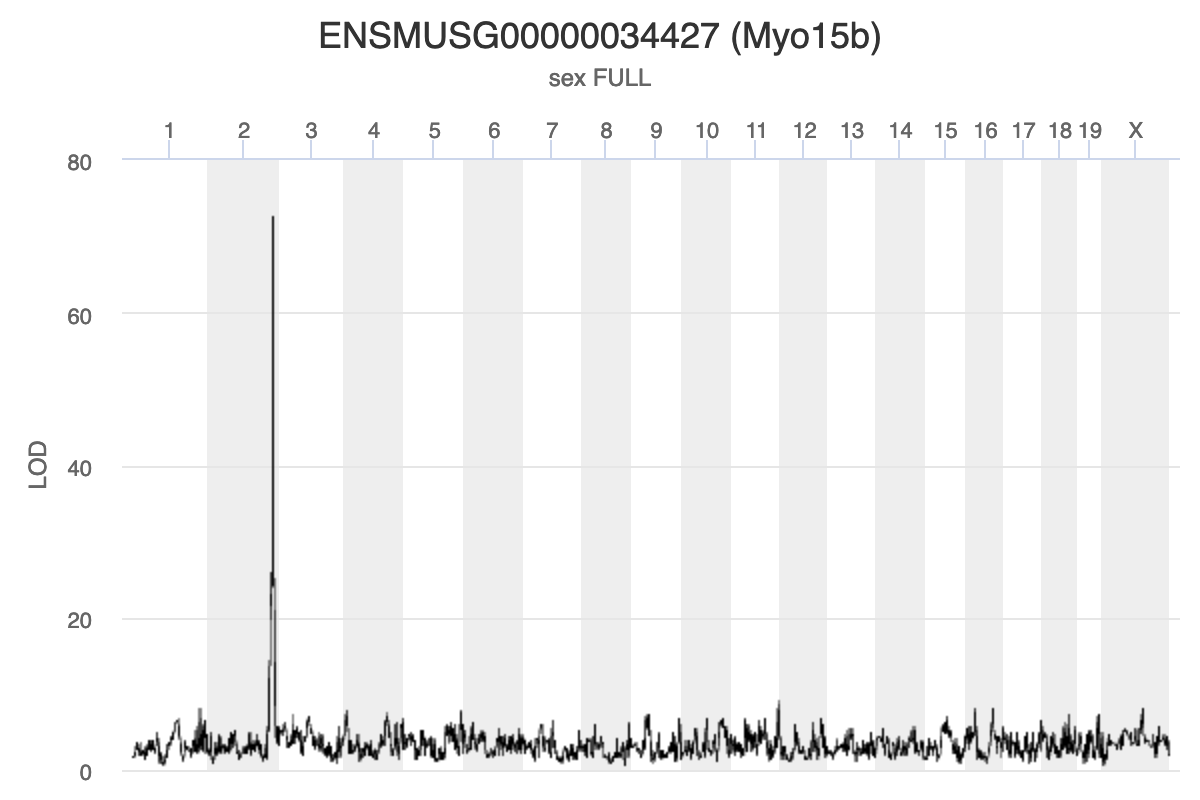 The QTL Viewer for the Attie islet data integrates
mediation into exploration of the data. Below, mediation analysis identifies
gene Hnf4a as the chromosome 2 gene that impacts Myo15b expression.
The QTL Viewer for the Attie islet data integrates
mediation into exploration of the data. Below, mediation analysis identifies
gene Hnf4a as the chromosome 2 gene that impacts Myo15b expression.
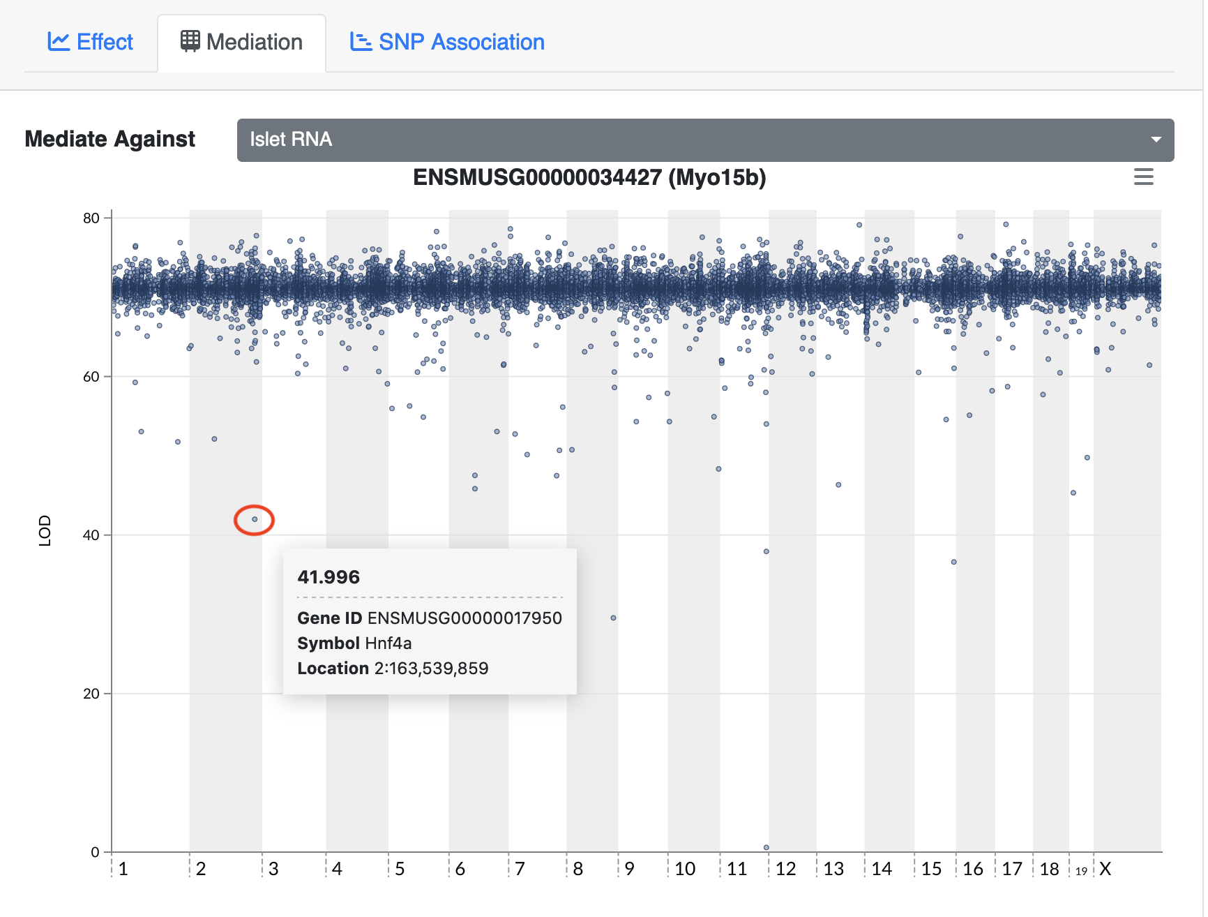
Load Libraries
library(knitr)
library(tidyverse)
library(qtl2)
library(intermediate)
Load Functions
rankZ = function(x) {
  x = rank(x, na.last = "keep", ties.method = "average") / (sum(!is.na(x)) + 1)
  return(qnorm(x))
}
Load Data
# expression data
load("../data/attie_DO500_expr.datasets.RData")

# data from paper
load("../data/dataset.islet.rnaseq.RData")

# phenotypes
load("../data/attie_DO500_clinical.phenotypes.RData")

# mapping data
load("../data/attie_DO500_mapping.data.RData")

# genotype probabilities
probs = readRDS("../data/attie_DO500_genoprobs_v5.rds")
Example from package. This will be removed, but I needed it for now.
  # DOQTL liver protein expresion dataset
  data(Tmem68)

  # Let us mediate Tmem68 to other proteins
  trgt = matrix(Tmem68$target, ncol = 1, dimnames = list(names(Tmem68$target), 'Tmem68'))
  annot = Tmem68$annotation
  colnames(annot)[5] = 'MIDDLE_POINT'
  med <- mediation.scan(target     = trgt,
                        mediator   = Tmem68$mediator,
                        annotation = annot,
                        covar      = Tmem68$covar,
                        qtl.geno   = Tmem68$qtl.geno)
Scanning with 192 samples.
[1] 1000
[1] 2000
[1] 3000
[1] 4000
[1] 5000
[1] 6000
[1] 7000
[1] 8000
  # Interactive plot
  kplot(med)
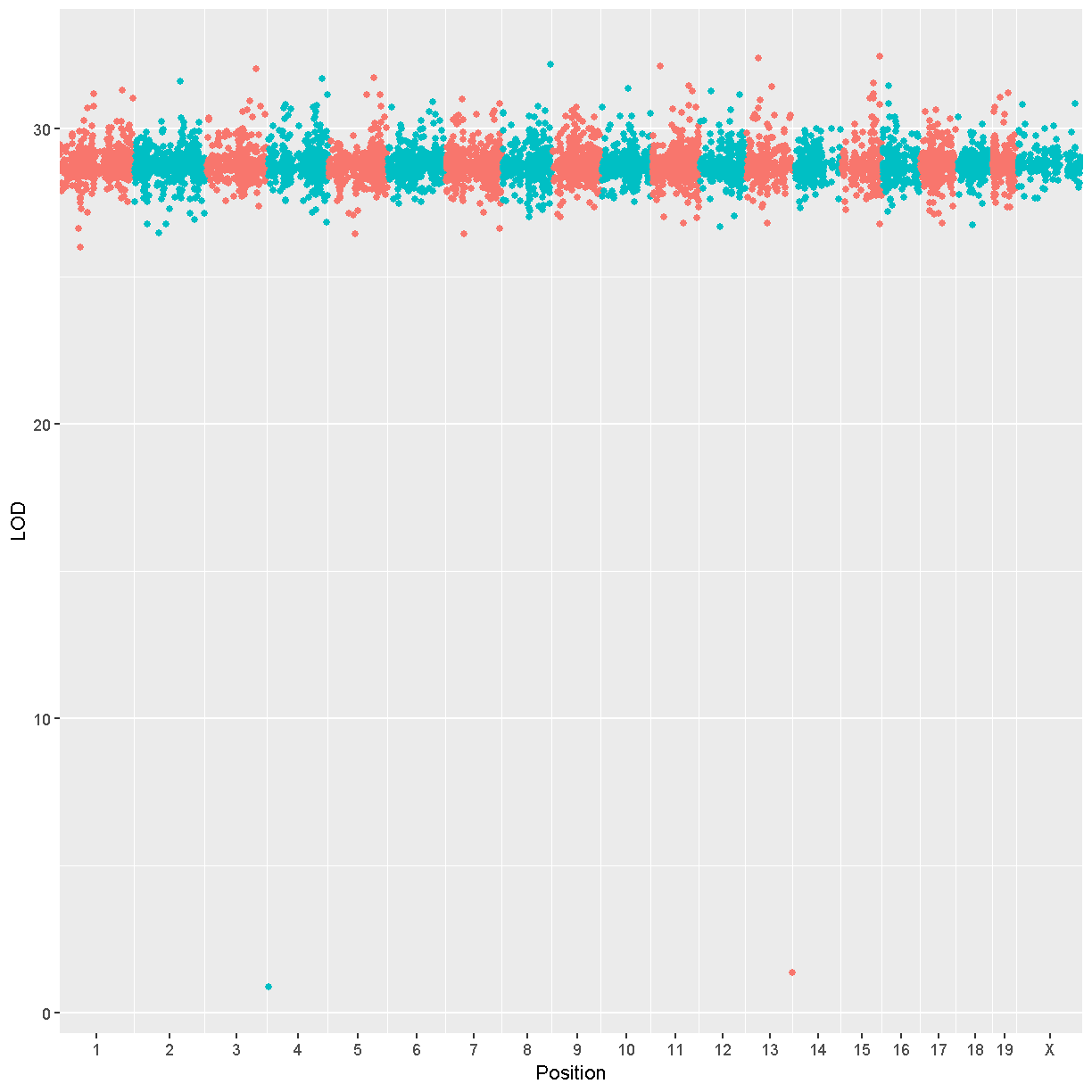
Searching for Candidate Genes
Mapping the Phenotype
We will map the “Insulin tAUC” trait becuase it has a QTL on chromosome 11. First, we will rankZ transform the phenotypes because this helps to satisfy the model assumptions. We will map using sex, generation, and the number of days on the diet as additive covariates.
# NOTE: QTL is not nearly as large with untransformed phenotype.
pheno_rz = pheno_clin %>%
             select(num_islets:weight_10wk) %>%
             as.matrix()
pheno_rz = apply(pheno_rz, 2, rankZ)

covar$DOwave = factor(covar$DOwave)
addcovar = model.matrix(~sex + DOwave + diet_days, data = covar)[,-1]
ins_qtl = scan1(genoprobs = probs,
                pheno     = pheno_rz[,'Ins_tAUC', drop = FALSE],
                kinship   = K,
                addcovar  = addcovar)
plot_scan1(ins_qtl, map, main = 'Insulin tAUC')
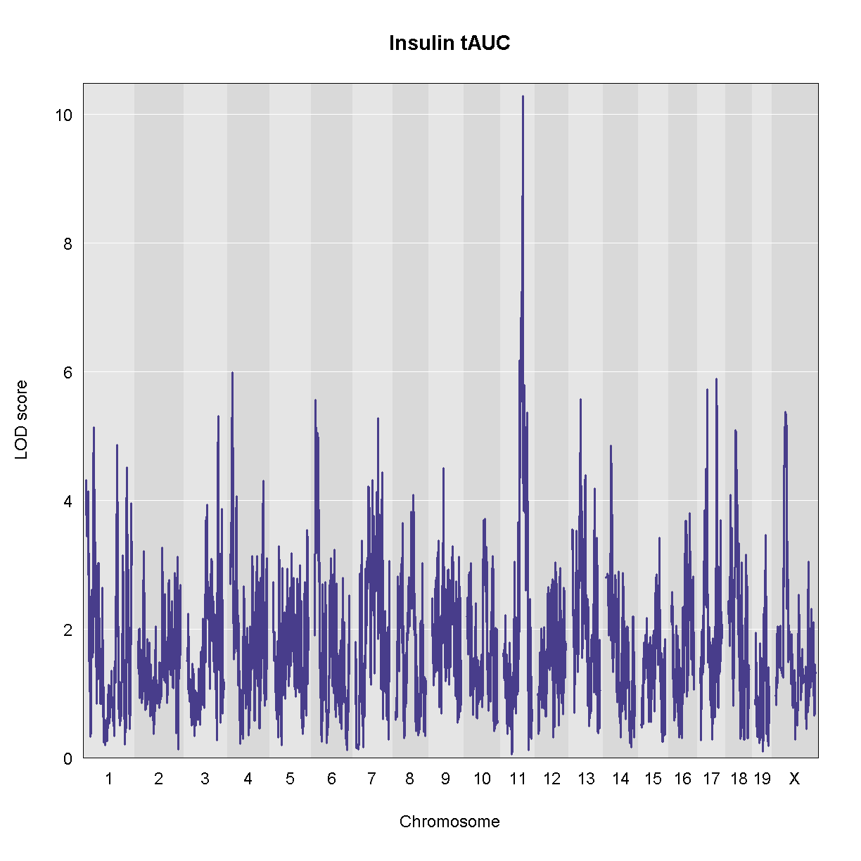
There is a large peak on chromosome 11. Let’s look at the LOD score and the location.
peaks = find_peaks(ins_qtl, map, threshold = 10, prob = 0.95)
peaks
  lodindex lodcolumn chr      pos      lod   ci_lo    ci_hi
1        1  Ins_tAUC  11 83.59467 10.27665 83.5791 84.95444
Let’s also estimate the founder allele effects for insulin tAUC.
TBD: This is slow. Precalculate and just show the plot?
chr = '11'
feff = scan1blup(genoprobs = probs[,chr],
                 pheno     = pheno_rz[,'Ins_tAUC', drop = FALSE],
                 kinship   = K[[chr]],
                 addcovar  = addcovar)
plot_coefCC(feff, map, scan1_output = qtl, legend = 'bottomleft')
Error in plot_coef(x, map, columns = columns, col = col, scan1_output = scan1_output, : object 'qtl' not found
Looking at the founder allele effects above, we can see that A/J, BL6, 129, and NOD alleles contribute to higher insulin tAUC values. Ideally, we are looking for a gene with a pattern of allele effects that matches this pattern, or it’s inverse.
TBD: Plot founder allele effects for two genes, one with a similar pattern, one without.
Searching for cis-eQTL under a physiological QTL
When we have a physiological QTL, we often start by looking for genes which contain missense, splice, or stop codon SNPs. This is a reasonable first approach to selecting candidate genes and may pay off. However, many QTL fall in intergenic regions, which suggests that the causal variant(s) may be in regulatory regions. These regulatory regions are not as well annotated as coding regions and it may be difficult to identify them from sequence alone. However, if you have gene expression data in a relevant tissue, you can look for genes in the QTL interval which have a cis-eQTL. If the pattern of founder allele effects for a candidate gene is similar to the allele effects of the physiological QTL, then this gene is a good candidate.
TBD: Need a figure with physiological QTL effect & cis-eQTL effects.
We have a QTL for insulin tAUC that extends from 83.579099 Mb to 84.95444 Mb. This support interval means that we expect the causal variant to be within this interval 95% of the time. We would like to select a set of candidate genes located near this QTL. If the causal variant is a coding SNP, then the gene will be located within this interval. However, if the causal variant is a regulatory SNP, then the gene that it regulates may be up to 2 Mb away from the variant. This means that we should be searching for genes within 2 Mb of the edges of the support interval.
TBD: Is there a REF for the +/- 2 Mb distance?
First, we need to get the support interval and add 2 MB to each side.
ci = c(peaks$ci_lo - 2, peaks$ci_hi + 2)
Next, we filter the eQTL results to retain genes in this interval.
cis_eqtl = dataset.islet.rnaseq$lod.peaks %>%
             filter(chrom == '11'  &
                      pos >= ci[1] &
                      pos <= ci[2])
There are 133 genes with cis-eQTL in this interval. That is a lot of genes! We could estimate the founder allele effects for each of the genes and stare at them pensively. Or we could add each gene to the QTL mapping model and see if the LOD score changes.
Mapping the Phenotype with a Gene as as Covariate
In QTL mediation analysis, we are hypothesizing that there is a genomic variant which affects the expression of a gene, which in turn affects the physiological phenotype.
TBD: Add mediation figure here again?
There is a gene called Slfn3 under the Insulin tAUC peak. Our hypothesis is that this gene may influence Insulin AUC becuase it has a cis-eQTL in the same location. In order to test this hypothesis, we will add the expression of this gene to the model as an additive covariate. If Slfn3 explains some of the variance in Insulin tAUC, then the LOD should decrease. If it does not, then the LOD will not change much.
covar_gene = cbind(norm[rownames(addcovar), 'ENSMUSG00000018986'], addcovar)
slfn3_qtl = scan1(genoprobs = probs,
                  pheno     = pheno_rz[,'Ins_tAUC', drop = FALSE],
                  kinship   = K,
                  addcovar  = covar_gene)

plot_scan1(ins_qtl,   map, chr = chr, main = 'Insulin tAUC with Slfn3')
plot_scan1(slfn3_qtl, map, chr = chr, color = 'blue', add = TRUE)
Warning in plot.xy(xy.coords(x, y), type = type, ...): "color" is not a
graphical parameter
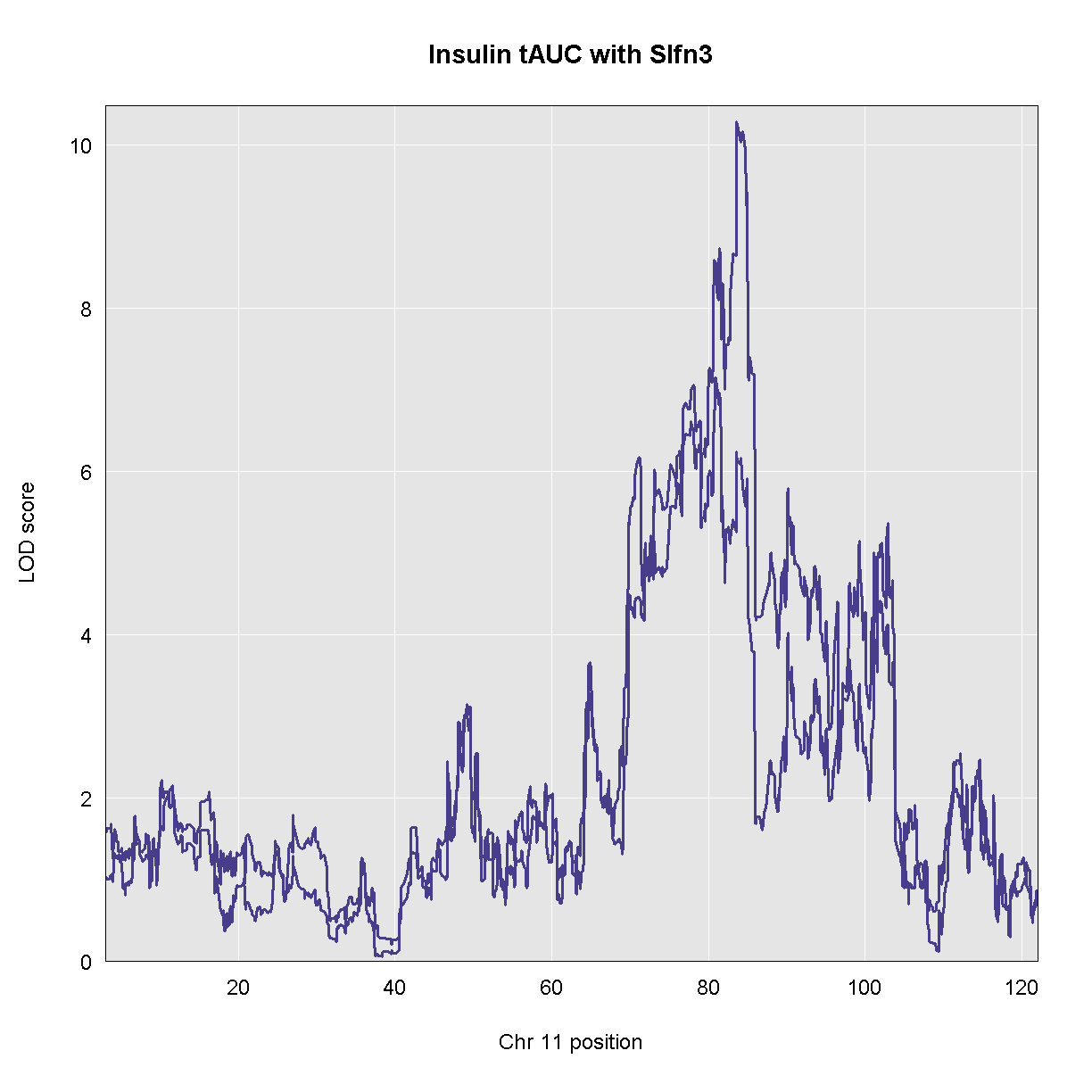
As you can see, the LOD decreased when we added the expression of Slfn3 into the model. Let’s see what the new LOD is on chromosome 11.
find_peaks(qtl, map, threshold = 6.5)
Error in align_scan1_map(scan1_output, map): object 'qtl' not found
The LOd decreased from 10.3 to 7.2.
DMG: STOPPED HERE
Searching for Causal Genes
In mediation analysis, we don’t know the causal gene in advance. We must fit a model like the one above for each gene that was measured. But this would involve mapping the trait across the entire genome for each gene. We don’t need to do this to identify causal genes under the phenotype QTL. We only need to fit a model using each gene at the position of the phenotype QTL.
Mediation analysis requires five pieces of data and metadata:
- Target: the phenotype that has a QTL for which we are seeking causal gene candidates.
- Mediator: gene expression for genes that will be used in the mediation analysis.
- Annotation: gene annotation data for the mediator genes.
- Covar: a set of covariates to use in the model.
- QTL.Geno: the genotype probabilities at the Target maximum QTL.
Challenge:
Visit the Attie islet data QTL viewer:
https://churchilllab.jax.org/qtlviewer/attie/islets#
- Select Islet RNA for the current data set.
- Type in a gene symbol to search for.
- Click on the highest peak in the LOD plot.
- Look at the Effects in the bottom right panel.
- Select the Mediation tab and click the LOD peak again.
- Hover over the dots in the mediation plot to discover genes that raise or lower the peak.
Solution
Key Points
Mediation analysis investigates an intermediary between an independent variable and its effect on a dependent variable.
Mediation analysis is used in high-throughput genomics studies to identify molecular phenotypes, such as gene expression or methylation traits, that mediate the effect of genetic variation on disease phenotypes or other outcomes of interest.