Principal Components Analysis
Last updated on 2025-09-23 | Edit this page
Estimated time: 60 minutes
Overview
Questions
- How can researchers simplify or streamline EDA in high-throughput data sets?
- What is principal component analysis (PCA) and when can it be used?
Objectives
- Explain the purpose of dimension reduction.
- Define a principal component.
- Perform a principal components analysis.
Dimension Reduction Motivation
Visualizing data is one of the most, if not the most, important step in the analysis of high-throughput data. The right visualization method may reveal problems with the experimental data that can render the results from a standard analysis, although typically appropriate, completely useless.
Recall that in recent history biologists went from using their eyes or simple summaries to categorize results, to having thousands (and now millions) of measurements per sample to analyze. Here we will focus on statistical inference in the context of high-throughput measurements, also called high-dimensional data. High-dimensional data is “wide” data, rather than long data, which has few variables relative to the number of observations. The number of features (variables) in high-dimensional data is much greater than the number of observations, making simple visualizations like scatterplots cumbersome.
We have shown methods for visualizing global properties of the columns or rows, but plots that reveal relationships between columns or between rows are more complicated due to the high dimensionality of data. For example, to compare each of the 189 samples to each other, we would have to create, for example, 17,766 MA-plots. Creating one single scatterplot of the data is impossible since points are very high dimensional.
We will describe powerful techniques for exploratory data analysis based on dimension reduction. The general idea is to reduce the dataset to have fewer dimensions, yet approximately preserve important properties, such as the distance between samples. If we are able to reduce down to, say, two dimensions, we can then easily make plots.
Principal component analysis (PCA) is a popular method of analyzing high-dimensional data. Large datasets of correlated variables can be summarized into smaller numbers of uncorrelated principal components that explain most of the variability in the original dataset. An example of PCA might be reducing several variables representing aspects of patient health (blood pressure, heart rate, respiratory rate) into a single feature.
PCA is a useful exploratory analysis tool. PCA allows us to reduce a large number of variables into a few features which represent most of the variation in the original variables. This makes exploration of the original variables easier.
The first principal component (\(Z_1\)) is calculated using the equation:
\[ Z_1 = a_{11}X_1 + a_{21}X_2 +....+a_{p1}X_p \]
\(X_1...X_p\) represents variables in the original dataset and \(a_{11}...a_p\) represent principal component loadings, which can be thought of as the degree to which each variable contributes to the calculation of the principal component.
Exercise 1
Descriptions of three datasets and research questions are given below. For which of these might PCA be considered a useful tool for analyzing data so that the research questions may be addressed?
- An epidemiologist has data collected from different patients admitted to hospital with infectious respiratory disease. They would like to determine whether length of stay in hospital differs in patients with different respiratory diseases.
- An online retailer has collected data on user interactions with its online app and has information on the number of times each user interacted with the app, what products they viewed per interaction, and the type and cost of these products. The retailer would like to use this information to predict whether or not a user will be interested in a new product.
- A scientist has assayed gene expression levels in 1000 cancer patients and has data from probes targeting different genes in tumour samples from patients. She would like to create new variables representing relative abundance of different groups of genes to i) find out if genes form subgroups based on biological function and ii) use these new variables in a linear regression examining how gene expression varies with disease severity.
- All of the above.
In the first case, a regression model would be more suitable; perhaps a survival model. In the second, again a regression model, likely linear or logistic, would be more suitable. In the third example, PCA can help to identify modules of correlated features that explain a large amount of variation within the data.
Therefore the answer here is 3.
What is a principal component?
The first principal component is the direction of the data along which the observations vary the most. The second principal component is the direction of the data along which the observations show the next highest amount of variation. The second principal component is a linear combination of the variables that is uncorrelated with the first principal component. There are as many principal components as there are variables in your dataset, but as we’ll see, some are more useful at explaining your data than others. By definition, the first principal component explains more variation than other principal components. Some of the following content is adapted from O’Callaghan A, Robertson G, LLewellyn M, Becher H, Meynert A, Vallejos C, Ewing A. (2024). High dimensional statistics with R. https://github.com/carpentries-incubator/high-dimensional-stats-r.
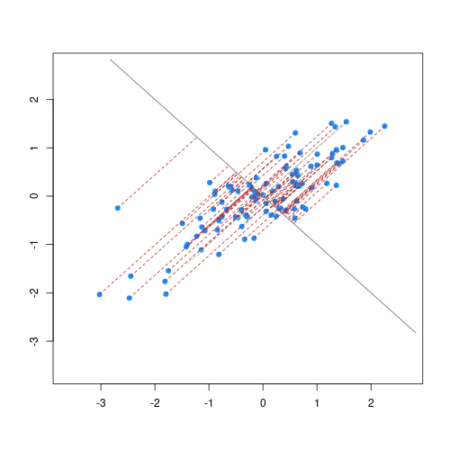
The animation below illustrates how principal components are calculated from data. You can imagine that the black line is a rod and each red dashed line is a spring. The energy of each spring is proportional to its squared length. The direction of the first principal component is the one that minimizes the total energy of all of the springs. In the animation below, the springs pull the rod, finding the direction of the first principal component when they reach equilibrium. We then use the length of the springs from the rod as the first principal component. This is explained in more detail on this Q&A website.
Example: Reducing two dimensions to one
We consider an example with twin heights. Here we simulate 100 two dimensional points that represent the number of standard deviations each individual is from the mean height. Each point is a pair of twins:
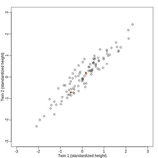
To help with the illustration, think of this as high-throughput gene expression data with the twin pairs representing the \(N\) samples and the two heights representing gene expression from two genes.
We are interested in the distance between any two samples. We can
compute this using dist. For example, here is the distance
between the two orange points in the figure above:
R
d=dist(t(y))
as.matrix(d)[1,2]
OUTPUT
[1] 1.140897What if making two dimensional plots was too complex and we were only able to make 1 dimensional plots. Can we, for example, reduce the data to a one dimensional matrix that preserves distances between points?
If we look back at the plot, and visualize a line between any pair of points, the length of this line is the distance between the two points. These lines tend to go along the direction of the diagonal. We have seen before that we can “rotate” the plot so that the diagonal is in the x-axis by making a MA-plot instead:
R
z1 = (y[1,]+y[2,])/2 #the sum
z2 = (y[1,]-y[2,])   #the difference

z = rbind( z1, z2) #matrix now same dimensions as y

thelim <- c(-3,3)
mypar(1,2)

plot(y[1,],y[2,],xlab="Twin 1 (standardized height)",
     ylab="Twin 2 (standardized height)",
     xlim=thelim,ylim=thelim)
points(y[1,1:2],y[2,1:2],col=2,pch=16)

plot(z[1,],z[2,],xlim=thelim,ylim=thelim,xlab="Average height",ylab="Difference in height")
points(z[1,1:2],z[2,1:2],col=2,pch=16)
How do we perform a PCA?
A prostate cancer dataset
The Prostate dataset represents data from 97 men who
have prostate cancer. The data come from a study which examined the
correlation between the level of prostate specific antigen and a number
of clinical measures in men who were about to receive a radical
prostatectomy. The data have 97 rows and 9 columns.
Columns include: 1. lcavol (log-transformed cancer
volume), 2. lweight (log-transformed prostate weight), 3.
lbph (log-transformed amount of benign prostate
enlargement), 4. svi (seminal vesicle invasion), 5.
lcp (log-transformed capsular penetration; amount of spread
of cancer in outer walls of prostate), 6. gleason (Gleason
score; grade of cancer cells), 7. pgg45 (percentage Gleason
scores 4 or 5), 8. lpsa (log-tranformed prostate specific
antigen; level of PSA in blood). 9. age (patient age in
years).
Here we will calculate principal component scores for each of the rows in this dataset, using five principal components (one for each variable included in the PCA). We will include five clinical variables in our PCA, each of the continuous variables in the prostate dataset, so that we can create fewer variables representing clinical markers of cancer progression. Standard PCAs are carried out using continuous variables only.
First, we will examine the Prostate dataset in the
Brq package.
R
library(Brq)
data("Prostate")
R
head(Prostate)
OUTPUT
      lcavol  lweight age      lbph svi       lcp gleason pgg45       lpsa
1 -0.5798185 2.769459  50 -1.386294   0 -1.386294       6     0 -0.4307829
2 -0.9942523 3.319626  58 -1.386294   0 -1.386294       6     0 -0.1625189
3 -0.5108256 2.691243  74 -1.386294   0 -1.386294       7    20 -0.1625189
4 -1.2039728 3.282789  58 -1.386294   0 -1.386294       6     0 -0.1625189
5  0.7514161 3.432373  62 -1.386294   0 -1.386294       6     0  0.3715636
6 -1.0498221 3.228826  50 -1.386294   0 -1.386294       6     0  0.7654678
Note that each row of the dataset represents a single patient.
We will create a subset of the data including only the clinical variables we want to use in the PCA.
R
pros2 <- Prostate[, c("lcavol", "lweight", "lbph", "lcp", "lpsa")]
head(pros2)
OUTPUT
      lcavol  lweight      lbph       lcp       lpsa
1 -0.5798185 2.769459 -1.386294 -1.386294 -0.4307829
2 -0.9942523 3.319626 -1.386294 -1.386294 -0.1625189
3 -0.5108256 2.691243 -1.386294 -1.386294 -0.1625189
4 -1.2039728 3.282789 -1.386294 -1.386294 -0.1625189
5  0.7514161 3.432373 -1.386294 -1.386294  0.3715636
6 -1.0498221 3.228826 -1.386294 -1.386294  0.7654678
Do we need to standardise the data?
Now we compare the variances between variables in the dataset.
R
apply(pros2, 2, var)
OUTPUT
  lcavol  lweight     lbph      lcp     lpsa
1.389157 0.246642 2.104840 1.955102 1.332476
R
par(mfrow = c(1, 2))
hist(pros2$lweight, breaks = "FD")
hist(pros2$lbph, breaks = "FD")
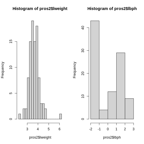
Note that variance is greatest for lbph and lowest for
lweight. It is clear from this output that we need to scale
each of these variables before including them in a PCA analysis to
ensure that differences in variances between variables do not drive the
calculation of principal components. In this example we standardise all
five variables to have a mean of 0 and a standard deviation of 1.
Exercise 2
Why might it be necessary to standardise variables before performing
a PCA?
Can you think of datasets where it might not be necessary to standardise
variables? Discuss.
- To make the results of the PCA interesting.
- If you want to ensure that variables with different ranges of values contribute equally to analysis.
- To allow the feature matrix to be calculated faster, especially in cases where there are a lot of input variables.
- To allow both continuous and categorical variables to be included in the PCA.
- All of the above.
- Scaling the data isn’t guaranteed to make the results more interesting. It also won’t affect how quickly the output will be calculated, whether continuous and categorical variables are present or not.
It is done to ensure that all features have equal weighting in the resulting PCs.
You may not want to standardise datasets which contain continuous variables all measured on the same scale (e.g. gene expression data or RNA sequencing data). In this case, variables with very little sample-to-sample variability may represent only random noise, and standardising the data would give these extra weight in the PCA.
Next we will carry out a PCA using the prcomp() function
in base R. The input data (pros2) is in the form of a
matrix. Note that the scale = TRUE argument is used to
standardise the variables to have a mean 0 and standard deviation of
1.
R
pca.pros <- prcomp(pros2, scale = TRUE, center = TRUE)
pca.pros
OUTPUT
Standard deviations (1, .., p=5):
[1] 1.5648756 1.1684678 0.7452990 0.6362941 0.4748755

Rotation (n x k) = (5 x 5):
              PC1         PC2         PC3         PC4         PC5
lcavol  0.5616465 -0.23664270  0.01486043  0.22708502 -0.75945046
lweight 0.2985223  0.60174151 -0.66320198 -0.32126853 -0.07577123
lbph    0.1681278  0.69638466  0.69313753  0.04517286 -0.06558369
lcp     0.4962203 -0.31092357  0.26309227 -0.72394666  0.25253840
lpsa    0.5665123 -0.01680231 -0.10141557  0.56487128  0.59111493
How many principal components do we need?
We have calculated one principal component for each variable in the original dataset. How do we choose how many of these are necessary to represent the true variation in the data, without having extra components that are unnecessary?
Let’s look at the relative importance of each component using
summary.
R
summary(pca.pros)
OUTPUT
Importance of components:
                          PC1    PC2    PC3     PC4    PC5
Standard deviation     1.5649 1.1685 0.7453 0.63629 0.4749
Proportion of Variance 0.4898 0.2731 0.1111 0.08097 0.0451
Cumulative Proportion  0.4898 0.7628 0.8739 0.95490 1.0000
R
# Get proportions of variance explained by each PC (rounded to 2 DP)
prop.var <- round(summary(pca.pros)$importance["Proportion of Variance", ], 2) *
  100
This returns the proportion of variance in the data explained by each of the (p = 5) principal components. In this example, PC1 explains approximately 49% of variance in the data, PC2 27% of variance, PC3 a further 11%, PC4 approximately 8% and PC5 around 5%.
We can use a screeplot to see how much variation in the data is explained by each principal component. Let’s calculate the screeplot for our PCA.
R
# calculate variance explained
varExp <- (pca.pros$sdev^2) / sum(pca.pros$sdev^2) * 100
# calculate percentage variance explained using output from the PCA
varDF <- data.frame(Dimensions = 1:length(varExp), varExp = varExp)
# create new dataframe with five rows, one for each principal component
R
plot(varDF)
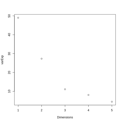
The screeplot shows that the first principal component explains most of the variance in the data (>50%) and each subsequent principal component explains less and less of the total variance. The first two principal components explain >70% of variance in the data. But what do these two principal components mean?
What are loadings and principal component scores?
The output from a PCA returns a matrix of principal component loadings in which the columns show the principal component loading vectors. Note that the square of values in each column sums to 1 as each loading is scaled so as to prevent a blow up in variance. Larger values in the columns suggest a greater contribution of that variable to the principal component.
We can examine the output of our PCA by writing the following in
R:
R
pca.pros
OUTPUT
Standard deviations (1, .., p=5):
[1] 1.5648756 1.1684678 0.7452990 0.6362941 0.4748755

Rotation (n x k) = (5 x 5):
              PC1         PC2         PC3         PC4         PC5
lcavol  0.5616465 -0.23664270  0.01486043  0.22708502 -0.75945046
lweight 0.2985223  0.60174151 -0.66320198 -0.32126853 -0.07577123
lbph    0.1681278  0.69638466  0.69313753  0.04517286 -0.06558369
lcp     0.4962203 -0.31092357  0.26309227 -0.72394666  0.25253840
lpsa    0.5665123 -0.01680231 -0.10141557  0.56487128  0.59111493
For each row in the original dataset PCA returns a principal
component score for each of the principal components (PC1 to PC5 in the
Prostate data example). We can see how the principal
component score (\(Z_{i1}\) for rows
\(i\) to \(n\)) is calculated for the first principal
component using the following equation from Figure 1:
\[ Z_{i1} = a_1 \times (lcavol_i - \overline{lcavol}) + a_2 \times (lpsa_i - \overline{lpsa}) \]
\(a_1\) and \(a_2\) represent principal component
loadings in this equation. A loading can be thought of as the ‘weight’
each variable has on the calculation of the principal component. Note
that in our example using the Prostate dataset
lcavol (log-transformed cancer volume) and
lpsa (log-tranformed prostate specific antigen in blood)
are the variables that contribute most to the first principal
component.
We can better understand what the principal components represent in terms of the original variables by plotting the first two principal components against each other and labelling points by patient number. Clusters of points which have similar principal component scores can be observed using a biplot and the strength and direction of influence different variables have on the calculation of the principal component scores can be observed by plotting arrows representing the loadings onto the graph. A biplot of the first two principal components can be created as follows:
R
biplot(pca.pros, xlim = c(-0.3, 0.3))
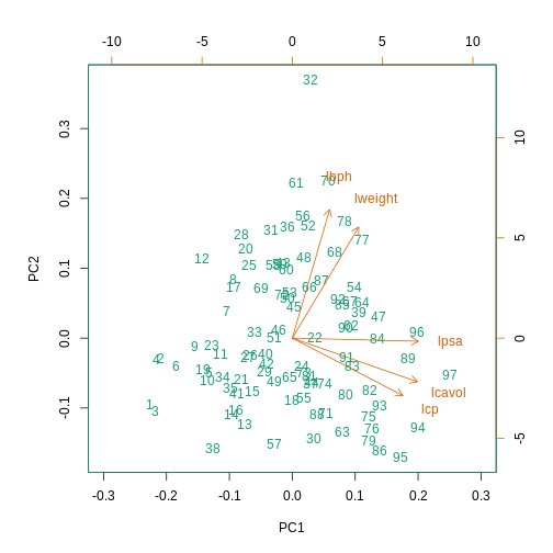
This biplot shows the position of each patient on a 2-dimensional
plot where loadings can be observed via the red arrows associated with
each of the variables. The variables lpsa,
lcavol and lcp are associated with positive
values on PC1 while positive values on PC2 are associated with the
variables lbph and lweight. The length of the
arrows indicates how much each variable contributes to the calculation
of each principal component.
The left and bottom axes show normalised principal component scores.
The axes on the top and right of the plot are used to interpret the
loadings, where loadings are scaled by the standard deviation of the
principal components (pca.pros$sdev) times the square root
the number of observations.
Using PCA to analyse gene expression data
In this section you will carry out your own PCA using the
Bioconductor package PCAtools applied to
gene expression data to explore the topics covered above.
PCAtools provides functions that can be
used to explore data via PCA and produce useful figures and analysis
tools.
A gene expression dataset of cancer patients
The dataset we will be analysing in this lesson includes two subsets of data: 1. a matrix of gene expression data showing microarray results for different probes used to examine gene expression profiles in 91 different breast cancer patient samples. 2. metadata associated with the gene expression results detailing information from patients from whom samples were taken.
Let’s load the PCAtools package and the
data.
R
library("PCAtools")
We will first load the microarray breast cancer gene expression data and associated metadata, downloaded from the Gene Expression Omnibus.
R
library("SummarizedExperiment")
cancer <- readRDS("./data/cancer_expression.rds")
mat <- assay(cancer)
metadata <- colData(cancer)
R
View(mat)
#nrow=22215 probes
#ncol=91 samples
R
View(metadata)
#nrow=91
#ncol=8
R
all(colnames(mat) == rownames(metadata))
OUTPUT
[1] TRUER
#Check that column names and row names match
#If they do should return TRUE
The ‘mat’ variable contains a matrix of gene expression profiles for each sample. Rows represent gene expression measurements and columns represent samples. The ‘metadata’ variable contains the metadata associated with the gene expression data including the name of the study from which data originate, the age of the patient from which the sample was taken, whether or not an oestrogen receptor was involved in their cancer and the grade and size of the cancer for each sample (represented by rows).
Microarray data are difficult to analyse for several reasons. Firstly, they are typically high-dimensional and therefore are subject to the same difficulties associated with analysing high dimensional data outlined above (i.e. p>n, large numbers of rows, multiple possible response variables, curse of dimensionality). Secondly, formulating a research question using microarray data can be difficult, especially if not much is known a priori about which genes code for particular phenotypes of interest. Finally, exploratory analysis, which can be used to help formulate research questions and display relationships, is difficult using microarray data due to the number of potentially interesting response variables (i.e. expression data from probes targeting different genes).
If researchers hypothesise that groups of genes (e.g. biological pathways) may be associated with different phenotypic characteristics of cancers (e.g. histologic grade, tumour size), using statistical methods that reduce the number of columns in the microarray matrix to a smaller number of dimensions representing groups of genes would help visualise the data and address research questions regarding the effect different groups of genes have on disease progression.
Using the PCAtools we will apply a PCA
to the cancer gene expression data, plot the amount of variation in the
data explained by each principal component and plot the most important
principal components against each other as well as understanding what
each principal component represents.
Exercise 3
Apply a PCA to the cancer gene expression data using the
pca() function from PCAtools.
You can use the help files in PCAtools to find out about the
pca() function (type help("pca") or
?pca in R).
Remove the lower 20% of principal components from your PCA using the
removeVar argument in the pca() function. As
in the example using prostate data above, examine the first 5 rows and
columns of rotated data and loadings from your PCA.
pc <- pca(mat, metadata = metadata)
#Many PCs explain a very small amount of the total variance in the data
#Remove the lower 20% of PCs with lower variance
pc <- pca(mat, metadata = metadata, removeVar = 0.2)
#Explore other arguments provided in pca
pc$rotated[1:5, 1:5]
pc$loadings[1:5, 1:5]

which.max(pc$loadings[, 1])
pc$loadings[49, ]

which.max(pc$loadings[, 2])
pc$loadings[27, ]
The function pca() is used to perform PCA, and uses as
inputs a matrix (mat) containing continuous numerical data
in which rows are data variables and columns are samples, and
metadata associated with the matrix in which rows represent
samples and columns represent data variables. It has options to centre
or scale the input data before a PCA is performed, although in this case
gene expression data do not need to be transformed prior to PCA being
carried out as variables are measured on a similar scale (values are
comparable between rows). The output of the pca() function
includes a lot of information such as loading values for each variable
(loadings), principal component scores
(rotated) and the amount of variance in the data explained
by each principal component.
Rotated data shows principal component scores for each sample and each principal component. Loadings the contribution each variable makes to each principal component.
Scaling variables for PCA
When running pca() above, we kept the default setting,
scale=FALSE. That means genes with higher variation in
their expression levels should have higher loadings, which is what we
are interested in. Whether or not to scale variables for PCA will depend
on your data and research question.
Note that this is different from normalising gene expression data. Gene expression data have to be normalised before donwstream analyses can be carried out. This is to reduce to effect technical and other potentially confounding factors. We assume that the expression data we use had been normalised previously.
Choosing how many components are important to explain the variance in the data
As in the example using the Prostate dataset we can use
a screeplot to compare the proportion of variance in the data explained
by each principal component. This allows us to understand how much
information in the microarray dataset is lost by projecting the
observations onto the first few principal components and whether these
principal components represent a reasonable amount of the variation. The
proportion of variance explained should sum to one.
There are no clear guidelines on how many principal components should be included in PCA: your choice depends on the total variability of the data and the size of the dataset. We often look at the ‘elbow’ on the screeplot as an indicator that the addition of principal components does not drastically contribute to explain the remaining variance or choose an arbitory cut off for proportion of variance explained.
Exercise 4
Using the screeplot() function in
PCAtools, create a screeplot to show
proportion of variance explained by each principal component. Explain
the output of the screeplot in terms of proportion of variance in data
explained by each principal component.
screeplot(pc, axisLabSize = 5, titleLabSize = 8)Note that first principal component (PC1) explains more variation than other principal components (which is always the case in PCA). The screeplot shows that the first principal component only explains ~33% of the total variation in the micrarray data and many principal components explain very little variation. The red line shows the cumulative percentage of explained variation with increasing principal components. Note that in this case 18 principal components are needed to explain over 75% of variation in the data. This is not an unusual result for complex biological datasets including genetic information as clear relationships between groups are sometimes difficult to observe in the data. The screeplot shows that using a PCA we have reduced 91 predictors to 18 in order to explain a significant amount of variation in the data. See additional arguments in screeplot function for improving the appearance of the plot.
Investigating the principal components
Once the most important principal components have been identified
using screeplot(), these can be explored in more detail by
plotting principal components against each other and highlighting points
based on variables in the metadata. This will allow any potential
clustering of points according to demographic or phenotypic variables to
be seen.
We can use biplots to look for patterns in the output from the PCA.
Note that there are two functions called biplot(), one in
the package PCAtools and one in
stats. Both functions produce biplots but
their scales are different!
Exercise 5
Create a biplot of the first two principal components from your PCA
(using biplot() function in
PCAtools - see
help("PCAtools::biplot") for arguments) and examine whether
the data appear to form clusters. Explain your results.
biplot(pc, lab = NULL, colby = 'Grade', legendPosition = 'top')The biplot shows the position of patient samples relative to PC1 and
PC2 in a 2-dimensional plot. Note that two groups are apparent along the
PC1 axis according to expressions of different genes while no separation
can be seem along the PC2 axis. Labels of patient samples are
automatically added in the biplot. Labels for each sample are added by
default, but can be removed if there is too much overlap in names. Note
that PCAtools does not scale biplot in the
same way as biplot using the stats package.
Let’s consider this biplot in more detail, and also display the loadings:
R
biplot(pc, lab = rownames(pc$metadata), pointSize = 1, labSize = 1)
ERROR
Error in pcaobj$rotated: object of type 'closure' is not subsettable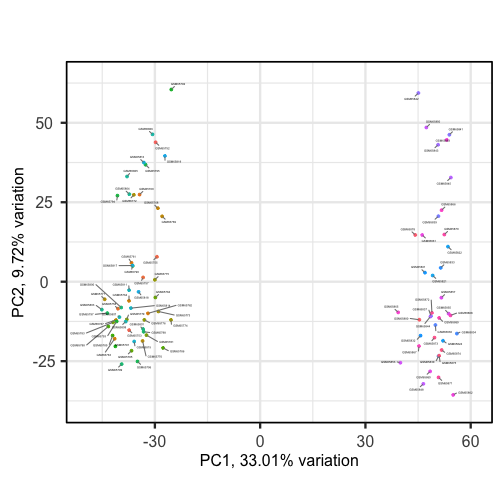
Sizes of labels, points and axes can be changed using arguments in
biplot (see help("biplot")). We can see from
the biplot that there appear to be two separate groups of points that
separate on the PC1 axis, but that no other grouping is apparent on
other PC axes.
R
plotloadings(pc, labSize = 3)
ERROR
Error in pcaobj$loadings: object of type 'closure' is not subsettable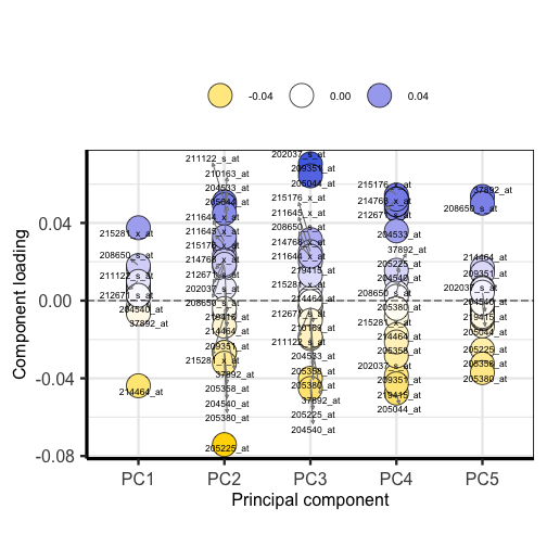
Plotting the loadings shows the magnitude and direction of loadings for probes detecting genes on each principal component.
Exercise 6
Use colby and lab arguments in
biplot() to explore whether these two groups may cluster by
patient age or by whether or not the sample expresses the oestrogen
receptor gene (ER+ or ER-).
  biplot(pc,
    lab = paste0(pc$metadata$Age,'years'),
    colby = 'ER',
    hline = 0, vline = 0,
    legendPosition = 'right')
{: .language-r} It appears that one cluster has more ER+ samples than the other group.
So far we have only looked at a biplot of PC1 versus PC2 which only
gives part of the picture. The pairplots() function in
PCAtools can be used to create multiple
biplots including different principal components.
R
pairsplot(pc)
ERROR
Error in pcaobj$components: object of type 'closure' is not subsettable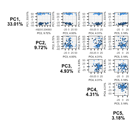
The plots show two apparent clusters involving the first principal component only. No other clusters are found involving other principal components.
Using PCA output in further analysis
The output of PCA can be used to interpret data or can be used in further analyses. For example, the PCA outputs new variables (principal components) which represent several variables in the original dataset. These new variables are useful for further exploring data, for example, comparing principal component scores between groups or including the new variables in linear regressions. Because the principal components are uncorrelated (and independent) they can be included together in a single linear regression.
Principal component regression
PCA is often used to reduce large numbers of correlated variables into fewer uncorrelated variables that can then be included in linear regression or other models. This technique is called principal component regression (PCR) and it allows researchers to examine the effect of several correlated explanatory variables on a single response variable in cases where a high degree of correlation initially prevents them from being included in the same model. This is called principal componenet regression (PCR) and is just one example of how principal components can be used in further analysis of data. When carrying out PCR, the variable of interest (response/dependent variable) is regressed against the principal components calculated using PCA, rather than against each individual explanatory variable from the original dataset. As there as many principal components created from PCA as there are variables in the dataset, we must select which principal components to include in PCR. This can be done by examining the amount of variation in the data explained by each principal component (see above).
- Visualizing data with thousands or tens of thousands of measurements is impossible using standard techniques.
- Dimension reduction techniques coupled with visualization can reveal relationships between dimensions (rows or columns) in the data.
- Principal components analysis is a dimension reduction technique that can reduce and summarize large datasets.