Statistical Models
Last updated on 2025-09-23 | Edit this page
Estimated time: 60 minutes
Overview
Questions
- What are some of the most widely used parametric distributions used in the life sciences besides the normal?
Objectives
- Define the Poisson distribution.
- Explain its relevance in RNA sequence analysis.
- Explain the purpose of maximum likelihood estimation.
- Generate some research questions that maximum likelihood estimation can address.
- Model distributions of gene variances.
Statistical Models
All models are wrong, but some are useful. -George E. P. Box
When we see a p-value in the literature, it means a probability distribution of some sort was used to quantify the null hypothesis. Many times deciding which probability distribution to use is relatively straightforward. For example, in the tea tasting challenge we can use simple probability calculations to determine the null distribution. Most p-values in the scientific literature are based on sample averages or least squares estimates from a linear model and make use of the CLT to approximate the null distribution of their statistic as normal.
The CLT is backed by theoretical results that guarantee that the approximation is accurate. However, we cannot always use this approximation, such as when our sample size is too small. Previously, we described how the sample average can be approximated as t-distributed when the population data is approximately normal. However, there is no theoretical backing for this assumption. We are now modeling. In the case of height, we know from experience that this turns out to be a very good model.
But this does not imply that every dataset we collect will follow a normal distribution. Some examples are: coin tosses, the number of people who win the lottery, and US incomes. The normal distribution is not the only parametric distribution that is available for modeling. Here we provide a very brief introduction to some of the most widely used parametric distributions and some of their uses in the life sciences. We focus on the models and concepts needed to understand the techniques currently used to perform statistical inference on high-throughput data. To do this we also need to introduce the basics of Bayesian statistics. For more in-depth description of probability models and parametric distributions please consult a Statistics textbook such as this one.
The Binomial Distribution
The first distribution we will describe is the binomial distribution. It reports the probability of observing \(S=k\) successes in \(N\) trials as
\[ \mbox{Pr}(S=k) = {N \choose k}p^k (1-p)^{N-k} \]
with \(p\) the probability of success. The best known example is coin tosses with \(S\) the number of heads when tossing \(N\) coins. In this example \(p=0.5\).
Note that \(S/N\) is the average of independent random variables and thus the CLT tells us that \(S\) is approximately normal when \(N\) is large. This distribution has many applications in the life sciences. Recently, it has been used by the variant callers and genotypers applied to next generation sequencing. A special case of this distribution is approximated by the Poisson distribution which we describe next.
The Poisson Distribution
Since it is the sum of binary outcomes, the number of people that win the lottery follows a binomial distribution (we assume each person buys one ticket). The number of trials \(N\) is the number of people that buy tickets and is usually very large. However, the number of people that win the lottery oscillates between 0 and 3, which implies the normal approximation does not hold. So why does CLT not hold? One can explain this mathematically, but the intuition is that with the sum of successes so close to and also constrained to be larger than 0, it is impossible for the distribution to be normal. Here is a quick simulation:
R
p=10^-7 ##1 in 10,000,0000 chances of winning
N=5*10^6 ##5,000,000 tickets bought
winners=rbinom(1000,N,p) ##1000 is the number of different lotto draws
tab=table(winners)
plot(tab)
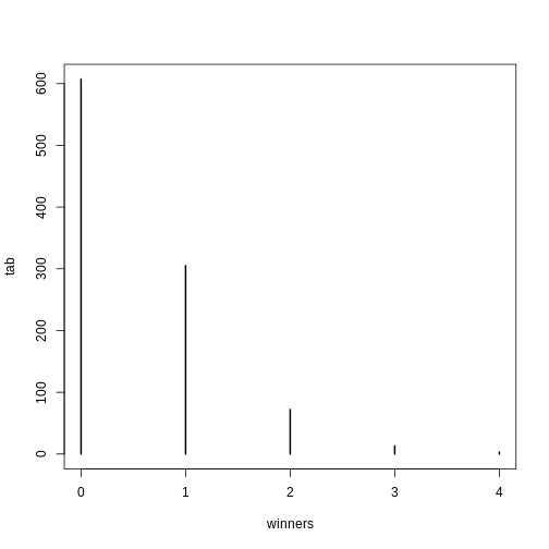
R
prop.table(tab)
OUTPUT
winners
    0     1     2     3     4
0.607 0.305 0.072 0.013 0.003
For cases like this, where \(N\) is very large, but \(p\) is small enough to make \(N \times p\) (call it \(\lambda\)) a number between 0 and, for example, 10, then \(S\) can be shown to follow a Poisson distribution, which has a simple parametric form:
\[ \mbox{Pr}(S=k)=\frac{\lambda^k \exp{-\lambda}}{k!} \]
The Poisson distribution is commonly used in RNA-seq analyses. Because we are sampling thousands of molecules and most genes represent a very small proportion of the totality of molecules, the Poisson distribution seems appropriate.
So how does this help us? One way is that it provides insight about the statistical properties of summaries that are widely used in practice. For example, let’s say we only have one sample from each of a case and control RNA-seq experiment and we want to report the genes with the largest fold-changes. One insight that the Poisson model provides is that under the null hypothesis of no true differences, the statistical variability of this quantity depends on the total abundance of the gene. We can show this mathematically, but here is a quick simulation to demonstrate the point:
R
N=10000##number of genes
lambdas=2^seq(1,16,len=N) ##these are the true abundances of genes
y=rpois(N,lambdas)##note that the null hypothesis is true for all genes
x=rpois(N,lambdas)
ind=which(y>0 & x>0)##make sure no 0s due to ratio and log

library(rafalib)
splot(log2(lambdas),log2(y/x),subset=ind)
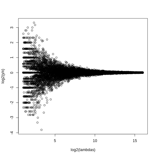
For lower values of lambda there is much more
variability and, if we were to report anything with a fold change of 2
or more, the number of false positives would be quite high for low
abundance genes.
NGS experiments and the Poisson distribution
In this section we will use the data stored in this dataset:
R
library(parathyroidSE) ##available from Bioconductor
data(parathyroidGenesSE)
se <- parathyroidGenesSE
The data is contained in a SummarizedExperiment object,
which we do not describe here. The important thing to know is that it
includes a matrix of data, where each row is a genomic feature and each
column is a sample. We can extract this data using the
assay function. For this dataset, the value of a single
cell in the data matrix is the count of reads which align to a given
gene for a given sample. Thus, a similar plot to the one we simulated
above with technical replicates reveals that the behavior predicted by
the model is present in experimental data:
R
x <- assay(se)[,23]
y <- assay(se)[,24]
ind=which(y>0 & x>0)##make sure no 0s due to ratio and log
splot((log2(x)+log2(y))/2,log(x/y),subset=ind)
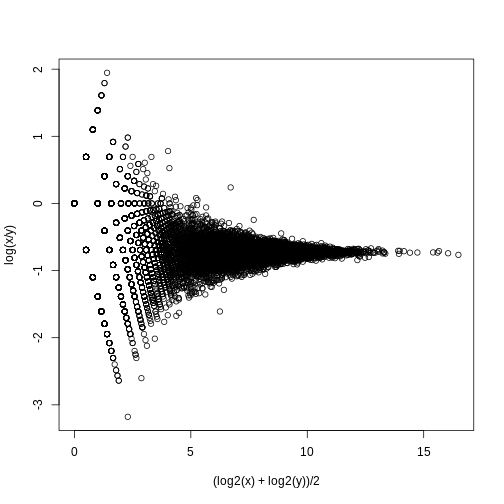
If we compute the standard deviations across four individuals, it is quite a bit higher than what is predicted by a Poisson model. Assuming most genes are differentially expressed across individuals, then, if the Poisson model is appropriate, there should be a linear relationship in this plot:
R
library(rafalib)
library(matrixStats)

vars=rowVars(assay(se)[,c(2,8,16,21)]) ##we know these are four
means=rowMeans(assay(se)[,c(2,8,16,21)]) ##different individuals

splot(means,vars,log="xy",subset=which(means>0&vars>0)) ##plot a subset of data
abline(0,1,col=2,lwd=2)
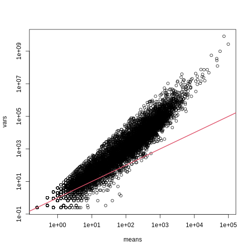
The reason for this is that the variability plotted here includes biological variability, which the motivation for the Poisson does not include. The negative binomial distribution, which combines the sampling variability of a Poisson and biological variability, is a more appropriate distribution to model this type of experiment. The negative binomial has two parameters and permits more flexibility for count data. For more on the use of the negative binomial to model RNA-seq data you can read this paper. The Poisson is a special case of the negative binomial distribution.
Maximum Likelihood Estimation
To illustrate the concept of maximum likelihood estimates (MLE), we use a relatively simple dataset containing palindrome locations in the HMCV genome. We read in the locations of the palindrome and then count the number of palindromes in each 4,000 basepair segments.
R
# read in the locations data
load("./data/hcmv.rda")

breaks <- seq(0, 4000 * round(max(locations)/4000), 4000)
tmp <- cut(locations, breaks)
counts <- table(tmp)

library(rafalib)
mypar(1,1)
hist(counts)
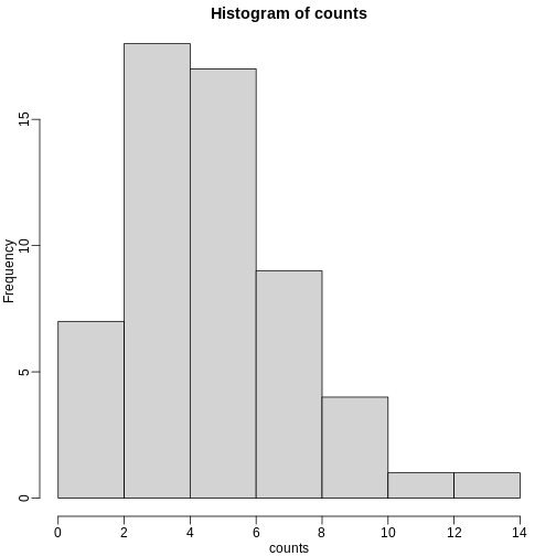
The counts do appear to follow a Poisson distribution. But what is the rate \(\lambda\) ? The most common approach to estimating this rate is maximum likelihood estimation. To find the maximum likelihood estimate (MLE), we note that these data are independent and the probability of observing the values we observed is:
\[ \Pr(X_1=k_1,\dots,X_n=k_n;\lambda) = \prod_{i=1}^n \lambda^{k_i} / k_i! \exp ( -\lambda) \]
The MLE is the value of \(\lambda\) that maximizes the likelihood:.
\[ \mbox{L}(\lambda; X_1=k_1,\dots,X_n=k_1)=\exp\left\{\sum_{i=1}^n \log \Pr(X_i=k_i;\lambda)\right\} \]
In practice, it is more convenient to maximize the log-likelihood
which is the summation that is exponentiated in the expression above.
Below we write code that computes the log-likelihood for any \(\lambda\) and use the function
optimize to find the value that maximizes this function
(the MLE). We show a plot of the log-likelihood along with vertical line
showing the MLE.
R
l <- function(lambda) sum(dpois(counts, lambda, log=TRUE))

lambdas <- seq(3, 7, len=100)
ls <- exp(sapply(lambdas, l))

plot(lambdas, ls, type="l")

mle=optimize(l, c(0,10), maximum=TRUE)
abline(v=mle$maximum)
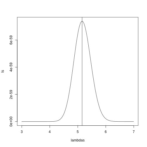
If you work out the math and do a bit of calculus, you realize that this is a particularly simple example for which the MLE is the average.
R
print( c(mle$maximum, mean(counts) ) )
OUTPUT
[1] 5.157894 5.157895Note that a plot of observed counts versus counts predicted by the Poisson shows that the fit is quite good in this case:
R
theoretical <- qpois((seq(0, 99) + 0.5)/100, mean(counts))

qqplot(theoretical, counts)
abline(0,1)
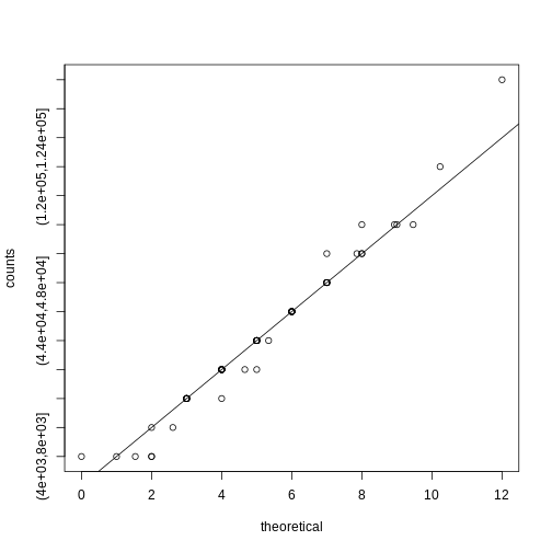
We therefore can model the palindrome count data with a Poisson with \(\lambda=5.16\).
Distributions for Positive Continuous Values
Different genes vary differently across biological replicates. Later, in the hierarchical models chapter, we will describe one of the most influential statistical methods in the analysis of genomics data. This method provides great improvements over naive approaches to detecting differentially expressed genes. This is achieved by modeling the distribution of the gene variances. Here we describe the parametric model used in this method.
We want to model the distribution of the gene-specific standard errors. Are they normal? Keep in mind that we are modeling the population standard errors so CLT does not apply, even though we have thousands of genes.
As an example, we use an experimental data that included both technical and biological replicates for gene expression measurements on mice. We can load the data and compute the gene specific sample standard error for both the technical replicates and the biological replicates.
R
library(Biobase) ##available from Bioconductor
load("data/maPooling.RData")
pd=pData(maPooling)

##determine which samples are bio reps and which are tech reps
strain=factor(as.numeric(grepl("b", rownames(pd))))
pooled=which(rowSums(pd)==12 & strain==1)
techreps=exprs(maPooling[,pooled])
individuals=which(rowSums(pd)==1 & strain==1)

##remove replicates
individuals=individuals[-grep("tr", names(individuals))]
bioreps=exprs(maPooling)[,individuals]

###now compute the gene specific standard deviations
library(matrixStats)
techsds=rowSds(techreps)
biosds=rowSds(bioreps)
We can now explore the sample standard deviation:
R
###now plot
library(rafalib)
mypar()
shist(biosds,unit=0.1,col=1,xlim=c(0,1.5))
shist(techsds,unit=0.1,col=2,add=TRUE)
legend("topright",c("Biological","Technical"), col=c(1,2),lty=c(1,1))
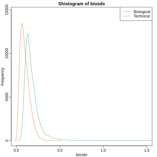
An important observation here is that the biological variability is substantially higher than the technical variability. This provides strong evidence that genes do in fact have gene-specific biological variability.
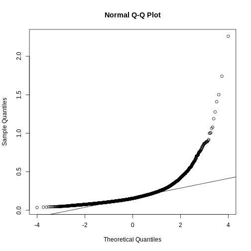
If we want to model this variability, we first notice that the normal distribution is not appropriate here since the right tail is rather large. Also, because SDs are strictly positive, there is a limitation to how symmetric this distribution can be. A qqplot shows this very clearly:
R
qqnorm(biosds)
qqline(biosds)
There are parametric distributions that possess these properties (strictly positive and heavy right tails). Two examples are the gamma and F distributions. The density of the gamma distribution is defined by:
\[ f(x;\alpha,\beta)=\frac{\beta^\alpha x^{\alpha-1}\exp{-\beta x}}{\Gamma(\alpha)} \]
It is defined by two parameters \(\alpha\) and \(\beta\) that can, indirectly, control location and scale. They also control the shape of the distribution. For more on this distribution please refer to this book.
Two special cases of the gamma distribution are the chi-squared and exponential distribution. We used the chi-squared earlier to analyze a 2x2 table data. For chi-square, we have \(\alpha=\nu/2\) and \(\beta=2\) with \(\nu\) the degrees of freedom. For exponential, we have \(\alpha=1\) and \(\beta=\lambda\) the rate.
The F-distribution comes up in analysis of variance (ANOVA). It is also always positive and has large right tails. Two parameters control its shape:
\[ f(x,d_1,d_2)=\frac{1}{B\left( \frac{d_1}{2},\frac{d_2}{2}\right)} \left(\frac{d_1}{d_2}\right)^{\frac{d_1}{2}} x^{\frac{d_1}{2}-1}\left(1+\frac{d1}{d2}x\right)^{-\frac{d_1+d_2}{2}} \]
with \(B\) the beta function and \(d_1\) and \(d_2\) are called the degrees of freedom for reasons having to do with how it arises in ANOVA. A third parameter is sometimes used with the F-distribution, which is a scale parameter.
Modeling the variance
In a later section we will learn about a hierarchical model approach to improve estimates of variance. In these cases it is mathematically convenient to model the distribution of the variance \(\sigma^2\). The hierarchical model used here implies that the sample standard deviation of genes follows scaled F-statistics:
\[ s^2 \sim s_0^2 F_{d,d_0} \]
with \(d\) the degrees of freedom involved in computing \(s^2\). For example, in a case comparing 3 versus 3, the degrees of freedom would be 4. This leaves two free parameters to adjust to the data. Here \(d\) will control the location and \(s_0\) will control the scale. Below are some examples of \(F\) distribution plotted on top of the histogram from the sample variances:
R
library(rafalib)
mypar(3,3)
sds=seq(0,2,len=100)
for(d in c(1,5,10)){
  for(s0 in c(0.1, 0.2, 0.3)){
    tmp=hist(biosds,main=paste("s_0 =",s0,"d =",d),
      xlab="sd",ylab="density",freq=FALSE,nc=100,xlim=c(0,1))
    dd=df(sds^2/s0^2,11,d)
    ##multiply by normalizing constant to assure same range on plot
    k=sum(tmp$density)/sum(dd)
    lines(sds,dd*k,type="l",col=2,lwd=2)
    }
}
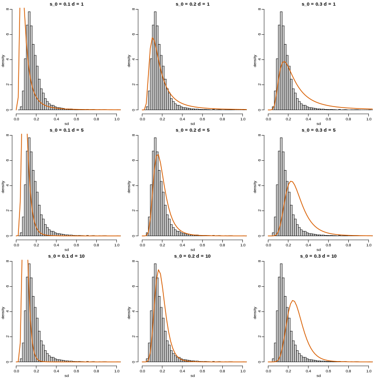
Now which \(s_0\) and \(d\) fit our data best? This is a rather
advanced topic as the MLE does not perform well for this particular
distribution (we refer to Smyth (2004)). The Bioconductor
limma package provides a function to estimate these
parameters:
R
library(limma)
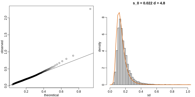
estimates=fitFDist(biosds^2, 11)
theoretical<- sqrt(qf((seq(0, 999) + 0.5)/1000, 11, estimates$df2) * estimates$scale)
observed <- biosds
The fitted models do appear to provide a reasonable approximation, as demonstrated by the qq-plot and histogram:
R
mypar(1,2)
qqplot(theoretical,observed)
abline(0,1)
tmp=hist(biosds,main=paste("s_0 =", signif(estimates[[1]],2),
                  "d =", signif(estimates[[2]],2)),
  xlab="sd", ylab="density", freq=FALSE, nc=100, xlim=c(0,1), ylim=c(0,9))
dd=df(sds^2/estimates$scale,11,estimates$df2)
k=sum(tmp$density)/sum(dd) ##a normalizing constant to assure same area in plot
lines(sds, dd*k, type="l", col=2, lwd=2)
Exercises
Suppose you have an urn with blue and red balls. If N balls are selected at random with replacement (you put the ball back after you pick it), we can denote the outcomes as random variables X1,…,XN that are 1 or 0. If the proportion of red balls is p , then the distribution of each of these is Pr(Xi=1)=p.
These are also called Bernoulli trials. These random variables are independent because we replace the balls. Flipping a coin is an example of this with p=0.5.
You can show that the mean and variance are p and p(1−p) respectively. The binomial distribution gives us the distribution of the sum SN of these random variables. The probability that we see k red balls is given by: Pr(SN=k)=(Nk)pk(1−p)N−k
In R, the function dbimom gives you this result. The function pbinom gives us Pr(SN≤k).
This equation has many uses in the life sciences. We give some examples below.
Exercise 1
The probability of conceiving a girl is 0.49. What is the probability that a family with 4 children has 2 girls and 2 boys (you can assume that the outcomes are independent)?
g <- sampleInfo$grouppvals <- rowttests(geneExpression, factor(g))$p.valuesum(pvals < 0.05)
Exercise 2
Use what you learned in Question 1 to answer these questions: What is the probability that a family with 10 children has 6 girls and 4 boys (assume no twins)?
p <- 0.49dbinom(6,10,p=p)
Exercise 3
The genome has 3 billion bases. About 20% are C, 20% are G, 30% are T, and 30% are A. Suppose you take a random interval of 20 bases, what is the probability that the GC-content (proportion of Gs of Cs) is strictly above 0.5 in this interval?
p <- 0.4pbinom(20,20,p) - pbinom(10,20,p)
Exercise 4
The probability of winning the lottery is 1 in 175,223,510. If 20,000,000 people buy a ticket, what is the probability that more than one person wins?
p <- 1/175233510N <- 200000001 - ppois(1,N*p)1 - pbinom(1,N,p)
Since the poisson distribution is a type of binomial distribution, both
distributions give the same values.
Exercise 5
We can show that the binomial approximation is approximately normal when N is large and p is not too close to 0 or 1. This means that:
SN−E(SN)Var(SN)‾‾‾‾‾‾‾‾√
is approximately normal with mean 0 and SD 1. Using the results for sums of independent random variables, we can show that E(SN)=Np and Var(Sn)=Np(1−p). The genome has 3 billion bases. About 20% are C, 20% are G, 30% are T, and 30% are A. Suppose you take a random interval of 20 bases, what is the exact probability that the GC-content (proportion of Gs of Cs) is greater than 0.35 and smaller or equal to 0.45 in this interval?
p <- 0.4pbinom(0.45*20, 20, p) - pbinom(0.35*20,20,p)
Exercise 6
For the question above, what is the normal approximation to the probability?
p <- 0.4N <- 20a <- (0.45*20 - N*p) / sqrt(N*p*(1-p))b <- (0.35*20 - N*p) / sqrt(N*p*(1-p))
approx <- pnorm(a) - pnorm(b)approx
Exercise 7
Repeat exercise 5, but using an interval of 1000 bases. What is the difference (in absolute value) between the normal approximation and the exact distribution of the GC-content being greater than 0.35 and lesser or equal to 0.45?
N <- 1000p <- 0.4a <- (0.45*N - N*p) / sqrt(N*p*(1-p))b <- (0.35*N - N*p) / sqrt(N*p*(1-p))approx <- pnorm(a) - pnorm(b)
exact <- pbinom(0.45*N,N,p) - pbinom(0.35*N,N,p)exact - approx
Exercise 8
The Cs in our genomes can be methylated or unmethylated. Suppose we
have a large (millions) group of cells in which a proportion p of the Cs
of interest are methylated. We break up the DNA of these cells and
randomly select pieces and end up with N pieces that contain the C we
care about. This means that the probability of seeing k methylated Cs is
binomial: exact = dbinom(k,N,p) We can approximate this with the normal
distribution: a <- (k+0.5 - N*p)/sqrt(N*p*(1-p))b <- (k-0.5 - N*p)/sqrt(N*p*(1-p))approx = pnorm(a) - pnorm(b)
Compute the difference approx - exact for:N <- c(5,10,50,100,500)p <- seq(0,1,0.25)
Compare the approximation and exact probability of the proportion of Cs
being p, k=1,…,N−1 plotting the exact versus the approximation for each
p and N combination. A) The normal approximation works well when p is
close to 0.5 even for small N=10
B) The normal approximation breaks down when p is close to 0 or 1 even
for large N
C) When N is 100 all approximations are spot on.
D) When p=0.01 the approximation are terrible for N=5,10,30 and only OK
for N=100
Ns <- c(5,10,50,100,500)Ps <- seq(0,1,0.25)mypar(5,5)for (i in seq_along(Ns)) {n <- Ns[[i]]k <- seq(1:n-1)for (j in seq_along(Ps)) {p <- Ps[[j]]exact = dbinom(k, n, p)a = (k+0.5- n*p)/sqrt(n*p*(1-p))b = (k-0.5- n*p)/sqrt(n*p*(1-p))approx = pnorm(a) - pnorm(b)qqplot(exact,approx,xlab='exact',ylab='approx',main = paste0('N=',n,' ','p=',p))abline(0,1)}}
The answer is C: When N is 100 all approximations are spot on. When p is
close to 0 or 1, the normal distribution breaks down even at N =
100.
Exercise 9
We saw in the previous question that when p is very small, the normal
approximation breaks down. If N is very large, then we can use the
Poisson approximation.
Earlier we computed 1 or more people winning the lottery when the
probability of winning was 1 in 175,223,510 and 20,000,000 people bought
a ticket. Using the binomial, we can compute the probability of exactly
two people winning to be:
N <- 20000000 p <- 1/175223510
dbinom(2,N,p)
If we were to use the normal approximation, we would greatly underestimate this:
a <- (2+0.5 - N*p)/sqrt(N*p*(1-p))
b <- (2-0.5 - N*p)/sqrt(N*p*(1-p))
pnorm(a) - pnorm(b)
To use the Poisson approximation here, use the rate λ=Np
representing the number of people per 20,000,000 that win the lottery. Note how much better the approximation is:
dpois(2,N*p)
In this case. it is practically the same because N is very large and Np is not 0. These are the assumptions needed for the Poisson to work. What is the Poisson approximation for more than one person winning?
1 - ppois(1,N*p)
Exercise 10
Now we are going to explore if palindromes are over-represented in some part of the HCMV genome. Make sure you have the latest version of the dagdata, load the palindrome data from the Human cytomegalovirus genome, and plot locations of palindromes on the genome for this virus:
library(dagdata)data(hcmv)plot(locations,rep(1,length(locations)),ylab="",yaxt="n")
These palindromes are quite rare, and therefore p is very small. If we break the genome into bins of 4000 basepairs, then we have Np not so small and we might be able to use Poisson to model the number of palindromes in each bin:
breaks=seq(0,4000*round(max(locations)/4000),4000)
tmp=cut(locations,breaks)
counts=as.numeric(table(tmp))
So if our model is correct, counts should follow a Poisson distribution. The distribution seems about right:
hist(counts)
So let X1,…,Xn be the random variables representing counts then Pr(Xi=k)=λk/k!exp(−λ) and to fully describe this distribution, we need to know λ. For this we will use MLE. We can write the likelihood described in book in R. For example, for λ=4 we have:
probs <- dpois(counts,4)
likelihood <- prod(probs) likelihood
Notice that it’s a tiny number. It is usually more convenient to compute log-likelihoods:
logprobs <- dpois(counts,4,log=TRUE)loglikelihood <- sum(logprobs)loglikelihood
Now write a function that takes λ and the vector of counts as input
and returns the log-likelihood. Compute this log-likelihood for lambdas
= seq(0,15,len=300) and make a plot. What value of lambdas
maximizes the log-likelihood?
loglike = function(lambdas) {logprobs <- dpois(counts,lambdas,log=T)loglikelihood <- sum(logprobs)return(loglikelihood)}lambdas <- seq(0,15,len=300)log_res <- exp(sapply(lambdas,loglike))optim_lambda <- lambdas[which(log_res == max(log_res))]
Exercise 11
The point of collecting this dataset was to try to determine if there is a region of the genome that has a higher palindrome rate than expected. We can create a plot and see the counts per location:
library(dagdata)data(hcmv)breaks=seq(0,4000*round(max(locations)/4000),4000)tmp=cut(locations,breaks)counts=as.numeric(table(tmp))binLocation=(breaks[-1]+breaks[-length(breaks)])/2plot(binLocation,counts,type="l",xlab=)
What is the center of the bin with the highest count?
binLocation[which(counts == max(counts))]
Exercise 12
What is the maximum count?
max(counts)
Exercise 13
Once we have identified the location with the largest palindrome count, we want to know if we could see a value this big by chance. If X is a Poisson random variable with rate:
lambda = mean(counts[ - which.max(counts) ])
What is the probability of seeing a count of 14 or more?
1 - ppois(13, lambda)
Exercise 14
So we obtain a p-value smaller than 0.001 for a count of 14. Why is it problematic to report this p-value as strong evidence of a location that is different?
- Poisson in only an approximation.
- We selected the highest region out of 57 and need to adjust for
multiple testing.
- λ is an estimate, a random variable, and we didn’t take into account
its variability.
- We don’t know the effect size.
The answer is B: We selected the highest region out of 57 and need to adjust for multiple testing. Answer A is wrong because we do use normal approximation in t-test to get a p-value, so there is nothing wrong with using approximation. Answer B is correct because the p-value that we obtained is from a comparison against the sample mean (z score = 0) rather than all other counts. Therefore, the p-value must be corrected (ex. Bonferroni’s procedure). Answer C is wrong because p value can also be a random variable, but this answer choice implies that p-value is not a random variable. Answer D is wrong because effect size is irrelevant.
Exercise 15
Use the Bonferonni correction to determine the p-value cut-off that guarantees a FWER of 0.05. What is this p-value cutoff?
0.05/length(counts)
Exercise 16
Create a qq-plot to see if our Poisson model is a good fit:
ps <- (seq(along=counts) - 0.5)/length(counts)lambda <- mean( counts[ -which.max(counts)])poisq <- qpois(ps,lambda)plot(poisq,sort(counts))abline(0,1)
How would you characterize this qq-plot? A) Poisson is a terrible
approximation.
B) Poisson is a very good approximation except for one point that we
actually think is a region of interest.
C) There are too many 1s in the data.
D) A normal distribution provides a better approximation.
The answer is B. You can check whether the palindrome counts are well
approximated by the normal distribution.qqnorm(sort(counts))
Exercise 17
Load the tissuesGeneExpression data library
load("data/tissuesGeneExpression.rda")
Now load this data and select the columns related to endometrium:
library(genefilter)y = e[,which(tissue=="endometrium")]
This will give you a matrix y with 15 samples. Compute the across
sample variance for the first three samples. Then make a qq-plot to see
if the data follow a normal distribution. Which of the following is
true? A) With the exception of a handful of outliers, the data follow a
normal distribution.
B) The variance does not follow a normal distribution, but taking the
square root fixes this.
C) The normal distribution is not usable here: the left tail is over
estimated and the right tail is underestimated.
D) The normal distribution fits the data almost perfectly.
vars <- rowVars(y[,1:3])length(vars)mypar(1,2)qqnorm(sqrt(vars)) # choice B is falseqqnorm(vars) # choice A and D are false
The answer is C.
Exercise 18
Now fit an F-distribution with 14 degrees of freedom using the fitFDist function in the limma package:
library(limma)res <- fitFDist(vars,14)res
Exercise 19
Now create a qq-plot of the observed sample variances versus the
F-distribution quantiles. Which of the following best describes the
qq-plot? A) The fitted F-distribution provides a perfect fit.
B) If we exclude the lowest 0.1% of the data, the F-distribution
provides a good fit.
C) The normal distribution provided a better fit.
D) If we exclude the highest 0.1% of the data, the F-distribution
provides a good fit.
pf <- (seq(along=vars)-0.5)/length(vars)theory <- qf(pf,14,res$df2) # theoretical quantiles from F distributionmypar(1,2)qqplot(theory, sort(vars), xlab = 'theory', ylab ='obs') # F approximation
vs variance from the data
qqnorm(sort(vars)) # normal approximation vs variance from the data
The answer is D: If we exclude the highest 0.1% of the data, the
F-distribution provides a good fit. Actually I do not think answer is
entirely correct but this is the most appropriate one. Even if we
exclude the top 0.1% there are still more outliers to remove. Here is a
demonstration.
vars_sort <- sort(vars)vars_excl <- vars_sort[1:18000] # 18000 out of 22215
kept = 81%pf_excl <- (seq(along=vars_excl)-0.5)/length(vars_excl)theory <- qf(pf_excl,14,res$df2)
mypar(2,2)qqplot(theory,vars_excl, xlab = 'theory',ylab='obs',main = 'all data compared with F-approximation')qqplot(vars_excl,theory, xlim = c(0,0.2),ylim = c(0,100), main = 'zoomed in')qqnorm(vars_excl, main = 'normal qqplot') # comparing with normal
approximation with filtered variance (81% kept)
Even if I keep up to 81% of the values, F-distribution
- Not every dataset follows a normal distribution. It is important to be aware of other parametric distributions underlying the data collected. This improves the technical precision of study results.