Content from Example Gene Expression Datasets
Last updated on 2025-09-23 | Edit this page
Estimated time: 35 minutes
Overview
Questions
- What data will be be using for our analyses?
Objectives
- Explore a high-throughput dataset composed of three tables.
- Examine the features (high-throughput measurements) of the data you explored.
Explore a Gene Expression Dataset
Since there is a vast number of available public datasets, we use several gene expression examples. Nonetheless, the statistical techniques you will learn have also proven useful in other fields that make use of high-throughput technologies. Technologies such as microarrays, next generation sequencing, fMRI, and mass spectrometry all produce data to answer questions for which what we learn here will be indispensable.
The three tables
Most of the data we use as examples in this book are created with high-throughput technologies. These technologies measure thousands of features. Examples of features are genes, single base locations of the genome, genomic regions, or image pixel intensities. Each specific measurement product is defined by a specific set of features. For example, a specific gene expression microarray product is defined by the set of genes that it measures.
A specific study will typically use one product to make measurements on several experimental units, such as individuals. The most common experimental unit will be the individual, but they can also be defined by other entities, for example different parts of a tumor. We often call the experimental units samples following experimental jargon. It is important that these are not confused with samples as referred to in previous chapters, for example “random sample”.
So a high-throughput experiment is usually defined by three tables: one with the high-throughput measurements and two tables with information about the columns and rows of this first table respectively.
Because a dataset is typically defined by a set of experimental units and a product defines a fixed set of features, the high-throughput measurements can be stored in an n x m matrix, with n the number of units and m the number of features. In R, the convention has been to store the transpose of these matrices, in which all the rows become columns and the columns become the rows.
Here is an example from a gene expression dataset:
R
load("./data/GSE5859Subset.rda") ## this loads the three tables
dim(geneExpression)
OUTPUT
[1] 8793 24We have RNA expression measurements for 8793 genes from blood taken from 24 individuals (the experimental units). For most statistical analyses, we will also need information about the individuals. For example, in this case the data was originally collected to compare gene expression across ethnic groups. However, we have created a subset of this dataset for illustration and separated the data into two groups:
R
dim(sampleInfo)
OUTPUT
[1] 24 4R
head(sampleInfo)
OUTPUT
    ethnicity       date         filename group
107       ASN 2005-06-23 GSM136508.CEL.gz     1
122       ASN 2005-06-27 GSM136530.CEL.gz     1
113       ASN 2005-06-27 GSM136517.CEL.gz     1
163       ASN 2005-10-28 GSM136576.CEL.gz     1
153       ASN 2005-10-07 GSM136566.CEL.gz     1
161       ASN 2005-10-07 GSM136574.CEL.gz     1
R
sampleInfo$group
OUTPUT
[1] 1 1 1 1 1 1 1 1 1 1 1 1 0 0 0 0 0 0 0 0 0 0 0 0One of the columns, filenames, permits us to connect the rows of this table to the columns of the measurement table.
R
match(sampleInfo$filename, colnames(geneExpression))
OUTPUT
[1] 1 2 3 4 5 6 7 8 9 10 11 12 13 14 15 16 17 18 19 20 21 22 23 24Finally, we have a table describing the features:
R
dim(geneAnnotation)
OUTPUT
[1] 8793 4R
head(geneAnnotation)
OUTPUT
     PROBEID  CHR     CHRLOC SYMBOL
1  1007_s_at chr6   30852327   DDR1
30   1053_at chr7  -73645832   RFC2
31    117_at chr1  161494036  HSPA6
32    121_at chr2 -113973574   PAX8
33 1255_g_at chr6   42123144 GUCA1A
34   1294_at chr3  -49842638   UBA7
The table includes an ID that permits us to connect the rows of this table with the rows of the measurement table:
R
head(match(geneAnnotation$PROBEID, rownames(geneExpression)))
OUTPUT
[1] 1 2 3 4 5 6The table also includes biological information about the features, namely chromosome location and the gene “name” used by biologists.
Exercise 1: How many samples were processed on 2005-06-27?
unique(sampleInfo$date) # check date format
sampleInfo[sampleInfo$date == "2005-06-27",]
sum(sampleInfo$date == "2005-06-27") # sum of TRUEs Exercise 2: How many of the genes represented in this particular technology are on chromosome Y?
unique(geneAnnotation$CHR) # check chromosome spelling
sum(geneAnnotation$CHR == "chrY", na.rm = TRUE) # remove missing values # (NAs) to sum TRUEsExercise 3: What is the log expression value for gene ARPC1A on the one subject that we measured on 2005-06-10?
sampleInfo[sampleInfo$date == "2005-06-10",] # June 10 sample
sampleFileName <- sampleInfo[sampleInfo$date == "2005-06-10", "filename"] # save file name
sampleProbeID <- geneAnnotation[which(geneAnnotation$SYMBOL == "ARPC1A"), "PROBEID"] # save probe ID
geneExpression[sampleProbeID, sampleFileName]Discussion
What kinds of research questions might you ask of this data? What are the dependent (response) and independent variables? Turn to a partner and discuss, then share with the group in the collaborative document.
- High-throughput data measures thousands of features.
- High-throughput data is typically composed of multiple tables.
Content from Basic inference for high-throughput data
Last updated on 2025-09-23 | Edit this page
Estimated time: 60 minutes
Overview
Questions
- How are inferences from high-throughput data different from inferences from smaller samples?
- How is the interpretation of p-values affected by high-throughput data?
Objectives
- Demonstrate that p-values are random variables.
- Simulate p-values from multiple analyses of high-throughput data.
Inference in Practice
Suppose we were given high-throughput gene expression data that was measured for several individuals in two populations. We are asked to report which genes have different average expression levels in the two populations. If instead of thousands of genes, we were handed data from just one gene, we could simply apply the inference techniques that we have learned before. We could, for example, use a t-test or some other test. Here we review what changes when we consider high-throughput data.
p-values are random variables
An important concept to remember in order to understand the concepts presented in this chapter is that p-values are random variables. Let’s revisit random variables as addressed in this Statistical Inference for Biology episode. We have a dataset that we imagine contains the weights of all control female mice. We refer to this as the population, even though it is impossible to have data for all mice in population. For illustrative purposes we imagine having access to an entire population, though in practice we cannot.
To illustrate a random variable, sample 12 mice from the population three times and watch how the average changes.
R
population <- unlist(read.csv(file = "./data/femaleControlsPopulation.csv"))
R
control <- sample(population, 12)
mean(control)
OUTPUT
[1] 22.1925R
control <- sample(population, 12)
mean(control)
OUTPUT
[1] 24.75417R
control <- sample(population, 12)
mean(control)
OUTPUT
[1] 23.94333Notice that the mean is a random variable. To explore p-values as random variables, consider the example in which we define a p-value from a t-test with a large enough sample size to use the Central Limit Theorem (CLT) approximation. The CLT says that when the sample size is large, the average Ȳ of a random sample follows a normal distribution centered at the population average μY and with standard deviation equal to the population standard deviation σY, divided by the square root of the sample size N.Then our p-value is defined as the probability that a normally distributed random variable is larger, in absolute value, than the observed t-test, call it Z. Recall that a t-statistic is the ratio of the observed effect size and the standard error. Because it’s the ratio of two random variables, it too is a random variable. So for a two sided test the p-value is:
In R, we write:
R
2 * (1 - pnorm(abs(Z)))
Now because Z is a random variable and Φ is a deterministic function, p is also a random variable. We will create a Monte Carlo simulation showing how the values of p change.
We use replicate to repeatedly create p-values.
R
set.seed(1)
N <- 12
B <- 10000
pvals <- replicate(B, {
  control = sample(population, N)
  treatment = sample(population, N)
  t.test(treatment, control)$p.val
  })
hist(pvals)
As implied by the histogram, in this case the distribution of the p-value is uniformly distributed. In fact, we can show theoretically that when the null hypothesis is true, this is always the case. For the case in which we use the CLT, we have that the null hypothesis H0 implies that our test statistic Z follows a normal distribution with mean 0 and SD 1 thus:
 This implies that:
which is the definition of a uniform distribution.
Thousands of tests
In this data we have two groups denoted with 0 and 1:
R
load("data/GSE5859Subset.rda")
g <- sampleInfo$group
g
OUTPUT
[1] 1 1 1 1 1 1 1 1 1 1 1 1 0 0 0 0 0 0 0 0 0 0 0 0If we were interested in a particular gene, let’s arbitrarily pick the one on the 25th row, we would simply compute a t-test. To compute a p-value, we will use the t-distribution approximation and therefore we need the population data to be approximately normal. Recall that when the CLT does not apply (e.g. when sample sizes aren’t large enough), we can use the t-distribution.
We check our assumption that the population is normal with a qq-plot:
R
e <- geneExpression[25, ]
R
library(rafalib)
mypar(1,2)

qqnorm(e[g==1])
qqline(e[g==1])

qqnorm(e[g==0])
qqline(e[g==0])
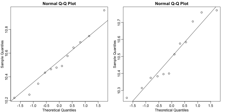
The qq-plots show that the data is well approximated by the normal approximation. The t-test does not find this gene to be statistically significant:
R
t.test(e[g==1], e[g==0])$p.value
OUTPUT
[1] 0.779303To answer the question for each gene, we simply repeat the above for
each gene. Here we will define our own function and use
apply:
R
myttest <- function(x)
  t.test(x[g==1],
         x[g==0],
         var.equal=TRUE)$p.value
pvals <- apply(geneExpression, 1, myttest)
We can now see which genes have p-values less than, say, 0.05. For example, right away we see that…
R
sum(pvals < 0.05)
OUTPUT
[1] 1383… genes had p-values less than 0.05.
However, as we will describe in more detail below, we have to be careful in interpreting this result because we have performed over 8,000 tests. If we performed the same procedure on random data, for which the null hypothesis is true for all features, we obtain the following results:
R
set.seed(1)
m <- nrow(geneExpression)
n <- ncol(geneExpression)
randomData <- matrix(rnorm(n * m), m, n)
nullpvals <- apply(randomData, 1, myttest)
sum(nullpvals < 0.05)
OUTPUT
[1] 419Discussion
Turn to a partner and explain what you did and found in the previous two analyses. What do you think the results mean? Then, share your responses with the group through the collaborative document.
As we will explain later in the chapter, this is to be expected: 419 is roughly 0.05 * 8192 and we will describe the theory that tells us why this prediction works.
Faster t-test implementation
Before we continue, we should point out that the above implementation is very inefficient. There are several faster implementations that perform t-test for high-throughput data. We make use of a function that is not available from CRAN, but rather from the Bioconductor project. Now we can show that this function is much faster than our code above and produce practically the same answer:
R
library(genefilter)
results <- rowttests(geneExpression, factor(g))
max(abs(pvals - results$p))
OUTPUT
[1] 6.528111e-14Exercises
These exercises will help clarify that p-values are random variables
and some of the properties of these p-values. Note that just like the
sample average is a random variable because it is based on a random
sample, the p-values are based on random variables (sample mean and
sample standard deviation for example) and thus it is also a random
variable.
To see this, let’s see how p-values change when we take different
samples.
R
set.seed(1)
pvals <- replicate(1000, { # recreate p-values as from above
  control = sample(population, 12)
  treatment = sample(population, 12)
  t.test(treatment,control)$p.val
  }
  )
head(pvals)
OUTPUT
[1] 0.3191557945 0.2683723148 0.0003358878 0.0312671917 0.1410320545
[6] 0.9478677657
R
hist(pvals)
Exercise 1: What proportion of the p-values is below 0.05?
sum(pvals < 0.05)/length(pvals)
50 of the p-values are less than 0.05 of a total
1000 p-values
Exercise 2: What proportion of the p-values is below 0.01?
sum(pvals < 0.01)/length(pvals)
11 of the p-values are less than 0.01 of a total
1000 p-values
Exercise 3
Assume you are testing the effectiveness of 20 diets on mice weight. For each of the 20 diets, you run an experiment with 10 control mice and 10 treated mice. Assume the null hypothesis, that the diet has no effect, is true for all 20 diets and that mice weights follow a normal distribution, with mean 30 grams and a standard deviation of 2 grams. Run a Monte Carlo simulation for one of these studies:
cases = rnorm(10, 30, 2)
controls = rnorm(10, 30, 2)
t.test(cases, controls)
Now run a Monte Carlo simulation imitating the results for the experiment for all 20 diets. If you set the seed at 100, set.seed(100), how many of p-values are below 0.05?
set.seed(100)n <- 20null <- vector("numeric", n)for (i in 1:n) {cases = rnorm(10, 30, 2)controls = rnorm(10, 30, 2)null[i] <- t.test(cases, controls)$p.val}sum(null < 0.05)
Exercise 4
Now create a simulation to learn about the distribution of the number of p-values that are less than 0.05. In question 3, we ran the 20 diet experiment once. Now we will run the experiment 1,000 times and each time save the number of p-values that are less than 0.05. Set the seed at 100, set.seed(100), run the code from Question 3 1,000 times, and save the number of times the p-value is less than 0.05 for each of the 1,000 instances. What is the average of these numbers? This is the expected number of tests (out of the 20 we run) that we will reject when the null is true.
set.seed(100)res <- replicate(1000, {randomData <- matrix(rnorm(20*20,30,2),20,20)pvals <- rowttests(randomData, factor(g))$p.valuereturn(sum(pvals<0.05)) # total number of false
positives per replication})mean(res)
Exercise 5
What this says is that on average, we expect some p-value to be 0.05 even when the null is true for all diets. Use the same simulation data and report for what percent of the 1,000 replications did we make more than 0 false positives?
mean(res 0)
- P-values are random variables.
- Very small p-values can occur by random chance when analyzing high-throughput data.
Content from Procedures for Multiple Comparisons
Last updated on 2025-09-23 | Edit this page
Estimated time: 30 minutes
Overview
Questions
- Why are p-values not a useful quantity when dealing with high-dimensional data?
- What are error rates and how are they calculated?
Objectives
- Define multiple comparisons and the resulting problems.
- Explain terms associated with error rates.
- Explain the relationship between error rates and multiple comparisons.
Procedures
In the previous section we learned how p-values are no longer a useful quantity to interpret when dealing with high-dimensional data. This is because we are testing many features at the same time. We refer to this as the multiple comparison or multiple testing or multiplicity problem. The definition of a p-value does not provide a useful quantification here. Again, because when we test many hypotheses simultaneously, a list based simply on a small p-value cut-off of, say 0.01, can result in many false positives with high probability. Here we define terms that are more appropriate in the context of high-throughput data.
The most widely used approach to the multiplicity problem is to define a procedure and then estimate or control an informative error rate for this procedure. What we mean by control here is that we adapt the procedure to guarantee an error rate below a predefined value. The procedures are typically flexible through parameters or cutoffs that let us control specificity and sensitivity. An example of a procedure is:
- Compute a p-value for each gene.
- Call significant all genes with p-values smaller than \(\alpha\).
Note that changing the \(\alpha\) permits us to adjust specificity and sensitivity.
Next we define the error rates that we will try to estimate and control.
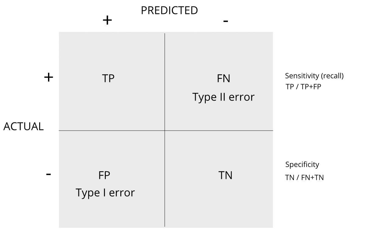
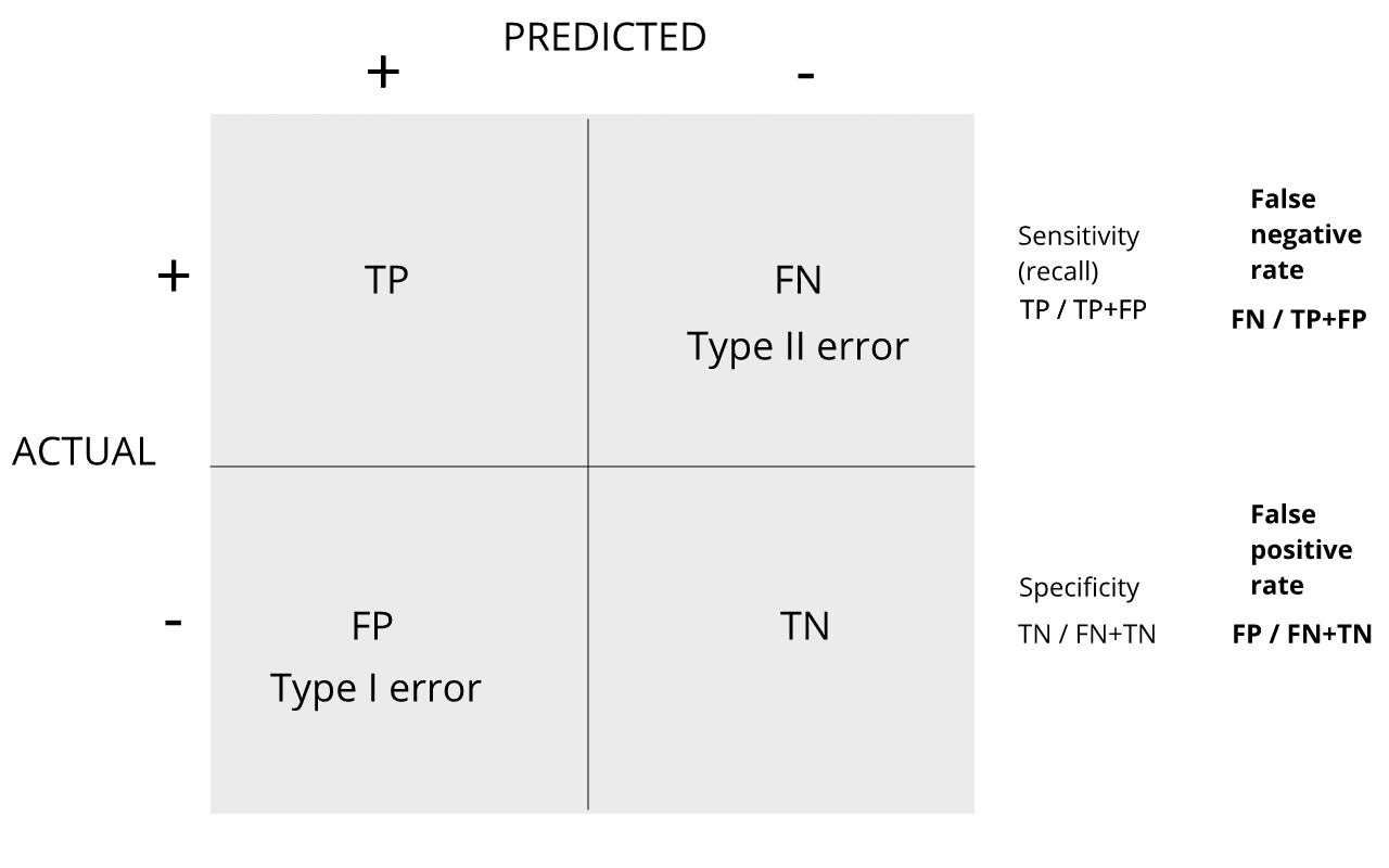
Review the matrix below to understand sensitivity, specificity, and error rates.
Discussion
Turn to a partner and explain the following:
1. Type I error
2. Type II error
3. sensitivity
4. specificity
When you are finished discussing, share with the group in the
collaborative document.
For more on this, see Classification evaluation by J. Lever, M. Krzywinski and N. Altman in Nature Methods 13, 603-604 (2016).
Exercises
With these exercises we hope to help you further grasp the concept that p-values are random variables and start laying the ground work for the development of procedures that control error rates. The calculations to compute error rates require us to understand the random behavior of p-values. We are going to ask you to perform some calculations related to introductory probability theory. One particular concept you need to understand is statistical independence. You also will need to know that the probability of two random e vents that are statistically independent occurring is P (A and B) = P (A)P (B). This is a consequence of the more general formula P (A and B) = P (A)P (B|A).
Exercise 1
Assume the null is true and denote the p-value you would get if you
ran a test as P. Define the function f (x) = Pr(P x) . What does f (x)
look like?
A) A uniform distribution.
B) The identity line.
C) A constant at 0.05.
D) P is not a random value.
Exercise 2
In the previous exercises, we saw how the probability of incorrectly rejecting the null for at least one of 20 experiments for which the null is true, is well over 5%. Now let’s consider a case in which we run thousands of tests, as we would do in a high throughput experiment. We previously learned that under the null, the probability of a p-value < p is p. If we run 8,793 independent tests, what it the probability of incorrectly rejecting at least one of the null hypothesis?
1 - 0.95^8793
Exercise 3
Suppose we need to run 8,793 statistical tests and we want to make the probability of a mistake very small, say 5%. Use the answer to Exercise 2 (Sidak’s procedure) to determine how small we have to change the cutoff, previously 0.05, to lower our probability of at least one mistake to be 5%.
m <- 87931 - 0.95^(1/m)
- We want our inferential analyses to maximize the percentage of true positives (sensitivity) and true negatives (specificity)
- p values are random variables, conducting multiple comparisons on high throughput data can produce a large number of false positives (Type 1 errors) simply by chance.
- There are procedures for improving sensitivity and specificity by controlling error rates below a predefined value.
Content from Error Rates
Last updated on 2025-09-23 | Edit this page
Estimated time: 30 minutes
Overview
Questions
- Why are type I and II error rates a problem in inferential statistics?
- What is Family Wise Error Rate, and why is it a concern in high throughput data?
Objectives
- Calculate error rates in simulated data.
- Calculate the number of false positives that occur in a given data set.
- Define family wise error rates.
Error Rates
Throughout this section we will be using the type I error and type II error terminology. We will also refer to them as false positives and false negatives respectively. We also use the more general terms specificity, which relates to type I error, and sensitivity, which relates to type II errors.
Types of Error
Whenever we perform a statistical test, we are aware that we may make a mistake. This is why our p-values are not 0. Under the null, there is always a positive, perhaps very small, but still positive chance that we will reject the null when it is true. If the p-value is 0.05, it will happen 1 out of 20 times. This error is called type I error by statisticians.
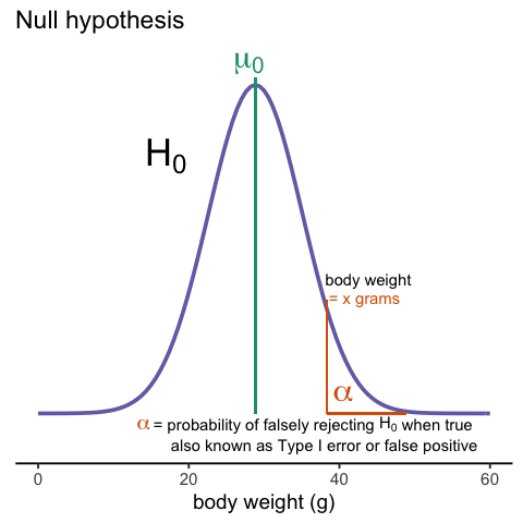
A type I error is defined as rejecting the null when we should not. This is also referred to as a false positive. So why do we then use 0.05? Shouldn’t we use 0.000001 to be really sure? The reason we don’t use infinitesimal cut-offs to avoid type I errors at all cost is that there is another error we can commit: to not reject the null when we should. This is called a type II error or a false negative.
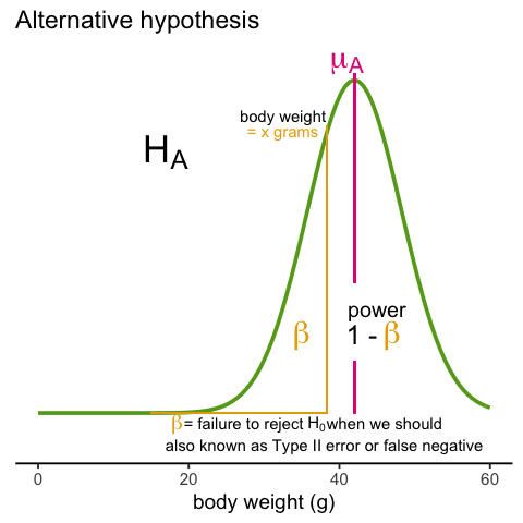
In the context of high-throughput data we can make several type I errors and several type II errors in one experiment, as opposed to one or the other as seen in Chapter 1. In this table, we summarize the possibilities using the notation from the seminal paper by Benjamini-Hochberg:
| Called significant | Not called significant | Total | |
|---|---|---|---|
| Null True | \(V\) | \(m_0-V\) | \(m_0\) |
| Alternative True | \(S\) | \(m_1-S\) | \(m_1\) |
| True | \(R\) | \(m-R\) | \(m\) |
To describe the entries in the table, let’s use as an example a dataset representing measurements from 10,000 genes, which means that the total number of tests that we are conducting is: \(m=10,000\). The number of genes for which the null hypothesis is true, which in most cases represent the “non-interesting” genes, is \(m_0\), while the number of genes for which the null hypothesis is false is \(m_1\). For this we can also say that the alternative hypothesis is true. In general, we are interested in detecting as many as possible of the cases for which the alternative hypothesis is true (true positives), without incorrectly detecting cases for which the null hypothesis is true (false positives). For most high-throughput experiments, we assume that \(m_0\) is much greater than \(m_1\). For example, we test 10,000 expecting 100 genes or less to be interesting. This would imply that \(m_1 \leq 100\) and \(m_0 \geq 19,900\).
Throughout this chapter we refer to features as the units being tested. In genomics, examples of features are genes, transcripts, binding sites, CpG sites, and SNPs. In the table, \(R\) represents the total number of features that we call significant after applying our procedure, while \(m-R\) is the total number of genes we don’t call significant. The rest of the table contains important quantities that are unknown in practice.
- \(V\) represents the number of type I errors or false positives. Specifically, \(V\) is the number of features for which the null hypothesis is true, that we call significant.
- \(S\) represents the number of true positives. Specifically, \(S\) is the number of features for which the alternative is true, that we call significant.
This implies that there are \(m_1-S\) type II errors or false negatives and \(m_0-V\) true negatives. Keep in mind that if we only ran one test, a p-value is simply the probability that \(V=1\) when \(m=m_0=1\). Power is the probability of \(S=1\) when \(m=m_1=1\). In this very simple case, we wouldn’t bother making the table above, but now we show how defining the terms in the table helps for the high-dimensional setting.
Data example
Let’s compute these quantities with a data example. We will use a Monte Carlo simulation using our mice data to imitate a situation in which we perform tests for 10,000 different fad diets, none of them having an effect on weight. This implies that the null hypothesis is true for diets and thus \(m=m_0=10,000\) and \(m_1=0\). Let’s run the tests with a sample size of \(N=12\) and compute \(R\). Our procedure will declare any diet achieving a p-value smaller than \(\alpha=0.05\) as significant.
R
set.seed(1)
population = unlist( read.csv(file = "./data/femaleControlsPopulation.csv") )
alpha <- 0.05
N <- 12
m <- 10000
pvals <- replicate(m,{
  control = sample(population,N)
  treatment = sample(population,N)
  t.test(treatment,control)$p.value
})
Although in practice we do not know the fact that no diet works, in this simulation we do, and therefore we can actually compute \(V\) and \(S\). Because all null hypotheses are true, we know, in this specific simulation, that \(V=R\). Of course, in practice we can compute \(R\) but not \(V\).
R
sum(pvals < 0.05)
OUTPUT
[1] 409These many false positives are not acceptable in most contexts.
Here is more complicated code showing results where 10% of the diets are effective with an average effect size of \(\Delta= 3\) ounces. Studying this code carefully will help us understand the meaning of the table above. First let’s define the truth:
R
alpha <- 0.05
N <- 12
m <- 10000
p0 <- 0.90 ##10% of diets work, 90% don't
m0 <- m * p0
m1 <- m - m0
nullHypothesis <- c( rep(TRUE, m0), rep(FALSE, m1))
delta <- 3
Now we are ready to simulate 10,000 tests, perform a t-test on each, and record if we rejected the null hypothesis or not:
R
set.seed(1)
calls <- sapply(1:m, function(i){
  control <- sample(population, N)
  treatment <- sample(population, N)
  if(!nullHypothesis[i]) treatment <- treatment + delta
  ifelse( t.test(treatment, control)$p.value < alpha,
          "Called Significant",
          "Not Called Significant")
})
Because in this simulation we know the truth (saved in
nullHypothesis), we can compute the entries of the
table:
R
null_hypothesis <- factor(nullHypothesis, levels=c("FALSE", "TRUE"))
table(null_hypothesis, calls)
OUTPUT
               calls
null_hypothesis Called Significant Not Called Significant
          FALSE                553                    447
          TRUE                 361                   8639
The first column of the table above shows us \(V\) and \(S\). Note that \(V\) and \(S\) are random variables. If we run the simulation repeatedly, these values change. Here is a quick example:
R
B <- 10 ##number of simulations
VandS <- replicate(B,{
  calls <- sapply(1:m, function(i){
    control <- sample(population, N)
    treatment <- sample(population, N)
    if(!nullHypothesis[i]) treatment <- treatment + delta
    t.test(treatment, control)$p.val < alpha
  })
  cat("V =",sum(nullHypothesis & calls), "S =",sum(!nullHypothesis & calls),"\n")
  c(sum(nullHypothesis & calls),sum(!nullHypothesis & calls))
  })
OUTPUT
V = 373 S = 540
V = 375 S = 553
V = 386 S = 545
V = 396 S = 565
V = 373 S = 532
V = 355 S = 541
V = 372 S = 501
V = 376 S = 522
V = 355 S = 570
V = 388 S = 506
This motivates the definition of error rates. We can, for example, estimate probability that \(V\) is larger than 0. This is interpreted as the probability of making at least one type I error among the 10,000 tests. In the simulation above, \(V\) was much larger than 1 in every single simulation, so we suspect this probability is very practically 1. When \(m=1\), this probability is equivalent to the p-value. When we have a multiple tests situation, we call it the Family Wise Error Rate (FWER) and it relates to a technique that is widely used: The Bonferroni Correction.
Discussion
Refer to the confusion matrix below showing false positive and false
negative rates, along with specificity and sensitivity. Turn to a
partner and explain the following:
How is specificity related to Type I error and false positive
rates?
How is sensitivity related to Type II error and false negative
rates?
When you are finished discussing, share with the group in the
collaborative document.
For more on this, see Classification evaluation by J. Lever, M. Krzywinski and N. Altman in Nature Methods 13, 603-604 (2016).
- Type 1 and Type II error are complementary concerns in data analysis. The reason we don’t have extremely strict cutoffs for alpha is because we don’t want to miss finding true positive results.
- It is possible to calculate the probability of finding at least one false positive result when conducting multiple inferential tests. This is the Family Wise Error Rate.
Content from The Bonferroni Correction
Last updated on 2025-09-23 | Edit this page
Estimated time: 45 minutes
Overview
Questions
- What is one way to control family wise error rate?
Objectives
- Apply the Bonferroni procedure to identify the true positives.
The Bonferroni Correction
Now that we have learned about the Family Wise Error Rate (FWER), we describe what we can actually do to control it. In practice, we want to choose a procedure that guarantees the FWER is smaller than a predetermined value such as 0.05. We can keep it general and instead of 0.05, use \(\alpha\) in our derivations.
Since we are now describing what we do in practice, we no longer have the advantage of knowing the truth. Instead, we pose a procedure and try to estimate the FWER. Let’s consider the naive procedure: “reject all the hypotheses with p-value <0.01”. For illustrative purposes we will assume all the tests are independent (in the case of testing diets this is a safe assumption; in the case of genes it is not so safe since some groups of genes act together). Let \(p_1,\dots,p_{10000}\) be the the p-values we get from each test. These are independent random variables so:
\[ \begin{aligned} \mbox{Pr}(\mbox{at least one rejection}) &= 1 -\mbox{Pr}(\mbox{no rejections}) \\ &= 1 - \prod_{i=1}^{1000} \mbox{Pr}(p_i>0.01) \\ &= 1-0.99^{1000} \approx 1 \end{aligned} \]
Or if you want to use simulations:
R
B <- 10000
minpval <- replicate(B, min(runif(10000, 0, 1)) < 0.01)
mean(minpval >= 1)
OUTPUT
[1] 1So our FWER is 1! This is not what we were hoping for. If we wanted it to be lower than \(\alpha=0.05\), we failed miserably.
So what do we do to make the probability of a mistake lower than \(\alpha\) ? Using the derivation above we can change the procedure by selecting a more stringent cutoff, previously 0.01, to lower our probability of at least one mistake to be 5%. Namely, by noting that:
\(\mbox{Pr}(\mbox{at least one rejection}) = 1-(1-k)^{10000}\)
and solving for \(k\), we get \(1-(1-k)^{10000}=0.01 \implies k = 1-0.99^{1/10000} \approx 1e-6\)
This now gives a specific example of a procedure. This one is actually called Sidak’s procedure. Specifically, we define a set of instructions, such as “reject all the null hypothesis for which p-values < 1e-6. Then, knowing the p-values are random variables, we use statistical theory to compute how many mistakes, on average, we are expected to make if we follow this procedure. More precisely, we compute bounds on these rates; that is, we show that they are smaller than some predetermined value. There is a preference in the life sciences to err on the side of being conservative.
A problem with Sidak’s procedure is that it assumes the tests are independent. It therefore only controls FWER when this assumption holds. The Bonferroni correction is more general in that it controls FWER even if the tests are not independent. As with Sidak’s procedure we start by noting that:
\(FWER = \mbox{Pr}(V>0) \leq \mbox{Pr}(V>0 \mid \mbox{all nulls are true})\)
or using the notation from the table above:
\(\mbox{Pr}(V>0) \leq \mbox{Pr}(V>0 \mid m_1=0)\)
The Bonferroni procedure sets \(k=\alpha/m\) since we can show that:
\[ \begin{align*} \mbox{Pr}(V>0 \,\mid \, m_1=0) &= \mbox{Pr}\left( \min_i \{p_i\} \leq \frac{\alpha}{m} \mid m_1=0 \right)\\ &\leq \sum_{i=1}^m \mbox{Pr}\left(p_i \leq \frac{\alpha}{m} \right)\\ &= m \frac{\alpha}{m}=\alpha \end{align*} \]
Controlling the FWER at 0.05 is a very conservative approach. Using the p-values computed in the previous section…
R
set.seed(1)
population <- unlist(read.csv(file = "./data/femaleControlsPopulation.csv"))
m <- 10000
N <- 12
p0 <- 0.90 ##10% of diets work, 90% don't
m0 <- m * p0
m1 <- m - m0
nullHypothesis <- c( rep(TRUE,m0), rep(FALSE,m1))
delta <- 3
pvals <- sapply(1:m, function(i){
  control <- sample(population, N)
  treatment <- sample(population, N)
  if(!nullHypothesis[i]) treatment <- treatment + delta
  t.test(treatment, control)$p.value
})
…we note that only:
R
sum(pvals < 0.05/10000)
OUTPUT
[1] 0are called significant after applying the Bonferroni procedure, despite having 1,000 diets that work.
Exercises
The following exercises should help you understand the concept of an error controlling procedure. You can think of it as defining a set of instructions, such as “reject all the null hypothesis for which p-values < 0.0001” or “reject the null hypothesis for the 10 features with smallest p-values”. Then, knowing the p-values are random variables, we use statistical theory to compute how many mistakes, on average, we will make if we follow this procedure. More precisely, we commonly find bounds on these rates, meaning that we show that they are smaller than some predetermined value. As described in the text, we can compute different error rates. The FWER tells us the probability of having at least one false positive. The FDR is the expected rate of rejected null hypothesis.
Note 1: the FWER and FDR are not procedures, but error rates. We will review procedures here and use Monte Carlo simulations to estimate their error rates.
Note 2: We sometimes use the colloquial term “pick genes that” meaning “reject the null hypothesis for genes that”.
Exercise 1
We have learned about the family wide error rate FWER. This is the probability of incorrectly rejecting the null at least once. Using the notation in the video, this probability is written like this: Pr(V 0). What we want to do in practice is choose a procedure that guarantees this probability is smaller than a predetermined value such as 0.05. Here we keep it general and, instead of 0.05, we use α. We have already learned that the procedure “pick all the genes with p-value < 0.05” fails miserably as we have seen that Pr(V 0) ≈ 1. So what else can we do? The Bonferroni procedure assumes we have computed p-values for each test and asks what constant k should we pick so that the procedure “pick all genes with p-value less than k “ has Pr(V 0) = 0.05. Furthermore, we typically want to be conservative rather than lenient, so we accept a procedure that has Pr(V 0) ≤ 0.05. So the first result we rely on is that this probability is largest when all the null hypotheses are true: Pr(V 0) ≤ Pr(V 0|all nulls are true) or: Pr(V 0) ≤ Pr(V 0 | m1 = 0) We showed that if the tests are independent then: Pr(V 0|m1) = 1−(1−k)m And we pick k so that 1 − (1 − k)m = α =⇒ k=1−(1−α)1/m Now this requires the tests to be independent. The Bonferroni procedure does not make this assumption and, as we previously saw, sets k = α/m and shows that with this choice of k this procedure results in P r(V 0) ≤ α. In R define alphas <- seq(0,0.25,0.01) Make a plot of α/m and 1 − (1 − α)1/m for various values of m 1.
plot(alphas/m, (1-(1-alphas)^(1/m)), xlab = 'bonf', ylab = 'sidak',
main = 'p-val cutoff')abline(0,1)
Exercise 2
Which procedure is more conservative Bonferroni’s or Sidak’s?
A) They are the same.
B) Bonferroni’s.
C) Depends on m.
D) Sidak’s.
Bonferroni’s procedure is more conservative (choice B). Conservative refers to strictness. The p-value cutoff for significance is lower in Bonferroni’s procedure, and therefore more conservative.
Exercise 3
To simulate the p-value results of, say 8,793 t-tests for which the
null is true, we don’t actually have to generate the original data. We
can generate p-values for a uniform distribution like this:
pvals <- runif(8793,0,1). Using what we have learned,
set the cutoff using the Bonferroni correction and report back the FWER.
Set the seed at 1 and run 10,000 simulation.
set.seed(1)bonf_res <- replicate(10000, {pvals <- runif(8793,0,1)bonfcall <- sum((pvals * m) < 0.05)return(bonfcall)})sum(bonf_res>0)/length(bonf_res)
Exercise 4
Using the same seed, repeat exercise 5, but for Sidak’s cutoff.
set.seed(1)sidak_res <- replicate(10000, {pvals <- runif(8793,0,1)sidakcall <- sum((1-(1-pvals)^m) < 0.05)return(sidakcall)sum(sidak_res>0)/length(sidak_res)})
- The Bonferroni technique controls FWER by dividing a predetermined alpha rate (e.g. alpha = .05) by the number of inferential tests performed.
- The Bonferroni correction is very strict and conservative.
Content from False Discovery Rate
Last updated on 2025-09-23 | Edit this page
Estimated time: 40 minutes
Overview
Questions
- What are False Discovery Rates, and when are they a concern in data analysis?
- How can you control false discovery rates?
Objectives
- Calculate the false discovery rate.
- Explain the limitations of restricting family wise error rates in a study.
False Discovery Rate
There are many situations for which requiring an FWER of 0.05 does not make sense as it is much too strict. For example, consider the very common exercise of running a preliminary small study to determine a handful of candidate genes. This is referred to as a discovery driven project or experiment. We may be in search of an unknown causative gene and more than willing to perform follow-up studies with many more samples on just the candidates. If we develop a procedure that produces, for example, a list of 10 genes of which 1 or 2 pan out as important, the experiment is a resounding success. With a small sample size, the only way to achieve a FWER \(\leq\) 0.05 is with an empty list of genes. We already saw in the previous section that despite 1,000 diets being effective, we ended up with a list with just 2. Change the sample size to 6 and you very likely get 0:
R
set.seed(1)
population <- unlist(read.csv(file = "./data/femaleControlsPopulation.csv"))
m <- 10000
p0 <- 0.90
m0 <- m*p0
m1 <- m-m0
nullHypothesis <- c( rep(TRUE,m0), rep(FALSE,m1))
delta <- 3
pvals <- sapply(1:m, function(i){
  control <- sample(population, 6)
  treatment <- sample(population, 6)
  if(!nullHypothesis[i]) treatment <- treatment + delta
  t.test(treatment, control)$p.value
  })
sum(pvals < 0.05/10000)
OUTPUT
[1] 0By requiring a FWER \(\leq\) 0.05, we are practically assuring 0 power (sensitivity). In many applications, this specificity requirement is over-kill. A widely used alternative to the FWER is the false discovery rate (FDR). The idea behind FDR is to focus on the random variable \(Q \equiv V/R\) with \(Q=0\) when \(R=0\) and \(V=0\). Note that \(R=0\) (nothing called significant) implies \(V=0\) (no false positives). So \(Q\) is a random variable that can take values between 0 and 1 and we can define a rate by considering the average of \(Q\). To better understand this concept here, we compute \(Q\) for the procedure: call everything p-value < 0.05 significant.
Discussion
Refer to the confusion matrix below showing false positive, false
negative, and false discovery rates, along with specificity and
sensitivity. Turn to a partner and explain the following:
How is the false discovery rate related to Type I error and false
positive rates?
How is sensitivity related to the false discovery rate?
When you are finished discussing, share with the group in the
collaborative document.
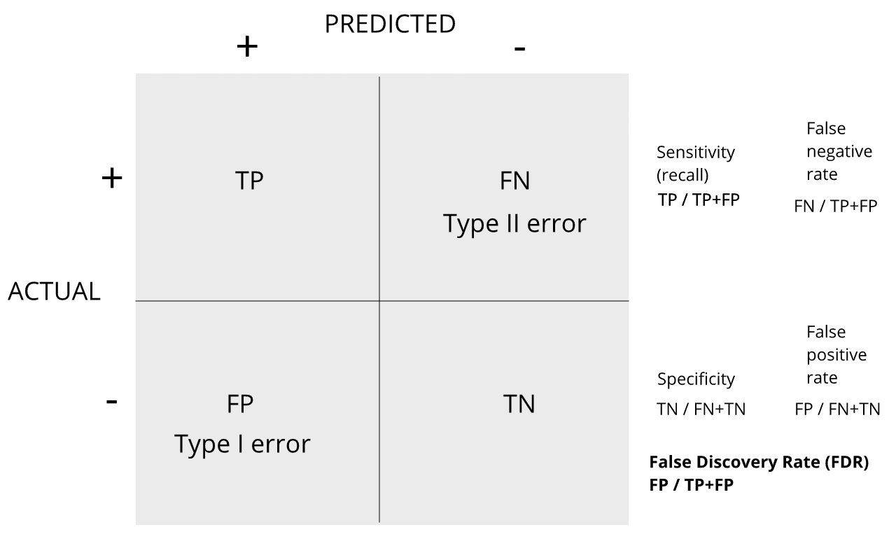
For more on this, see Classification evaluation by J. Lever, M. Krzywinski and N. Altman in Nature Methods 13, 603-604 (2016).
Vectorizing code
Before running the simulation, we are going to vectorize the
code. This means that instead of using sapply to run
m tests, we will create a matrix with all data in one call
to sample. This code runs several times faster than the code above,
which is necessary here due to the fact that we will be generating
several simulations. Understanding this chunk of code and how it is
equivalent to the code above using sapply will take a you
long way in helping you code efficiently in R.
R
library(genefilter) ##rowttests is here
alpha <- 0.05
N <- 12
set.seed(1)
##Define groups to be used with rowttests
g <- factor( c(rep(0, N), rep(1, N)) )
B <- 1000 ##number of simulations
Qs <- replicate(B, {
  ##matrix with control data (rows are tests, columns are mice)
  controls <- matrix(sample(population, N*m, replace=TRUE), nrow=m)

  ##matrix with control data (rows are tests, columns are mice)
  treatments <-  matrix(sample(population, N*m, replace=TRUE), nrow=m)

  ##add effect to 10% of them
  treatments[which(!nullHypothesis),] <- treatments[which(!nullHypothesis),] + delta

  ##combine to form one matrix
  dat <- cbind(controls, treatments)

 calls <- rowttests(dat, g)$p.value < alpha
 R=sum(calls)
 Q=ifelse(R > 0, sum(nullHypothesis & calls)/R, 0)
 return(Q)
})
Controlling FDR
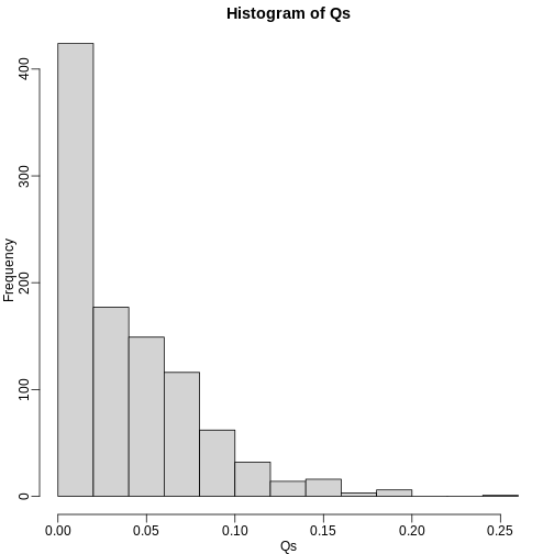
The code above is a Monte Carlo simulation that generates 10,000 experiments 1,000 times, each time saving the observed \(Q\). Here is a histogram of these values:
R
library(rafalib)
mypar(1, 1)
hist(Qs) ##Q is a random variable, this is its distribution
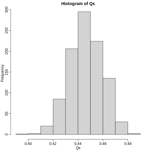
The FDR is the average value of \(Q\)
R
FDR=mean(Qs)
print(FDR)
OUTPUT
[1] 0.4465395The FDR is relatively high here. This is because for 90% of the tests, the null hypotheses is true. This implies that with a 0.05 p-value cut-off, out of 100 tests we incorrectly call between 4 and 5 significant on average. This combined with the fact that we don’t “catch” all the cases where the alternative is true, gives us a relatively high FDR. So how can we control this? What if we want lower FDR, say 5%?
To visually see why the FDR is high, we can make a histogram of the
p-values. We use a higher value of m to have more data from
the histogram. We draw a horizontal line representing the uniform
distribution one gets for the m0 cases for which the null
is true.
R
set.seed(1)
controls <- matrix(sample(population, N*m, replace=TRUE), nrow=m)
treatments <-  matrix(sample(population, N*m, replace=TRUE), nrow=m)
treatments[which(!nullHypothesis),] <- treatments[which(!nullHypothesis),] + delta
dat <- cbind(controls, treatments)
pvals <- rowttests(dat, g)$p.value

h <- hist(pvals, breaks=seq(0,1,0.05))
polygon(c(0,0.05,0.05,0), c(0,0,h$counts[1],h$counts[1]), col="lightsteelblue1")
abline(h=m0/20)
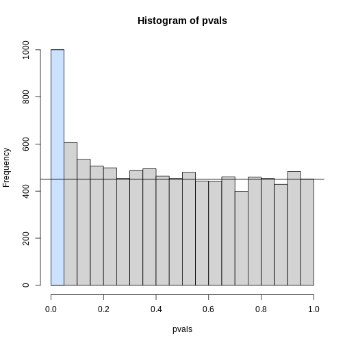
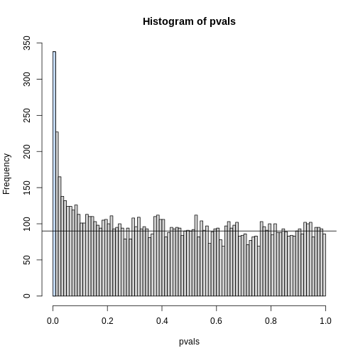
The first bar (grey) on the left represents cases with p-values smaller than 0.05. From the horizontal line we can infer that about 1/2 are false positives. This is in agreement with an FDR of 0.50. If we look at the bar for 0.01, we can see a lower FDR, as expected, but would call fewer features significant.
R
h <- hist(pvals,breaks=seq(0,1,0.01))
polygon(c(0,0.01,0.01,0),c(0,0,h$counts[1],h$counts[1]),col="lightsteelblue1")
abline(h=m0/100)
As we consider a lower and lower p-value cut-off, the number of features detected decreases (loss of sensitivity), but our FDR also decreases (gain of specificity). So how do we decide on this cut-off? One approach is to set a desired FDR level \(\alpha\), and then develop procedures that control the error rate: FDR \(\leq \alpha\).
Benjamini-Hochberg (Advanced)
We want to construct a procedure that guarantees the FDR to be below a certain level \(\alpha\). For any given \(\alpha\), the Benjamini-Hochberg (1995) procedure is very practical because it simply requires that we are able to compute p-values for each of the individual tests and this permits a procedure to be defined.
For this procedure, order the p-values in increasing order: \(p_{(1)},\dots,p_{(m)}\). Then define \(k\) to be the largest \(i\) for which
\[p_{(i)} \leq \frac{i}{m}\alpha\]
The procedure is to reject tests with p-values smaller or equal to \(p_{(k)}\). Here is an example of how we would select the \(k\) with code using the p-values computed above:
R
alpha <- 0.05
i = seq(along=pvals)

mypar(1,2)
plot(i,sort(pvals))
abline(0,i/m*alpha)
##close-up
plot(i[1:15],sort(pvals)[1:15],main="Close-up")
abline(0,i/m*alpha)
R
k <- max( which( sort(pvals) < i/m*alpha) )
cutoff <- sort(pvals)[k]
cat("k =",k,"p-value cutoff=",cutoff)
OUTPUT
k = 24 p-value cutoff= 0.0001197627We can show mathematically that this procedure has FDR lower than 5%. Please see Benjamini-Hochberg (1995) for details. An important outcome is that we now have selected 11 tests instead of just 2. If we are willing to set an FDR of 50% (this means we expect at least 1/2 our genes to be hits), then this list grows to 1063. The FWER does not provide this flexibility since any list of substantial size will result in an FWER of 1.
Keep in mind that we don’t have to run the complicated code above as
we have functions to do this. For example, using the p-values
pvals computed above, we simply type the following:
R
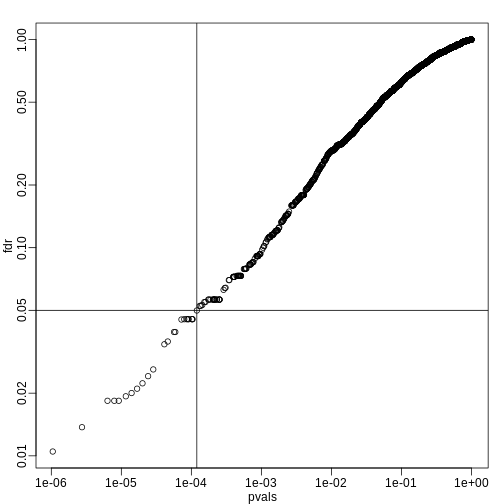
fdr <- p.adjust(pvals, method="fdr")
mypar(1,1)
plot(pvals,fdr,log="xy")
abline(h=alpha,v=cutoff) ##cutoff was computed above
We can run a Monte-Carlo simulation to confirm that the FDR is in fact lower than .05. We compute all p-values first, and then use these to decide which get called.
R
alpha <- 0.05
B <- 1000 ##number of simulations. We should increase for more precision
res <- replicate(B,{
  controls <- matrix(sample(population, N*m, replace=TRUE),nrow=m)
  treatments <-  matrix(sample(population, N*m, replace=TRUE),nrow=m)
  treatments[which(!nullHypothesis),]<-treatments[which(!nullHypothesis),]+delta
  dat <- cbind(controls,treatments)
  pvals <- rowttests(dat,g)$p.value
  ##then the FDR
  calls <- p.adjust(pvals,method="fdr") < alpha
  R=sum(calls)
  Q=ifelse(R>0,sum(nullHypothesis & calls)/R,0)
  return(c(R,Q))
})
Qs <- res[2,]
mypar(1,1)
hist(Qs) ##Q is a random variable, this is its distribution
R
FDR=mean(Qs)
print(FDR)
OUTPUT
[1] 0.03641142The FDR is lower than 0.05. This is to be expected because we need to be conservative to ensure the FDR \(\leq\) 0.05 for any value of \(m_0\), such as for the extreme case where every hypothesis tested is null: \(m=m_0\). If you re-do the simulation above for this case, you will find that the FDR increases.
We should also note that in …
R
Rs <- res[1,]
mean(Rs==0) * 100
OUTPUT
[1] 1.3… percent of the simulations, we did not call any genes significant.
Finally, note that the p.adjust function has several
options for error rate controlling procedures:
R
p.adjust.methods
OUTPUT
[1] "holm"       "hochberg"   "hommel"     "bonferroni" "BH"
[6] "BY"         "fdr"        "none"
It is important to remember that these options offer not just different approaches to estimating error rates, but also that different error rates are estimated: namely FWER and FDR. This is an important distinction. More information is available from:
R
?p.adjust
In summary, requiring that FDR \(\leq\) 0.05 is a much more lenient requirement FWER \(\leq\) 0.05. Although we will end up with more false positives, FDR gives us much more power. This makes it particularly appropriate for discovery phase experiments where we may accept FDR levels much higher than 0.05.
- Restricting FWER too much can cause researchers to reject the null hypothesis when it’s actually true. This is especially likely in the small samples used in discovery phase experiments.
- The Benjamini-Hochberg correction controls FDR by guaranteeing it to be below a desired alpha level.
- FDR is a more liberal correction than Bonferroni. While it generates more false positives, it also provides more statistical power.
Content from Direct Approach to FDR and q-values
Last updated on 2025-09-23 | Edit this page
Estimated time: 60 minutes
Overview
Questions
- How can you control false discovery rates when you don’t have an a priori error rate?
Objectives
- Apply the Storey correction to identify true negatives.
- Explain the difference between the Storey correction and Benjamini-Hochberg approach.
Direct Approach to FDR and q-values (Advanced)
Here we review the results described by John D. Storey in J. R. Statist. Soc. B (2002). One major distinction between Storey’s approach and Benjamini and Hochberg’s is that we are no longer going to set a \(\alpha\) level a priori. Because in many high-throughput experiments we are interested in obtaining some list for validation, we can instead decide beforehand that we will consider all tests with p-values smaller than 0.01. We then want to attach an estimate of an error rate. Using this approach, we are guaranteed to have \(R>0\). Note that in the FDR definition above we assigned \(Q=0\) in the case that \(R=V=0\). We were therefore computing:
\[ \mbox{FDR} = E\left( \frac{V}{R} \mid R>0\right) \mbox{Pr}(R>0) \]
In the approach proposed by Storey, we condition on having a non-empty list, which implies \(R>0\), and we instead compute the positive FDR
\[ \mbox{pFDR} = E\left( \frac{V}{R} \mid R>0\right) \]
A second distinction is that while Benjamini and Hochberg’s procedure controls under the worst case scenario, in which all null hypotheses are true ( \(m=m_0\) ), Storey proposes that we actually try to estimate \(m_0\) from the data. Because in high-throughput experiments we have so much data, this is certainly possible. The general idea is to pick a relatively high value p-value cut-off, call it \(\lambda\), and assume that tests obtaining p-values > \(\lambda\) are mostly from cases in which the null hypothesis holds. We can then estimate \(\pi_0 = m_0/m\) as:
\[ \hat{\pi}_0 = \frac{\#\left\{p_i > \lambda \right\} }{ (1-\lambda) m } \]
There are more sophisticated procedures than this, but they follow the same general idea. Here is an example setting \(\lambda=0.1\). Using the p-values computed above we have:
R
library(genefilter) ##rowttests is here
set.seed(1)
alpha <- 0.05
N <- 12

##Define groups to be used with rowttests
g <- factor( c(rep(0, N), rep(1, N)) )

# re-create p-values from earlier if needed
population <- unlist(read.csv(file = "./data/femaleControlsPopulation.csv"))
m <- 10000
p0 <- 0.90
m0 <- m*p0
m1 <- m-m0
nullHypothesis <- c( rep(TRUE,m0), rep(FALSE,m1))
delta <- 3

B <- 1000 ##number of simulations. We should increase for more precision
res <- replicate(B, {
  controls <- matrix(sample(population, N*m, replace=TRUE),nrow=m)
  treatments <- matrix(sample(population, N*m, replace=TRUE),nrow=m)
  treatments[which(!nullHypothesis),]<-treatments[which(!nullHypothesis),]+delta
  dat <- cbind(controls,treatments)
  pvals <- rowttests(dat,g)$p.value
  ##then the FDR
  calls <- p.adjust(pvals,method="fdr") < alpha
  R=sum(calls)
  Q=ifelse(R>0,sum(nullHypothesis & calls)/R,0)
  return(c(R,Q))
  }
  )
Qs <- res[2,]
R
set.seed(1)
controls <- matrix(sample(population, N*m, replace=TRUE),nrow=m)
treatments <-  matrix(sample(population, N*m, replace=TRUE),nrow=m)
treatments[which(!nullHypothesis),]<-treatments[which(!nullHypothesis),]+delta
dat <- cbind(controls,treatments)
pvals <- rowttests(dat,g)$p.value
hist(pvals,breaks=seq(0,1,0.05),freq=FALSE)
lambda = 0.1
pi0=sum(pvals> lambda) /((1-lambda)*m)
abline(h= pi0)
R
print(pi0) ##this is close to the try pi0=0.9
OUTPUT
[1] 0.9326667With this estimate in place we can, for example, alter the Benjamini and Hochberg procedures to select the \(k\) to be the largest value so that:
\[\hat{\pi}_0 p_{(i)} \leq \frac{i}{m}\alpha\]
However, instead of doing this, we compute a q-value for each test. If a feature resulted in a p-value of \(p\), the q-value is the estimated pFDR for a list of all the features with a p-value at least as small as \(p\).
In R, this can be computed with the qvalue function in
the qvalue package:
R
library(qvalue)
res <- qvalue(pvals)
qvals <- res$qvalues
plot(pvals, qvals)
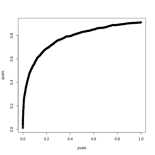
we also obtain the estimate of \(\hat{\pi}_0\):
R
res$pi0
OUTPUT
[1] 0.9117251This function uses a more sophisticated approach at estimating \(\pi_0\) than what is described above.
Exercises
In the following exercises, we will define error controlling procedures for experimental data. We will make a list of genes based on q-values. We will also assess your understanding of false positives rates and false negative rates by asking you to create a Monte Carlo simulation.
Exercise 1
Load the gene expression data:load("episodes/data/GSE5859Subset.rda")
We are interested in comparing gene expression between the two groups
defined in the sampleInfo table. Compute a p-value for each gene using
the function rowttests from the genefilter package.
library(genefilter)?rowttests
How many genes have p-values smaller than 0.05?
g <- sampleInfo$grouppvals <- rowttests(geneExpression, factor(g))$p.valuesum(pvals < 0.05)
Exercise 2: Apply the Bonferroni correction to achieve a FWER of 0.05. How many genes are called significant under this procedure?
m <- 8793sum(pvals < (0.05/m))
Exercise 3
The FDR is a property of a list of features, not each specific feature. The q-value relates FDR to individual features. To define the q-value, we order features we tested by p-value, then compute the FDRs for a list with the most significant, the two most significant, the three most significant, etc. The FDR of the list with the, say, m most significant tests is defined as the q-value of the m-th most significant feature. In other words, the q-value of a feature, is the FDR of the biggest list that includes that gene. In R, we can compute q-values using the p.adjust function with the FDR option. Read the help file for p.adjust and compute how many genes achieve a q-value < 0.05 for our gene expression dataset.
pvals_adjust <- p.adjust(pvals, method = 'fdr')sum(pvals_adjust < 0.05)
Exercise 4
Now use the qvalue function, in the Bioconductor qvalue package, to estimate q-values using the procedure described by Storey. How many genes have q-values below 0.05?
res <- qvalue(pvals)sum(res$qvalues < 0.05)
Exercise 5
Read the help file for qvalue and report the estimated proportion of genes for which the null hypothesis is true π0 = m0/m
res$pi0
Exercise 6
The number of genes passing the q-value < 0.05 threshold is larger
with the q-value function than the p.adjust difference. Why is this the
case? Make a plot of the ratio of these two estimates to help answer the
question.
A) One of the two procedures is flawed.
B) The two functions are estimating different things.
C) The qvalue function estimates the proportion of genes for which the
null hypothesis is true and provides a less conservative estimate.
D) The qvalue function estimates the proportion of genes for which the
null hypothesis is true and provides a more conservative estimate.
plot(pvals_adjust, res$qvalues, xlab = 'fdr', ylab = 'qval')abline(0,1)
The qvalue function estimates the proportion of genes for which the null
hypothesis is true and provides a less conservative estimate (choice
C).
Exercise 7
This exercise and the remaining ones are more advanced. Create a Monte Carlo Simulation in which you simulate measurements from 8,793 genes for 24 samples, 12 cases and 12 controls. Then for 100 genes create a difference of 1 between cases and controls. You can use the code provided below. Run this experiment 1,000 times with a Monte Carlo simulation. For each instance, compute p-values using a t-test and keep track of the number of false positives and false negatives. Compute the false positive rate and false negative rates if we use Bonferroni, q-values from p.adjust, and q-values from qvalue function. Set the seed to 1 for all three simulations. What is the false positive rate for Bonferroni? What are the false negative rates for Bonferroni?
n <- 24
m <- 8793
mat <- matrix(rnorm(n*m),m,n)
delta <- 1
positives <- 500
mat[1:positives,1:(n/2)] <- mat[1:positives,1:(n/2)]+delta g <- c(rep(0,12),rep(1,12))
m <- 8793
B <- 1000
m1 <- 500
N <- 12
m0 <- m-m1
nullHypothesis <- c(rep(TRUE,m0),rep(FALSE,m1))
delta <- 1
set.seed(1)
res <- replicate(B, {
controls <- matrix(rnorm(N*m),nrow = m, ncol = N)
treatment <- matrix(rnorm(N*m),nrow = m, ncol = N)
treatment[!nullHypothesis,] <-
treatment[!nullHypothesis,] + delta
dat <- cbind(controls, treatment)
pvals <- rowttests(dat, factor(g))$p.value
calls <- pvals < (0.05/m)
R <- sum(calls)
V <- sum(nullHypothesis & calls)
fp <- sum(nullHypothesis & calls)/m0 # false positive
fn <- sum(!nullHypothesis & !calls)/m1 # false negative
return(c(fp,fn))
})
res<-t(res)
head(res)
mean(res[,1]) # false positive rate
mean(res[,2]) # false negative rateExercise 8
What are the false positive rates for p.adjust?
What are the false negative rates for p.adjust?
g <- c(rep(0,12),rep(1,12))
m <- 8793
B <- 1000
m1 <- 500
N <- 12
m0 <- m-m1
nullHypothesis <- c(rep(TRUE,m0),rep(FALSE,m1))
delta <- 1

set.seed(1)
res <- replicate(B, {
  controls <- matrix(rnorm(N*m),nrow = m, ncol = N)
  treatment <- matrix(rnorm(N*m),nrow = m, ncol = N)
  treatment[!nullHypothesis,] <-
    treatment[!nullHypothesis,] + delta
  dat <- cbind(controls, treatment)
  pvals <- rowttests(dat, factor(g))$p.value
  pvals_adjust <- p.adjust(pvals, method = 'fdr')
  calls <- pvals_adjust < 0.05
  R <- sum(calls)
  V <- sum(nullHypothesis & calls)
  fp <- sum(nullHypothesis & calls)/m0 # false positive
  fn <- sum(!nullHypothesis & !calls)/m1 # false negative
  return(c(fp,fn))
})
res <- t(res)
head(res)
mean(res[,1]) # false positive rate
mean(res[,2]) # false negative rateExercise 9
What are the false positive rates for qvalues?
What are the false negative rates for qvalues?
g <- c(rep(0,12),rep(1,12))
m <- 8793
B <- 1000
m1 <- 500
N <- 12
m0 <- m-m1
nullHypothesis <- c(rep(TRUE,m0),rep(FALSE,m1))
delta <- 1

set.seed(1)
res <- replicate(B, {
  controls <- matrix(rnorm(N*m),nrow = m, ncol = N)
  treatment <- matrix(rnorm(N*m),nrow = m, ncol = N)
  treatment[!nullHypothesis,] <-
    treatment[!nullHypothesis,] + delta
  dat <- cbind(controls, treatment)
  pvals <- rowttests(dat, factor(g))$p.value
  qvals <- qvalue(pvals)$qvalue
  calls <- qvals < 0.05
  R <- sum(calls)
  V <- sum(nullHypothesis & calls)
  fp <- sum(nullHypothesis & calls)/m0 # false positive
  fn <- sum(!nullHypothesis & !calls)/m1 # false negative
  return(c(fp,fn))
})
res <- t(res)
head(res)
mean(res[,1]) # false positive rate
mean(res[,2]) # false negative rate - The Storey correction makes different assumptions that Benjamini-Hochberg. It does not set a priori alpha levels, but instead estimates the number of true null hypotheses from a given data set.
- The Storey correction is less computationally stable than Benjamini-Hochberg.
Content from Basic EDA for high-throughput data
Last updated on 2025-09-23 | Edit this page
Estimated time: 75 minutes
Overview
Questions
- What problems can different kinds of exploratory plots detect in high-throughput data?
Objectives
- Create four different types of plots for high-throughput data.
- Explain how to use them to detect problems.
Basic Exploratory Data Analysis
An under-appreciated advantage of working with high-throughput data is that problems with the data are sometimes more easily exposed than with low-throughput data. The fact that we have thousands of measurements permits us to see problems that are not apparent when only a few measurements are available. A powerful way to detect these problems is with exploratory data analysis (EDA). Here we review some of the plots that allow us to detect quality problems.
Volcano plots
Here we will use the results obtained from applying t-test to data from a gene expression dataset:
R
library(genefilter)
load("data/GSE5859Subset.rda")
g <- factor(sampleInfo$group)
results <- rowttests(geneExpression, g)
pvals <- results$p.value
And we also generate p-values from a dataset for which we know the null is true:
R
m <- nrow(geneExpression)
n <- ncol(geneExpression)
randomData <- matrix(rnorm(n * m), m, n)
nullpvals <- rowttests(randomData, g)$p.value
As we described earlier, reporting only p-values is a mistake when we can also report effect sizes. With high-throughput data, we can visualize the results by making a volcano plot. The idea behind a volcano plot is to show these for all features. In the y-axis we plot -log (base 10) p-values and on the x-axis we plot the effect size. By using -log (base 10), the “highly significant” features appear at the top of the plot. Using log also permits us to better distinguish between small and very small p-values, for example 0.01 and \(10^6\). Here is the volcano plot for our results above:
R
plot(results$dm,-log10(results$p.value),
     xlab="Effect size",ylab="- log (base 10) p-values")
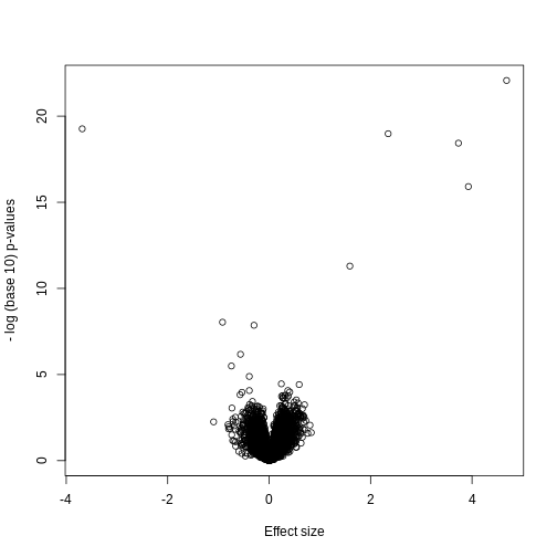
Many features with very small p-values, but small effect sizes as we see here, are sometimes indicative of problematic data.
p-value Histograms
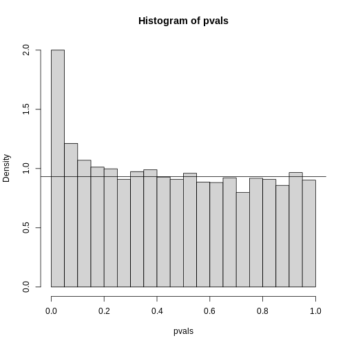
Another plot we can create to get an overall idea of the results is to make histograms of p-values. When we generate completely null data the histogram follows a uniform distribution. With our original dataset we see a higher frequency of smaller p-values.
R
library(rafalib)
mypar(1,2)
hist(nullpvals,ylim=c(0,1400))
hist(pvals,ylim=c(0,1400))
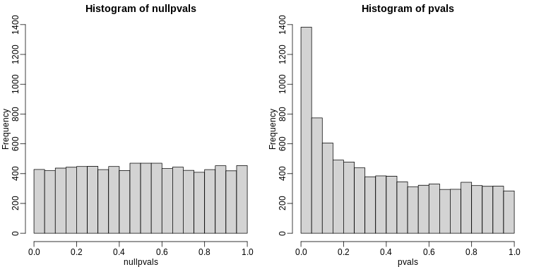
When we expect most hypotheses to be null and don’t see a uniform p-value distribution, it might be indicative of unexpected properties, such as correlated samples.
If we permute the outcomes and calculate p-values then, if the samples are independent, we should see a uniform distribution. With these data we do not:
R
permg <- sample(g)
permresults <- rowttests(geneExpression,permg)
hist(permresults$p.value)
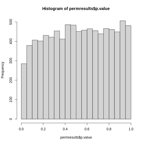
In a later chapter we will see that the columns in this dataset are not independent and thus the assumptions used to compute the p-values here are incorrect.
Data boxplots and histograms
With high-throughput data, we have thousands of measurements for each experimental unit. As mentioned earlier, this can help us detect quality issues. For example, if one sample has a completely different distribution than the rest, we might suspect there are problems. Although a complete change in distribution could be due to real biological differences, more often than not it is due to a technical problem. Here we load a large gene expression experiment available on Github. We “accidentally” use log instead of log2 on one of the samples.
R
library(Biobase)
load("data/GSE5859.rda")
ge <- exprs(e) ## ge for gene expression
ge[,49] <- ge[,49]/log2(exp(1)) ## imitate error
A quick look at a summary of the distribution using boxplots immediately highlights the mistake:
R
library(rafalib)
mypar(1,1)
boxplot(ge,range=0,names=1:ncol(e),col=ifelse(1:ncol(ge)==49,1,2))
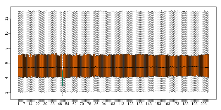
Note that the number of samples is a bit too large here, making it hard to see the boxes. One can instead simply show the boxplot summaries without the boxes:
R
qs <- t(apply(ge,2,quantile,prob=c(0.05,0.25,0.5,0.75,0.95)))
matplot(qs,type="l",lty=1)
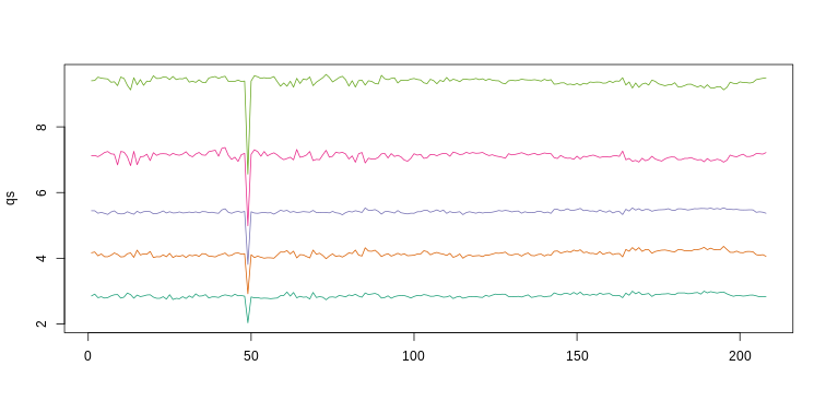
We refer to this figure as a kaboxplot because Karl Broman was the first we saw use it as an alternative to boxplots.
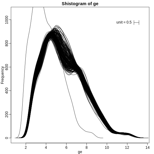
We can also plot all the histograms. Because we have so much data, we create histograms using small bins, then smooth the heights of the bars and then plot smooth histograms. We re-calibrate the height of these smooth curves so that if a bar is made with base of size “unit” and height given by the curve at \(x_0\), the area approximates the number of points in region of size “unit” centered at \(x_0\):
R
mypar(1,1)
shist(ge,unit=0.5)
MA plot
Scatterplots and correlation are not the best tools to detect replication problems. A better measure of replication can be obtained from examining the differences between the values that should be the same. Therefore, a better plot is a rotation of the scatterplot containing the differences on the y-axis and the averages on the x-axis. This plot was originally named a Bland-Altman plot, but in genomics it is commonly referred to as an MA-plot. The name MA comes from plots of red log intensity minus (M) green intensities versus average (A) log intensities used with microarrays (MA) data.
R
x <- ge[,1]
y <- ge[,2]
mypar(1, 2)
plot(x, y)
plot((x + y)/2, x - y)
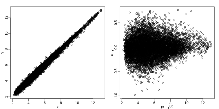
Note that once we rotate the plot, the fact that these data have differences of about:
R
sd(y - x)
OUTPUT
[1] 0.2025465becomes immediate. The scatterplot shows very strong correlation, which is not necessarily informative here.
We will later introduce dendograms, heatmaps, and multi-dimensional scaling plots.
Exercises
Load the SpikeInSubset library and the
mas133 data:
R
library(SpikeInSubset)
OUTPUT
Loading required package: affyR
data(mas133)
Now make the following plot of the first two samples and compute the correlation:
R
e <- exprs(mas133)
plot(e[,1],e[,2],main=paste0("corr=",signif(cor(e[,1],e[,2]),3)),cex=0.5)
k <- 3000
b <- 1000 #a buffer
polygon(c(-b,k,k,-b),c(-b,-b,k,k),col="red",density=0,border="red")
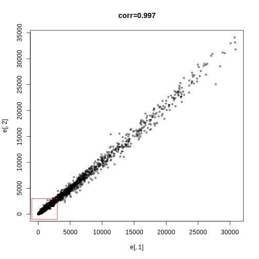
Exercise 1
What proportion of the points are inside the box?
length(which(e[,1] <= 3000 & e[,2]<= 3000)) / dim(e)[1]sum(e[,1] <= 3000 & e[,2] <= 3000) / dim(e)[1]
Exercise 2
Now make the sample plot with log:plot(log2(e[,1]),log2(e[,2]))k <- log2(3000)b <- log2(0.5)polygon(c(b,k,k,b),c(b,b,k,k),col="red",density=0,border="red")
What is an advantage of taking the log?
A) The tails do not dominate the plot: 95% of data is not in a tiny
section of plot.
B) There are less points.
C) There is exponential growth.
D) We always take logs.
The answer choice is A: The tails do not dominate the plot, 95% of data are not in a tiny section of the plot.
Exercise 3
Make an MA-plot:e <- log2(exprs(mas133))plot((e[,1]+e[,2])/2,e[,2]-e[,1],cex=0.5)
The two samples we are plotting are replicates (they are random samples
from the same batch of RNA). The correlation of the data was 0.997 in
the original scale and 0.96 in the log-scale. High correlations are
sometimes confused with evidence of replication. However, replication
implies we get very small differences between the observations, which is
better measured with distance or differences.
What is the standard deviation of the log ratios for this
comparison?
e <- log2(exprs(mas133))plot((e[,1]+e[,2])/2,e[,2]-e[,1],cex=0.5)sd(e[,2]-e[,1])
Exercise 4
How many fold changes above 2 do we see?
sum(abs(e[,2]-e[,1])1)
- While it is tempting to jump straight in to inferential analyses, it’s very important to run EDA first. Visualizing high-throughput data with EDA enables researchers to detect biological and technical issues with data. Plots can show at a glance where errors lie, making inferential analyses more accurate, efficient, and replicable.
Content from Principal Components Analysis
Last updated on 2025-09-23 | Edit this page
Estimated time: 60 minutes
Overview
Questions
- How can researchers simplify or streamline EDA in high-throughput data sets?
- What is principal component analysis (PCA) and when can it be used?
Objectives
- Explain the purpose of dimension reduction.
- Define a principal component.
- Perform a principal components analysis.
Dimension Reduction Motivation
Visualizing data is one of the most, if not the most, important step in the analysis of high-throughput data. The right visualization method may reveal problems with the experimental data that can render the results from a standard analysis, although typically appropriate, completely useless.
Recall that in recent history biologists went from using their eyes or simple summaries to categorize results, to having thousands (and now millions) of measurements per sample to analyze. Here we will focus on statistical inference in the context of high-throughput measurements, also called high-dimensional data. High-dimensional data is “wide” data, rather than long data, which has few variables relative to the number of observations. The number of features (variables) in high-dimensional data is much greater than the number of observations, making simple visualizations like scatterplots cumbersome.
We have shown methods for visualizing global properties of the columns or rows, but plots that reveal relationships between columns or between rows are more complicated due to the high dimensionality of data. For example, to compare each of the 189 samples to each other, we would have to create, for example, 17,766 MA-plots. Creating one single scatterplot of the data is impossible since points are very high dimensional.
We will describe powerful techniques for exploratory data analysis based on dimension reduction. The general idea is to reduce the dataset to have fewer dimensions, yet approximately preserve important properties, such as the distance between samples. If we are able to reduce down to, say, two dimensions, we can then easily make plots.
Principal component analysis (PCA) is a popular method of analyzing high-dimensional data. Large datasets of correlated variables can be summarized into smaller numbers of uncorrelated principal components that explain most of the variability in the original dataset. An example of PCA might be reducing several variables representing aspects of patient health (blood pressure, heart rate, respiratory rate) into a single feature.
PCA is a useful exploratory analysis tool. PCA allows us to reduce a large number of variables into a few features which represent most of the variation in the original variables. This makes exploration of the original variables easier.
The first principal component (\(Z_1\)) is calculated using the equation:
\[ Z_1 = a_{11}X_1 + a_{21}X_2 +....+a_{p1}X_p \]
\(X_1...X_p\) represents variables in the original dataset and \(a_{11}...a_p\) represent principal component loadings, which can be thought of as the degree to which each variable contributes to the calculation of the principal component.
Exercise 1
Descriptions of three datasets and research questions are given below. For which of these might PCA be considered a useful tool for analyzing data so that the research questions may be addressed?
- An epidemiologist has data collected from different patients admitted to hospital with infectious respiratory disease. They would like to determine whether length of stay in hospital differs in patients with different respiratory diseases.
- An online retailer has collected data on user interactions with its online app and has information on the number of times each user interacted with the app, what products they viewed per interaction, and the type and cost of these products. The retailer would like to use this information to predict whether or not a user will be interested in a new product.
- A scientist has assayed gene expression levels in 1000 cancer patients and has data from probes targeting different genes in tumour samples from patients. She would like to create new variables representing relative abundance of different groups of genes to i) find out if genes form subgroups based on biological function and ii) use these new variables in a linear regression examining how gene expression varies with disease severity.
- All of the above.
In the first case, a regression model would be more suitable; perhaps a survival model. In the second, again a regression model, likely linear or logistic, would be more suitable. In the third example, PCA can help to identify modules of correlated features that explain a large amount of variation within the data.
Therefore the answer here is 3.
What is a principal component?
The first principal component is the direction of the data along which the observations vary the most. The second principal component is the direction of the data along which the observations show the next highest amount of variation. The second principal component is a linear combination of the variables that is uncorrelated with the first principal component. There are as many principal components as there are variables in your dataset, but as we’ll see, some are more useful at explaining your data than others. By definition, the first principal component explains more variation than other principal components. Some of the following content is adapted from O’Callaghan A, Robertson G, LLewellyn M, Becher H, Meynert A, Vallejos C, Ewing A. (2024). High dimensional statistics with R. https://github.com/carpentries-incubator/high-dimensional-stats-r.
The animation below illustrates how principal components are calculated from data. You can imagine that the black line is a rod and each red dashed line is a spring. The energy of each spring is proportional to its squared length. The direction of the first principal component is the one that minimizes the total energy of all of the springs. In the animation below, the springs pull the rod, finding the direction of the first principal component when they reach equilibrium. We then use the length of the springs from the rod as the first principal component. This is explained in more detail on this Q&A website.
Example: Reducing two dimensions to one
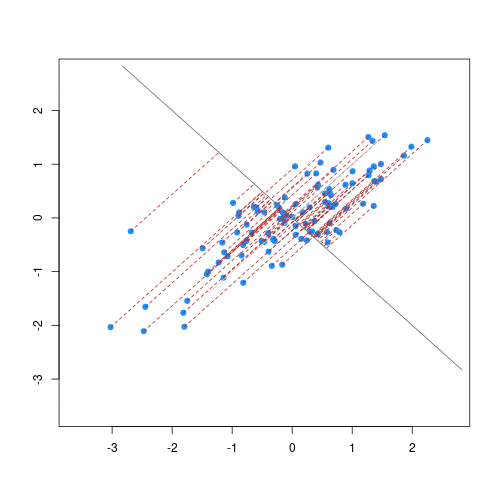
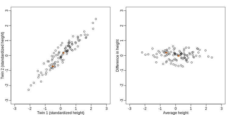
We consider an example with twin heights. Here we simulate 100 two dimensional points that represent the number of standard deviations each individual is from the mean height. Each point is a pair of twins:
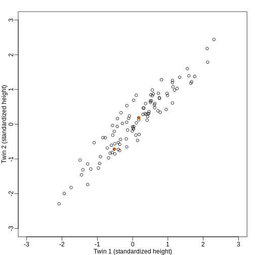
To help with the illustration, think of this as high-throughput gene expression data with the twin pairs representing the \(N\) samples and the two heights representing gene expression from two genes.
We are interested in the distance between any two samples. We can
compute this using dist. For example, here is the distance
between the two orange points in the figure above:
R
d=dist(t(y))
as.matrix(d)[1,2]
OUTPUT
[1] 1.140897What if making two dimensional plots was too complex and we were only able to make 1 dimensional plots. Can we, for example, reduce the data to a one dimensional matrix that preserves distances between points?
If we look back at the plot, and visualize a line between any pair of points, the length of this line is the distance between the two points. These lines tend to go along the direction of the diagonal. We have seen before that we can “rotate” the plot so that the diagonal is in the x-axis by making a MA-plot instead:
R
z1 = (y[1,]+y[2,])/2 #the sum
z2 = (y[1,]-y[2,])   #the difference

z = rbind( z1, z2) #matrix now same dimensions as y

thelim <- c(-3,3)
mypar(1,2)

plot(y[1,],y[2,],xlab="Twin 1 (standardized height)",
     ylab="Twin 2 (standardized height)",
     xlim=thelim,ylim=thelim)
points(y[1,1:2],y[2,1:2],col=2,pch=16)

plot(z[1,],z[2,],xlim=thelim,ylim=thelim,xlab="Average height",ylab="Difference in height")
points(z[1,1:2],z[2,1:2],col=2,pch=16)
How do we perform a PCA?
A prostate cancer dataset
The Prostate dataset represents data from 97 men who
have prostate cancer. The data come from a study which examined the
correlation between the level of prostate specific antigen and a number
of clinical measures in men who were about to receive a radical
prostatectomy. The data have 97 rows and 9 columns.
Columns include: 1. lcavol (log-transformed cancer
volume), 2. lweight (log-transformed prostate weight), 3.
lbph (log-transformed amount of benign prostate
enlargement), 4. svi (seminal vesicle invasion), 5.
lcp (log-transformed capsular penetration; amount of spread
of cancer in outer walls of prostate), 6. gleason (Gleason
score; grade of cancer cells), 7. pgg45 (percentage Gleason
scores 4 or 5), 8. lpsa (log-tranformed prostate specific
antigen; level of PSA in blood). 9. age (patient age in
years).
Here we will calculate principal component scores for each of the rows in this dataset, using five principal components (one for each variable included in the PCA). We will include five clinical variables in our PCA, each of the continuous variables in the prostate dataset, so that we can create fewer variables representing clinical markers of cancer progression. Standard PCAs are carried out using continuous variables only.
First, we will examine the Prostate dataset in the
Brq package.
R
library(Brq)
data("Prostate")
R
head(Prostate)
OUTPUT
      lcavol  lweight age      lbph svi       lcp gleason pgg45       lpsa
1 -0.5798185 2.769459  50 -1.386294   0 -1.386294       6     0 -0.4307829
2 -0.9942523 3.319626  58 -1.386294   0 -1.386294       6     0 -0.1625189
3 -0.5108256 2.691243  74 -1.386294   0 -1.386294       7    20 -0.1625189
4 -1.2039728 3.282789  58 -1.386294   0 -1.386294       6     0 -0.1625189
5  0.7514161 3.432373  62 -1.386294   0 -1.386294       6     0  0.3715636
6 -1.0498221 3.228826  50 -1.386294   0 -1.386294       6     0  0.7654678
Note that each row of the dataset represents a single patient.
We will create a subset of the data including only the clinical variables we want to use in the PCA.
R
pros2 <- Prostate[, c("lcavol", "lweight", "lbph", "lcp", "lpsa")]
head(pros2)
OUTPUT
      lcavol  lweight      lbph       lcp       lpsa
1 -0.5798185 2.769459 -1.386294 -1.386294 -0.4307829
2 -0.9942523 3.319626 -1.386294 -1.386294 -0.1625189
3 -0.5108256 2.691243 -1.386294 -1.386294 -0.1625189
4 -1.2039728 3.282789 -1.386294 -1.386294 -0.1625189
5  0.7514161 3.432373 -1.386294 -1.386294  0.3715636
6 -1.0498221 3.228826 -1.386294 -1.386294  0.7654678
Do we need to standardise the data?
Now we compare the variances between variables in the dataset.
R
apply(pros2, 2, var)
OUTPUT
  lcavol  lweight     lbph      lcp     lpsa
1.389157 0.246642 2.104840 1.955102 1.332476
R
par(mfrow = c(1, 2))
hist(pros2$lweight, breaks = "FD")
hist(pros2$lbph, breaks = "FD")
Note that variance is greatest for lbph and lowest for
lweight. It is clear from this output that we need to scale
each of these variables before including them in a PCA analysis to
ensure that differences in variances between variables do not drive the
calculation of principal components. In this example we standardise all
five variables to have a mean of 0 and a standard deviation of 1.
Exercise 2
Why might it be necessary to standardise variables before performing
a PCA?
Can you think of datasets where it might not be necessary to standardise
variables? Discuss.
- To make the results of the PCA interesting.
- If you want to ensure that variables with different ranges of values contribute equally to analysis.
- To allow the feature matrix to be calculated faster, especially in cases where there are a lot of input variables.
- To allow both continuous and categorical variables to be included in the PCA.
- All of the above.
- Scaling the data isn’t guaranteed to make the results more interesting. It also won’t affect how quickly the output will be calculated, whether continuous and categorical variables are present or not.
It is done to ensure that all features have equal weighting in the resulting PCs.
You may not want to standardise datasets which contain continuous variables all measured on the same scale (e.g. gene expression data or RNA sequencing data). In this case, variables with very little sample-to-sample variability may represent only random noise, and standardising the data would give these extra weight in the PCA.
Next we will carry out a PCA using the prcomp() function
in base R. The input data (pros2) is in the form of a
matrix. Note that the scale = TRUE argument is used to
standardise the variables to have a mean 0 and standard deviation of
1.
R
pca.pros <- prcomp(pros2, scale = TRUE, center = TRUE)
pca.pros
OUTPUT
Standard deviations (1, .., p=5):
[1] 1.5648756 1.1684678 0.7452990 0.6362941 0.4748755

Rotation (n x k) = (5 x 5):
              PC1         PC2         PC3         PC4         PC5
lcavol  0.5616465 -0.23664270  0.01486043  0.22708502 -0.75945046
lweight 0.2985223  0.60174151 -0.66320198 -0.32126853 -0.07577123
lbph    0.1681278  0.69638466  0.69313753  0.04517286 -0.06558369
lcp     0.4962203 -0.31092357  0.26309227 -0.72394666  0.25253840
lpsa    0.5665123 -0.01680231 -0.10141557  0.56487128  0.59111493
How many principal components do we need?
We have calculated one principal component for each variable in the original dataset. How do we choose how many of these are necessary to represent the true variation in the data, without having extra components that are unnecessary?
Let’s look at the relative importance of each component using
summary.
R
summary(pca.pros)
OUTPUT
Importance of components:
                          PC1    PC2    PC3     PC4    PC5
Standard deviation     1.5649 1.1685 0.7453 0.63629 0.4749
Proportion of Variance 0.4898 0.2731 0.1111 0.08097 0.0451
Cumulative Proportion  0.4898 0.7628 0.8739 0.95490 1.0000
R
# Get proportions of variance explained by each PC (rounded to 2 DP)
prop.var <- round(summary(pca.pros)$importance["Proportion of Variance", ], 2) *
  100
This returns the proportion of variance in the data explained by each of the (p = 5) principal components. In this example, PC1 explains approximately 49% of variance in the data, PC2 27% of variance, PC3 a further 11%, PC4 approximately 8% and PC5 around 5%.
We can use a screeplot to see how much variation in the data is explained by each principal component. Let’s calculate the screeplot for our PCA.
R
# calculate variance explained
varExp <- (pca.pros$sdev^2) / sum(pca.pros$sdev^2) * 100
# calculate percentage variance explained using output from the PCA
varDF <- data.frame(Dimensions = 1:length(varExp), varExp = varExp)
# create new dataframe with five rows, one for each principal component
R
plot(varDF)
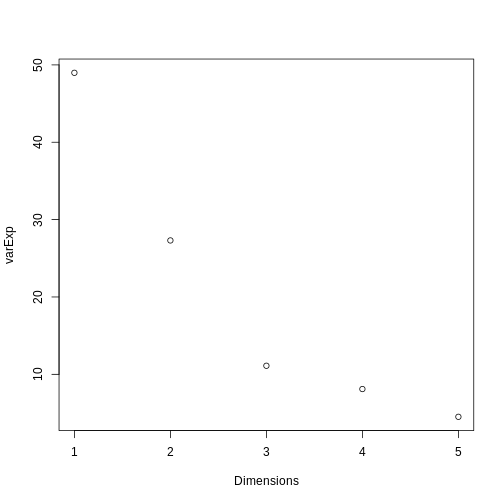
The screeplot shows that the first principal component explains most of the variance in the data (>50%) and each subsequent principal component explains less and less of the total variance. The first two principal components explain >70% of variance in the data. But what do these two principal components mean?
What are loadings and principal component scores?
The output from a PCA returns a matrix of principal component loadings in which the columns show the principal component loading vectors. Note that the square of values in each column sums to 1 as each loading is scaled so as to prevent a blow up in variance. Larger values in the columns suggest a greater contribution of that variable to the principal component.
We can examine the output of our PCA by writing the following in
R:
R
pca.pros
OUTPUT
Standard deviations (1, .., p=5):
[1] 1.5648756 1.1684678 0.7452990 0.6362941 0.4748755

Rotation (n x k) = (5 x 5):
              PC1         PC2         PC3         PC4         PC5
lcavol  0.5616465 -0.23664270  0.01486043  0.22708502 -0.75945046
lweight 0.2985223  0.60174151 -0.66320198 -0.32126853 -0.07577123
lbph    0.1681278  0.69638466  0.69313753  0.04517286 -0.06558369
lcp     0.4962203 -0.31092357  0.26309227 -0.72394666  0.25253840
lpsa    0.5665123 -0.01680231 -0.10141557  0.56487128  0.59111493
For each row in the original dataset PCA returns a principal
component score for each of the principal components (PC1 to PC5 in the
Prostate data example). We can see how the principal
component score (\(Z_{i1}\) for rows
\(i\) to \(n\)) is calculated for the first principal
component using the following equation from Figure 1:
\[ Z_{i1} = a_1 \times (lcavol_i - \overline{lcavol}) + a_2 \times (lpsa_i - \overline{lpsa}) \]
\(a_1\) and \(a_2\) represent principal component
loadings in this equation. A loading can be thought of as the ‘weight’
each variable has on the calculation of the principal component. Note
that in our example using the Prostate dataset
lcavol (log-transformed cancer volume) and
lpsa (log-tranformed prostate specific antigen in blood)
are the variables that contribute most to the first principal
component.
We can better understand what the principal components represent in terms of the original variables by plotting the first two principal components against each other and labelling points by patient number. Clusters of points which have similar principal component scores can be observed using a biplot and the strength and direction of influence different variables have on the calculation of the principal component scores can be observed by plotting arrows representing the loadings onto the graph. A biplot of the first two principal components can be created as follows:
R
biplot(pca.pros, xlim = c(-0.3, 0.3))
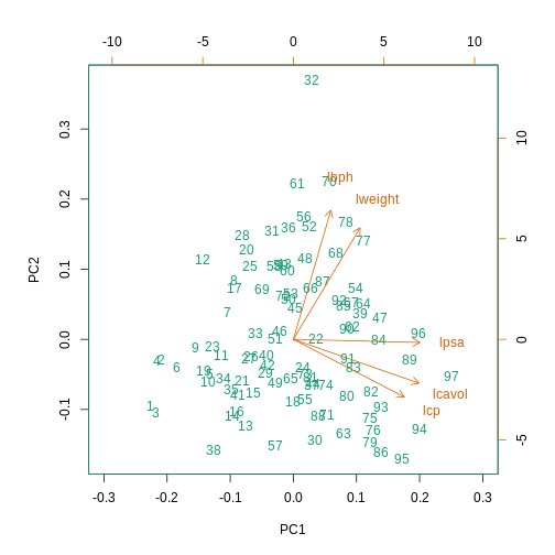
This biplot shows the position of each patient on a 2-dimensional
plot where loadings can be observed via the red arrows associated with
each of the variables. The variables lpsa,
lcavol and lcp are associated with positive
values on PC1 while positive values on PC2 are associated with the
variables lbph and lweight. The length of the
arrows indicates how much each variable contributes to the calculation
of each principal component.
The left and bottom axes show normalised principal component scores.
The axes on the top and right of the plot are used to interpret the
loadings, where loadings are scaled by the standard deviation of the
principal components (pca.pros$sdev) times the square root
the number of observations.
Using PCA to analyse gene expression data
In this section you will carry out your own PCA using the
Bioconductor package PCAtools applied to
gene expression data to explore the topics covered above.
PCAtools provides functions that can be
used to explore data via PCA and produce useful figures and analysis
tools.
A gene expression dataset of cancer patients
The dataset we will be analysing in this lesson includes two subsets of data: 1. a matrix of gene expression data showing microarray results for different probes used to examine gene expression profiles in 91 different breast cancer patient samples. 2. metadata associated with the gene expression results detailing information from patients from whom samples were taken.
Let’s load the PCAtools package and the
data.
R
library("PCAtools")
We will first load the microarray breast cancer gene expression data and associated metadata, downloaded from the Gene Expression Omnibus.
R
library("SummarizedExperiment")
cancer <- readRDS("./data/cancer_expression.rds")
mat <- assay(cancer)
metadata <- colData(cancer)
R
View(mat)
#nrow=22215 probes
#ncol=91 samples
R
View(metadata)
#nrow=91
#ncol=8
R
all(colnames(mat) == rownames(metadata))
OUTPUT
[1] TRUER
#Check that column names and row names match
#If they do should return TRUE
The ‘mat’ variable contains a matrix of gene expression profiles for each sample. Rows represent gene expression measurements and columns represent samples. The ‘metadata’ variable contains the metadata associated with the gene expression data including the name of the study from which data originate, the age of the patient from which the sample was taken, whether or not an oestrogen receptor was involved in their cancer and the grade and size of the cancer for each sample (represented by rows).
Microarray data are difficult to analyse for several reasons. Firstly, they are typically high-dimensional and therefore are subject to the same difficulties associated with analysing high dimensional data outlined above (i.e. p>n, large numbers of rows, multiple possible response variables, curse of dimensionality). Secondly, formulating a research question using microarray data can be difficult, especially if not much is known a priori about which genes code for particular phenotypes of interest. Finally, exploratory analysis, which can be used to help formulate research questions and display relationships, is difficult using microarray data due to the number of potentially interesting response variables (i.e. expression data from probes targeting different genes).
If researchers hypothesise that groups of genes (e.g. biological pathways) may be associated with different phenotypic characteristics of cancers (e.g. histologic grade, tumour size), using statistical methods that reduce the number of columns in the microarray matrix to a smaller number of dimensions representing groups of genes would help visualise the data and address research questions regarding the effect different groups of genes have on disease progression.
Using the PCAtools we will apply a PCA
to the cancer gene expression data, plot the amount of variation in the
data explained by each principal component and plot the most important
principal components against each other as well as understanding what
each principal component represents.
Exercise 3
Apply a PCA to the cancer gene expression data using the
pca() function from PCAtools.
You can use the help files in PCAtools to find out about the
pca() function (type help("pca") or
?pca in R).
Remove the lower 20% of principal components from your PCA using the
removeVar argument in the pca() function. As
in the example using prostate data above, examine the first 5 rows and
columns of rotated data and loadings from your PCA.
pc <- pca(mat, metadata = metadata)
#Many PCs explain a very small amount of the total variance in the data
#Remove the lower 20% of PCs with lower variance
pc <- pca(mat, metadata = metadata, removeVar = 0.2)
#Explore other arguments provided in pca
pc$rotated[1:5, 1:5]
pc$loadings[1:5, 1:5]

which.max(pc$loadings[, 1])
pc$loadings[49, ]

which.max(pc$loadings[, 2])
pc$loadings[27, ]
The function pca() is used to perform PCA, and uses as
inputs a matrix (mat) containing continuous numerical data
in which rows are data variables and columns are samples, and
metadata associated with the matrix in which rows represent
samples and columns represent data variables. It has options to centre
or scale the input data before a PCA is performed, although in this case
gene expression data do not need to be transformed prior to PCA being
carried out as variables are measured on a similar scale (values are
comparable between rows). The output of the pca() function
includes a lot of information such as loading values for each variable
(loadings), principal component scores
(rotated) and the amount of variance in the data explained
by each principal component.
Rotated data shows principal component scores for each sample and each principal component. Loadings the contribution each variable makes to each principal component.
Scaling variables for PCA
When running pca() above, we kept the default setting,
scale=FALSE. That means genes with higher variation in
their expression levels should have higher loadings, which is what we
are interested in. Whether or not to scale variables for PCA will depend
on your data and research question.
Note that this is different from normalising gene expression data. Gene expression data have to be normalised before donwstream analyses can be carried out. This is to reduce to effect technical and other potentially confounding factors. We assume that the expression data we use had been normalised previously.
Choosing how many components are important to explain the variance in the data
As in the example using the Prostate dataset we can use
a screeplot to compare the proportion of variance in the data explained
by each principal component. This allows us to understand how much
information in the microarray dataset is lost by projecting the
observations onto the first few principal components and whether these
principal components represent a reasonable amount of the variation. The
proportion of variance explained should sum to one.
There are no clear guidelines on how many principal components should be included in PCA: your choice depends on the total variability of the data and the size of the dataset. We often look at the ‘elbow’ on the screeplot as an indicator that the addition of principal components does not drastically contribute to explain the remaining variance or choose an arbitory cut off for proportion of variance explained.
Exercise 4
Using the screeplot() function in
PCAtools, create a screeplot to show
proportion of variance explained by each principal component. Explain
the output of the screeplot in terms of proportion of variance in data
explained by each principal component.
screeplot(pc, axisLabSize = 5, titleLabSize = 8)Note that first principal component (PC1) explains more variation than other principal components (which is always the case in PCA). The screeplot shows that the first principal component only explains ~33% of the total variation in the micrarray data and many principal components explain very little variation. The red line shows the cumulative percentage of explained variation with increasing principal components. Note that in this case 18 principal components are needed to explain over 75% of variation in the data. This is not an unusual result for complex biological datasets including genetic information as clear relationships between groups are sometimes difficult to observe in the data. The screeplot shows that using a PCA we have reduced 91 predictors to 18 in order to explain a significant amount of variation in the data. See additional arguments in screeplot function for improving the appearance of the plot.
Investigating the principal components
Once the most important principal components have been identified
using screeplot(), these can be explored in more detail by
plotting principal components against each other and highlighting points
based on variables in the metadata. This will allow any potential
clustering of points according to demographic or phenotypic variables to
be seen.
We can use biplots to look for patterns in the output from the PCA.
Note that there are two functions called biplot(), one in
the package PCAtools and one in
stats. Both functions produce biplots but
their scales are different!
Exercise 5
Create a biplot of the first two principal components from your PCA
(using biplot() function in
PCAtools - see
help("PCAtools::biplot") for arguments) and examine whether
the data appear to form clusters. Explain your results.
biplot(pc, lab = NULL, colby = 'Grade', legendPosition = 'top')The biplot shows the position of patient samples relative to PC1 and
PC2 in a 2-dimensional plot. Note that two groups are apparent along the
PC1 axis according to expressions of different genes while no separation
can be seem along the PC2 axis. Labels of patient samples are
automatically added in the biplot. Labels for each sample are added by
default, but can be removed if there is too much overlap in names. Note
that PCAtools does not scale biplot in the
same way as biplot using the stats package.
Let’s consider this biplot in more detail, and also display the loadings:
R
biplot(pc, lab = rownames(pc$metadata), pointSize = 1, labSize = 1)
ERROR
Error in pcaobj$rotated: object of type 'closure' is not subsettable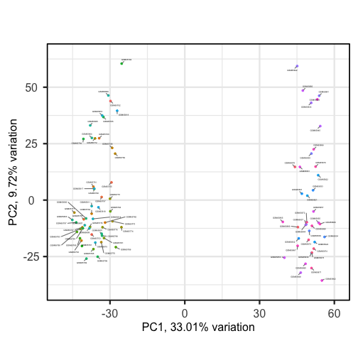
Sizes of labels, points and axes can be changed using arguments in
biplot (see help("biplot")). We can see from
the biplot that there appear to be two separate groups of points that
separate on the PC1 axis, but that no other grouping is apparent on
other PC axes.
R
plotloadings(pc, labSize = 3)
ERROR
Error in pcaobj$loadings: object of type 'closure' is not subsettable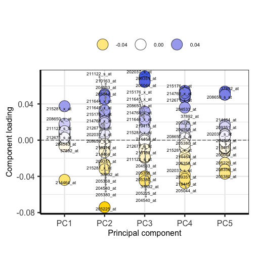
Plotting the loadings shows the magnitude and direction of loadings for probes detecting genes on each principal component.
Exercise 6
Use colby and lab arguments in
biplot() to explore whether these two groups may cluster by
patient age or by whether or not the sample expresses the oestrogen
receptor gene (ER+ or ER-).
  biplot(pc,
    lab = paste0(pc$metadata$Age,'years'),
    colby = 'ER',
    hline = 0, vline = 0,
    legendPosition = 'right')
{: .language-r} It appears that one cluster has more ER+ samples than the other group.
So far we have only looked at a biplot of PC1 versus PC2 which only
gives part of the picture. The pairplots() function in
PCAtools can be used to create multiple
biplots including different principal components.
R
pairsplot(pc)
ERROR
Error in pcaobj$components: object of type 'closure' is not subsettable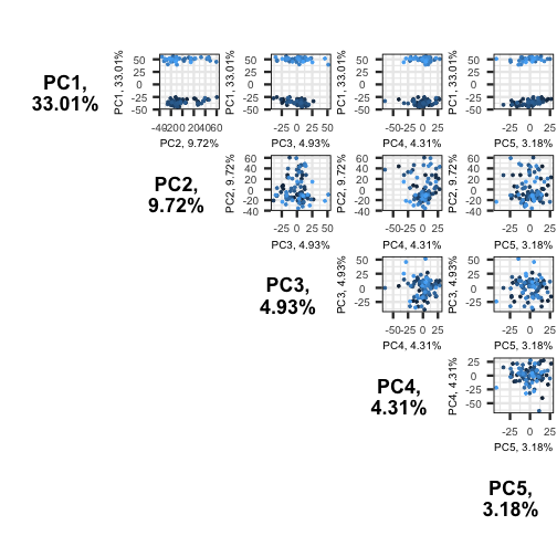
The plots show two apparent clusters involving the first principal component only. No other clusters are found involving other principal components.
Using PCA output in further analysis
The output of PCA can be used to interpret data or can be used in further analyses. For example, the PCA outputs new variables (principal components) which represent several variables in the original dataset. These new variables are useful for further exploring data, for example, comparing principal component scores between groups or including the new variables in linear regressions. Because the principal components are uncorrelated (and independent) they can be included together in a single linear regression.
Principal component regression
PCA is often used to reduce large numbers of correlated variables into fewer uncorrelated variables that can then be included in linear regression or other models. This technique is called principal component regression (PCR) and it allows researchers to examine the effect of several correlated explanatory variables on a single response variable in cases where a high degree of correlation initially prevents them from being included in the same model. This is called principal componenet regression (PCR) and is just one example of how principal components can be used in further analysis of data. When carrying out PCR, the variable of interest (response/dependent variable) is regressed against the principal components calculated using PCA, rather than against each individual explanatory variable from the original dataset. As there as many principal components created from PCA as there are variables in the dataset, we must select which principal components to include in PCR. This can be done by examining the amount of variation in the data explained by each principal component (see above).
- Visualizing data with thousands or tens of thousands of measurements is impossible using standard techniques.
- Dimension reduction techniques coupled with visualization can reveal relationships between dimensions (rows or columns) in the data.
- Principal components analysis is a dimension reduction technique that can reduce and summarize large datasets.
Content from Statistical Models
Last updated on 2025-09-23 | Edit this page
Estimated time: 60 minutes
Overview
Questions
- What are some of the most widely used parametric distributions used in the life sciences besides the normal?
Objectives
- Define the Poisson distribution.
- Explain its relevance in RNA sequence analysis.
- Explain the purpose of maximum likelihood estimation.
- Generate some research questions that maximum likelihood estimation can address.
- Model distributions of gene variances.
Statistical Models
All models are wrong, but some are useful. -George E. P. Box
When we see a p-value in the literature, it means a probability distribution of some sort was used to quantify the null hypothesis. Many times deciding which probability distribution to use is relatively straightforward. For example, in the tea tasting challenge we can use simple probability calculations to determine the null distribution. Most p-values in the scientific literature are based on sample averages or least squares estimates from a linear model and make use of the CLT to approximate the null distribution of their statistic as normal.
The CLT is backed by theoretical results that guarantee that the approximation is accurate. However, we cannot always use this approximation, such as when our sample size is too small. Previously, we described how the sample average can be approximated as t-distributed when the population data is approximately normal. However, there is no theoretical backing for this assumption. We are now modeling. In the case of height, we know from experience that this turns out to be a very good model.
But this does not imply that every dataset we collect will follow a normal distribution. Some examples are: coin tosses, the number of people who win the lottery, and US incomes. The normal distribution is not the only parametric distribution that is available for modeling. Here we provide a very brief introduction to some of the most widely used parametric distributions and some of their uses in the life sciences. We focus on the models and concepts needed to understand the techniques currently used to perform statistical inference on high-throughput data. To do this we also need to introduce the basics of Bayesian statistics. For more in-depth description of probability models and parametric distributions please consult a Statistics textbook such as this one.
The Binomial Distribution
The first distribution we will describe is the binomial distribution. It reports the probability of observing \(S=k\) successes in \(N\) trials as
\[ \mbox{Pr}(S=k) = {N \choose k}p^k (1-p)^{N-k} \]
with \(p\) the probability of success. The best known example is coin tosses with \(S\) the number of heads when tossing \(N\) coins. In this example \(p=0.5\).
Note that \(S/N\) is the average of independent random variables and thus the CLT tells us that \(S\) is approximately normal when \(N\) is large. This distribution has many applications in the life sciences. Recently, it has been used by the variant callers and genotypers applied to next generation sequencing. A special case of this distribution is approximated by the Poisson distribution which we describe next.
The Poisson Distribution
Since it is the sum of binary outcomes, the number of people that win the lottery follows a binomial distribution (we assume each person buys one ticket). The number of trials \(N\) is the number of people that buy tickets and is usually very large. However, the number of people that win the lottery oscillates between 0 and 3, which implies the normal approximation does not hold. So why does CLT not hold? One can explain this mathematically, but the intuition is that with the sum of successes so close to and also constrained to be larger than 0, it is impossible for the distribution to be normal. Here is a quick simulation:
R
p=10^-7 ##1 in 10,000,0000 chances of winning
N=5*10^6 ##5,000,000 tickets bought
winners=rbinom(1000,N,p) ##1000 is the number of different lotto draws
tab=table(winners)
plot(tab)
R
prop.table(tab)
OUTPUT
winners
    0     1     2     3     4
0.607 0.305 0.072 0.013 0.003
For cases like this, where \(N\) is very large, but \(p\) is small enough to make \(N \times p\) (call it \(\lambda\)) a number between 0 and, for example, 10, then \(S\) can be shown to follow a Poisson distribution, which has a simple parametric form:
\[ \mbox{Pr}(S=k)=\frac{\lambda^k \exp{-\lambda}}{k!} \]
The Poisson distribution is commonly used in RNA-seq analyses. Because we are sampling thousands of molecules and most genes represent a very small proportion of the totality of molecules, the Poisson distribution seems appropriate.
So how does this help us? One way is that it provides insight about the statistical properties of summaries that are widely used in practice. For example, let’s say we only have one sample from each of a case and control RNA-seq experiment and we want to report the genes with the largest fold-changes. One insight that the Poisson model provides is that under the null hypothesis of no true differences, the statistical variability of this quantity depends on the total abundance of the gene. We can show this mathematically, but here is a quick simulation to demonstrate the point:
R
N=10000##number of genes
lambdas=2^seq(1,16,len=N) ##these are the true abundances of genes
y=rpois(N,lambdas)##note that the null hypothesis is true for all genes
x=rpois(N,lambdas)
ind=which(y>0 & x>0)##make sure no 0s due to ratio and log

library(rafalib)
splot(log2(lambdas),log2(y/x),subset=ind)
For lower values of lambda there is much more
variability and, if we were to report anything with a fold change of 2
or more, the number of false positives would be quite high for low
abundance genes.
NGS experiments and the Poisson distribution
In this section we will use the data stored in this dataset:
R
library(parathyroidSE) ##available from Bioconductor
data(parathyroidGenesSE)
se <- parathyroidGenesSE
The data is contained in a SummarizedExperiment object,
which we do not describe here. The important thing to know is that it
includes a matrix of data, where each row is a genomic feature and each
column is a sample. We can extract this data using the
assay function. For this dataset, the value of a single
cell in the data matrix is the count of reads which align to a given
gene for a given sample. Thus, a similar plot to the one we simulated
above with technical replicates reveals that the behavior predicted by
the model is present in experimental data:
R
x <- assay(se)[,23]
y <- assay(se)[,24]
ind=which(y>0 & x>0)##make sure no 0s due to ratio and log
splot((log2(x)+log2(y))/2,log(x/y),subset=ind)
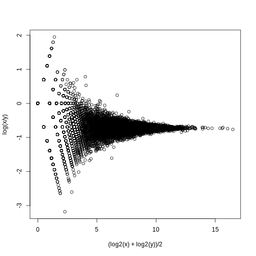
If we compute the standard deviations across four individuals, it is quite a bit higher than what is predicted by a Poisson model. Assuming most genes are differentially expressed across individuals, then, if the Poisson model is appropriate, there should be a linear relationship in this plot:
R
library(rafalib)
library(matrixStats)

vars=rowVars(assay(se)[,c(2,8,16,21)]) ##we know these are four
means=rowMeans(assay(se)[,c(2,8,16,21)]) ##different individuals

splot(means,vars,log="xy",subset=which(means>0&vars>0)) ##plot a subset of data
abline(0,1,col=2,lwd=2)
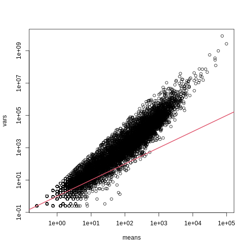
The reason for this is that the variability plotted here includes biological variability, which the motivation for the Poisson does not include. The negative binomial distribution, which combines the sampling variability of a Poisson and biological variability, is a more appropriate distribution to model this type of experiment. The negative binomial has two parameters and permits more flexibility for count data. For more on the use of the negative binomial to model RNA-seq data you can read this paper. The Poisson is a special case of the negative binomial distribution.
Maximum Likelihood Estimation
To illustrate the concept of maximum likelihood estimates (MLE), we use a relatively simple dataset containing palindrome locations in the HMCV genome. We read in the locations of the palindrome and then count the number of palindromes in each 4,000 basepair segments.
R
# read in the locations data
load("./data/hcmv.rda")

breaks <- seq(0, 4000 * round(max(locations)/4000), 4000)
tmp <- cut(locations, breaks)
counts <- table(tmp)

library(rafalib)
mypar(1,1)
hist(counts)
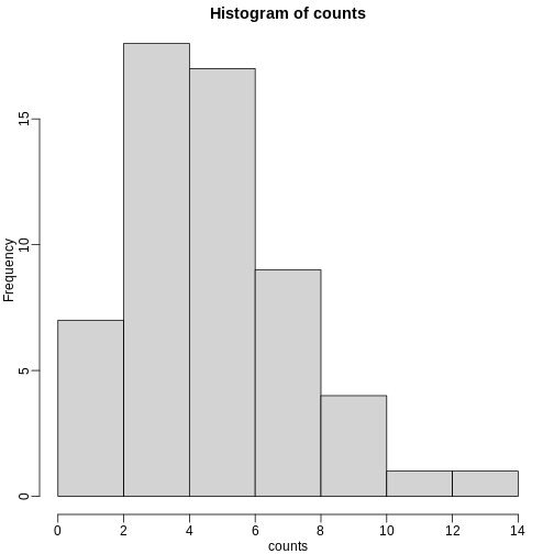
The counts do appear to follow a Poisson distribution. But what is the rate \(\lambda\) ? The most common approach to estimating this rate is maximum likelihood estimation. To find the maximum likelihood estimate (MLE), we note that these data are independent and the probability of observing the values we observed is:
\[ \Pr(X_1=k_1,\dots,X_n=k_n;\lambda) = \prod_{i=1}^n \lambda^{k_i} / k_i! \exp ( -\lambda) \]
The MLE is the value of \(\lambda\) that maximizes the likelihood:.
\[ \mbox{L}(\lambda; X_1=k_1,\dots,X_n=k_1)=\exp\left\{\sum_{i=1}^n \log \Pr(X_i=k_i;\lambda)\right\} \]
In practice, it is more convenient to maximize the log-likelihood
which is the summation that is exponentiated in the expression above.
Below we write code that computes the log-likelihood for any \(\lambda\) and use the function
optimize to find the value that maximizes this function
(the MLE). We show a plot of the log-likelihood along with vertical line
showing the MLE.
R
l <- function(lambda) sum(dpois(counts, lambda, log=TRUE))

lambdas <- seq(3, 7, len=100)
ls <- exp(sapply(lambdas, l))

plot(lambdas, ls, type="l")

mle=optimize(l, c(0,10), maximum=TRUE)
abline(v=mle$maximum)
If you work out the math and do a bit of calculus, you realize that this is a particularly simple example for which the MLE is the average.
R
print( c(mle$maximum, mean(counts) ) )
OUTPUT
[1] 5.157894 5.157895Note that a plot of observed counts versus counts predicted by the Poisson shows that the fit is quite good in this case:
R
theoretical <- qpois((seq(0, 99) + 0.5)/100, mean(counts))

qqplot(theoretical, counts)
abline(0,1)
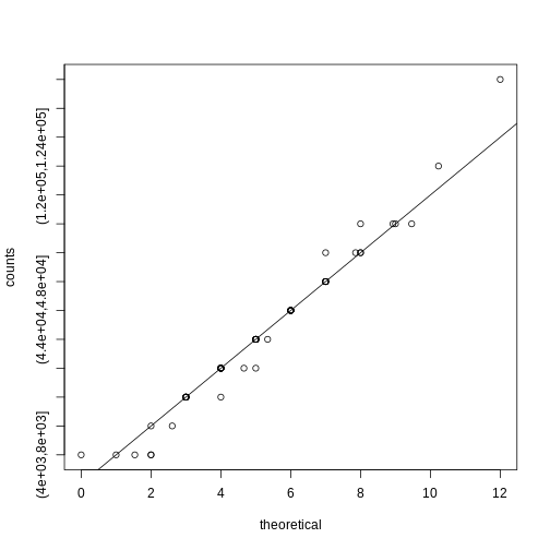
We therefore can model the palindrome count data with a Poisson with \(\lambda=5.16\).
Distributions for Positive Continuous Values
Different genes vary differently across biological replicates. Later, in the hierarchical models chapter, we will describe one of the most influential statistical methods in the analysis of genomics data. This method provides great improvements over naive approaches to detecting differentially expressed genes. This is achieved by modeling the distribution of the gene variances. Here we describe the parametric model used in this method.
We want to model the distribution of the gene-specific standard errors. Are they normal? Keep in mind that we are modeling the population standard errors so CLT does not apply, even though we have thousands of genes.
As an example, we use an experimental data that included both technical and biological replicates for gene expression measurements on mice. We can load the data and compute the gene specific sample standard error for both the technical replicates and the biological replicates.
R
library(Biobase) ##available from Bioconductor
load("data/maPooling.RData")
pd=pData(maPooling)

##determine which samples are bio reps and which are tech reps
strain=factor(as.numeric(grepl("b", rownames(pd))))
pooled=which(rowSums(pd)==12 & strain==1)
techreps=exprs(maPooling[,pooled])
individuals=which(rowSums(pd)==1 & strain==1)

##remove replicates
individuals=individuals[-grep("tr", names(individuals))]
bioreps=exprs(maPooling)[,individuals]

###now compute the gene specific standard deviations
library(matrixStats)
techsds=rowSds(techreps)
biosds=rowSds(bioreps)
We can now explore the sample standard deviation:
R
###now plot
library(rafalib)
mypar()
shist(biosds,unit=0.1,col=1,xlim=c(0,1.5))
shist(techsds,unit=0.1,col=2,add=TRUE)
legend("topright",c("Biological","Technical"), col=c(1,2),lty=c(1,1))
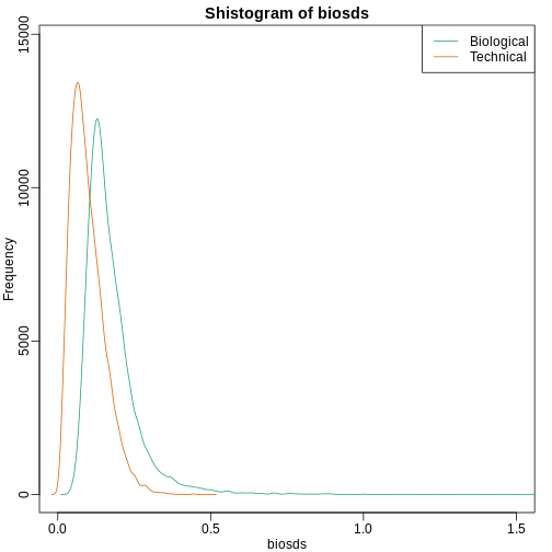
An important observation here is that the biological variability is substantially higher than the technical variability. This provides strong evidence that genes do in fact have gene-specific biological variability.
If we want to model this variability, we first notice that the normal distribution is not appropriate here since the right tail is rather large. Also, because SDs are strictly positive, there is a limitation to how symmetric this distribution can be. A qqplot shows this very clearly:
R
qqnorm(biosds)
qqline(biosds)
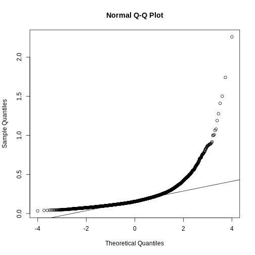
There are parametric distributions that possess these properties (strictly positive and heavy right tails). Two examples are the gamma and F distributions. The density of the gamma distribution is defined by:
\[ f(x;\alpha,\beta)=\frac{\beta^\alpha x^{\alpha-1}\exp{-\beta x}}{\Gamma(\alpha)} \]
It is defined by two parameters \(\alpha\) and \(\beta\) that can, indirectly, control location and scale. They also control the shape of the distribution. For more on this distribution please refer to this book.
Two special cases of the gamma distribution are the chi-squared and exponential distribution. We used the chi-squared earlier to analyze a 2x2 table data. For chi-square, we have \(\alpha=\nu/2\) and \(\beta=2\) with \(\nu\) the degrees of freedom. For exponential, we have \(\alpha=1\) and \(\beta=\lambda\) the rate.
The F-distribution comes up in analysis of variance (ANOVA). It is also always positive and has large right tails. Two parameters control its shape:
\[ f(x,d_1,d_2)=\frac{1}{B\left( \frac{d_1}{2},\frac{d_2}{2}\right)} \left(\frac{d_1}{d_2}\right)^{\frac{d_1}{2}} x^{\frac{d_1}{2}-1}\left(1+\frac{d1}{d2}x\right)^{-\frac{d_1+d_2}{2}} \]
with \(B\) the beta function and \(d_1\) and \(d_2\) are called the degrees of freedom for reasons having to do with how it arises in ANOVA. A third parameter is sometimes used with the F-distribution, which is a scale parameter.
Modeling the variance
In a later section we will learn about a hierarchical model approach to improve estimates of variance. In these cases it is mathematically convenient to model the distribution of the variance \(\sigma^2\). The hierarchical model used here implies that the sample standard deviation of genes follows scaled F-statistics:
\[ s^2 \sim s_0^2 F_{d,d_0} \]
with \(d\) the degrees of freedom involved in computing \(s^2\). For example, in a case comparing 3 versus 3, the degrees of freedom would be 4. This leaves two free parameters to adjust to the data. Here \(d\) will control the location and \(s_0\) will control the scale. Below are some examples of \(F\) distribution plotted on top of the histogram from the sample variances:
R
library(rafalib)
mypar(3,3)
sds=seq(0,2,len=100)
for(d in c(1,5,10)){
  for(s0 in c(0.1, 0.2, 0.3)){
    tmp=hist(biosds,main=paste("s_0 =",s0,"d =",d),
      xlab="sd",ylab="density",freq=FALSE,nc=100,xlim=c(0,1))
    dd=df(sds^2/s0^2,11,d)
    ##multiply by normalizing constant to assure same range on plot
    k=sum(tmp$density)/sum(dd)
    lines(sds,dd*k,type="l",col=2,lwd=2)
    }
}
Now which \(s_0\) and \(d\) fit our data best? This is a rather
advanced topic as the MLE does not perform well for this particular
distribution (we refer to Smyth (2004)). The Bioconductor
limma package provides a function to estimate these
parameters:
R
library(limma)
estimates=fitFDist(biosds^2, 11)

theoretical<- sqrt(qf((seq(0, 999) + 0.5)/1000, 11, estimates$df2) * estimates$scale)
observed <- biosds
The fitted models do appear to provide a reasonable approximation, as demonstrated by the qq-plot and histogram:
R
mypar(1,2)
qqplot(theoretical,observed)
abline(0,1)
tmp=hist(biosds,main=paste("s_0 =", signif(estimates[[1]],2),
                  "d =", signif(estimates[[2]],2)),
  xlab="sd", ylab="density", freq=FALSE, nc=100, xlim=c(0,1), ylim=c(0,9))
dd=df(sds^2/estimates$scale,11,estimates$df2)
k=sum(tmp$density)/sum(dd) ##a normalizing constant to assure same area in plot
lines(sds, dd*k, type="l", col=2, lwd=2)
Exercises
Suppose you have an urn with blue and red balls. If N balls are selected at random with replacement (you put the ball back after you pick it), we can denote the outcomes as random variables X1,…,XN that are 1 or 0. If the proportion of red balls is p , then the distribution of each of these is Pr(Xi=1)=p.
These are also called Bernoulli trials. These random variables are independent because we replace the balls. Flipping a coin is an example of this with p=0.5.
You can show that the mean and variance are p and p(1−p) respectively. The binomial distribution gives us the distribution of the sum SN of these random variables. The probability that we see k red balls is given by: Pr(SN=k)=(Nk)pk(1−p)N−k
In R, the function dbimom gives you this result. The function pbinom gives us Pr(SN≤k).
This equation has many uses in the life sciences. We give some examples below.
Exercise 1
The probability of conceiving a girl is 0.49. What is the probability that a family with 4 children has 2 girls and 2 boys (you can assume that the outcomes are independent)?
g <- sampleInfo$grouppvals <- rowttests(geneExpression, factor(g))$p.valuesum(pvals < 0.05)
Exercise 2
Use what you learned in Question 1 to answer these questions: What is the probability that a family with 10 children has 6 girls and 4 boys (assume no twins)?
p <- 0.49dbinom(6,10,p=p)
Exercise 3
The genome has 3 billion bases. About 20% are C, 20% are G, 30% are T, and 30% are A. Suppose you take a random interval of 20 bases, what is the probability that the GC-content (proportion of Gs of Cs) is strictly above 0.5 in this interval?
p <- 0.4pbinom(20,20,p) - pbinom(10,20,p)
Exercise 4
The probability of winning the lottery is 1 in 175,223,510. If 20,000,000 people buy a ticket, what is the probability that more than one person wins?
p <- 1/175233510N <- 200000001 - ppois(1,N*p)1 - pbinom(1,N,p)
Since the poisson distribution is a type of binomial distribution, both
distributions give the same values.
Exercise 5
We can show that the binomial approximation is approximately normal when N is large and p is not too close to 0 or 1. This means that:
SN−E(SN)Var(SN)‾‾‾‾‾‾‾‾√
is approximately normal with mean 0 and SD 1. Using the results for sums of independent random variables, we can show that E(SN)=Np and Var(Sn)=Np(1−p). The genome has 3 billion bases. About 20% are C, 20% are G, 30% are T, and 30% are A. Suppose you take a random interval of 20 bases, what is the exact probability that the GC-content (proportion of Gs of Cs) is greater than 0.35 and smaller or equal to 0.45 in this interval?
p <- 0.4pbinom(0.45*20, 20, p) - pbinom(0.35*20,20,p)
Exercise 6
For the question above, what is the normal approximation to the probability?
p <- 0.4N <- 20a <- (0.45*20 - N*p) / sqrt(N*p*(1-p))b <- (0.35*20 - N*p) / sqrt(N*p*(1-p))
approx <- pnorm(a) - pnorm(b)approx
Exercise 7
Repeat exercise 5, but using an interval of 1000 bases. What is the difference (in absolute value) between the normal approximation and the exact distribution of the GC-content being greater than 0.35 and lesser or equal to 0.45?
N <- 1000p <- 0.4a <- (0.45*N - N*p) / sqrt(N*p*(1-p))b <- (0.35*N - N*p) / sqrt(N*p*(1-p))approx <- pnorm(a) - pnorm(b)
exact <- pbinom(0.45*N,N,p) - pbinom(0.35*N,N,p)exact - approx
Exercise 8
The Cs in our genomes can be methylated or unmethylated. Suppose we
have a large (millions) group of cells in which a proportion p of the Cs
of interest are methylated. We break up the DNA of these cells and
randomly select pieces and end up with N pieces that contain the C we
care about. This means that the probability of seeing k methylated Cs is
binomial: exact = dbinom(k,N,p) We can approximate this with the normal
distribution: a <- (k+0.5 - N*p)/sqrt(N*p*(1-p))b <- (k-0.5 - N*p)/sqrt(N*p*(1-p))approx = pnorm(a) - pnorm(b)
Compute the difference approx - exact for:N <- c(5,10,50,100,500)p <- seq(0,1,0.25)
Compare the approximation and exact probability of the proportion of Cs
being p, k=1,…,N−1 plotting the exact versus the approximation for each
p and N combination. A) The normal approximation works well when p is
close to 0.5 even for small N=10
B) The normal approximation breaks down when p is close to 0 or 1 even
for large N
C) When N is 100 all approximations are spot on.
D) When p=0.01 the approximation are terrible for N=5,10,30 and only OK
for N=100
Ns <- c(5,10,50,100,500)Ps <- seq(0,1,0.25)mypar(5,5)for (i in seq_along(Ns)) {n <- Ns[[i]]k <- seq(1:n-1)for (j in seq_along(Ps)) {p <- Ps[[j]]exact = dbinom(k, n, p)a = (k+0.5- n*p)/sqrt(n*p*(1-p))b = (k-0.5- n*p)/sqrt(n*p*(1-p))approx = pnorm(a) - pnorm(b)qqplot(exact,approx,xlab='exact',ylab='approx',main = paste0('N=',n,' ','p=',p))abline(0,1)}}
The answer is C: When N is 100 all approximations are spot on. When p is
close to 0 or 1, the normal distribution breaks down even at N =
100.
Exercise 9
We saw in the previous question that when p is very small, the normal
approximation breaks down. If N is very large, then we can use the
Poisson approximation.
Earlier we computed 1 or more people winning the lottery when the
probability of winning was 1 in 175,223,510 and 20,000,000 people bought
a ticket. Using the binomial, we can compute the probability of exactly
two people winning to be:
N <- 20000000 p <- 1/175223510
dbinom(2,N,p)
If we were to use the normal approximation, we would greatly underestimate this:
a <- (2+0.5 - N*p)/sqrt(N*p*(1-p))
b <- (2-0.5 - N*p)/sqrt(N*p*(1-p))
pnorm(a) - pnorm(b)
To use the Poisson approximation here, use the rate λ=Np
representing the number of people per 20,000,000 that win the lottery. Note how much better the approximation is:
dpois(2,N*p)
In this case. it is practically the same because N is very large and Np is not 0. These are the assumptions needed for the Poisson to work. What is the Poisson approximation for more than one person winning?
1 - ppois(1,N*p)
Exercise 10
Now we are going to explore if palindromes are over-represented in some part of the HCMV genome. Make sure you have the latest version of the dagdata, load the palindrome data from the Human cytomegalovirus genome, and plot locations of palindromes on the genome for this virus:
library(dagdata)data(hcmv)plot(locations,rep(1,length(locations)),ylab="",yaxt="n")
These palindromes are quite rare, and therefore p is very small. If we break the genome into bins of 4000 basepairs, then we have Np not so small and we might be able to use Poisson to model the number of palindromes in each bin:
breaks=seq(0,4000*round(max(locations)/4000),4000)
tmp=cut(locations,breaks)
counts=as.numeric(table(tmp))
So if our model is correct, counts should follow a Poisson distribution. The distribution seems about right:
hist(counts)
So let X1,…,Xn be the random variables representing counts then Pr(Xi=k)=λk/k!exp(−λ) and to fully describe this distribution, we need to know λ. For this we will use MLE. We can write the likelihood described in book in R. For example, for λ=4 we have:
probs <- dpois(counts,4)
likelihood <- prod(probs) likelihood
Notice that it’s a tiny number. It is usually more convenient to compute log-likelihoods:
logprobs <- dpois(counts,4,log=TRUE)loglikelihood <- sum(logprobs)loglikelihood
Now write a function that takes λ and the vector of counts as input
and returns the log-likelihood. Compute this log-likelihood for lambdas
= seq(0,15,len=300) and make a plot. What value of lambdas
maximizes the log-likelihood?
loglike = function(lambdas) {logprobs <- dpois(counts,lambdas,log=T)loglikelihood <- sum(logprobs)return(loglikelihood)}lambdas <- seq(0,15,len=300)log_res <- exp(sapply(lambdas,loglike))optim_lambda <- lambdas[which(log_res == max(log_res))]
Exercise 11
The point of collecting this dataset was to try to determine if there is a region of the genome that has a higher palindrome rate than expected. We can create a plot and see the counts per location:
library(dagdata)data(hcmv)breaks=seq(0,4000*round(max(locations)/4000),4000)tmp=cut(locations,breaks)counts=as.numeric(table(tmp))binLocation=(breaks[-1]+breaks[-length(breaks)])/2plot(binLocation,counts,type="l",xlab=)
What is the center of the bin with the highest count?
binLocation[which(counts == max(counts))]
Exercise 12
What is the maximum count?
max(counts)
Exercise 13
Once we have identified the location with the largest palindrome count, we want to know if we could see a value this big by chance. If X is a Poisson random variable with rate:
lambda = mean(counts[ - which.max(counts) ])
What is the probability of seeing a count of 14 or more?
1 - ppois(13, lambda)
Exercise 14
So we obtain a p-value smaller than 0.001 for a count of 14. Why is it problematic to report this p-value as strong evidence of a location that is different?
- Poisson in only an approximation.
- We selected the highest region out of 57 and need to adjust for
multiple testing.
- λ is an estimate, a random variable, and we didn’t take into account
its variability.
- We don’t know the effect size.
The answer is B: We selected the highest region out of 57 and need to adjust for multiple testing. Answer A is wrong because we do use normal approximation in t-test to get a p-value, so there is nothing wrong with using approximation. Answer B is correct because the p-value that we obtained is from a comparison against the sample mean (z score = 0) rather than all other counts. Therefore, the p-value must be corrected (ex. Bonferroni’s procedure). Answer C is wrong because p value can also be a random variable, but this answer choice implies that p-value is not a random variable. Answer D is wrong because effect size is irrelevant.
Exercise 15
Use the Bonferonni correction to determine the p-value cut-off that guarantees a FWER of 0.05. What is this p-value cutoff?
0.05/length(counts)
Exercise 16
Create a qq-plot to see if our Poisson model is a good fit:
ps <- (seq(along=counts) - 0.5)/length(counts)lambda <- mean( counts[ -which.max(counts)])poisq <- qpois(ps,lambda)plot(poisq,sort(counts))abline(0,1)
How would you characterize this qq-plot? A) Poisson is a terrible
approximation.
B) Poisson is a very good approximation except for one point that we
actually think is a region of interest.
C) There are too many 1s in the data.
D) A normal distribution provides a better approximation.
The answer is B. You can check whether the palindrome counts are well
approximated by the normal distribution.qqnorm(sort(counts))
Exercise 17
Load the tissuesGeneExpression data library
load("data/tissuesGeneExpression.rda")
Now load this data and select the columns related to endometrium:
library(genefilter)y = e[,which(tissue=="endometrium")]
This will give you a matrix y with 15 samples. Compute the across
sample variance for the first three samples. Then make a qq-plot to see
if the data follow a normal distribution. Which of the following is
true? A) With the exception of a handful of outliers, the data follow a
normal distribution.
B) The variance does not follow a normal distribution, but taking the
square root fixes this.
C) The normal distribution is not usable here: the left tail is over
estimated and the right tail is underestimated.
D) The normal distribution fits the data almost perfectly.
vars <- rowVars(y[,1:3])length(vars)mypar(1,2)qqnorm(sqrt(vars)) # choice B is falseqqnorm(vars) # choice A and D are false
The answer is C.
Exercise 18
Now fit an F-distribution with 14 degrees of freedom using the fitFDist function in the limma package:
library(limma)res <- fitFDist(vars,14)res
Exercise 19
Now create a qq-plot of the observed sample variances versus the
F-distribution quantiles. Which of the following best describes the
qq-plot? A) The fitted F-distribution provides a perfect fit.
B) If we exclude the lowest 0.1% of the data, the F-distribution
provides a good fit.
C) The normal distribution provided a better fit.
D) If we exclude the highest 0.1% of the data, the F-distribution
provides a good fit.
pf <- (seq(along=vars)-0.5)/length(vars)theory <- qf(pf,14,res$df2) # theoretical quantiles from F distributionmypar(1,2)qqplot(theory, sort(vars), xlab = 'theory', ylab ='obs') # F approximation
vs variance from the data
qqnorm(sort(vars)) # normal approximation vs variance from the data
The answer is D: If we exclude the highest 0.1% of the data, the
F-distribution provides a good fit. Actually I do not think answer is
entirely correct but this is the most appropriate one. Even if we
exclude the top 0.1% there are still more outliers to remove. Here is a
demonstration.
vars_sort <- sort(vars)vars_excl <- vars_sort[1:18000] # 18000 out of 22215
kept = 81%pf_excl <- (seq(along=vars_excl)-0.5)/length(vars_excl)theory <- qf(pf_excl,14,res$df2)
mypar(2,2)qqplot(theory,vars_excl, xlab = 'theory',ylab='obs',main = 'all data compared with F-approximation')qqplot(vars_excl,theory, xlim = c(0,0.2),ylim = c(0,100), main = 'zoomed in')qqnorm(vars_excl, main = 'normal qqplot') # comparing with normal
approximation with filtered variance (81% kept)
Even if I keep up to 81% of the values, F-distribution
- Not every dataset follows a normal distribution. It is important to be aware of other parametric distributions underlying the data collected. This improves the technical precision of study results.