Estimated QTL effects
Overview
Teaching: 10 min
Exercises: 20 minQuestions
How do I find the estimated effects of a QTL on a phenotype?
Objectives
Obtain estimated QTL effects.
Plot estimated QTL effects.
Recall that to model data from a cross, we use
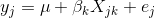
where yj is the phenotype of the jth individual, μ is the mean phenotype value, βk is the effect of the kth genotype, Xjk is the genotype for individual j, and εj is the error for the jth individual. In the figure below, μ equals 94.6, and β equals 15.4 for the alternative hypothesis (QTL exists).
This linear model is y = 94.6 + 15.4X + ε. The model intersects the genotype groups at their group means, and is based on μ and βk for chromosome 2 marker D2Mit17 located at 56.8 cM.
The effect of genotype BB (the β for the BB genotype) at marker D2Mit17 is 15.5, while the effect of the SS genotype is -15.4 on the liver phenotype. The effect of the SB genotype is -0.1 relative to μ equals 94.6.
The scan1() function returns only LOD scores. To obtain estimated QTL effects,
use the function scan1coef(). This function takes a single phenotype and the
genotype probabilities for a single chromosome and returns a matrix with the
estimated coefficients at each putative QTL location along the chromosome.
For example, to get the estimated QTL effects on chromosome 2 for the liver
phenotype, we would provide the chromosome 2 genotype probabilities and the
liver phenotype to the function scan1coef() as follows:
c2eff <- scan1coef(pr[,"2"], iron$pheno[,"liver"])
The result is a matrix of 39 positions × 3 genotypes. An additional column contains the intercept values (μ).
dim(c2eff)
[1] 39 4
head(c2eff)
                SS        SB        BB intercept
D2Mit379 -8.627249 -1.239968  9.867217  95.10455
c2.loc39 -8.802858 -1.405183 10.208040  95.15023
c2.loc40 -8.926486 -1.552789 10.479275  95.18752
c2.loc41 -8.994171 -1.670822 10.664993  95.21294
c2.loc42 -9.004121 -1.748738 10.752859  95.22372
c2.loc43 -8.956705 -1.779555 10.736260  95.21841
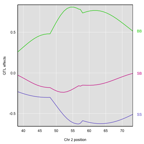
To plot the QTL effects, use the function plot_coef().
plot_coef(c2eff, map, legend = "topright")

The plot shows effect values on the y-axis and cM values on the x-axis. The value of the intercept (μ) appears at the top. The effect of the SB genotype is centered around zero, with the effects of the other two genotypes above and below.
To plot only the effects, use the argument columns to indicate which
coefficients to plot. Add scan1_output to include a LOD plot at the bottom.
plot_coef(c2eff, map, columns = 1:3, scan1_output = out,
          main = "Chromosome 2 QTL effects and LOD scores",
          legend = "topright")

If instead you want additive and dominance effects, you can provide a square matrix of contrasts, as follows:
c2effB <- scan1coef(pr[,"2"], iron$pheno[,"liver"],
                    contrasts=cbind(mu=c(1,1,1), a=c(-1, 0, 1), d=c(-0.5, 1, -0.5)))
The result will then contain the estimates of mu, a (the additive effect), and d (the dominance effect).
dim(c2effB)
[1] 39 3
head(c2effB)
               mu        a         d
D2Mit379 95.10455 9.247233 -1.239968
c2.loc39 95.15023 9.505449 -1.405183
c2.loc40 95.18752 9.702880 -1.552789
c2.loc41 95.21294 9.829582 -1.670822
c2.loc42 95.22372 9.878490 -1.748738
c2.loc43 95.21841 9.846482 -1.779555
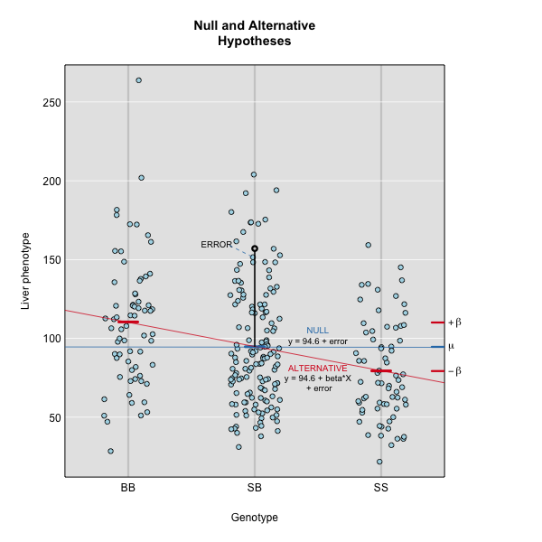
For marker D2Mit17, mu, a, and d are 94.616915, 15.4026314, -0.1033269.
Here’s a plot of the chromosome 2 additive and dominance effects, which are in the second and third columns.
plot_coef(c2effB, map["2"], columns=2:3, col=col)
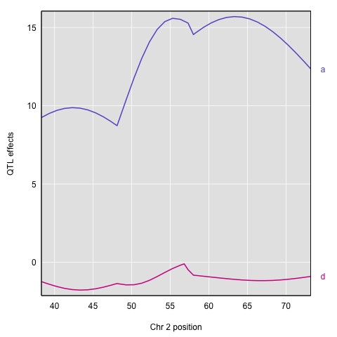
If you provide a kinship matrix to scan1coef(), it fits a linear mixed model (LMM) to account for a residual polygenic effect. Here let’s use the kinship matrix from the LOCO method.
c2eff_pg <- scan1coef(pr[,"2"], iron$pheno[,"liver"], kinship_loco[["2"]])
dim(c2eff_pg)
[1] 39 4
head(c2eff_pg)
                 SS         SB       BB intercept
D2Mit379  -9.552159 -0.5954469 10.14761  94.54643
c2.loc39  -9.868033 -0.7068007 10.57483  94.57886
c2.loc40 -10.130889 -0.8028380 10.93373  94.60481
c2.loc41 -10.332864 -0.8737574 11.20662  94.62137
c2.loc42 -10.468249 -0.9112466 11.37950  94.62626
c2.loc43 -10.533817 -0.9103486 11.44417  94.61832
Here’s a plot of the estimates.
plot_coef(c2eff_pg, map, columns = 1:3, scan1_output = out_pg_loco, main = "Chromosome 2 QTL effects and LOD scores", legend = "topright")

You can also get estimated additive and dominance effects, using a matrix of contrasts.
c2effB_pg <- scan1coef(pr[,"2"], iron$pheno[,"liver"], kinship_loco[["2"]],
                       contrasts=cbind(mu=c(1,1,1), a=c(-1, 0, 1), d=c(-0.5, 1, -0.5)))
Here’s a plot of the results.
plot(c2effB_pg, map["2"], columns=2:3, col=col)
Another option for estimating the QTL effects is to treat them as random effects and calculate Best Linear Unbiased Predictors (BLUPs). This is particularly valuable for multi-parent populations such as the Collaborative Cross and Diversity Outbred mice, where the large number of possible genotypes at a QTL leads to considerable variability in the effect estimates. To calculate BLUPs, use scan1blup(); it takes the same arguments as scan1coef(), including
the option of a kinship matrix to account for a residual polygenic effect.
c2blup <- scan1blup(pr[,"2"], iron$pheno[,"liver"], kinship_loco[["2"]])
Here is a plot of the BLUPs (as dashed curves) alongside the standard estimates.
plot_coef(c2eff, map["2"], columns=1:3)
plot(c2blup, map["2"], columns=1:3, add=TRUE, lty=2, legend = "topright")

The scan1coef function can also provide estimated QTL effects for binary traits, with model="binary". (However, scan1blup has not yet been implemented for binary traits.)
c2eff_bin <- scan1coef(pr[,"2"], bin_pheno[,"liver"], model="binary")
Here’s a plot of the effects. They’re a bit tricky to interpret, as they are basically log odds ratios.
Finally, to plot the raw phenotypes against the genotypes at a single putative QTL position, you can use the function plot_pxg(). This takes a vector of genotypes as produced by the maxmarg() function, which picks the most likely genotype from a set of genotype probabilities, provided it is greater than some specified value (the argument minprob). Note that the “marg” in “maxmarg” stands for “marginal”, as this function is selecting the genotype at each position that has maximum marginal probability.
For example, we could get inferred genotypes at the chr 2 QTL for the liver phenotype (at 28.6 cM) as follows:
g <- maxmarg(pr, map, chr=2, pos=28.6, return_char=TRUE)
We use return_char=TRUE to have maxmarg() return a vector of character strings with the genotype labels.
We then plot the liver phenotype against these genotypes as follows:
par(mar=c(4.1, 4.1, 0.6, 0.6))
plot_pxg(g, iron$pheno[,"liver"], ylab="Liver phenotype")

par(mar=c(4.1, 4.1, 0.6, 0.6))
plot_pxg(g, iron$pheno[,"liver"], SEmult=2, swap_axes=TRUE, xlab="Liver phenotype")

Challenge 1
Find the QTL effects for chromosome 16 for the liver phenotype.
1) Create an objectc16effto contain the effects.
2) Plot the chromosome 16 coefficients and add the LOD plot at bottom.Solution to Challenge 1
1)
c16eff <- scan1coef(pr[,"16"], iron$pheno[,"liver"])
2)plot_coef(c16eff, map, legend = "topright", scan1_output = out)
Challenge 2
In the code block above, we use
swap_axes=TRUEto place the phenotype on the x-axis. We can useSEmult=2to include the mean ± 2 SE intervals.
1) How would you decide which chromosome to plot? Discuss this with your neighbor, then write your responses in the collaborative document.
2) Calculate and plot the best linear unbiased predictors (blups) for spleen on the chromosome of your choice.Solution to Challenge 2
Key Points
Estimated founder allele effects can be plotted from the mapping model coefficients.
Additive and dominance effects can be plotted using contrasts.