QTL analysis in Diversity Outbred Mice
Overview
Teaching: 30 min
Exercises: 30 minQuestions
How do I bring together each step in the workflow?
How is the workflow implemented in an actual study?
Objectives
Work through an actual QTL mapping workflow from a published study.
This tutorial will take you through the process of mapping a QTL and searching for candidate genes for DNA damage from benzene exposure. The adverse health effects of benzene, including leukemia and aplastic anemia, were first studied in occupational settings in which workers were exposed to high benzene concentrations. Environmental sources of benzene exposure typically come from the petrochemical industry, however, a person’s total exposure can be increased from cigarettes, consumer products, gas stations, and gasoline powered engines or tools stored at home.
Exposure thresholds for toxicants are often determined using animal models that have limited genetic diversity, including standard inbred and outbred rats and mice. These animal models fail to capture the influence of genetic diversity on toxicity response, an important component of human responses to chemicals such as benzene. The Diversity Outbred (DO) mice reflect a level of genetic diversity similar to that of humans.
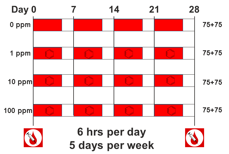
The data comes from a toxicology study in which Diversity Outbred (DO) mice were exposed to benzene via inhalation for 6 hours a day, 5 days a week for 4 weeks (French, J. E., et al. (2015) Environ Health Perspect 123(3): 237-245). The study was conducted in two equally sized cohort of 300 male mice each, for a total of 600 mice. They were then sacrificed and reticulocytes (red blood cell precursors) were isolated from bone marrow. The number of micro-nucleated reticulocytes, a measure of DNA damage, was then measured in each mouse. The goal is to map gene(s) that influence the level of DNA damage in the bone marrow.
Load and explore the data
Make sure that you are in your scripts directory. If you’re not sure where you are working right now, you can check your working directory with getwd(). If you are not in your scripts directory, run setwd("scripts") in the Console or Session -> Set Working Directory -> Choose Directory in the RStudio menu to set your working directory to the scripts directory.
Once you are in your scripts directory, create a new R script with File -> New File -> R script, or use the +document icon at upper left.
The data for this tutorial has been saved as an R binary file that contains several data objects. Load it in now by running the following command in your new script.
load("../data/qtl2_demo.Rdata")
sessionInfo()
The call to sessionInfo provides information about the R version running on your machine and the R packages that are installed. This information can help you to troubleshoot. If you can’t load the data, try downloading the data again by copying and pasting the following into your browser: ftp://ftp.jax.org/dgatti/qtl2_workshop/qtl2_demo.Rdata
We loaded in three data objects. Check the Environment tab to see what was loaded. You should see a phenotypes object called pheno with 598 observations (in rows) of 12 variables (in columns), an object called map (physical map), and an object called probs (genotype probabilities).
Phenotypes
pheno is a data frame containing the phenotype data. Click on the triangle to the left of pheno in the Environment pane to view its contents. Run names(pheno) to list the variables.
NOTE: the sample IDs must be in the rownames of pheno. For more information about data file format, see the Setup instructions.
pheno contains the sample ID, sex, the study cohort, the concentration of benzene and the proportion of bone marrow reticulocytes that were micro-nucleated (prop.bm.MN.RET). Note that the sample IDs are also stored in the rownames of pheno. In order to save time for this tutorial, we will only map with 598 samples from the 100 ppm dosing group.
Challenge 1 Look at the Data
Determine the dimensions of
pheno.
1). How many rows and columns does it have?
2). What are the names of the variables it contains?
3). What does the distribution of theprop.bm.MN.RETcolumn look like? Is it normally distributed?Solution to Challenge 1
dim(pheno)
1).dim(pheno)[1]gives the number of rows anddim(pheno)[2]the number of columns. You can also use the structure commandstr(pheno), which will tell you that this is a data frame with 598 observations of 12 variables. It will also list the 12 variable names for you.
2). Usecolnames(pheno)ornames(pheno), or click the triangle to the left ofphenoin the Environment tab.
3). Usehist(pheno$prop.bm.MN.RET)to plot the distribution of the data. The data has a long right tail and is not normally distributed.
Many statistical models, including the QTL mapping model in qtl2, expect that the incoming data will be normally distributed. You may use transformations such as log or square root to make your data more normally distributed. We will be mapping the proportion of micronucleated reticulocytes in bone marrow (prop.bm.MN.RET) and, since the data does not contain zeros or negative numbers, we will log transform the data. Here is a histogram of the untransformed data.
hist(pheno$prop.bm.MN.RET, main = "Proportion of micronucleated reticulocytes")

Apply the log() function to this data.
pheno$log.MN.RET <- log(pheno$prop.bm.MN.RET)
Now, let’s make a histogram of the log-transformed data.
hist(pheno$log.MN.RET, main = "Proportion of micronucleated reticulocytes (log-transformed)")

This looks much better!
Some researchers are concerned about the reproducibility of DO studies. The argument is that each DO mouse is unique and therefore can never be reproduced. But this misses the point of using the DO. While mice are the sampling unit, in QTL mapping we are sampling the founder alleles at each locus. An average of 1/8th of the alleles should come from each founder at any given locus. Also, DO mice are a population of mice, not a single strain. While it is true that results in an individual DO mouse may not be reproducible, results at the population level should be reproducible. This is similar to the human population in that results from one individual may not represent all humans, but results at the population level should be reproducible.
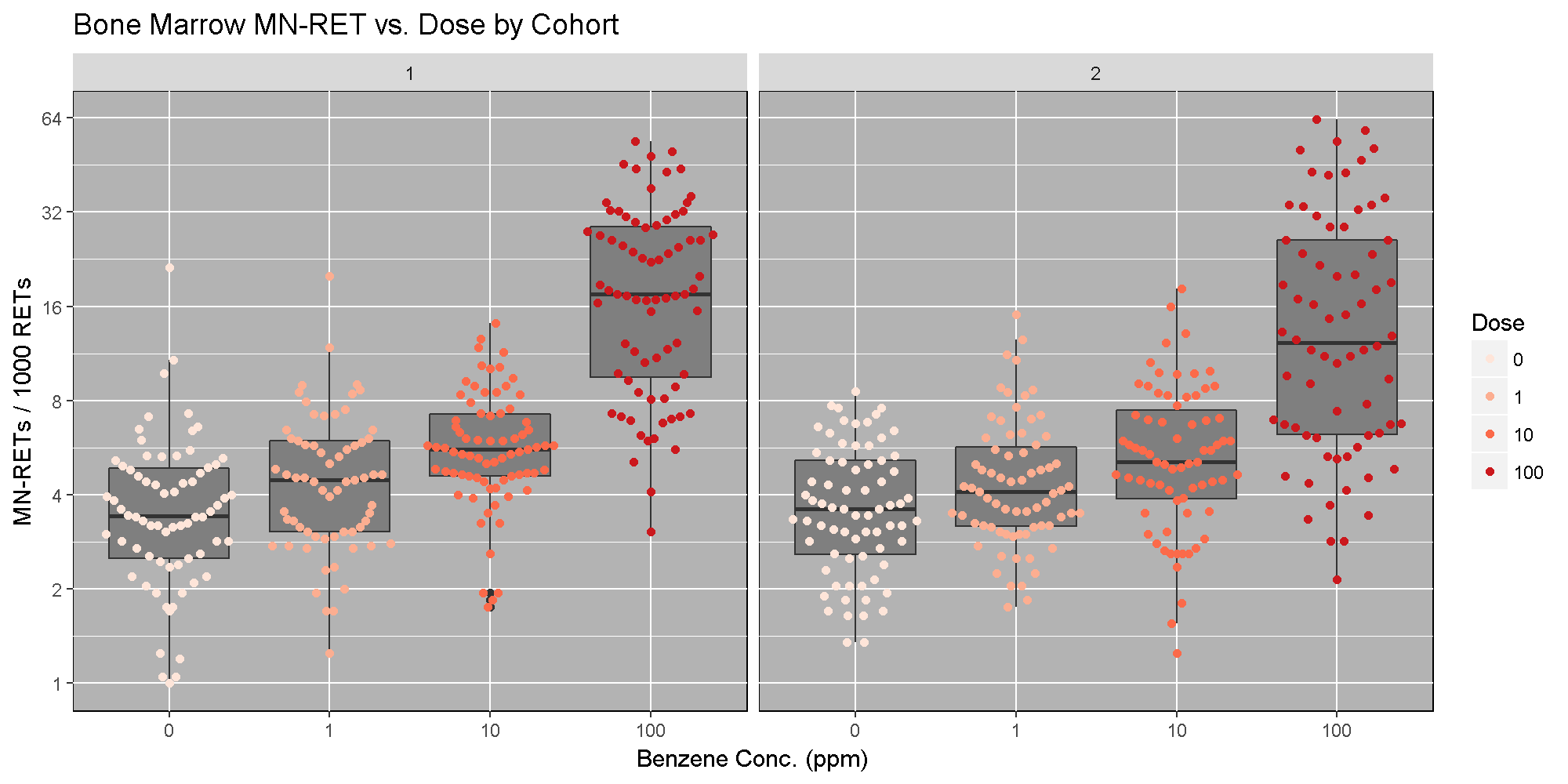
The benzene inhalation study was conducted in two separate cohorts (termed Study in the pheno object). Below, we plot the proportion of micronucleated reticulocytes in bone marrow versus the benzene concentration for each study cohort. As you can see, while individual mice have varying micronucleated reticulocytes, there is a dose-dependent increase in micronucleated reticulocytes in both cohorts. This is an example of how results in the DO reproduce at the population level.
The Marker Map
The marker map for each chromosome is stored in the map object. Each list element is a numeric vector with each marker position in megabases (Mb). This is used to plot the LOD scores calculated at each marker during QTL mapping.
The markers are from a genotyping array called the Mouse Universal Genotyping Array (MUGA) and contains 7,856 SNP markers. Marker locations for the MUGA and other mouse arrays are available from The Jackson Laboratory’s FTP site.
Look at the structure of map in the Environment tab by clicking the triangle to the left or by running str(map) in the Console.
Challenge 2 Data Dimensions II
1). Determine the length of
map.
2). How many markers are on chromosome 1?Solution to Challenge 2
1).
length(map)
2).length(map[[1]])
Genotype (allele) probabilities
Each element of probs is a 3 dimensional array containing the founder allele dosages for each sample at each marker on one chromosome. These probabilities have been pre-calculated for you, so you can skip the step for calculating genotype probabilities and the optional step for calculating allele probabilities.
Next, we look at the dimensions of probs for chromosome 1:
dim(probs[[1]])
[1] 590 8 537
probs is a three dimensional array containing the proportion of each founder haplotype at each marker for each DO sample. The 590 samples are in the first dimension, the 8 founders in the second and the 537 markers along chromosome 1 are in the third dimension.
Let’s return to the probs object. Look at the contents for the first 500 markers of one sample.
NOTE: the sample IDs must be in the rownames of probs.
plot_genoprob(probs, map, ind = 1, chr = 1)

In the plot above, the founder contributions, which range between 0 and 1, are colored from white (= 0) to black (= 1.0). A value of ~0.5 is grey. The markers are on the X-axis and the eight founders (denoted by the letters A through H) on the Y-axis. Starting at the left, we see that this sample has genotype BB because the row for B is black, indicating values of 1.0. Moving along the genome to the right, the genotype becomes CE where rows C and E are gray, followed by CD, FH, AG, GH, etc. The values at each marker sum to 1.0.
Calculating A Kinship Matrix
Next, we need to create a matrix that accounts for the kinship relationships between the mice. We do this by looking at the correlation between the founder haplotypes for each sample at each SNP. For each chromosome, we create a kinship matrix using all markers except the ones on the current chromosome using the loco (leave-one-chromosome-out) method. Simulations suggest that mapping using this approach increases the power to detect QTL.
K <- calc_kinship(probs = probs, type = "loco")
Kinship values between pairs of samples range between 0 (no relationship) and 1.0 (completely identical). Let’s look at the kinship matrix.
n_samples <- 50
heatmap(K[[1]][1:n_samples, 1:n_samples])

The figure above shows kinship between all pairs of samples. Light yellow indicates low kinship and dark red indicates higher kinship. Orange values indicate varying levels of kinship between 0 and 1. The dark red diagonal of the matrix indicates that each sample is identical to itself. The orange blocks along the diagonal may indicate close relatives (i.e. siblings or cousins).
Covariates
Next, we need to create additive covariates that will be used in the mapping model. We will use study cohort as a covariate in the mapping model. If we were mapping with all mice, we would also add benzene concentration to the model. This study contained only male mice, but in most cases, you would include sex as an additive covariate as well.
addcovar <- model.matrix(~Study, data = pheno)[,-1]
The code above copies the rownames(pheno) to rownames(addcovar) as a side-effect.
NOTE: the sample IDs must be in the rownames of pheno, addcovar, genoprobs and K. qtl2 uses the sample IDs to align the samples between objects. For more information about data file format, see Karl Broman’s vignette on input file format.
Performing a genome scan
Before we run the mapping function, let’s look at the mapping model. At each marker on the genotyping array, we will fit a model that regresses the phenotype (micronucleated reticulocytes) on covariates and the founder allele proportions.

where:
- yi is the phenotype for mouse i,
- βs is the effect of study cohort,
- si is the study cohort for mouse i,
- βj is the effect of founder allele j,
- gij is the probability that mouse i carries an allele from founder j,
- λi is an adjustment for kinship-induced correlated errors for mouse i,
- εi is the residual error for mouse i.
Note that this model will give us an estimate of the effect of each founder allele at each marker. There are eight founder strains that contributed to the DO, so we will get eight founder allele effects.
There are almost 600 samples in this data set and it may take several minutes to map one trait. In order to save some time, we will map using only the samples in the 100 ppm concentration group.
c100 <- which(pheno$Conc == 100)
In order to map the proportion of bone marrow reticulocytes that were micro-nucleated, you will use the scan1 function. To see the arguments for scan1, you can type help(scan1). First, let’s map the untransformed phenotype. (Recall that we log-transformed it above).
index <- which(colnames(pheno) == "prop.bm.MN.RET")
qtl <- scan1(genoprobs = probs, pheno = pheno[c100,index, drop = FALSE], kinship = K, addcovar = addcovar)
Next, we plot the genome scan.
plot_scan1(x = qtl, map = map, main = "Proportion of Micro-nucleated Bone Marrow Reticulocytes")

Challenge 3 How does a log-tranformation change the QTL plot?
1). Perform a genome scan on the column called
log.MN.RET. (Hint: setindexto the column index inpheno.)
2). How does the LOD score for the peak on Chr 10 change?Solution to Challenge 3
1).
index <- which(colnames(pheno) == "prop.bm.MN.RET")
qtl <- scan1(genoprobs = probs, pheno = pheno[c100,index, drop = FALSE], kinship = K, addcovar = addcovar)
plot_scan1(x = qtl, map = map, main = "Log-Transformed BM micronucleated reticulocytes")
2). The LOD increases from ~16 to ~26.
This challenge shows the importance of looking at your data and transforming it to meet the expectations of the mapping model. In this case, a log transformation improved the model fit and increased the LOD score. We will continue the rest of this lesson using the log-transformed data. Set your index variable equal to the column index of log.MN.RET. Redo the genome scan with the log-transformed reticulocytes.
index <- which(colnames(pheno) == "log.MN.RET")
qtl <- scan1(genoprobs = probs, pheno = pheno[c100, index,  drop = FALSE], kinship = K, addcovar = addcovar)
Performing a permutation test
There is clearly a large peak on Chr 10. Next, we must assess its statistical significance. This is most commonly done via permutation. We advise running at least 1,000 permutations to obtain significance thresholds. In the interest of time, we perform 100 permutations here.
perms <- scan1perm(genoprobs = probs, pheno = pheno[c100,index, drop = FALSE], addcovar = addcovar, n_perm = 100)
The perms object contains the maximum LOD score from each genome scan of permuted data.
Challenge 4 What is significant?
1). Create a histogram of the LOD scores
perms. Hint: use thehist()function.
2). Estimate the value of the LOD score at the 95th percentile.
3). Then find the value of the LOD score at the 95th percentile using thesummary()function.Solution to Challenge 4
1).
hist(x = perms)orhist(x = perms, breaks = 15)
2). By counting number of occurrences of each LOD value (frequencies), we can approximate the 95th percentile at ~7.5.
3).summary(perms)
We can now add thresholds to the previous QTL plot. We use a significance threshold of p < 0.05. To do this, we select the 95th percentile of the permutation LOD distribution.
plot(x = qtl, map = map,  main = "Proportion of Micro-nucleated Bone Marrow Reticulocytes")
thr = summary(perms)
abline(h = thr, col = "red", lwd = 2)

The peak on Chr 10 is well above the red significance line.
Finding LOD peaks
We can then plot the QTL scan. Note that you must provide the marker map, which we loaded earlier in the MUGA SNP data.
We can find all of the peaks above the significance threshold using the find_peaks function.
find_peaks(scan1_output = qtl, map = map, threshold = thr)
  lodindex  lodcolumn chr      pos      lod
1        1 log.MN.RET  10 33.64838 26.22947
Challenge 5 Find all peaks
Find all peaks for this scan whether or not they meet the 95% significance threshold.
Solution to Challenge 5
find_peaks(scan1_output = qtl, map = map)
Notice that some peaks are missing because they don’t meet the default threshold value of 3. Seehelp(find_peaks)for more information about this function.
The support interval is determined using the Bayesian Credible Interval and represents the region most likely to contain the causative polymorphism(s). We can obtain this interval by adding a prob argument to find_peaks. We pass in a value of 0.95 to request a support interval that contains the causal SNP 95% of the time.
find_peaks(scan1_output = qtl, map = map, threshold = thr, prob = 0.95)
  lodindex  lodcolumn chr      pos      lod   ci_lo    ci_hi
1        1 log.MN.RET  10 33.64838 26.22947 31.8682 34.17711
From the output above, you can see that the support interval is 5.5 Mb wide (30.16649 to 35.49352 Mb). The location of the maximum LOD score is at 34.17711 Mb.
Estimated QTL effects
We will now zoom in on Chr 10 and look at the contribution of each of the eight founder alleles to the proportion of bone marrow reticulocytes that were micro-nucleated. Remember, the mapping model above estimates the effect of each of the eight DO founders. We can plot these effects (also called ‘coefficients’) across Chr 10 using scan1coef.
chr <- 10
coef10 <- scan1blup(genoprobs = probs[,chr], pheno = pheno[c100,index, drop = FALSE], kinship <- K[[chr]], addcovar = addcovar)
This produces an object containing estimates of each of the eight DO founder allele effect. These are the βj values in the mapping equation above.
plot_coefCC(x = coef10, map = map, scan1_output = qtl, main = "Proportion of Micro-nucleated Bone Marrow Reticulocytes")

The top panel shows the eight founder allele effects (or model coefficients) along Chr 10. The founder allele effects are centerd at zero and the units are the same as the phenotype. You can see that DO mice containing the CAST/EiJ allele near 34 Mb have lower levels of micro-nucleated reticulocytes. This means that the CAST allele is associated with less DNA damage and has a protective effect. The bottom panel shows the LOD score, with the support interval for the peak shaded blue.
SNP Association Mapping
At this point, we have a 6 Mb wide support interval that contains a polymorphism(s) that influences benzene-induced DNA damage. Next, we will impute the DO founder sequences onto the DO genomes. The Sanger Mouse Genomes Project has sequenced the eight DO founders and provides SNP, insertion-deletion (indel), and structural variant files for the strains (see Baud et.al., Nat. Gen., 2013). We can impute these SNPs onto the DO genomes and then perform association mapping. The process involves several steps and I have provided a function to encapsulate the steps. To access the Sanger SNPs, we use a SQLlite database provided by Karl Broman. You should have downloaded this during Setup. It is available from the JAX FTP site, but the file is 3 GB, so it may take too long to download right now.
Association mapping involves imputing the founder SNPs onto each DO genome and fitting the mapping model at each SNP. At each marker, we fit the following model:

where:
- yi is the phenotype for mouse i,
- βs is the effect of study cohort,
- si is the study cohort for mouse i,
- βm is the effect of adding one allele at marker m,
- gim is the allele call for mouse i at marker m,
- λi is an adjustment for kinship-induced correlated errors for mouse </i>i</i>,
- εi is the residual error for mouse i.
We can call scan1snps to perform association mapping in the QTL interval on Chr 10. We first create variables for the chromosome and support interval where we are mapping. We then create a function to get the SNPs from the founder SNP database The path to the SNP database (snpdb_file argument) points to the data directory on your computer. Note that it is important to use the keep_all_snps = TRUE in order to return all SNPs.
chr <- 10
start <- 30
end <- 36
query_func <- create_variant_query_func("../data/cc_variants.sqlite")
assoc <- scan1snps(genoprobs = probs[,chr], map = map, pheno = pheno[c100,index,drop = FALSE], kinship = K, addcovar = addcovar, query_func = query_func, chr = chr, start = start, end = end, keep_all_snps = TRUE)
The assoc object is a list containing two objects: the LOD scores for each unique SNP and a snpinfo object that maps the LOD scores to each SNP. To plot the association mapping, we need to provide both objects to the plot_snpasso function.
plot_snpasso(scan1output = assoc$lod, snpinfo = assoc$snpinfo, main = "Proportion of Micro-nucleated Bone Marrow Reticulocytes")

This plot shows the LOD score for each SNP in the QTL interval. The SNPs occur in “shelves” because all of the SNPs in a haplotype block have the same founder strain pattern. The SNPs with the highest LOD scores are the ones for which CAST/EiJ contributes the alternate allele.
We can add a plot containing the genes in the QTL interval using the plot_genes function. We get the genes from another SQLlite database created by Karl Broman called mouse_genes.sqlite. You should have downloaded this from the JAX FTP Site during Setup.
First, we must query the database for the genes in the interval. The path of the first argument points to the data directory on your computer.
query_genes <- create_gene_query_func(dbfile = "../data/mouse_genes.sqlite", filter = "source='MGI'")
genes <- query_genes(chr, start, end)
head(genes)
  chr source       type    start     stop score strand phase              ID
1  10    MGI pseudogene 30.01095 30.01730    NA      +    NA MGI:MGI:2685078
2  10    MGI pseudogene 30.08426 30.08534    NA      -    NA MGI:MGI:3647013
3  10    MGI pseudogene 30.17971 30.18022    NA      +    NA MGI:MGI:3781001
4  10    MGI       gene 30.19457 30.20060    NA      -    NA MGI:MGI:1913561
5  10    MGI pseudogene 30.37292 30.37556    NA      +    NA MGI:MGI:3643405
6  10    MGI       gene 30.45052 30.45170    NA      +    NA MGI:MGI:5623507
     Name Parent                                         Dbxref
1   Gm232   <NA>    NCBI_Gene:212813,ENSEMBL:ENSMUSG00000111554
2  Gm8767   <NA>    NCBI_Gene:667696,ENSEMBL:ENSMUSG00000111001
3  Gm2829   <NA> NCBI_Gene:100040542,ENSEMBL:ENSMUSG00000110776
4   Cenpw   <NA>     NCBI_Gene:66311,ENSEMBL:ENSMUSG00000075266
5  Gm4780   <NA>    NCBI_Gene:212815,ENSEMBL:ENSMUSG00000111047
6 Gm40622   <NA>                            NCBI_Gene:105245128
                  mgiName             bioType Alias
1      predicted gene 232          pseudogene  <NA>
2     predicted gene 8767          pseudogene  <NA>
3     predicted gene 2829          pseudogene  <NA>
4    centromere protein W protein coding gene  <NA>
5     predicted gene 4780          pseudogene  <NA>
6 predicted gene%2c 40622         lncRNA gene  <NA>
The genes object contains annotation information for each gene in the interval.
Next, we will create a plot with two panels: one containing the association mapping LOD scores and one containing the genes in the QTL interval. We do this by passing in the genes argument to plot_snpasso. We can also adjust the proportion of the plot allocated for SNPs (on the top) and genes (on th bottom) using the ‘top_panel_prop’ argument.
plot_snpasso(assoc$lod, assoc$snpinfo, main = "Proportion of Micro-nucleated Bone Marrow Reticulocytes", genes = genes, top_panel_prop = 0.5)

Searching for Candidate Genes
One strategy for finding genes related to a phenotype is to search for genes with expression QTL (eQTL) in the same location. Ideally, we would have liver and bone marrow gene expression data in the DO mice from this experiment. Unfortunately, we did not collect this data. However, we have liver gene expression for a separate set of untreated DO mice Liver eQTL Viewer. We searched for genes in the QTL interval that had an eQTL in the same location. Then, we looked at the pattern of founder effects to see if CAST stood out. We found two genes that met these criteria.
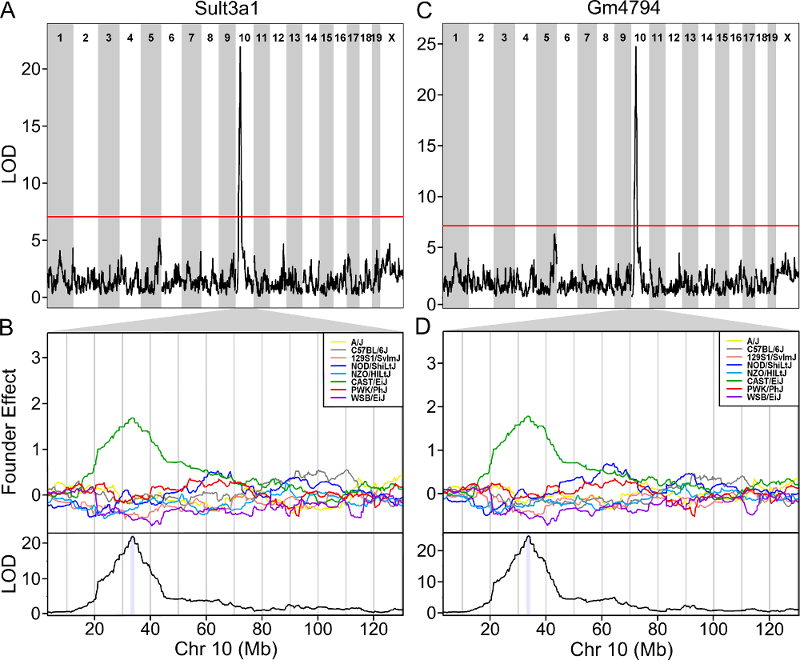
As you can see, both Sult3a1 and Gm4794 have eQTL in the same location on Chr 10 and mice with CAST allele (in green) express these genes more highly. Sult3a1 is a sulfotransferase that may be involved in adding a sulphate group to phenol, one of the metabolites of benzene. Go to the Ensembl web page for Gm4794. Note that Gm4794 has a new name: Sult3a2. In the menu on the left, click on the “Gene Tree (image)” link.
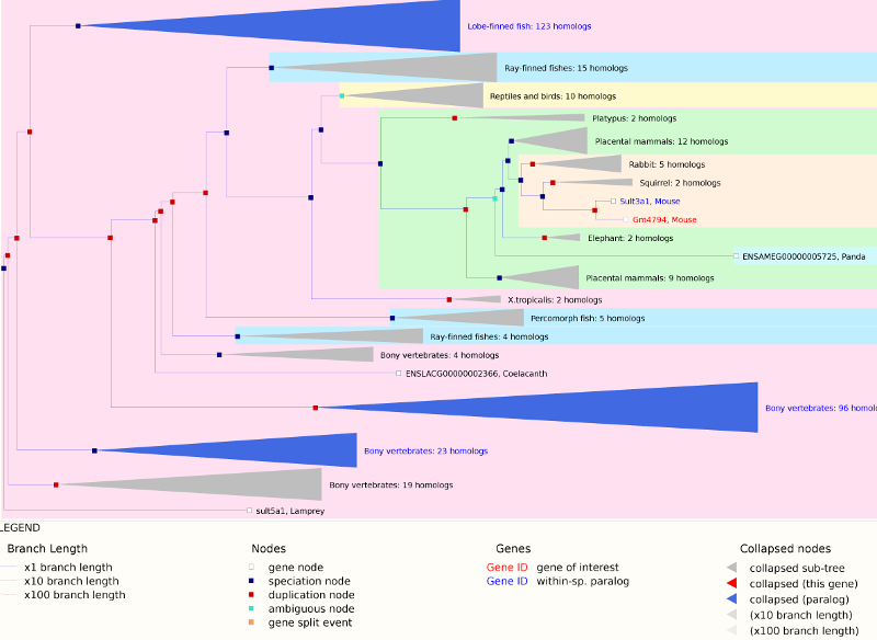
As you can see, Sult3a2 is a paralog of Sult3a1 and hence both genes are sulfotransferases. These genes encode enzymes that attach a sulfate group to other compounds.
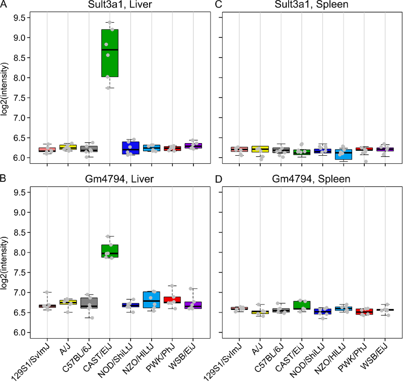
We also looked at a public gene expression database in which liver, spleen and kidney gene expression were measured in 26 inbred strains, including the eight DO founders. You can search for Sult3a1 and Gm4794 in this strain survey data. We did this and plotted the spleen and liver expression values. We did not have bone marrow expression data from this experiment. We also plotted the expression of all of the genes in the QTL support interval that were measured on the array (data not shown). Sult3a1 and its paralog Gm4794 were the only genes with a different expression pattern in CAST. Neither gene was expressed in the spleen.
Next, go to the Sanger Mouse Genomes website and enter Sult3a1 into the Gene box. Scroll down and check only the DO/CC founders (129S1/SvImJ, A/J, CAST/EiJ, NOD/ShiLtJ, NZO/HlLtJ & WSB/EiJ) and then scroll up and press Search. This will show you SNPs in Sult3a1. Select the Structural Variants tab and note the copy number gain in CAST from 33,764,194 to 33,876,194 bp. Click on the G to see the location, copy this position (10:33764194-33876194) and go to the Ensembl website. Enter the position into the search box and press Go. You will see a figure similar to the one below.
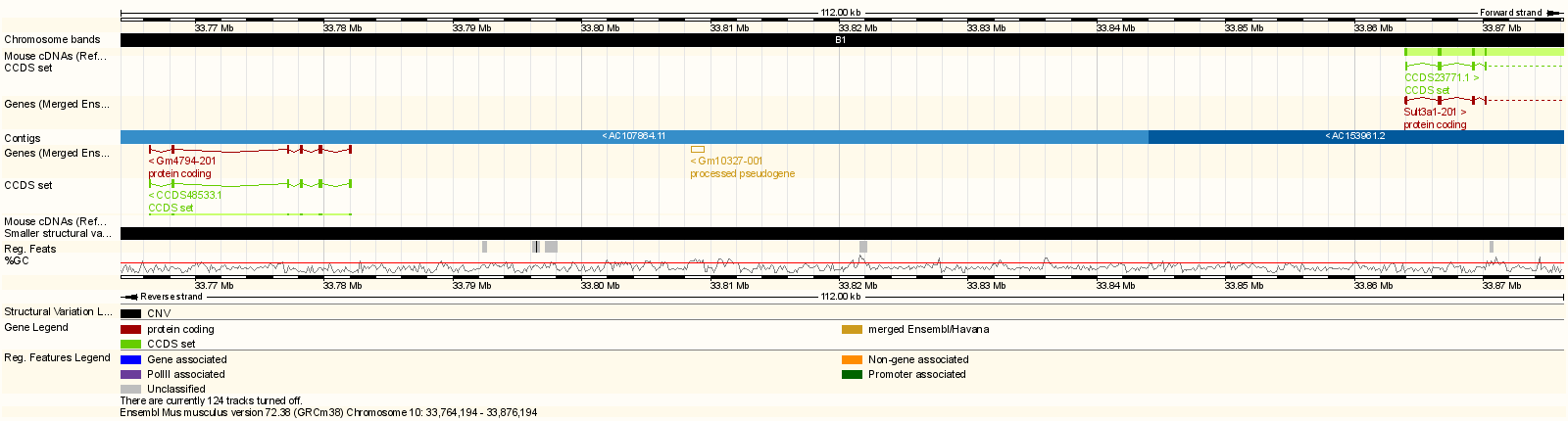
Note that both Gm4794 (aka Sult3a2) and part of Sult3a1 are in the copy number gain region.
In order to visualize the size of the copy number gain, we queried the Sanger Mouse Genomes alignment files for the eight founders. We piled up the reads at each base (which is beyond the scope of this tutorial) and made the figure below.
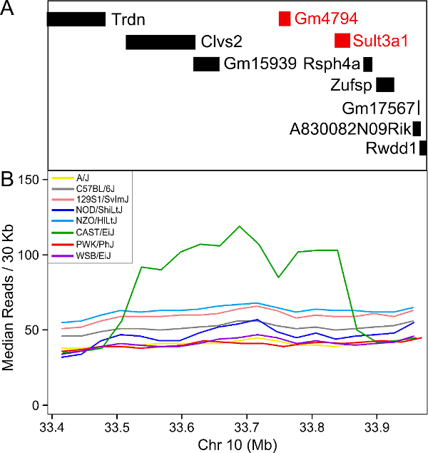
As you can see, there appears to be a duplicatation in the CAST founders that covers four genes: Clvs2, Gm15939, Gm4794 and Sult3a1. Clvs2 is expressed in neurons and Gm15939 is a predicted gene that may not produce a transcript.
Hence, we have three pieces of evidence that narrows our candidate gene list to Sult3a1 and Gm4794:
- Both genes have a liver eQTL in the same location as the micronucleated reticulocytes QTL.
- Among genes in the micronucleated reticulocytes QTL interval, only Sult3a1 and Gm4794 have differential expression of the CAST allele in the liver.
- There is a copy number gain of these two genes in CAST.
Sulfation is a prominent detoxification mechanism for benzene as well. The diagram below shows the metabolism pathway for benzene (Monks, T. J., et al. (2010). Chem Biol Interact 184(1-2): 201-206.) Hydroquinone, phenol and catechol are all sulfated and excreted from the body.
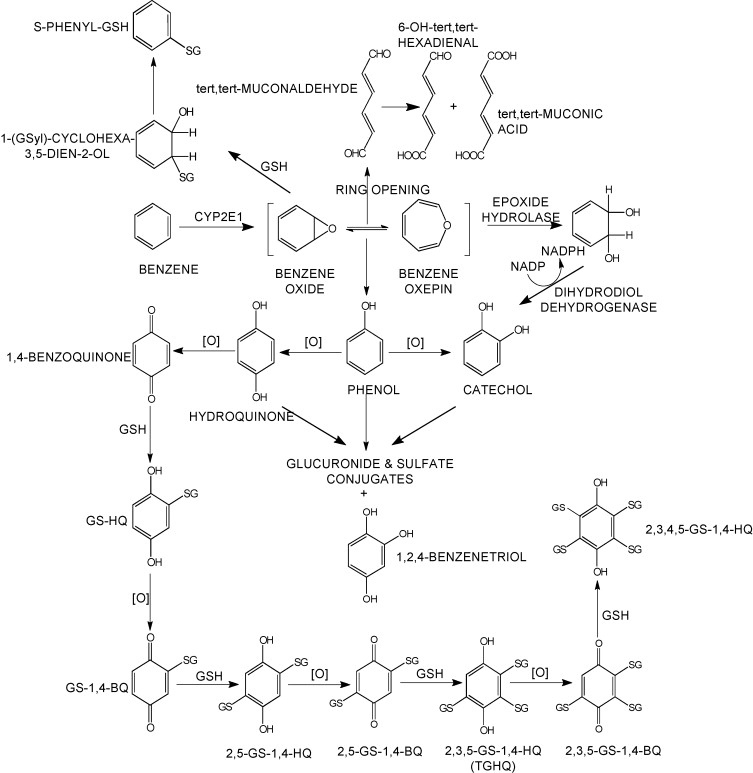
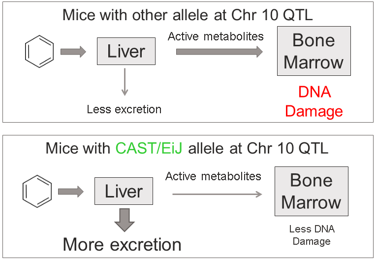
This analysis has led us to the following hypothesis. Inhaled benzene is absorbed by the lungs into the bloodstream and transported to the liver. There, it is metabolized, and some metabolites are transported to the bone marrow. One class of genes that is involved in toxicant metabolism are sulfotransferases. Sult3a1 is a phase II enzyme that conjugates compounds (such as phenol, which is a metabolite of benzene) with a sulfate group before transport into the bile. It is possible that a high level of Sult3a1 expression could remove benzene by-products and be protective. Our hypothesis is that the copy number gain in the CAST allele increases liver gene expression of Sult3a1 and Gm4794. High liver expression of these genes allows mice containing the CAST allele to rapidly conjugate harmful benzene metabolites and excrete them from the body before they can reach the bone marrow and cause DNA damage. Further experimental validation is required, but this is a plausible hypothesis.
We hope that this tutorial has shown you how the DO can be used to map QTL and use the founder effects and bioinformatics resources to narrow down the candidate gene list. Here, we made used of external gene expression databases and the founder sequence data to build a case for a pair of genes.
Challenge 6 Map another trait.
1). Make a histogram of the column
pre.prop.MN.RETinpheno. Does it look like it should be log transformed? If so, add a column tophenothat contains the log ofpre.prop.MN.RET.
2). Perform a genome scan using all samples on the column calledpre.prop.MN.RET. Since you’re using all samples, the scan will take longer. (Hint: setindexto the column index inpheno.)
3). Which chromosome has the higest peak? Usefind_peaksto get the location and support interval for the highest peak.
4). Calculate and plot the BLUPs for the chromosome with the highest peak. (This may take a few minutes.)
5). Perform association mapping in the support interval for the QTL peak, plot the results and plot the genes beneath the association mapping plot.Solution to Challenge 6
1).
hist(pheno$pre.prop.MN.RET)
pheno$log.pre.MN.RET <- log(pheno$pre.prop.MN.RET)
2).index <- which(colnames(pheno) == "log.pre.MN.RET")
addcovar <- model.matrix(~Study + Conc, data = pheno)[,-1]
qtl_pre <- scan1(genoprobs = probs, pheno = pheno[,index, drop = FALSE], kinship = K, addcovar = addcovar)
plot_scan1(x = qtl_pre, map = map, main = "Log-Transformed Pre-dose micronucleated reticulocytes")
3).find_peaks(qtl_pre, map, threshold = 10, prob = 0.95)
4).chr <- 4
coef4 <- scan1blup(genoprobs = probs[,chr], pheno = pheno[,index, drop = FALSE], kinship = K[[chr]], addcovar = addcovar)
plot_coefCC(x = coef4, map = map, scan1_output = qtl, main = "Log-Transformed Pre-dose micronucleated reticulocytes")
5).chr <- 4
start <- 132.5
end <- 136
assoc4 = scan1snps(genoprobs = probs[,chr], map = map, pheno = pheno[,index,drop = FALSE], kinship = K, addcovar = addcovar, query_func = query_func, chr = chr, start = start, end = end, keep_all_snps = TRUE)
genes <- query_genes(chr, start, end)
plot_snpasso(assoc4$lod, assoc4$snpinfo, main = "Log-Transformed Pre-dose micronucleated reticulocytes", genes = genes)
Key Points
.
.